Ink Review: Franklin-Christoph Olde Emerald

This ink is another that I have been wanting to pick up for a long time, but just now bit the bullet and got around to doing so.  Franklin-Christoph introduced their line of inks last year, and they've received rave reviews so far.  I can see why:  they're classy dark shades of blue, purple, green, and red, and from what I've seen so far they are incredibly low maintenance and safe.  At one of the pen shows last year I took note that Mike Masuyama was using the Dark Denim to test the pens he was working on, and he was telling everyone sitting at his table that he is very careful what inks he puts in his customers' pens.  Anyhow, I picked up two bottles at the Atlanta Pen Show:  Olde Emerald (Green) and Syrah, Syrah (Red/Burgundy).  I have not inked up a pen with the Syrah, Syrah, but here is my take on the Green, and it's a good one. 

This review was written with a Stipula Etruria Alter Ego with a 1.1 mm Stub on an Exacompta Index Card.  The Stub is pretty wet, and the Index Card not exactly absorbent, so the dry time on this ink is slower than it would be on typical daily use paper.  

This is a fairly wet ink, but it dries quickly.  The dry time reflected on my written review is somewhat misleading.  I've found that this ink dries within 5-10 seconds on most papers, and it was dry at 15 seconds on this Exacompta index card.  As you can see from the photos, the ink shades beautifully.  The color has been described as "the color of money," which from what I've seen, is pretty accurate.  I've found myself using this ink on a daily basis!  

Ink Review: Akkerman Chinatown Red and Voorhout Violet

My first stop at last weekend's Atlanta Pen Show was the Vanness Pens table.  I drove down from Nashville for the day, pretty much worrying the whole way that Vanness would be sold out of Akkerman by the time I arrived.  I shouldn't have worried!  Lisa and Wendi brought 75 bottles, which I think covered the full spectrum of colors, and while I hear the ink went fast, there was plenty of it left on Saturday morning when I got there.  Chinatown Red and Voorhout Violet were the two colors I had come for, so I snapped them up and took them out to my car for safekeeping.  And, of course, when I got back to the hotel that night, they were the first two that I inked up.  

These are the "baby Akkermans," (60ml), not the 150ml bottles.  The large bottles have been discontinued. 

Which ink to review first?  The Voorhout violet is definitely the most interesting of the two, at least to me.  I love dark purple inks, and have been looking for a purplish black that I can use professionally on a daily basis.  I have Pharmacist's Purpura Imperialis, which is nice, but the IG formulation is a little too high maintenance for my routine use.  This ink, on the other hand, is nearly perfect for work.  Even in a wet pen, it's well-behaved on cheap paper, does not feather or bleed through, and dries quickly.  I would say the ink itself is slightly "dry."  There's great shading, as you can see in the gallery photos below.

Akkerman Voorhout Violet exhibits some nice shading properties.  Written on an Exacompta Index Card. 

The Chinatown Red is very different.  It's much more saturated, does not shade as much, and is a "wetter" ink.  Even though the Chinatown Red flows more freely, it is still well-behaved and does not bleed through or feather too much on copy paper.  The scan below does a fairly decent job of capturing the color.  It's a bright red with orange undertones.  I spent all of last week editing a 75-page report and went through two fills of this color in my Pelikan M600 EF. 

Both of these inks will make it into my general rotation.  I always have one or more shades of red (my preferred color), and the voorhout violet is dark enough to make it into my family of "business inks."  Now that I have my two desired Akkerman colors, I can lay off the ink purchases for a while! 

Ink Review: Vintage Carter's Tulip Purple

I have a moderately large stash of vintage ink, including a quart-size bottle of Carter's Tulip Purple from the 1930's or 1940's that I won on an eBay auction a year or so back.  The Carter's Ink Company, based in Boston, Massachusetts, was one of the largest ink manufacturers in the world.  It was acquired by Avery Dennison in the 1970s, which effectively ended all of their fountain pen-related ink operations and resulted in the destruction of all of Carter's records dating back to the 1860s.  Presumably, all of Carter's formulas, etc. are lost.

The bottle and package itself are quite impressive.  The packaging was in relatively good condition when I received it.  You can see the entire Carter's line of ink listed on the sides, along with a list of ink properties and other sizes available.  (gallons, anyone?)

This is a very vibrant, relatively well-behaved vintage ink--meaning no feathering or bleed-through--although I found that it stains like crazy.  I used to have a Noodler's Ahab, and it turned the clear converter into a dark blue-purple color.  For this review, I used, what else, a Carter's vintage ink cube desk pen. 

Vintage Carter's Ink Cube Inkwell with a fine point.  Another great eBay find! I had been looking for one of these for a long time and finally found one in decent shape.

As you can see, this is a purple that tends to be on the violet blue side once it dries. 

My observations on the ink:  It's a nice purple-blue color.  It appears much more like a traditional purple when wet, and dries to a bluish tinge, as you can see from the scan above, which was done with doxie flip on the highest-resolution setting.  The ink does not feather, and will not bleed through on the cheap paper that I've used, which is a heavier-weight inkjet paper I bought on special at Costco (i.e., nothing fancy).  I've had really good results on both Doane and Scout Books.  There is some show through on Field Notes, but nothing that to me would render the paper unusable.  Dry time is approximately 10 seconds on fairly nice paper such as Rhodia or the Exacompta index card that I used for the review.

Thank you for reading!  

Imagine this . . . a quart of ink.  Noodler's does custom runs of larger bottles, from what I hear, as does Pelikan.  I've read that the primary use of these larger ink bottles were teachers using them to fill inkwells on student desks. 

When I purchased this, the bottle was about 95% full, but had previously been opened and used.  There was no film floating around in the ink or sediment resting on the bottom, so I said what the hey... and used it.  Overall, I've been pleased with the results, although I would not recommend using this ink in a very expensive pen or one that is prone to staining.       

The Ink Cube Inkwell came with an empty bottle of Carter's that I was able to refill with the Tulip Purple and reuse.  Carter's inkwells were proprietary, in that you had to use Carter's special ink bottle to refill them.  Carter's bottles are now highly collectible.

Pen Review: MontBlanc Meisterstuck 146

Montblanc 146
Montblanc 146
MB 146 Medium Stub Nib
MB 146 Writing Sample

The Good:

  • The pen's design is iconic.  The solid black resin, gold trim, and white snowflake on the cap are classic, if not "vintage."  It's a nice looking pen without the "bling" quality that makes some of the MB limited editions hard to carry day-to-day.
  • The build is quality.  The pen has good heft, good balance posted or unposted, and the piston is solid.  I have a two-tone gold nib, which dates the pen to the 1990s or later.  The nib was originally a medium (see "The Bad," below).
  • It is a piston filler.  I love piston-filling fountain pens that you have to fill from an ink bottle.  There's an intangible classiness to them.  I'm also a big fan of Montblanc ink.  The piston on this pen is smooth, works well, and holds a large amount of ink.
  • It's a custom medium stub nib that has great line variation.  I had this pen custom ground to about a .7mm stub nib.  It has nice line variation while remaining practical for day-to-day writing.  Photos of the nib and a writing sample are below.

This pen tends to generate strong opinions among the pen community.  Some are very vocal in their dislike of all things Montblanc, primarily because of the no-holds-barred marketing campaign by the company, the astronomic retail prices charged for a new pen in a Montblanc boutique or authorized retailer, and what some perceive as annoying questions they get from people immediately upon learning that they collect pens, such as "So how many Montblancs do you have?" or "Do you have a Montblanc?"  On at least two occasions, I personally have mentioned to two separate acquaintances that I visited a pen show, only to be met with, "Did you see a lot of Montblancs there?"  And the truth is, you do, because so many people have received these pens as gifts, never used them, and try to unload them for cash (particularly the more common 144's, 146's, and 149's), that there are hoards of them at shows, and they often go for prices far below the retail prices charged in boutiques. Keep in mind that a pen purchased secondhand does not come with a Montblanc warranty, so you're on your own if the pen breaks, and it will be up to you to locate a reasonably priced pen repair person or pay Montblanc their standard charge to fix it.

That said, once you understand that the market for second hand Montblanc pens can be far easier on the wallet to navigate, it makes it much easier to enjoy these pens as pens, and not as status symbols.  The one Montblanc that I have is the Meisterstuck 146 "Le Grand," the second-largest of the Meisterstuck series, following the 149 "Diplomat."  I purchased my 146 at the 2012 Washington D.C. pen show.  I've used the pen fairly extensively for the past year, and intentionally waited to review it so that I could give it a fair shake.

The Bad:

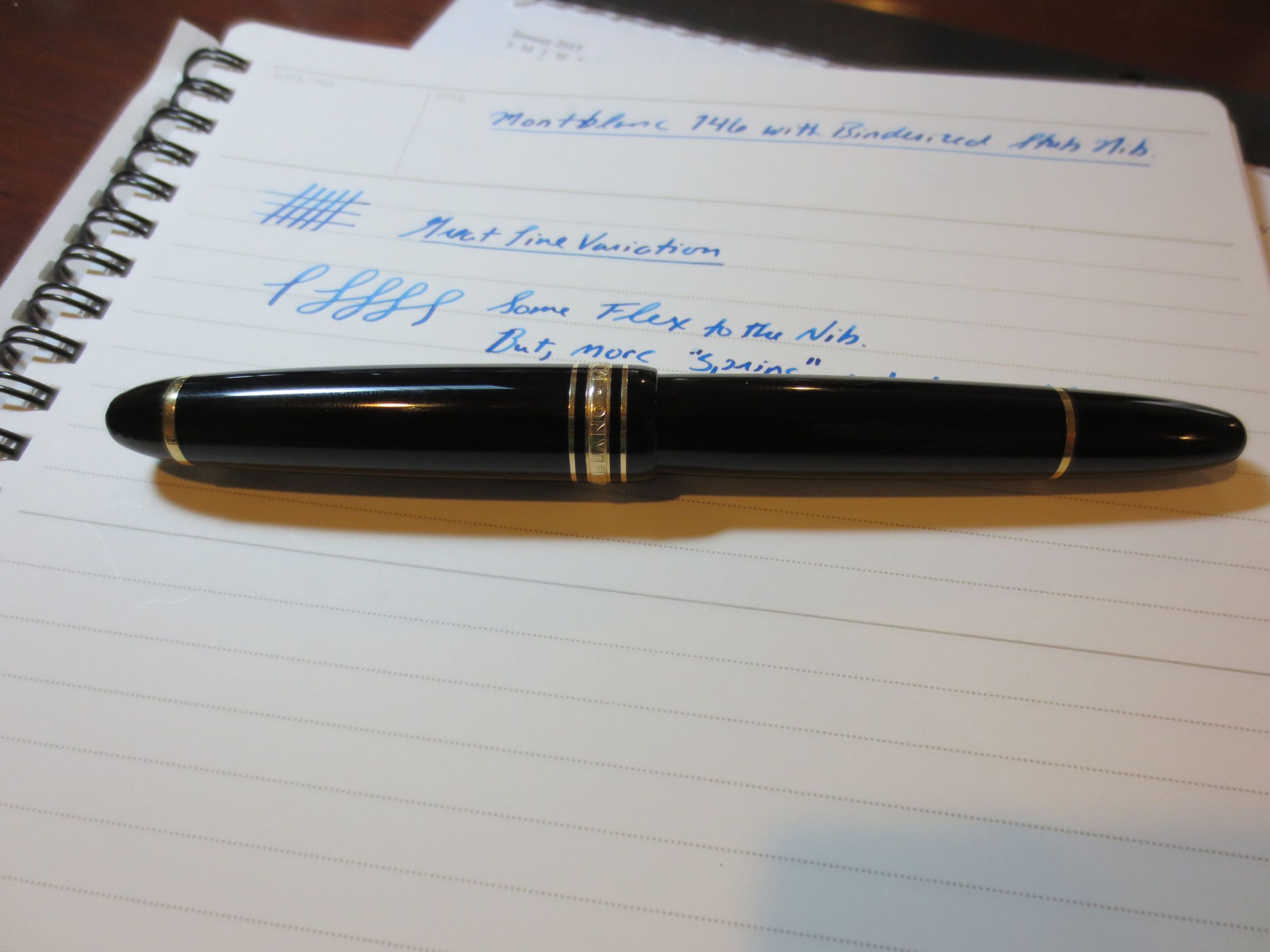
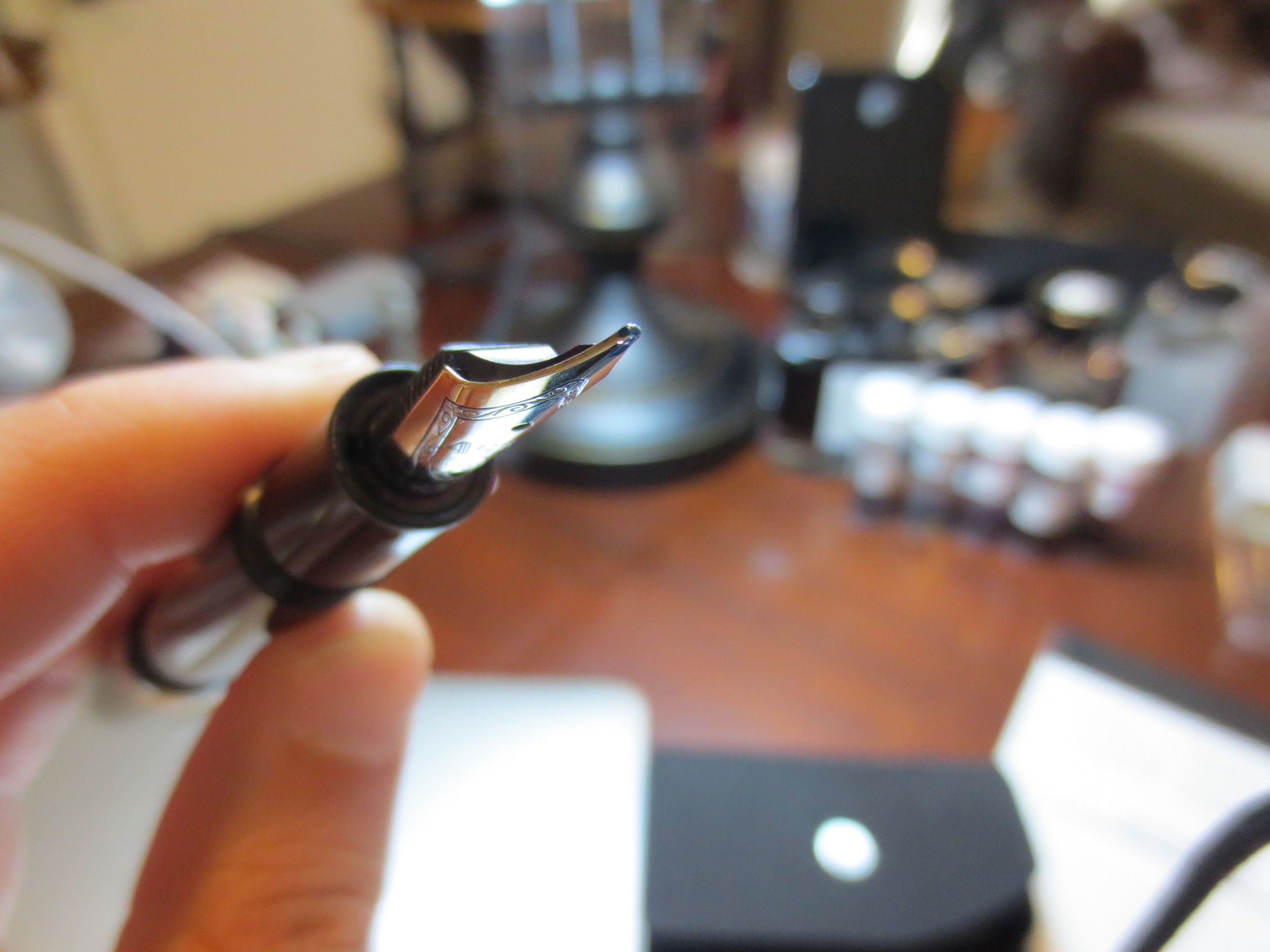
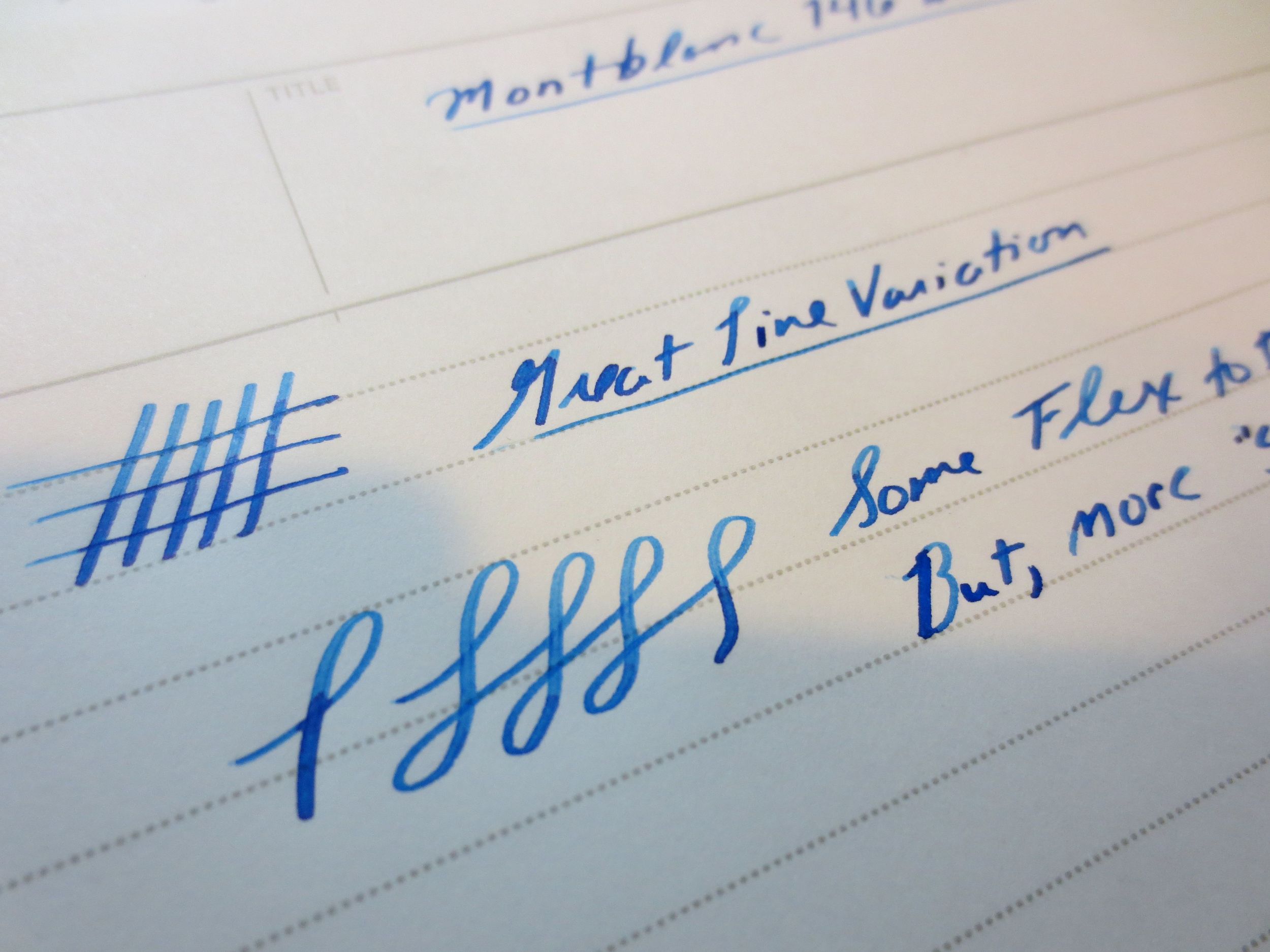
  • The nib, as originally purchased, had a terrible baby's bottom that caused the pen to skip on the downstroke every time I wrote with the pen.  This required work by two different nibmeisters to fix to my satisfaction.  The first ground it to a gorgeous medium stub, but the flow issue persisted.  Mike Masuyama, of Mikeitwork.com, finally figured out what was going on at the 2013 D.C. Pen Show a year later, right when I was at the point of selling this thing.  Now, however, I have a nice medium stub nib that is customized to my hand.  Though it's become one of my favorite daily writers, a pen that retails for well over $500 should not have issues with the nib out of the box.  (For those unfamiliar with the term "baby's bottom," check out Richard Binder's Glossopedia at www.richardspens.com.  In short, the nib is too rounded due to the manufacturer's efforts to make it smooth, resulting in the ink not reaching the surface of the page.)
  • The price.  I paid below retail for this pen.  However, once you consider that I had to pay an additional $65 over the course of a year for nib work to get the pen writing consistently, that jacks the price back up into the questionable category.

Conclusions:

  • Am I glad I own this pen?  On the whole, probably.  I'm not going to sell it.  I would consider it a 146 to be an essential piece for any collector who wants to have a sampling of the "big pens" in their collection.  That's a personal preference.
  • Would I buy more Montblanc pens?  If the price was right.  I'd love a 149, but it's not at the top of my wish list.  I've also eyed the Johannes Brahms limited edition and the Midnight Black Starwalker, but it's not been enough to get me to pull the trigger.
  • The medium stub nib pushes this pen over the edge for me on this particular pen.  It's wide enough that you get the line variation, without the "shovel" quality that renders some stubs too wide and wet for everyday writing.