I'm a bit late to the party on this one, I know, but regardless, this ink is so awesome that I couldn't stand to not review it. J. Herbin, the French ink manufacturer known for being one of the oldest in the world still operating, has released the latest entry in its "1670" series of "anniversary" inks that contain gold flakes. The fourth time must indeed be the charm, because after some earlier misses, they've nailed this one.
The first 1670 ink, Rouge Hematite, has its devotees, but I didn't care for the bottle I tried. The gold flakes weren't the problem--they didn't clog my pen and they weren't too pronounced, as I'd initially feared. Rather, I found the red too pinkish and the ink smeared so badly (on even the cheapest, most absorbent paper) that it ended up being unusable. I'd literally rest my hand on a sheet of paper I'd written on hours ago, only to pick it up and have pinkish ink transfer all over my palm. While Rouge Hematite supposedly has been reformulated multiple times, I had such a bad experience that I never picked it up again, and was never tempted by the next two inks in the series, Blue Ocean and Stormy Grey.
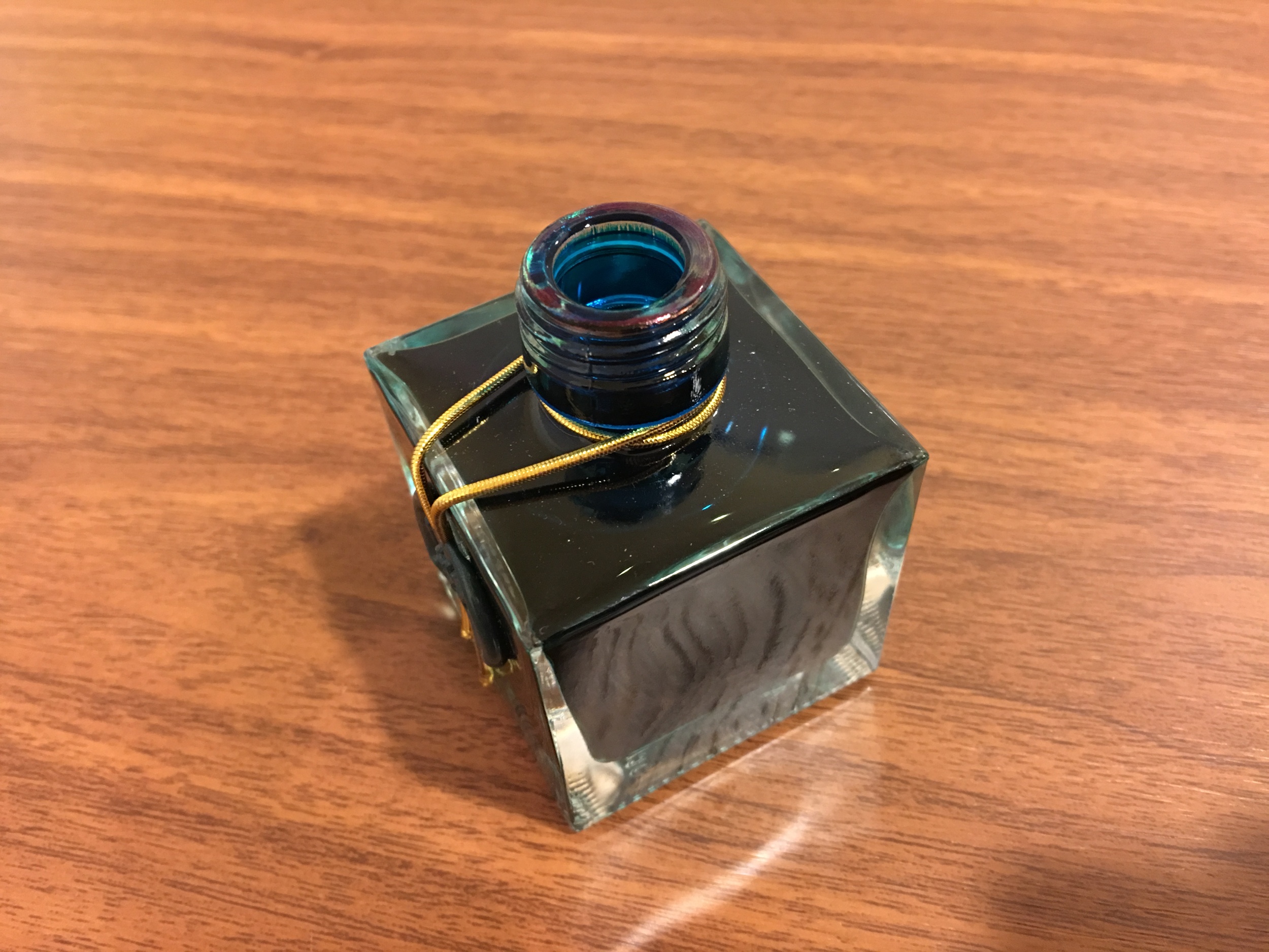
The hallmark of the Herbin 1670 inks: Gold on the bottom! Shake the bottle before filling.
And so I initially ignored the fourth entry in the series, Emerald of Chivor. And then I read this review. And this review. And ESPECIALLY this one (Susan's photos of the sheen and gold flakes are far beyond anything I can do with my levels of photographic incompetence). So I decided to give it a shot.
Short answer: I'm glad I did. I'm liking this ink a lot, and I can see this making it into the rotation for personal writing, but maybe not for work. (My office culture has a ways to go before glitter ink becomes a thing. And yes, try to avoid it all you want, but at the end of the day, it's basically glitter ink. Only slightly more acceptable in a professional setting than this.)
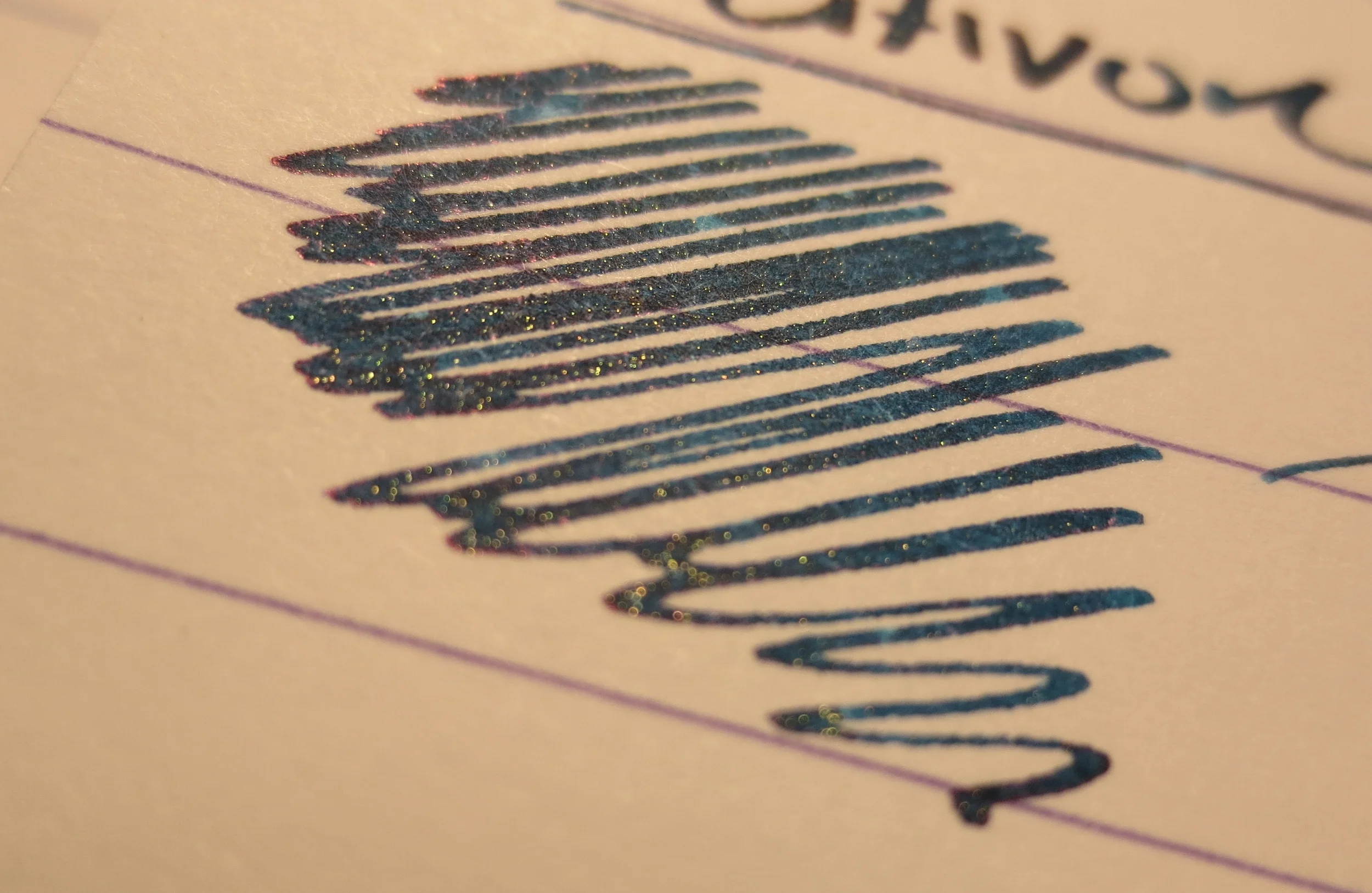
The ink itself is a teal-green, similar to Sailor Yama-Dori, but darker. I've included a writing sample in the gallery below: with a wet nib, from a few steps away, the ink will dry very dark. As it dries, a nice red sheen emerges, and unlike the Rouge Hematite, the ink dries quickly, even on super slick Clairefontaine paper. I will note that I did experience some minor bleedthrough and feathering on cheaper paper. Surprisingly, it was Staples sugarcane paper, which typically handles fountain pen ink fairly well, but since I'm probably not going to be using this ink at the office (where cheap paper is everywhere) it's not that big of a deal. I'd also mention that this ink is not waterproof (picture in gallery), but it doesn't fare as poorly with a splash of water as other Herbin inks I've used.
My experience with the Herbin 1670 inks is a great example of why you should be careful when generalizing about ink brands. Inks can, and sometimes do, vary significantly even though they are made by the same manufacturer, or come from the same line. If you are looking for a dark blue-green ink with a lot of character, I can easily recommend Emerald of Chivor.
I would agree that you should heed the warning on the box. (It has everything but the skull and crossbones.) A cartridge-converter pen might give you more leeway, but I'd flush pens filled with this ink at least every couple of weeks or so.
I would like to take a moment to thank Pen Boutique for providing me with this bottle of ink for review. Pen Boutique is an excellent source for pens and ink, especially limited edition inks. (Confession: they are my primary source for limited edition Montblanc inks when I need to stock up on ones that I like.) You can purchase Emerald of Chivor directly from them.


DISCLAIMER: I was provided the product reviewed in this post, free of charge, for review purposes.