Inks of New York: Noodler's Pinstripe Homage

I broke this out yesterday from my stash of inks that I somehow never got around to trying, and I really like it.  I'm not anti-Noodler's.  I don't necessarily buy the "these inks will dissolve your pen" arguments as long as you are smart about cleaning your pen periodically and use common sense with your fragile vintage stuff.  For example, don't use a super saturated Noodler's Ink in a vintage celluloid pen that could easily stain.  For most modern pens, I'll typically give Noodler's a go.  (As with anything I say on this blog, YMMV, so use your own judgment with regard to what inks you're comfortable with.)  

Pinstripe Homage has some of my favorite Noodler's artwork. 

Anyway, back to this ink.  Pinstripe Homage is one of the "New York Colors" that Noodler's manufactured for the former Art Brown International Pen Shop in Manhattan (may it rest in peace).  Other colors included Subway Series Sepia, Manhattan Blue, and Brooklyn Brawn.  Some of us out there appreciate the overarching baseball theme.  Personally, I love this color, and can't believe that I waited this long to use it.  I'd describe it as a darker blue black with hints of teal (dare I say a "dark Yama-Dori"?)  I also like the fact that this ink dries quickly and doesn't bleed, though it will feather a bit on cheap paper, like most Noodler's inks.  

People have also compared this ink to Iroshizuku Syo-Ro, another "teal-black" ink.  

Unfortunately, as far as I know this ink is not available anymore.  I picked up my bottle from Goldspot, who bought Art Brown's remaining stock when the shop closed.  If anyone wants to do an ink sample trade for some of this, reach out!          

One Week With: The Noodler's Ebonite Konrad

For this week’s in-depth review I’ve chosen a pen that gets surprisingly little love from the pen blogosphere: the Noodler's Konrad.  This review is going to be fairly lengthy, so I’ll provide my preliminary conclusions up front for those of you who don’t want to read the background.

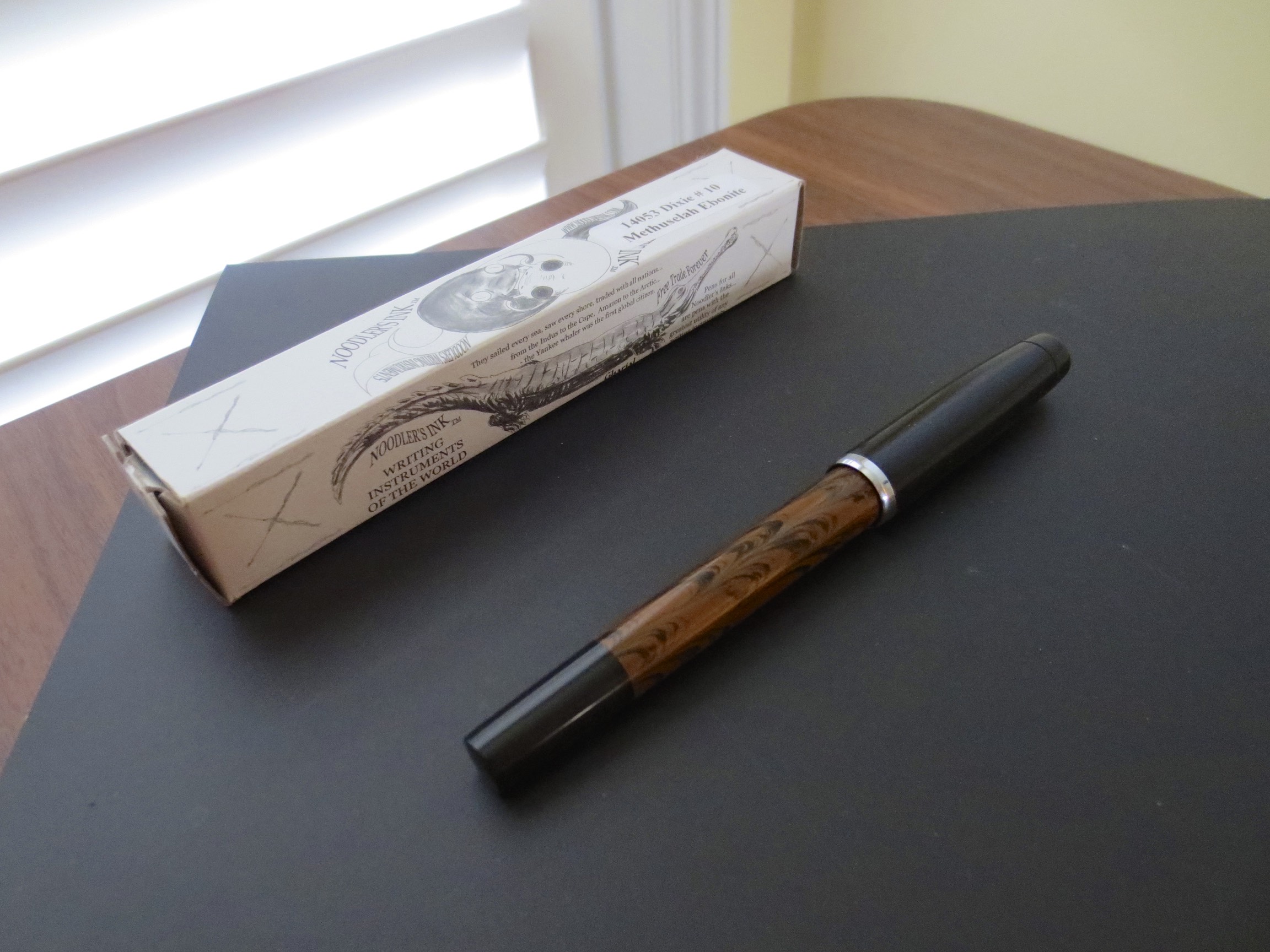
The Noodler's Dixie No. 10 Methuselah Ebonite, with standard Noodler's luxury packaging. 

The Noodler's Dixie No. 10 Methuselah Ebonite, with standard Noodler's luxury packaging. 

  • I really like this pen.  It’s a nice writer, flexed or unflexed, and a good buy for a pen with a piston-filling mechanism at the $40 price point.

  • I prefer the Ebonite version of the Konrad to the standard version because it’s larger and sits better in the hand, IMHO.  

  • The Konrad, like other Noodler’s pens, is customizable, with any No. 6 nib being swappable.  **If you are going to swap nibs on these pens, be aware that the nib that comes pre-installed with this pen has been heat-set and hand-tuned by Nathan Tardiff, so be prepared to tinker with the pen and the feed to get optimal performance from a substitute nib.**

  • If you want a mid-range pen that has some flex capability, or even just slightly more character than a TWSBI or a Safari, the Konrad is a solid choice.    

  • I received this pen free of charge for review purposes from our sponsor at Pen Chalet.  

A Brief History of Noodler’s Fountain Pens

Noodler’s pens have a somewhat controversial history.  The company first introduced in or around 2011(?) a bare-bones, entry level, piston-filled “resin” fountain pen with a fine/medium steel nib.  These initial pens were functional but known more for their knock-you-on-your-backside smell than anything else.  I purchased two of them for around $14 each when I was first re-testing the fountain pen waters, used them sporadically, and paid them forward via FPN or FP Geeks.  One of these pens was originally a clear demonstrator, which eventually mutated into a “violet” demonstrator after four hours of use as my “Baystate Blue” pen.  **Disclaimer—I no longer use Baystate Blue, but if you want to, I would strongly recommend devoting a single pen to this ink, unless you want to spend a lot of time cleaning your pens with bleach.**  These pens were nice little writers, and certainly functional, but too small for my hands.    

Noodler’s next introduced what until now has been my favorite of their pens, an ebonite “aerometric filler” in green and brown mottled ebonite with a nice medium nib.  You could remove the aerometric filler, which was essentially a glued-on press converter, and use the pen as an eyedropper.  This little pen made a good everyday user with its large ink capacity.  It sat on my desk at work for a year and a half filled with Heart of Darkness.  I wish that I still had this pen, and so far have looked in vain to find them on Ebay or Fountain Pen Network Classifieds.  I paid this one forward as well.

Noodler's steel flex nib.  Note the nib slit that runs the entire length of the nib.  

Enter the Noodler’s “flex pens.”  When these pens first hit the market, demand could only be called insane.  The original flex pen, now called the “Nib Creaper”, was an updated version of the original piston filler that included a steel “flex” nib.  Those of you who have ever played around with a Noodler’s flex pen know that they are nothing like vintage gold-nibbed flex pens.  These are steel nibs, manufactured in India, and feature a slit which runs from the tip of the nib all the way down to where the nib meets the section.  With no pressure, the nib writes what I would call a “Western fine” line, though when you “flex” the nib, you can get pretty decent line variation, up to a broad or so.  YMMV with these nibs.  I’ve written with some that barely flex at all, and others that make your writing look flat-out gorgeous.  All of these pens feature an ebonite feed, which is rare these days, and **generally** do a decent job of delivering sufficient ink flow to this nib.   

As mentioned, the initial run of pens were extraordinarily well-received.  Goulet Pens would get a shipment in, only to sell out in minutes.  Because the parts were manufactured in India, and hand-assembled in the United States by Nathan Tardiff (owner/sole employee) of Noodler’s, months would pass before there was a re-stock.  While the time between re-stocks is better now, I believe Nathan still hand-sets and heat-sets each feed and personally tests each nib.

The pen that I’ve been using for the past week, the Noodler’s ebonite Konrad (Dixie No. 10 Methuselah Ebonite version), is the third iteration of the Noodler’s flex pen.  A year or so after introducing their first flex pen, Noodler’s released the Ahab, which was billed as a larger flex pen with a large capacity pump filler that could be removed to create an eyedropper with a massive ink reservoir.  (9ml of ink, anyone?)  I will save discussion of the Ahab for another time, because I want to re-review this pen now that early quality-control issues supposedly have been resolved.  BUT, in full disclosure, from the outset many Ahab purchasers experienced poor ink flow (in some instances the pens would not start at all), stuck converters, and the ever present very strong smell.  The flow issues could often be fixed by cleaning the feed—or for the intrepid, carving an additional channel into the ebonite—but retailers sometimes made the mistake of marketing what was intended to be a “tinkerer’s pen” to fountain pen newbies, who were overwhelmed. 

The Konrad is born

Enter the Konrad.  **Disclaimer—I don’t have one of the standard Konrads.  This review is based on the Ebonite Konrad, which is a more expensive pen at $40, as opposed to the $20 price point of the standard Konrad.**  The Konrad is probably the most “accessible” Noodler’s pen made so far, in that it is a large-capacity piston-fill fountain pen (no pump fillers) that is fairly traditional looking, and because I understand Noodler’s made an effort to address the Q.C. issues that plagued the Ahab by paying closer attention to the feeds and heat-setting the feeds to the nib to ensure better flow.  

Build Quality and Design

The build quality of the Konrad is pretty good for the price point.  The standard model is a resin/celluloid variant that is made in India, and they come in a wide range of colors with Noodler’s typical “descriptive” names (“Hudson Bay Fathoms Blue?”).  I particularly like the clear demonstrator models, and may pick up a few.  The pen I have is made out of ebonite, with a black cap, section, and blind cap and a brown mottled barrel.  There is an ink window that you can use to check the pen’s ink supply.  Ebonite pens are incredibly durable—it’s the same material used to make bowling balls, so I’m sure that the clip/nib/piston mechanism will wear out of this pen long before the body of the pen breaks down. 

Noodler's Konrad ink window, barrel and section. 

In a nod to vintage pens, Noodler’s has created a two-part piston mechanism, where the user removes the blind cap entirely to access a plastic piston knob that is turned to refill the pen.  The only other pen company I’m aware of that features this type of piston filler is Delta.  

Noodler's Konrad piston mechanism with blind cap removed. 

At what you are paying, this pen is solidly constructed.  There are machining marks here and there on the pen body, and my cap came with a slight knick under the clip, but it doesn’t bother me.  I would probably advise, however, that at $10 more, if you are a true fountain pen newbie who wants to minimize having to tinker with your pen, and don’t care about “flex,” you are probably better off going with TWSBI (who, be advised, has their own quality issues).  

Konrad posted

Konrad unposted

The “Flex Nib”

The “flex” you can get from these pens is variable.  As you can see in the writing sample below, this particular pen gets decent “flex” from the nib, and makes my cursive handwriting look quite nice.  In order to get “vintage flex” line variation many people are looking for, you will either have to press very hard on this nib or adjust the nib and feed (see below).  This pen writes so nicely that I’m not going to tinker with it further, and am perfectly happy with the amount of flex I can get out of it.  

You can adjust the feed by moving it further away/closer to the tip of the nib in order to increase/decrease the amount that the steel nib will flex.  I did this with an Ahab a while back, and it’s not necessarily easy to do and get right.  I’d advise against it unless you are prepared to tinker for an extended period of time. 

Konrad writing sample with Iroshizuku Asa-Gao, on Clairefontaine Seyes-ruled paper. 

Other Notes

The Konrad, like all Noodler’s pens, is designed to be customizable, and is compatible with any No. 6-sized nib.  If you don’t like the flex nib that comes with the pen, Goulet Pens offers their own line of compatible replacement nibs in a full range of tip sizes, including 1.1 and 1.5mm stub nibs.  Noodler’s themselves sell standard F/M/B nibs that fit the Konrad and the Ahab.  Of course, you can also find a vintage 14k gold No. 6 nib if you want to go that route.  Be advised that once you swap nibs, the feed will no longer be heat-set and tuned, so you may have to tinker with the pen to get optimal performance.  

In conclusion, this is a nice pen and I’m very happy with it.  As you often find with lower-priced pens, it is less temperamental and writes more consistently than some of the more expensive pens in my collection.  You can purchase this pen from Pen Chalet.  I received this product free of charge for review purposes.

Ink Review: Noodler's Air Corps Blue-Black

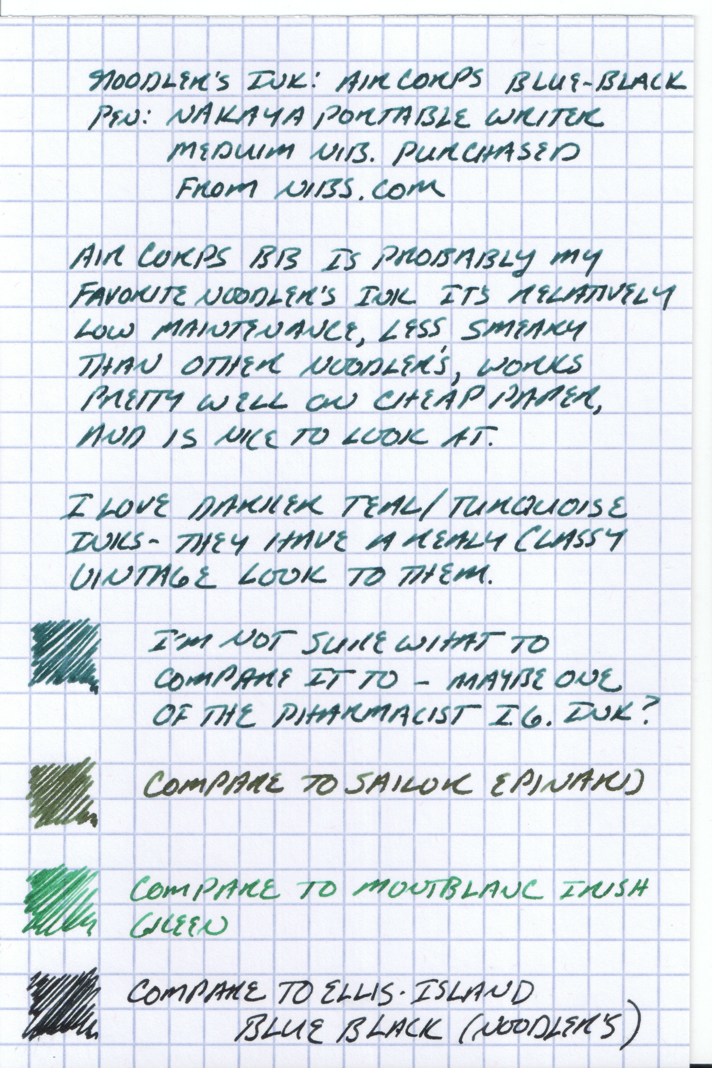
This ink was a surprise.  I've not been a huge fan of Noodler's ink.  I've found that with certain exceptions, Noodler's never dries, transfers ("ghosts") onto previous pages when you try to write on both sides of a notebook page, and stains pens.  Reading some of the pen forums, people have resorted to diluting the ink with distilled water in order to eliminate some of these undesirable characteristics, but that's always seemed like too much trouble for me.  I'm all for fiddling around with this hobby, but as far as ink goes, I've always expected it to "write right out of the bottle." I was pleasantly surprised to discover that this ink was, to me, one of the Noodler's exceptions. 

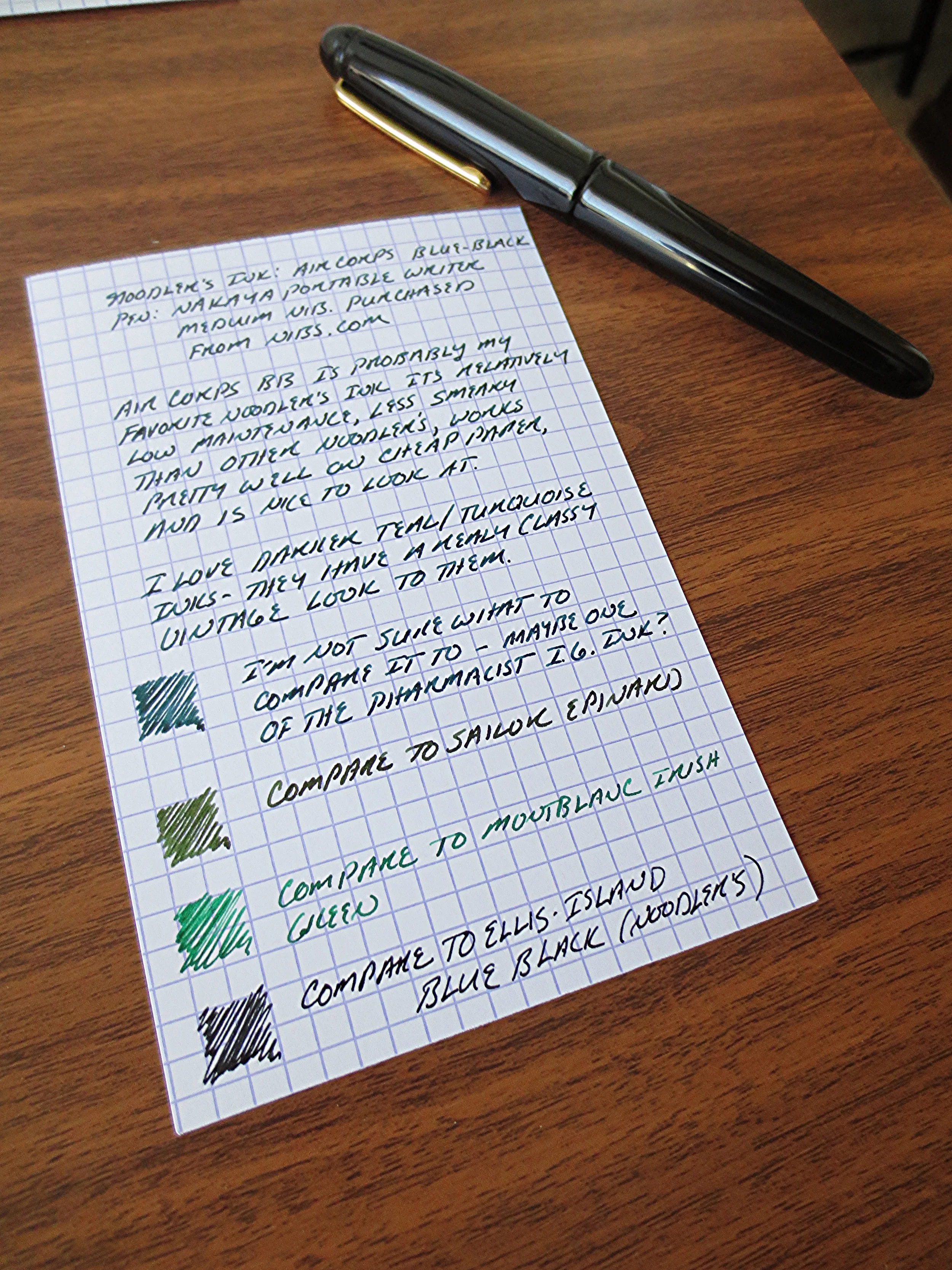
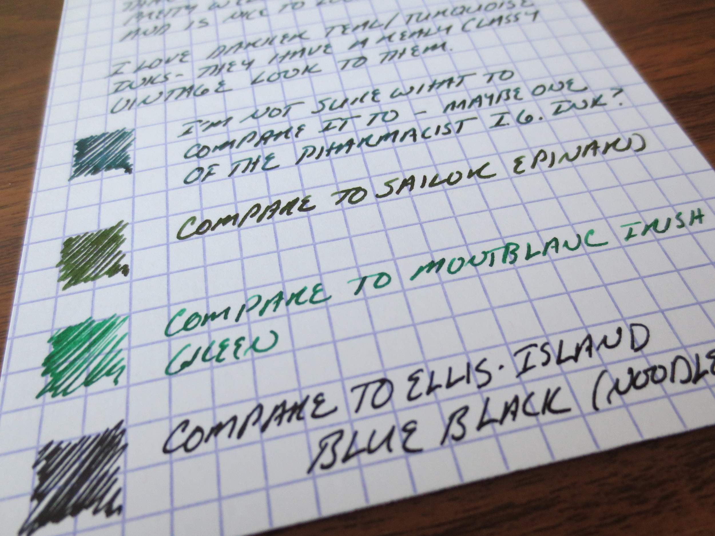
I compared this to three other inks I had loaded up:  Montblanc's Irish Green, Sailor's Epinard, and Noodler's Ellis Island Blue-Black, all of which I like, and the latter of which I really want to love, if not for the fact that it seemingly ne…

I compared this to three other inks I had loaded up:  Montblanc's Irish Green, Sailor's Epinard, and Noodler's Ellis Island Blue-Black, all of which I like, and the latter of which I really want to love, if not for the fact that it seemingly never dries (in a fine nib, no less).  Grrrr...

The pen I used for this review as a Nakaya Portable Writer (with clip) in Solid Black.  The nib's a medium, which translates into a Western fine, maybe an extra-fine depending on the brand.  This ink worked well in the pen.  No hard starts, and no staining the converter.  The paper is an Exacompta index card.  

I will say that this ink is more of a dark teal as opposed to a true blue-black, leaning heavily towards the blue-green end of the spectrum.  If I had to compare it to anything, I might choose Pharmacist's Turkish Night.  (I know, I know, I never finished the Pharmacist series of reviews that I started a year or so ago.  Those are in the queue.)