The Pelikan Stola III has a very professional, understated look. With this pen, Pelikan clearly is trying to step away from the playful look of the lower-cost Pelikano, Future, and Twist and offer a pen with the same inexpensive quality that won't look out of place on the desk of an office professional in more "traditional" settings. Pelikan markets this pen as "a modern writing device for a successful start into the business world." If that's their goal, Pelikan has largely succeeded, though the relatively short barrel, inability to post, and the lack of any variety in nib size will probably limit the size of the audience who can use this pen for a true daily writer.
Presentation and Build
Starting with the packaging: very nice and appropriate for the pen's price point. It won't win any design awards, but the cardboard clamshell box holds the pen nicely and offers better protection than the simple cardboard sleeve used by Lamy for the Safari and the AL-Star.
The packaging on the Stola is appropriate for the pen's price point: simple and understated, yet still sophisticated.
Inside the box, the Stola looks solid and well-made. The body of the pen is entirely crafted from metal: according to Pelikan, the cap is crafted from aluminum and the barrel from brass, topped with silver lacquer and a black coated metal clip. For a metal pen, it's not unduly heavy and is fairly well balanced. The section is plastic.
If you like to use your pens unposted, the Stola should work fine for you. Unfortunately, it's a touch short for me to use comfortably for longer writing sessions.
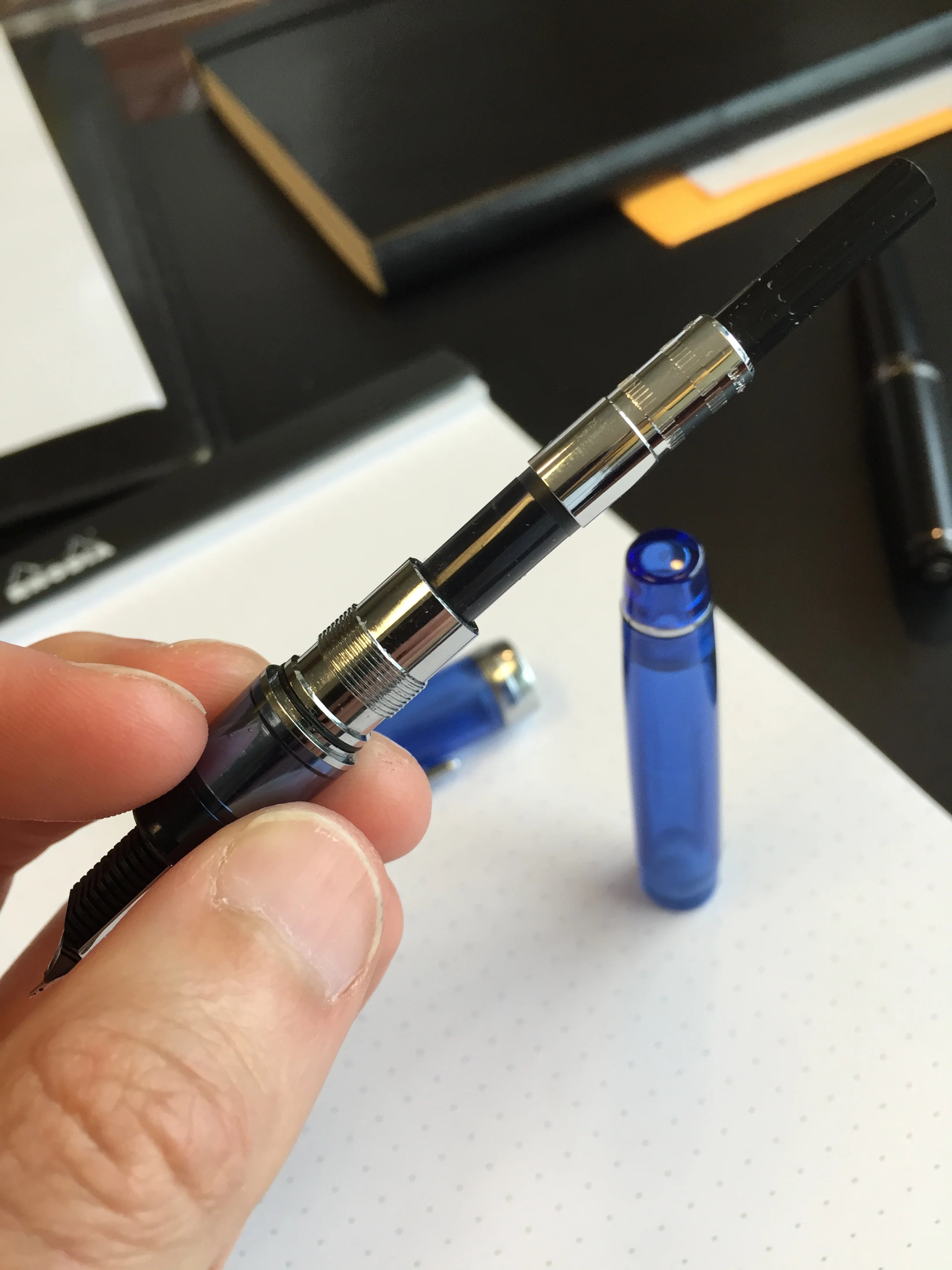
The one concern I have about build quality on this pen is the "inner cap", which is an insert (typically plastic) fit inside the cap of a fountain pen to create an airtight seal and help keep the pen from drying out. The internal cap on the Stola appears to be a piece of clear molded plastic friction-fit into the cap, which creates a decent seal when the pen is closed, but won't permit the pen to post easily. You can jam the cap down onto the barrel, but it will work itself free after a few seconds of writing. My concern is that posting the pen repeatedly will crack the inner cap and/or cause it to come free--it just doesn't look all that sturdy. For that reason I would recommend not trying to post this pen.
Capped in the hand, the Stola is a medium-sized pen.
Filling system
Again, for the entry-level market, Pelikan bills the Stola as a cartridge pen, but I had no problem inking it up and using it with a Schmidt converter. Curious Side Note: like other people who received this pen for review, the Pelikan cartridge that came with the pen exploded inside the pen barrel. This is probably due to the fact that these pens passed through an area still experiencing below-freezing temperatures in transit rather than any underlying quality issue with the Pelikan cartridges, but I do find it curious that this happened to multiple people.
Nib
Pelikan makes very nice stainless steel nibs, and the Stola III is no exception. I don't know whether the nib is made in-house at Pelikan or not, but it's quality, and I haven't experienced any hard starts or skips. A big drawback for me personally is that the pen is only available in a medium nib. Due to sturdy build on this pen, it would be a perfect candidate for a "bag" or "car" pen, that I leave inked up for daily writing here and there. For those kinds of pens, though, I typically prefer a fine or extra-fine point to minimize bleed-through on the cheap paper you inevitably have to write on during the day. The Stola, at least in its current incarnation, is too broad for me to use consistently.
The Pelikan Stola only comes in a medium stainless steel nib.
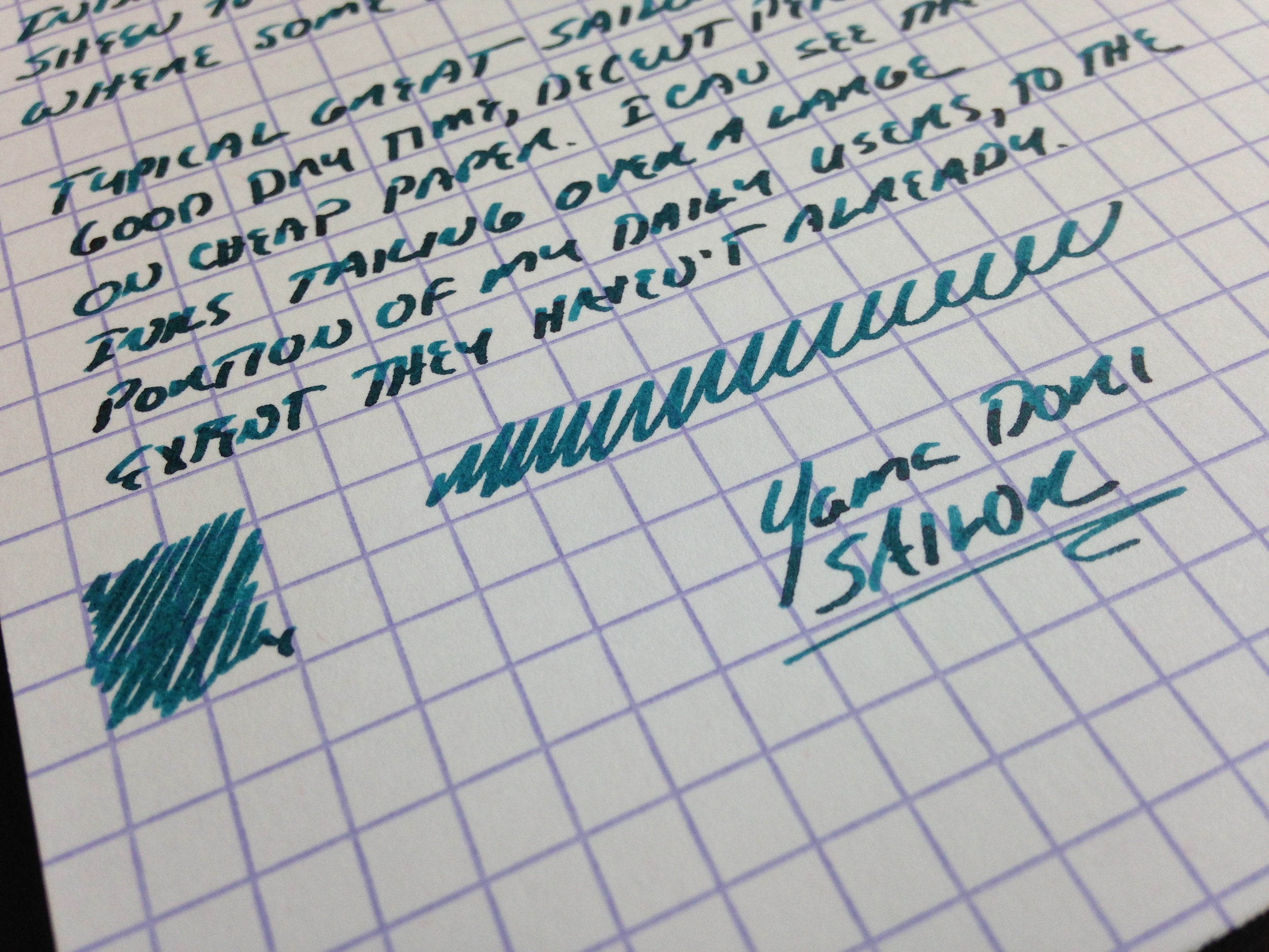
Pelikan Stola III writing sample. The medium nib leaves a moderately wet line. I had no skips or hard starts.
Takeaways
There is probably a market for this pen, and judging from consumer reviews on Pen Chalet, buyers are generally satisfied. The $36 retail price places this pen at a slightly higher price point than the Lamy Safari and at about the same level as the AL-Star. That the Stola only comes in a medium nib, however, docks it a notch in my book. Also, the inability to post the pen makes it unusable as a true daily writer for me. That said, I found the section on the Stola very comfortable to use, so if Lamy's triangular grip doesn't work for you, or if you find the Pilot Metropolitan uncomfortable to hold due to the "step-down" from the barrel to section, you may want to give the Pelikan Stola III a try. On the whole, there wasn't anything about the Stola that nudged this into "great" or "excellent" pen territory, but it's certainly a good writing instrument, and if you're looking for a basic daily knockaround that you don't have to worry about excessively, you could do far worse.
If you are interested in the Pelikan Stola, it's available from our sponsor Pen Chalet for $36 in both fountain pen and rollerball versions. Pen Chalet offers a wide variety of pens and accessories, and it's where I do a large portion of my pen and ink shopping. Ron's prices are excellent, he runs regular promotions, and any orders over $50 receive free shipping. Importantly, Pen Chalet is an authorized retailer of all the brands they stock, and will stand by their products if you have any problems.
DISCLAIMER: I was provided this pen by PenChalet at no cost for review purposes. This post contains affiliate links, through which I may be compensated a small amount if you purchase a pen from any of the sites linked to in this article. While I'd greatly appreciate it if you use these links to purchase a pen you are interested in, you are, of course, under no obligation to do so. Many thanks!