My obsession with Sailor ink knows no bounds. If I had to choose a favorite brand of fountain pen ink, it wouldn’t even be close: Sailor would win easily. I probably have nearly two dozen bottles of current and discontinued Sailor inks, including doubles stashed away "for posterity" as well as some exclusive inks manufactured for Japanese retailers. (For more on why I like Sailor ink in general, check out this post that I did last year.)
What I wanted to write about today are the “Kobe Inks” - the line of ink that Sailor manufactures and bottles for the Kobe-Nagasawa Department Store in Kobe, Japan. While the inks that Sailor makes for Bungubox (or “Bung Box”) - another Japanese retailer located in Hamamatsu - have received most of the attention and acclaim in the pen community (probably due to the tulip-shaped ink bottle that they unfortunately no longer use), Kobe inks tended to get overlooked. Last I checked, there were nearly 60 different colors of ink in the Kobe line, a few of which are similar to colors Sailor has issued elsewhere, but many of which are unique.
I have four Kobe Inks in my collection: No. 4 (Foreigners’ Residence Red); No. 6 (Kobe Bordeaux); No. 9 (Suma Purple); and No. 37 (Harbour Island Blue). The inks are numbered for ease of reference, though they’ve also been given names that correspond to various places in Kobe and other themes of the city. I ordered No. 4 and No. 37 from Vanness Pens, who stocks most of the ink, and I picked up bottles of No. 6 and No. 9 from Kobe-Nagasawa directly at the 2016 D.C. Pen Show, where they had a table. It was something else to see that many bottles of Sailor ink - and so many different colors - stacked up in one place.
I like all four of the Kobe Inks that I currently have, but I need to add some of the greens, golds and oranges that can be found in unique shades that many ink manufacturers don't attempt.
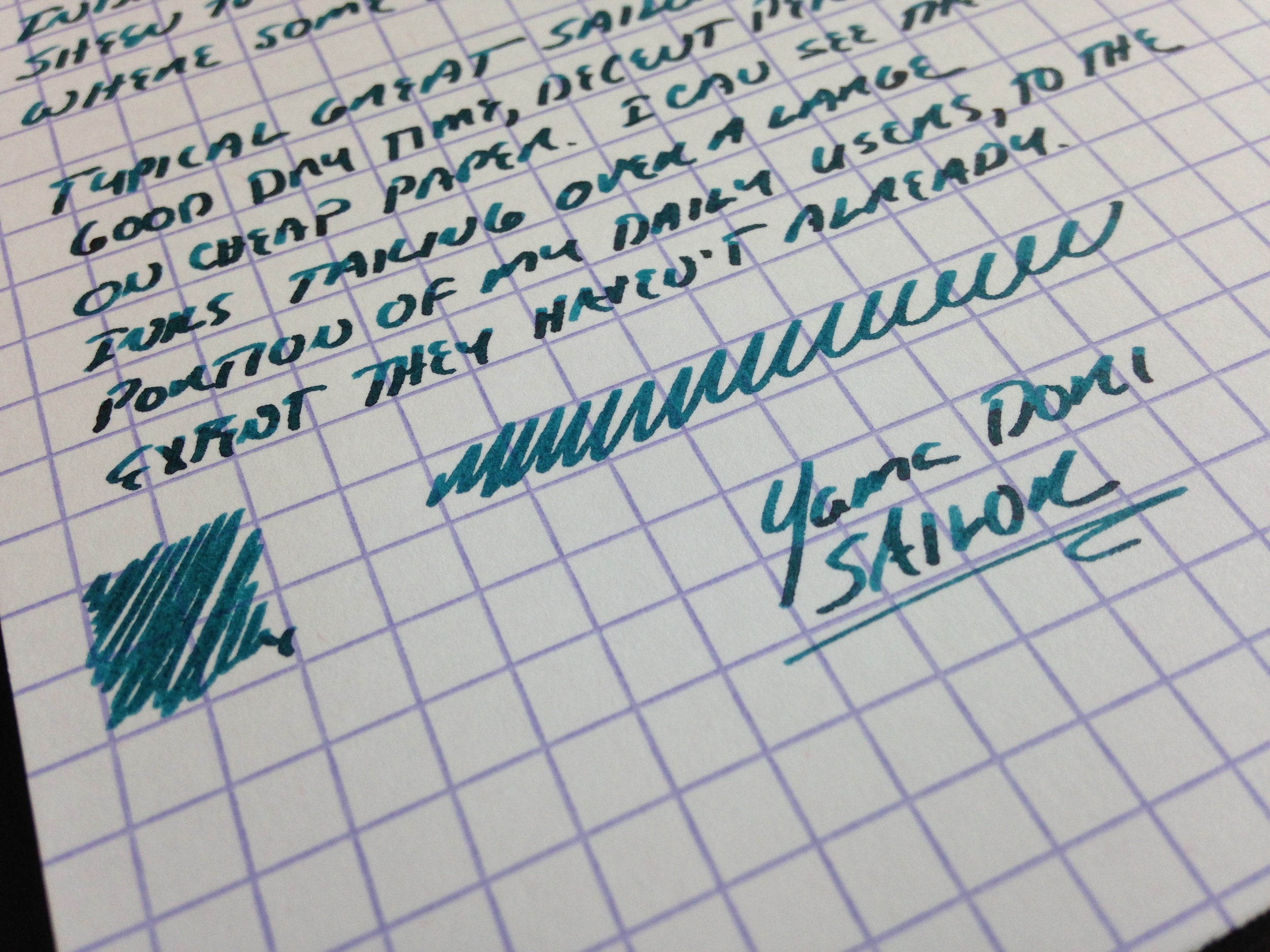
It amazes me that Sailor can manufacture such a wide range of ink colors without running into manufacturing problems with certain batches and/or specific colors. Other ink brands like Diamine generally have a good reputation in terms of ink quality and behavior but occasionally people will experience issues with super-saturated colors (especially reds and oranges) clogging nibs, staining, or feathering on cheaper paper. Not so with Sailor. Out of all the colors of Sailor ink that I’ve tried, I have yet to find one that doesn’t function reasonably well on cheap recycled office paper. I’d also add that some of the shades of green, gold, and orange they offer can’t be found elsewhere, with the possible exception of KWZ.
Part of the Kobe-Nagasawa table display at the 2016 D.C. Pen Show. Vanness Pens picked up whatever stock they had left at the end of the weekend (which wasn't much!).
Where to Buy
There’s no longer any need to navigate the world of overseas eBay sellers or third-party shipping agents if you want to get your hands on some Kobe inks. Vanness Pens carries most of the line (54 colors, last I checked), and currently have most colors in stock. The ink is priced at $30 for a bottle or $4 for a 4ml sample, which is a premium over standard Sailor inks but hey, you won’t find these colors anywhere else. Just be warned - hunting for that "perfect" color can get addictive. (Not to mention expensive!)
Disclaimer: I purchased the ink featured in this review with my own funds for my own collection, and was not compensated for this post.


