Ink Review: Akkerman Chinatown Red and Voorhout Violet

My first stop at last weekend's Atlanta Pen Show was the Vanness Pens table.  I drove down from Nashville for the day, pretty much worrying the whole way that Vanness would be sold out of Akkerman by the time I arrived.  I shouldn't have worried!  Lisa and Wendi brought 75 bottles, which I think covered the full spectrum of colors, and while I hear the ink went fast, there was plenty of it left on Saturday morning when I got there.  Chinatown Red and Voorhout Violet were the two colors I had come for, so I snapped them up and took them out to my car for safekeeping.  And, of course, when I got back to the hotel that night, they were the first two that I inked up.  

These are the "baby Akkermans," (60ml), not the 150ml bottles.  The large bottles have been discontinued. 

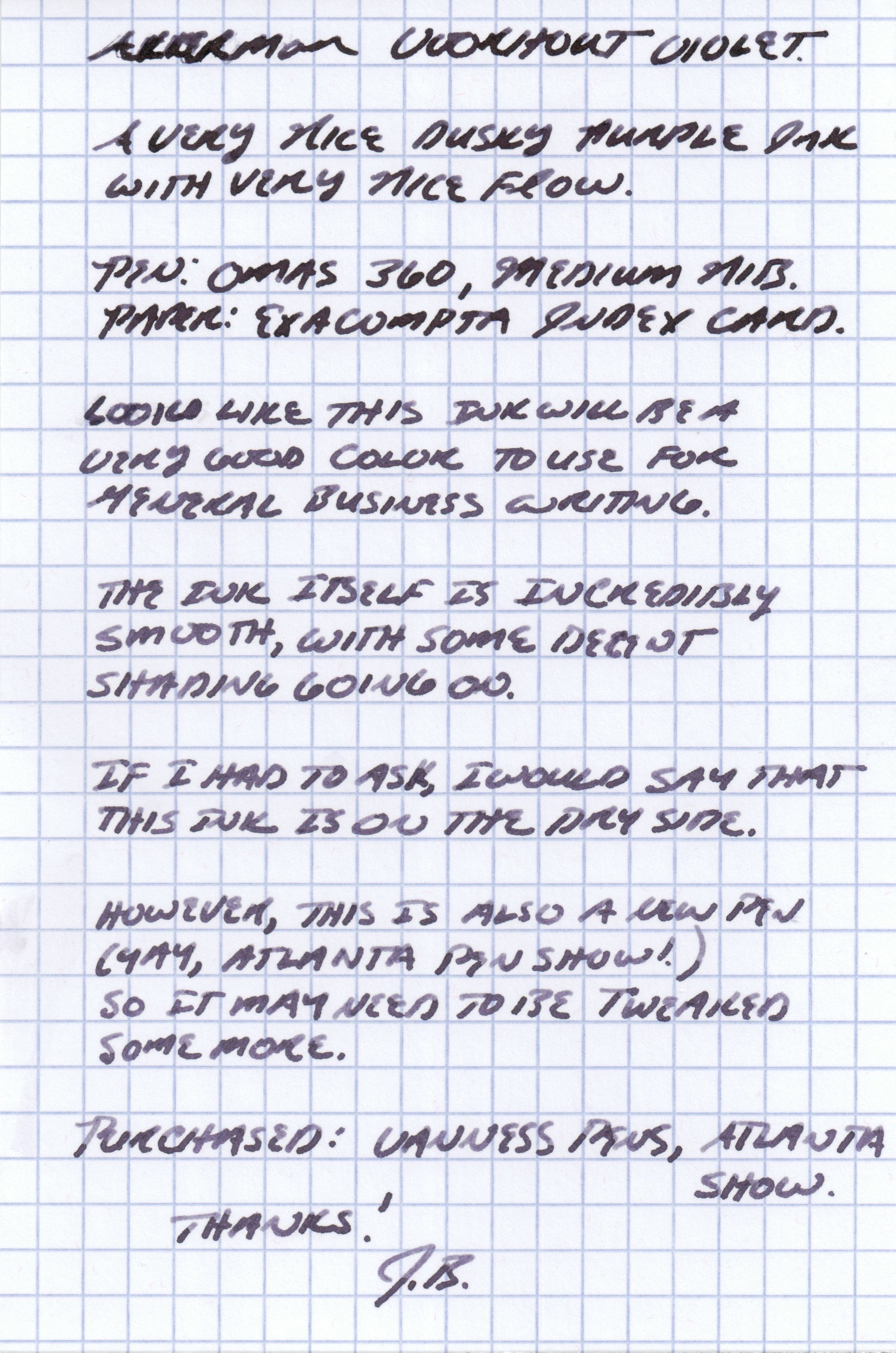
Which ink to review first?  The Voorhout violet is definitely the most interesting of the two, at least to me.  I love dark purple inks, and have been looking for a purplish black that I can use professionally on a daily basis.  I have Pharmacist's Purpura Imperialis, which is nice, but the IG formulation is a little too high maintenance for my routine use.  This ink, on the other hand, is nearly perfect for work.  Even in a wet pen, it's well-behaved on cheap paper, does not feather or bleed through, and dries quickly.  I would say the ink itself is slightly "dry."  There's great shading, as you can see in the gallery photos below.

Akkerman Voorhout Violet exhibits some nice shading properties.  Written on an Exacompta Index Card. 

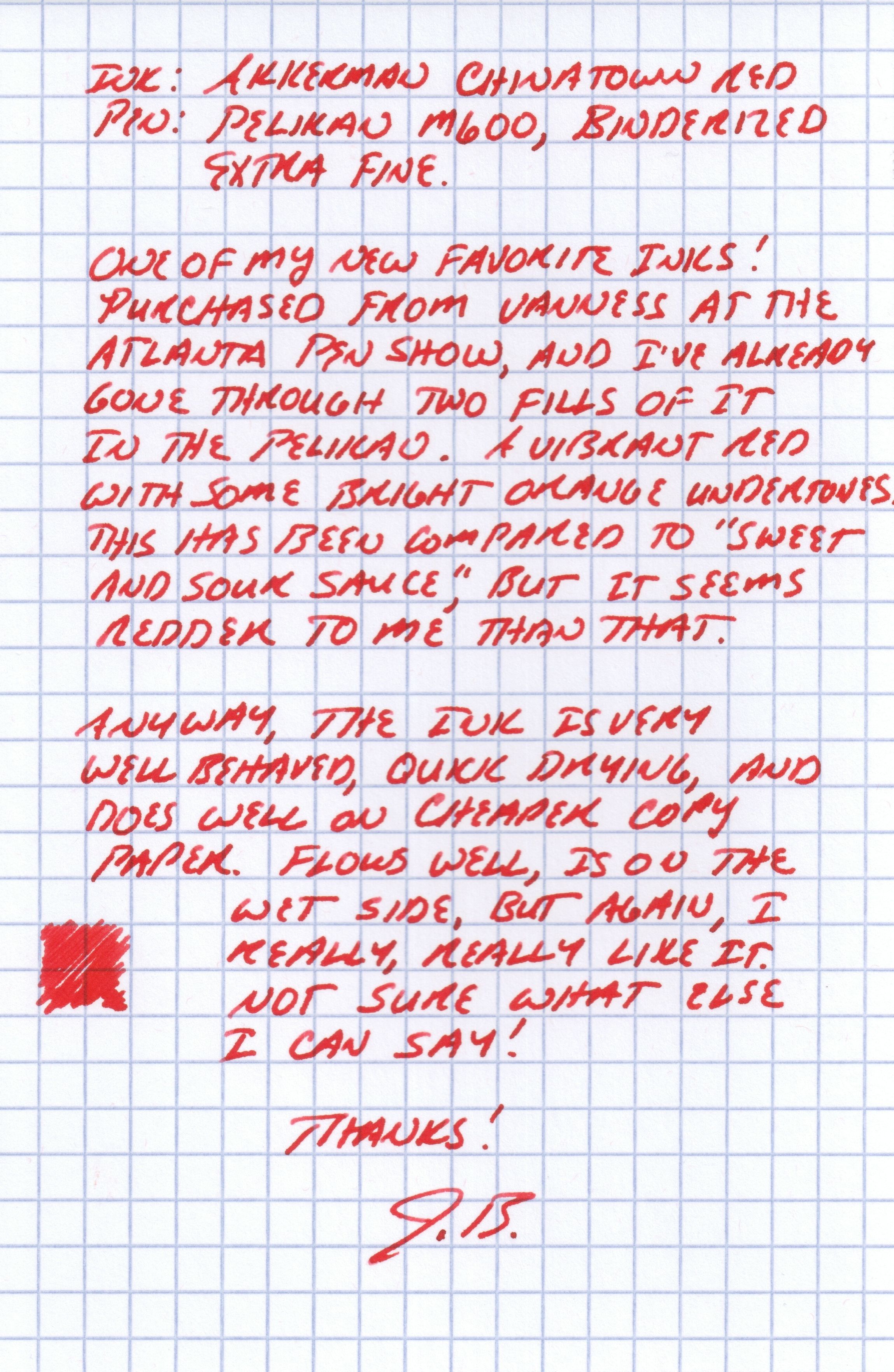
The Chinatown Red is very different.  It's much more saturated, does not shade as much, and is a "wetter" ink.  Even though the Chinatown Red flows more freely, it is still well-behaved and does not bleed through or feather too much on copy paper.  The scan below does a fairly decent job of capturing the color.  It's a bright red with orange undertones.  I spent all of last week editing a 75-page report and went through two fills of this color in my Pelikan M600 EF. 

Both of these inks will make it into my general rotation.  I always have one or more shades of red (my preferred color), and the voorhout violet is dark enough to make it into my family of "business inks."  Now that I have my two desired Akkerman colors, I can lay off the ink purchases for a while! 

Ink Review: Vintage Carter's Tulip Purple

I have a moderately large stash of vintage ink, including a quart-size bottle of Carter's Tulip Purple from the 1930's or 1940's that I won on an eBay auction a year or so back.  The Carter's Ink Company, based in Boston, Massachusetts, was one of the largest ink manufacturers in the world.  It was acquired by Avery Dennison in the 1970s, which effectively ended all of their fountain pen-related ink operations and resulted in the destruction of all of Carter's records dating back to the 1860s.  Presumably, all of Carter's formulas, etc. are lost.

The bottle and package itself are quite impressive.  The packaging was in relatively good condition when I received it.  You can see the entire Carter's line of ink listed on the sides, along with a list of ink properties and other sizes available.  (gallons, anyone?)

This is a very vibrant, relatively well-behaved vintage ink--meaning no feathering or bleed-through--although I found that it stains like crazy.  I used to have a Noodler's Ahab, and it turned the clear converter into a dark blue-purple color.  For this review, I used, what else, a Carter's vintage ink cube desk pen. 

Vintage Carter's Ink Cube Inkwell with a fine point.  Another great eBay find! I had been looking for one of these for a long time and finally found one in decent shape.

As you can see, this is a purple that tends to be on the violet blue side once it dries. 

My observations on the ink:  It's a nice purple-blue color.  It appears much more like a traditional purple when wet, and dries to a bluish tinge, as you can see from the scan above, which was done with doxie flip on the highest-resolution setting.  The ink does not feather, and will not bleed through on the cheap paper that I've used, which is a heavier-weight inkjet paper I bought on special at Costco (i.e., nothing fancy).  I've had really good results on both Doane and Scout Books.  There is some show through on Field Notes, but nothing that to me would render the paper unusable.  Dry time is approximately 10 seconds on fairly nice paper such as Rhodia or the Exacompta index card that I used for the review.

Thank you for reading!  

Imagine this . . . a quart of ink.  Noodler's does custom runs of larger bottles, from what I hear, as does Pelikan.  I've read that the primary use of these larger ink bottles were teachers using them to fill inkwells on student desks. 

When I purchased this, the bottle was about 95% full, but had previously been opened and used.  There was no film floating around in the ink or sediment resting on the bottom, so I said what the hey... and used it.  Overall, I've been pleased with the results, although I would not recommend using this ink in a very expensive pen or one that is prone to staining.       

The Ink Cube Inkwell came with an empty bottle of Carter's that I was able to refill with the Tulip Purple and reuse.  Carter's inkwells were proprietary, in that you had to use Carter's special ink bottle to refill them.  Carter's bottles are now highly collectible.