Now that we’re past Christmas Day, another year of Inkvent/Colorvent ink Advent calendars has come and gone! This year was, overall, a good year for both Diamine and Colorverse in terms of the inks they chose for the calendars, but for my own personal preferences I would still give the edge to Colorverse. Why? Simply because most of the colors they chose to include are inks that I could see myself using on a regular basis, whereas the Diamine inks tend to be more “festive” and holiday-themed. That’s not bad by the way, and is actually the reason many people choose the Diamine calendar. Here’s a run-down of the last few days:
Yes, I know this was actually Day 22. I got lost when I started playing catch-up so I stopped numbering them. I really enjoyed the Diamine Pineapple Spritz, btw, more than I thought I would, with its combination of pigment and shimmer.
Colorverse Lunar Black and Winter Wonderland were both interesting: I always enjoy black/dark grey inks that offer subtle undertones of other colors like blue and purple, and I felt that Winter Wonderland struck a good balance of shimmer and sheen.
The last few Diamine Inkvent Inks I didn’t find all that interesting. “Let It Snow” felt like a single-tone shimmer ink, and while Antler had some interesting shading that will appeal to some, the color didn’t do much for me. This year’s large 30ml bottle, “The Myrrh the Merrier,” was a shimmer/sheen combination but as with most of the Diamine sheening inks, I found the red sheen overpowering.
Takeaways and Overall Conclusions
I’ll likely always work my way through both calendars, because I find it to be a fun way to celebrate the holiday season and the calendars always have at least one or two inks that showcase each brands’ creativity. My favorite inks from this year’s calendar were probably Colorverse “Erebus Crater”, a multishading blue grey, and Diamine “Nostalgia,” a multishading red/purple/grey from the Chameleon collection. Diamine always releases the entire line of Inkvent inks as standard releases, while last year Colorverse picked three of the most popular to add to the standard lineup. Apparently they are doing the same for 2026, so we’ll eagerly await this year’s choices. Be sure to vote in the poll via the QR code on the back of your Colorvent Calendar box.
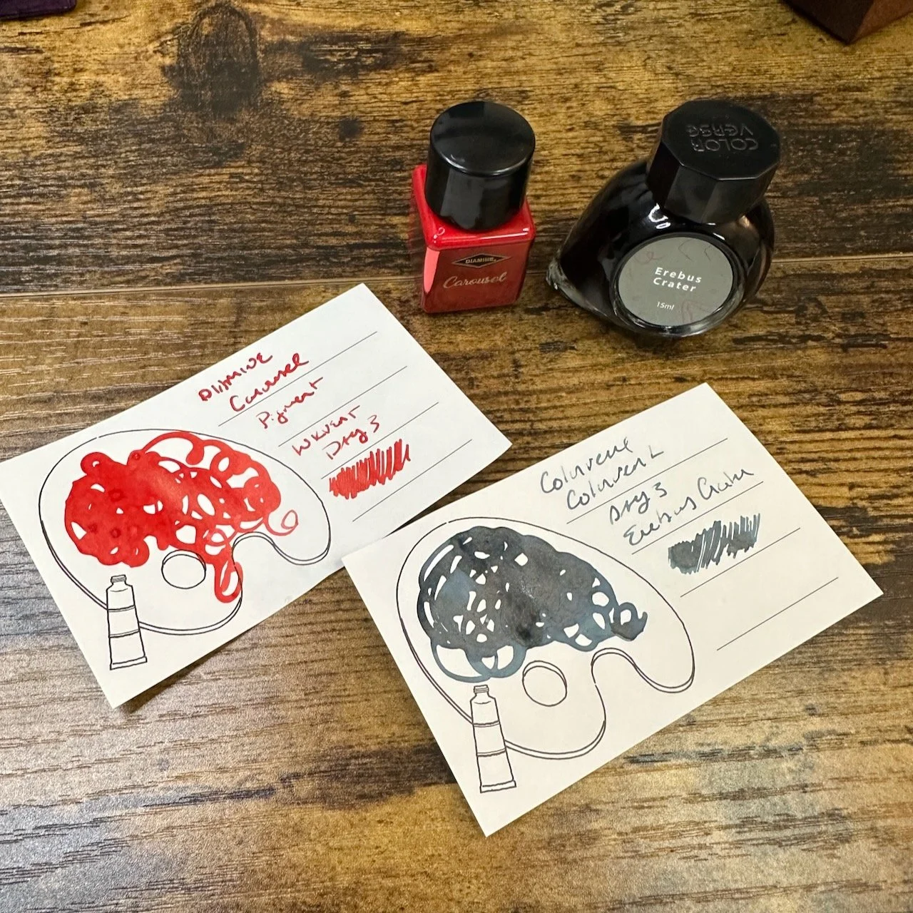
Colorverse Erebus Crater (right).
Diamine Nostalgia.
The Gentleman Stationer is supported by purchases from the T.G.S. Curated Shop and pledges via the T.G.S. Patreon Program. You can also come visit us and see any products we sell directly at our physical stationery store in Nashville, Tennessee!