• Blog
  • Shop
  • Resources
  • FAQ (Ask TGS)
  • About
  • Archive
  • Contact
  • Sign In My Account
Menu

The Gentleman Stationer

Vintage Living in the Modern World.
  • Blog
  • Shop
  • Resources
  • FAQ (Ask TGS)
  • About
  • Archive
  • Contact
  • Sign In My Account

From the Archives: Tomoe River 68gsm Remains One of My Favorite Papers

September 27, 2023

On this past weekend’s Patreon meetup, we discussed the topic of Tomoe River 68gsm paper, which has always been the slightly less-favored version of Tomoe River, the classic lightweight fountain pen friendly Japanese paper. The formula and rights to “Tomoe River” paper has changed hands several times over the past few years, with the current version of the 52gsm paper (the lightest weight version) now made by Sanzen. The Sanzen TRP will soon be the exclusive version of that particular paper on the market. It’s unclear what’s happening with the heavier 68gsm version, including whether it is still being made or whether the current stock of 68gsm paper and notebooks represents “back stock” that will disappear once the paper is all used up. The latter is the most likely scenario.

While much depends on the ink you’re using, I’ve generally found that Tomoe River 68gsm dries quicker than the thinner 52gsm.

68gsm Tomoe River Paper feels quite different from the 52gsm version - especially the “original” 52gsm - which is the paper with the “crinkly” feeling that so many people know and love. Personally, I find the 52gsm version too lightweight for my taste, especially in a work notebook or bound pad that tends to be subject to rough treatment. The 68gsm is equally ink-friendly (though it does show colors differently), is more durable, and in my opinion has a better feel when writing since it the tactile feedback that I like in a thicker paper. I also appreciate that it’s frequently available in dot grid.

Because it’s thicker, the 68gsm paper exhibits less show-through on the back of a page, making it in my opinion a better choice for a notebook paper than the thinner 52gsm Tomoe River.

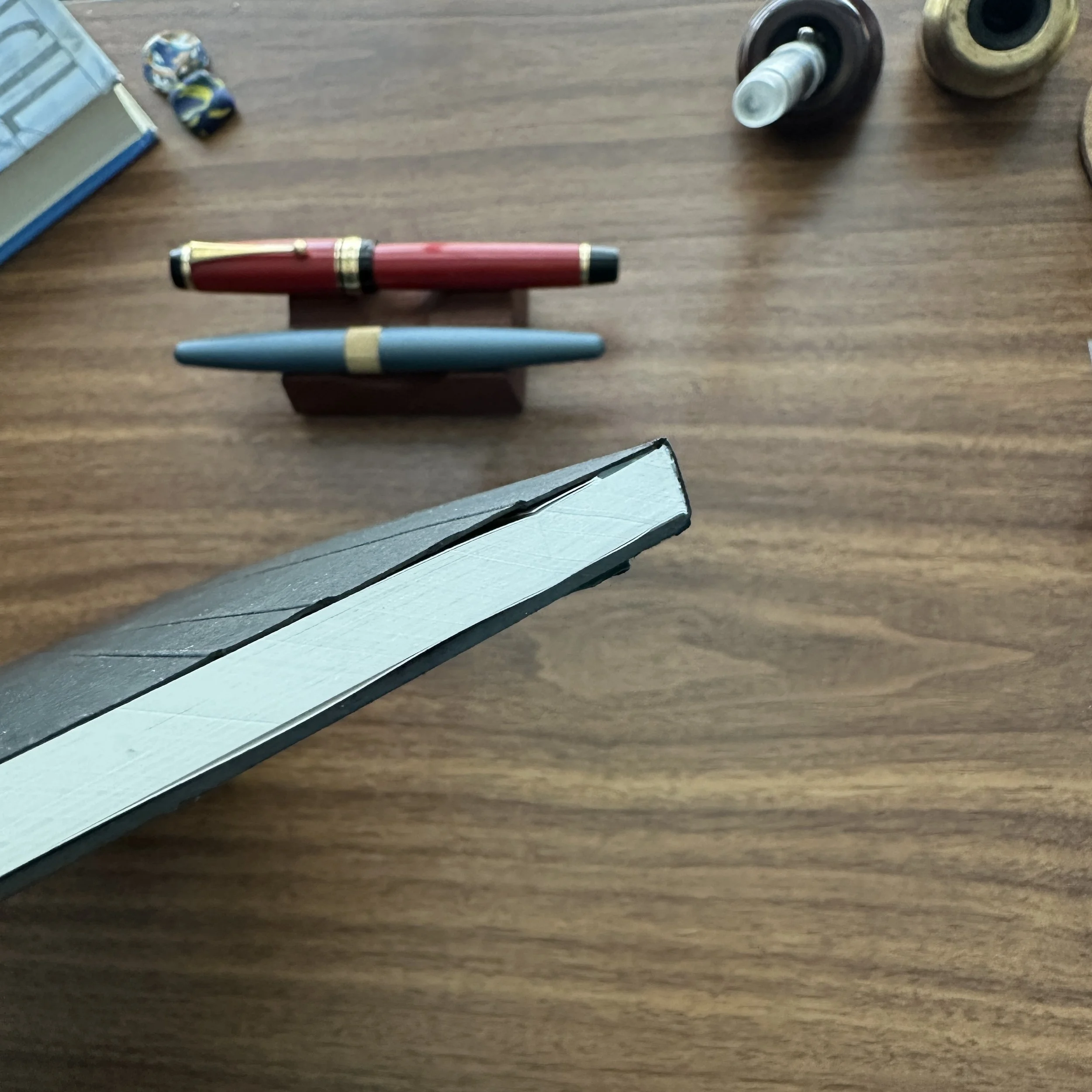
During the meetup this weekend, I pulled out an Odyssey Notebook that I received directly from Odyssey at the D.C. Pen show a couple of years ago and wrote in it for a bit, really enjoying the feel of the 68gsm Tomoe River and hoping that it won’t go away anytime soon. Alas, I suspect its days are numbered.

Takeaways and Where to Buy

Unlike the original 52gsm Tomoe River Paper, which has been much lamented, other discontinued or soon-to-be-discontinued papers such as Tomoe River 68gsm and Cosmo Air Light haven’t been receiving as much fanfare. It’s probably because the weight and feel of these papers aren’t quite as unique and irreplaceable as the super-lightweight Tomoe River, and the good news is that fans won’t have as much of an issue finding a suitable replacement. Have you found a substitute? Let me know because I’m interested.

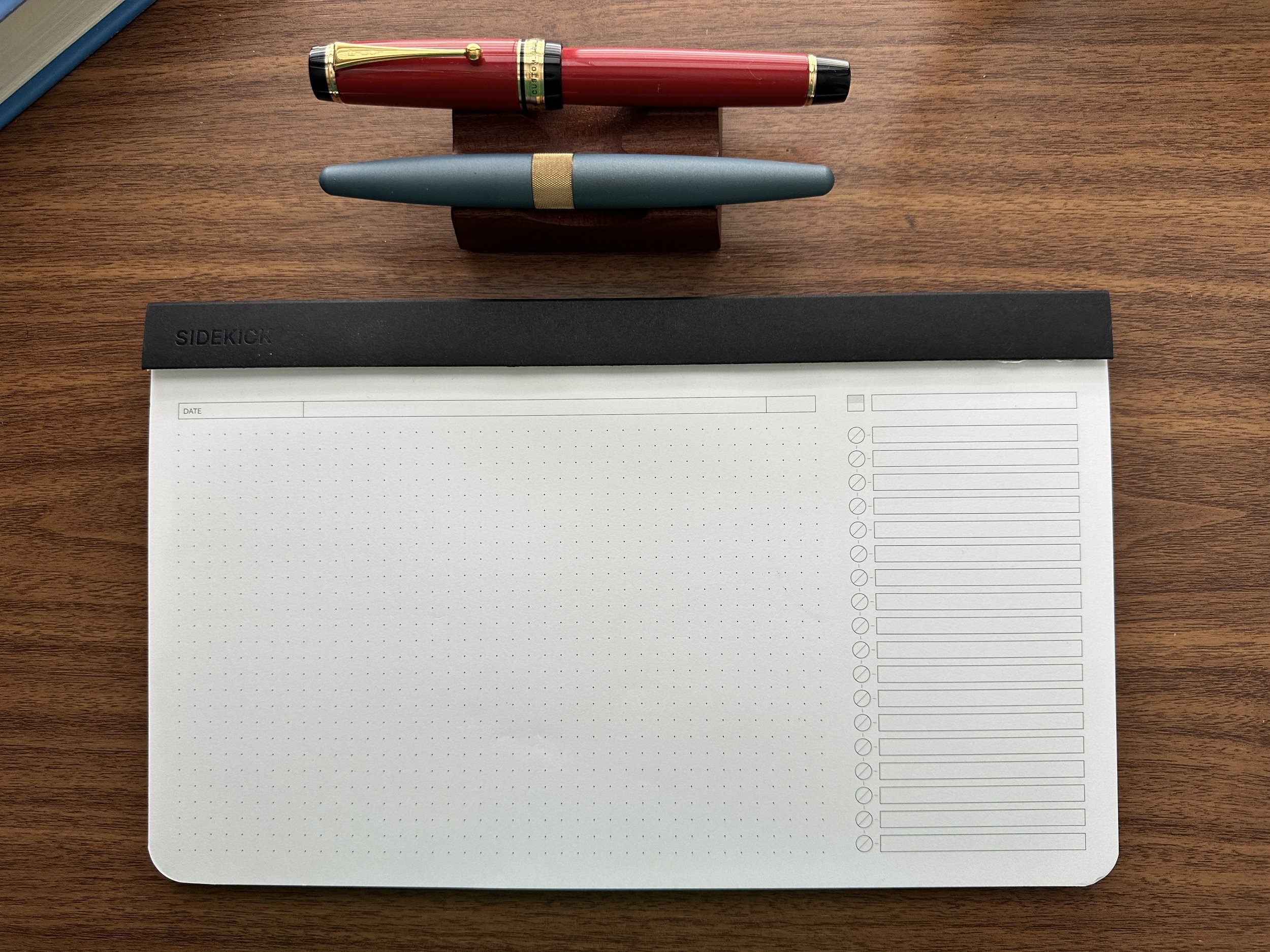
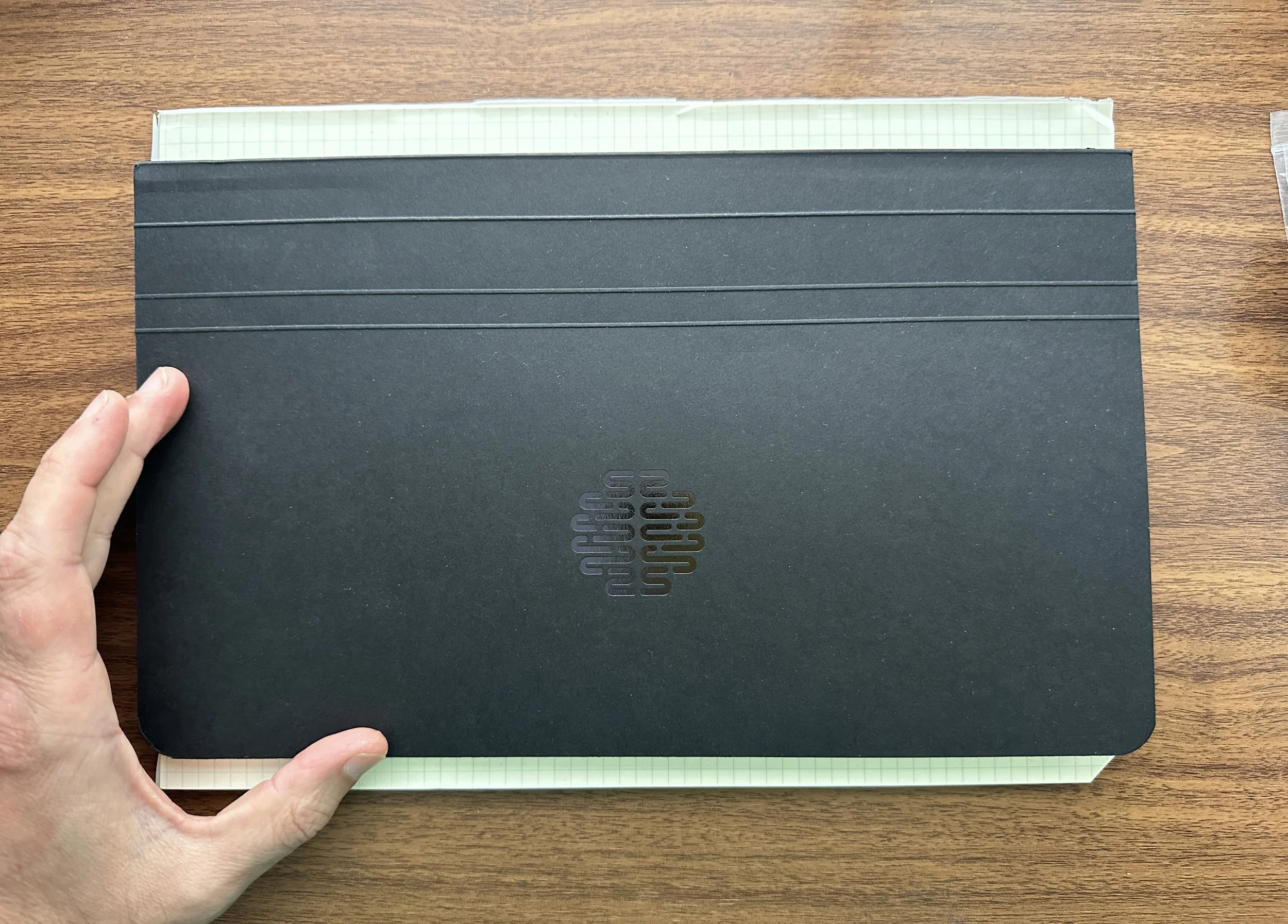
I have a healthy personal stock of 68gsm Tomoe River Paper, and for now there are several different ways you can still get a hold of it. We carry it in our own shop in the form of the Lochby A5 Notebooks and Pocket Notebooks, which are sold as refills for the Lochby Field Journal and Pocket Journal, respectively, but which are standard sizes and can be used as stand-alone notebooks or as refills in similarly sized covers. Other brands that still use 68gsm Tomoe River paper include Odyssey Notebooks (shown in this post), which makes a line of hardbound notebooks in A5 and B5 sizing, as well as the Endless Recorder line, which is in the process of switching over to “Regalia” paper, presumably in the expectation that the Tomoe River 68gsm will be gone someday. I don’t generally encourage stockpiling, but I will certainly use what I have while I can!

The Gentleman Stationer is supported entirely by purchases from the T.G.S. Curated Shop and pledges via the T.G.S. Patreon Program. This post does not contain paid sponsorships or third-party affiliate links.

In Paper Products Tags Tomoe River Paper, 68gsm Tomoe River, Favorites
1 Comment

Personal Workflow: It's More Than Novelty - Different Paper Rulings for Different Purposes

September 20, 2023

Between my dual careers as an attorney and a writer/shopkeeper/administrator, I go through a lot of paper. (Seriously - people don’t believe me when I tell them that I’ve been known to write through 1-2 full converters of ink in a single day. That requires a LOT of paper.) But what paper do I use? That depends on the nature of the writing itself. Dot grid has long been my standard “everyday” paper simply because it’s so versatile, but lately I’ve rediscovered the beauty of a plain blank page. I’ve also enjoyed using the “quadrant graph” layout from Plotter/Midori Designphil. I thought it would be fun to talk specifics about each of these papers, how I use them, and in what formats.

My Most Used Paper Rulings and How/WhY I choose Each one

  1. Dot Grid. A light, subtle dot ruling offers just enough structure for actual writing, but it can also “disappear” if you want to draw, take random notes vertically, annotate, etc. To me, dot grid paper represents the perfect compromise between structure and flexibility, and best of all, it’s readily available in pretty much any pad or notebook format you can think of (including colored paper). The three formats I use the most are the Rhodia Dot Pad, a stationery workhorse which has been in my rotation for more than a decade, the letter-sized Write Notepads Memo Pad, and anything with dot grid Tomoe River paper, preferably the 68gsm version because I think it holds up to daily use better. (Get it while you still can.) Dot grid is my default paper.

  2. Reticle/Cross Grid. After dot grid, the next best thing for me is a reticle grid, featuring small crosses instead of dots. (Hence this ruling also being called “cross grid.”) Offering a bit more structure than a dot grid without the fully connected lines to disrupt your writing, I will opt for a reticle grid over standard graph any day. This particular paper first went mainstream back in 2014 with the release of the Field Notes “Night Sky” edition. These days, reticle grid paper can still be somewhat difficult to find - certainly harder than dot grid - but it’s becoming more common. Atelier Musubi offers it as an option in their recently released “Rasa 83” notebooks, as well as their new Spica Bond 75 pocket notebooks. Nanami Paper also continues to sell the Seven Seas “Crossfield” Tomoe River Journal.

  3. Blank. Back at the beginning of the year, I resolved to allow myself to just enjoy using really good paper that didn’t have a set “purpose.” I wanted to play around more with pens, ink, and even paint, and blank paper makes the perfect canvas for experimentation. Moreover, because many specialty Japanese papers only come in a blank format, allowing yourself to enjoy the blank page dramatically expands your range of options. Specific papers I’ve used often include Midori MD Cotton (which sadly no longer comes in anything other than blank), Passepied, Spica Bond, and even the G. Lalo laid paper. I’ve actually come to enjoy taking notes randomly on a blank page, without any “guidelines,” especially when brainstorming.

  4. Multi-Lined. Somewhat sadly, I find myself using lined paper less these days, though that’s more incidental than intentional. I rarely use a standard lined ruling, and when I do I will nearly always opt for Clairefontaine’s French/Seyes-ruled paper and, more recently, the Nakabayashi lined versions that were recommended to me by Ana over at the Well-Appointed Desk. That said, I expect my usage of this multi-lined paper to dramatically increase over the next year. While I’ve been hinting at this on the site (and definitely in the Patreon discussions) for a while, I feel comfortable disclosing that I’m in the middle of a career change that (1) will allow me to devote more time to T.G.S.; and (2) move to a position at my day job that is much more writing-intensive, which is the part of the work that I truly enjoy. Hopefully I’ll shift back to where I was several years ago, using Clairefontaine French-Ruled paper to draft legal briefs by hand, much to the befuddlement of my coworkers! ;)

  5. Quadrant Graph. I’ve been using this new arrival to the lineup almost nonstop since Plotter released their special edition “Japan Blue” notebooks last month. While I don’t typically use graph paper, if I do it’s going to be micro-graph (2mm). After some initial skepticism, I’ve really come to enjoy this layout. I write small, so the micro-graph doesn’t bother me even if a standard graph ruling isn’t my favorite. What’s surprised me is the utility of having a page divided into four quadrants. I make a lot of lists, some of which are related to one another and include “sub-lists” under specific tasks, so this layout has been quite useful for project management and thinking through SWOT-style analyses. It’s also helpful to be able to separate notes on different topics into four sections on a single page. For those who find the blue Plotter paper too dark (or the micro-graph too small), Midori sells a standard A5 journal in what they call a “Grid-Block” layout.

A dot grid ruling (top - Midori Soft Color) compared against reticle grid (bottom - Musubi Pocket Notebook)

Further Reading on My Favorite Papers

Out of the three major categories of stationery (pens, inks, paper), I feel the most comfortable recommending paper, since I have extensive experience using it everyday for 30+ years in a variety of personal and professional contexts. (I can also talk about it for hours - you’ve been warned.) Paper preferences, however, are subjective, with ruling preferences differing from person to person depending not only on need but also handwriting and notetaking style. So my ruling preferences, discussed above, may not equate to yours, and that’s ok! Finding what works for you is part of the fun of this passion/hobby.

If you’d like to read further on the topic of paper and recommendations, I’ll typically direct readers to this post on Fountain Pen Friendly Paper, which has an extensive comments section that contains additional discussion among readers. At some point I will need to update the post based on certain suggestions, but there are so many brands mentioned that there’s probably no way I will get to them all!

The Plotter Quadrant Graph Paper.

The Gentleman Stationer is supported entirely by purchases from the T.G.S. Curated Shop and pledges via the T.G.S. Patreon Program. This post does not contain third-party affiliate links or paid advertising.

In Paper Products, Editorial Tags Editorial, Paper Review
1 Comment

Paper Review: Clairefontaine Is My Personal Benchmark for Fountain Pen Friendly Paper

July 26, 2023

Everyone has a personal benchmark, or reference point by which they measure most things, whether it’s pens, inks, paper, or something else entirely. For me, whenever I’m evaluating any sort of paper, my comparison starts with Clairefontaine.

In an era where new specialty paper brands hit the market on a seemingly weekly basis - each touted as having “special properties” or “even more ink friendliness than ___” - it’s easy to overlook the basics. Brands such as Clairefontaine and Rhodia (which come from the same family of companies but have slightly different paper formulations) have been churning out excellent all-around paper for a very long time, and if what you’re looking for is quality, relatively cost-effective paper that’s easy to find and capable of handling most pens and inks, I often suggest that new users start here. Specifically, the reasons I love/recommend this paper include:

  • Versatility. Clairefontaine Paper comes in a wide range of formats and rulings. Honestly, the idea for this post struck me yesterday morning as I was unpacking a recent shop order and found myself floored by the variety of products that kept emerging from the box. Clairefontaine makes pocket notebooks, reporter-style notebooks, A5 notebooks, A4 notebooks, legal pads, top-spiral legal pads, looseleaf paper - you get the picture. While I count myself a paper aficionado, and consider experimenting across product lines part of the fun, if you prefer to focus on the pens and/or inks you can stick to Clairefontaine and find pretty much any paper format you might need within that line.

  • Consistent Quality. What I love about Clairefontaine is that you don’t need to think about whether it’s going to offer you a baseline-level of fountain pen friendliness. Although most people lump them together as “Clairefontaine/Rhodia”, I’ve generally found Clairefontaine to be more consistent across batches and the product line as a whole.

  • Cost Effectiveness. Whether it’s those of us who use fountain pens on a daily basis at work, or prolific journalers who can fill a 100+ page notebook in a matter of weeks, most people have to pay attention to the cost of this hobby on some level. While they’ve had to raise prices over the past couple of years, Clairefontaine paper is still some of the more reasonably priced fountain pen friendly stationery on the market. As I write this, notebooks containing Clairefontaine paper range from $5.50 to $23, depending on size and page volume.

Clairefontaine paper is famous for how well it handles ink. The bright white version showcases color and shading fairly well. It also holds up to extremely wet pens and inks, though as discussed further below, that may affect dry time.

As you can see, there is zero bleed-through from handwriting. It took me FOUR passes with a q-tip - basically until the paper soaked through and began disintegrating, before I saw any bleeding whatsoever from the ink swab. Even then, it only bled along the “weak spots” in the paper (i.e., where the ruling was printed).

That’s not to say that Clairefontaine doesn’t have it’s drawbacks, and any well-rounded review should point them out. First of all, dry time can be an issue, especially with wet and/or super-saturated inks. What makes Clairefontaine paper so ink-friendly is the fact that the paper is coated to minimize feathering and bleed-through, so it takes longer to dry because the paper doesn’t absorb as much ink as other brands. As a result, many left handers find that that ink frequently smears, and certain Noodler’s and Organics Studio formulations will literally never dry on this paper. On a similar note, because this paper tends to feel very smooth, I find it less satisfying to use with pencil. While to me this is more of a tactile issue, some people claim that graphite smears more easily on Clairefontaine and other coated papers. YMMV.

Clairefontaine’s 1951 Collection, with it’s school-days-retro vibe, has been incredibly popular.

Takeaways and Where to Buy

I always keep Clairefontaine paper close at hand. I opened my “notebook stash drawer” in my office desk yesterday and three Clairefontaine products jumped out at me: (1) a packet of French-ruled looseleaf sheets, which will be returning to the shop soon; (2) a “Pupitre” legal-style A4 pad; and (3) a spiral-bound A4 French-ruled notebook. I started with Clairefontaine paper way back in college, when I first got into fountain pens, and at this point I consider myself a lifer with this brand.

In the interest of full disclosure (though most readers probably already know this) we do sell Clairefontaine directly via our own shop, though my love of this paper predates my status as a retailer by decades. You can generally find this paper at most pen retailers worldwide.

Further Reading

I’ve previously reviewed a few specific iterations of Clairefontaine Paper, including my favorite French/Seyes-ruled layout, which is what got me hooked on quality stationery all those years ago. For a broader look at how different brands compare, and what I consider to be “fountain pen friendly”, check out our “Hierarchies of Fountain Pen Friendly Paper” post. This particular article has a vibrant comments section, from which I’ve already picked up several new suggestions on additional brands to review and/or carry in the shop. Please add to the conversation if you don’t see one of your own favorites represented!

In Paper Products Tags Paper Review, Clairefontaine
5 Comments
Cortex Brand Sidekick Notepad

The Cortex Brand Sidekick Notepad: Hype or Innovation? A Bit of Both

May 24, 2023

Since the release of the Baron Fig Mastermind in 2017, I've paid close attention to the "landscape desk pad" segment of the stationery marketplace, because as I mentioned in my review of that product, this particular category holds a special place in my productivity-stationery-loving heart. There's no set of circumstances under which I don't have a pad of paper sitting below or to the side of my keyboard when I'm working on the computer, and I often prefer a "landscape" (i.e., horizontal) layout when I'm drafting documents longhand. So how does the recently released Sidekick Notepad from Cortex Brand measure up to the significant hype it’s received? Let’s take a look.

The foldover cover, complete with Cortex “Brain” logo.

A Second Original Product from Cortex Brand, an Offshoot of the Cortex Podcast

Rarely does a paper product - much less something like a desk pad - generate significant attention in "mainstream" internet and YouTube circles, but with the release of the Sidekick Notepad, Cortex Brand has achieved just that. Not only am I starting to see this product broadly advertised on social media, but it’s also been reviewed in publications such as Inc. While it may not be “the best productivity tool I’ve used yet” (as Inc. somewhat hyperbolically proclaims), Cortex Brand definitely has something with their stationery product line, and they’ve certainly accomplished their stated goal of designing a product capable of standing alone, independent of a podcast audience. Whether that ends up being the case remains to be seen, but the Sidekick Notepad is a great product that fits a niche many stationery manufacturers have largely ignored.

Those unfamiliar with Relay.fm’s Cortex Podcast but interested in discussions of the intersection between digital and analog in work and everyday life should give Cortex a listen. Hosted by Myke Hurley (of The Pen Addict podcast) and CGP Grey (of the eponymous YouTube Channel), I've been a semi-regular listener for years, and previously reviewed their Theme System Journal, which has been helpful to me at various points over the past few years as I've navigated some life changes which required a more structured journaling experience. The Sidekick Notepad is the second product wholly designed by Cortex Brand, which borrows some visual design elements from the Theme System Journal and generally builds on a common theme of offering products designed to assist users is capturing thoughts and ideas in a structured - but not overly structured - format that helps translate raw material into action items.

I also want to comment on the print quality. The printing on the dot grid and the To-Do list are exceptionally clean and legible.

Layout, Build Quality, and Specific Workflow for Which this Product is Designed

Straddling the line between notebook and notepad, the Sidekick Notepad is a 12 x 7” (roughly A4) covered writing pad that features a dot grid layout with a to-do list column on the right-hand side. The design and build quality is exceptional. Featuring 60 sheets of thick, fountain pen friendly Munken Lynx paper, I've had no issues with fountain pens or rollerballs feathering or bleeding through the pages. The cover is constructed from a paper called "Extract" made from recycled coffee cups, and the entire notepad is hand-assembled by a print shop in London using a combination of modern and traditional techniques. I want to call out three specific points that I believe makes the Sidekick Notepad a well-made stationery product:

  • The Munken Paper Doesn't Curl. Those of you who regularly use desk and legal pads know what I'm talking about. Over time, resting your arms on the pad and/or carrying them in a briefcase can cause the paper to curl at the edges, resulting in a beat-up look that detracts from an otherwise clean, professional design. That's not a factor with the Sidekick, helped by not only paper quality but the fold-down cover.

  • The Perforations Tear Easily and Cleanly. This one's self-explanatory, but it's a big deal to me. I dislike desk pads and legal pads with messy perforations that leave bits of torn paper stuck to the top of the binding.

  • The Cover Looks Professional and Is Sturdy Enough to Travel. I love the Baron Fig Mastermind, but my major complaint is that it's hard to transport the pad in a briefcase between locations without the paper getting torn to shreds and bent. There’s also a flimsy backing board so the entire pad tends to curl over time. The Sidekick Notepad solves this problem by adding a durable cover that folds back underneath the pad when in use, as well as a sturdy backing board that keeps the pad flat and should hold up to a significant amount of daily use. This sort of durable construction is a major value-add for me, and what may keep me using this product going forward.

Check out the perforations! I also like the subtle branding.

How is this product intended to be used? Based on both the layout and the explanation given on several different episodes of Cortex, the natural use case is as a GTD-style capture device. The Sidekick Notepad sits beneath your keyboard (or in front of you at a meeting), and as you jot notes you further refine them into to-dos and action items that you can then incorporate into your bullet journal or digital to-do manager. It's a clean, straightforward workflow. While you can also use the Sidekick for standard notetaking or writing, you'll probably want to seek out something slightly more cost-effective, as I'll discuss below.

A huge part of the Sidekick’s allure is its aesthetic, as well as the functionality. Not only does the cover protect your notepad and add a layer of privacy if you want to cover your writing during meetings or when you step away from your desk (a big plus for me), it just looks better as it’s used compared to other pads that can start to seem tattered after they’ve been used for a while.

Price: At $35 (Before Shipping), the Sidekick Notepad May Be Prohibitively Expensive for Some

A large section of this review has to be devoted to the price point at which Cortex Brand sells this product, because the main drawback is expense. The Sidekick Notepad costs $35 for one notebook, with shipping for a single notebook costing an additional $10-15. Cortex Brand uses Cotton Bureau for fulfillment, which results in a somewhat incongruous situation where a product made in the U.K. is shipped to the U.S. for fulfillment, and U.K./European customers bear the brunt of international shipping on a U.K.-made product. I will note that, at least for U.S. consumers, purchasing this product in bulk evens out the shipping. Ten notebooks currently results in a shipping charge of $16.74 (more than reasonable), which brings the per-unit price (shipped) to roughly $36.60 - expensive, but hardly unprecedented given the prices enthusiasts pay for Japanese brands such as Life Stationery. The larger question is whether NON-stationery nerds (i.e., just regular nerds and professionals) who aren’t already Cortex fans will pay this much for a disposable writing pad that’s NOT intended to be retained long-term, and whether the reason for the price point is adequately communicated outside the Cortex Podcast audience.

The specifications on the notebook are high quality, and it shows once you have the product in hand.

In addition to discussing the demanding product specifications and lengthy design/prototyping process, on the podcast Myke and Grey talk about how they are trying to create a company targeting consumers beyond those who already listen to the Cortex Podcast. While they have absolutely nailed the design and build quality, the primary roadblock to the Sidekick Notepad achieving true "mainstream" success outside the Cortex listenership is that you have to listen to the podcast to fully appreciate what they were trying to accomplish. You can’t really evaluate the Sidekick as “just a notepad,” but rather as a tool that’s intended to be used in a specific way.

I’ve had no issues using fountain pens on either the Sidekick Notepad or in the Theme System Journal. I love this paper and would like to see it used more.

Personally, prior to listening to two different Cortex episodes discussing the Sidekick Notepad, I had passed on purchasing and reviewing this product. A long-time friend and reader asked me to reconsider, and was kind enough to send me one of the multiple Sidekicks she had purchased. The fact that someone was enthusiastic enough about the item to not only buy multiples but to donate one so that it could be reviewed was the first factor that caused me to reconsider my position here. My perspective further changed after I was actually able to hear the story and philosophy behind the product, and understand that it would supplement, not replace, certain items already in my workflow.

Cortex Brand Sidekick Notepad backing Board.

The backing board is substantial and durable, something that’s not as common as you might think but adds a lot of value to the quality of the experience.

Takeaways and Where to Buy, Along with A few less costly Alternatives

As noted, you can purchase the Sidekick Notepad via Cotton Bureau for $35. I enjoy this product and will probably pick up a few more, especially since at some point I will be placing a reorder for the Theme System Journal, and one of the Cortex Brand Mark One pens. It of course helps that the Sidekick's layout fits nicely with how I already take notes at my computer, and my own work situation (moving between setups at home and in a physical office). At $35 per unit, the Sidekick will be price prohibitive for certain consumers - especially those who don't want/need the note + action item layout - but understanding the product's intended audience and use-case, a market for a high-end notepad like this one definitely exists.

Slimmer than most, the Sidekick Notepad will fit beneath a keyboard and will be versatile enough to use in most locations. Shown here atop a standard A4 Midori MD Writing Pad.

Who is this product NOT for? Those who burn through 5+ sheets of paper on a daily basis, or who only use desk pads for taking lots of notes and drafting documents. If you're someone who prefers (or is required) to retain notes long-term, you might consider a spiral bound landscape notebook like those sold by Write Notepads or Maruman Mnemosyne, both of which contain fountain pen friendly paper and are generally less expensive. Those looking for a more straightforward tear-off writing pad without the special formatting can get a similar experience from the Baron Fig Mastermind, or a Midori MD or MD Cotton writing pad, again at a lower per-unit price. It goes without saying that none of these products are "cheap" by any stretch - if you appreciate quality paper, you'll need to pay for it, as these days good stationery is simply not made in the quantities necessary to keep prices at a commodity level.

The Gentleman Stationer is supported entirely by purchases from the T.G.S. Curated Shop and pledges via the T.G.S. Patreon Program. This product was donated by a reader for review and was not funded or sponsored by Cortex Brand. This post does not contain links to affiliates or third-party advertisers.

In Paper Products Tags Cortex Brand, Cortex Brand Sidekick Notepad
Comment

Introducing Nakabayashi Logical Prime Paper: Ink Friendly and Quick Drying

May 13, 2023

Earlier this year, my friend Ana over at the Well-Appointed Desk recommended that I try out Logical Prime paper from Nakabayashi Stationery, a brand I knew by reputation (mainly for their scissors and desk accessories) but had never personally tried. This paper is apparently known for being fountain pen friendly, with relatively short dry times and nice sheening and shading for showcasing ink.

So far, the quality has impressed. I’ve pushed this paper with some fairly wet nibs - including a No. 8 Bock Titanium nib - and tested multiple inks, and the only one that’s feathered or bled has been a Kakimori pigmented ink that, frankly, has feathered and bled through everything I’ve tried except mixed media paper. I can see this Logical Prime paper working its way into my rotation, especially where I need a slimmer spiral notebook for discrete projects.

The notebooks come in four rulings and a blank option. Clockwise from top left: 7mm “lined”, 6mm “lined”, grid, and dot.

The Logical Prime Notebooks contain 40 sheets (80 pages) in the thread-bound format, and 50 sheets (100 pages) in the “W-Ring” spiral binding. The paper comes in four different rulings, including some interesting 6mm and 7mm lined variants that remind me of Clairefontaine Séyes-ruled paper. Pages have a header reminiscent of that on Maruman Mnemosyne, allowing you to better organize your notes.

All of the standard fountain pen inks I tested worked extremely well.

Takeaways and Where to Buy

Nakabayashi Logical Prime paper recently became more widely available in the U.S. So far, testing with this paper has been extremely positive, and I’ve listed an initial shipment for sale in the shop in both the “Thread Binding” and “W-Ring” (spiral bound) formats. These notebooks are relatively inexpensive, with the thread-bound version priced at $6 and the W-Ring version priced at $7.50. Note that the Logical Prime paper is considered Nakabayashi’s premium paper option, with certain other Nakabayashi paper not handling fountain pens quite as well. I don’t plan to stock anything other than Logical Prime until I have had a chance to test their other offerings.

This post does not contain third-party affiliate links or paid advertising. The Gentleman Stationer is supported by purchases through the T.G.S. Curated Shop and pledges via the T.G.S. Patreon Program.

In Notebook Review, Paper Products Tags Fountain Pen Friendly Paper, Paper Review, Nakabayashi, Nakabayashi Logical Prime
Comment
← Newer Posts Older Posts →
Store Hours and Location
Visit the T.G.S. Curated SHOP
*New* Updated "Best Pens" Guide (2025)
T.G.S. 2025 Holiday Gift Guide
TGS x Roterfaden TGS_25
Hierarchies of Fountain Pen Friendly Paper

Join Our Patreon!
Subscribe to the TGS E-mail List

Featured Posts

Featured
Cover On the Paper Trail Intro Clip.jpeg
Dec 3, 2025
Introducing "On the Paper Trail," a New Podcast/Video Collaboration with Lisa Vanness of Vanness Pens!
Dec 3, 2025
Dec 3, 2025
Iro-Utsushi-Fine-Dip-Pens.jpeg
Oct 1, 2025
The Pilot Iro-Utsushi Dip Pen (and in General, Simple vs. Fancy Dip Pens)
Oct 1, 2025
Oct 1, 2025
Levenger-Annotation-Pad.jpeg
Sep 20, 2025
Five Boutique Paper Brands I'm Watching Closely and Why
Sep 20, 2025
Sep 20, 2025
The Gentleman Stationer RSS

© Digital Divide Media, LLC, 2014-present.

All content is the exclusive property of Digital Divide Media, LLC, d/b/a The Gentleman Stationer, including “The Gentleman Stationer” website and trademark, and should not be reproduced without express written permission.  All rights reserved.

All content containing paid advertising, affiliate links, or sponsored content will be plainly disclosed by a disclaimer when/if featured.

Contact Information

Store Shipping Policy and Return Policy

Privacy Policy

Cookie Policy

Terms and Conditions

Powered by Squarespace