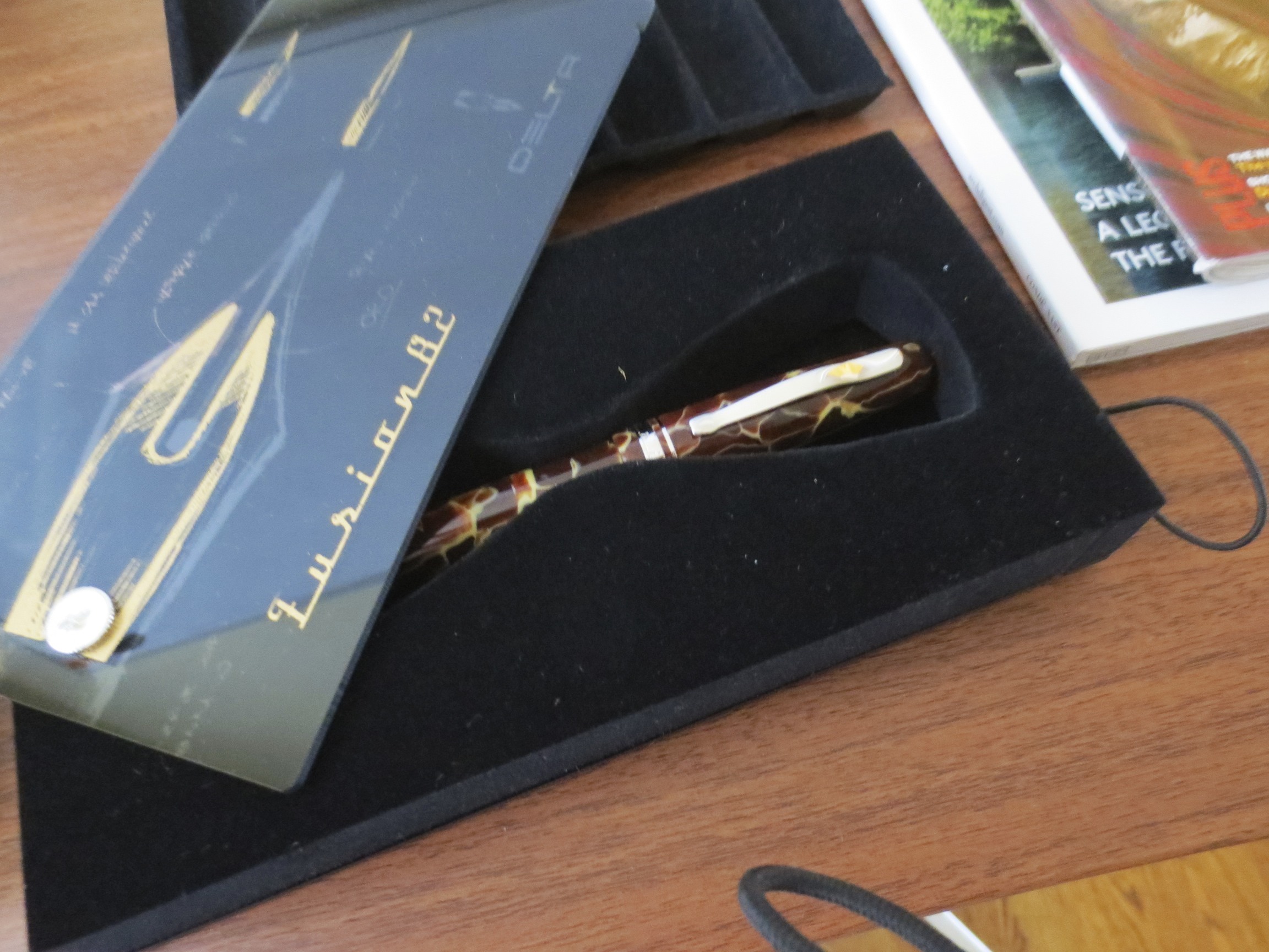
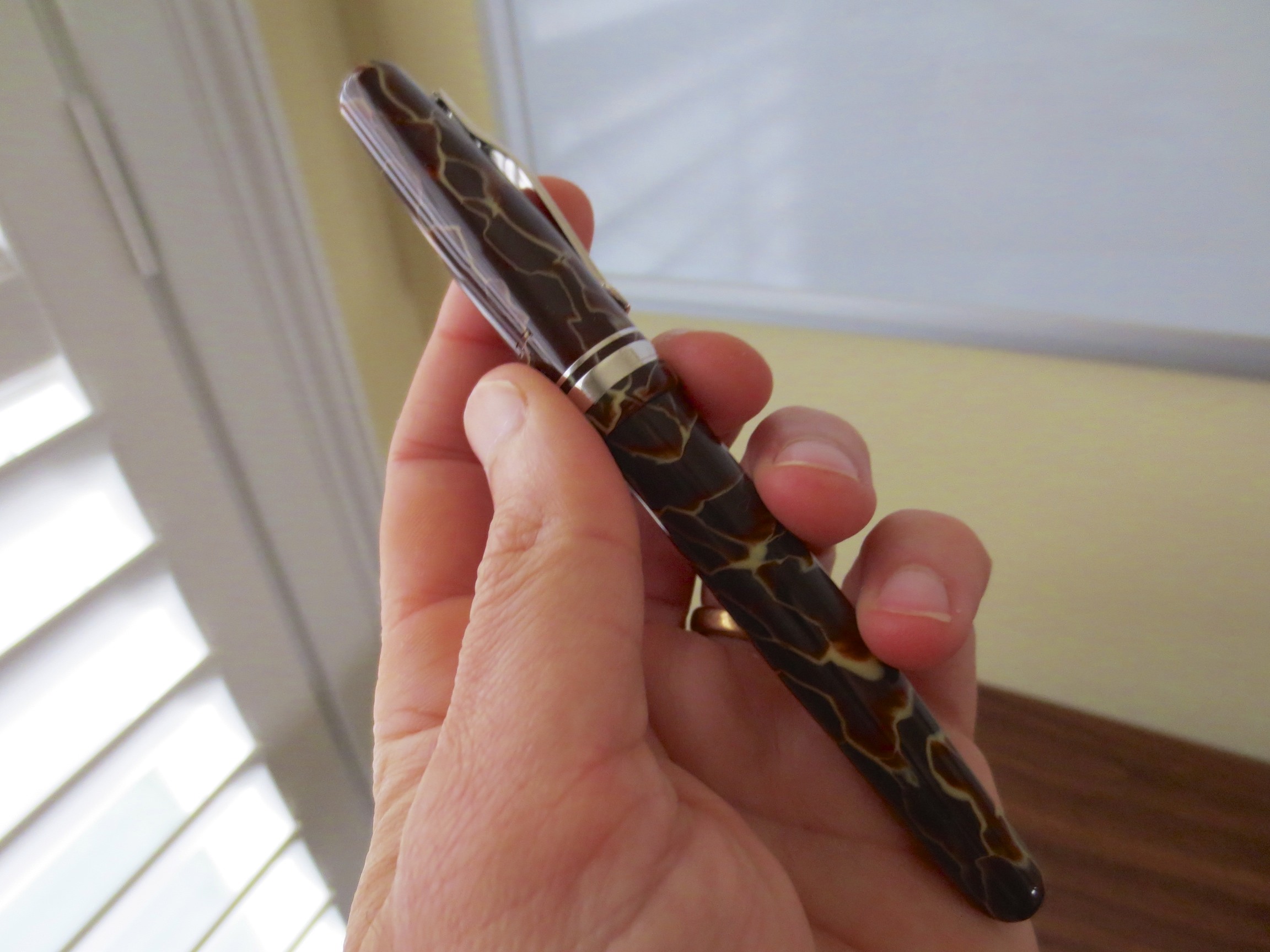
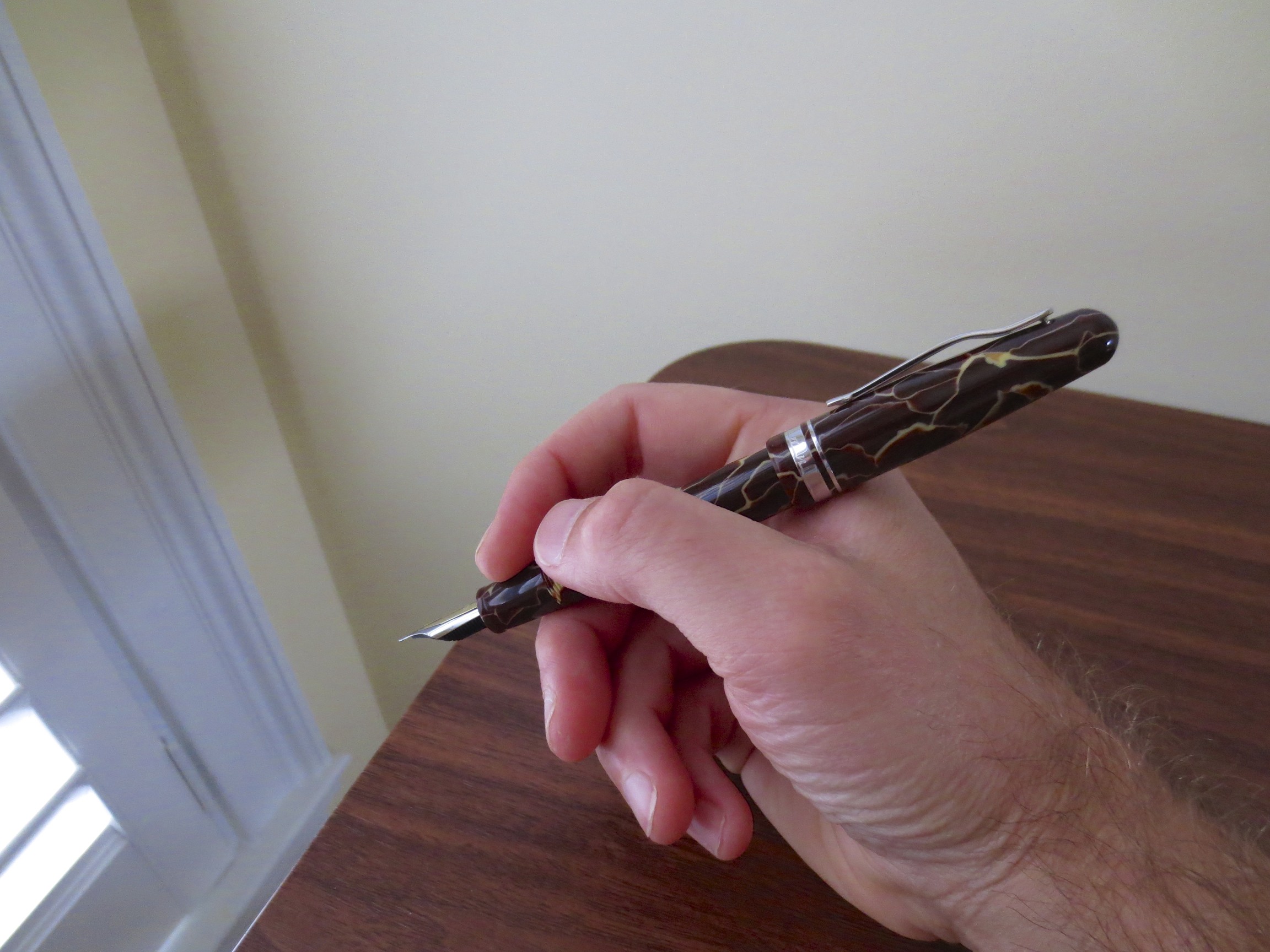
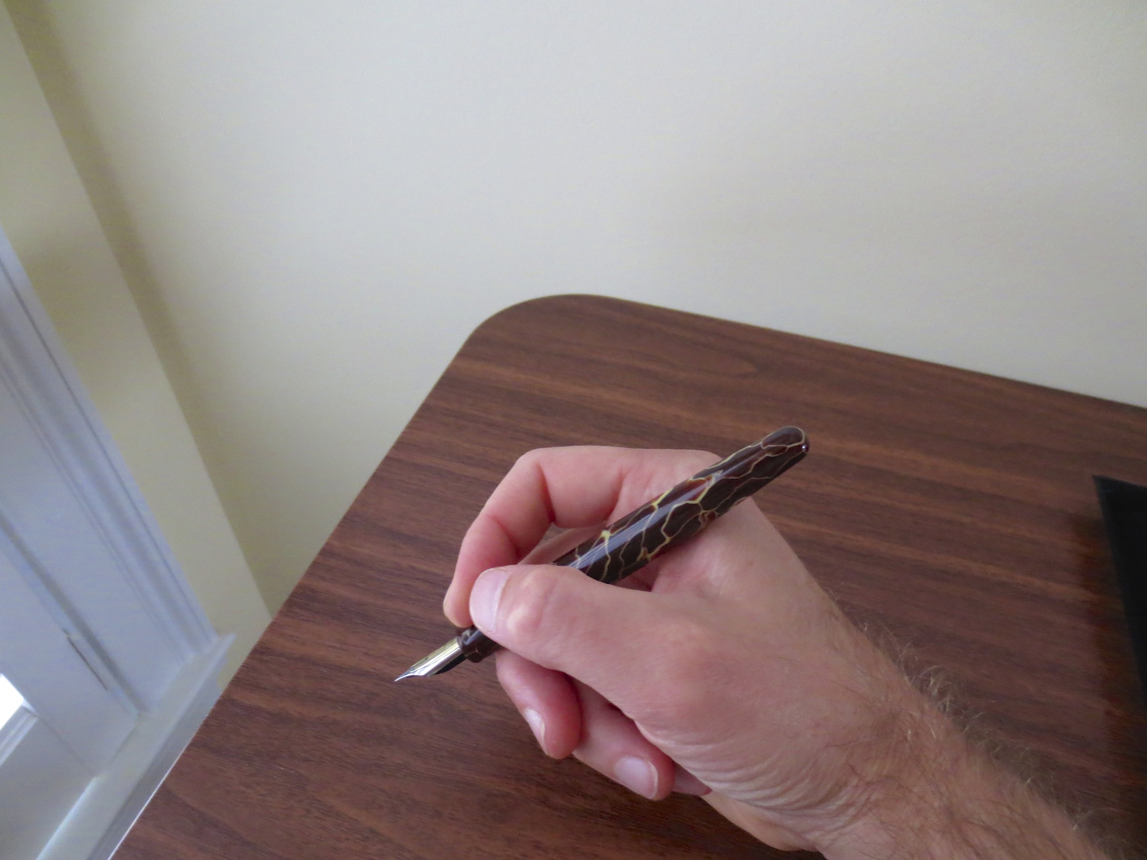
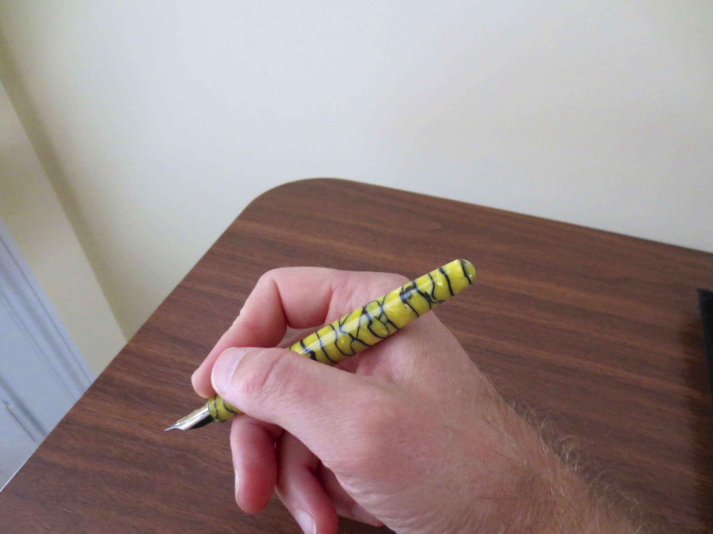
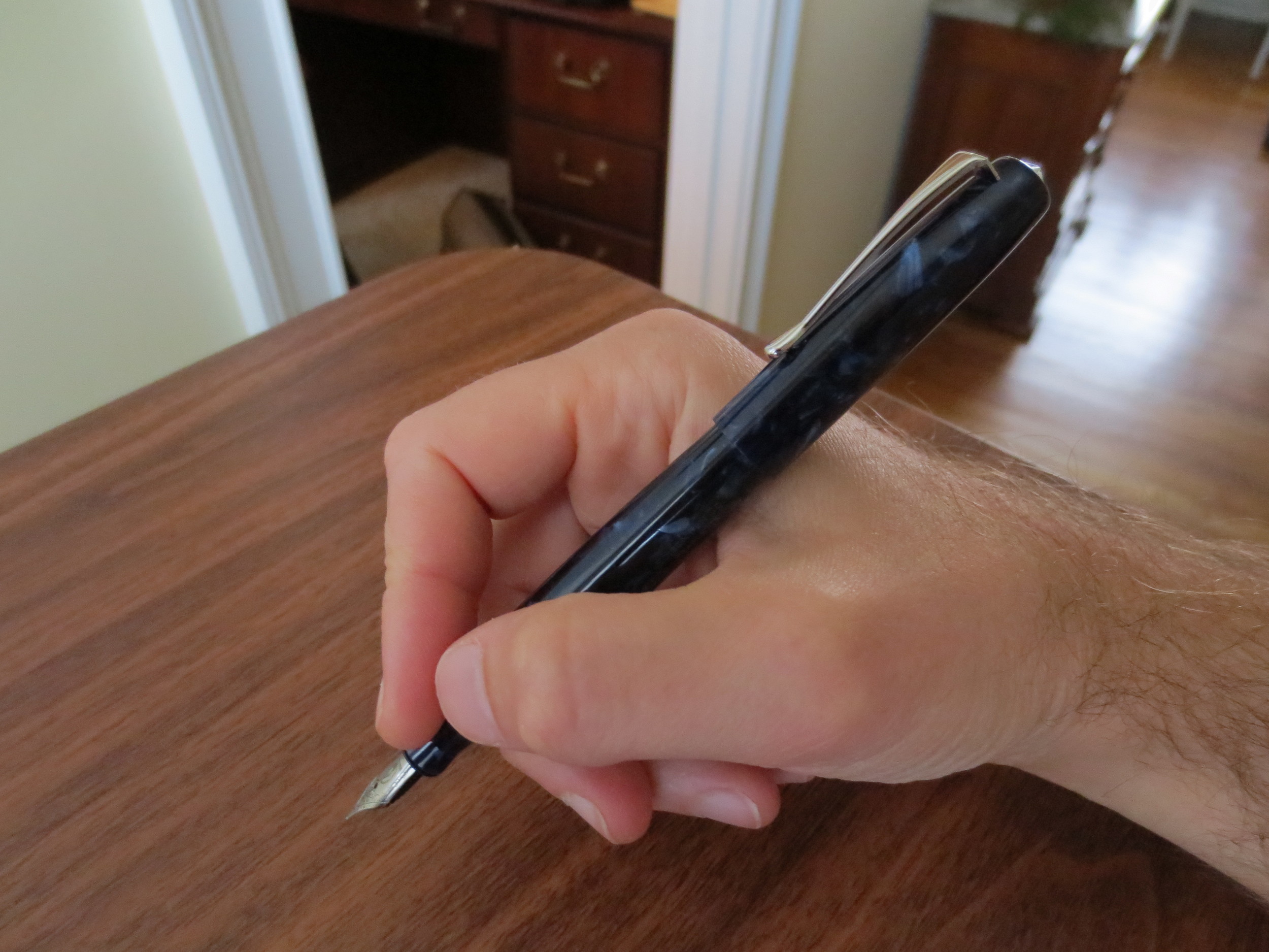
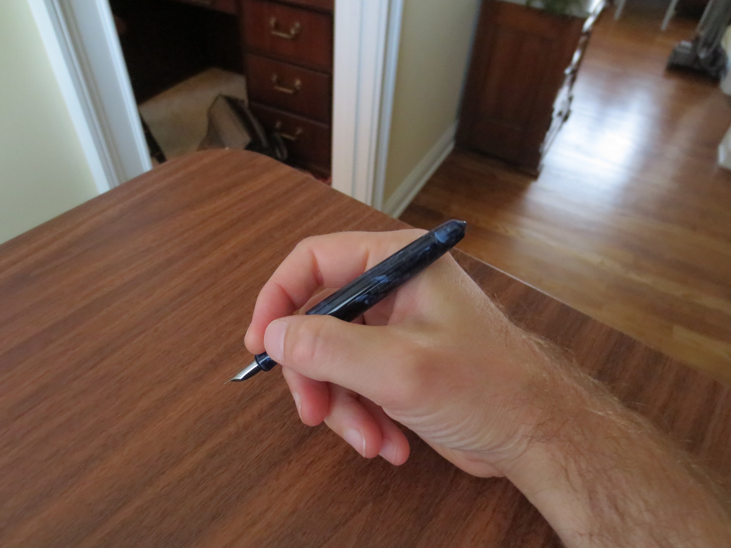
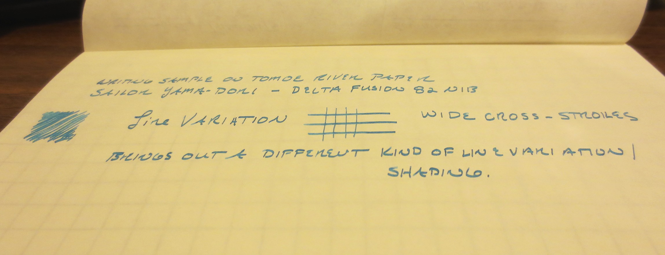
Part II of this review will focus mainly on one nib in particular: the Pompeii celluloid Fusion 82 that I had Richard Binder grind from a broad nib to a Hebrew Italic nib. This grind is quite unique, and is the opposite of the typical italic grind, which has wide vertical strokes and narrow cross-strokes. The Hebrew Italic nib has wide cross-strokes and narrow vertical ones, which gives your handwriting what some have described as an "architectural" look, because it resembles the handwriting of Frank Lloyd Wright. As always, Richard has done an excellent job on this grind. The pen is a lot of fun to write with, and despite the unusual nature of the nib it's very easy to use as a daily writer--much easier than some crisp italics I have used. I've included several photographs of my handwriting with the nib, from a variety of angles. In the longer handwriting sample below, you will see that you can flip the nib, as you can with Richard's Italifine, to write an ultra-fine line.
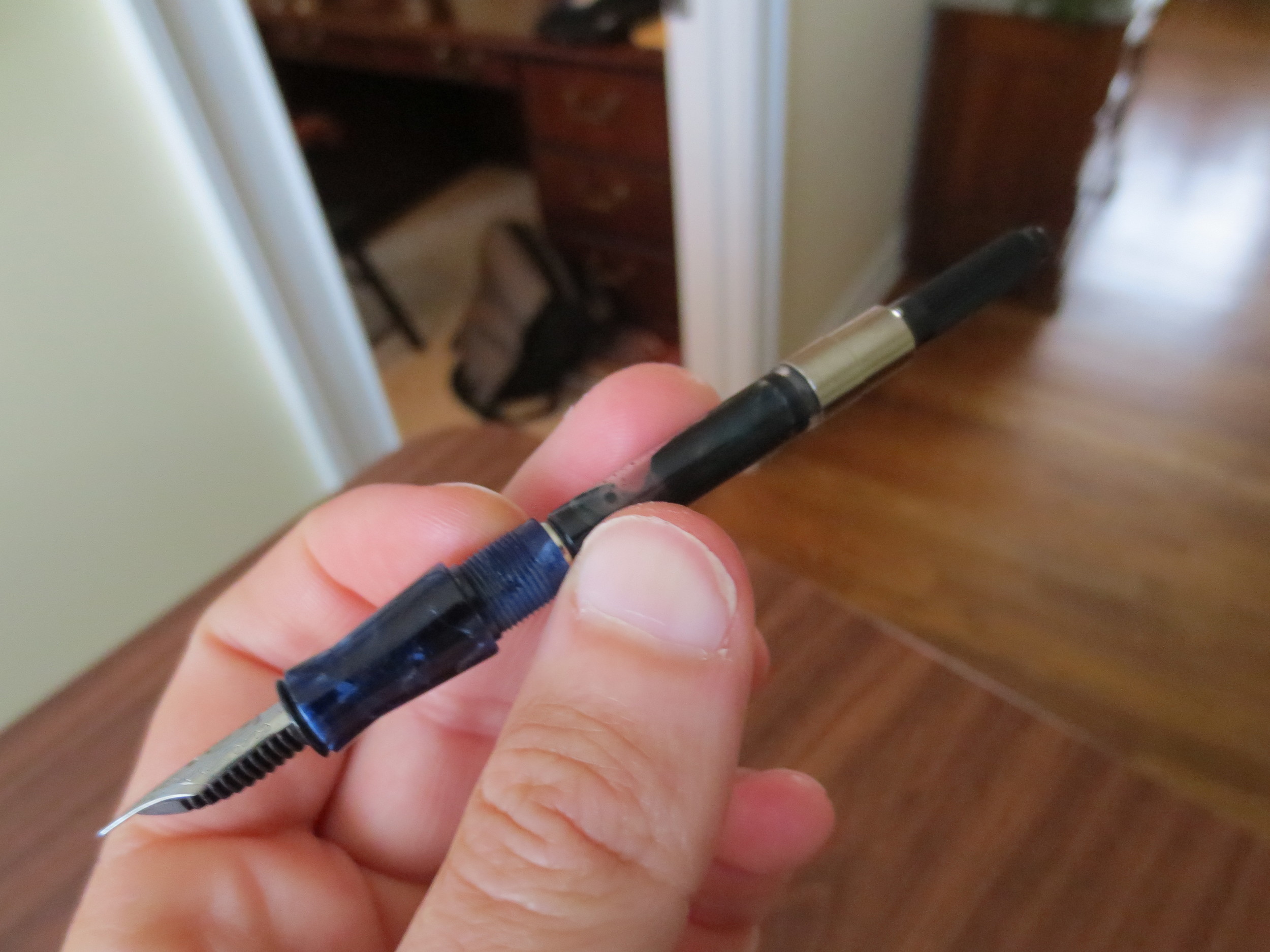
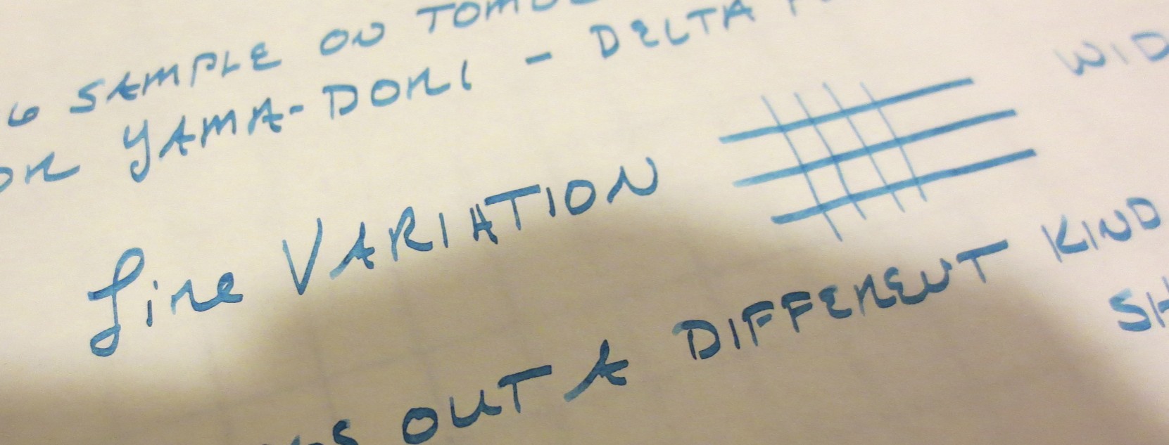
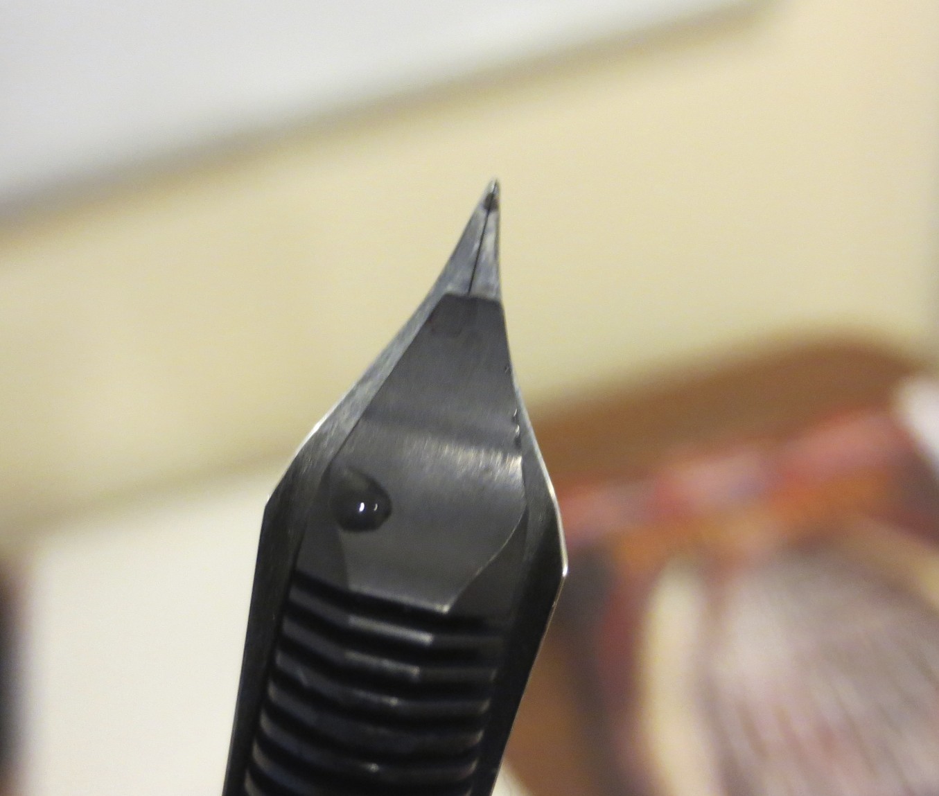
This is the best picture I've managed to take that shows the nature of the grind, which gives narrow vertical strokes and wide cross-strokes. Because this nib started as a broad Fusion nib, which is narrower than most broads, I get less dramatic line variation than a grind which started with more tipping material.
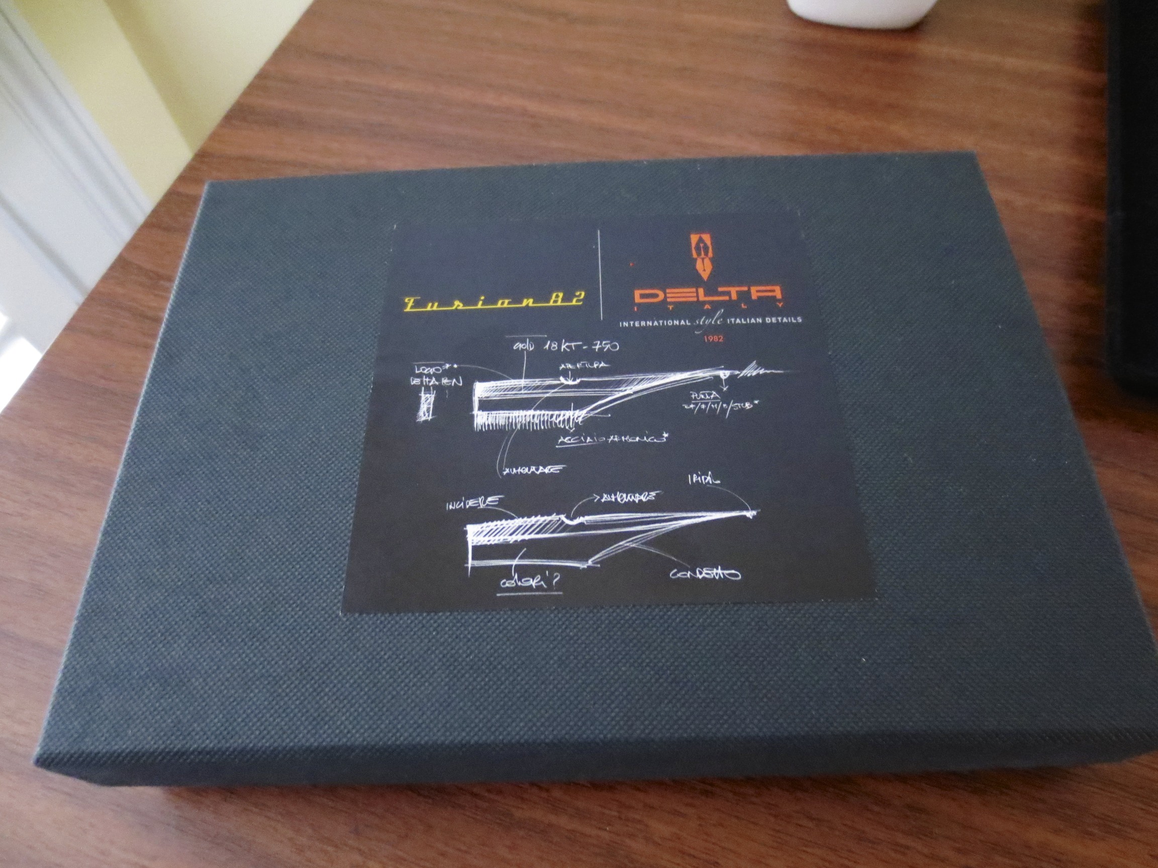
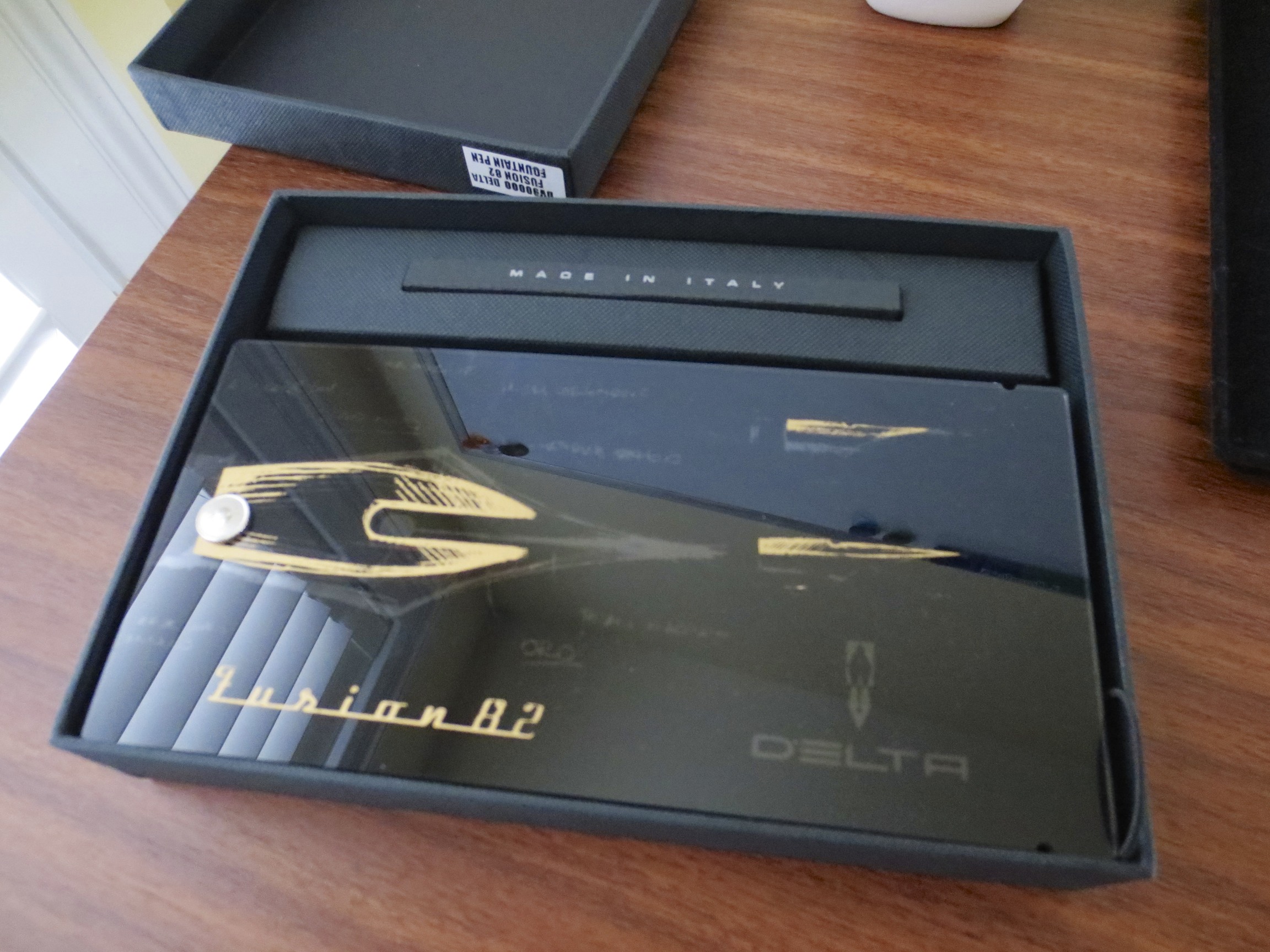
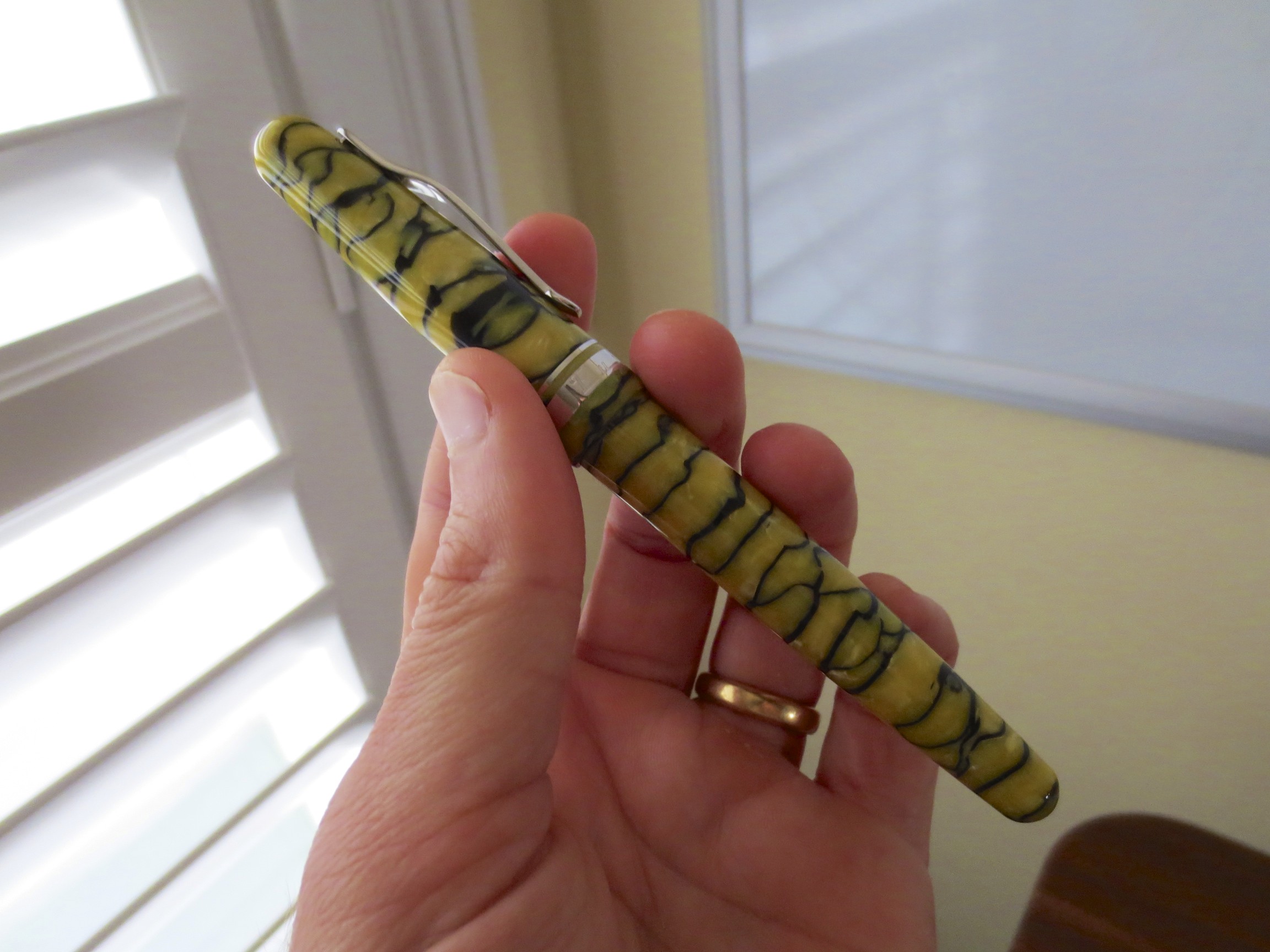
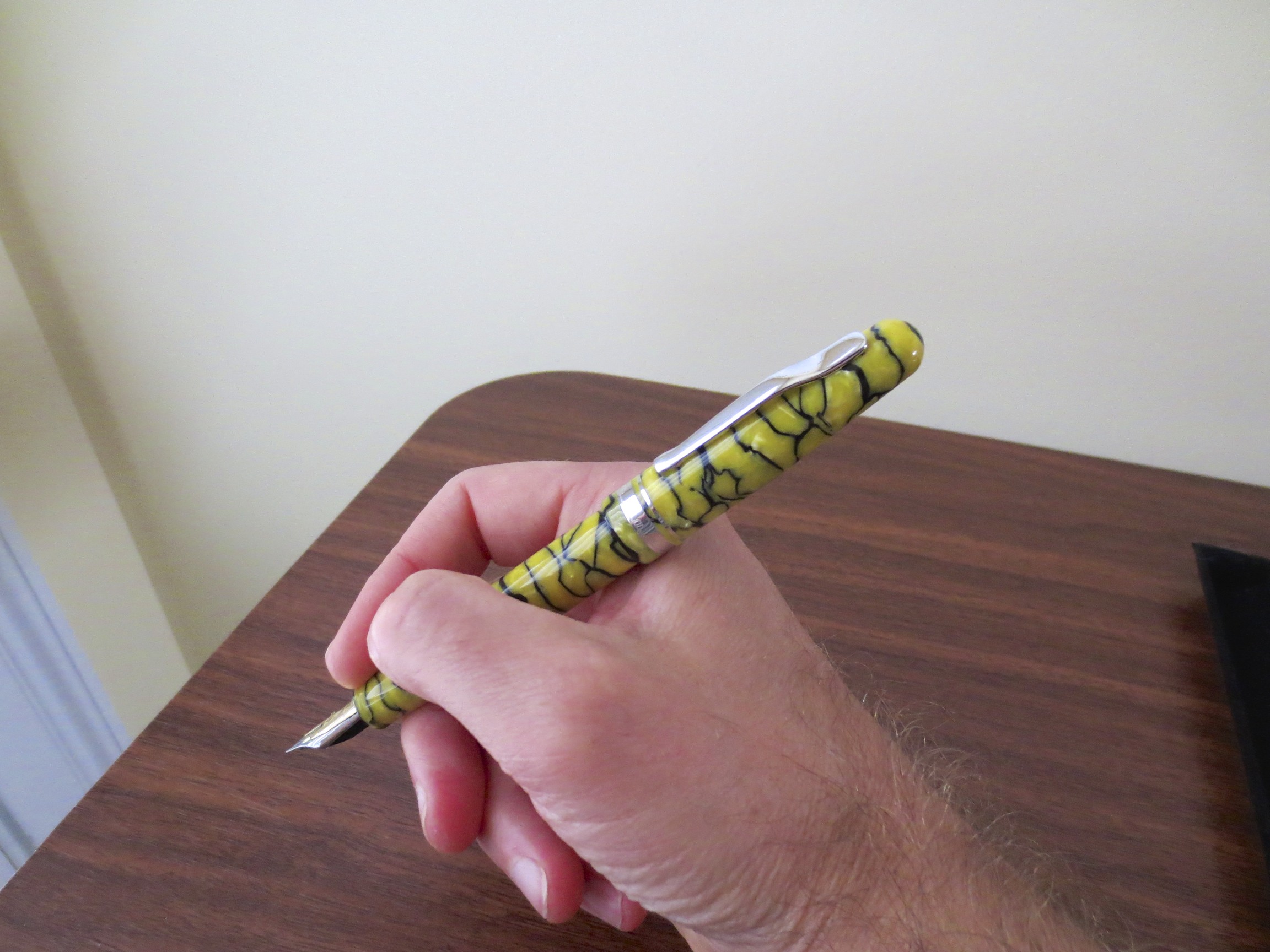
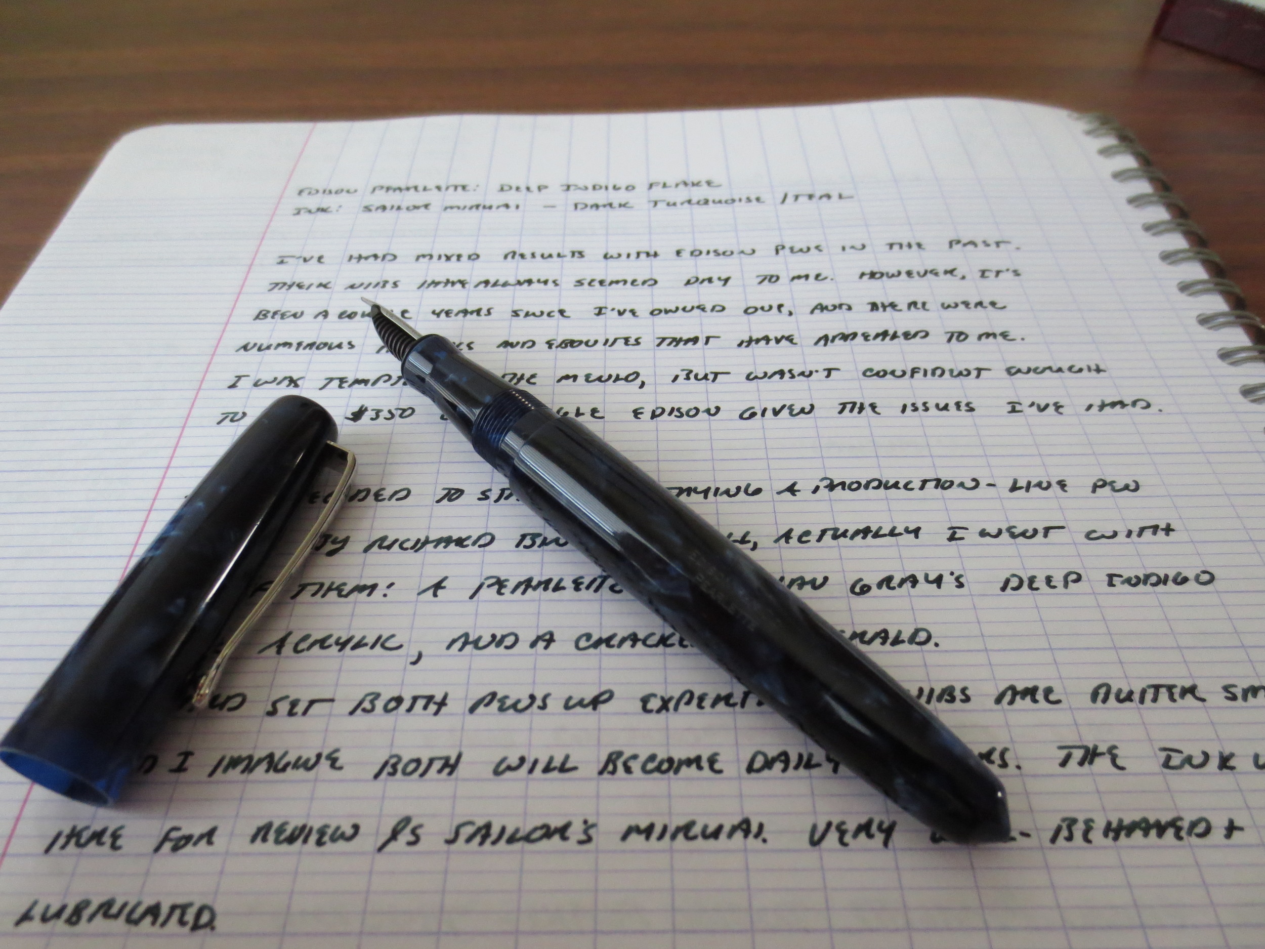
Second, my thoughts on the Delta's "Fusion" nib generally: Overall, it's an excellent steel nib. The nibs are exceptionally smooth, and are paired with a good feed that supply adequate ink flow. I probably would not, however, pay a premium for this nib alone. The approximately $236 for the standard acrylic Fusion 82 is a very steep price for what is, essentially, a steel nib pen, absent any compelling explanation (which I have yet to see) as to how the Fusion "technology" works. As I mentioned in my previous review, however, I justified the purchase price of these pens on the basis of the celluloid material, not the nibs, although I'm happy that the nibs are more than functional functional and don't detract from the pens at all.

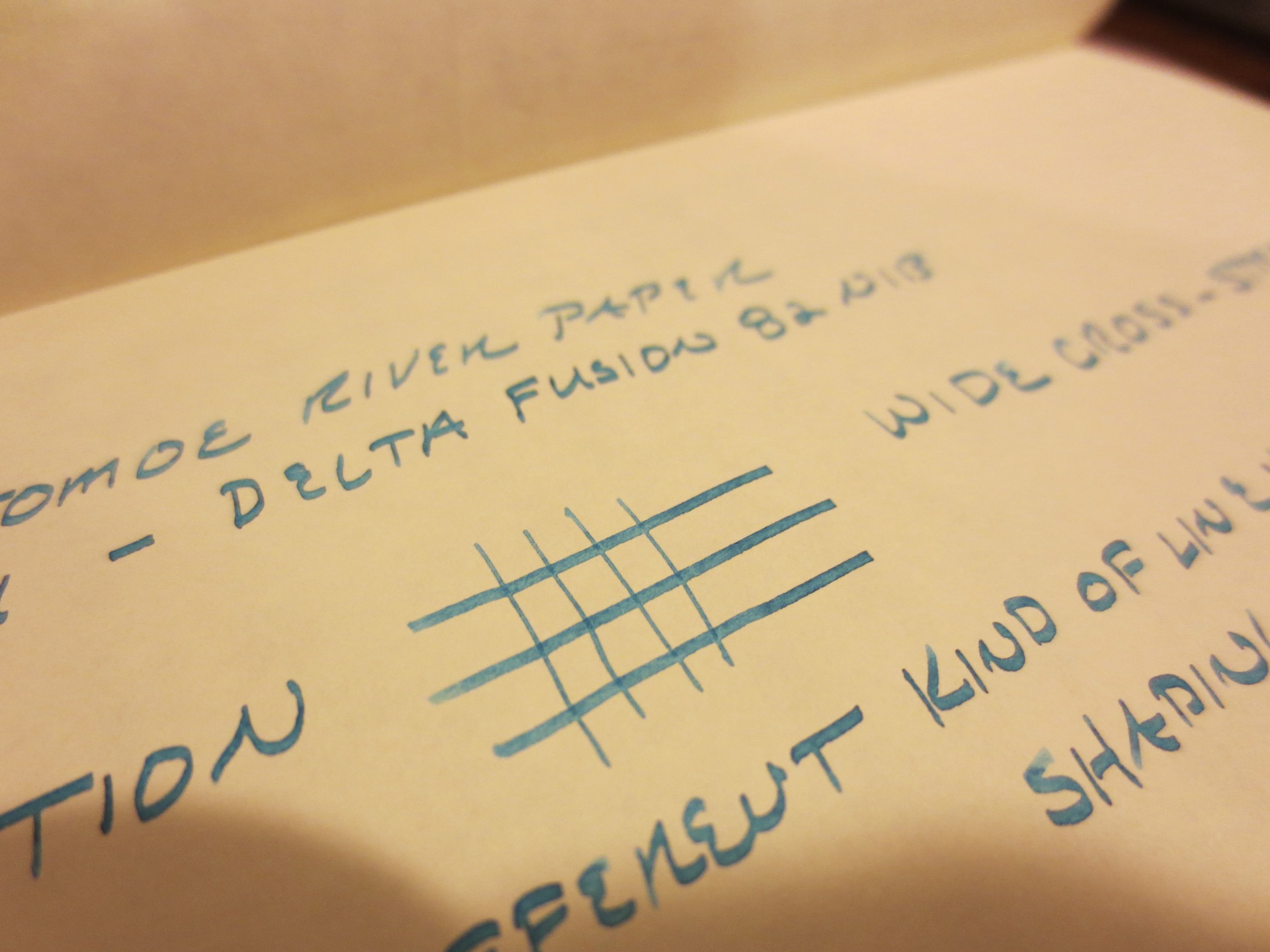
Handwritten review on Exacompta card stock. The top writing sample is the Hebrew Italic in Sailor Yama-Dori (a little light because I had just cleaned the pen and there was some water in the feed); the bottom sample is Sailor Souten in the standard Delta Fusion medium nib. Note the ability to flip the Hebrew Italic and write with an ultra fine point.