As I announced yesterday, The Gentleman Stationer is giving away a Pilot Metropolitan in honor of Fountain Pen Day, courtesy of Jetpens. I announced the giveaway first to ensure that anyone interested had a full week to participate, even though I haven't gotten around to posting my actual review of the Pilot Metro until now.
This is the Pilot Metropolitan that The Gentleman Stationer is giving away in honor of Fountain Pen Day. See yesterday's post for details!
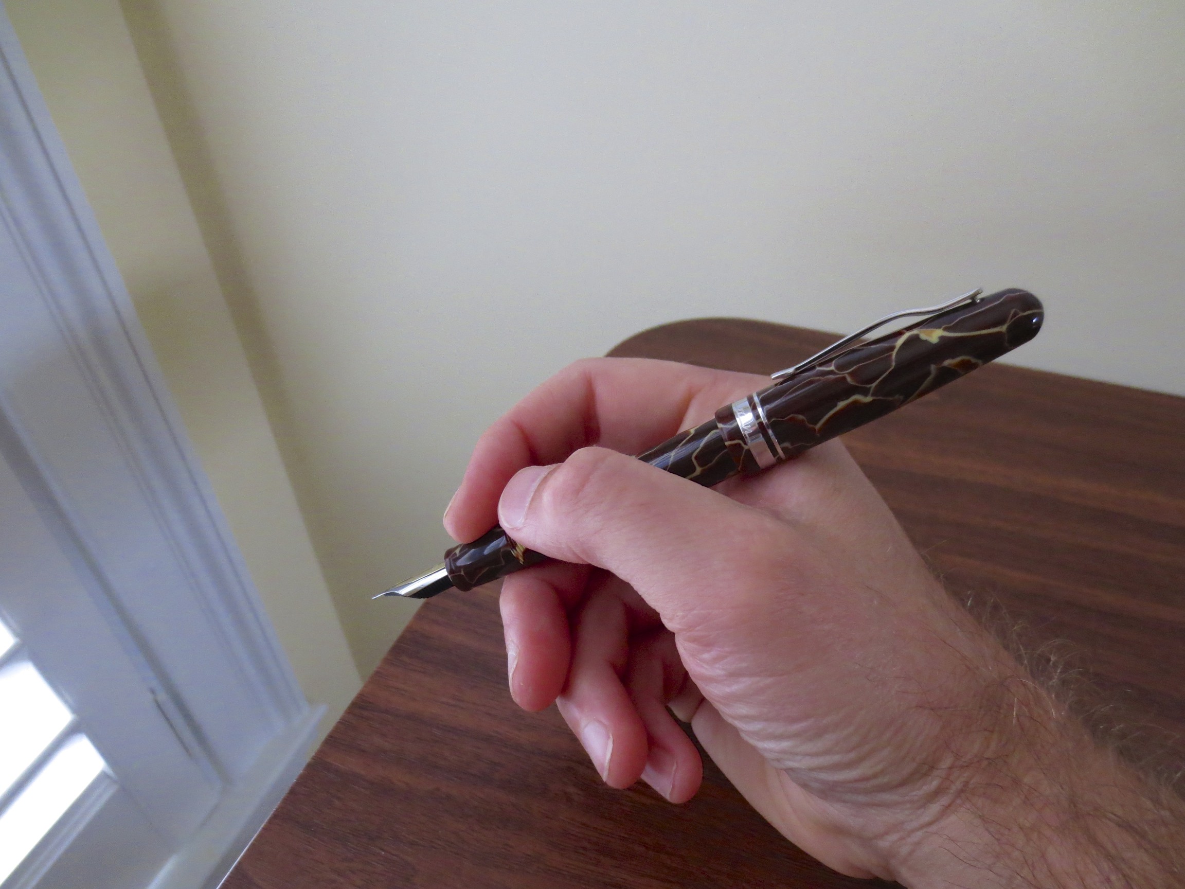
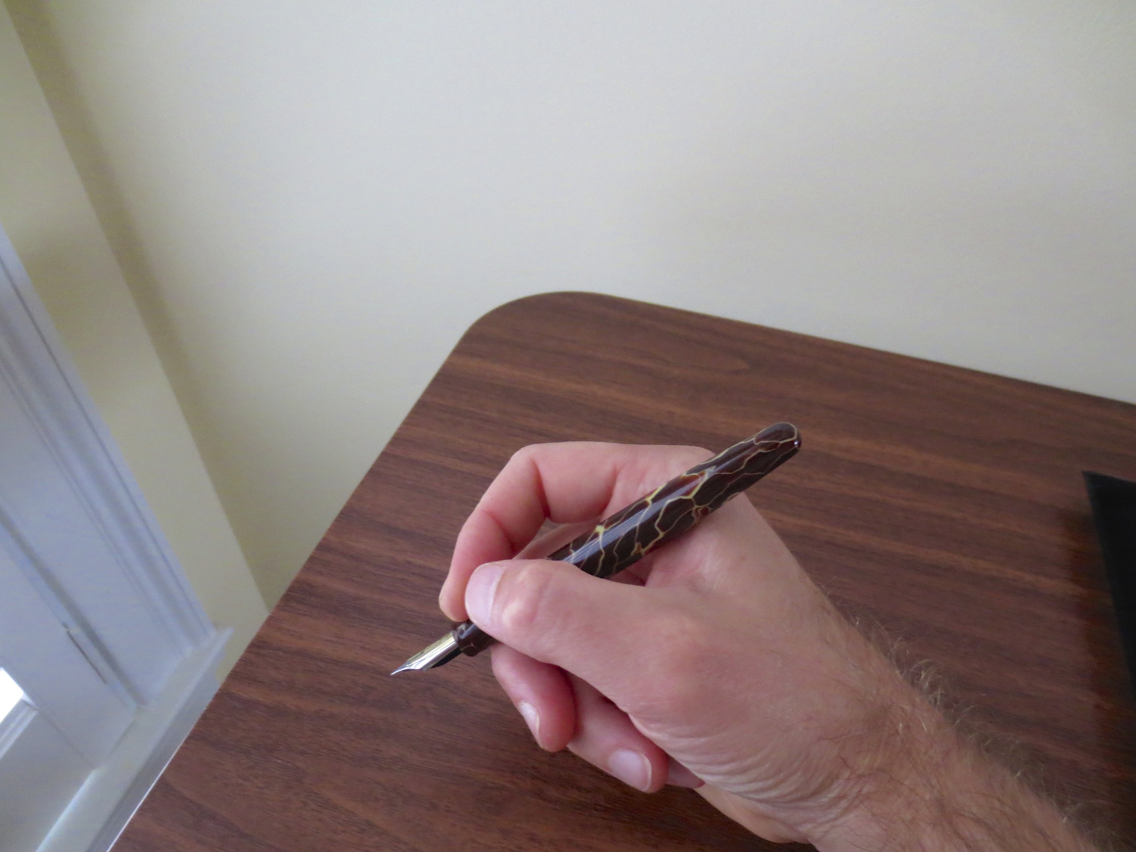
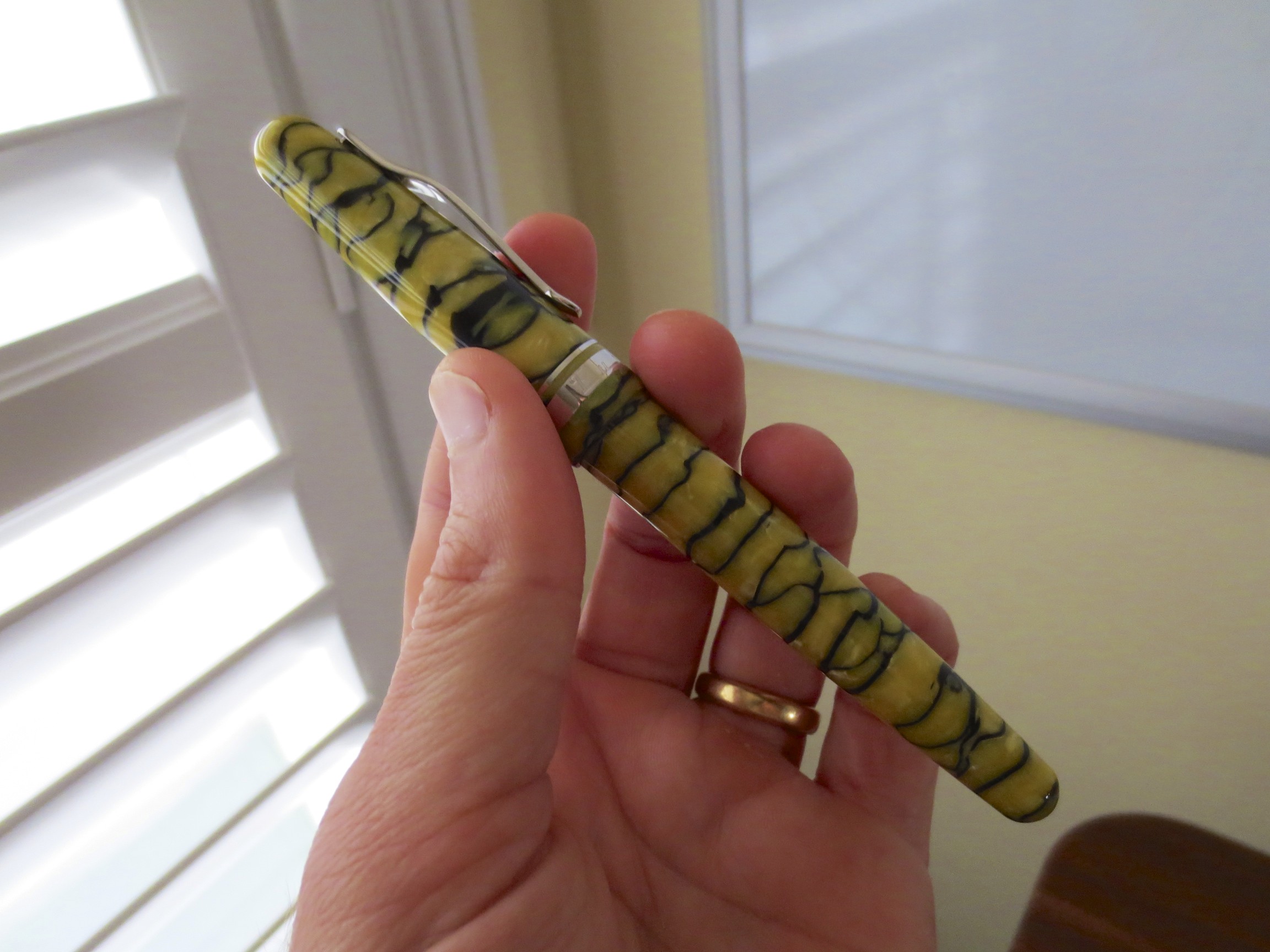
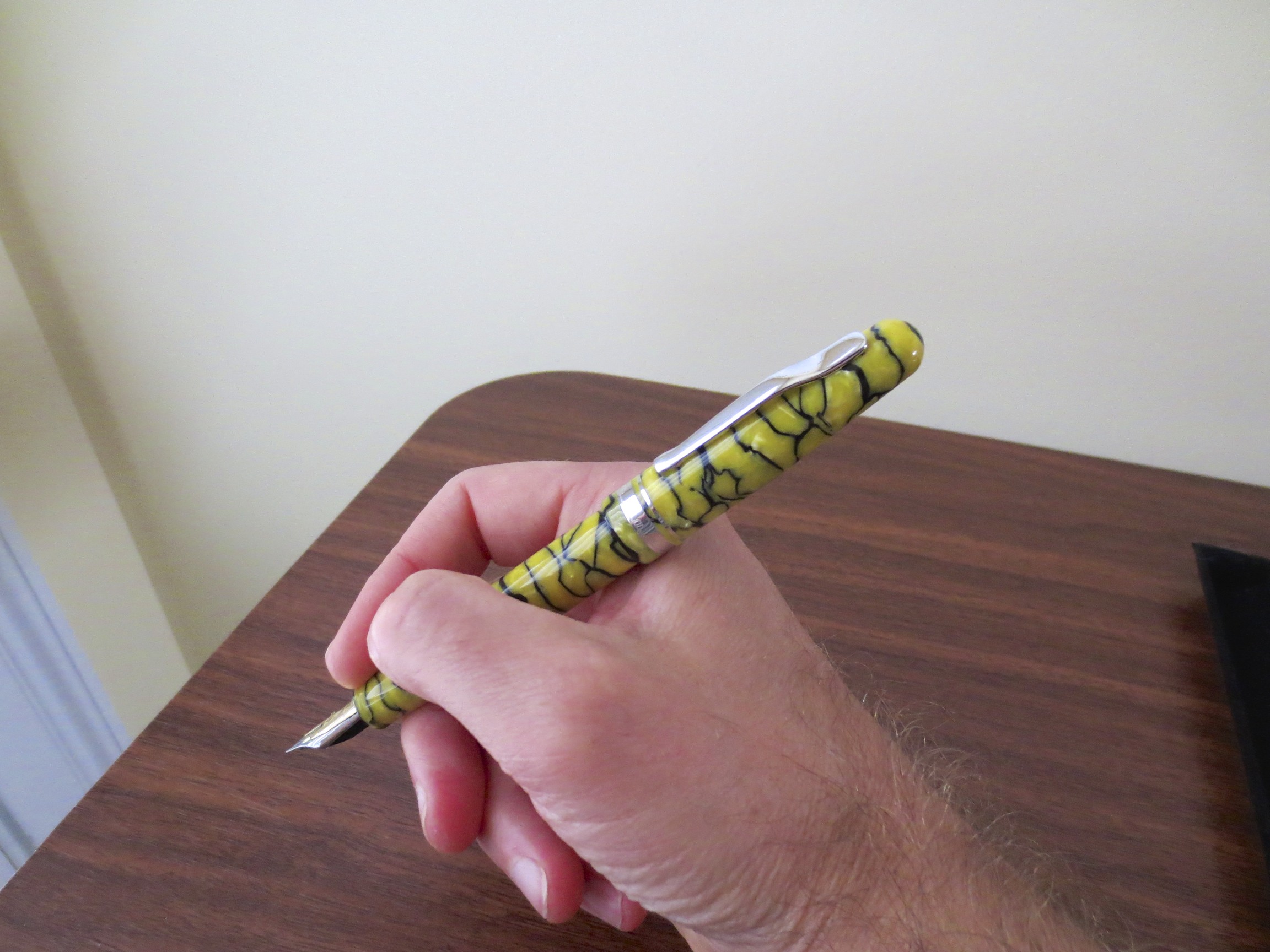
The Pilot Metropolitan is an excellent pen and I'm not sure I can sing its praises enough. It's not that the pen doesn't have shortcomings--it does. The grip section has a somewhat awkward "step-down" from the barrel to the section that can cause problems for those who grip their pens high. From an aesthetic perspective, some of the new "animal print" patterns (purple leopard print?) are a little out there. But at the end of the day, I believe this is the single best entry level pen on the market, and one of the best workhorse "daily user" pens available. I spent this past week using the Metropolitan (plain silver, fine point) exclusively. Here are my thoughts.
Entry Level Fountain Pens
I bought my first fountain pen when I was living in France in 2000-2001. I was a university student at the Sciences-Po in Strasbourg, and the only one in all of my lectures who was writing with a rollerball (a Pilot V5, my then pen of choice). After a week or so of watching my new classmates write elegant cursive on their Seyes-lined paper and change their ink cartridges to switch back and forth between ink colors I had never seen, I was intrigued enough to stop by the stationery store on my way back to my apartment and pick up three student-grade fountain pens and what must have been a half gallon plastic bag of generic blue-black ink cartridges. I no longer have any of those pens, but I'm pretty sure they were a Waterman Kultur, a Sheaffer No-Nonsense, and a generic Stypen. With the lone exception of the Kultur, these pens were horrible writers, with dry, scratchy nibs and flow issues. The Stypen leaked and ruined at least two pairs of pants. But I was hooked.
I mention this story because I probably spent twice the price of a Pilot Metropolitan on those three cheaply made pens, only one of which worked *reasonably* well, and none of which I ever could have used in the professional environment I work in today. It's possible that if the Metropolitan had been available, and I had bought that pen as a student, I would still be using the same pen today, and I certainly would have been spared five years of rotating through handfuls of cheap fountain pens looking for something that was halfway reliable and wouldn't break the bank. I also can't help but think that if I caught the fountain pen bug using the "first pens" I had available to me, how many people might be converted if they had the opportunity to test the waters of the fountain pen world with an attractive, reliable pen like this one.
Build
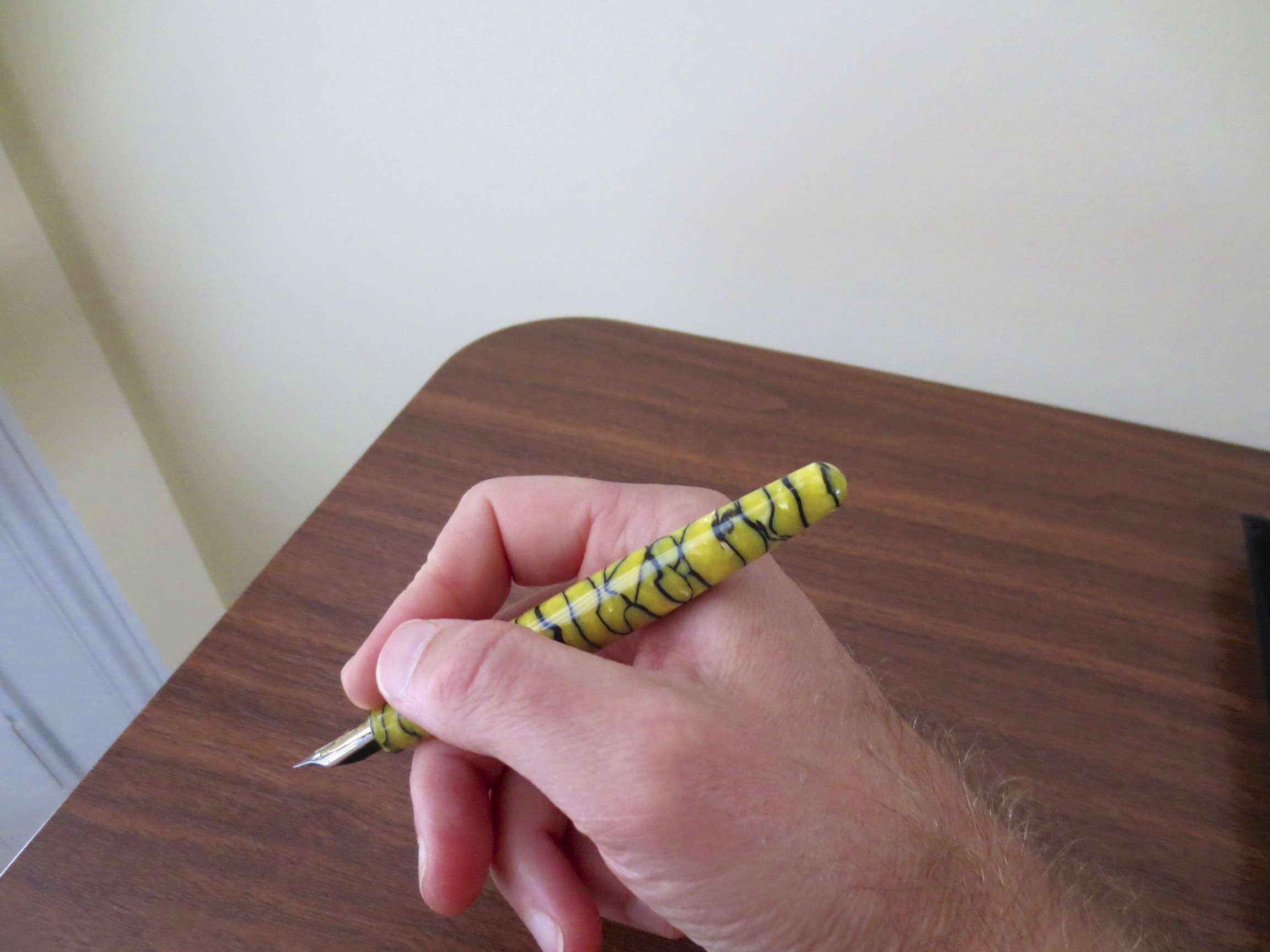
This pen is a workhorse. I have two Metropolitans in my collection: a plain black pen with a medium nib, and a plain silver pen with a fine nib. While the medium is probably my favorite for everyday writing, I broke out the fine this week for review purposes.
The Pilot Metropolitan is a classic-looking pen that performs well as a daily user.
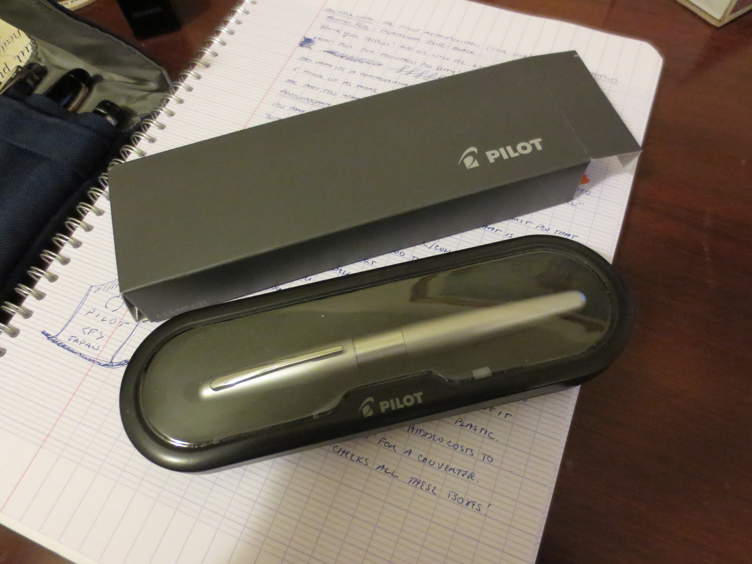
The body of the pen is predominantly plastic, but it has some heft to it, so I suspect there is a brass weight in the barrel. The plastic is thick and not brittle, unlike some pens billed as "beginner" or "entry level" fountain pens. It feels sturdy. It also doesn't scratch easily. I've tossed these things into various bags, pockets with keys, car glove boxes, etc. and they still look good as new. The clip is nothing special: It's not spring loaded, but it's tight, and the pen definitely stays clipped to wherever you keep it stored. Finally--my favorite part--the cap is a "click" or "slip" cap that pops on and off with a satisfying "thunk" and stays on, with no wiggle.
The converter that ships with the Metropolitan is nothing fancy, but at least you don't get stuck paying an extra $5 for the privilege of filling from the bottle (which is supposed to be economical).
The Metropolitan is a cartridge/converter pen that ships with a converter installed. The converter is pretty basic: it's a low-end squeeze converter that's nothing fancy but gets the job done. I believe it's the same one that ships with the Pilot Parallel calligraphy pens. The pen also comes with a single cartridge of Pilot Blue or Blue-Black Ink (I can't tell by looking at it, and I haven't used it). Like most Japanese companies, Pilot's cartridges are proprietary, so be warned that if you want to use cartridges to refill this pen you can't use the standard international model.
Design
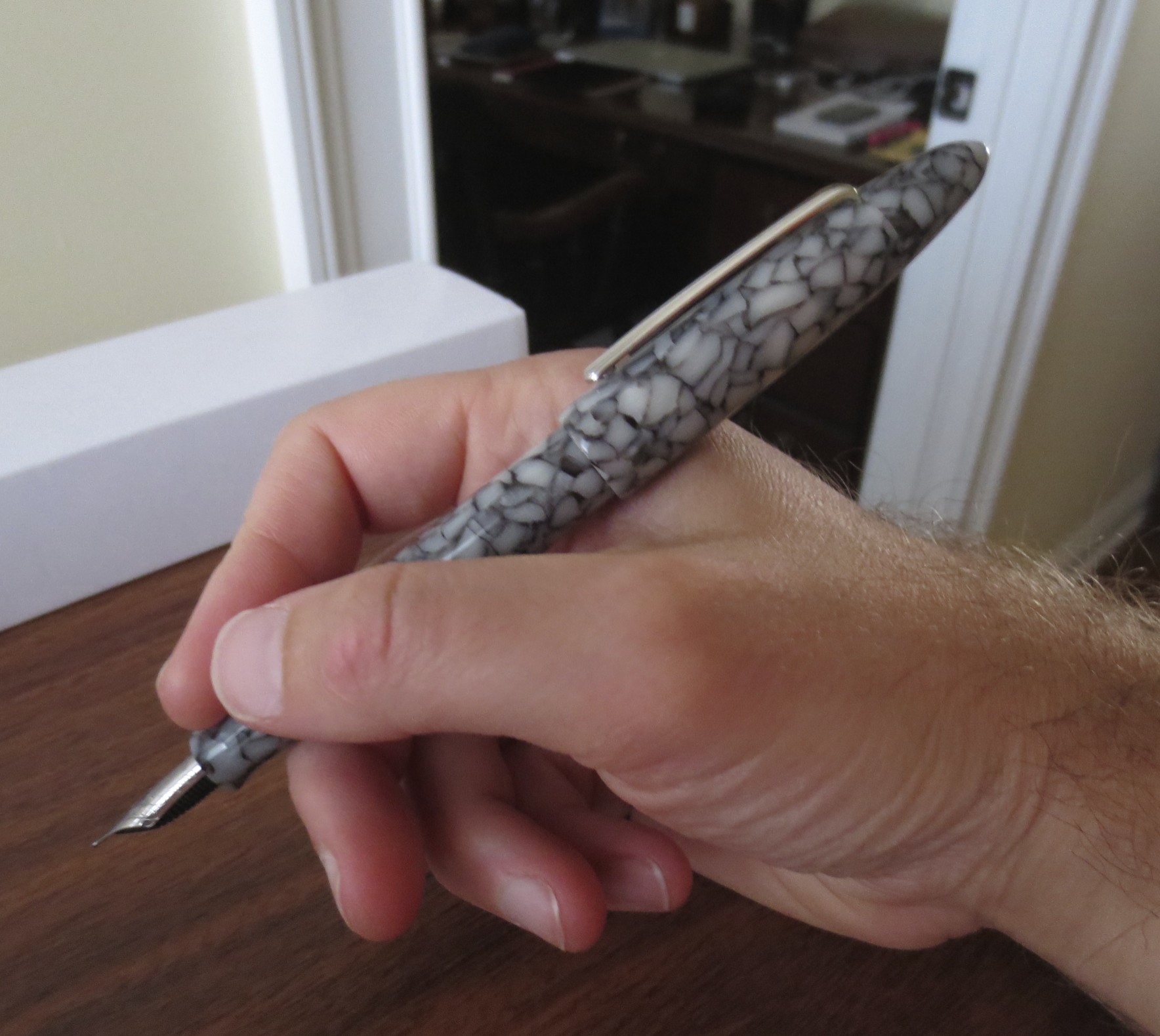
The Metropolitan sports a classic streamlined design. In its most basic color scheme (i.e., those not involving animal print), it's a pen that won't turn heads at the office, for those of you (like me) who get tired of eye rolls whenever you break out something that doesn't resemble the G2 or Sarasa or Jotter or whatever other "nice pen" your coworkers are carrying.
The Nib
Translucent Pilot feed.
The Metropolitan uses the same nib as the Prera and other midrange Pilot pens.
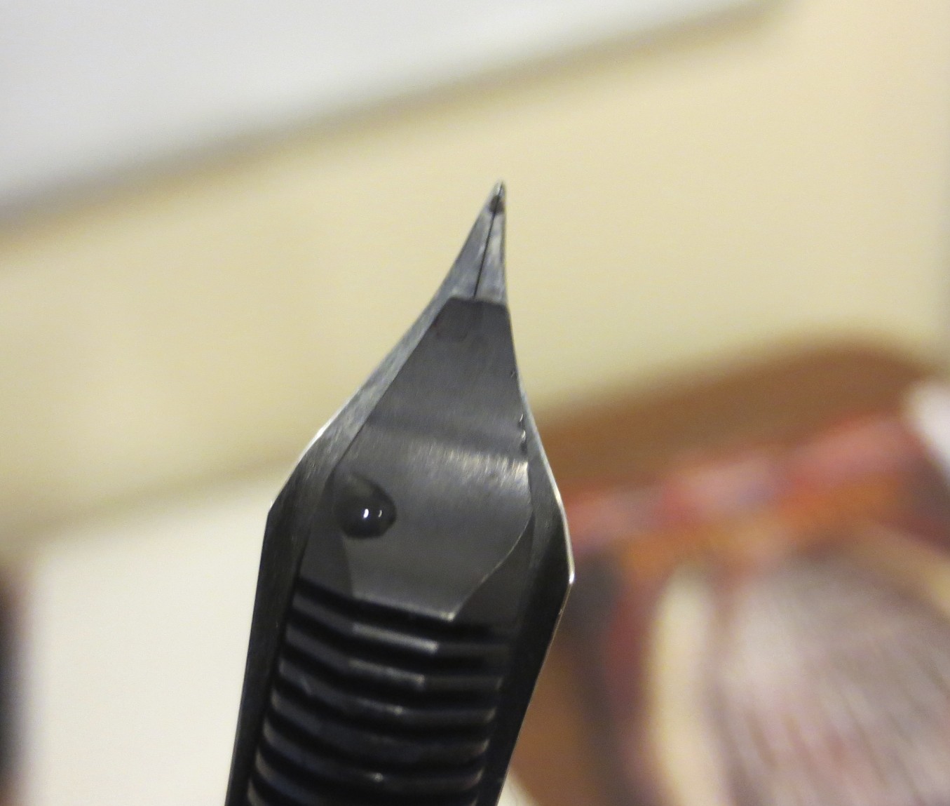
Unlike many (if not most) pens at this price point, the Metropolitan sports a smooth stainless steel nib that has none of the scratch first-time fountain pen users sometimes complain about. The nibs on the two Metros I have are actually smoother than many gold nibs I own. They are stiff as nails--don't be expecting any flex or significant line variation--but these pens aren't intended to write Copperplate or Spencerian. I've heard the nibs are swappable with the Prera and other mid-range Pilot pens, but I have no experience doing that and can't recommend it one way or another.
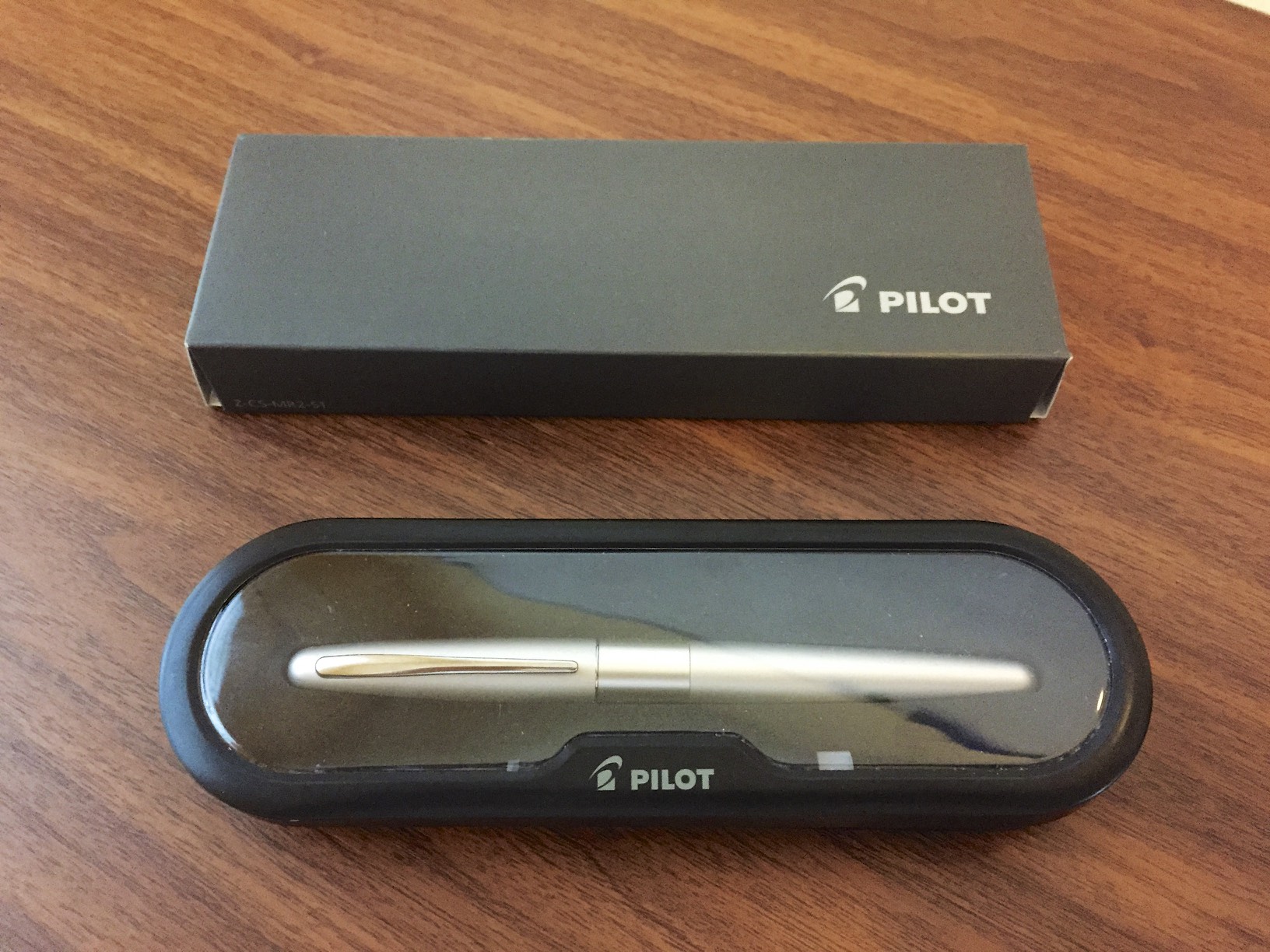
Packaging and Price Point
Considering the Metropolitan is priced at a whopping $15.00, the packaging on the Metropolitan easily exceeds its competition. It comes in a fairly nice clamshell box enclosed in a cardboard sleeve. Definitely more than I would expect, considering that the Pilot G2 Pro is only slightly less expensive and doesn't come in a box at all. But moving back to the price point: $15.00. I'm not sure there is anything on the market that even approaches a pen of this quality for $15.00. Some people will say that you can get a Jinhao or another Chinese pen for $5 or whatever on Ebay, and, yes, it's possible that if you take that leap of faith you might receive a pen that writes as well as a Metropolitan, but the consistency won't be there. I've bought those very cheap pens before, and for every excellent writer there are five that won't work at all and are a complete waste of money. (Do the math: buy 6 pens to get one decent writer = 6 x $5.00 per pen = $30.00). Save yourself the headache, buy the Metropolitan and you're sure to get something that writes, and writes well.
DISCLAIMER: While the pen that I used to write this review comes from my own personal collection, JetPens is providing the Metropolitan for the Fountain Pen Day Giveaway free of charge. If you aren't lucky in the giveaway, Jetpens currently has the Metropolitan listed for $14.50 (plain black, fine nib), which is the best pricing I've seen on the pen. (LINK HERE) And if you spend $25 or more you get free shipping!
Handwritten review. The ink is Platinum Blue-Black, and the paper is Clairefontaine French-ruled.