• Blog
  • Shop
  • Resources
  • FAQ (Ask TGS)
  • About
  • Archive
  • Contact
  • Sign In My Account
Menu

The Gentleman Stationer

Vintage Living in the Modern World.
  • Blog
  • Shop
  • Resources
  • FAQ (Ask TGS)
  • About
  • Archive
  • Contact
  • Sign In My Account

The Lamy Safari comes packaged in a simple, yet well designed, cardboard sleeve.  

Basic Black: One Week with the Lamy Safari

February 13, 2015

Lamy's Safari line is a go-to recommendation for a "first fountain pen."  Many people, like me, come to Safaris later, after they have been using (much more expensive) fountain pens for a while, only to realize that the Safari is a flat-out good pen, irrespective of its price range.  If you don't have one in your rotation, you should reconsider, provided the design works for you.  

Design and Build

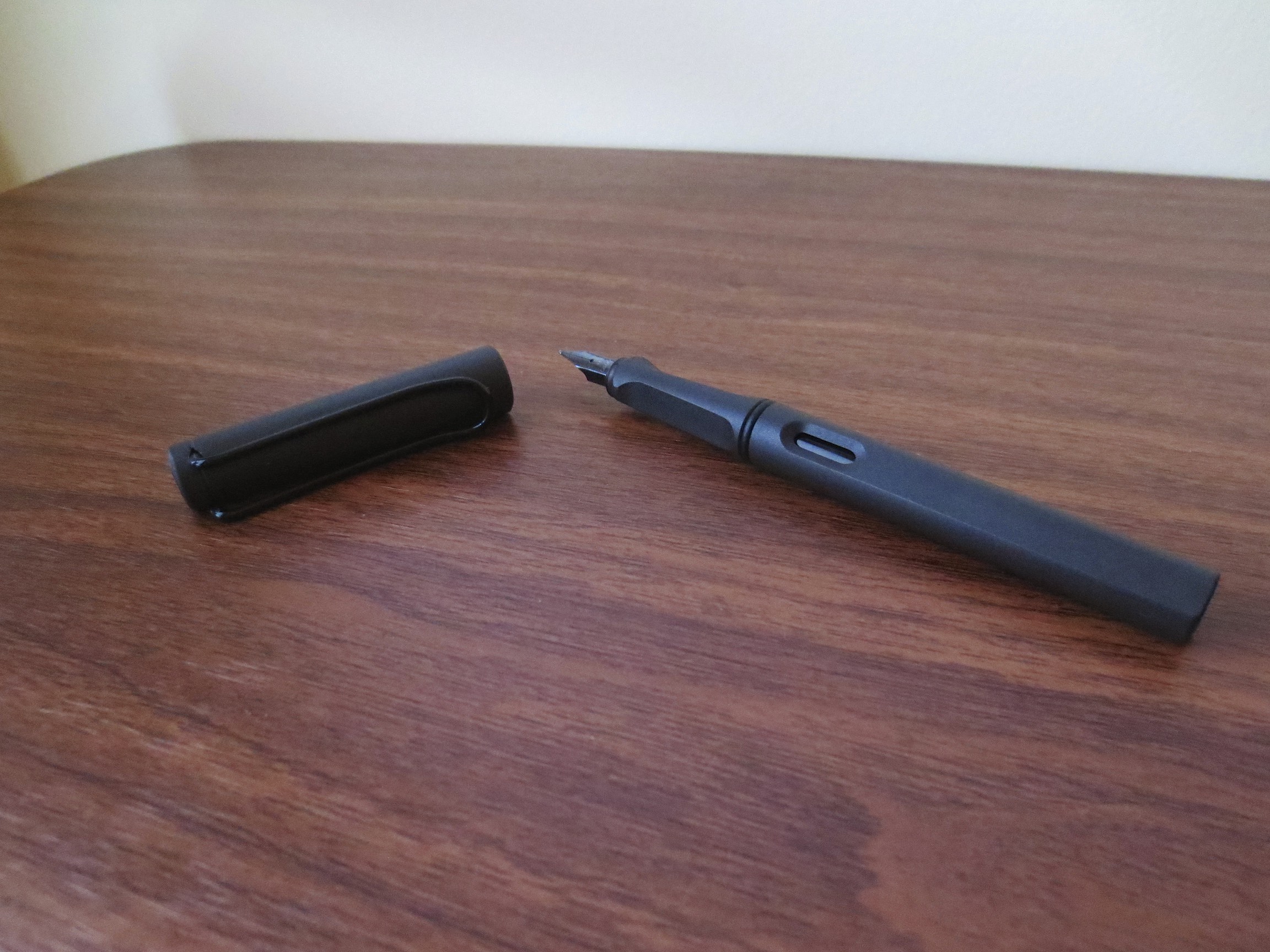
Like the Lamy 2000 (perhaps my favorite fountain pen of all time), the Safari sports an iconic design.  Also like the Lamy 2000, the Safari has remained largely unchanged since its debut in 1980.  The pen is relatively rugged, made of injection-molded plastic, and will hold up to pretty robust pocket carry and daily use.  It's earned a reputation as a good daily user; a "knockabout" fountain pen for those who are hesitant to tote their more expensive pens around town with them.  The Safari also comes in numerous colors, including matte charcoal (pictured), shiny black, red, blue, white, and yellow, along with various "limited edition" colors that change annually.  This year's L.E. Safari is neon coral; last year's was neon yellow.  

Profile shot of the Safari.  You can see how the sides of the triangular section are flat, forming a ridge along the top.  

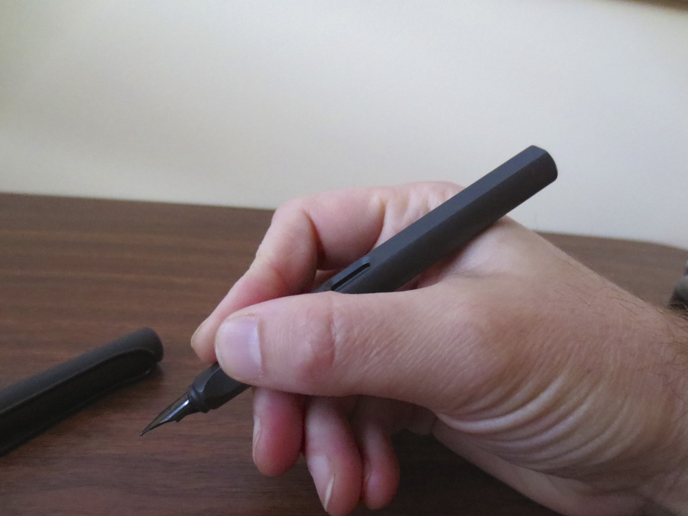
The Safari sports a characteristic triangular grip section, which is either loved or hated by users. Frankly speaking, your opinion of the grip section will either make or break this pen for you.  I don't mind, because I apparently grip my pen in a manner that is "Lamy-compatible," but I know several people who simply can't use this pen because the section hurts their fingers.  At the $30 price point, the Safari is not going to break the bank if the purchase doesn't work out, but this may be a "try-before-you-buy" purchase if you have never held a Safari or an Al-Star (the slightly larger, more expensive aluminum version of the Safari).  Fortunately, Safaris are relatively easy to find.  For example, in my area, a local luggage store that carries a very limited pen selection stocks Safaris.   

How I hold the pen, which is fairly comfortable.  Yes, the nib on the Charcoal Safari is black! 

Finally, the Safari is a cartridge/converter pen.  The pen comes with a single cartridge of Lamy blue ink, but a converter must be purchased separately for a few dollars more. 

Nibs  

The Safari uses Lamy's interchangeable nibs that also fit other Lamy pens, including the Al-Star, the Vista (basically, a clear Safari demonstrator), and the Studio.  All Safaris come with stainless steel nibs, but if you're inspired to trick out this pen I imagine that the gold nibs featured on some of the more expensive Studio models would also fit the Safari. 

There's no need to spend that extra money, however, because for the most part, Lamy's Steel nibs are perfectly satisfactory.  I've had the best luck with the medium nibs, which write a traditional "western medium" line.  The fine and extra-fine nibs can be scratchy, and sometimes I can barely tell a difference between them.  If you are interested in trying italic nibs, Lamy offers 1.1 and 1.5 mm options, and they are very good for the price point.   

Takeaways

So is a Safari right for you?  If you are considering one, here are the main questions to ask yourself: 

  • Is the triangular grip section going to bother you?  If you think that it might, and "grip guides" on pens and pencils haven't worked for you in the past, I would try to find a Safari to test out before you place an order. 
  • Do you mind having a "funky looking" pen?  With it's grip section and oversized cap and clip, the Safari is "unique" looking, to say the least. You will get questions about this pen, and people will want to use it.  
  • Are you worried you will be tempted to buy more than one?  Here's what I find to be the main issue--because Safaris (and AL-Stars as well) are not very expensive, the siren song of the "limited edition" becomes very hard to resist.  This year's limited edition AL-Star in Copper Orange is already on its way to me. 

But once these issue are resolved, get a Safari.  It's a great pen.  It's also one that I have owned once before, sold to finance another purchase, and immediately regretted letting go.  I'm glad this one's back in my pen case. 

Ink Used in this Review 

Lamy's iconic ink bottle with the blotter paper holder in the base. 

The ink that I used to review this pen was Lamy black.  Lamy black gets very little "press" on the pen blog circuit, probably because it's one of the most utilitarian inks out there.  It does, however, flow extremely well and shades to some degree.  While many people don't find shading desirable in a black ink, Lamy black has some additional character, meaning that it has some deeper green/purple undertones.  I've also enjoyed the bottle, which comes with a roll of blotter paper that you tear off and use to wipe the nib after you fill the pen.  The ink has worked well on most paper that I've used over the past week, and especially in my Baron Fig notebook that has become my daily companion.   

Lamy Ink Bottle, deconstructed. 

This pen and bottle of ink was provided to me for review purposes at no charge by Ron at PenChalet.  PenChalet carries a wide variety of Lamy prducts, including the 2000, the Safari, the AL Star, and others.  Their prices are always extremely competitive, and they stand behind the quality of what they sell. 
View fullsize IMG_1154.jpg
View fullsize IMG_1155.jpg
View fullsize IMG_0404.jpg
In Pens Tags Pen Review, Lamy Ink, Lamy Safari, Lamy Pens, Black Pen Society, Black Ink
10 Comments

The Pelikan M600 Souverain:  The lesser-loved, highly practical mid-size sedan of the Souverain line. 

Pelikan M600 Souverain: The Right Choice?

February 3, 2015

Here’s one pen review I’ve been sitting on for the past two years, and I’m just now comfortable putting it out there.  Neither the pen nor the review is particularly complex or controversial, but for some reason I really wanted to get this one right.  

I purchased the red/black striated Pelikan M600 from Richard Binder at the 2013 Baltimore Pen Show.  While it wasn’t the most expensive pen that I had purchased to date, it was definitely the purchase I had thought the most about prior to pulling the trigger.  The reason?  I was torn between the M600 and the M800/M1000s that nearly everyone was urging me to buy.  So, how did things turn out?  I made the right choice, for me at least.  

Build Quality

Every Pelikan I’ve owned or written with is built like a tank, and the M600 is no exception.  These are high quality German pens, and are designed to last.  This pen has seen heavy use over the past two years, yet the action on the piston remains smooth, with no sticking or loosening of the blind cap over time.  My pen has no visible flaws on the body or the trim, other than some minor micro-scratches that I consider normal wear and tear. 

The cap band is engraved with "Souverain," and the material has a sparkling quality to it.  It doesn't photograph very well in my current lighting, but where the barrel meets the section the pen is translucent, allowing you to view the current ink capacity. 

My pen is in the classic striated material (either celluloid or resin, which one I'm not sure).   I chose the red/black version, my all-time favorite color combination.  Solid black, green striated, and blue striated are also available, along with some special editions that pop up from time to time, like this gorgeous white tortoise version Azizah from Gourmet Pens reviewed (in the M400 size).  I normally keep this pen loaded with a dark red or burgundy ink.  

Nib

The M600 sports a 14K nib that can easily be modified to add flex.  Both Richard Binder and John Mottishaw offer this option.  I have the standard EF nib, which I wouldn’t characterize as “flexy,” but it’s definitely soft.  The nib is engraved with scrollwork and the classic Pelikan logo.  One note on Pelikan nibs:  they tend to run very, very wide.  Prior to Richard Binder tuning this nib, the EF nib ran more like a typical western fine, or even a Japanese medium.  Richard ground it down to more of a “true EF,” but you’re still not going to get .3mm lines out of this nib.  Per my preference, he set the nib to write moderately wet, with the slightest hint of feedback.       

View fullsize IMG_1112.jpg
View fullsize IMG_1104.JPG
View fullsize IMG_1105.jpg

Packaging  

I save most of my pen boxes, but I’m not one of those people who pays a ton of attention to packaging.  Most of the time the box ends up in the closet, where it stays indefinitely (unless I sell or trade the pen).  The M600 comes in a nice Pelikan presentation box, very dignified without being overly ostentatious.  The box includes a faux-white leather pen wrap/envelope, which is nice (I suppose), although I've never used it and probably never will.  (White leather is an impractical carry for things that hold ink.)  Pelikan could up its game by offering its Souverain line with a bottle of ink in lieu of the "penvelope."  It's not uncommon, once you get into the $250+ price range, for a pen company to offer a free bottle, especially if the pen is a piston-filler.  I’m surprised that Pelikan hasn’t seized on the opportunity to market its “luxury” Edelstein line of ink by packaging it with its pens.  Recently, some retailers have taken it upon themselves to throw in a bottle of Edelstein with your purchase.  Check for deals!       

View fullsize IMG_1098.jpg
View fullsize IMG_1101.jpg

Takeaways

“You’ll regret buying the M600 later. Spend the extra $150 or so and get the M800.  You’ll definitely want more pen.”  I can’t tell you how many times I heard this from pen show attendees (and not necessarily vendors who were trying to sell me the more expensive model).  So were they right?  Let’s find out.

I’m glad I went with the M600.  While I still expect to add both a M800 and a M1000 to my collection eventually, those have been pushed way down the wish list.  If you’re thinking about buying your first high-end Pelikan (and by “high-end,” I mean $250 plus), and are debating between the M400/M600/M800/M1000 lines, here are a few things to consider: 

  • The M600 is very light, posts well, and fits perfectly in a shirt pocket.  It’s a great daily writer and a workhorse.  I found the M400 slightly too small for my hand.  The M600 was a better fit.  For an illustration of the size of the M600, see the gallery below.         
  • The M800 is a large, heavy pen.  I don’t find that it fits easily into a normal shirt or jacket pocket, and it’s very long and top heavy when posted.  The same thing goes for the M1000.  I don’t know of anyone who posts the latter.  
  • The 14K nib on the M600 is much softer than the nib on the M800, which I found stiff.  On the larger end of the spectrum, however, the M1000 nib is very soft and provides decent line variation.
  • The M600 nib units are interchangeable with the M400 and, I believe with the M205.  If you have other compatible Pelikans, you will get decent mileage out of any additional nib units you buy, which can mean serious savings (especially if the nibs have been modified or customized by a nibmeister).  The M800 nibs units are only interchangeable within the M800 line; likewise for the M1000 nib units. 
  • All of the pens in the Pelikan Souverain series are piston fillers with good ink capacity.  I’ve not measured the ink capacity of the M600, but one fill gets me through two or three days of writing with this pen exclusively, and if I’m carrying more than one pen (which is most of the time), a single fill gets me through a full week.
View fullsize IMG_1107.jpg
View fullsize IMG_1108.JPG
View fullsize IMG_1102.jpg
View fullsize IMG_1114.jpg

I purchased this pen from Richard Binder, who unfortunately is no longer retailing Pelikan pens (though he does still sell and modify replacement Pelikan nibs).  Pen Chalet has excellent prices on Pelikans (the standard M600 currently retails for around $400, minus applicable discount codes). If you are looking at purchasing a Pelikan pen from a nibmeister who will tune the pen prior to shipping it to you, I would recommend visiting John Mottishaw at Classic Fountain Pens.  

For another take on this pen (with a BB nib) and a look at her drool-worthy collection of Pelikans, check out Azizah's review of the red/black M600.  

In Pens Tags Pelikan Souverain, Pelikan, Pen Review
4 Comments

Pen Review: Kaweco AC Sport

December 14, 2014

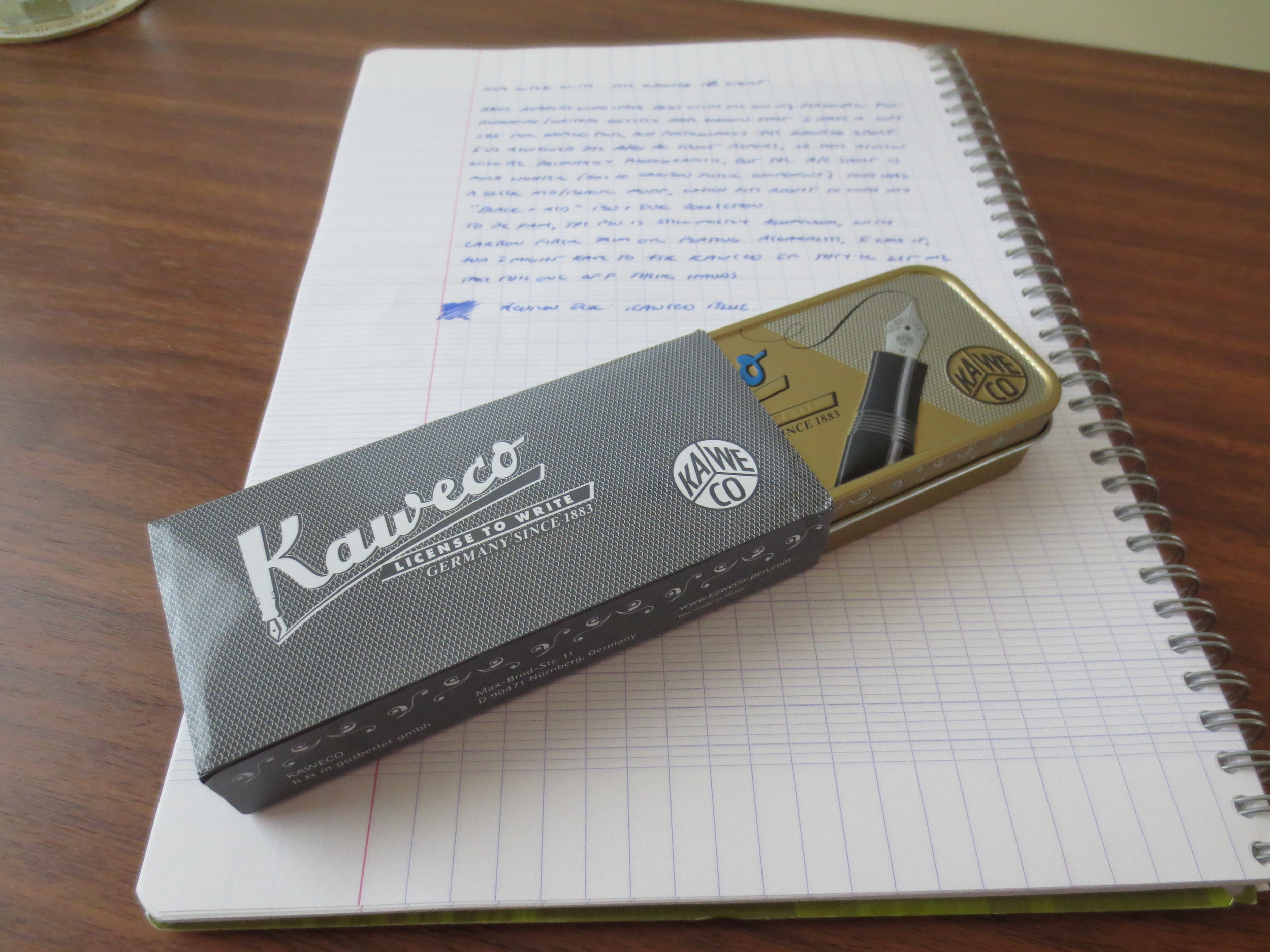
When Kaweco sent me the Dia2 for review, they also sent me a few other pens.  Included among them was the Kaweco AC Sport, which may my favorite of Kaweco’s many entries in the Sport lineup.  For starters, it comes in a deep red with black trim.  While my small-ish fountain pen collection (hey, compared to some people) remains varied, the one constant is that I like red pens and black pens, and when a pen is both red and black, I generally buy it.  This review won’t revisit the build quality, great steel nib, etc., of Kaweco's flagship line, all of which are excellent.  See my review of the AL Sport line.  Instead, I’ll talk about what makes the AC Sport special. 

A picture of the pen body, which is wrapped in carbon fiber trim.  I reviewed this pen with a medium nib, which is my go-to size for Kaweco. 

The AC Sport is different from the other Sport pens because it is Kaweco’s riff on last year’s trend of adding carbon fibre trim to fountain pens (and pricing them accordingly).  One thing that should be stated up front:  the AC Sport is not a true carbon fiber fountain pen, in the sense that the pen body is made of carbon fiber components.  A true “carbon fiber” fountain pen made out of carbon fiber costs five or six times as much as the AC Sport.  I recall seeing a few of these a couple years ago, and something tells me they didn’t sell well, because you don’t really see them anymore.  What Kaweco appears to have done is taken an AL Sport and wrapped the barrel in carbon fiber panelling or trim.  The result is more aesthetic than anything else, but I suppose that if you are really, really hard on a pen, or want to avoid the scratches to which the AL Sport is prone, you might get some more durability out of the AC Sport.  According to my scientific method of deduction (i.e., holding both pens in my hands and trying to guess which one is heavier), the AL Sport and the AC Sport weigh about the same.

View fullsize IMG_0985.JPG
View fullsize IMG_0986.JPG
View fullsize IMG_0987.JPG
View fullsize IMG_0991.JPG
View fullsize IMG_0992.JPG
View fullsize IMG_0993.JPG

So why would you buy an AC Sport priced at $122.50, when the AL Sport typically starts at $80, and the regular Kaweco Sport at $25?  Honestly, it comes down to a matter of preference and aesthetics.  When it comes to nice looking red and black pens (and the red AC Sport fits the bill), I have no self control.  From an economic standpoint, if you are looking for an extremely durable, pocketable, nice writing pen, the standard Kaweco Sport is one of the best buys on the market at $25.  There’s no practical need to spend any additional cash.  On the other hand, if you’d like something a little “fancier,” (as in, not plastic), the AL Sport can be had for a bit more, still at the sub-$100 price point.  The AC Sport is the fanciest of them all, but it is a good looking, quality pen.  Carbon fiber is not cheap, and I think the going rate for this pen is reasonable for what you get.  I plan on pairing it up with one of Kaweco’s black-plated nibs as soon as I can find one.   

You can find the AC Sport at Jetpens.  [Link Here].  In the interest of full disclosure, Kaweco provided me with this pen for review purposes.

In Pens Tags Pen Review, Kaweco, AC Sport
Comment

Pen Review: Karas Kustoms Ink Black 'n Copper

December 7, 2014

Before I got this pen into my hands, I didn’t know whether or not I would like the Karas Kustoms Ink.  I love their machined rollerball/gel pen bodies, such as the Retrakt, the Bolt, and the Render K, but I wasn’t sure how the machined pen concept would translate to a fountain pen, which is much more sensitive to issues such as balance and weight.  Also, I’ve had difficulties in the past with metal sections.  I shouldn’t have worried. 

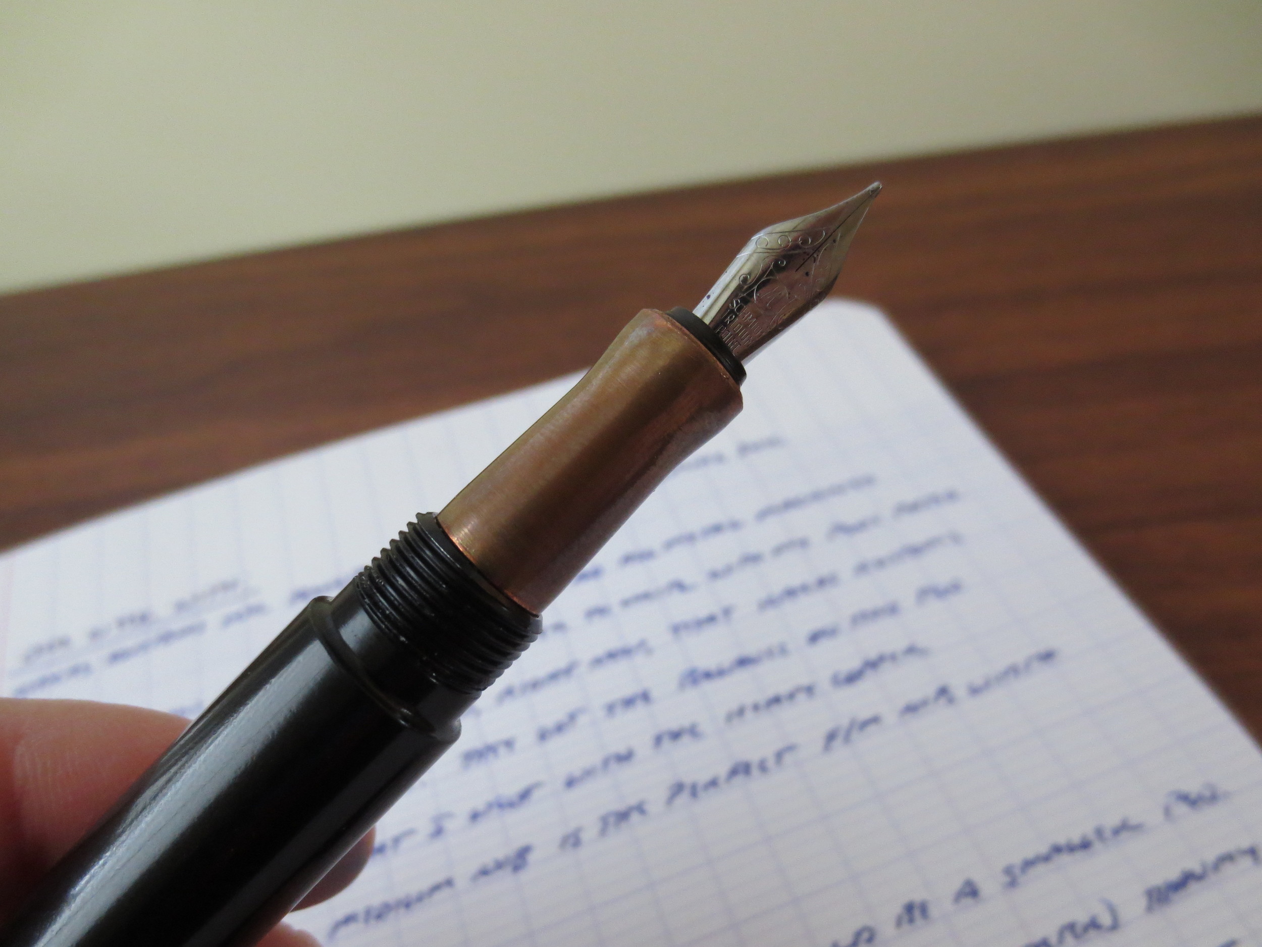
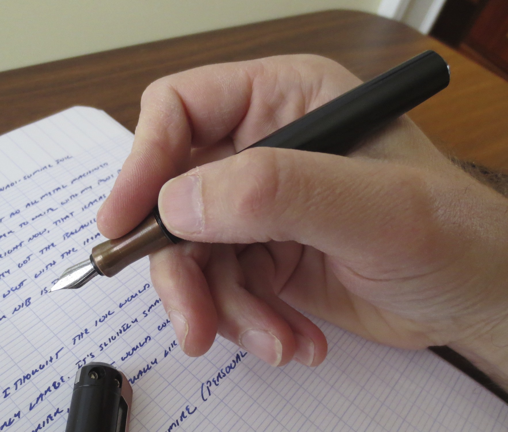
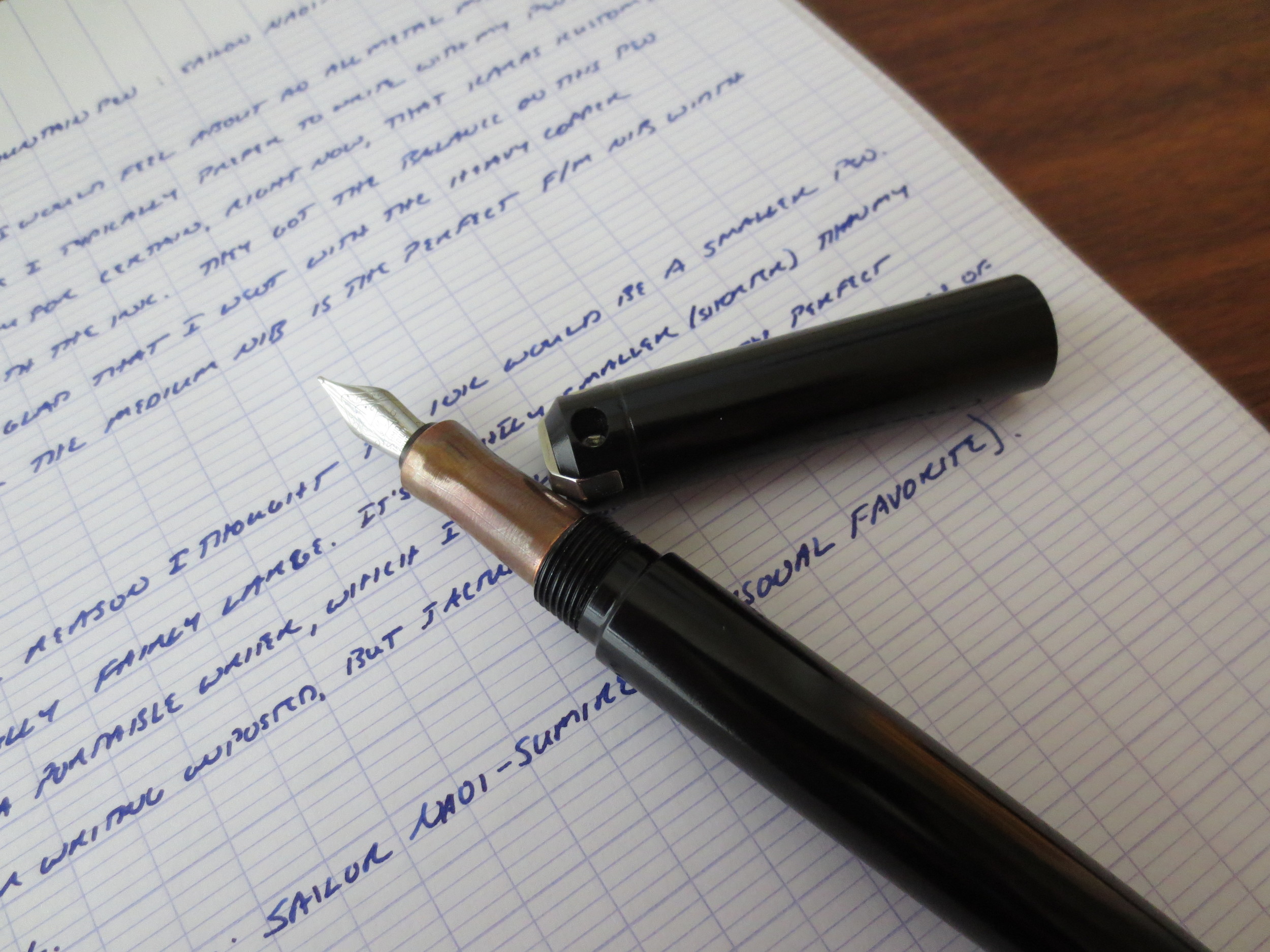
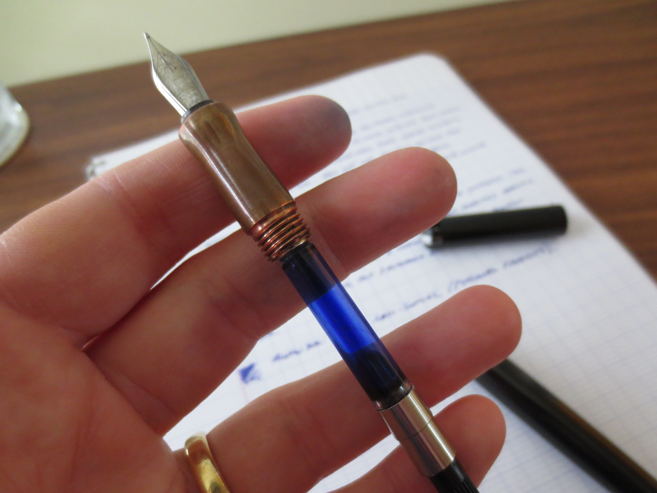
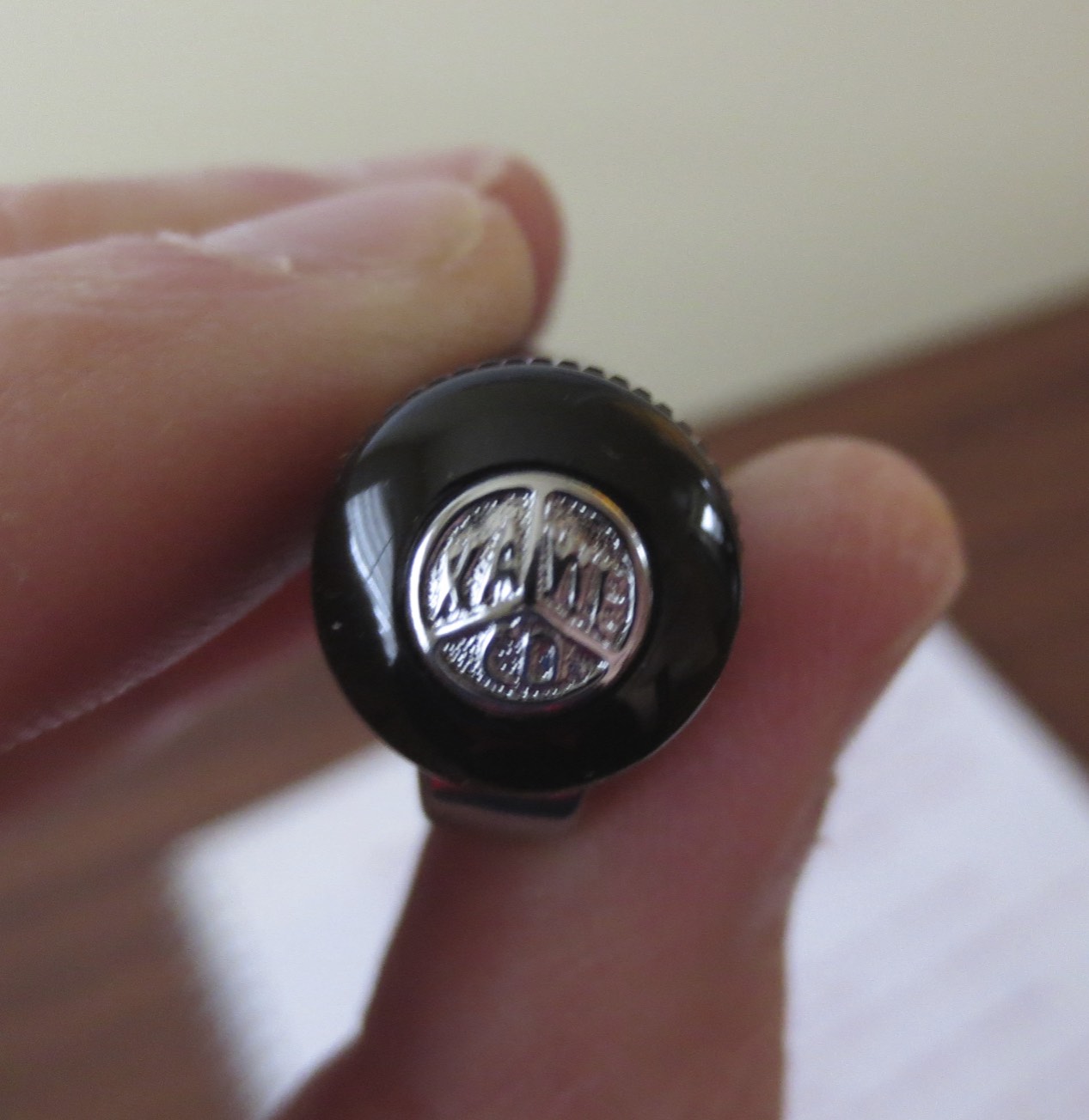
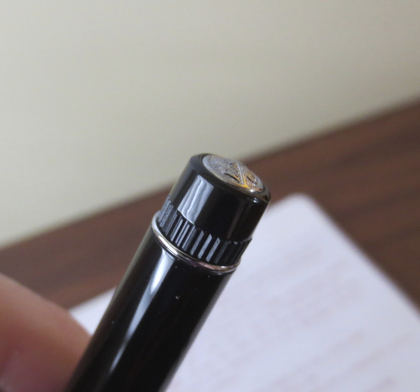
Like Karas Kustoms’ other projects, the Ink has been masterfully executed.  This pen already has been reviewed to death by nearly every other blogger out there in recent months since the Kickstarter project shipped, so I won’t rehash the details about the impeccable design, construction, balance, etc.  :)  Instead, I’ll tell you what my favorite aspect of this pen is:  customization.  You can choose an anodized pen body from among various color options, and pair it with a grip sections made from different metals (aluminum, brass, or copper).  I chose a black pen with a copper section and couldn’t be happier.  The copper was shiny for the first day or so of use, and rapidly developed an “old-penny” patina.  I’ve tried to include some photographs showing how this happened.  Check out the picture that I posted to Instagram the day I received the pen, and compare to how the pen looks today.  It’s awesome. 

Here is the copper section just after purchase. 

Here is the copper section approximately one week later. 

The nib is a stainless steel Schmidt, like the old TWSBIs.  I chose a medium, and it writes flawlessly.  The flow is just wet enough to let me use even my driest inks without any problem.  I personally preferred these nibs on TWSBI pens and have not been very happy with TWSBI since they change over to Bock.  

View fullsize IMG_1012.JPG
View fullsize IMG_1014.jpg
View fullsize IMG_1015.JPG
View fullsize IMG_1018.JPG

Karas Kustoms Ink handwritten review with Sailor Naoi-Sumire. 

The Karas Kustoms Ink is on my short list for best pen purchase of 2014, and should be in your pen case, if you haven’t added it already!

In Pens Tags Pen Review, Karas Kustoms, Karas Kustoms Ink
1 Comment

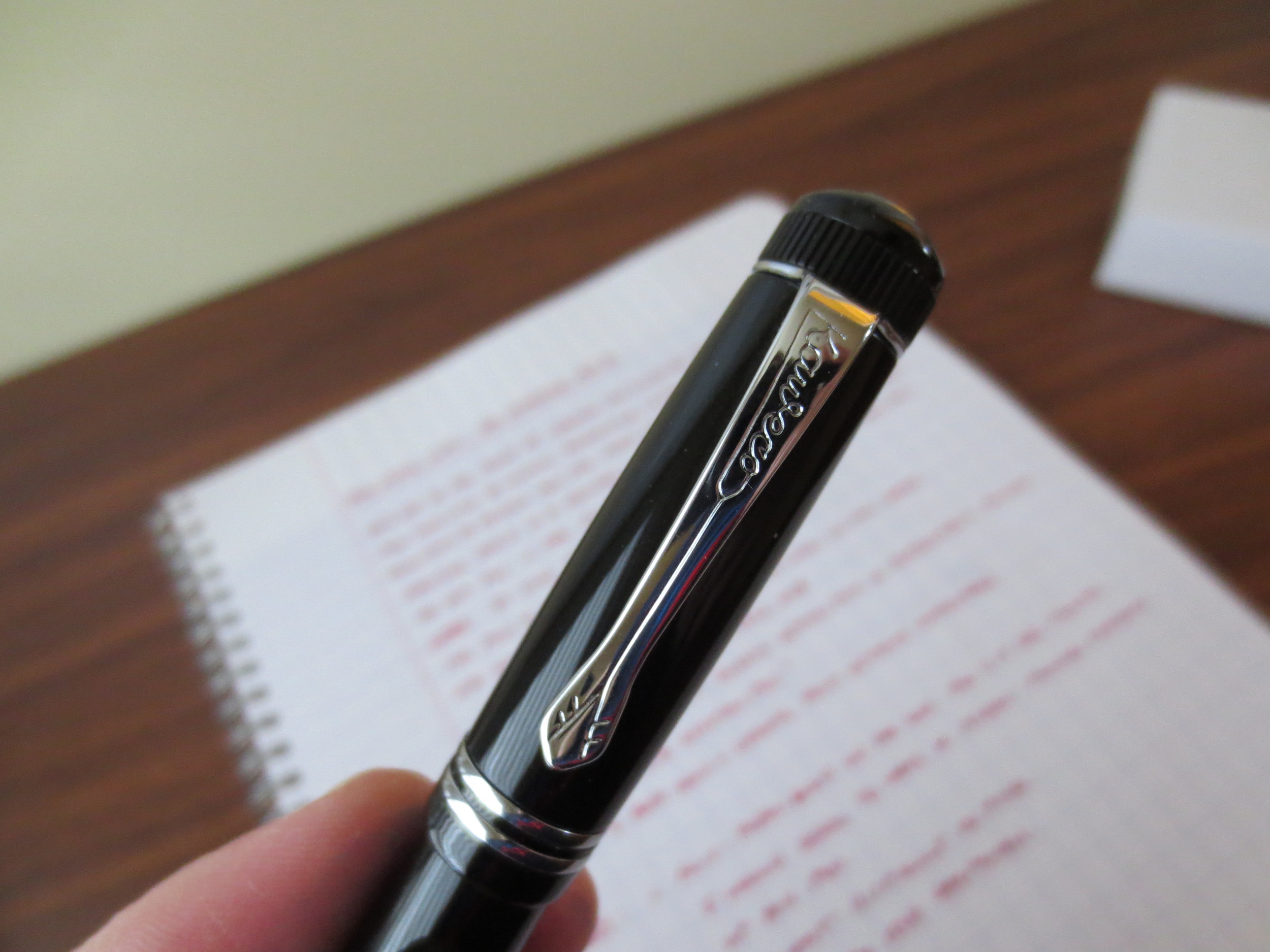
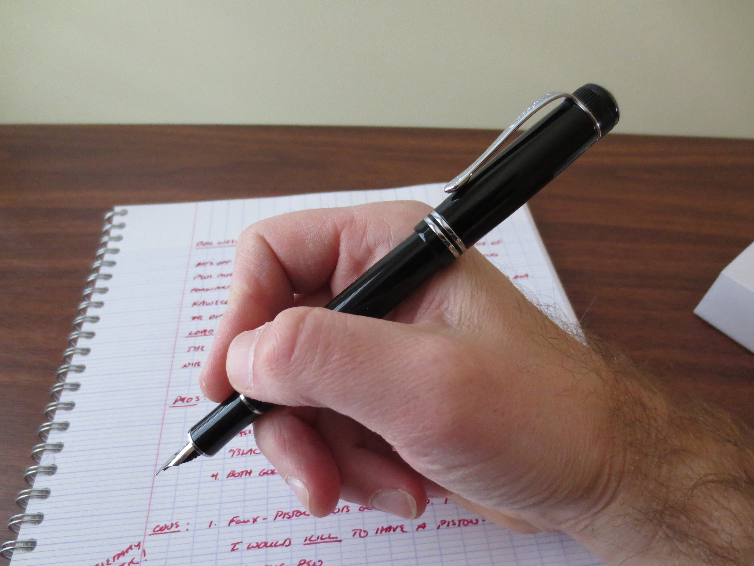
Kaweco's take on the "Black German Pen."  

One Week With: The Kaweco Dia2

November 29, 2014

Thanks to the folks at Kaweco for allowing me to take one of their high-end pens, the Dia2, for a test drive.  In summary, this is an excellent pen that deserves to be in your pen case.  It’s understated and classy looking, and sports the same killer steel nib that many love on the Kaweco Sport.  To boot, the nibs are interchangeable, so if you have a Sport that writes well and that you love, you can simply swap the nib out and use it on multiple pens. 

The Kaweco Dia2 in its presentation box. 

The Dia2 is, like the Sport, a reissue of one of Kaweco’s classic pens, the Dia.  And, like the vintage Sport, the original vintage Dia was a piston filler.  I’ll go ahead and get my one criticism of this pen out of the way:  it’s designed to look like a piston filler but fills only by cartridge/converter.  I know that by foregoing an integrated filling system, Kaweco kept the price of the pen down in the $100 range, which makes it an outstanding bargain considering how good this pen looks and performs, but something about the “imitation” piston knob on the end of the Dia2 looks sorta cheesy.  I know this might not go for most people, but I’d be willing to spend more money on this pen to pay for the piston system.  Also, the Dia2 seems to take a proprietary converter; my standard Schmidt and Waterman converters are too long to fit the Dia2.  Anyway, with that taken care of, here’s what I like about the rest of the pen:  everything else.  

Build Quality

Like most Kaweco pens, the build quality on the Dia2 is excellent.  It’s a black resin pen with chrome trim.  Both the body and trim of the pen are well executed; I couldn’t find any visible manufacturing flaws on the pen I tested.  Also, the resin used in the Dia2 seems to be exceptionally scratch-proof.  Normally, after you post a pen at least once or twice, the barrel will show some micro-scratches.  This pen does not, even after a week or so of regular use.    

The pen is noticeably lightweight.  I don’t mean this in a negative way: it doesn’t feel flimsy.  Rather, it weighs enough to feel serious but is still light enough to use for marathon writing sessions.  (I’ll concede that this is probably attributable, at least in part, to the lack of a heavy piston-filling system, FWIW, but I suppose they could always go plastic and rubber, like TWSBI.)  The Dia2 also fits my hand very well, posted or unposted, which is rare for me, as I normally always have to use a pen posted to obtain the desired balance while writing.  

The Nib

Kaweco Dia2 "sporting" the Sport nib.  (sorry, couldn't resist)

I’ve reviewed the nibs from the Kaweco Sport and Kaweco’s other pens here, so you all know I’m a fan.  Kaweco’s nibs (at least in the fine and medium sizes) are smooth, high quality stainless steel nibs.  I’m looking forward to testing out their gold nibs, hopefully sometime soon.  My main criticism of Kaweco’s other full-size pens, however, has been that by using the Sport nib, these pens appear awkward because the nib looks too small.  Not so with the Dia2—the nib size works, for whatever reason that may be.  It seems to be an intangible thing.  Perhaps it’s the way that the barrel is slightly tapered on both ends?

Handwritten ink review in Kaweco Ruby Red

Takeaways

I used this pen for a solid week without a hiccup.  Since we’re now in the holiday season, I’ll go ahead and recommend this pen as a great gift idea for someone wanting/needing a professional-looking, quality writing instrument that doesn’t break the bank.  I personally like the “black German pen” aesthetic, especially the black on chrome.  (Gold-plated trim is also available.)  It’s nice to be able to buy a pen that looks this good and writes this well for just over $100, as opposed to shelling out $400 for other companies' "entry level" pens cast from what is probably the same "precious resin."  While I personally wish that the pen came with a piston-filler, I can live with refilling cartridges or purchasing a Kaweco converter.  

Full disclosure:  Kaweco provided me with this pen to review, free of charge.  This didn’t influence my opinion on the pen’s quality or performance.     

IMG_0997.JPG
IMG_1000.jpg
IMG_1001.jpg
IMG_1003.JPG
IMG_1005.JPG
IMG_1006.jpg


In Pens Tags Kaweco Dia2, Kaweco
1 Comment
← Newer Posts Older Posts →
Store Location
Visit the T.G.S. Curated SHOP
*New* Updated "Best Pens" Guide (2025)
TGS x Hinze Pens Violet Tendencies Taschenstift Fountain Pen
Hierarchies of Fountain Pen Friendly Paper
Allex Scissors arrayed on a desk showing link to desk accessories

Join Our Patreon!
Subscribe to the TGS E-mail List

Featured Posts

Featured
Desk-Accessoris-Unstaged.jpeg
Jun 25, 2025
Getting Personal: Five "Stationery Adjacent" Items I Can't Live Without
Jun 25, 2025
Jun 25, 2025
Pilot-Iroshizuku-Yama-Budo-Writing-Sample.jpeg
May 24, 2025
Joe's Picks: Five Favorite Inks From Pilot's Iroshizuku Lineup
May 24, 2025
May 24, 2025
Yamamoto-Gray-Paper-Sampler-Set.jpeg
May 10, 2025
Discovering Unusual Paper: "Paper Tasting" Sets from Yamamoto Paper
May 10, 2025
May 10, 2025
The Gentleman Stationer RSS

© Digital Divide Media, LLC, 2014-present.

All content is the exclusive property of Digital Divide Media, LLC, d/b/a The Gentleman Stationer, including “The Gentleman Stationer” website and trademark, and should not be reproduced without express written permission.  All rights reserved.

All content containing paid advertising, affiliate links, or sponsored content will be plainly disclosed by a disclaimer when/if featured.

Contact Information

Store Shipping Policy and Return Policy

Privacy Policy

Cookie Policy

Terms and Conditions

Powered by Squarespace