• Blog
  • Shop
  • Resources
  • FAQ (Ask TGS)
  • About
  • Archive
  • Contact
  • Sign In My Account
Menu

The Gentleman Stationer

Vintage Living in the Modern World.
  • Blog
  • Shop
  • Resources
  • FAQ (Ask TGS)
  • About
  • Archive
  • Contact
  • Sign In My Account

Edison Menlo in Tibaldi Celluloid with clear acrylic ink window. Currently inked with Montblanc JFK Navy Blue.

Pen Review: Edison Menlo in Tibaldi Impero Celluloid

April 30, 2016

I've owned several Edison pens over the years:  a Pearlette, a Herald, and a Mina (unfortunately never reviewed).  And while I've enjoyed the pens, I've never found a shape and a material that I truly loved enough to make the pens stick in my collection.  That may change with the Menlo. 

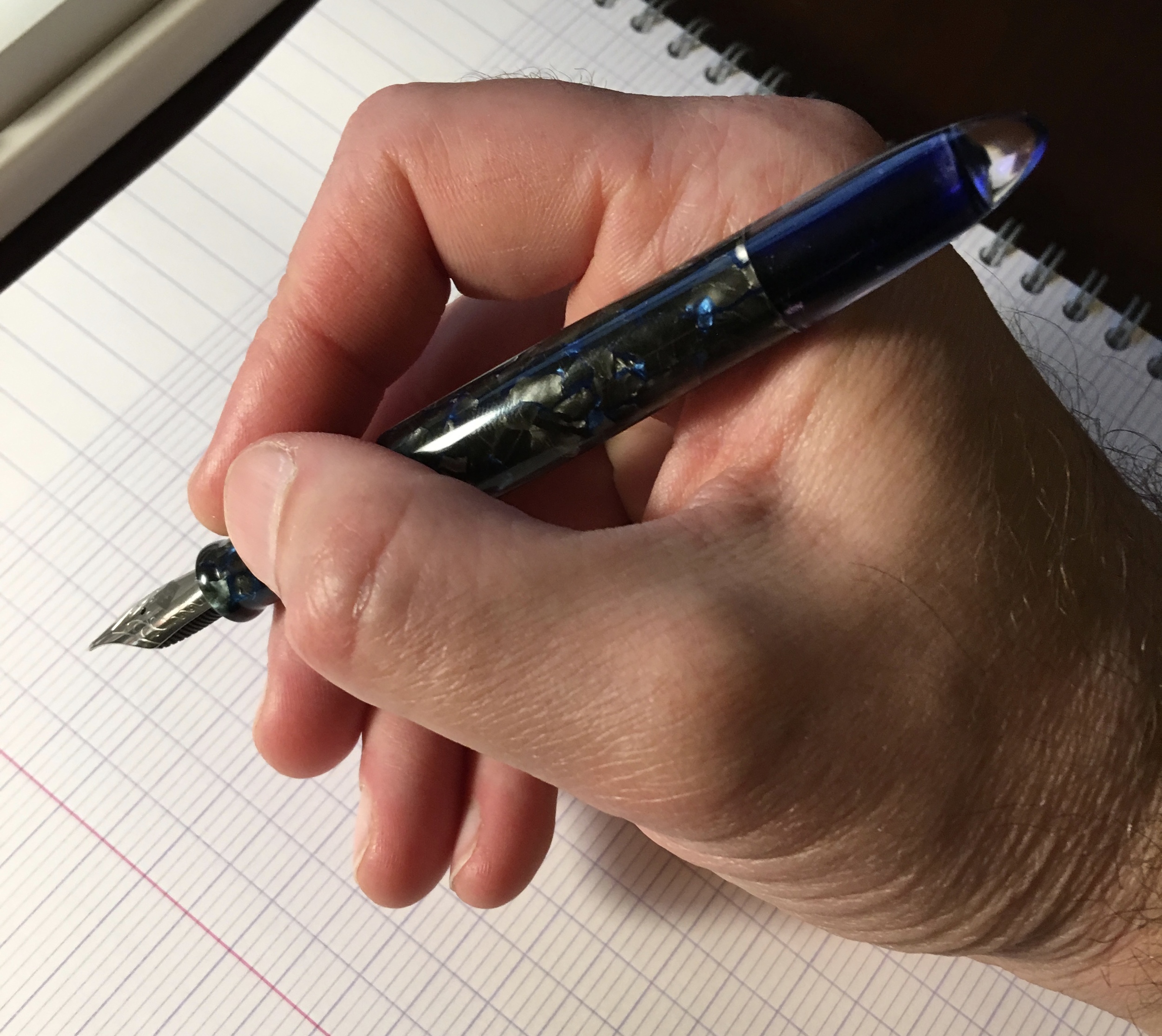
View fullsize Edison Menlo in hand
View fullsize Edison Menlo unposted
View fullsize Edison Menlo posted

The Menlo is definitely my favorite of all of the Edison pens that I've tried to date.  I prefer the more slender torpedo shape that sits well in the hand and is comfortable to write with posted or unposted.  Since this pen does not have the brass pump filling system that the Menlo is known for, it's extremely light and perfect for longer writing sessions.  I have it filled as an eyedropper, so it also has an enormous ink capacity.  I haven't measured it yet, but my best guess would be around 4ml.  The ink lasts a long time on one fill.  

The Material:  Discontinued Tibaldi Celluloid

This pen is made from Tibaldi "Impero" celluloid, which is no longer available so I snatched this pen up as soon as I saw it come on the secondary "Slack" market.  This particular celluloid might be the most beautiful material I've ever owned.  It's a mixture of black, graphite, and gray pearl intermixed with veins of bright blue (think "Bung Box Sapphire" blue).  Photographs don't do the celluloid justice:  the material appears much darker on the screen than it does in real life, and you can't get a good sense of the depth of color and complexity of the design.  

Tibaldi Impero celluloid is notoriously difficult to photograph.  It's hard to capture the full range of colors running through this material. 

A lighter picture in which I tried to capture the detail in the material a bit more. 

This custom pen also features a clear acrylic ink window, which can serve as both a reminder of the color ink you have in the pen and a "warning light" to let you know when you're about to run out.  A big thank you to my friend and fellow Pen Addict "Slacker" Phil for commissioning this design, and then passing it along for sale!       

Once you can see the ink level through the window, 

A word of caution about celluloid pens:  they can stain.  Usually, I would not use a celluloid pen body as an eyedropper (or even as a Menlo pump-filler) because the ink is constantly in contact with the material, and will eventually cause the pen to discolor.  Because the Tibaldi celluloid is so dark, however, I haven't had any problems with noticeable staining from blue, black, or blue-black inks.  

A Note about Edison Nibs

You observant readers may have noticed that I've already reviewed the nib on this pen.  The GREAT thing about Edison Pens (and Franklin-Christoph pens, and Scriptorium pens, and Newton pens) is that the nibs are interchangeable.  The Edison Menlo accepts #6 JoWo Nibs, so I swapped out the stock extra-fine that came with this pen for my Franklin-Christoph Masuyama Broad Cursive Italic that I purchased with my Pocket 66.  I love this nib.  The cursive italic grind has excellent line variation, and is a slightly drier writer than a stub nib, which makes this nib an excellent choice for work. 

Pricing

The Menlo is an Edison "signature line" pen, meaning that it's custom-made to order, and because the standard Menlo has the fancy filling system, prices start at $350.  You would need to confirm with Brian Gray of Edison, but I believe the price for an eyedropper or cartridge/converter Menlo would be $250, since you would not have the added cost of the pump filler.  You also may have added cost depending on the material you choose and whether or not you opt for a gold nib.  Brian's pricing is standard for a custom pen, and to me represents good value. 

I'm a big fan of what Brian is doing over at the Edison Pen Company.  His pens are of excellent quality, and he has a wide range of offerings suitable for many different tastes.  He will also work with you on completely custom designs.  I highly recommend you check him out. 

Disclaimer:  I purchased this pen with my own funds for my own collection.  I have not been compensated in any way for this review.

In Pens Tags Edison, Edison Menlo, Pen Review
Comment

The Delta Dolcevita Soiree Mid-Size:  the "understated" entry in the Dolcevita line. 

Pen Review: Delta Dolcevita Soiree

April 23, 2016

Delta has become one of my favorite modern pen companies.  In recent years, they've expanded their line and, in my opinion, the change has been for the better.  They've moved away from extremely large, flashy (some would say tacky) limited edition pens, and introduced more understated designs, as well as several reasonably priced entry-level offerings.  In this review I'm going to take a look at a variation on Delta's flagship "Dolcevita" pen, the "Soiree" model.  

The main thing that made me hesitant to purchase Delta Pens in the past was their size.  I had always regarded Delta as the Italian company that made very large, chunky pens with a lot of flashy gold or silver trim, usually in some sort of crazy theme.  Delta still does that, and many of their pens aren't to my taste, but in recent years they've slimmed down the size of their offerings which brought the company back onto my radar. 

The first Delta that really drew me in was the Fusion 82, which Delta introduced several years ago as the vehicle for marketing their "Fusion" nib.  I won't go deep into the controversy that the Fusion Nib generated in this particular article. Long story short, the Fusion nib is a steel nib with a piece of gold plating fused to the top of it, and its release was accompanied by a lot of marketing hype supported by "questionable" scientific assertions regarding what that gold plate does to the ink in the pen.  Regardless, I got a really good deal on two Fusion 82s at the 2014 D.C. Pen Show, and whatever you think about Delta's marketing, my two Fusion nibs are up there with the best-writing pens in my collection.  

The Mid-Size Dolcevita

Delta's packaging is incredibly tasteful.  The Dolcevita Soiree Mid-size came with a pack of Delta cartridges and a converter, so it's immediately ready to write.  

Having enjoyed my Fusion 82 pens for a year, I reconsidered the Dolcevita.  The standard Delta Dolcevita is a sizable pen, combines a bright orange celluloid body with a black cap and silver trim, and sits just on the borderline of what I would consider "too big" and "too flashy" for my taste. Even the smaller Dolcevita "mid-size" qualifies as a large pen in my book.  At some point, thought, I saw the Soiree model, probably at the 2014 D.C. Pen Show, and it stuck in my head. Once I saw a deal I couldn't pass up, I jumped on it.   

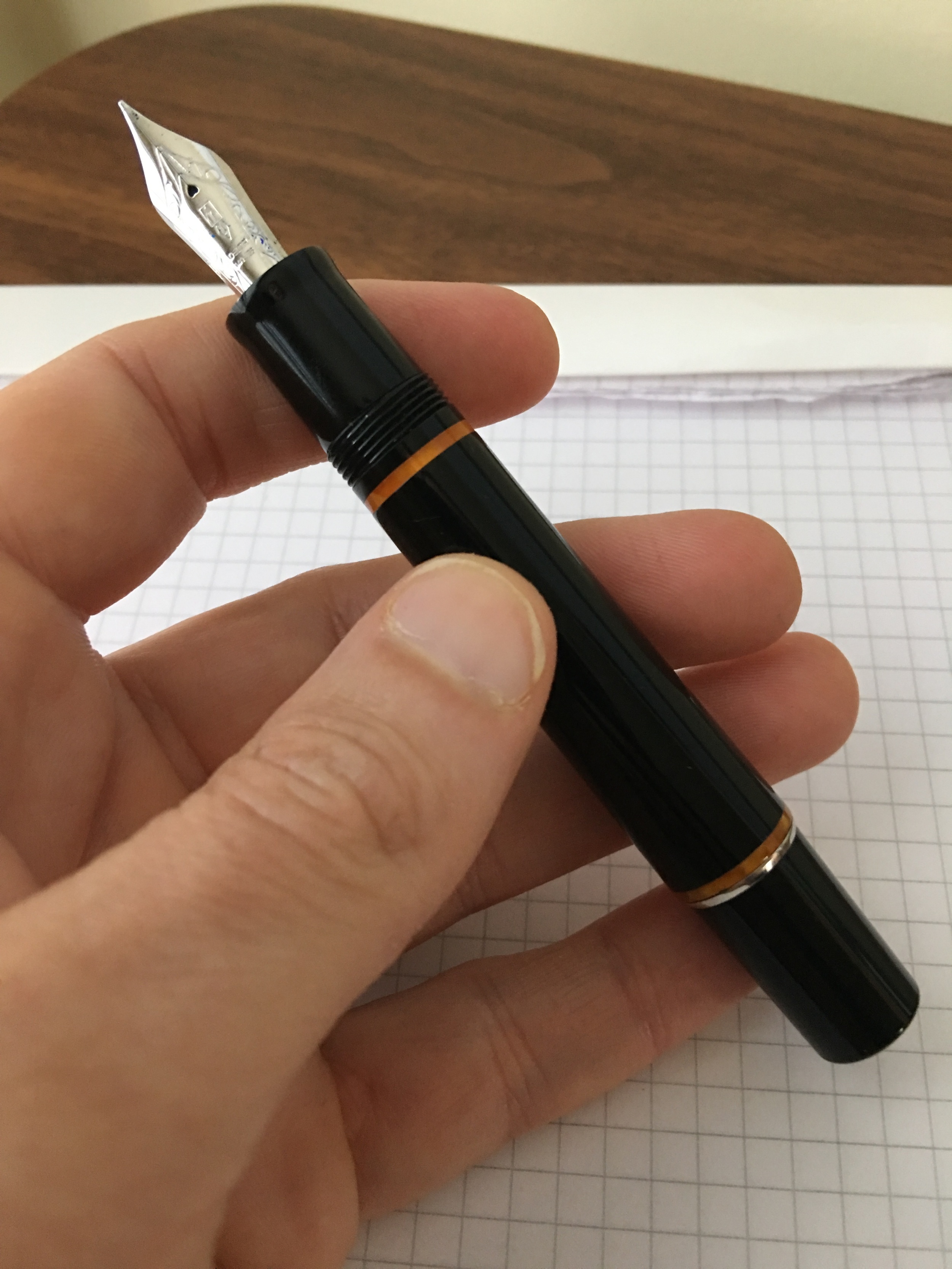
From what I can tell, the Dolcevita Soiree only comes in the mid-size, which means that it uses a cartridge-converter filling system rather than the piston used by the larger Dolcevitas.  That's fine with me--I've grown to prefer C/C fillers as they are exceptionally easy to clean.  While I will probably add the standard Dolcevita to my collection at some point--what can I say, it's grown on me--I think I prefer the design of the Soiree.  It's a solid black resin pen (nothing really exciting there), but it's saved from being boring by four bands of bright orange celluloid, offset by a sterling silver cap band.  Delta also uses a "roller" clip on the Dolcevita, which makes this pen exceptionally easy to get in and out of a shirt pocket, and the clip doesn't snag the fabric.

The mid-size pen is still relatively large, as I mentioned, but it's very well balanced, and can be used posted or unposted, as reflected in the gallery below.       

View fullsize IMG_1052.JPG
View fullsize IMG_1053.JPG
View fullsize IMG_1054.jpg
View fullsize IMG_1055.jpg
View fullsize IMG_1057.JPG

A Nib That Writes Well Out of the Box

What keeps me coming back to Delta pens (five times now) are the nibs.  While I've had some of my Delta nibs modified with specialty grinds, not a single one of these pens has needed to be adjusted out of the box to make it write well.  No babies' bottoms, no hard starts, no misaligned tines, and no scratchiness.  The Dolcevita Soiree is no exception.  This fine nib even has some angular, stub-like qualities that makes my writing stand out a bit more than typical western nibs, which I sometimes find "blobbish" without much line variation.  The pens in the Dolcevita line come in both 14K and Fusion nib models.  I prefer the 14K, but if you don't want to pay the extra premium, I have had excellent experiences with the Fusion nibs, too.

The 14K fine nib on the Delta Dolcevita Soiree Mid-size.  I believe most of Delta's nibs and feeds are made by Bock. They write exceptionally well.  

One thing I will note is that Delta gold nibs tend to run true to size.  This is becoming increasingly rare with respect to western "fine" nibs: sometimes it seems as though all nib sizes are becoming wider by default, and in many brands (hem!, Lamy) there's literally no difference between the extra-fine and the fine.    

A writing sample with the Delta Dolcevita Soiree, 14k fine, Montblanc Limited Edition Tolstoy on Rhodia. 

Overall Impressions

I've enjoyed owning the Dolcevita Soiree, and it's turned into a regular daily writer.   I can't emphasize how refreshing it's been to have nibs write well out of the box.  Oddly enough, my two most recent purchases have been larger pens:  a Delta "Rediscover Pompeii" limited edition and an "Italian Technology" oversize demonstrator (which is a button-filler).  I guess I'm coming around to the "Delta aesthetic".  I'll review these pens at a later date, but everything that I've said here stands:  all of them write exceptionally well out of the box, and larger size notwithstanding, the pens are comfortable to hold and fit the hand well.  

Value

I purchased this Dolcevita Soiree on sale from Marte Modena during a promotion they were running last year.  If you recall, there was a lot of controversy over Delta's supposed move to Marte Modena for a large portion of their online sales.  Marte Modena's prices were so low (in some cases, well below wholesale) that some even speculated Delta could be in financial trouble and/or facing the threat of liquidation.  Now that a few months have passed, I don't have any greater insight into what was going on there, other than that it might have been a loss-leader promotion to gain business.  Marte Modena's prices now have come up significantly, in some cases all the way up to full MSRP.  

With respect to this pen, Marte Modena currently has it priced at $438 for a 14K nib, and $328 for the fusion nib.  I've not seen this pen at many U.S. retailers, so I'm not sure if it's still in production.  If it is, I imagine you can get a better price.  Until recently, Anderson Pens had one listed for $275, which is closer to what I paid and more than fair, but it's currently out of stock. One U.S.-based Amazon seller has the Soiree available, but it's priced at $476, which is high.  

In general, Bryant Greer of Chatterley Luxuries is another a good source for Delta pens, and he also collaborates with Delta on some special editions in celluloid.  You can check out my reviews of the two limited edition Fusion 82s that I bought in Delta's Pompeii and Marmo Incrinato celluloids here.  

DISCLAIMER:  I purchased the pen featured in this review with my own funds for my own collection. This post does contain affiliate links, through which I may be compensated a small amount if you purchase something from certain sites linked to in this article.  While I'd greatly appreciate it if you use these links to purchase an item you are interested in, you are, of course, under no obligation to do so.  Many thanks! 

In Pens Tags Delta, Dolcevita
1 Comment

The Kaweco Allrounder Ballpoint in red. 

A New Perspective: Kaweco Allrounder Ballpoint

April 2, 2016

A while back I reviewed the Kaweco Allrounder fountain pen, and wasn't overly enthusiastic. While I loved the looks of Kaweco's full-size fountain pen offerings, the fact that Kaweco used the same nib as the smaller Sport and Lilliput pens made the design look awkward.  The Allrounder in particular was a disappointment because other than the nib, I loved the design of the pen.  The shape made the pen extremely comfortable to hold.  Since it was aluminum, it was lightweight, and above-all, it was red!

The Allrounder is a fairly large ballpoint pen.  It's a comfortable size to use for extended periods of time, which I can't say for most ballpoints. 

Enter the Kaweco Allrounder ballpoint.  I've taken to carrying at least one ballpoint pen in my bag at all times.  For work, it serves various purposes:  signing receipts, filling out forms with carbon slips (yes, that still happens), and just having a general quick-deployment writing solution that works for whatever paper might be in front of me.  Depending on where I am, my EDC ballpoint option typically is either my Tactile Turn Mover with a .38mm Uniball Jetstream refill, a Pilot Acroball, my "Wood with a Story" olivewood ballpoint, or more recently, the Kaweco Allrounder.

The Allrounder ballpoint has the same trim as the fountain pen, including the Kaweco "medallion" on the cap. 

My Allrounder is made from red aluminum with chrome trim, the same as the fountain pen that I tested over a year ago.  Instead of a cap, however, the ballpoint has a convenient twist mechanism to deploy the refill, which is a medium Parker-style refill branded as the Kaweco "Soul."  I don't know whether this is a proprietary refill Kaweco, or a rebranded Quink or Schmidt refill.  It doesn't really matter: I suspect it's the latter, but whatever it is, it's nice.  The medium point isn't too wide, and the ink dries fairly quickly and doesn't smear.  

Thanks to Kaweco for sending this pen to me as a promotional gift this Christmas.  The Allrounder ballpoint is somewhat difficult to find, and those sellers that stock it have the pen listed at a high price point.  Fahrney's Pens has this pen listed at a whopping $90, which is too much.  Cultpens sells it for £54 (excluding VAT), which is roughly $76 (still too high). The price point is probably one reason why this otherwise very nice pen doesn't get much attention.  In the $30-50 range, this pen would probably sell quite well.  While I can't recommend that someone purchase this pen as currently priced, I can recommend the Kaweco Soul refill for any Parker-style ballpoints you may have.  It leaves a smooth line and doesn't skip.  I don't know the official line width, but it writes like a .7mm (though it could be a well-behaved 1.0mm).  

The Kaweco Allrounder ballpoint (bottom) compared to the Baron Fig Squire (middle) and the Tactile Turn Mover (top). 

DISCLAIMER:  Kaweco provided me with the pen featured in this review free of charge.  This post contains affiliate links, through which I may be compensated a small amount if you purchase something from any of the sites linked to in this article.  While I'd greatly appreciate it if you use these links to purchase an item you are interested in, you are, of course, under no obligation to do so.  Many thanks!    


In Pens Tags Pen Review, Kaweco, Ballpoint, Kaweco Allrounder
Comment

The Baron Fig Squire in Charcoal

First Impressions of the Baron Fig Squire: The Pen Is A Mighty Sword

March 26, 2016

I rarely write first impressions of products immediately after I receive them, but I'm going to make an exception for something I've been anticipating for months.  In case you missed it, last fall Baron Fig launched a Kickstarter for their own custom-designed pen, the Squire. The design is unique, and can best be described as something of a hybrid between the Ajoto Pen and the Retro 51 Tornado.  The Squire uses the same great Schmidt P8126 refill as the Retro 51 Tornado (though it's branded Baron Fig).  I've never used this refill in the .6mm form, as opposed to the standard .7mm, and I absolutely love it.  I may need to give Retro 51 another shot, but the Squire sets a high bar.  

Build

This is a brushed aluminum pen, designed with purposeful simplicity.  There were two Kickstarter color options:  silver and charcoal.  I opted for charcoal, since I already have plenty of silver pens lying around here, and I'm glad that I chose this finish, though I'd probably categorize the color as more of a steel gray (or, dare I say it, "blue steel"), than a charcoal.

As described, the pen is medium-sized and perfectly balanced in the hand, and the refill extends using a twist mechanism that functions smoothly.  The only "drawback" on the design front is the branding.  I would have preferred that they omit the "sword logo" and "Baron Fig" from the body of the pen, in favor of just brushed aluminum, but that's a personal preference and others might not care.  The packaging I love.  The bottom half of the box doubles as a desktop pen stand for the Squire.         

View fullsize IMG_0902.jpg
View fullsize IMG_0903.jpg
View fullsize IMG_0904.jpg

Writing Sample

The ink flow on this refill is generous, and on the verge of being slightly too wet.  If you write with a heavy hand, as I tend to, you will experience some show-through and bleed on cheaper paper.  Interestingly, I was able to see the slightest bit of show-through in my Hobonichi Techo, of all things.  BUT, the flip side to that is the smoothness of this refill.  As a daily writer, that alone should keep me coming back to this pen, since pretty much any ink that I use bleeds through the cheap paper I have to use at work. 

A writing sample for the Baron Fig Squire (Schmidt P8126 .6mm capless rollerball refill).  Like any liquid ink pen that writes a wet, smooth line, you're going to have slight feathering and possibly even some bleedthrough on cheaper paper.  This Nock Co. Dot-Dash pad works very well. 

Price

Kickstarter pricing for the Squire started at $50 shipped.  Pre-order pricing on the Baron Fig website is slightly higher, at $55 plus shipping.  That price might fall somewhat if the Squire takes off and Baron Fig benefits from scaled-up production, but it's the same price point as the Karas Kustoms EDK, which uses the same refill.  Both pens are priced fairly for pens of their quality.  

Takeaways

The verdict is still out on things like durability and practicality (particularly the lack of a clip and whether that will affect my personal use) but Baron Fig is onto something with the design of this pen.  Most importantly, they clearly understand how to successfully deliver a high quality product on time, so I think we can look forward to new entries in the Squire line, via Kickstarter or otherwise. Personally, I'd love to see a mechanical and/or clutch pencil in this form factor.  

Further Reading

If I've piqued your interest in the Squire, check out Andy Welfle's Woodclinched blog. Andy took a sneak peek at the Squire prototypes back in November during his visit to Baron Fig HQ (jealous), and has a comprehensive review along with backstory.   

DISCLAIMER:  This post contains affiliate links, through which I may be compensated a small amount if you purchase an item from certain sites linked to in this article.  While I'd greatly appreciate it if you use these links to purchase something you are interested in, you are, of course, under no obligation to do so.  Many thanks! 

In Refills, Pens Tags Pen Review, Baron Fig, Squire, Schmidt P8126
6 Comments

The Platinum 3776 Century demonstrators in Chartres blue (below) and Bourgogne (top).

Pen Review: The Platinum 3776 Century: Chartres and Bourgogne

March 24, 2016

I've really gotten into Japanese pens over the past year.  Sailor and Pilot are quite possibly my two favorite brands at the moment, and now Platinum has caught my eye.  I have very little experience with Platinum's offerings--I owned a preppy or two when I was first starting out, but only recently tested their higher-end pens.  Overall, I'm very impressed.  

First Impressions

The packaging on Platinum pens is unremarkable.  The pens arrive in a blue clamshell box with white satin interior.  It's functional, but that's about it.  What's inside the box is a different story. Platinum's flagship pen is the 3776 Century (apparently the number is a reference to the height of Mt. Fuji), and I opted for the colored demonstrators.  Over the span of a month, I picked up both the "Chartres" blue demonstrator pen, as well as the "Bourgogne" red demonstrator.  These are gorgeous pens: they are translucent, but only slightly so, and the color is incredibly deep and not cheap-looking at all.  You can tell the pen is solidly built.  For those of you not familiar with French history/geography, Bourgogne is a reference to a wine varietal/region, and Chartres blue is a reference to the unique color of the stained glass in the Chartres Cathedral.

Bourgogne Fountain Pen Unposted.  These pens are large enough to use without posting.  Here, you can also get a sense of the material.  It's a demonstrator, but the translucence is only slight.  This gives the pens a higher-quality feel than your ordinary plastic demonstrator.

In a perfect world, I would have purchased the blue pen with rhodium trim, but I wanted Platinum's "Ultra Extra Fine" specialty nib, which only comes in the gold.  The Bourgogne pen also only comes in gold trim, which looks very nice.  Again, the clip strongly resembles the hardware on Nakaya pens.  

Bourgogne pen posted.  The cap posts pretty deeply, 

One pet peeve, however, is that these pens don't come with a converter.  It irritates me to no end when pen companies do this:  anytime you are spending over $50 on a pen (much less the $200+ these pens command on the U.S. market), the converter should get thrown in free of charge.   

Nibs

The nibs on my pens turned out to be a mixed bag.  The UEF nib had some flow issues, and while I've been able to increase inkflow on my own enough to make the pen usable, it will need to be tuned at the Atlanta Pen Show.  The UEF point is tiny, however, and you can write as small as you could ever possibly desire with this nib.  Once it's tuned properly, I imagine that I will like it quite a bit. 

View fullsize Platinum Medium Nib
View fullsize Platinum UEF Nib/Feed
View fullsize Platinum UEF Nib
View fullsize Platinum Medium Nib Writing Sample
View fullsize Platinum UEF Writing Sample

On the other hand, the medium nib in my Bourgogne demonstrator was exceptional out of the box.  I might say that it writes even better than the medium nib on the Nakaya I once owned.  (That's not a coincidence--Nakaya uses Platinum nibs.)  I have not experienced a single skip or hard start with this pen.  Platinum uses a patented "slip-and-seal" internal cap that keeps the pen from drying out for up to a year of non-use.  I don't plan on testing this feature anytime soon, but it's nice to know about, I guess.

Value Proposition

This is where things get tricky.  Platinum pens apparently are much cheaper in Japan than they are here in the U.S.  For example, the Chartres blue demonstrator retails for approximately $228 at U.S.-based retailers, while those based in Japan (or who import directly from Japan) sell this pen at a much lower price point.  While I typically try to support U.S-based retailers where I can, it's too much to expect customers to pay $150 extra on the basis of loyalty alone.  I would note, however, that if you purchase from Amazon or eBay, you might get stuck addressing nib issues, etc. on your own, or experience long wait times returning the pen.  For this good of a deal I'm willing to take that risk, but others may not want to deal with it.     

Takeaways

At $75, the Platinum 3776 is an excellent value proposition and moves itself into competition for the "best first gold-nibbed pen" list (subject to the potential-lack-of-actual-customer-support qualification I mentioned).  For a little more than a TWSBI Vac Mini or a 580 AL, you get a 14K nib that's pretty much the same as you would find on a Nakaya.  I am withholding judgment on the UEF nib for the time being, until I get the issues sorted out, but I can strongly recommend the stock (F,M,B) Platinum nibs.  The medium I have is one of the best mediums I've ever written with.  

If You're Interested in Further Reading...

Check out Azizah's review of the Bourgogne demonstrator at GourmetPens, as well as Junee from Alt. Haven's review of the Chartres pen.  

In Pens Tags Platinum, Pen Review
3 Comments
← Newer Posts Older Posts →
Store Hours and Location
Visit the T.G.S. Curated SHOP
*New* Updated "Best Pens" Guide (2025)
TGS x Hinze Pens Violet Tendencies Taschenstift Fountain Pen
Hierarchies of Fountain Pen Friendly Paper
Allex Scissors arrayed on a desk showing link to desk accessories

Join Our Patreon!
Subscribe to the TGS E-mail List

Featured Posts

Featured
Playing-ink-MD-Cotton-Glass-Pens.jpeg
Sep 17, 2025
What's On Your Desk? My Personal Favorite Papers for Fountain Pens, 2025
Sep 17, 2025
Sep 17, 2025
San-Francisco-Pen-Show-Hotel-view.jpeg
Sep 3, 2025
2025 San Francisco Pen Show Recap: Still The Best "Big" Show!
Sep 3, 2025
Sep 3, 2025
TGS-Fountain-Pen-Testing-Station.jpeg
Aug 23, 2025
Ask TGS: How Do You Recommend Fountain Pens to New Users?
Aug 23, 2025
Aug 23, 2025
The Gentleman Stationer RSS

© Digital Divide Media, LLC, 2014-present.

All content is the exclusive property of Digital Divide Media, LLC, d/b/a The Gentleman Stationer, including “The Gentleman Stationer” website and trademark, and should not be reproduced without express written permission.  All rights reserved.

All content containing paid advertising, affiliate links, or sponsored content will be plainly disclosed by a disclaimer when/if featured.

Contact Information

Store Shipping Policy and Return Policy

Privacy Policy

Cookie Policy

Terms and Conditions

Powered by Squarespace