• Blog
  • Shop
  • Resources
  • FAQ (Ask TGS)
  • About
  • Archive
  • Contact
  • Sign In My Account
Menu

The Gentleman Stationer

Vintage Living in the Modern World.
  • Blog
  • Shop
  • Resources
  • FAQ (Ask TGS)
  • About
  • Archive
  • Contact
  • Sign In My Account

First Look at a New Release from an Old Brand: Pineider Avatar

May 12, 2018

Pineider made waves in the stationery community last year by announcing that Dante Delvecchio, formerly of Visconti, had joined the company to focus on its fountain pen line. Pineider itself is not a new brand: based in Florence, Italy, they've been selling high-end writing paper and other stationery goods since the late 1700s, but only recently joined the contemporary fountain pen resurgence. Over the past year, Pineider has released a few different models: La Grande Bellezza, The Key of Heaven, and the pen featured here, the Avatar. The first two are higher-end models outfitted with 18kt gold nibs, while the Avatar is the lower-priced, steel-nibbed offering. 

Pineider pens ship in a leatherette box containing a small assortment of Pineider stationery. 

Pineider pens ship in a leatherette box containing a small assortment of Pineider stationery. 

Design and Build

Most of the Pineider models sport a similar design: a swirled or marbled acrylic body, a sculpted metal section, an engraved cap band, magnetic "soft" closure, and Pineider's signature "feather" clip. On the Avatar, Pineider refers to the resin as "stone effect," and it comes in four different color options: Pacific Blue, Saffron Yellow, Coal Gray, and Lipstick Red. I believe Pineider uses Bock nibs, based on the design of the feed, but I haven't been able to confirm this one way or another. 

The cap band features Pineider branding and what I understand to be the Florence skyline. The hinged feather clip might be my favorite detail on this pen. 

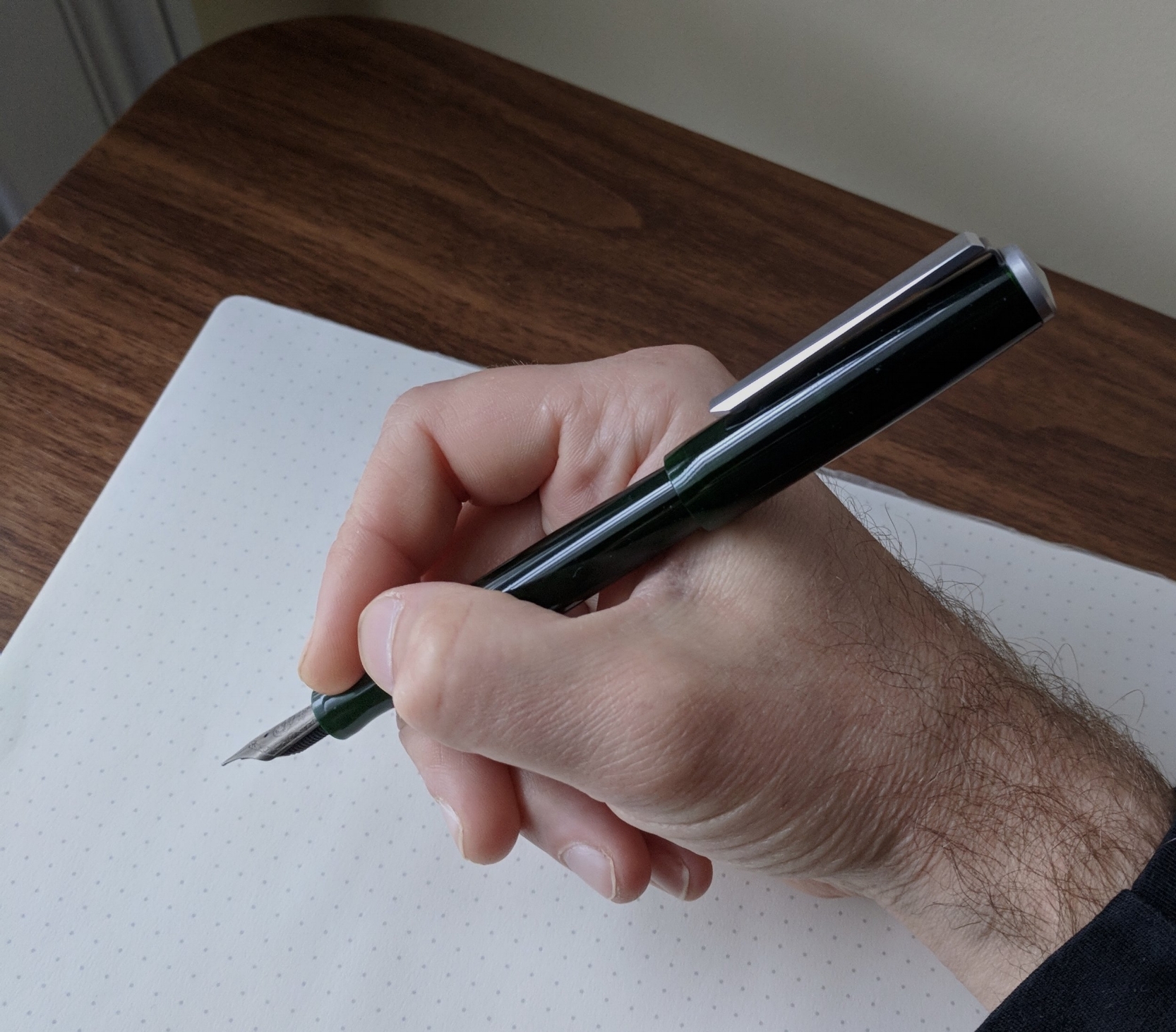
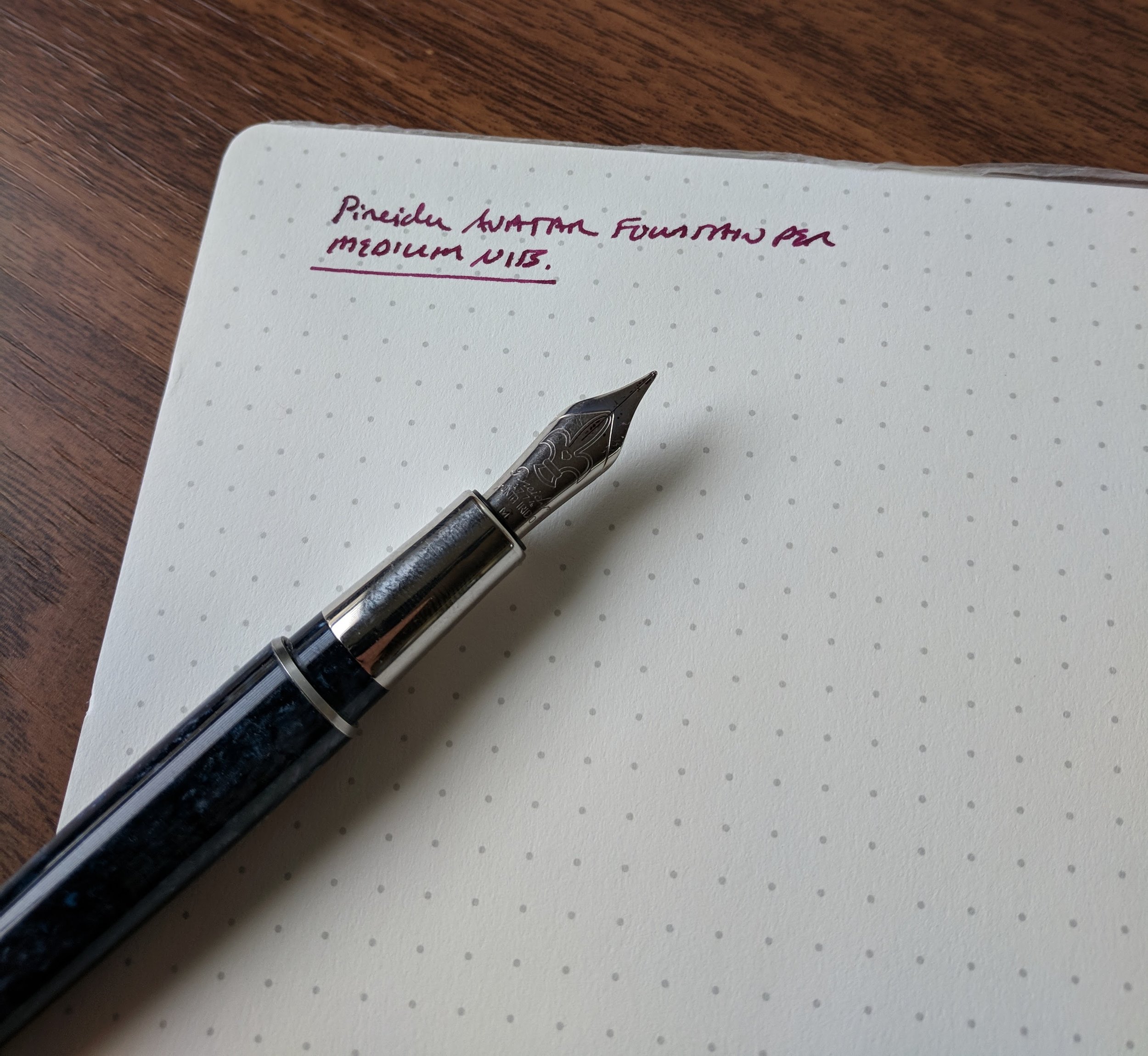
In terms of a writing experience, the Pineider Avatar is a comfortable pen to hold. Resin cartridge-converter pens are typically very light, and the Avatar is no exception. The metal section front-weights the pen a bit, making for a good balance that I enjoyed. The standard stainless steel medium nib on this pen wasn't particularly exciting, but wrote well out of the box and would make for a perfectly nice daily writer. 

Since giving up my "death grip" on my fountain pens to ward off RSI issues, I've had better luck with metal sections not slipping out of my hands.

View fullsize PIneider Avatar Posted In-Hand
View fullsize Pineider Avatar Unposted In Hand
View fullsize Pineider Avatar Writing Sample

Takeaways and Where to Buy

The Avatar is a nice pen, and I don't have anything "bad" to say about it. At the same time, it didn't get me excited about Pineider as a brand.  It's impossible to avoid the inevitable comparisons to Visconti, given the Dante Delvecchio connection, and the Avatar reminds me, somewhat, of the Visconti Rembrandt (priced lower) and the Visconti Van Gogh (priced slightly higher).  I do think that the two Viscontis seem more "finished" with their artist-inspired themes, while the Pineider Avatar seems to lack unique design cues that might justify paying a premium for the pen. That doesn't mean they're bad pens - they're not at all - it's just that Pineider has pursued a luxury price point, and I suspect they will have a difficult time distinguishing their current three models enough to gain a significant foothold in this market segment. I've seen a lot of Pineider Pens on sale recently.  

You can purchase the Pineider Avatar from our sponsor Goldspot Pens, currently priced at $224. As I alluded to above, this price strikes me as a bit on the high side for this pen, though I've heard rumblings that Pineider's steel nib offerings might see a price drop as new models are released and production scales up. The pens are well-made, and if Pineider can hit the right combination of price/value they could become an interesting option.  

Disclaimer: Goldspot loaned me the pen featured in this review free of charge, for review purposes, and is a paid sponsor of this blog. Many thanks to Goldspot for making this review possible! 

In Pens Tags Pineider, Pen Review, Pineider Avatar
Comment

Pen Review: Karas Kustoms Decograph

May 5, 2018

Most seasoned readers of this blog will be familiar with Karas Kustoms, the Arizona-based manufacturers of machined pens such as the excellent Render K and the Ink fountain pen, among others. Last year, Karas launched a new "Signature Line" of pens under the mark "Karas Pen Co.," the first of which is the vintage-inspired Decograph fountain pen. I purchased one around Christmas to check out, and have been putting it through the paces of my review process for the past several months. 

The Decograph ships in an aluminum tube that pays tribute to Karas Kustoms' heritage as a machine shop. A very nice touch, though it likely adds to the cost of the pen. 

Design and Build

As you would expect from a shop of experienced machinists, the Decograph is a very well built pen that doesn't skimp on the details. (I'd point you to the Karas logo on the end cap, the faceted clip, and the machined aluminum tube that serves as the packaging.) True to its name, this pen exudes an art-deco, vintage vibe that you don't see very often in modern fountain pens. Since it's made entirely from thermoplastic and grade 6061 aluminum, the Decograph is also incredibly light - the designer intended this pen to be used as a daily writer.  

The translucent "Deco Green" thermoplastic is some of the prettiest pen material I've seen in a while. In certain light, it appears almost black, but can otherwise appear almost a bright "beetle green," as I've heard this color described elsewhere. I also love the faceting on the clip. 

All that said, there are a few design elements of the pen that prevent this from being an ideal "workhorse" fountain pen for me. First is the girth - the barrel of the Decograph is slightly too skinny for my personal preference, especially given it's length. I like to post my caps, and posting the fairly substantial Decograph cap onto the relatively slender barrel leaves the pen feeling a touch lopsided. Because the thermoplastic is so light, Karas could probably get away with a slightly bigger pen and a wider section. Recognizing that everyone's preferences are different, and many people find the Decograph perfectly balanced, perhaps we'll see this in another model added to the Signature Line in the future? 

The small design details matter, and I think Karas nailed them here. 

Nib and Writing Experience

Out of the box, the writing experience was a mixed bag. The Karas Decograph uses Bock nibs. As I've previously discussed here on the blog, most smaller pen manufacturers (and even some larger manufacturers) source their nibs from a third-party company, typically JoWo, Schmidt, or Bock. Of these three options, Bock nibs are my least favorite. In recent years, I've found the quality control to be spotty: the nibs write dry, the slits are cut unevenly, and the feeds are often misaligned. If you luck into a good Bock nib, or you purchase from a retailer who adjusts or resets the nib and feed themselves, you will get a perfectly serviceable pen, but I do wish Bock would get their act together as it causes problems for smaller companies who don't have in-house nib expertise. 

The Karas Kustoms Decograph posted. 

The Karas Kustoms Decograph posted. 

My experience with the Decograph was no different. The original steel nib that shipped with the pen had the nib slit cut off center, so it skipped and wrote dry. I considered asking Karas for a replacement, but since I don't use steel Bock nibs in general, I swapped in an extra fine titanium nib from another pen and put the steel nib into the "teaching myself nibwork" bin. If you're interested in a Decograph, I would highly recommend paying the upgrade charge and going with a titanium or gold nib, especially since Karas's nib pricing is very reasonable. I've had better luck with Bock's higher-end offerings. 

The Decograph unposted. 

Once I got the nib issue sorted out, the Decograph is an exceptionally nice writer. I wasn't prepared to like this pen nearly as much as I do. The light weight makes this a pen you can easily use for hours, and it almost grows on you subconsciously - I find myself reaching for this pen all the time on my desk, even if I did wish the barrel was just a touch more substantial. I expected to purchase this pen for review and then sell it off, but this one will probably end up a keeper. If you're on the fence, I'd encourage you to borrow a Decograph from a friend or test one out at a pen show - this is definitely a pen that you have to see in person to fully appreciate.   

Takeaways and Where to Buy

The Decograph represents a welcome step for Karas outside the machined metal pen market, and I look forward to seeing what they do with the line in the future. In addition to the standard colors ("Deco Black" and the "Deco Green" featured here), Karas periodically releases special edition colors such as the Decograph 1801 "Sleeping Beauty" edition. The pens can be purchased directly from the Karas Kustoms website under the "Signature Pens" category. 

Price-wise, the Decograph starts at $140 for a steel nib, and you can add $25 to upgrade to titanium and $75 to upgrade to gold. While some have commented that these prices seem expensive, these are "small batch" pens made by an independently owned family company. Viewed in that light, and the higher per-pen cost of manufacture, the prices are reasonable and consistent with brands like Franklin-Christoph and the Edison Production Line. 

Disclaimer: I purchased the pen featured in this review with my own funds, for my own collection. I was not compensated in any way for this review. 

In Pens Tags Pen Review, Karas Kustoms, Decograph, Karas Pen Company
Comment

Kickstarter Alert: Studio Neat Mark One

May 2, 2018

If you're not already in on this latest Kickstarter, you have just over two days left to back the Mark One, a new rollerball from Studio Neat. Described as a "minimal, durable, retractable pen," it's all of that, and a comfortable writer to boot.

I suspect a lot of people will look at this pen and ask themselves what the big deal is here. To be honest, I did too, until I spent some time with a Mark One Prototype. For me, what makes this pen great is the texture: the aluminum barrel is coated with cerakote, a ceramic-polymer coating that's not only extremely durable, but gives the pen a unique matte finish that I've not seen before, especially on a white pen.

The combination of the matte white barrel and the copper knock is stunning. While the Mark One is a round pen, it doesn't roll around as much as I expected, due to the way the pen is weighted.

Studio Neat launched the Mark One in two color schemes: a black cerakote pen with a brushed aluminum knock, or a white cerakote pen with a copper knock. When Studio Neat offered me a choice of prototype pens to review, it was a no-brainer. The white/copper version is unlike anything else out there at the moment, in terms of both looks and feel. 

Though somewhat difficult to see, you can vaguely make out the matte texture of the cerakote in this photograph. 

As you might expect with a retractable rollerball pen, the Mark One comes loaded with the excellent Schmidt P8126 rollerball refill, but also accepts any Parker-style ("G2") refill. This gives you some versatility: I currently have mine loaded with the Schmidt Easyflow 9000 hybrid ballpoint refill, and I recently learned about these Premec fine-point gel refills that should fit not only the Mark One, but other retractable rollerballs such as the Baron Fig Squire and the Retro 51 Tornado. 

The Mark One is well-balanced, and clearly intended to be a durable minimalist workhorse. The pen has been seeing regular use over the past several months. 

Where to Buy

The Mark One pen is available exclusively via Kickstarter. Studio Neat launches all of their products on the Kickstarter platform, and they're pros, so you should feel confident that this project will be well run and you'll get your pen. The Mark One starts at $50 for Kickstarter backers, with an intended retail price of $65, placing it at roughly the same price point as the Baron Fig Squire. Backer rewards include options for one or two Mark One pens, as well as an option for a Mark One pen and a Studio Neat Panobook notebook, which I reviewed last year. The Panobook had it's own successful Kickstarter launch, and is now sold separately.  

As I mentioned earlier, you have two days left to back the Mark One, so if this pen piques your interest and you want to get in on the Kickstarter pricing, act now. If you happen to miss the Kickstarter, no worries, because Studio Neat should have the Mark One for sale on their website in the near future. 

Disclaimer: The pen featured in this post is a prototype provided to me free of charge by Studio Neat for review purposes. While I understand that this prototype is substantially final, there may be slight differences between this pen and the Kickstarter reward you ultimately receive. Many thanks to Studio Neat for making this review possible!

In Crowdfunding Projects, Pens Tags Pen Review, Kickstarter, Rollerball, Mark One, Studio Neat
Comment

Workhorse Pens: Faber-Castell E-Motion Pure Black Review

April 25, 2018

The Faber-Castell E-Motion is a pen that I initially reviewed on loan, but always wanted to revisit after an extended period of usage. So, I purchased the model that appealed to me - the E-Motion "Pure Black" edition - and the pen has spent the better part of a year in heavy rotation. Everything from my initial review still applies to this pen: the fit and finish are high-quality and top notch, the nib is sublime, and I like the unique chunky design. But what tips the E-Motion Pure Black over the top into "daily workhorse" territory, when I don't think the standard E-Motion would have caught on nearly as well? 

Three "pure black" workhorses, from the top: Lamy 2000, Faber-Castell E-Motion Pure Black, and Montblanc 146 Ultra Black.

The texture of the barrel. The Pure Black model may have a metal barrel, but it doesn't feel like it. Faber-Castell has coated the barrel with some sort of PVD material, engraved with a subtle guilloche pattern, which gives the pen a soft feel and makes it extremely comfortable to hold. Frankly, I'm surprised at how easy it is to write with this pen for long periods of time. It's somewhat counterintuitive since the Pure Black is a very heavy pen, but the E-Motion has good balance, even posted, and is a perfect example of how metal pens don't need to be unwieldy. Sure, the design looks a bit "unique," and people tend to have strong opinions about the aesthetics, but I count myself a fan, and you can't argue with results as a daily writer. 

The engraved PVD-coated barrel

The only drawback to this pen from a "workhorse" perspective is ink capacity. Like nearly all Faber-Castell and Graf von Faber-Castell pens, the E-Motion is a cartridge-converter pen that will hold far less ink than, say, a piston-filler. That said, this nib writes a true medium line, and it's not overly wet, so I've never had a situation where I've run out of ink during the day, even during periods of heavy writing. The Faber-Castell converter has decent ink capacity, similar to a standard Schmidt. 

Faber-Castell's understated nib design. There's no breather hole, which is a hallmark of Faber-Castell's nib design, and doesn't affect ink flow at all.

Despite it's weight, I prefer to use the E-Motion posted. Another selling point on this pen is the clip. The lever-action is tight and easy to use, and the pen will clip on to basically anything.

Takeaways and Where to Buy

Faber-Castell makes some of the best true "workhorse" pens out there, mainly because their nibs are so good. I've never had a Faber-Castell nib that required work or adjustment, and the ink flow always seems to be moderately wet - perfect for the type of writing I like to do. Though the pens tend to be more expensive than your typical steel-nib pens, you get what you pay for, and in the year I've had this pen I've never once regretted shelling out for the E-Motion Pure Black.

You can purchase the Faber-Castell E-Motion Pure Black fountain pen from our sponsor Appelboom Pens. Appelboom carries a wide range of Faber-Castell and Graf von Faber-Castell pens, at very reasonable prices. They also have quick international shipping. 

Disclaimer: I purchased the pen featured in this review with my own funds, for my own use.

Further Reading

This post is part of my new series on "Workhorse Pens," which I define as solid everyday writers that I use for most of my daily work. If you enjoyed this post, check out my other pieces on the Montblanc 146 and the Lamy 2000.  

Another size comparison of the Faber-Castell E-Motion Pure Black against two other "workhorse" pens.

In Pens Tags Workhorse Pens, Faber Castell, Pen Review
8 Comments

Pen Review: The TWSBI Diamond Mini (AL Gold Model)

April 21, 2018

Since introducing the 530 several years ago, TWSBI has dominated the $50-100 price point, and has also made serious headway into the entry-level segment with the TWSBI Eco. But what about the TWSBI Diamond Mini, the pen that seems to get lost in the shuffle? Honestly, it's probably my favorite TWSBI pen, at least in terms of functionality. 

Unposted, the TWSBI Diamond Mini is quite a bit shorter than the TWSBI 580. 

Unposted, the TWSBI Diamond Mini is quite a bit shorter than the TWSBI 580. 

There's no real need to go into the history of TWSBI again in-depth - I've already done this in prior reviews of the flagship TWSBI 580, the TWSBI Vac Mini, and the TWSBI Eco. The short version is that TWSBI is a Taiwanese manufacturer that has proven companies can bring a high-quality piston-filling fountain pen to market at well under $100. The Diamond Mini has never really attracted the same amount of attention as the Vac models and the 580, because I think many people tend to write the Diamond Mini off as a "smaller and cheaper" 580 that's a bit boring. In terms of looks, they're correct: there's not a lot to visually distinguish the Diamond Mini from the 580, other than - obviously - the shorter length and some different color schemes. Both pens have the same faceted barrel and similar nibs. So why do I like the Mini so much? Because it posts. 

Posted, the Diamond Mini is actually slightly longer than the TWSBI 580. 

Posted, the Diamond Mini is actually slightly longer than the TWSBI 580. 

The piston knob on the Diamond Mini is threaded, so the cap not only posts, but screws on for maximum security. This feature is quite convenient for someone like me, who tends to write "on the go" a lot in situations where I don't have a table to place the cap. I don't typically recommend that people purchase a fountain pen for their primary "pocket carry," simply because they take longer to deploy, but the TWSBI Diamond Mini is always at or near the top of that list if you just can't bring yourself to use a ballpoint. 

View fullsize TWSBI Diamond Mini Posted
View fullsize TWSBI Diamond Mini Unposted

Takeaways and Where to Buy

I always recommend TWSBI pens to people who are interested in trying a piston-filler fountain pen for the first time. The barrier to entry is lower than a Pelikan M200 or a Lamy 2000, and TWSBI generally offers a relatively inexpensive, reliable writing experience while still allowing people to dabble in the "limited edition" craze. For the past few years, TWSBI has released a series of AL (aluminum) trim models in various colors. If you like the AL Gold model pictured in this review, I'd jump on that pretty fast because they seem to be getting scarce, and TWSBI will likely replace them with a new color sometime this year. The standard Diamond Mini, however, is pretty much always available, and also comes in a black "classic" configuration.  I typically order all of my TWSBI's through Amazon. 

Note: The reputation of TWSBI's "Diamond" models (the 580 and the Diamond Mini) have suffered a bit in years past due to reports of barrels cracking. More recently, TWSBI seems to have improved both their quality control and manufacturing process. I've personally never suffered any sort of catastrophic failure or ink leakage, even on one Diamond Mini that developed hairline cracks on the section. (This was an initial run model from four or five years ago.) Regardless, TWSBI is known for having good customer service, so if you run into a problem, they will make it right.   

Disclaimer: I purchased the pen featured in this review with my own funds, for my own use. This post does contain affiliate links. Pricing and availability is current as of the time of this review.

In Pens Tags TWSBI Diamond Mini, TWSBI, Pen Review, Portable Fountain Pens, Pocket Pens
1 Comment
← Newer Posts Older Posts →
Store Hours and Location
Visit the T.G.S. Curated SHOP
*New* Updated "Best Pens" Guide (2025)
T.G.S. 2025 Holiday Gift Guide
TGS x Roterfaden TGS_25
Hierarchies of Fountain Pen Friendly Paper

Join Our Patreon!
Subscribe to the TGS E-mail List

Featured Posts

Featured
Cover On the Paper Trail Intro Clip.jpeg
Dec 3, 2025
Introducing "On the Paper Trail," a New Podcast/Video Collaboration with Lisa Vanness of Vanness Pens!
Dec 3, 2025
Dec 3, 2025
Iro-Utsushi-Fine-Dip-Pens.jpeg
Oct 1, 2025
The Pilot Iro-Utsushi Dip Pen (and in General, Simple vs. Fancy Dip Pens)
Oct 1, 2025
Oct 1, 2025
Levenger-Annotation-Pad.jpeg
Sep 20, 2025
Five Boutique Paper Brands I'm Watching Closely and Why
Sep 20, 2025
Sep 20, 2025
The Gentleman Stationer RSS

© Digital Divide Media, LLC, 2014-present.

All content is the exclusive property of Digital Divide Media, LLC, d/b/a The Gentleman Stationer, including “The Gentleman Stationer” website and trademark, and should not be reproduced without express written permission.  All rights reserved.

All content containing paid advertising, affiliate links, or sponsored content will be plainly disclosed by a disclaimer when/if featured.

Contact Information

Store Shipping Policy and Return Policy

Privacy Policy

Cookie Policy

Terms and Conditions

Powered by Squarespace