• Blog
  • Shop
  • Resources
  • FAQ (Ask TGS)
  • About
  • Archive
  • Contact
  • Sign In My Account
Menu

The Gentleman Stationer

Vintage Living in the Modern World.
  • Blog
  • Shop
  • Resources
  • FAQ (Ask TGS)
  • About
  • Archive
  • Contact
  • Sign In My Account

From left, Franklin-Christoph Model 20 in Maya Blue, Vintage Green, and Winter Pine.

Pen Review: Franklin-Christoph Model 20 Marietta

October 5, 2019

Although Franklin-Christoph pens rotate through my pen case regularly, and I’ve been a customer of the company for years, their pens have not appeared on the blog as frequently as I would have liked. That changes now. Today I want to talk about my favorite Franklin-Christoph fountain pen: the Model 20 “Marietta.” 

I tend to pick one or two models within a brand and stick with them as my daily users. There’s an easy explanation for this:  Once I find a pen that fits my hand and meets my needs as an everyday writer, there’s not much incentive to go looking elsewhere. With Leonardo, of course there’s the Momento Zero. With Lamy, I prefer the Lamy 2000 and Lamy Studio and rarely use much else. With Montblanc, it’s the 146. Parker, the Sonnet, another great “unsung hero.” For Franklin-Christoph, it’s the Model 20. 

The top of each cap is engraved with the understated Franklin-Christoph logo.

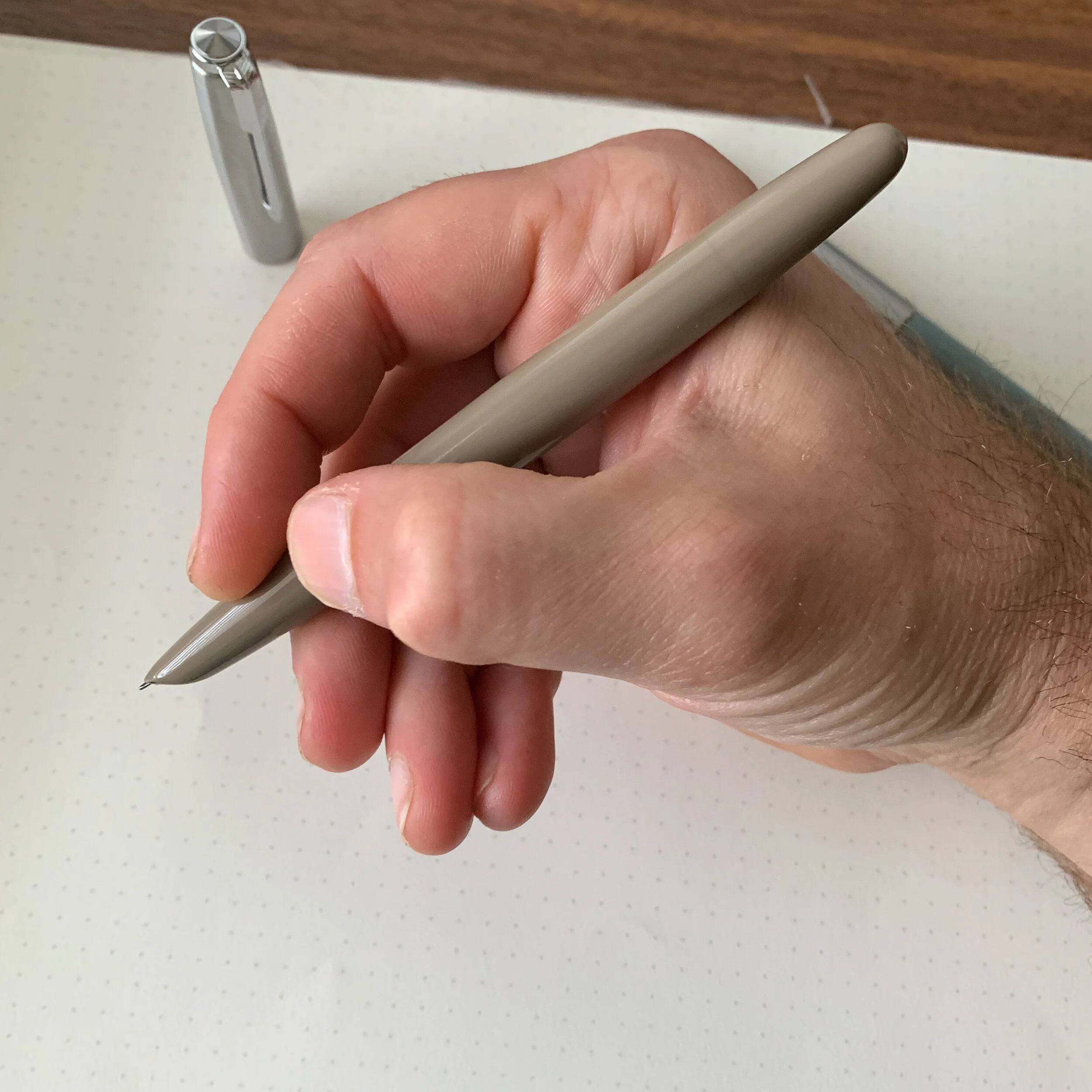
Inspired by vintage flat-top pens from the fountain pen “golden age” of the 1920s and 1930s, the Model 20 is a mid-sized pen notable for its friction-fit slip cap, and ability to easily convert from a cartridge-converter filling system to an eyedropper. I love the fact that this lightweight pen posts deeply, without adding much weight or length to the barrel. Though some might find the design too understated, or a bit plain, I regard it as an example of classic vintage-inspired penmaking, where the purpose of the pen is not just to create an objet d’art but rather to focus on the pen as a tool for writing.   

My Winter Pine Model 20 posted. The cap on the Model 20 posts securely, and I’ve never had issues with it coming loose posted or capped.

One thing I appreciate about Franklin-Christoph is that they share a lot of information about their pen design on the website, which is always helpful for answering questions people may have about the various models. On the Model 20, I frequently get questions about the slip cap - namely “How does it stay on?” and “Won’t the cap develop cracks around the lip, like so many vintage slip cap pens do?” Well, I can’t vouch for how this pen will hold up 100 years from now, but I can say two things: 

  • I’ve never had a Franklin-Christoph pen lose the cap in a pen case. F-C goes so far to say on their website: “When capped or posted properly it is impossible to sling the cap off, so [it] can be securely used in a shirt pocket or pen pouch.” Strong words, and they hold up. 

  • I’ve never had a Model 20 crack, and in the unlikely event it did, (1) it would most likely be my fault because I did something stupid; and (2) Franklin-Christoph would fix it. 

Though I don’t use this pen unposted, the Model 20 is still a comfortable length.

Another thing to note is that the design of the Model 20 has been refined and optimized to solve a problem that seems to plague slip-cap pens: ink being drawn into the cap by the vacuum that occurs when the pen is uncapped, particularly when the pen is eyedroppered. (See my recent review of the Karas Kustoms Vertex.) Franklin-Christoph notes that “[t]he interior of the cap has a feature that releases air pressure to eliminate the vacuum,” which I assume is a machining trade secret. Anyway, it works. I’ve not had any issues with Model 20 fountain pens leaking into the cap, even when I (rarely) eyedropper them. 

“Maya Blue” might be my favorite color in the standard Franklin-Christoph lineup. Note the smooth section, free of any threads to interfere with your grip comfort. A key benefit of a slip-cap pen.

Franklin-Christoph Nibs

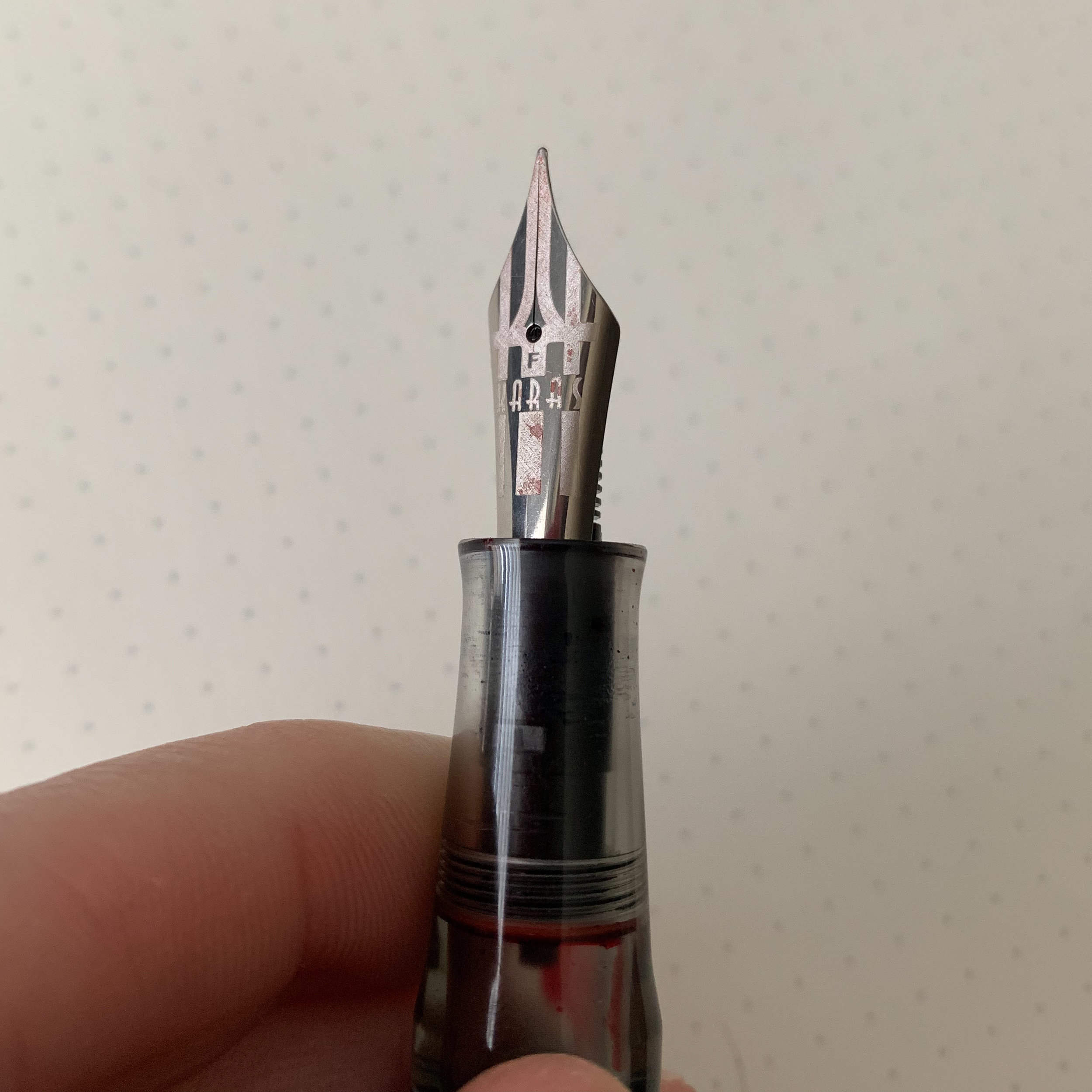
I should probably write a stand-alone article about Franklin-Christoph nibs, and I go back and forth on whether they are better known for their nibs than their pens at this point. All Franklin-Christoph pens accept either No. 5 or No. 6 JoWo nibs, are available in steel or gold, with standard nib widths or specialty grinds, and are tuned in-house prior to shipping. If you visit Franklin-Christoph at a pen show, they will tune the pen for you in person, and you will have the opportunity to sit at the table and provide live feedback as the nib is adjusted to your personal preference. I’ve never received a bad nib on a Franklin-Christoph pen. 

A 14kt Franklin-Christoph JoWo No. 6 with a Masuyama Fine Cursive Italic.

Specialty grinds include the S.I.G. (Stub Italic Gradient), a stainless steel nib ground to a cross between a stub and a cursive italic, which offers the line variation of the latter with the smoother writing experience of the former. Audrey Matteson has taken over primary S.I.G. duties from the late Jim Rouse, who developed the grind, and under her stewardship the S.I.G. has become my preferred Franklin-Christoph nib. Other options include a “Fine Flex,” a 1.9mm Music Nib, as well as needlepoint, cursive italic, and stub grinds by Mike Masuyama.   

On my Model 20 in “Winter Pine” that I acquired at this year’s D.C. Pen Show, I opted for a medium S.I.G. in the “Shadow” nib. It looks great and Audrey did an exceptional job tuning. This pen has the potential to become a favorite!

On my Model 20 in “Winter Pine” that I acquired at this year’s D.C. Pen Show, I opted for a medium S.I.G. in the “Shadow” nib. It looks great and Audrey did an exceptional job tuning. This pen has the potential to become a favorite!

Takeaways and Where to Buy

I guess you could say that I have the beginning of a “mini-collection” of Franklin-Christoph Model 20s, with a high likelihood of picking up more in the future. The F-C table is one of my first stops in the morning at most pen shows, because the prototypes go fast! 

Franklin-Christoph only sells their standard line direct to customers on their website. Currently, the Model 20 is available in Classic Black, Diamondcast Green, Vintage Green (pictured here), Maya Blue (pictured here), and Tiger Red. An excellent reason to visit a pen show is to have the opportunity to pick up Franklin-Christoph pens in various “prototype” materials, like the “Winter Pine” Model 20 that I purchased at the 2019 D.C. Pen Show. Occasionally, you can find special runs of unique materials in The Stock Room section of the F-C website. All Model 20 pens are priced at $165 for a standard steel-nib pen, with additional charges for specialty or gold nibs.

If you are looking for a smaller pen, consider the “Pocket 20” (currently listed as the “Model 20p”), which is priced at $145 but takes the same No. 6 JoWo nib. Back in 2015, I reviewed the Pocket 66 and Model 65 Stabilis Eyedroppers. While those two pens did not work for me over the long-term, and I’ve gone all-in on the Model 20, they are also great options and you may find the review of interest.

Franklin-Christoph also offers more than just pens, having recently expanded into watches, bags, and other luxury accessories. I’ve previously reviewed their leather Covered Pen Tray, and plan to review their “Penvelope” series of cases in the near future. Let’s just say I’m following their Initial Watch Offering closely….

Disclaimer: I purchased the pens featured in this review with my own funds, for my own personal use.

In Pens Tags Franklin-Christoph, Franklin-Christoph Model 20, Franklin-Christoph Model 20 Marietta, Fountain Pen, Pen Review
Comment

A Vintage Gateway? Wing Sung 601 "Vacumatic" Filler

September 15, 2019

Longtime readers of this blog know that despite my primary focus on the “high-end” segment of the fine-writing industry, I have a soft-spot for bargains, especially if I find a sub-$20 pen that outperforms pens costing 3-5 times as much. Over the past year, brands such as Moonman and PenBBS have moved to the top of my list quality-wise, but it’s hard to dismiss Wing Sung. But before you write the Wing Sung 601 off as yet another cheap Chinese Parker 51 clone like those that used to sell on eBay at $5 for a pack of 6, let me assure you that all of the recent Wing Sung Pens I have tested, including not just the 601 but also the 618 piston filler, have performed exceptionally well.

The last Wing Sung pens I reviewed were the Wing Sung 618 and the 698, both piston fillers that have proven to be quite durable, despite their all-plastic construction and low price point. I still use them regularly, and my two 618 pens in particular are regularly inked. Enter the Wing Sung 601, which is a bit of a throwback to the late 2000s when Chinese pen companies flooded eBay with extremely inexpensive Parker 51 clones (more on that below), only this pen is of much better quality and uses a pump-filling “vacumatic” filling system.

Yes, you heard that right! You can now purchase a vintage-style “vacumatic” fountain pen for less than $20. And it’s far from a terrible pen. The Wing Sung 601 uses the same stainless steel hooded nib that you find on the 618. Because vacumatic/pump-filler fountain pens use the pen’s barrel as an ink reservoir (like an eyedropper), I actually find that the 601 writes a smoother, wetter line than the 618, even if the nib is still technically a fine/extra fine in width.

The downsides to vacumatic-style fountain pens are (1) they’re a pain to clean, and (2) the rubber sac/diaphragm attached to the pump will eventually wear out, probably every 2 years or so depending on how frequently you use the pen and your choice of inks. With my vacumatics (either true vintage pens or vintage-inspired modern pens), I choose one or two inks - typically a black, blue, or blue-black - to use in the pen, and stick with those colors so that I don’t have to worry about cleaning the pen to a pristine state. With respect to repairs, many people will likely choose to use a $20 pen until it breaks and then toss it in the garbage. However, I think that the Wing Sung 601 presents a low-risk opportunity to learn vacumatic repair/sac-replacement, and some eBay sellers are even offering replacement filling mechanisms.

A note on Chinese companies’ fixation with the Parker 51: Hero and Wing Sung have been producing pens “inspired by” the Parker 51 since at least the 1960s, with varying degrees of quality. It doesn’t take a vintage expert to recognize that these are NOT real Parker 51 pens, in that they don’t say “Parker” anywhere on them, though they do sport an “arrow clip.” I won’t engage in an extended discussion of the history between Parker and Hero/Wing Sung, because that’s been done elsewhere, but the conventionally accepted story is that the Chinese government nationalized a Parker factory in Shanghai at some point in the mid-20th century, and Hero (which I believe owned/owns Wing Sung) has been churning out Parker 51 clones ever since. You can read more about the current status of the Wing Sung brand, and a bit more history, at Frank’s comprehensive Chinese Fountain Pen blog, Frank Underwater.

View fullsize Wing Sung 601 Unposted
View fullsize Wing Sung 601 Posted
View fullsize Wing Sung 601 Writing Sample

Takeaways and Where to Buy

While a $15-20 Wing Sung pen is never going to replace an authentic vintage Parker 51 in either beauty or quality, the 601 is an inexpensive, low-risk introduction to this style of pen, particularly the vacumatic-style filling system. If you are on the fence as to whether or not you want to spend $100+ on a properly restored Parker 51, give one of these Wing Sung pens a try to see if you enjoy the shape and style. It’s a close-enough approximation, and even if you decide you don’t want to take the plunge, you have a competent everyday writer that didn’t cost a lot of money.

Wing Sung pens, including the Wing Sung 601 pens pictured here, are widely available on either eBay or Amazon. On eBay, I’ve purchased pens from Seller art-pen-book-dy, and also from Amazon, where pens are generally come with free Prime Shipping. One other thing to note is that some eBay sellers are offering replacement filling systems for as little as $2.99. This is doubly interesting to me because not only is it a cheap and easy fix for a broken Wing Sung 601, but it raises the question of whether this mechanism could be used to fix a broken Parker 51 Vacumatic, since original mechanisms are no longer in production.

Disclaimer: This post contains affiliate links. I purchased the pens featured in this review with my own funds, for my own use.

In Pens Tags Wing Sung 601, Wing Sung, Vacumatic Filler, Pump Filler, Chinese Pens
6 Comments

Pen Review: Karas Kustoms Vertex Fountain Pen

September 7, 2019

While I wasn’t one of the lucky ones able to snag an original Vertex prototype when Karas teased the pens late last year, I admired them from afar and have been waiting for their wider release. Earlier this summer Paul from Karas Kustoms contacted me and asked whether I would be interested in reviewing the finished product. I received for review a Vertex in limited run “Galeocerdo” acrylic, which I would describe as a multi-toned metallic silver material that I hope makes its way into regular production at some point. As for the pen itself, overall I’m impressed with what Karas has done, but the Vertex still has some issues that give me reservations about issuing an unqualified recommendation. Read on to learn more.    

As always, Karas Kustoms gets creative on their packaging. My Vertex shipped in this machined aluminum box, with a foam insert to protect the pen.

Vintage-Inspired Design and Maximum Writing Comfort

Let’s start with what I really enjoy about the Vertex: the look of this pen and how comfortable it is to use for long periods of time. Karas has carried over the vintage design aesthetic from its previous “Signature” release, the Decograph, into a shorter, chunkier pen that I prefer. (While I enjoyed testing the Decograph, over time I found the pen slightly too long posted.) The long, concave section on the Vertex is outstanding, and in addition to comfort you can modify the look of your pen by swapping in a section made from a different color acrylic. Karas sells replacement sections separately, so you can purchase more than one. 

The metallic shimmer on the Galeocerdo acrylic makes me want to see more of this material. Hopefully the initial run was not a one-off.

As an acrylic pen that uses a cartridge-converter/eyedropper filling system (more on that below), the Vertex weighs next to nothing. For me, the pen has the best balance when posted, and I happily used this pen for three full days of work drafting and annotating documents longhand. The cap posts securely, and the lack of threads on the long section makes the Vertex a great choice for those who, like me, tend to adjust their grip higher or lower as I write, and don’t always hold the pen the same way. While the section is smooth, it has enough texture to provide a good grip, and I had no issues with slippage even after long writing sessions. 

Here, you can see (1) the transparent acrylic section, which is slightly concave; (2) the ink window; and (3) the o-ring embedded in the section to prevent leaking through the front of the pen.

One interesting design choice that I ended up enjoying was the decision to make the top of the cap concave.

View fullsize Karas Kustoms Vertex Unposted
View fullsize Karas Kustoms Vertex Posted

Optimized for Eyedroppering

Karas designed the Vertex as an “eyedropper” fountain pen, meaning that the pen’s barrel can be used as an ink reservoir without resorting to a cartridge or converter. That’s both a blessing and a curse. On the plus side, used as an eyedropper, the Vertex holds a massive amount of ink so you can avoid refilling frequently. Aesthetically, filling the barrel with ink also allows the transparent section to function as an ink window, a conscious design choice and my clear preference since a visible cartridge or converter would, in my opinion, destroy the beauty of the pen. The Vertex incorporates custom fit o-rings into the barrel and section so that the pen ships “eyedropper-ready,” with no need to add silicone grease to seal the threads. The cap also features an o-ring, which creates a seal that not only keeps the cap closed or posted securely, but should prevent ink from leaking out in the event there is a spill in the cap. Which brings me to…. 

The downside of this design. The main flaw in the Vertex is that the o-ring on the interior of the cap can create pressure that draws ink out of the nib and feed when you uncap the pen. To avoid any issues, Karas recommends that you uncap the pen with the nib pointed up. I would add that you should try to uncap the pen as slowly as possible, and to avoid using the cap as a fidget toy, which I confess to sometimes doing with my slip-cap pens. But even exercising as much care as I possibly could, I still ended up with ink on the section, in the cap, and on my hands on multiple occasions, with the problem getting worse after I had transported the pen in my bag to and from the office, where changes in air temperature likely increased the tendency to burp ink. I will note this temperature issue is a problem inherent in most eyedropper fountain pens, unless they incorporate a valve or seal like those found in high-end Danitrios or on the Opus 88 line. I would not recommend using the Vertex as a “pocket” eyedropper, or in a desktop pen-holder such as the Good Made Better Penwell where the pen would stored with the nib facing down.    

Karas Kustoms went above and beyond on the nib engraving. I love the new logo.

Karas Kustoms went above and beyond on the nib engraving. I love the new logo.

Quality Control on Bock Nibs Remains a Head-Scratcher

Karas Kustoms uses Bock nibs on the Vertex. There’s nothing wrong with Bock nibs per se. If you get a good one, they can be exceptionally nice writers. The nibs on my Conway Stewart Model 100 and both of my Faggionato pens are great examples of how a properly tuned Bock nib can equal most any other writing experience. On the other hand, however, Bock nibs are somewhat notorious for their inconsistency, and I guess I was due to take a hit after I’d had a long run of good draws. The first nib on my Vertex didn’t write at all, whether the pen was eyedroppered or whether I used the included converter. Paul quickly sent me another one - Karas customer service is excellent - and the second nib had a tendency to hard-start with a converter but wrote perfectly well when eyedroppered. The issues with the Bock nibs don’t move me one way or another on this specific pen: While I probably prefer Schmidt or JoWo, many pen brands source their nibs from Bock and unfortunately sometimes you just have to work with your retailer until you find one that’s satisfactory. A good thing about Bock nibs is that they’re easily interchangeable.     

From left, for size/shape comparison purposes: the Lamy 2000 fountain pen, the Karas Kustoms Vertex, and the Franklin-Christoph Model 20.

Takeaways and Where to Buy

I’m all-in on the direction in which Karas is moving with their pen design. I’ve thoroughly enjoyed testing out their last two “Signature” releases, the Vertex and the Decograph, and I would probably give the edge to the Vertex in terms of aesthetic design due to how comfortable this pen is in the hand and how well it posts. In their Signature line, Karas seeks to evoke the shape of classic Parker and Sheaffer pens, and the Vertex definitely has the feel of a Sheaffer Legacy or PFM. 

That said, the tendency for the Vertex to burp ink gives me pause as to whether I could use the pen as a true daily writer, which I really want to do because it’s such a comfortable pen for long sessions. I’m not sure whether anything can actually be done to mitigate the issue - it’s an eyedropper fountain pen after all, and the design of the Vertex doesn’t lend itself to easily incorporating a seal or valve. For the time being, I’m going to continue to use the Vertex and see whether the issue resolves itself as I get a better feel for how to cap/uncap the pen without causing an “inksplosion.”  

The Vertex featured in this review is the limited run “Galeocerdo” acrylic version, which is not currently available for sale on the Karas website. Production line versions of the Vertex are available in black and dark green acrylic, as well as black and white Delrin. As noted above, you can purchase different color clear acrylic sections to customize your pen, and choose from steel, titanium, and 14k gold Bock nibs. The Vertex starts at a more than reasonable $130 for a pen with a steel nib, with the price increasing if you opt for titanium or gold. (The $80 upcharge for a gold nib still allows the Vertex to remain a reasonably priced pen.)

Disclaimer: I received the pen featured in this review from Karas Kustoms, free of charge for review purposes. Many thanks to Paul and the team at Karas Kustoms for making this review possible.

In Pens Tags Karas Kustoms, Pen Review, Karas Kustoms Vertex
1 Comment

Pen Review: Aurora Vintage Duo-cart Fountain Pen

September 4, 2019

In 2017, Aurora teased a reissue of their vintage Duo-cart fountain pen, only to withdraw it from the market in order to fix some minor design flaws. While I owned one of the 2017 Duo-carts, and enjoy the pen, I held off on publishing a formal review until Aurora could perfect the design, namely the friction-fit cap which had a tendency to come loose on the original iteration of the pen. After what turned out to be a bit of a wait, Aurora re-released the Duo-cart this year as part of their “Archivi Storici” lineup, which is the name the company gives to modern versions of vintage pens reissued from the Aurora archives. The result? This one’s a hit and merits the attention of those who desire vintage style without the fuss of writing with an actual vintage pen.  

I tend to ignore packaging, but the delivery on Aurora’s “Archivi Storici” line is top notch. As shown in the “open-box” view below, you get a bottle of ink, converter, and cartridges along with your pen - everything you need to get writing straight away.

Aurora’s hooded nibs are slightly different than those on the Lamy 2000 or the Parker 51. They’re less streamlined and a bit “chunkier,” for lack of a better term. I don’t dislike the look - the Duo-cart is, and was intended to be, a workhorse pen and it looks the part.

Pros: A hooded nib and a highly usable vintage-inspired design.

What do I like about the Duo-cart? It’s a well-built modern workhorse with vintage looks. This combination of style and comfort nearly always lands a positive review here at TGS.

  • A Hooded Nib. Anytime a pen company releases a pen with a hooded nib, it catches my attention immediately. The Duo-cart’s stainless steel nib is stiff and has a touch of Aurora’s signature tooth, which makes for a tactile writing experience, without being scratchy. (It’s hard to describe, but those who have written with an Aurora pen know what I’m talking about - almost like writing with a pencil.) I would characterize the nib as a moderately wet “Western medium,” though that will vary somewhat depending on what ink you use.  

  • True Vintage Styling. In addition to the hooded nib, the Duo-cart features several other vintage-inspired design touches, drawn directly from the Aurora archives. My personal favorites include the “linear guilloche” cap, and the classic “Aurora Made in Italy” script around the base. 

  • Good Balance and All-Day Writing Comfort. What I enjoy most about the Duo-cart (as well as other vintage and vintage-inspired pens) is the fact that the pen was designed in an era when fountain pens were intended to be used as a daily writing tool akin to your keyboard. Therefore, comfort is key. The section is long and provides ample room to grip the pen, and since the Duo-cart uses a friction fit cap there are no sharp threads to interfere with your grip or dig into your hand. The pen is similar in size to the Lamy 2000 or the Parker 51.

The engraved streamline cap looks great - almost like pinstripes. With this release, Aurora introduced navy, light green, and light blue versions of the Duo-cart alongside the black and burgundy versions from the initial release. The light green (shown here) has the most “vintage” feel of any of them, in my opinion.

Cons: You can have your nib in any size you want, as long as it’s medium.

There isn’t much that I dislike about the Duo-cart, but those considering a purchase should note a couple of things: 

  • Posting. The main issue that I still have with this pen, even after the reissue, is that the cap sometimes fails to post securely. On a couple of occasions, I’ve had the posted cap go flying across my desk at work when I turned around or moved my arm suddenly. Not an issue for those who don’t post their pens, but it can be a bit of a problem for me unless I remember to jam the cap down pretty hard on the back of the barrel.

  • Nib Size. What’s the cliche? You can have it in any size you want, as long as you like medium? I imagine this choice had to do with the scale and cost of production on the hooded nib, which is specific to this pen, so Aurora went with its most popular nib option. My two Duo-carts are somewhat wet writers, so those looking for a fine or extra-fine line will probably need to invest in a nib grind.   

In keeping with its name, the Aurora Duo-cart uses a cartridge-converter filling system.

View fullsize Aurora Duo-cart Unposted
View fullsize Aurora Duo-cart posted

Takeaways and Where to Buy

The Duo-cart is my first foray into Aurora’s “Archivi Storici” editions, and given how much I’ve enjoyed this pen I look forward to more of these releases in the future. (I also plan to dig around on eBay and see if I can unearth some of the previous Archivi Storici editions, which include a re-release of the vintage-style Aurora 88.) I support pen companies reissuing modern versions of their vintage pen designs, since it caters to those of us who appreciate the classic fountain pen styles, yet don’t necessarily want to deal with using a higher-maintenance vintage pen on a daily basis.

You can purchase the Aurora Duo-cart at most Aurora retailers, including our site sponsor Pen Chalet. Aurora has set MSRP at $195 for this pen, with most retailers pricing it around $156. I don’t have any issues with this price point. The Duo-cart looks high-end, the pen is well-made, and you have to account for the time and expense of resurrecting a vintage pen from the archives that’s been out of production for years. The $150-200 price bracket is competitive, however, and Aurora is going nose-to-nose with other excellent steel-nib pens such as the Esterbrook Estie, the Leonardo Momento Zero, and the Pelikan M205. The Duo-cart’s hooded nib distinguishes it from these pens, but for around $20 more you can purchase the Lamy 2000, which also features a hooded nib, but in 14k gold with a piston filler. The design aesthetic is distinct enough, however, that the Duo-cart will likely carve out its own niche.

Editor’s Note: The dark teal ink shown in this writing sample is a limited edition collaboration between Pen Chalet and Colorverse, “Monsoon Storm.” This particular Colorverse ink includes two different colors, a 65ml bottle of Monsoon Storm and a 15ml bottle of an orange-gold color called “Monument Valley.” I may do a stand-alone review of both inks but since these are limited edition inks that may sell out I figured I would post the details here. Currently, this ink is listed at 30% off and on sale for $25. 

Disclaimer: This post contains links to paid sponsors and affiliates. I acquired this pen using store credit generated through my participation in Pen Chalet’s affiliate program.

In Pens Tags Aurora Archivi Storici, Aurora Duo-cart, Vintage, Pen Review
Comment

Pen Review: Leonardo Officina Italiana Momento Zero x Pen Chalet Special Edition

August 21, 2019

For years, I went back and forth on whether to acquire the Delta Dolcevita, the flagship of now-defunct Italian pen company Delta. While I appreciated the depth of the orange material Delta used - a bright orange acrylic/cellulose acetate? - the pen was always just slightly too large for my taste, and the trim levels and scrollwork a little too ostentatious. I never ended up buying the classic Dolcevita, though I did briefly own the Dolcevita Soiree.

Leonardo uses Bock nibs, customized with an understated imprint. All of my Leonardo nibs have been well-tuned writers out of the box. The “roller clip” is another nice Delta legacy. Most of the standard Momento Zero pens feature stainless steel nibs, with gold nibs available on premium models.

Leonardo Officina Italiana is a new pen company run by former Delta craftsmen, and while you definitely notice the Delta heritage, Leonardo pens appeal to me because they are more understated, taking the best elements of Delta’s design and material choices and omitting the superfluous flourishes. The pens are “minimalist” in the best sense: they rely on a design that’s simple and straightforward without being boring, and focuses the attention Leonardo’s diverse array of materials that range from acrylics to celluloid to ebonite.

While I’ve previously reviewed Leonardo’s “flagship” pen, the Momento Zero, I wanted to separately review a recently released limited edition made available through Pen Chalet, which transposes the Delta Dolcevita’s orange and black color scheme onto the much more functional size and shape of the Momento Zero. Even better, the pen was made available in both a gloss and matte finish, with ruthenium trim. The pen pictured here sports the matte finish.

Like the other Momento Zero pens in my collection (I now have seven total), everything about this special edition is well-executed and makes for a quality, highly functional pen. The medium size and slightly tapered shape of the Momento Zero lends itself to longer writing sessions or all-day use, whether you post the pen or not. The matte finish on the section feels nice, similar to the matte finish on the Sailor Imperial Black, and provides good grip. The nib writes a smooth, relatively wet, western fine line. Like the other Momento Zeroes that are priced below $200, this pen features a steel nib and a “captured converter” filling system, meaning that you can either unscrew the section and remove the converter as you would with a traditional cartridge-converter pen, or you can remove the blind cap and work the converter like a piston-filler. As pictured below, even the converter sports ruthenium trim!

Did I mention Leonardo’s attention to detail? Most companies would not have bothered to plate the “non visible” components, such as the end of the converter under the blind cap. Things like this make me smile.

Takeaways and Where to Buy

I appreciate how Leonardo has chosen to focus its offerings on two classically styled pen models, the Momento Zero and the Furore, and expand the lineup by releasing these pens in new colors and new materials that include exclusive store collaborations. As I mentioned above, the pen featured here was an exclusive collaboration with our site sponsor Pen Chalet, and limited to a run of 25 pens. It sold out quickly. Fortunately, however, Pen Chalet and Leonardo have just launched a new, expanded collaboration that slightly tweaks the design of the pens. Check out the newest release, now available in orange and matte or gloss black acrylic with gold trim or in “Hawaii” acrylic with matte or gloss black acrylic and ruthenium trim. The orange/black/gold combination offers the classic “Delta Dolcevita” look, while the “dark Hawaii” is something truly unique to Leonardo. These pens are priced at the $199 price point - which I consider a bargain given the quality - and I’m looking forward to adding one of the “dark Hawaii” pens to my collection soon.

A few of the other Leonardo Momento Zero pens in my collection, including three from the high-end “Maestro” set made available last year.

Also stay tuned for the upcoming Momento Zero Grande, which will be a larger version of the standard pen featuring an integrated piston filling system and new materials. Follow @leonardo_pens on Instagram for details.

Disclaimer: This post contains affiliate links. I purchased the pen featured in this review using store credit generated through my participation in the Pen Chalet affiliate program, which is one method I use to acquire pens to review for the blog. Many thanks to Ron and Pen Chalet for making this review possible!

In Pens Tags Leonardo Momento Zero, Leonardo, Leonardo Officina Italiana
1 Comment
← Newer Posts Older Posts →
Store Location
Visit the T.G.S. Curated SHOP
*New* Updated "Best Pens" Guide (2025)
TGS x Hinze Pens Violet Tendencies Taschenstift Fountain Pen
Hierarchies of Fountain Pen Friendly Paper
Allex Scissors arrayed on a desk showing link to desk accessories

Join Our Patreon!
Subscribe to the TGS E-mail List

Featured Posts

Featured
Yamamoto-Gray-Paper-Sampler-Set.jpeg
May 10, 2025
Discovering Unusual Paper: "Paper Tasting" Sets from Yamamoto Paper
May 10, 2025
May 10, 2025
Four-Micarta-Fountain-Pens.jpeg
Apr 19, 2025
Yes, Micarta for me! I finally got my hands on Some Micarta Pens, Plus My Own Special Edition
Apr 19, 2025
Apr 19, 2025
2025-Arkansas-Pen-Show-haul.jpeg
Mar 29, 2025
Unboxing the Arkansas Pen Show Haul! Two Nib Grinds, Inks, and a New Pen
Mar 29, 2025
Mar 29, 2025
The Gentleman Stationer RSS

© Digital Divide Media, LLC, 2014-present.

All content is the exclusive property of Digital Divide Media, LLC, d/b/a The Gentleman Stationer, including “The Gentleman Stationer” website and trademark, and should not be reproduced without express written permission.  All rights reserved.

All content containing paid advertising, affiliate links, or sponsored content will be plainly disclosed by a disclaimer when/if featured.

Contact Information

Store Shipping Policy and Return Policy

Privacy Policy

Cookie Policy

Terms and Conditions

Powered by Squarespace