• Blog
  • Shop
  • Resources
  • FAQ (Ask TGS)
  • About
  • Archive
  • Contact
  • Sign In My Account
Menu

The Gentleman Stationer

Vintage Living in the Modern World.
  • Blog
  • Shop
  • Resources
  • FAQ (Ask TGS)
  • About
  • Archive
  • Contact
  • Sign In My Account

The Platinum Prefounte fountain pen in Vermillion Orange.

Pen Review: Platinum Prefounte Fountain Pen

July 20, 2024

Platinum rules the sub-$20 fountain pen space, at least among the larger, more mainstream pen brands. While Pilot and TWSBI have their own inexpensive “entry level” releases in the Kakuno and the Go, respectively, no company has as many different options at this price point as Platinum. Most fountain pen users are familiar with the Platinum Preppy and the Platinum Plaisir, but there’s yet another option that’s gaining some steam since its release a couple years ago: The Platinum Prefounte.

Priced to sit in-between the all-plastic Preppy fountain pen and the more upscale Plaisir, the Prefounte features a transparent plastic barrel in a new set of colors and with a more durable metal clip. While the Prefounte uses the same nib/feed/section as the Preppy (they are interchangeable), the barrel itself feels slightly more substantial than on the Preppy, and I enjoy not having to worry about the clip snapping off if I overextend it. All of Platinum’s pens are capable of taking both a cartridge and a converter (though they are proprietary and can only be used on Platinum pens), and I see nothing that would prevent you from eyedroppering the Prefounte by adding silicone grease and/or an o-ring to eyedropper the pen the same way you would modify a Preppy.

Who is this pen targeting? I would say those looking for an inexpensive everyday pen for the office or travel, as well as those experimenting with fountain pens for the first time but who don’t want something that looks as “disposable” as the standard $4 Preppy. At $11, the Prefounte also falls into what I think of as the zero-risk gift zone: a pen that you can easily gift to friends and family who you think might like fountain pens, without worrying about spending a lot of money on something they may or may not end up using.

For the last minute trip I had to take this weekend (yes, two days before a shop move), I grabbed some travel-ready pens, including one of the new Platinum Preppy Wa limited editions, this Vermillion Orange Prefounte, and my yellow/green Plaisir with the desk pen nib installed. All of Platinum’s lower-priced pens use a version of the slip-and-seal cap system, which prevents the pen from drying out. Though I’ve never tested the “one-year” claim, it works very well.

I’ve personally been thinking a lot about entry-level fountain pens lately. As I build out inventory in advance of a physical shop opening, I want to have as broad a range of options to offer as possible, especially for those people curious about fountain pens who inevitably will want to come in and see them in person before committing. Being able to show someone a nice looking pen with a reliable nib, functional clip, multiple color options, and the ability to use cartridges or bottled ink, all for $11, makes the hobby much less intimidating for new users.

We currently have the Platinum Prefounte available in all five colors: Night Sea, Dark Emerald, Crimson Red, Graphite Blue, and Vermillion Orange. The colors are all on the darker side and look quite nice, especially the blues and the orange, which I picked out for my tester. Nib options are fine (03) and medium (05), and each pen ships with a Platinum Blue-Black Cartridge. Converters and other cartridge options are sold separately.

The Gentleman Stationer is supported by purchases from the T.G.S. Curated Shop and pledges via the T.G.S. Patreon Program.

Platinum’s stainless steel nibs aren’t fancy, but they are consistently decent writers that lay down a standard fine or medium line.
In Pens Tags Platinum Pens, Platinum Prefounte, Pen Review, Fountain Pen
2 Comments

TWSBI Precision Pens, the Full Set.

Pen Review: The TWSBI Precision Fountain Pen

January 10, 2024

Despite epitomizing so-called old technology, do you know what product continues to be enduringly popular? The woodcase pencil. Do you know what else tends to sell insanely well, though they’re a bit more of a cult taste? Hexagonal pens designed to mimic the feel of the pencil. Often marketed as “drafting” or “technical” pens, these are one of the most heavily requested products, both for review purposes and for the shop. The now-discontinued Rotring 600 fountain pen remains the darling of this category, yet for years TWSBI has sold a fountain pen version of its “Precision” line. I can’t believe I’m just now reviewing it.

Hexagonal Pens: They’ll never roll off the desk! The TWSBI Precision fountain pen, second from right, shown with the Caran d’Ache 849 Paul Smith (top), the Rotring 600 (right), the Mark’Style Days Metal Gel Ballpoint, an the TWSBI Precision Ballpoint/Mechanical Pencil (far left).

I first got my hands on the Precision ballpoints and mechanical pencils last year. I loved them both and they are constantly in my “go-anywhere” rotation, especially when I’m working and need a reliable, understated no-nonsense writing instrument. The Precision fountain pen is a larger take on the same format, with brushed “gunmetal” construction that assumes as understated a look as a fountain pen like this one can possibly have. I do appreciate added texture on metal pens: this one feels especially good in the hand with excellent balance and just the right amount of “grippiness” to prevent slippage.

Something about a technical pen gives you an increased sense of … precision… especially when writing or annotating. I opted for a fine nib on the fountain pen, and I’ve been using it regularly to take smaller notes. The nib is the same as on the TWSBI Diamond 580, though you will need to swap the nib manually (friction fit) as I’m told the nib units are designed slightly differently.

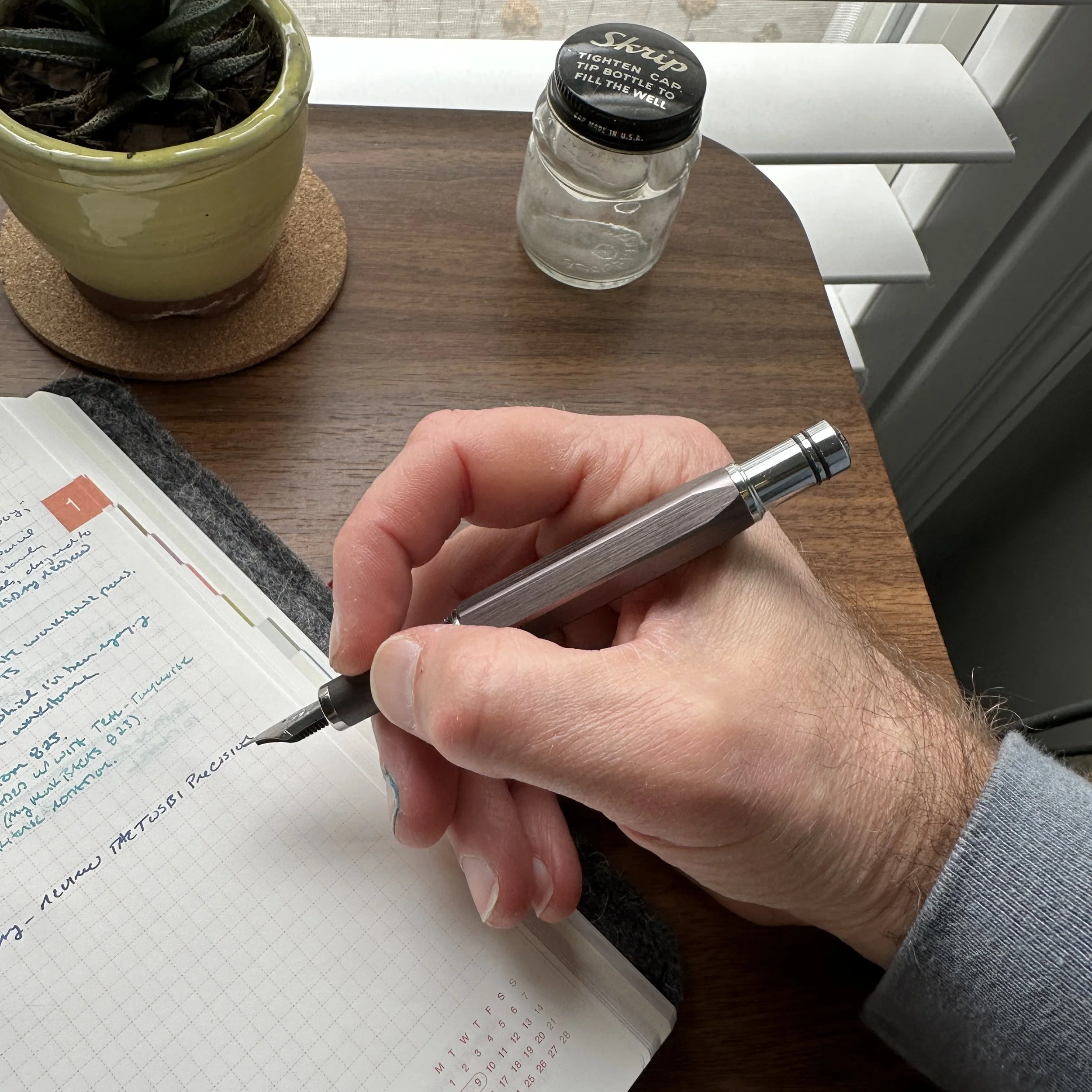
View fullsize TWSBI Precision Unposted In-Hand
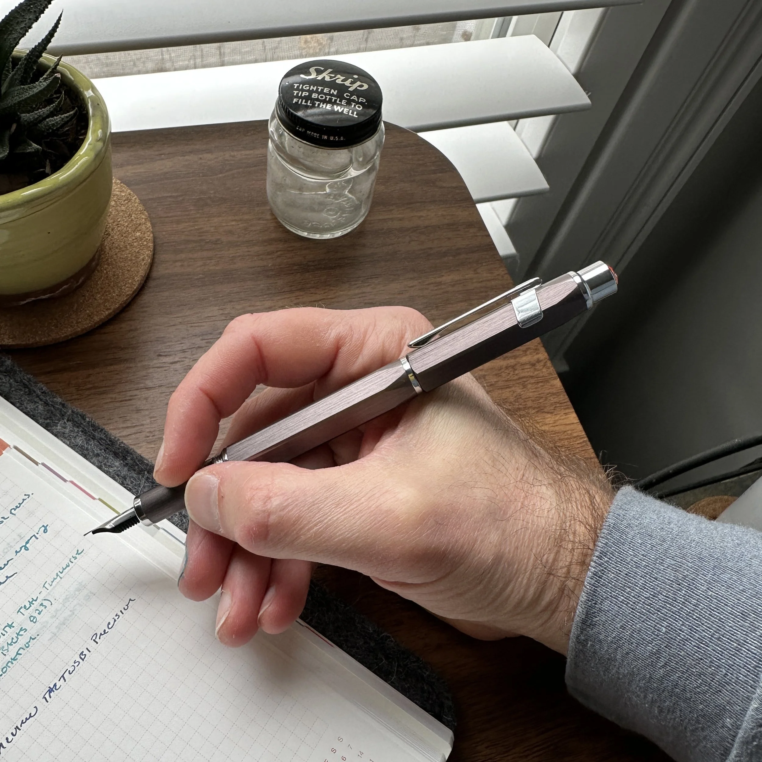
View fullsize TWSBI Precision Posted In-Hand

Though traditionally intended for “technical” professionals such as architects, there’s no reason you can’t use a so-called drafting pen for everyday writing. The Precision writes comfortably due to the rounded section (no knurling here), and I’ve found the pen to feel best unposted. That said, the piston knob/blind cap on the back of the pen does come equipped with a double set of o-rings to allow you to post the cap securely, and while a touch long for my taste, the pen certainly remains usable.

Like most TWSBI fountain pens, the Precision fills with TWSBI’s reliable piston mechanism, and this particular model includes an ink window just above the section threads so you can monitor your ink level. Here the Precision borrows from the TWSBI “Classic” - yet another TWSBI back-catalogue item I’ve never reviewed. While the Precision doesn’t hold as much ink as the TWSBI ECO or the Diamond 580, you’ll still get a significant amount of writing from each fill. I’ve had this one inked for a couple of weeks and it’s not run dry on me yet despite fairly heavy use at work. As noted above, the pen sports the same nib as the Diamond 580, and offers the same reliable writing experience.

The TWSBI Precision (Center) compared against a TWSBI Eco and a TWSBI Diamond 580. Size-wise, the precision sits in the middle of the pack, more akin to the Classic.

Takeaways and Where to Buy

The TWSBI Precision reaffirms, once again, my decision to spend some time revisiting companies’ “back catalogues” and reviewing older models that I bypassed in the early days of T.G.S. The Precision is an excellent fountain pen, especially for $80 (compared to $300+ for some of the vintage Rotrings), making it a great way to try out this type of writing instrument. The nibs are standard TWSBI Diamond 580 nibs, though the nib units are slightly different and you will need to swap the nib directly (by pulling and replacing) rather than using the Diamond 580’s threaded nib unit. The design offers TWSBI fans and/or those looking for a reasonably priced “technical” fountain pen something quite different to add to their rotation.

I’m somewhat surprised TWSBI has not expanded the Precision fountain pen lineup with at least one or two other colors, such as standard black and silver to match the ballpoint and mechanical pencil. Given the demand for this type of fountain pen, and Rotring’s exit from the technical fountain pen market, there should be a natural opening, and that brushed metal finish would look exceptionally good in multiple colors.

For further reading, be sure to check out our review archive featuring additional reviews of TWSBI and other brands. You can purchase the TWSBI Precision fountain pen, as well as other TWSBI products, directly from us in the T.G.S. Curated Shop. The content side of the Gentleman Stationer is entirely self-supported via the shop and the Patreon Program.

In Pens Tags Technical Pen, TWSBI Precision, TWSBI, Fountain Pen, Pen Review
2 Comments

Pen Review: Graf von Faber-Castell Classic Macassar Fountain Pen

February 1, 2023

If there’s one thing that I’ve learned during my near decade in the pen world, it’s that sometimes you enjoy things that you shouldn’t enjoy. What do I mean by that? Well, as a general rule, I tend not to like slimmer pens that don’t post. While there are exceptions, I typically find slim, non-posting pens unbalanced (posting the cap can give an otherwise too-skinny pen a necessary bit of heft), and in any event it can be a hassle to keep track of the loose cap while writing. Did I mention there are exceptions…?

I’ve previously reviewed the Graf von Faber-Castell Classic fountain pen, and enjoyed that pen when I had it on loan, but ended up returning the review sample due to concerns about the dimensions and how well those would work for me as an everyday writer. Since posting that review (back in 2018), I’ve acquired two Graf von Faber-Castell fountain pens, and after a longer test period, held on to both of them in my permanent collection. Of the two (a Guilloche and the pen featured here, the Classic Macassar), the larger Classic Macassar is my favorite.

Graf von Faber-Castell makes fountain pens in a range of sizes. The Classic series, which features most of their wood barrels, is larger than the Guilloche series, shown on the right.

I have a fair number of black-trimmed pens in my collection, ranging from Sailor’s Pro Gear Imperial Black and Black Luster to the Montblanc 149 Ultra Black release from a few years ago, so if I was every going to invest in one of Graf von Faber-Castell’s flagship pens, it would be this one. Featuring an 18k ruthenium-plated nib and PVD-coated titanium trim, the Classic Macassar is stunning to look at. The darker trim perfectly complements the darker Macassar Ebony wood, and like pretty much every other pen I’ve ever tried from Graf von Faber-Castell, the nib writes perfectly. The Company states that each of these nibs is “run-in by hand,” which I take to mean that it’s hand-tested and tuned before it leaves the factory.

The PVD coating on the metal section gives it a nice grip, and the elongated concave shape is exceptionally comfortable.

As I mentioned, design-wise, I shouldn’t love this pen as much as I do. The cap is extremely impractical, but I love the oversized, top-heavy look, and the spring-loaded clip works wonderfully. That said, this pen absolutely does not post. While the Graf von Faber-Castell website shows a photograph of the Classic Macassar posting relatively deeply, my pen barely posts at all, to the point where I don’t even want to post the pen for photography purposes because I don’t want to risk damaging the threads or internal cap. If posting is an absolute necessity for how you use pens, I’d consider the Graf von Faber-Castell Guilloche series, a slightly smaller, slimmer fountain pen that posts more securely.

For comparison purposes, I’ll show a photograph of my Graf von Faber-Castell Guilloche fountain pen, which is a slimmer pen that posts, even if the end result is a touch long for my taste.

Personally, I find that the Classic Macassar is just heavy enough for me to comfortably use unposted, and while the inability to post the cap will likely leave this particular fountain pen outside the “daily Workhorse” category, I’ve had a hard time putting it away. Even though I’ve told myself I should sell it, because it’s not an everyday user for me, I can’t. Do you have pens in your collection that you have some sort of inexplicable draw to, that you enjoy using even though it’s a pen that your experience tells you that you absolutely shouldn’t like, but you do anyway? Well, this is one of those for me.

The Graf von Faber-Castell Classic Macassar in-hand.

Takeaways and Where to Buy

Though an exceptional fountain pen with a unique look, like most GvFC products, the Classic Macassar retails at an extremely high price point. As of the time of writing, MSRP on this pen is $685 as shown on the Graf von Faber Castell US website, with most retailers having it priced around $550. That’s expensive, but then again, on par for a ruthenium-plated nib pen with blacked out titanium parts. (Compare with the Sailor Pro Gear Imperial Black, which now lists for $472, or the Montblanc 146 Ultra Black, which apparently has a secondary market value north of $1200?) Whether the pen is "worth it” to you goes far beyond practicality - for me, the combination of black trim and dark wood, as well as the wonderful writing experience offered by the Graf von Faber-Castell Classic pens in general, keeps this one in my collection.

For this review, I chose to ink this Graf pen with Ferris Wheel Press Roaring Patina Black, and the review paper is the excellent Life Noble Note.

I acquired this pen years ago, and can’t remember exactly where (though it was probably either Appelboom or the now-closed La Couronne du Compte). This post does not contain third-party affiliate links or advertising. The Gentleman Stationer is supported entirely by purchases from the T.G.S. Curated Shop, and pledges via the T.G.S. Patreon Program.

In Pens Tags Graf von Faber-Castell, Fountain Pen, Fountain Pens
4 Comments

My Favorite Style of Pen: A Second Look at the Aurora Optima Fountain Pen

November 2, 2022

Since this coming Friday is Fountain Pen Day, it’s only appropriate that both of my main posts this week be devoted to, well, fountain pens! Today’s post is less a full review than a further observation based on several years of heavy use. Back in 2016 I reviewed the Aurora Optima, on loan from my friend Thomas. While I enjoyed that pen, it was a bit out of my price range at the moment and I didn’t end up picking one up until a couple of years later, when I added the green Auroloide version pictured here. I wanted to take a moment today to remark not only on how much I have enjoyed the Optima, but in particular the shape.

Sailor Pro Gear Imperial Black (left) compared against the Aurora Optima. These two share a similar profile.

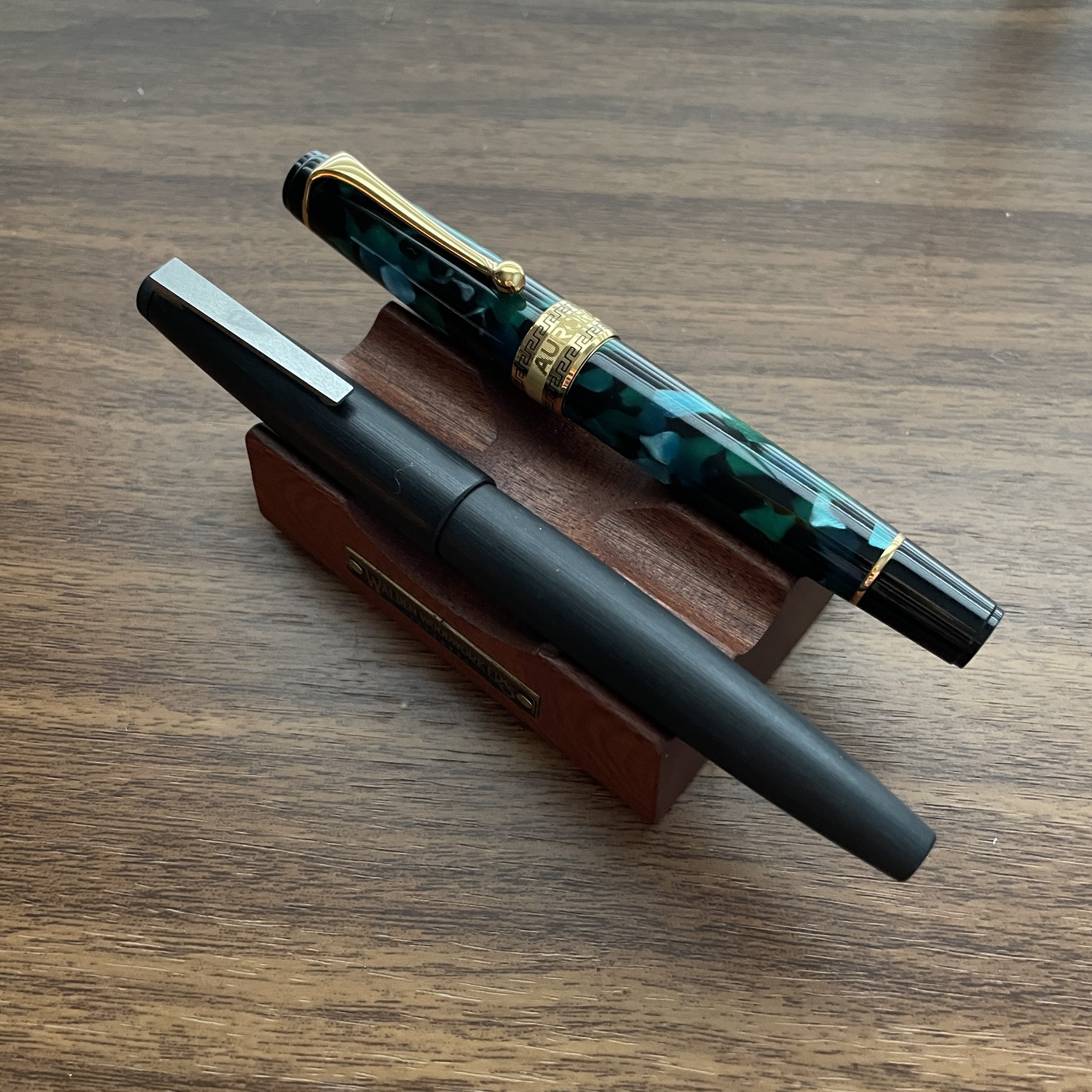
If you’ve followed the blog over the years, you likely know that I have several pen models that are personal favorites, including the Lamy 2000 and the Sailor Pro Gear. If you add the Aurora Optima and the Opus 88 Minty (a recent addition) into that mix, you’ll also notice a trend: I apparently favor a streamlined flat-top design, mostly in pens that post.

Lamy 2000 (left) vs. Aurora Optima.

Why do I like this shape so much? As with all things fountain pens, it’s largely a matter of personal preference. “Postability” plays a huge role: Most days I’m running between meetings in different offices and conference rooms, writing perched on different chairs and sometimes even on a bench in the back of a courtroom or leaning against the wall in a crowded conference room. I can’t really worry about what I’m going to do with the cap of my fountain pen.

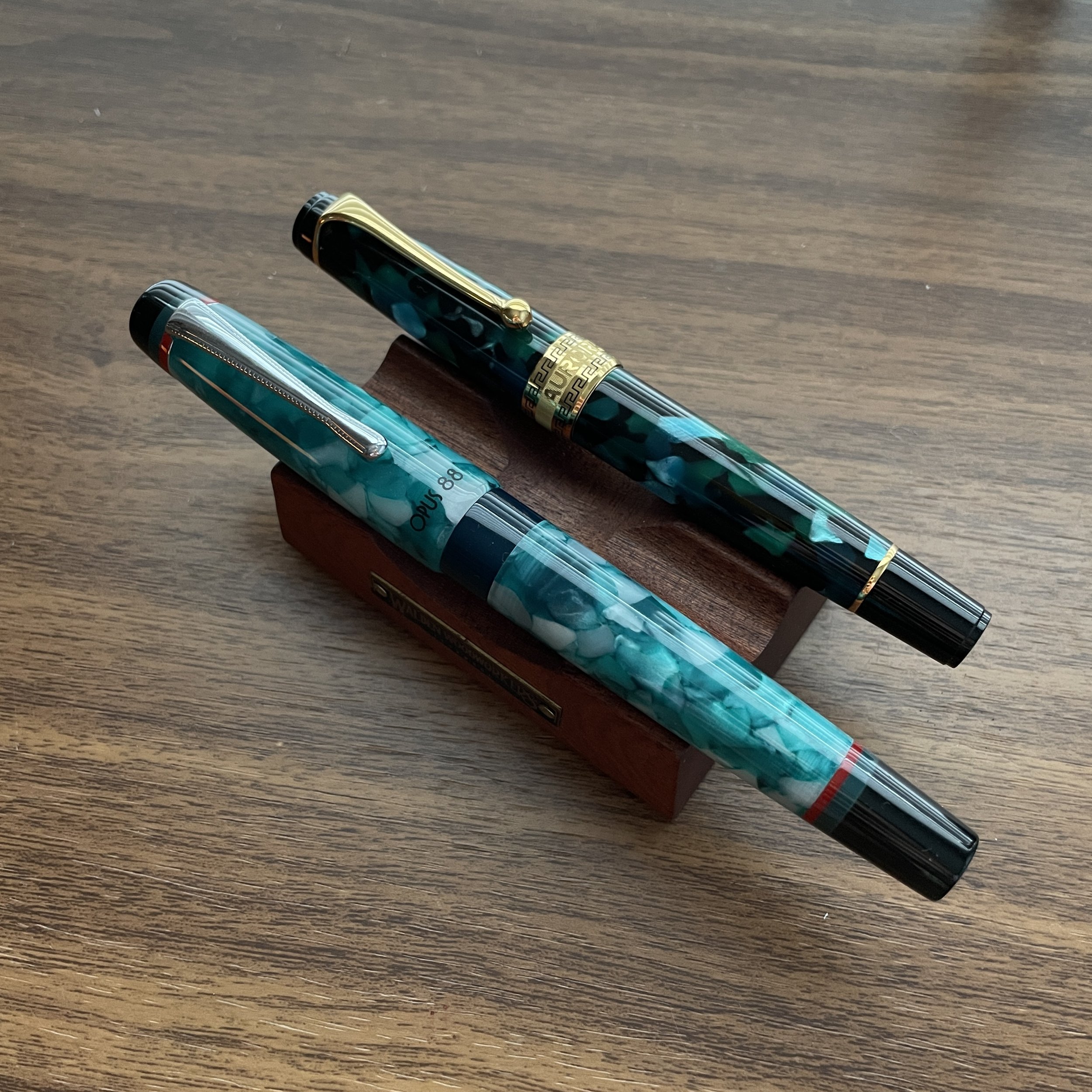
But a lot of what I enjoy about this pen design is personal in the sense that the shape fits my hand better than nearly every other style. With both the Lamy 2000 and the Pro Gear, the pen fits my hand best posted; the Optima sits in the midrange size-wise, at a point where I can generally use it either posted or unposted; and the Opus 88 is more on the upper end of the range, where I can post it if necessary (it’s very light), but when I’m at a desk or at home I find the size perfect unposted.

The Opus 88 Minty (left) and the Aurora Optima (right)

Takeaways and Where to Buy

If I found myself in a position where I had to choose a single model of fountain pen to use forever, never purchasing another pen ever again, chances are that it would likely be one of the pens pictured here. A primary goal of my writing here at T.G.S. has been to encourage people, when making a purchasing decision, to look beyond the aesthetics of a pen or piece of stationery to how well it will work for them in everyday use. While pens like the stock Aurora Optima or Lamy 2000 may not be the most visually exciting from the perspective of today’s FOMO, limited-edition driven market, they have staying power among fountain pen aficionados for a reason: they’re well-built workhorses that will let you write comfortably, for long periods of time.

An overhead comparison of four pens with a similar classic shape.

You can purchase the Aurora Optima pictured here from most Aurora dealers, as it’s the standard green model with gold trim. I picked this one up from Dan at The Nibsmith, who doesn’t appear to have this particular color in stock at the moment, but our friends at Dromgoole’s do have it priced at $476. The Lamy 2000 and Sailor Pro Gears are also widely available at retail, generally priced at around $200 and $300-$350, respectively. For a similar look in a larger pen, you might consider the Opus 88 Minty (which we do sell directly), a Japanese-style eyedropper that not only holds a LOT of ink, but sits in at the $125 price point. I plan to review the Minty separately at a later date.

Further Reading on the Aurora Optima

I originally reviewed the Aurora Optima in Nero Perla Auroloide, and in that review I discuss most of the technical specs, etc. on that pen. I’ve also reviewed the Aurora Optima Rollerball, which features the same excellent overall shape in a rollerball format.

This post does not contain affiliate links. The Gentleman Stationer is supported entirely by purchases through the T.G.S. Curated Shop and the T.G.S. Patreon Program. The site takes a lot of time and effort to maintain, and we greatly appreciate your support if you have the opportunity to make a purchase through our online store or throw a couple of dollars our way via Patreon. Many thanks!

In Pens Tags Fountain Pens, Fountain Pen, Aurora Optima
3 Comments

Exploring Stock Custom Nibs: The Esterbrook Needlepoint by Kirk Speer

May 11, 2022

In my past few pen show reviews, particularly my review of the Baltimore Pen Show, I remarked on how there are many more nib grinders working at pen shows than there used to be. The result is not only shorter wait times and more options for those looking to tune or customize their fountain pens to their personal preferences, but a wider range of styles and specialties that only make this hobby more fun and more interesting.

A secondary benefit to having more working nib grinders is yet another trend: manufacturers offering pre-ground specialty nibs as an add-on to standard pens. While Franklin-Christoph has done this for years, with their Masuyama, SIG, and Nagahara-ground nibs, Esterbrook now offers a cursive italic (“Journaler”), an architect (“Scribe”), and now a needlepoint, from Kirk Speer of Pen Realm.

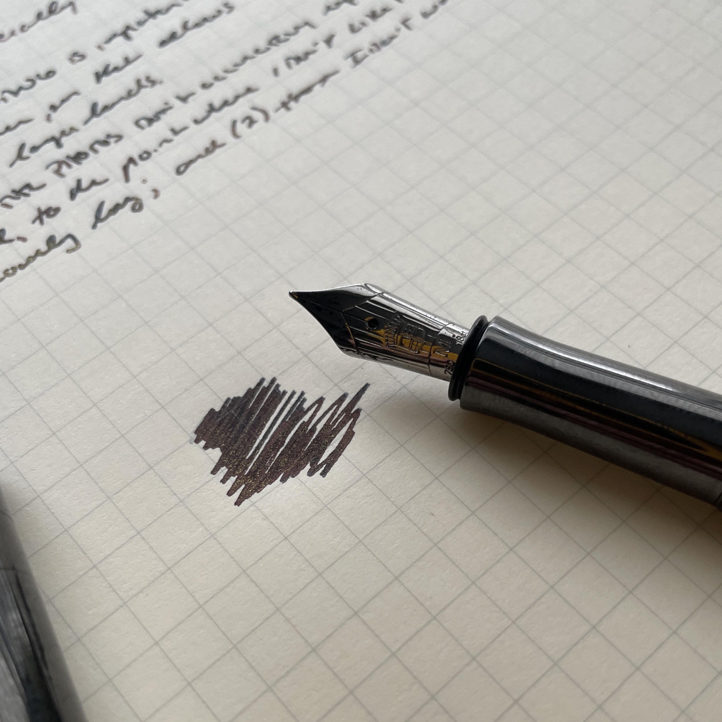
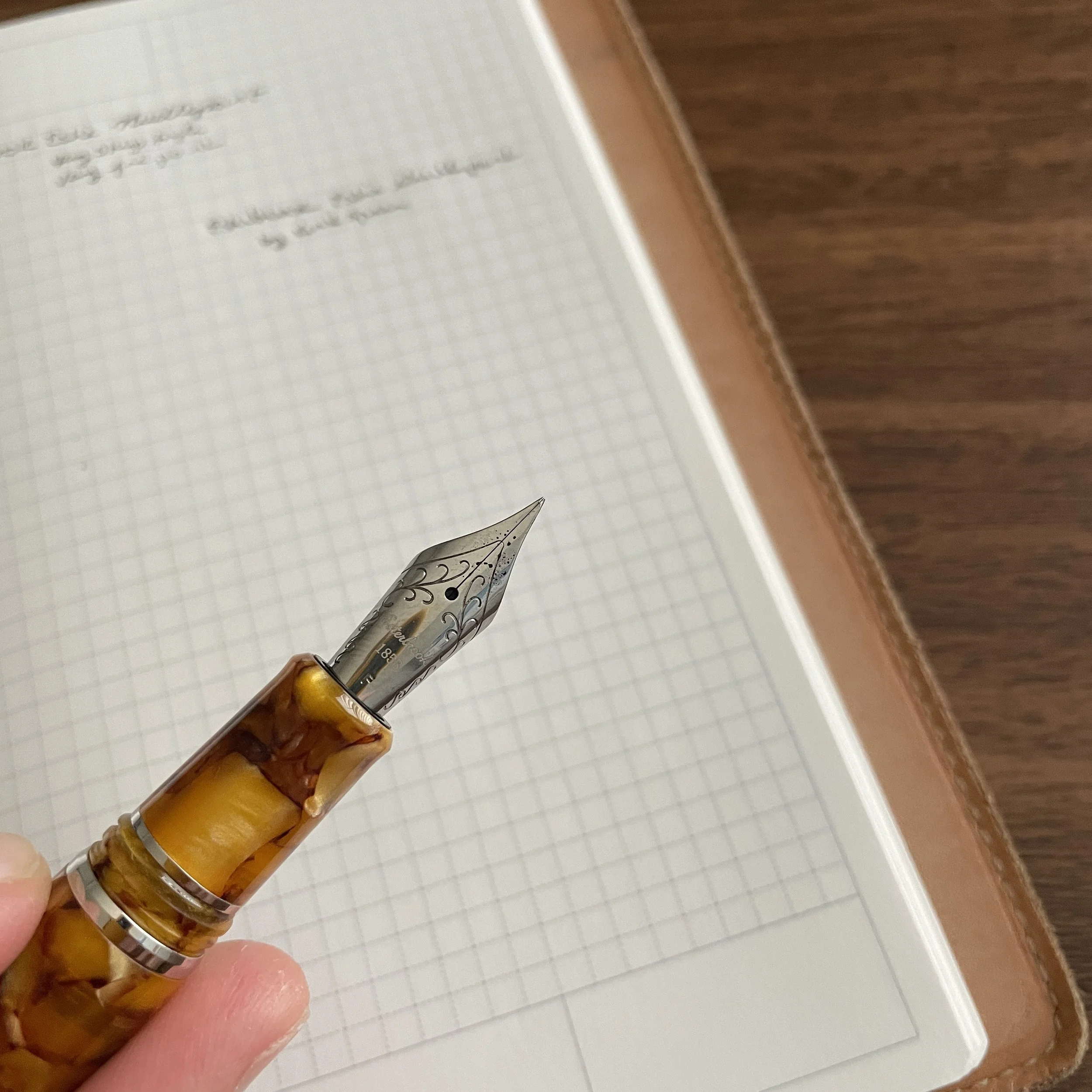
This Kirk Speer needlepoint nib from Esterbrook balances a narrow line with smooth writing.

Needlepoint grinds, or “extra, extra-fine” or “ultra-extra fine” nibs, aren’t necessarily as popular among enthusiasts as stubs, italics, and architects. They require you to use light writing pressure, or else the sharp tip will dig into the paper, and even with a light hand needlepoint nibs can feel toothy, which some people consider “scratchy.” That said, if you have small handwriting, or need a fountain pen to use for annotations or marginalia, I’m a firm believer that you need at least one needlepoint nib in your collection.

Kirk ground this needlepoint from a fine, as opposed to an extra-fine. Having more tipping to work with on the original nib often leads to better results, in my experience, especially if you value smoothness.

This particular nib, ground for Esterbrook by Kirk Speer of Pen Realm, is smoother than most needlepoints I’ve used, making it a perfect nib for those who want something that writes a narrower line than your typical JoWo steel extra fine nib, but isn’t so fine that it can’t easily be used for everyday writing. I would compare this needlepoint nib to a standard Japanese extra-fine nib (or even some Japanese fine nibs), rather than something like the Platinum Ultra-Extra Fine or the Franklin-Christoph Nagahara nibs. That said, because these nibs are ground by hand, there will lbe at least some variation between them, and the nib I received may not be identical to every nib out there.

Comparing the line from a Platinum Ultra-Extra Fine Nib (top), the Franklin-Christoph Nagahara needlepoint (middle), and the Esterbrook by Kirk Speer needlepoint (bottom). The Esterbrook nib writes a wider line, but is much smoother and better for everyday writing than the other two, which many people find too toothy. (I personally love them, but I have situations where I need to write very, very small.)

Takeaways and Where to Buy

Esterbrook has done the pen community a great service by introducing these custom nib options into its standard lineup, and by making it easier to get a custom nib grind as an add-on to your purchase of an Esterbrook pen without having to travel to a pen show or separately send your pen off to a nib grinder for what can be a weeks-long waiting period. While an ultra-fine needlepoint grind may not be for everyone, I found this particular nib to be well-made, and it will have a permanent home among my various Esties.

The Esterbrook featured here is the Honeycomb with Chrome Trim, one of my favorite materials.

You can purchase the nib and pen featured in this review from most Esterbrook retailers, including our friends at Vanness Pens. Typically, the custom-ground Esterbrook nibs cost an additional $48, with most of the markup going to cover the cost of the nib work. (To compare, having a pen ground to a needlepoint typically costs around $50, excluding the cost of shipping.) If you’re interested in further exploring Kirk’s work and having him grind or modify a pen for you, visit his site at Pen Realm.

Further Reading

Those interested in reading further on different types of custom nib grinds should start with this post I wrote a couple of years ago. In terms of other specialty Esterbrook nibs, I have reviewed the Esterbrook “Journaler” nib - a cursive italic nib ground by Gena Salorino of Custom Nib Studio, which is still available. There is also an architect nib, the “Scribe”, ground by Josh Lax of J.J. Lax Pen Co., which I’ve not had the opportunity to try but I have used Josh’s architect nibs and enjoy them.

Disclaimer: Esterbrook provided me with the nib featured in this review free of charge, for review purposes. This post does not contain paid third-party affiliate links. The Gentleman Stationer is supported entirely by purchases made through the T.G.S. Curated Shop and the T.G.S. Patreon Program.

In Pens Tags Esterbrook Needlepoint, Custom Nibs, Nib Grinding, Fountain Pen, Esterbrook
2 Comments
Older Posts →
Store Location
Visit the T.G.S. Curated SHOP
*New* Updated "Best Pens" Guide (2025)
TGS x Hinze Pens Violet Tendencies Taschenstift Fountain Pen
Hierarchies of Fountain Pen Friendly Paper
Allex Scissors arrayed on a desk showing link to desk accessories

Join Our Patreon!
Subscribe to the TGS E-mail List

Featured Posts

Featured
Pilot-Iroshizuku-Yama-Budo-Writing-Sample.jpeg
May 24, 2025
Joe's Picks: Five Favorite Inks From Pilot's Iroshizuku Lineup
May 24, 2025
May 24, 2025
Yamamoto-Gray-Paper-Sampler-Set.jpeg
May 10, 2025
Discovering Unusual Paper: "Paper Tasting" Sets from Yamamoto Paper
May 10, 2025
May 10, 2025
Four-Micarta-Fountain-Pens.jpeg
Apr 19, 2025
Yes, Micarta for me! I finally got my hands on Some Micarta Pens, Plus My Own Special Edition
Apr 19, 2025
Apr 19, 2025
The Gentleman Stationer RSS

© Digital Divide Media, LLC, 2014-present.

All content is the exclusive property of Digital Divide Media, LLC, d/b/a The Gentleman Stationer, including “The Gentleman Stationer” website and trademark, and should not be reproduced without express written permission.  All rights reserved.

All content containing paid advertising, affiliate links, or sponsored content will be plainly disclosed by a disclaimer when/if featured.

Contact Information

Store Shipping Policy and Return Policy

Privacy Policy

Cookie Policy

Terms and Conditions

Powered by Squarespace