I’ve never given the Caran d’Ache 849 fountain pen a proper stand-alone write-up, even though it’s been on the market for several years now. Like the 849 ballpoint, the fountain pen has grown on me over time, as yet one more way in which Swiss company Caran d’Ache has taken the classic hexagonal barrel and applied it to writing instruments beyond the woodcase pencil. I figured it’s time to take a closer look at this pen.
Back when this pen was first introduced, it was a bit of a departure for Caran d’Ache, as they previously had been known for higher-end fountain pens such as their Léman and Ecridor series. While releasing a fountain pen in the $50-60 price range increased the brand’s accessibility, moving “downmarket” was viewed by some as risky, given the company’s relative lack of experience at the price point and the inevitable manufacturing and quality control compromises that often need to be made to create an affordable fountain pen. Years later, however, the 849 fountain pen is still around, remains widely available, and has garnered a good reputation as not just an entry-level pen but a solid everyday writer for those who enjoy a slimmer format with a couple of different grip options.
Before I continue with the rest of the post, I want to be completely transparent up front that I am an authorized Caran d’Ache retailer and sell these and other Caran d’Ache products in my shop. My goal, as it has always been, is to offer detailed discussions and reviews of products so that you can make an informed decision about what you ultimately decide to purchase. I’m selective about the products I stock, drawing on nearly a decade of prior experience as a pen user and collector, and generally only sell products that I would use myself. That said, I strongly encourage readers to do as much research as they can, including from sources other than me, before deciding on any purchase.
Pen Design: Building on an Iconic Shape
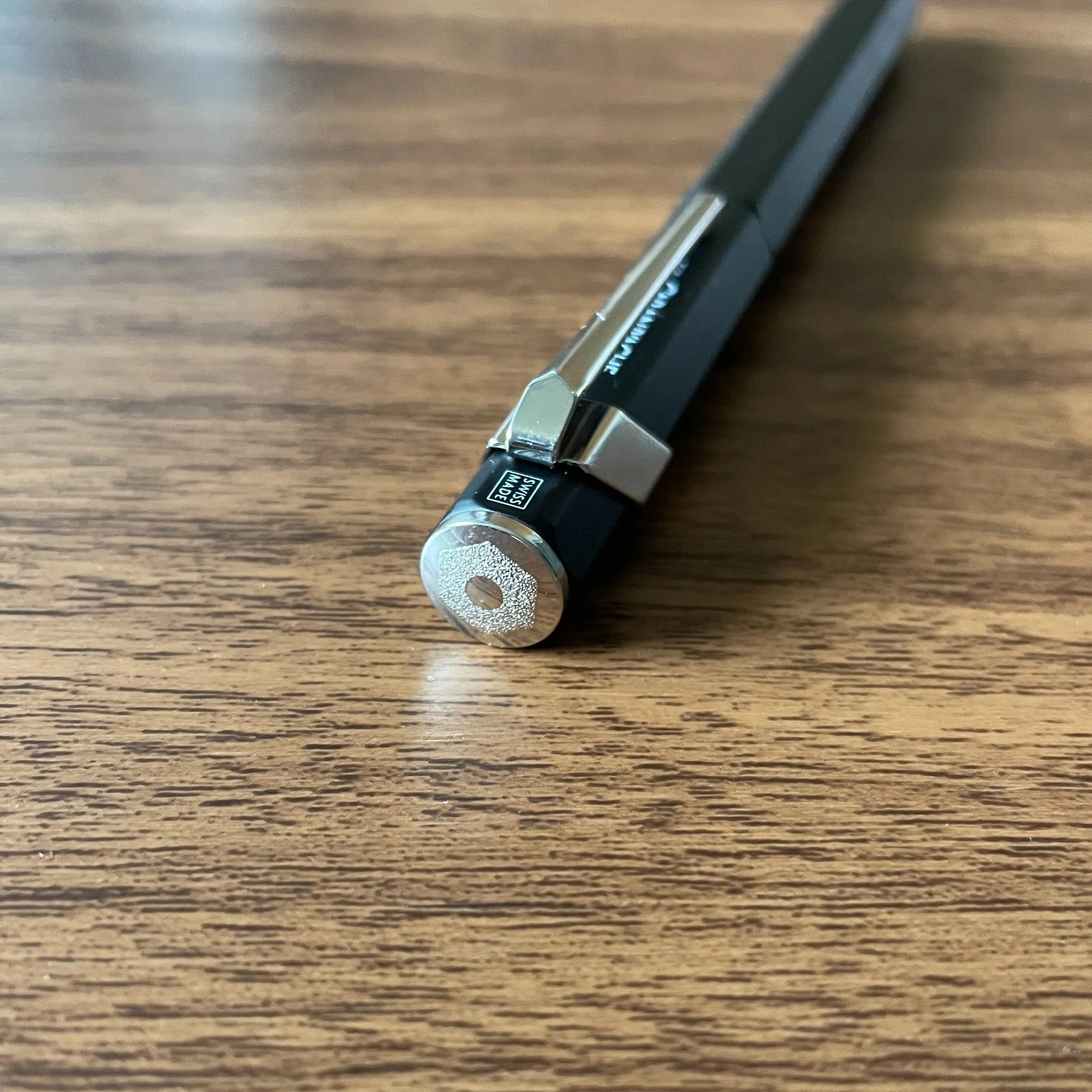
The 849 fountain pen is pretty simple, construction-wise, featuring a lightweight aluminum body that comes in a variety of finishes: classic navy blue, white, red, and matte black, as well as “wilder” green, orange, yellow, and pink fluorescent. The pen accepts short international cartridges, long international cartridges, and will take a Caran d’Ache converter if you want to fill from a bottle.
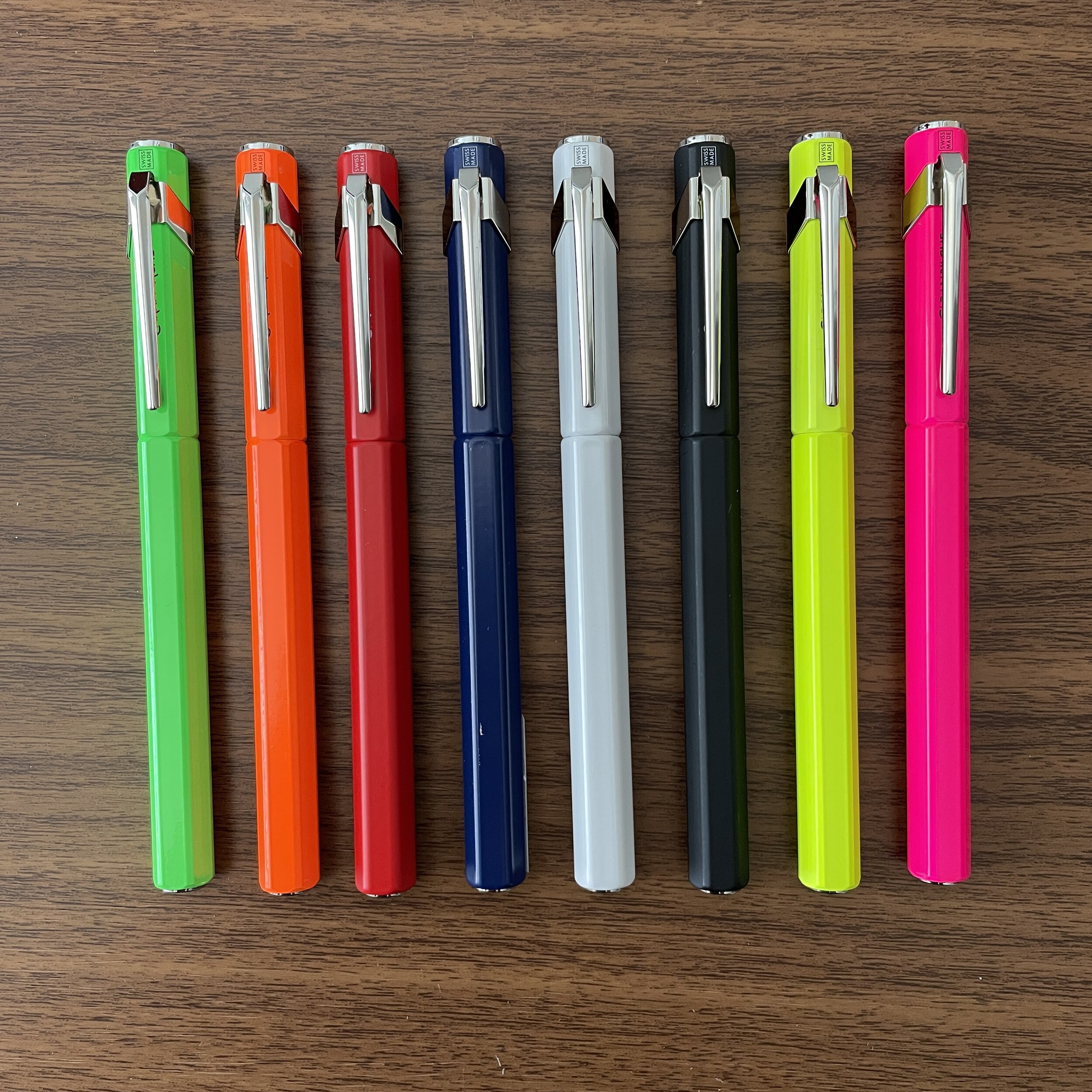
The full color array of Caran d’Ache 849 fountain pens.
Where the Caran d’Ache 849 fountain pen departs from most pens in this price segment, however, is its unique design. The pen borrows its hexagonal barrel from the 849 ballpoint, with the hex edges slightly rounded for increased comfort. The Caran d’Ache logo appears etched on the cap finial, with branding tucked under clip - another quirky design touch shared by the 849/844/Fixpencil family. Like its siblings, the 849 fountain pen fits well in a planner loop, so it’s easily portable.
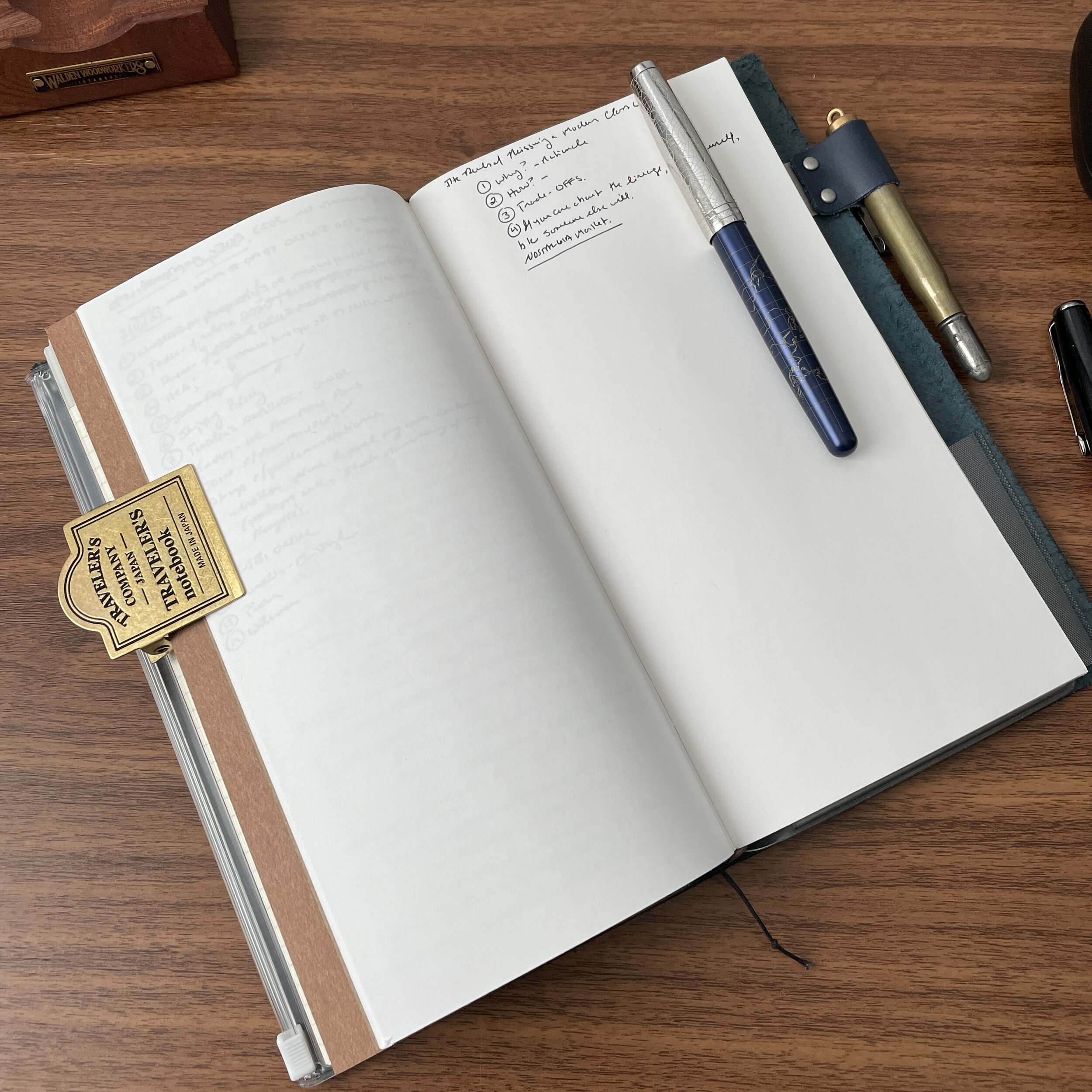
The 849 fountain pen will fit in the Traveler’s Notebook pen loop and other similarly sized pen slots.
Nib and Writing Experience
Though slimmer than what I typically prefer in a daily writer, I consider the 849 fountain pen comfortable to use, and it makes for a convenient pen to keep in the pen loop of a planner or notebook. The friction-fit cap snaps firmly closed, and attaches securely to the barrel in case you want to post the pen.
The Caran d’Ache 849 fountain pen stainless steel nib in fine, with a splash of Idyllic Blue.
The pen features a smaller stainless steel nib with a shape somewhat reminiscent of the nib on a Lamy Safari. Though not at all “flexible,” I would describe it as pleasantly springy, and the all of the ones I personally have used have been smooth. Given the pen’s light weight (even posted), you can comfortably write for longer sessions, provided a slimmer format works for you.


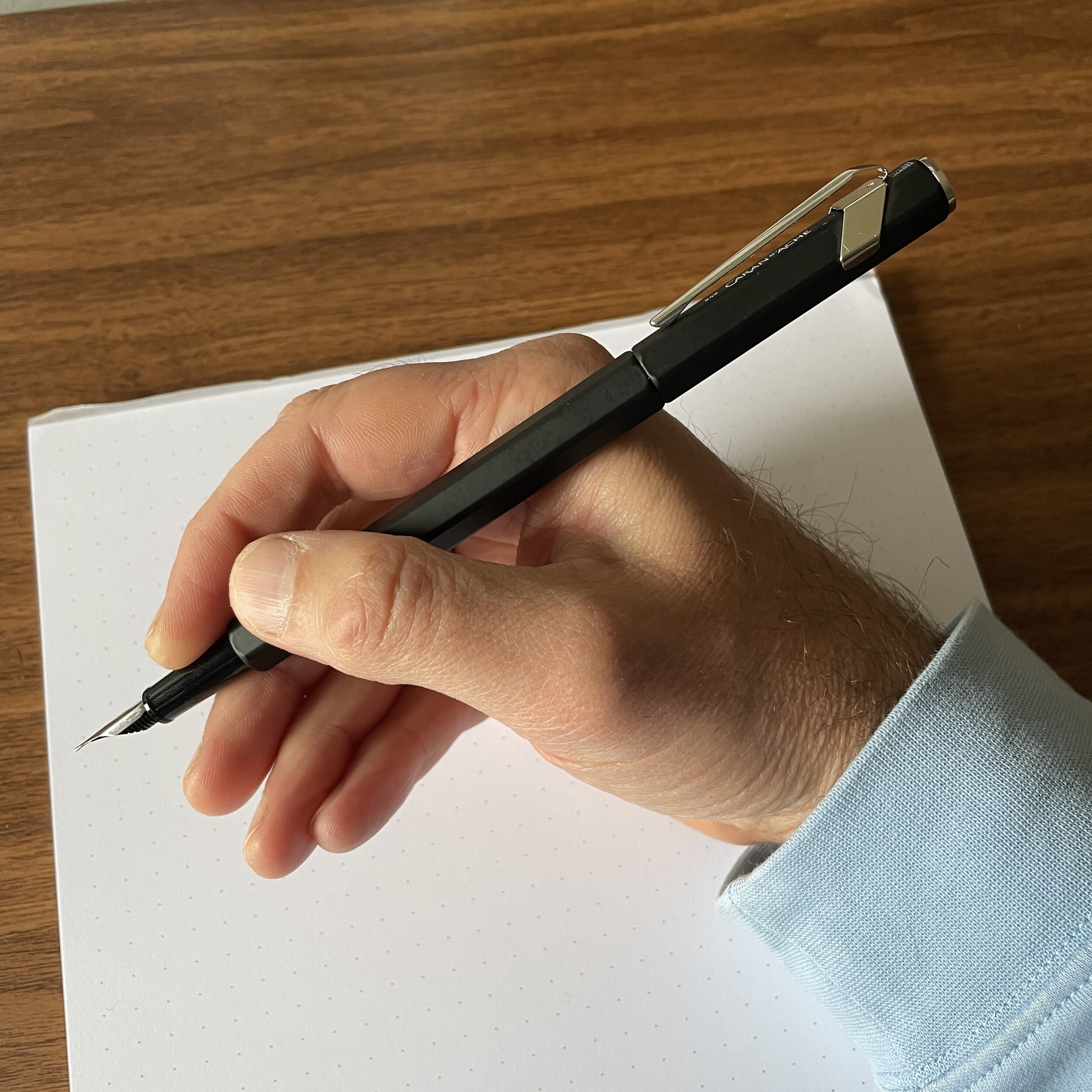
The section and barrel present a couple of different grip options. You can of course hold the pen at the rounded plastic section, but I sometimes grip this pen a bit higher up on the hexagonal barrel. While it gives the pen a bit of a “paintbrush” feel, I find it oddly enjoyable to use this way, especially if I’m writing in formal cursive.

Takeaways and Where to Buy
The Caran d’Ache 849 fountain pen is a fun addition to the Swiss company’s now-iconic (and increasingly expansive) “849 lineup.” A key benefit of the shared design scheme is the ability to create matching fountain pen/ballpoint/pencil sets. Here, I opted for the matte black fountain pen for my own personal collection, because I already have a matte black .7mm mechanical pencil, and eventually I’ll add a “Black Code” 849 ballpoint and a black Fixpencil so that I’m color-consistent. (If the company is listening, the “Black Code” motif applied to a fountain pen, mechanical pencil, and fixpencil - especially a black-plated knock and clip - would sell like crazy. Just sayin’….)
From left, the “Black Code” 849 Ballpoint, the 849 fountain pen in matte black, the 844 mechanical pencil in matte black, and the Fixpencil with black knock.
As I noted above, Caran d’Ache is one of the brands I’ve chosen to sell directly, and I currently stock the fountain pen in all colors with fine and medium nib options, as well as the full range of Caran d’Ache “Chromatics” ink cartridges. If these pens do well, I’ll consider bringing in additional nib sizes, converters, and bottled ink, but for now I’m sticking to the most popular nib widths and cartridges, which honestly is how most people use this pen. The 849 Fountain Pen currently retails for $52, and ships with one Caran d’Ache “Idyllic Blue” ink cartridge.