• Blog
  • Shop
  • Podcast
  • Resources
  • About
  • Archive
  • Contact
  • Cart
  • Sign In My Account
Menu

The Gentleman Stationer

Vintage Living in the Modern World.
  • Blog
  • Shop
  • Podcast
  • Resources
  • About
  • Archive
  • Contact
  • Cart
  • Sign In My Account

Edison Menlo in Tibaldi Celluloid with clear acrylic ink window. Currently inked with Montblanc JFK Navy Blue.

Pen Review: Edison Menlo in Tibaldi Impero Celluloid

April 30, 2016

I've owned several Edison pens over the years:  a Pearlette, a Herald, and a Mina (unfortunately never reviewed).  And while I've enjoyed the pens, I've never found a shape and a material that I truly loved enough to make the pens stick in my collection.  That may change with the Menlo. 

View fullsize Edison Menlo in hand
View fullsize Edison Menlo unposted
View fullsize Edison Menlo posted

The Menlo is definitely my favorite of all of the Edison pens that I've tried to date.  I prefer the more slender torpedo shape that sits well in the hand and is comfortable to write with posted or unposted.  Since this pen does not have the brass pump filling system that the Menlo is known for, it's extremely light and perfect for longer writing sessions.  I have it filled as an eyedropper, so it also has an enormous ink capacity.  I haven't measured it yet, but my best guess would be around 4ml.  The ink lasts a long time on one fill.  

The Material:  Discontinued Tibaldi Celluloid

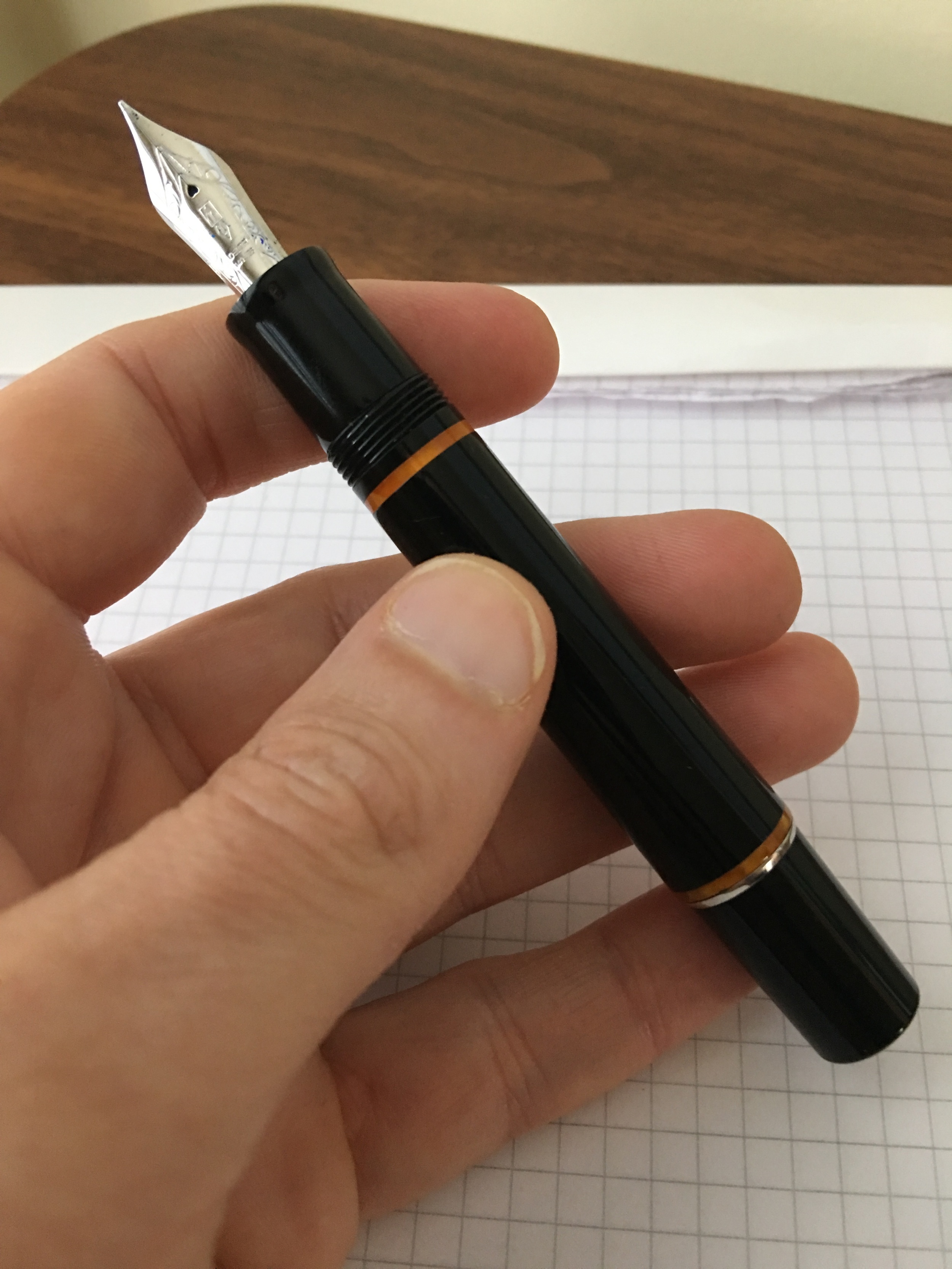
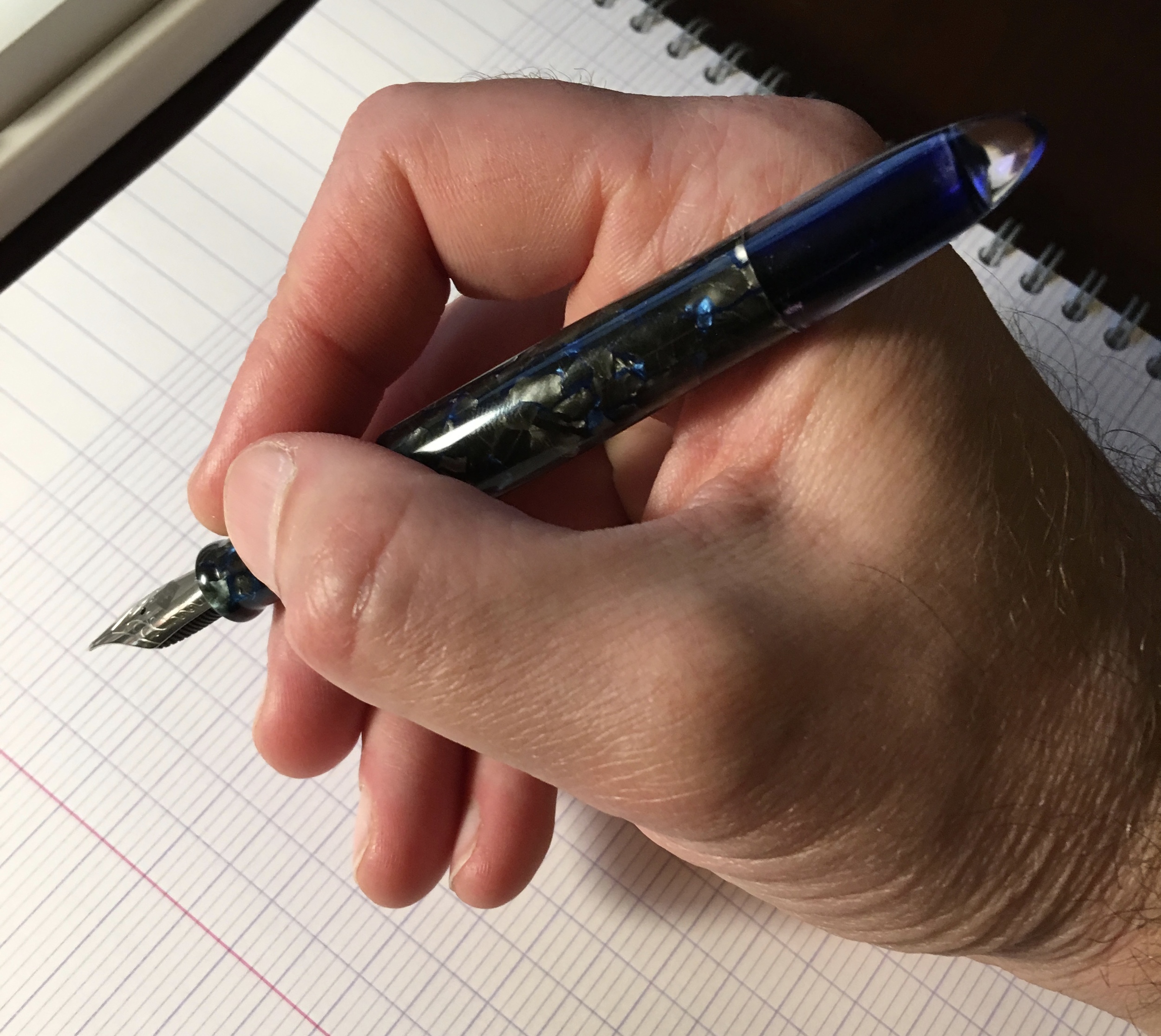
This pen is made from Tibaldi "Impero" celluloid, which is no longer available so I snatched this pen up as soon as I saw it come on the secondary "Slack" market.  This particular celluloid might be the most beautiful material I've ever owned.  It's a mixture of black, graphite, and gray pearl intermixed with veins of bright blue (think "Bung Box Sapphire" blue).  Photographs don't do the celluloid justice:  the material appears much darker on the screen than it does in real life, and you can't get a good sense of the depth of color and complexity of the design.  

Tibaldi Impero celluloid is notoriously difficult to photograph.  It's hard to capture the full range of colors running through this material. 

A lighter picture in which I tried to capture the detail in the material a bit more. 

This custom pen also features a clear acrylic ink window, which can serve as both a reminder of the color ink you have in the pen and a "warning light" to let you know when you're about to run out.  A big thank you to my friend and fellow Pen Addict "Slacker" Phil for commissioning this design, and then passing it along for sale!       

Once you can see the ink level through the window, 

A word of caution about celluloid pens:  they can stain.  Usually, I would not use a celluloid pen body as an eyedropper (or even as a Menlo pump-filler) because the ink is constantly in contact with the material, and will eventually cause the pen to discolor.  Because the Tibaldi celluloid is so dark, however, I haven't had any problems with noticeable staining from blue, black, or blue-black inks.  

A Note about Edison Nibs

You observant readers may have noticed that I've already reviewed the nib on this pen.  The GREAT thing about Edison Pens (and Franklin-Christoph pens, and Scriptorium pens, and Newton pens) is that the nibs are interchangeable.  The Edison Menlo accepts #6 JoWo Nibs, so I swapped out the stock extra-fine that came with this pen for my Franklin-Christoph Masuyama Broad Cursive Italic that I purchased with my Pocket 66.  I love this nib.  The cursive italic grind has excellent line variation, and is a slightly drier writer than a stub nib, which makes this nib an excellent choice for work. 

Pricing

The Menlo is an Edison "signature line" pen, meaning that it's custom-made to order, and because the standard Menlo has the fancy filling system, prices start at $350.  You would need to confirm with Brian Gray of Edison, but I believe the price for an eyedropper or cartridge/converter Menlo would be $250, since you would not have the added cost of the pump filler.  You also may have added cost depending on the material you choose and whether or not you opt for a gold nib.  Brian's pricing is standard for a custom pen, and to me represents good value. 

I'm a big fan of what Brian is doing over at the Edison Pen Company.  His pens are of excellent quality, and he has a wide range of offerings suitable for many different tastes.  He will also work with you on completely custom designs.  I highly recommend you check him out. 

Disclaimer:  I purchased this pen with my own funds for my own collection.  I have not been compensated in any way for this review.

In Pens Tags Edison, Edison Menlo, Pen Review
Comment

Book Block Customizable Notebooks

April 26, 2016

A few weeks ago I was contacted by Phoebe at Book Block, a maker of custom notebooks based out of the U.K.  Book Block ran a successful Kickstarter campaign last year to fund their "Bookblock Original" brand, which they bill as "The World's First Truly Custom Notebook." Here's how they describe the Bookblock Original concept: 

“We thought it odd that all the good stuff only happens inside a notebook. Why not make the notebook your own and jazz up the cover with something awesome that’s personal to you? Bookblock Original is the brainchild of custom notebook manufacturers Book Block. Bookblock creates fully customised notebooks for businesses, brands and organisations in high-volumes. As a team of people who are passionate about art and design and involved in the creative world, we realised that more and more people wanted to be able to create products that were completely personal to them.”

Book Block will print a design of your choice onto a Moleskine-style notebook, which you can customize with your choice of ribbon, paper, etc.  The printed cover is good quality--they print at 2400 dpi, and the result is much better than other "customized" Moleskine-style notebooks I've received at conferences, for work, etc.  They also offer custom debossed leather covers, an option that I would be interested in checking out in the future.  I can see how this could be a lot of fun--if not addictive--if you were a designer or artist with some very detailed, intricate designs that you want printed on a notebook.  I stuck with my blog logo for my test notebook.  Not the most original, but it came out well. These high-quality, professional images were provided by Book Block, along with my notebook.  I've also included some shots of other custom notebooks they have done, to give you a sense of what's possible.  

View fullsize BookBlock Custom Notebook6.jpg
View fullsize BookBlock Custom Notebook4.jpg
View fullsize BookBlock Custom Notebook5.jpg
View fullsize BookBlock Custom Notebook1.jpg
View fullsize BookBlock Custom Notebook2.jpg
View fullsize BookBlock Custom Notebook3.jpg

A Mini-Review of the Monsieur Notebook

The notebook I received is a customized Monsieur notebook, a brand that was heavily promoted a few years ago as a Moleskine-style notebook with a leather cover (either real leather or vegan leather). The notebook itself is very nice and sturdy, and lays flat.  The paper in my notebook is the 80 or 90 gsm plain paper, which is better than Moleskine paper but still has a lot of bleed and show-through with fountain pen and rollerball inks.  I wouldn't consider it unusable by any means, but this particular book will probably see more use with ballpoints, gel, and pencils.  If you decide to place an order with Book Block, and you write primarily with fountain pens, I would recommend that you upgrade to the 100 gsm "Fountain White" paper.  Also, YMMV with Monsieur's ruled or dot-grid paper, instead of the blank. Ana over at The Well-Appointed Desk had a good experience with Monsieur's stock 90 gsm ruled paper, which also comes in a dot grid format.  Monsieur Notebooks are more easily found in the U.K. than in the U.S., but you can order them through Amazon, with prices ranging from $15-25 depending on size and paper choice.    

View fullsize Monsieur Notebook Sample
View fullsize Reverse Monsieur Writing Sample

Takeaways

I'm very happy with my custom notebook, and once I burn through some of my notebook backlog, I'm considering ordering a few more in different cover designs (with the "fountain" paper).  I will be interested to see how well the cover on the notebook holds up.  The soft-cover feels very nice in the hand, but it does pick up finger marks and the spine creases fairly easily. That's likely due to the soft texture and the fact that I chose solid black, but I did want to mention it because people can be very particular about that sort of thing.  

A big thank you to Phoebe and her team over at Book Block, who worked with me on this notebook! 

DISCLAIMER:  Book Block provided me with a single notebook, free of charge, for review purposes.  My thoughts here are my own.  This post contains some affiliate links, through which I may be compensated a small amount if you purchase something from certain sites linked to in this article.  While I'd greatly appreciate it if you use these links to purchase an item you are interested in, you are, of course, under no obligation to do so.  Many thanks! 

In Notebook Review Tags Book Block, Custom Notebook, Monsieur Notebook
Comment

The Delta Dolcevita Soiree Mid-Size:  the "understated" entry in the Dolcevita line. 

Pen Review: Delta Dolcevita Soiree

April 23, 2016

Delta has become one of my favorite modern pen companies.  In recent years, they've expanded their line and, in my opinion, the change has been for the better.  They've moved away from extremely large, flashy (some would say tacky) limited edition pens, and introduced more understated designs, as well as several reasonably priced entry-level offerings.  In this review I'm going to take a look at a variation on Delta's flagship "Dolcevita" pen, the "Soiree" model.  

The main thing that made me hesitant to purchase Delta Pens in the past was their size.  I had always regarded Delta as the Italian company that made very large, chunky pens with a lot of flashy gold or silver trim, usually in some sort of crazy theme.  Delta still does that, and many of their pens aren't to my taste, but in recent years they've slimmed down the size of their offerings which brought the company back onto my radar. 

The first Delta that really drew me in was the Fusion 82, which Delta introduced several years ago as the vehicle for marketing their "Fusion" nib.  I won't go deep into the controversy that the Fusion Nib generated in this particular article. Long story short, the Fusion nib is a steel nib with a piece of gold plating fused to the top of it, and its release was accompanied by a lot of marketing hype supported by "questionable" scientific assertions regarding what that gold plate does to the ink in the pen.  Regardless, I got a really good deal on two Fusion 82s at the 2014 D.C. Pen Show, and whatever you think about Delta's marketing, my two Fusion nibs are up there with the best-writing pens in my collection.  

The Mid-Size Dolcevita

Delta's packaging is incredibly tasteful.  The Dolcevita Soiree Mid-size came with a pack of Delta cartridges and a converter, so it's immediately ready to write.  

Having enjoyed my Fusion 82 pens for a year, I reconsidered the Dolcevita.  The standard Delta Dolcevita is a sizable pen, combines a bright orange celluloid body with a black cap and silver trim, and sits just on the borderline of what I would consider "too big" and "too flashy" for my taste. Even the smaller Dolcevita "mid-size" qualifies as a large pen in my book.  At some point, thought, I saw the Soiree model, probably at the 2014 D.C. Pen Show, and it stuck in my head. Once I saw a deal I couldn't pass up, I jumped on it.   

From what I can tell, the Dolcevita Soiree only comes in the mid-size, which means that it uses a cartridge-converter filling system rather than the piston used by the larger Dolcevitas.  That's fine with me--I've grown to prefer C/C fillers as they are exceptionally easy to clean.  While I will probably add the standard Dolcevita to my collection at some point--what can I say, it's grown on me--I think I prefer the design of the Soiree.  It's a solid black resin pen (nothing really exciting there), but it's saved from being boring by four bands of bright orange celluloid, offset by a sterling silver cap band.  Delta also uses a "roller" clip on the Dolcevita, which makes this pen exceptionally easy to get in and out of a shirt pocket, and the clip doesn't snag the fabric.

The mid-size pen is still relatively large, as I mentioned, but it's very well balanced, and can be used posted or unposted, as reflected in the gallery below.       

View fullsize IMG_1052.JPG
View fullsize IMG_1053.JPG
View fullsize IMG_1054.jpg
View fullsize IMG_1055.jpg
View fullsize IMG_1057.JPG

A Nib That Writes Well Out of the Box

What keeps me coming back to Delta pens (five times now) are the nibs.  While I've had some of my Delta nibs modified with specialty grinds, not a single one of these pens has needed to be adjusted out of the box to make it write well.  No babies' bottoms, no hard starts, no misaligned tines, and no scratchiness.  The Dolcevita Soiree is no exception.  This fine nib even has some angular, stub-like qualities that makes my writing stand out a bit more than typical western nibs, which I sometimes find "blobbish" without much line variation.  The pens in the Dolcevita line come in both 14K and Fusion nib models.  I prefer the 14K, but if you don't want to pay the extra premium, I have had excellent experiences with the Fusion nibs, too.

The 14K fine nib on the Delta Dolcevita Soiree Mid-size.  I believe most of Delta's nibs and feeds are made by Bock. They write exceptionally well.  

One thing I will note is that Delta gold nibs tend to run true to size.  This is becoming increasingly rare with respect to western "fine" nibs: sometimes it seems as though all nib sizes are becoming wider by default, and in many brands (hem!, Lamy) there's literally no difference between the extra-fine and the fine.    

A writing sample with the Delta Dolcevita Soiree, 14k fine, Montblanc Limited Edition Tolstoy on Rhodia. 

Overall Impressions

I've enjoyed owning the Dolcevita Soiree, and it's turned into a regular daily writer.   I can't emphasize how refreshing it's been to have nibs write well out of the box.  Oddly enough, my two most recent purchases have been larger pens:  a Delta "Rediscover Pompeii" limited edition and an "Italian Technology" oversize demonstrator (which is a button-filler).  I guess I'm coming around to the "Delta aesthetic".  I'll review these pens at a later date, but everything that I've said here stands:  all of them write exceptionally well out of the box, and larger size notwithstanding, the pens are comfortable to hold and fit the hand well.  

Value

I purchased this Dolcevita Soiree on sale from Marte Modena during a promotion they were running last year.  If you recall, there was a lot of controversy over Delta's supposed move to Marte Modena for a large portion of their online sales.  Marte Modena's prices were so low (in some cases, well below wholesale) that some even speculated Delta could be in financial trouble and/or facing the threat of liquidation.  Now that a few months have passed, I don't have any greater insight into what was going on there, other than that it might have been a loss-leader promotion to gain business.  Marte Modena's prices now have come up significantly, in some cases all the way up to full MSRP.  

With respect to this pen, Marte Modena currently has it priced at $438 for a 14K nib, and $328 for the fusion nib.  I've not seen this pen at many U.S. retailers, so I'm not sure if it's still in production.  If it is, I imagine you can get a better price.  Until recently, Anderson Pens had one listed for $275, which is closer to what I paid and more than fair, but it's currently out of stock. One U.S.-based Amazon seller has the Soiree available, but it's priced at $476, which is high.  

In general, Bryant Greer of Chatterley Luxuries is another a good source for Delta pens, and he also collaborates with Delta on some special editions in celluloid.  You can check out my reviews of the two limited edition Fusion 82s that I bought in Delta's Pompeii and Marmo Incrinato celluloids here.  

DISCLAIMER:  I purchased the pen featured in this review with my own funds for my own collection. This post does contain affiliate links, through which I may be compensated a small amount if you purchase something from certain sites linked to in this article.  While I'd greatly appreciate it if you use these links to purchase an item you are interested in, you are, of course, under no obligation to do so.  Many thanks! 

In Pens Tags Delta, Dolcevita
1 Comment

The two pens I purchased at this year's Atlanta Pen Show:  A Pilot Custom 823 (top), and a Pelikan M800 in Burnt Orange.  

Atlanta Pen Show: Insane Saturday Recap

April 20, 2016

Saturday's are typically the first "public day" at pen shows, meaning that there's a bigger crowd because the doors are open to anyone who pays the $5-10 admission. Thursdays and Fridays are usually restricted to "weekend pass" holders, who pay $30-40 for early access to the show, as well a invitations to dinners and after-parties throughout the weekend.  I always buy the weekend pass if I will be attending for more than a single day, since it more than pays for itself in food and drink expense alone (not to mention the ability to get in early and get your name on Mike Masuyama's list). 

After my adventures on Friday, I thought I was tapped out for the weekend, but I was wrong. On Saturday, I made what I think was a fairly well-thought out purchase decision.  I've been wanting a Pelikan M800 for years, and I couldn't pass up Pelikan's special edition "Burnt Orange" pen before it was retired.  A couple years back, I passed on the Brown Tortoise M800 Special Edition and have regretted it ever since, so I pulled the trigger.  Tom Baley, who doesn't have a website but is a Pelikan specialty dealer, made me a great deal.  I had Mike Masuyama grind the broad nib to a .4mm cursive italic, and the pen is an outstanding writer.

Playing at the Atlanta Pen Show Ink Testing Station, in my Fountain Pen Day notebook.  How cool is this thing?  Much better than the open bottles and dip pens at D.C.  I was very pleased to discover KWZ Ink. 

To go with the Burnt Orange pen, what better than Diamine 150th Anniversary Terracotta ink, right?  I then spent thirty minutes or so at the ink testing station, and had the opportunity to try a handful of KWZ Inks.  They're quite nice.  As a direct result of the ink testing station, I bought a bottle of Bung Box Ink of Witch (a purple black color that's now in my Pilot Custom 823), and a bottle of KWZ Green Gold (which is in my Lamy 2000 Stainless Steel).  KWZ inks might be the find of the show for me:  they behaved well on any paper I tried, and the colors really pop.

While I was waiting for Mike Masuyama to free up, I wandered to the end of the room and visited the Franklin-Christoph table.  Scott and Jim had their typical pen show setup, with two trays of tester pens, their standard line of pens for sale, and assorted ink and leather goods.  As they have in recent years, they also brought several trays of prototype pens in experimental acrylics that may or may not enter the regular line at some point.  Right now, the only way to snag one of these pens is to visit the Franklin-Christoph table at a pen show, or to keep checking online in The Stock Room section of their website.  I personally didn't pick up anything this year--they had some nice acrylics but none of them really spoke to me.  They were, however, running a pen show special where you could purchase a pocket pen (I believe the 45?) with a standard nib for $90. Those are the deals you can only get at a show!        

View fullsize Franklin-Christoph Acrylics
View fullsize Jim Rouse at Work.

Mark Bacas probably thinks I'm crazy, because I visited him twice and had three pens ground. As I mentioned in my last update, I had him grind one of my Deltas to a medium "smooth cursive italic," which is a classic cursive italic grind with the edges smoothed out to make it somewhat less crisp.  It's a great writer.  I was in the mood to experiment a bit, so I also had him put a reversible cursive italic/extra-fine point on my Lamy 2000 stainless steel, and a "Concord Turk" (i.e., basically an ultrafine architect's point, which is surprisingly smooth) on my Pelikan M600.  All of these new nibs will get their own write-up at some point. 

After spending every dime I brought with me (and more), I took the opportunity to wander around the show and take pictures of the vendors and all the various pens, inks, and paper they brought with them.

View fullsize Platinum Celluloid Pens
View fullsize Sailor Pens
View fullsize Jonathan Brooks
View fullsize Bung Box Inks
View fullsize Lettering by Matthew Morse
View fullsize Paperblanks Notebooks
View fullsize Notebooks Galore
View fullsize Lamy Pens
View fullsize Kenro Industries

Live Broadcast of the Pen Addict Podcast, 200th Episode

The show didn't close until 5:00pm, but I figured it would be a long night and ducked out an hour early to rest.  Myke wasn't kidding when he said their was a sizable crowd waiting outside the door (and yes, he did visibly shudder when the doors opened).  If you haven't listened to the live broadcast yet, do so.  It's more or less impossible to describe the experience unless you were there, but let's just say that a lot of people commented on how they were overcome by the sense of friendship and community in the room.  It was a fun night.     

My 200th Episode/Atlanta Pen Show Commemorative Dudek Cube. 

AND, shock:  I won the door prize!  I'm pretty sure I've never won a drawing for anything in my life, and certainly not one this nice.  The featured prize was a commemorative Cube by Dudek Modern goods.  (My old Dudek Block will shortly go to its new home with Charles Anderson in Atlanta.)  The box of prizes, which was provided by PenChalet, also included a Lamy AL-Star in Charged Green, with a bottle of the charged green ink, a Quo Vadis Habana Notebook, and a Monteverde Mountains of the World Ballpoint Kilimanjaro Edition.  

View fullsize Dave Rhea
View fullsize Getting Ready
View fullsize Myke Hurley
View fullsize Dan Bishop
View fullsize Ana Reinert
View fullsize Myke and Ana in action.

Takeaways

I didn't have a chance to stay through Sunday due to a family conflict, but two full days of this pen show did enough damage to my wallet!  A bunch of us went out to dinner Saturday night following the live recording and had a great time.  I turned in relatively early, but there was still a lively scene at the bar.  If I had one recommendation for this show next year, it would be to make sure the hotel has more seating and tables available for people.  I probably would have stayed out later had there actually been a place to sit, but after being on my feet for 12+ hours I just couldn't do it anymore.  At one point we had bottles of ink and paper spread out over the piano in the lounge!  Overall, however, this was a great pen show, and Atlanta has become a fixture on my annual calendar alongside D.C.  I'm already counting the days until August.   

DISCLAIMER:  This post contains affiliate links, through which I may be compensated a small amount if you purchase something from any of the sites linked to in this article.  While I'd greatly appreciate it if you use these links to purchase an item you are interested in, you are, of course, under no obligation to do so.  Many thanks!   

In Pen Shows Tags Pen show, Atlanta Pen Show
Comment

Mike Masuyama hard at work.  I'm not sure Mike got to eat throughout the entire weekend. 

Atlanta Pen Show: Thursday/Friday Recap

April 18, 2016

Wow. That's about all I can say to summarize the 2016 Atlanta Pen Show. A big thank you to everyone who made the experience what it was. Seriously, so many people were there that I'm sure I'm going to leave people out of my recap, so I'll apologize in advance. The Atlanta Pen Show demonstrates how the pen community in general is growing rapidly: the small one-and-a-half room show that I first visited in 2014 bears no resemblance to what transpired this past weekend. Last year I had time in the mornings to write my show recaps on the fly and to provide you all with a real-time sense of the show. This year I was so busy visiting with people and keeping up with all the goings-on that it was all I could do to remember to take pictures. Hopefully everyone enjoyed the Instagram photos. You can find my photos and more via the hashtag #ATLPenShow2016.

Thursday Recap

I arrived at around 2:00pm on Thursday, in time for the scheduled "informal" pre-show gathering that night. Brad of the Pen Addict had reserved a room off the bar for early-arriving attendees to meet and socialize. After a group dinner at the Mexican Restaurant down the street (which was visited frequently over the course of the next few days due to the lack of walkable options), everyone gathered back at the hotel to talk and discuss their "acquisition targets" for the weekend. I made it an early night to ensure that I was rested for the first day of the show.

The few, the hardcore: those who showed up Thursday night to drink in an empty hotel ballroom with no chairs. 

Friday Recap

After an early morning breakfast at the Waffle House (where Mike Masuyama and I shared neighboring barstools), the show kicked into high gear. The lines for nib work formed quickly. Mike Masuyama did not get through his entire list on Friday, and in a departure from his usual practice, allowed the list to "roll over" to the next day. As a result, Mike was running behind throughout the weekend. Fortunately, because the pen community is awesome, many people self-limited to having Mike work on only one pen, to make sure everyone got a chance to have a nib ground or tuned.  I chose to have Mike tune my Platinum Chartres Blue 3776 with the Ultra Extra Fine nib, which of course now writes perfectly. 

The beneficiary of Mike's delay was Mark Bacas, a relative newcomer who has been taking in paid nib work for a little over a year.  Mark ground three pens for me over the weekend:  a medium architect's nib on my new Pilot Custom 823 (see below), a smooth medium cursive italic on one of my Deltas, and an ultrafine nib he calls the "Concord Turk", which is essentially a super-fine architect's point that I'm enjoying.  More on that later.  Mark does quality nib work, and I understand that he also has a quick turnaround time.    

Jeff and Brad from Nock Co. looking very serious.  Check out the stock! 

Nock Co. was present with a huge slew of stock, including Brasstowns, Hightowers, Sinclairs, and paper goods.  Their Limited Run "Blue Label" products sold out so quickly I didn't even get a chance to take a picture, but they offered, for the show only, a navy blue envelope-style case with a snap closure.  I'm looking forward to seeing what appears under the Blue Label line in the future. 

View fullsize Nock Co. Paper Goods
View fullsize Nock Co. Cases
View fullsize Ana at the table.

Next door to Nock Co., Cary set up the Fountain Pen Day booth.  Cary had a whole line of FPD swag for sale, including hats, pins, t-shirts, and best of all, pocket notebooks and Midori-style notebook covers.  I really enjoyed getting to know Cary and meeting him in person for the second time (previously we had only spoken briefly at last year's D.C. Show).   

The Montblanc Rouge et Noir pens that everyone wanted to see. 

Brian and Lisa Anderson had the new Montblanc Rouge et Noir pens at the show. I'm not sure whether they sold many, but these pens prompted a hot-or-cold reaction from everyone I talked to: people either loved them or were lukewarm. The pen is too slender for me. It's gorgeous, don't get me wrong, but it's off "The List."

Look at all that Akkerman Ink!  Pretty sure Vanness Pens brought most, if not all, of the available colors.    

Vanness Pens was present with two or three tables of ink and pens, including their large "wall" of Akkerman and Bung Box.  Between Vanness and the Andersons, nearly every ink brand in existence was well represented.  Lisa Vanness also had one of the Joey Feldman limited edition Retro 51s at the show, and I'm glad I didn't miss the opportunity to pick one up.  The red clip version (which comes with the signed artwork) has already sold out, and the black clip version is well on its way.  If you've been sitting the fence on this one, act now because you're not going to get another chance. 

View fullsize More Bung Box
View fullsize Bung Box Ink

Friday Purchases

Most of my pen show purchases.  From left:  Nock Co. Sinclair in Navy/Steel; my Fishing Vest Pin and Pelican Clip; Pilot Custom 823 with customized architect's nib; Fountain Pen Day leather notebook cover; Bung Box Ink of Witch, and KWZ Green Gold.  

Sticking to my goal of limiting pen acquisitions to those I truly want to have in the collection, I only purchased two pens this weekend. The first purchase was a Pilot Custom 823 that I bought from Brian Anderson and took to Mark Bacas for a medium architect's grind. Brian's customer service was, as always, impeccable, and this pen is going to be in my pen case more often than not.  It's an ink tank with an excellent nib that makes a perfect daily driver.  The second purchase?  Stay tuned for the Saturday recap. 

I dropped a boatload of cash at the Nock Co. and Fountain Pen Day booths.  From Nock, I picked up a Sinclair in the Navy/Steel colorway, some pocket notebooks, a Pelican clip (which I may or may not have purchased because it doubles as a bottle opener), the "Fishing Vest" pin and sticker pack, some dot-dash notecards, and some pocket notebooks.  From Cary, I bought a t-shirt, some Tomoe River pocket notebooks, and a Midori-style leather notebook cover that is set up to hold three Field Notes-sized notebooks at once.  This might be my single favorite purchase of the show, and I'm going to give it more of an in-depth treatment on the blog later. I really hope Cary keeps making these notebook covers because they're quite nice looking and incredibly useful for those of us who keep multiple notebooks going at once and lack a viable method of organizing them. 

Overall Impressions of Day 1

A shot of the large ballroom at the 2016 Atlanta Pen Show (though this may have been a Saturday shot).  This room was mostly vintage goods, though there were a few modern dealers and brands in here.  

I was impressed at how the show organizers dealt with the heavy traffic, which skewed younger than the typical pen show due to the publicity surrounding the 200th Episode of the Pen Addict, recorded live on Saturday.  Jimmy Dolive of Total Fine Writing in Atlanta is the primary organizer, and he was super friendly and inviting to all of the newcomers.  

I would also say that this show probably had a 50/50 split between vintage and modern pens, with custom pen makers heavily represented, including:  Shawn Newton of Newton Pens, Jonathan Brooks of the Carolina Pen Company, Fisher of Pens, and Ryan Krusac Studios.  The boys from Karas Kustoms were also present, showing off their line with some limited edition show-only Inks and EDKs. Shawn Newton's wife, Elizabeth, also showed her handcrafted pen sleeves and wraps, which were a hit.  If you haven't visited her site, please check it out.  **UPDATE:  Franklin-Christoph was also present, but I didn't get a chance to spend any time at their table until Saturday, so look for a detailed discussion of everything they brought in the next post.**

Beer and Pens after hours.  What more could you ask for? 

Best of all, everyone got along!  The vibe of the show was energetic, enthusiastic, and happy (which tends to be the case when the show is crowded and people are spending money).  On Friday night, the show organizers hosted a cookout for all the weekend pass-holders with surprisingly decent hamburgers and hotdogs from the hotel restaurant.  Apart from a slight "misunderstanding" relating to whether we were allowed to bring home-brewed beer into the restaurant, the entire event went smoothly and people talked and swapped pens late into the night.  I packed it in relatively "early" (11:00pm) to save my energy for the next day.  

I could go on forever, but I have to, you know, go work my real job.  I'm sure I missed something, so you may also want to check out the following blogs for pictures and recaps: The Well-Appointed Desk, The Pen Addict, Penucopia, Leigh Reyes: My Life as a Verb, My Pen Needs Ink, and the Goulet Pens blog. As I mentioned earlier, check out the hashtag #ATLpenshow2016 on Twitter and Instagram.  A TON of people were posting pictures and videos, so be prepared to look for a while and be tempted to attend the show next year. 

In Pen Shows Tags Pen Show, Atlanta Pen Show
2 Comments
← Newer Posts Older Posts →
Store Hours and Location
Visit the T.G.S. Curated SHOP
Updated "Best Pens" Guide
On the Paper Trail Podcast
TGS_25 Roterfaden New Stock Available
Hierarchies of Fountain Pen Friendly Paper

Join Our Patreon!
Subscribe to the TGS E-mail List

Featured Posts

Featured
Pilot-Custom-Series-Pens-overview.jpg
Mar 14, 2026
The Pilot "Custom" Series: An Overview of Some of My Favorite Fountain Pens
Mar 14, 2026
Mar 14, 2026
Pentel-Sign-Pen-Cover.JPG
Feb 28, 2026
Pen Review: The Pentel Sign Pen (Craft Design Technology Version)
Feb 28, 2026
Feb 28, 2026
Cover On the Paper Trail Intro Clip.jpeg
Dec 3, 2025
Introducing "On the Paper Trail," a New Podcast/Video Collaboration with Lisa Vanness of Vanness Pens!
Dec 3, 2025
Dec 3, 2025
The Gentleman Stationer RSS

View Cart

© Digital Divide Media, LLC, 2014-present.

All content is the exclusive property of Digital Divide Media, LLC, d/b/a The Gentleman Stationer, including “The Gentleman Stationer” website and trademark, and should not be reproduced without express written permission.  All rights reserved.

All content containing paid advertising, affiliate links, or sponsored content will be plainly disclosed by a disclaimer when/if featured.

Contact Information

Store Shipping Policy and Return Policy

Privacy Policy

Cookie Policy

Terms and Conditions

Powered by Squarespace