• Blog
  • Shop
  • Resources
  • FAQ (Ask TGS)
  • About
  • Archive
  • Contact
  • Sign In My Account
Menu

The Gentleman Stationer

Vintage Living in the Modern World.
  • Blog
  • Shop
  • Resources
  • FAQ (Ask TGS)
  • About
  • Archive
  • Contact
  • Sign In My Account

Pen Review: Taccia Spectrum

August 12, 2017

Many smaller pen brands perennially get lost in the noise and excitement surrounding new product announcements from well-established companies such as Sailor, Pilot, Aurora, etc. To me, Taccia is a perfect example. Taccia has released and hyped some odd pens in the past, that appeal to more of a niche customer than the wider market (the Taccia Savanna, anyone?). This year, that changed, when they announced the release of the Spectrum and the Pinnacle - two classic-looking pens that received mainstream attention. I had my first opportunity to handle the Spectrum at this year's Baltimore Pen Show, and while the pen impressed, I felt the price point was high. I also thought the pen was maybe a touch - boring? - but the main sticking point was value. In my mind, I kept comparing it to the Platinum 3776, which offered similar aesthetics and an exceptional gold nib at a similar, and sometimes lower, price.   

The Taccia Spectrum compared against what I'd consider to be its closes "rival," the Platinum 3776 Century. The two pens have a similar shape, but different hardware. 

The Spectrum gained some momentum through the year, and because I kept hearing so much about this pen I wanted to give it a more thorough review than my initial "pen show" impressions. As I mentioned above, Taccia started out selling these pens for $160, the high-end of the market for a rather basic pen with a stainless steel nib, and a price point that placed the Spectrum in direct competition with the Platinum 3776 and the Sailor 1911 Standard. Retailers have since lowered the price of the Spectrum to $127, which is a MUCH better deal, and brings this pen into a range at which I can comfortably recommend it.

Build and Writing Experience

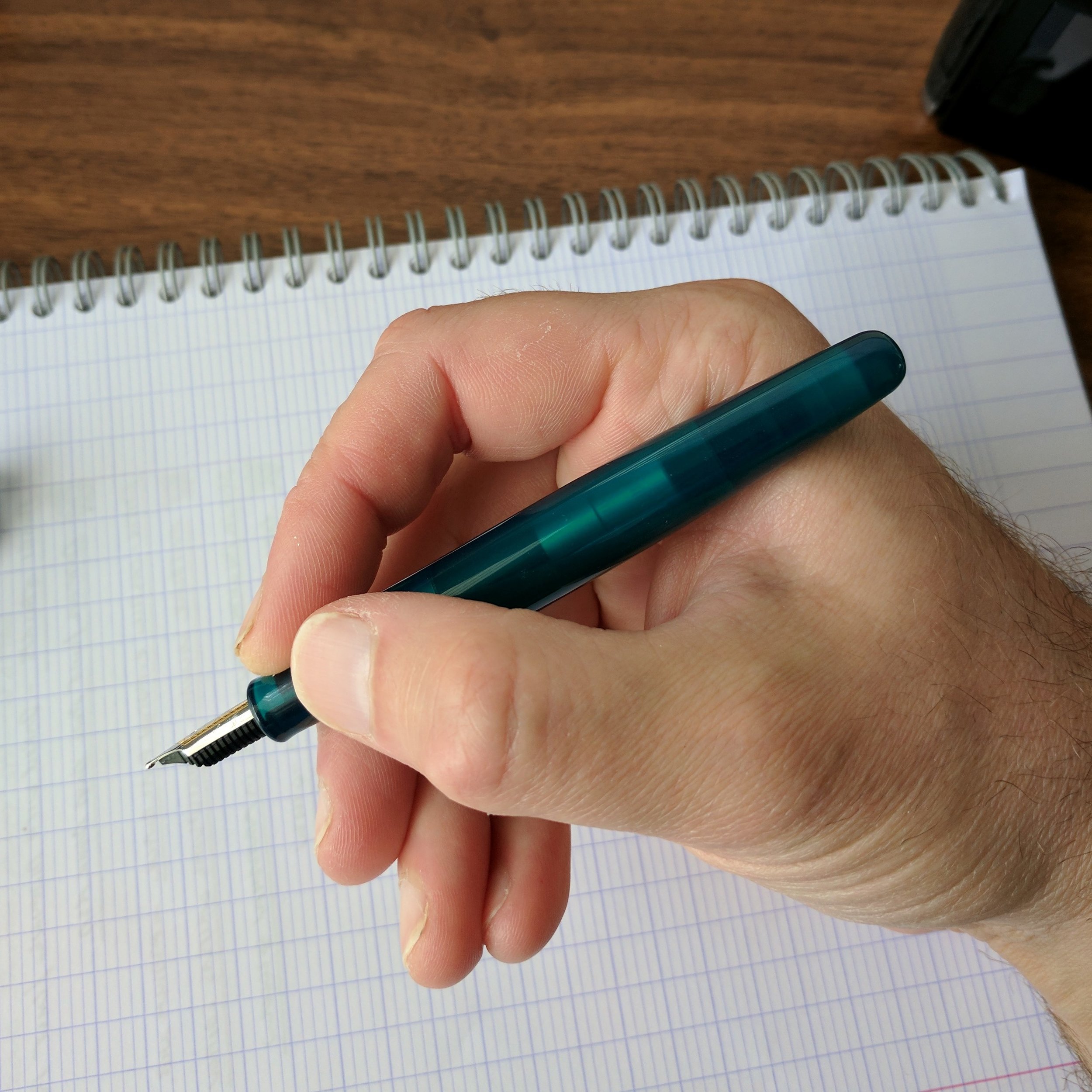
The Spectrum is a classic, cigar-shaped pen that I could comfortably use posted or unposted. With the rounded ends, the shape reminds me, again, of the Platinum 3776 or even a Nakaya Portable writer. I did find myself wishing that the cap posted just a touch deeper, like the cap on the Platinum, but I probably value this sort of versatility more than most - I'm a hardcore "poster." There's also a bit of a step from the body to the grip section and metal threads. Neither bothered me, but be advised of the potential issue if sharper threads and steps on pens have a tendency to dig into your hand.  

View fullsize Taccia Spectrum Unposted

The Spectrum comes in three attractive shades of translucent acrylic: Merlot (which is a brighter red than the name would suggest), Ocean Blue, and Forest Green (reviewed here, which in person looks lighter and a bit more teal). These technically qualify as "demonstrator" pens, but the effect is more subtle here since the acrylic isn't completely transparent. 

The one design choice I wish Taccia had done differently was the logo - this appears to be an applied logo - not etched - so I worry it may wear off over time. 

Taccia and Sailor share a U.S. distributor (Itoya), and Taccia has leaned heavily on their relationship with Sailor when marketing this pen. Both the Spectrum and the Pinnacle feature Sailor stainless steel nibs. The Taccia representative in Baltimore indicated that a gold-nib option was available for a sizeable upcharge, but I've not seen this option available at retailers so far.

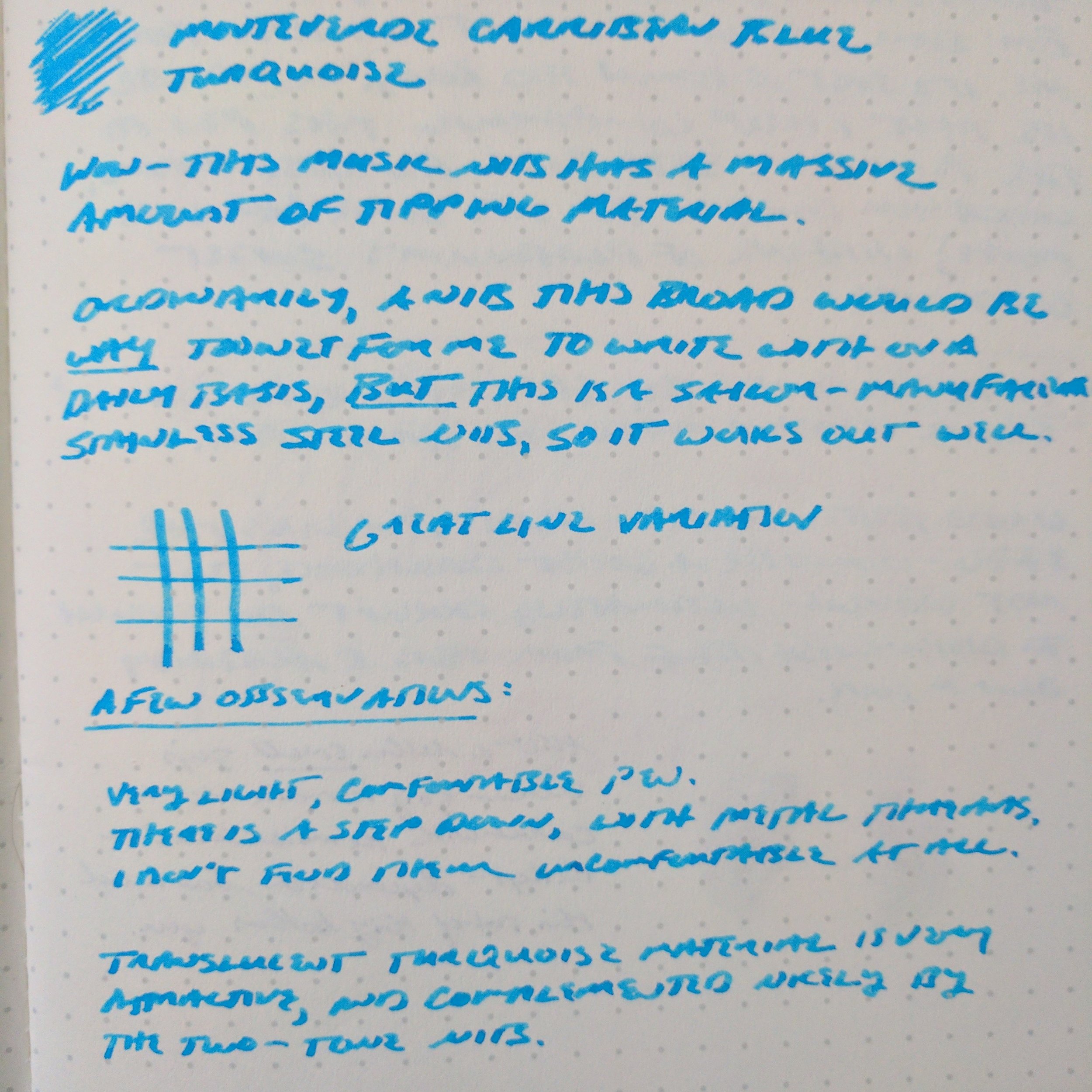
No complaints whatsoever about the Sailor stainless steel music nib - it was super smooth, with a ton of tipping material. 

The stainless steel music nib on the Spectrum is more appropriately characterized as a stub - Sailor music nibs don't have three tines, as you would find on a classic music nib. My Spectrum wrote quite smoothly, with a surprisingly even ink flow more suitable to my writing style than the wetter 14k or 18k Sailor music nibs I've tried in the past. I didn't experience any skipping or hard starting. 

The review ink here is Monteverde Caribbean Blue. This Sailor steel music nib gave me decent line variation, and wrote a slightly narrower line than its 18k and 14k equivalents. 

The review ink here is Monteverde Caribbean Blue. This Sailor steel music nib gave me decent line variation, and wrote a slightly narrower line than its 18k and 14k equivalents. 

Takeaways and Where to Buy 

At the current price point, Taccia is competing not only against other high-quality steel-nibbed pens like the Diplomat Aero and the Pelikan M205, but also against the Platinum 3776 and the Sailor 1911 Standard, both of which feature very nice 14K nibs. Based on my brief experience with the Spectrum, it should hold its own, though this market segment can be difficult to thrive in given the extent of the competition. The nib is the key selling point here, and if you're a fan of Sailor nibs and like the aesthetics of the Spectrum you won't be disappointed.    

Many thanks to the awesome team at Anderson Pens for loaning me this pen to review. Anderson Pens stocks both the Taccia Spectrum and the Taccia Pinnacle in a wide range of nib options, from extra fine to music. The Spectrum is currently priced at $127, and the Pinnacle at $119. 

Taccia pens on display alongside some gorgeous celluloid Platinum 3776s at the Anderson Pens table at the 2017 D.C. Pen Show.  On the far left, the Taccia Pinnacle, followed by two Taccia Spectrums in Blue Ocean and Merlot. 

Further Reading 

The team at Hand Over That Pen reviewed the Taccia Spectrum a few weeks back. Check out their review here. Apparently their review units were provided directly by Taccia, so they had the opportunity to sample both the steel and gold nibs. 

Disclaimer: Anderson Pens loaned me this Taccia Spectrum for review purposes at no charge. This post may contain affiliate links. 
In Pens Tags Taccia Spectrum, Pen Review, Taccia, Music Nib
2 Comments

Introducing Amethyste de l'Oural, the First Ink in the Jacques Herbin 1798 Collection

August 9, 2017

Herbin has just announced Amethyst de l'Oural ("Amethyst of the Ural Mountains"), billed as the first ink in the new "Jacques Herbin 1798 Collection." Herbin fans will notice that both the packaging and the ink itself appear similar to the inks in the 1670 Anniversary collection, only this time the ink contains flecks of silver instead of gold! The end result is striking.

Herbin has widened the mouth of the bottle a bit, but otherwise the packaging will look familiar to those of you who enjoyed the Herbin 1670 Anniversary Inks. 

Herbin has widened the mouth of the bottle a bit, but otherwise the packaging will look familiar to those of you who enjoyed the Herbin 1670 Anniversary Inks. 

Overall, Amethyste de l'Oural is a nice deep purple color, and the silver flecks complement the ink better than gold would have. Herbin has also widened the mouth of the ink bottle, making it MUCH easier to fill larger-diameter pens without having to decant the ink into another bottle or fill with a syringe. While I personally may not use these sparkly inks in my daily writing, I can't deny that they're gorgeous to look at, especially when used for folded nib lettering. 

A shot of the silver sparkles and a bit of sheen

A couple of new interesting bits: Per Herbin, the date, 1798, marks the ascent of Napoleon and the end of the French Revolution, and also the time in which steel nib dip pens began to replace the traditional writing quill.  You may also notice that J. Herbin has rebranded itself as "Herbin," the original name used by the company at the time of its founding in 1670. 

Where to Buy

Amethyste de l'Oural is being shipped to retailers this month. It should be available for sale to the public by the end of September at any Herbin retailer, including our site sponsor Vanness Pens, which carries the line of standard Herbin inks, as well as the 1670 Anniversary inks.   

Further Reading

I've previously reviewed Herbin inks from the 1670 collection, including Emerald of Chivor and Caroube de Chypre. Check them out if these kinds of inks interest you. 

Disclaimer: Exaclair, Herbin's U.S. Distributor, provided me with this bottle of ink free of charge, for review purposes. This post also contains affiliate links. 

Tags Herbin, Herbin 1798 Inks
Comment

2017 DC Pen Show: Saturday Recap

August 6, 2017

Well, I stuck to my guns and didn't buy anything on Saturday after what turned into a blowout Friday. That isn't to say that Saturday at the D.C. Pen Show wasn't enjoyable. The crowds were significantly larger than Friday, and from what I heard most vendors did really well because people were buying a lot of pens and ink! I spent most of the day visiting with people whom I hadn't seen in a very long time, and walking around the show just enjoying the experience. I'll try to keep this recap limited to pictures as much as possible, because I know that's what you all want to see!  

As always, Brian and Andrea Gray of the Edison Pen Company stayed busy at their table. They brought a large selection of custom pens to the show. 

Kenro Industries was at the show, and they brought a selection of Montegrappa Fortuna pens, including these Heartwood pens shown here. 

Dan Smith ("The Nibsmith") was located in the back hallway, and kept up a brisk business throughout the weekend. 

And, as always, Mike Masuyama had a steady stream of customers. If you want to book a slot with Mike, you need to get to the show EARLY.  

Despite being assigned a table in the back hallway, Vanness Pens seems to have had a good show. 

View fullsize Montegrappa Fortunas
View fullsize Montegrappa Fortuna Mosaic
View fullsize Franklin-Christoph Table
View fullsize Custom Clips by Andy Belliveau
View fullsize Waterman 100 Year Pens
View fullsize New Pens by Conklin
View fullsize Vanness Ink Testing Station
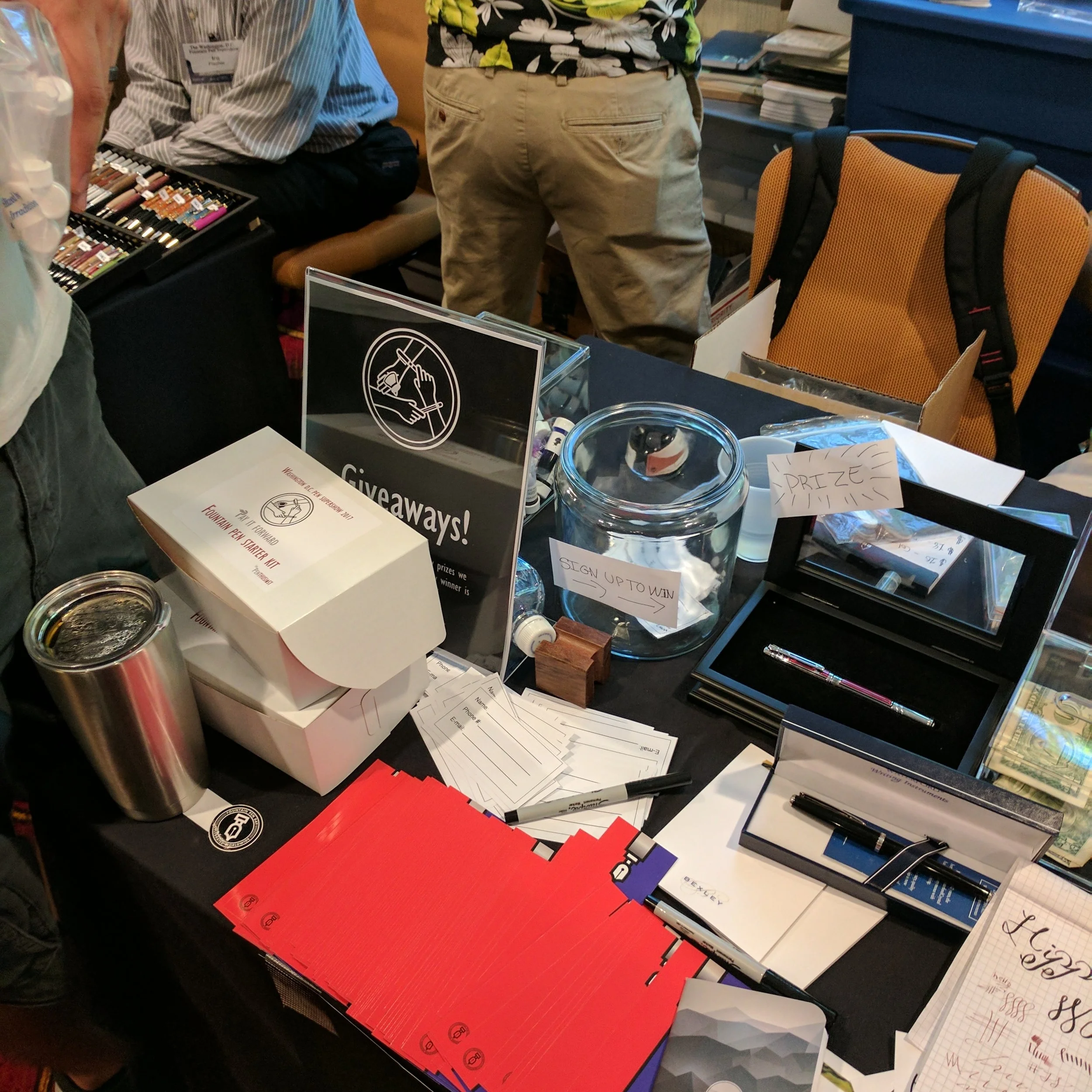
View fullsize The "Pay It Forward" Table
View fullsize Pay It Forward

After Hours

After the show ended, everyone headed downstairs to a memorial service for Susan Wirth, who passed away unexpectedly in May after the Chicago Pen Show. Her associates set up her booth at the D.C. Show this year, just as she would have, and it was good to see them doing a brisk business all weekend. 

Afterwards, Kenro Industries hosted an after-hours event for bloggers and some other show attendees at Top Golf in Alexandria, and they were kind enough to invite me. Check out my Instagram stream (@gentlemanstationer) for some of the antics. Let's just say it wasn't an early night.   

In Pen Shows Tags DC Pen Show, Pen Show
3 Comments

Some after-hours folded nib work by Dan Hoisner. 

2017 DC Pen Show: Thursday and Friday Quick Recap!

August 5, 2017

It's been a wild Thursday and Friday here at the 2017 D.C. Pen Show, and your correspondent is nearly tapped out already, in terms of both money and energy. The D.C. Pen Show runs for four days, with the first two days being "trader days", and Saturday and Sunday open to the public. Thursday is generally very quiet, with a handful of vendors set up in the ballroom selling to each other before the madness starts. Friday is much busier, but still not as crazy as Saturday. Friday at the D.C. Pen Show might be my favorite day of any pen show that I regularly attend, because admission is limited to the "weekend pass" holders and you can wander this absolutely massive show, scouring the tables for gems that might get lost in the shuffle during the MUCH more crowded public days.

This Friday, However, Had a Hitch...

The seething masses waiting to crash the gates on Friday morning. Torches and pitchforks have been Photoshopped out.  

After a quiet Thursday night, which many of us spent at the hotel bar catching up with people we hadn't seen in months (or in some cases, years), we were eager for the show doors to open at 9 a.m. Sadly, due to a LOT of disorganization on the the show promoter's part, some vendors didn't even receive table assignments until nearly noon, and it was after lunch before the show was fully set up and ready to go. Needless to say, there were a lot of unhappy/visibly angry vendors, and understandably so. Even though it's not a public day, a lot of business gets done on Friday (especially on the higher end), and the pen repairmen and nib grinders lose a full half-day of business if they can't get their table assignments and start work as soon as possible in the morning. Hopefully they will make it up on a busy Saturday and Sunday, and that changes are made to ensure that the same thing doesn't happen next year. Otherwise, I'm not sure that the D.C. show will retain its position as the premier pen show on "the circuit," because vendors and attendees can't - and shouldn't - justify the time and expense of attending this show if the promoters can't take basic steps to ensure that the doors open on schedule.   

My Friday Takeaways

I kicked off the 2017 D.C. Pen Show by picking up two pocket pens from Ian Schon of Schon Design, who showed up with both his standard line as well as a bunch of prototypes. I've not used Ian's pens before, but have heard great things, so predictably I picked up two: a PVD DLC-coated stainless steel classic version, and a royal blue and gold anodized prototype. Both of these use the Fisher Space Pen refill, which you know I'm a fan of. 

View fullsize Schon DSGN PVD DLC-Coated Stainless Pen
View fullsize Schon DSGN Prototypes
View fullsize More Schon DSGN Prototypes for Sale

Things moved pretty quickly after that. I snapped up three pens, two of which I've wanted to purchase for the past couple of years: an Edison Menlo (with the new draw filler filling system), an Edison Glenmont in Tibaldi Impero Celluloid, and a Kanilea Pen Co Nui Nalu. 

From left: Kanilea Pen Co Nui Nalu, Edison Menlo with Draw Filler in blue flecked acrylic, and Edison Glenmont in Tibaldi Impero Celluloid. 

Despite the short day, I also managed to have nibs tuned by Mike Masuyama and Dan Smith, and picked up a couple bottles of Robert Oster ink from Vanness Pens (Fire and Ice and Maroon 1789). After the chaos that was Friday morning, everyone pretty much stayed on-site at the hotel for dinner and retired to the bar later for drinks and sharing the day's finds. Hopefully I'll have much more to share tomorrow, after a full day of pens and people! In the meantime, here's a gallery of some pen show shots. 

View fullsize Kanilea Pens
View fullsize Vanness Ink Testing Station
View fullsize Ryan Krusac Pens
View fullsize More pens from Vanness!

If you're in the Washington, D.C.-Northern Virginia-Maryland area, be sure to visit the D.C. Pen Show this weekend, August 5 and 6! It's being held at the Marriott Fairview Park Hotel in Falls Church, VA, and runs from 9:30 to 5!   

In Pen Shows Tags Pen Show, DC Pen Show
Comment

Notebook Review: Musubi Premium Journals

July 29, 2017

It's hard to believe that Tomoe River paper is seemingly everywhere these days, given how difficult it was to import/locate just a few years ago. If you're unfamiliar with Tomoe River, it's some of the best paper for fountain pen users out there, and certainly the most unique. Despite its light weight and overall thinness, Tomoe River paper will not bleed or feather except in the most extreme circumstances, and Tomoe River notebooks can contain hundreds of sheets of paper while remaining compact. 

Seighaia ("Wave") pattern in Enji fabric. This thin journal actually has 200 sheets of paper.

The most recent Tomoe River notebook that I've had the opportunity to review comes via the team at Musubi, located in SIngapore. Musubi sells hand-sewn journals and diaries that contain 200 sheets of unlined Tomoe River Paper and are wrapped in unique Japanese fabrics. Notably, Musubi employs disabled artisans, and per their website, operates in partnership with an organization dedicated to finding employment opportunities for individuals with physical disabilities. 

Each Musubi notebook features a hand-sewn binding. 

Musubi was kind enough to send me an A5 clothbound notebook in the Enji ("Autumn Red") color scheme, featuring the Seigaiha ("Wave") pattern. It's a beautiful notebook. The cloth is soft, the binding appears to be high quality, and the notebook lays completely flat, making it easy to use the entire page. The Tomoe River paper, of course, is exceptional, and Musubi has used a heavier ivory laid paper for the endsheets. The soft clothbound cover might not hold up to the rigors of daily carry, but this would be an excellent journal to keep at your desk or bedside. 

Tomoe River Paper handles nearly all fountain pen inks very well, even with wet nibs. 

Where to Purchase

Musubi A5 journals can be purchased directly from Musubi's online store, and come in a variety of colors in addition to the red featured here, including Midori ("Matcha Green") and Kon ("Navy Blue"). You can also choose from either the Seigaiha ("Wave") pattern, the Tonbo ("Dragonfly") pattern, or a variety of seasonal prints, including rabbits, owls, and sakura ("Cherry Blossoms"). Diaries are handmade to order, and require a lead time of 2-3 weeks.  They are also not inexpensive, ranging from $67 US for the basic pattern to $96 for more exotic fabrics, but you're paying a premium for craftsmanship.  Many thanks to Musubi for providing me with the opportunity to review this unique item. 

Disclaimer: Musubi sent me this journal free of charge for review purposes. I was not otherwise compensated for this review. 

In Notebook Review Tags Musubi, Journal, Tomoe River, Notebook
Comment
← Newer Posts Older Posts →
Store Location
Visit the T.G.S. Curated SHOP
*New* Updated "Best Pens" Guide (2025)
TGS x Hinze Pens Violet Tendencies Taschenstift Fountain Pen
Hierarchies of Fountain Pen Friendly Paper
Allex Scissors arrayed on a desk showing link to desk accessories

Join Our Patreon!
Subscribe to the TGS E-mail List

Featured Posts

Featured
Pilot-Iroshizuku-Yama-Budo-Writing-Sample.jpeg
May 24, 2025
Joe's Picks: Five Favorite Inks From Pilot's Iroshizuku Lineup
May 24, 2025
May 24, 2025
Yamamoto-Gray-Paper-Sampler-Set.jpeg
May 10, 2025
Discovering Unusual Paper: "Paper Tasting" Sets from Yamamoto Paper
May 10, 2025
May 10, 2025
Four-Micarta-Fountain-Pens.jpeg
Apr 19, 2025
Yes, Micarta for me! I finally got my hands on Some Micarta Pens, Plus My Own Special Edition
Apr 19, 2025
Apr 19, 2025
The Gentleman Stationer RSS

© Digital Divide Media, LLC, 2014-present.

All content is the exclusive property of Digital Divide Media, LLC, d/b/a The Gentleman Stationer, including “The Gentleman Stationer” website and trademark, and should not be reproduced without express written permission.  All rights reserved.

All content containing paid advertising, affiliate links, or sponsored content will be plainly disclosed by a disclaimer when/if featured.

Contact Information

Store Shipping Policy and Return Policy

Privacy Policy

Cookie Policy

Terms and Conditions

Powered by Squarespace