Double Ink Review: Sailor Jentle Miruai and Nioi-Sumire

Today I'm going to try something new:  In an effort to get these new Sailor Inks reviewed and posted ASAP, I'm going to review them two at a time.  Generally, I keep about six fountain pens inked up at any given time, but carry two with me on any given day.  One is filled with a dark ink for notes, signing documents, etc.  The other is filled with a brighter ink that I use for marking stuff up, and is typically a red, orange or purple.  The past two days I've been using this pair.  Miruai is a deep blue/green-black ink, and apparently translates as "Seaweed."  Nioi-Sumire is a bright blue-violet ("Sweet Violet"), but to me leans more towards the blue end of the spectrum.  I think both are gorgeous.  Thank you Anderson Pens!

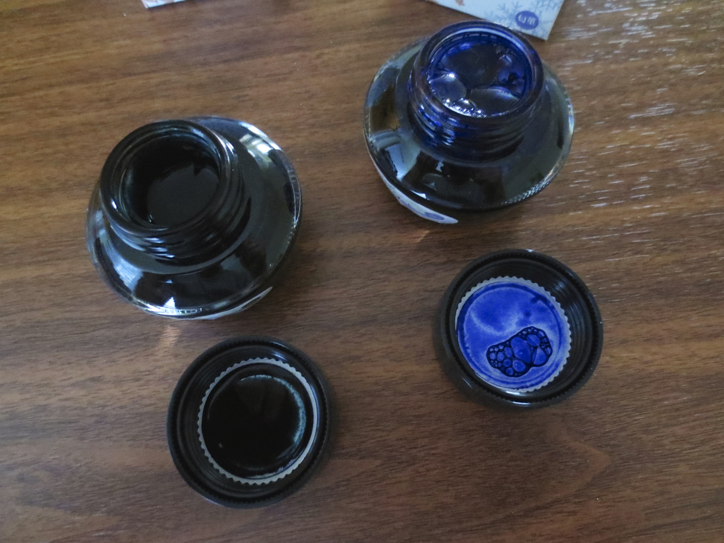
Sailor kept the same bottle with the internal inkwell.  I personally like the Sailor bottle, although some complain that the inkwell makes it difficult to flil pens with larger nibs.

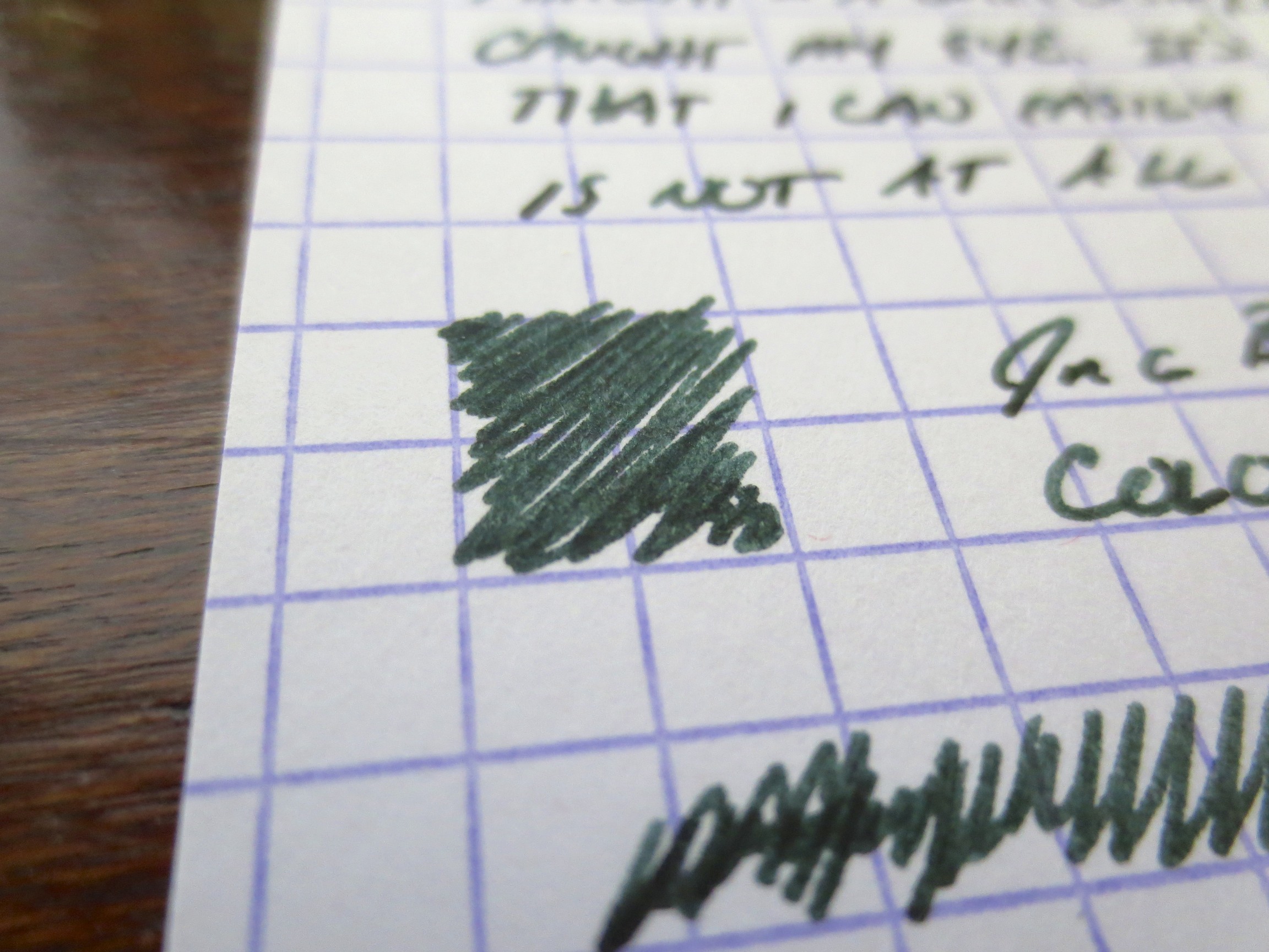
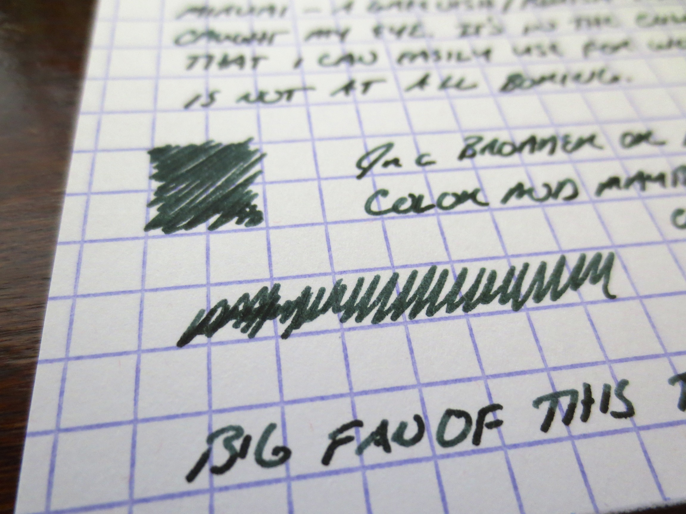
This gives you an idea of how dark Miruai is.  The ink is probably a bit blacker than Epinard, but I have not done a side-by-side comparison.  Miruai has more blue in the color. 

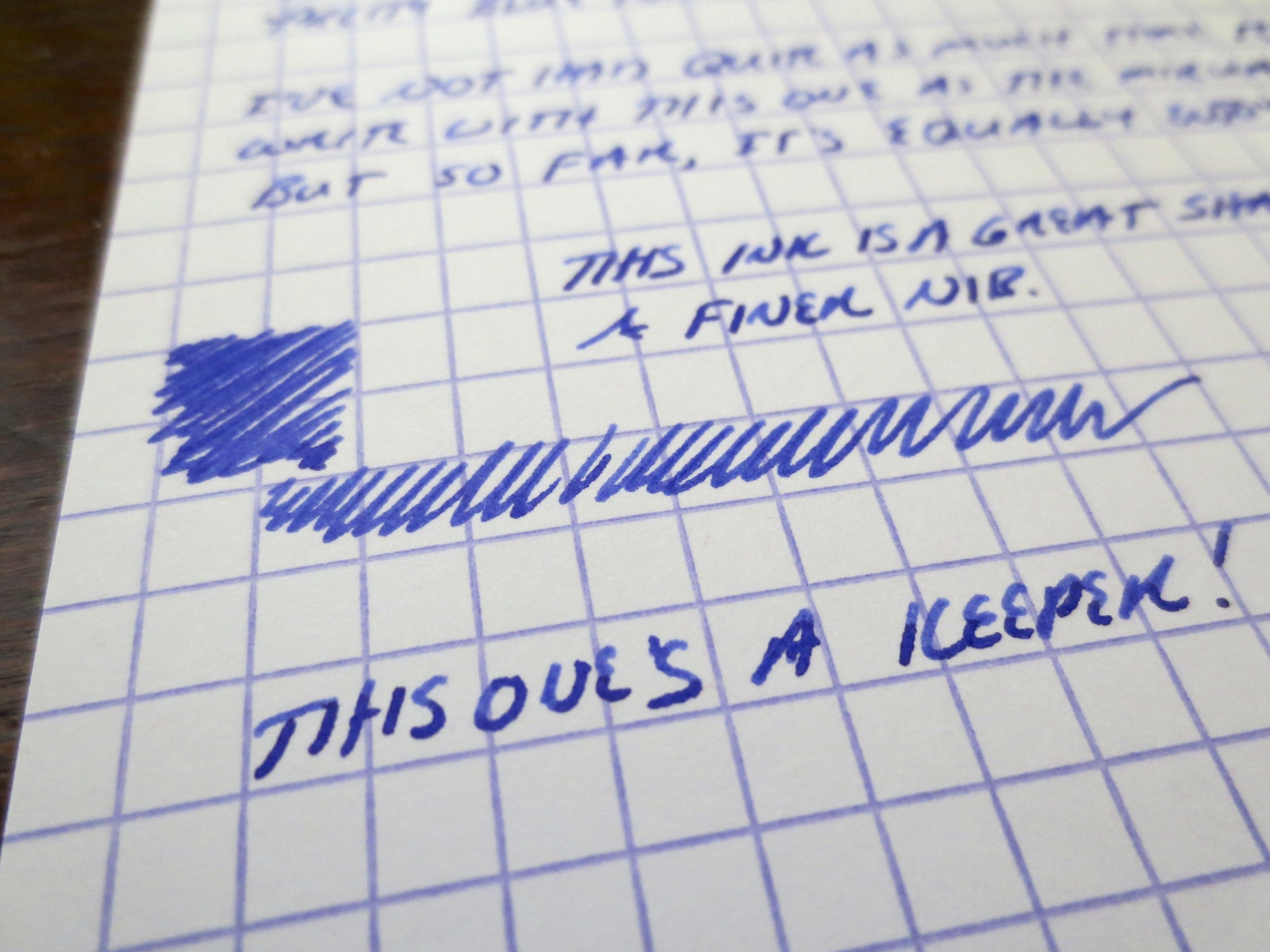
Nioi-Sumire, to me at least, is far more blue than purple.  If you are looking for a very purple ink, try Shigure (review forthcoming). 

I've enjoyed working with both of these inks.  They share the same great properties with the rest of Sailor's Jentle line.  As you may have heard, Sailor discontinued its "regular" line of inks earlier this year, and resurrected several "limited edition" inks from 2010 to replace them.  Because of the somewhat unique range of colors and the fact that these inks were so well-behaved (meaning they clean easy, dry quickly, and don't crust up on nibs), people were up in arms.  Rest easy, folks.  While Apricot, Epinard, Sky High, etc. may be gone (at least until Sailor brings them back as "limited editions" at a higher price point, as some have speculated), we have an entirely new line of great colors to play with.

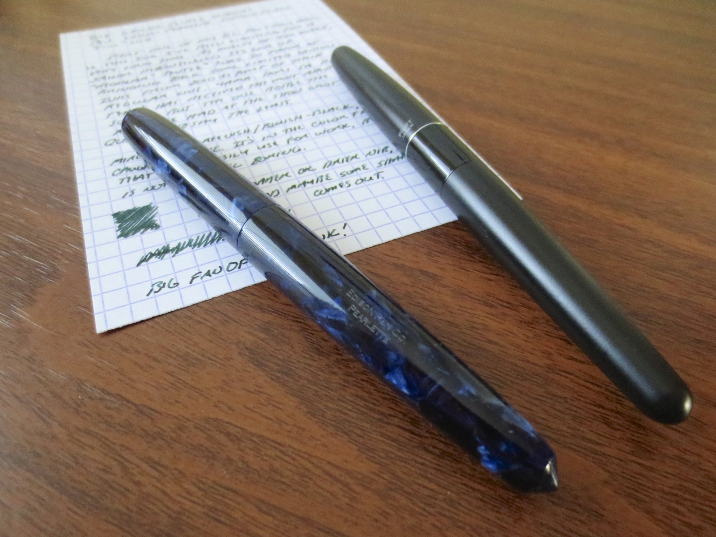
Both of these inks are moderately saturated, and a touch dry, but I had no flow issues with either.  I have the Nioi-Sumire in a Pilot Metropolitan with a medium nib, and the Miruai in a brand-spankin'-new Edison Pearlette in deep indigo flake acrylic (fine nib) which I absolutely love.  Card stock is Exacompta, and the scanner is a Doxie Flip.  Here are the results:

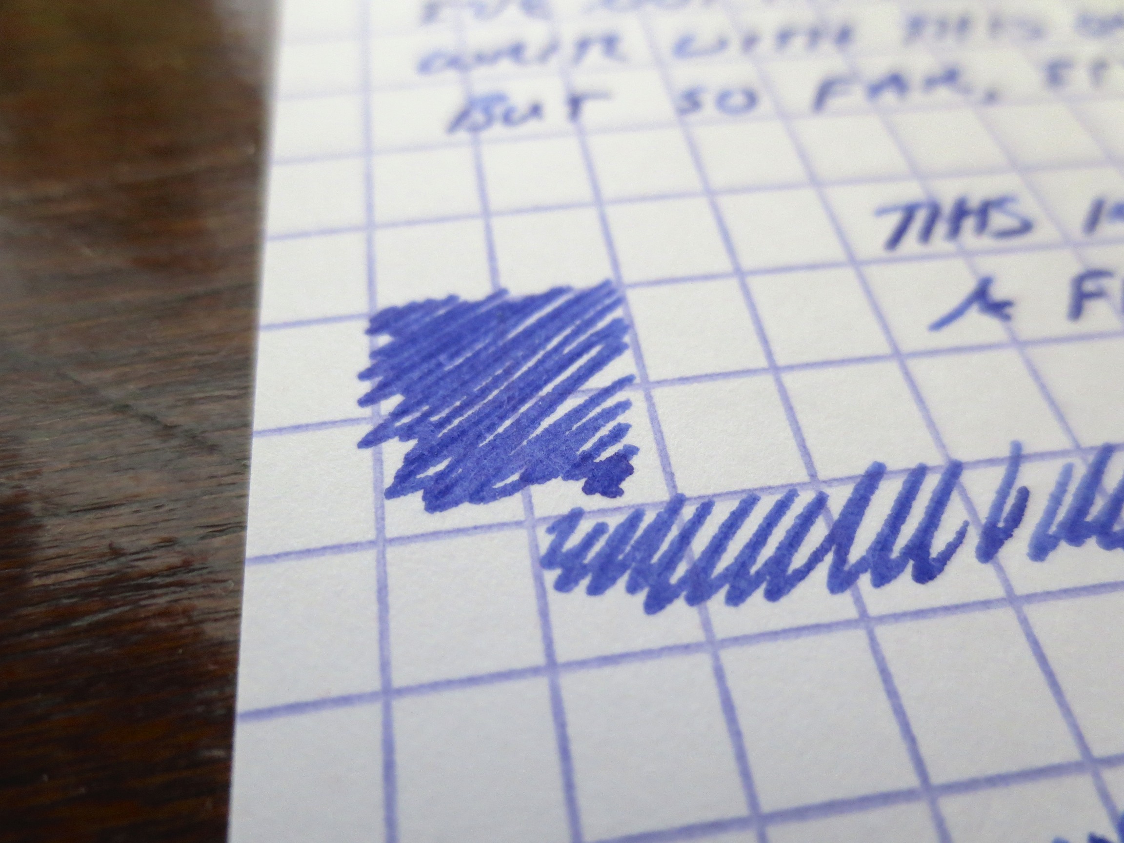
Scan of Nioi-Sumire.  This is a fairly accurate representation of what the color looks like when the ink is dry.  I've also included some photographs in the gallery below to show some of the shading. 

This scan captured the blue-green edge to the Miruai pretty well.  In a very fine nib, the ink can appear almost black.  In this Edison Pearlette "fine," which runs wider than the typical fine nib, you get some shading and a touch of sheen.
Ink Review: Iroshizuku Kon-Peki

Whoa.  As of last night I thought today might be the day that I missed my blogging schedule for the first time since this blog has been live.  Due to a series of cascading airline delays, I staggered in at 1 a.m. last night after nearly 12 straight hours in Boston Logan Airport.  (I did get a chance to visit the famed Bromfield Pen Shop, albeit briefly, though my schedule and DC Pen Show induced discipline prevented me from buying anything).  So today, I offer you an ink review that I've had in the can for a while but haven't posted simply because I think this ink has been reviewed to death and I've never been quite able to make myself love it.

Everyone's favorite Iroshizuku--except mine.

Honestly, though, I know why other people love this ink, and it's for the same reasons that I haven't sold the bottle.  It's got a Baystate Blue-style pop to it with none of the headache.  Like all Iroshizuku inks, Kon-Peki is well behaved and cleans out of pens easily.  But I'm not a blue ink kind of guy.  I mean, I like blue ink, and sometimes I have to use it for work, but I'd rather use a blue-black or a turquoise.  If I do have to use a blue ink, more often than not it's this one, which people term "cerulean."  This review was written with an Omas Ogiva ground by Mike Masuyama to a Japanese medium.  (I asked him to copy the nib width on my Nakaya portable writer, which is perfect for me). 

Please ignore the smudging of Sailor Apricot on the paper.  I'm too tired to redo this or touch it up. 

In a wetter nib, there's some shading as well as a bit of reddish sheen, which some people like. 

Again, apologies for the transfer of Apricot that was on my hand. 

Be prepared for next week, as the Gentleman Stationer goes to the DC Pen Show!

None More Black

"There's something about this that's so black, it's like how much more black could this be?  And the answer is none.  None more black."   ---Nigel Tufnel, composer, describing Aurora black ink.

The blackest of the black. It doesn't get much blacker.

Last night, I was wondering, what if I took a look back at the writing that I've done over the four years or so since I've been an avid fountain pen user, and tried to select the best black ink I've used?  The answer to any question like this is obviously subjective, because people value different things in a basic black ink.  Some want darkness of color, where no shading or hints of other colors are present.  Some want absolute permanence.  Others value the ability to purchase the ink in massive quantities, such as a giant custom-ordered bottle of Noodler's or a liter bottle of Pelikan Brilliant Black.  As for me, I'm not a heavy user of black ink, and only have two bottles.  The first, Sailor's Kiwa-Guro Nano Black, is a pigmented ink that meets my occasional need for permanence.  It's a pigmented ink, however, which is specifically designed for use in very fine Japanese nibs.  I've found that if you use it in a broader nib, especially a wet nib, the pigment "stacks" or "pools" on the paper as the ink dries and it will smear or ghost onto the next page.**  Therefore, for most day-to-day writing, if I'm in the mood for a basic black ink, I choose Aurora black because it's a "true black" and simply works well.  Aurora black is a very dark ink, which dries quickly, flows well, and has worked in every pen I've ever used it in, even the most temperamental of vintage writers.  Some people turn to Waterman Florida/Serenity blue to troubleshoot a pen; I turn to Aurora black.  I highly recommend this ink as a daily user.  The only caveat is that you may see some feathering and bleeding on very cheap copy paper, but that will be minimized in a fine nib.  On moderately heavy paper, you should have no problems. 

Aurora Black is very dark, smooth, and flows generously.  It dries quickly and does not smear.  Aurora makes two colors of ink:  black and blue.  The story may be apocryphal, but supposedly the reason the company sticks with two colors is quality control.  The quality of their ink is so high, they don't want to jeopardize that by expanding beyond what they already do well.

** Noodler's Bulletproof black and Heart of Darkness had the same smearing/ghosting issues for me.  People have recommended diluting them with distilled water, but since permanence is not a serious concern for me, I've stuck with Aurora and saved myself the trouble.  In situations where true permancence is required, I'll happily use ballpoints, a Sharpie pen, or a Sakura Pigma Micron. 

Ink Review: Iroshizuku Yama-Budo

Continuing my "red" kick, this week I've been using a lot of Iroshizuku Yama-Budo, an ink I like but have not used much in recent months.  That's due more to my glut of ink and tendency to rotate colors regularly than to any problems with this particular ink, of which there are none.  It's an unusual color (Pilot translates Yama-Budo as "Crimson Glory Vine"), and I personally have not seen an equivalent anywhere else.  From looking at swatches, I'd consider Rohrer & Klingner Solferino (link here for a swatch) or possibly their Magenta (link here) to be similar.  However, I've used neither of these two inks and have no idea how they would compare to Yama-Budo in terms of properties.  I can't imagine that you would get much better than Pilot's premium ink.

Handwritten review of Iroshizuku Yama Budo on Exacompta Index Card stock. 

As you can see from the writing sample, Yama-Budo is a pinkish-purple, which is just purple enough to use in a professional capacity, and contains enough pink to make the ink interesting without looking garish.  I like this ink in a wider nib--you can get some nice shading!  Otherwise, it's like any other Iroshizuku ink:  the dry time is relatively quick, and it works fine on less expensive paper.   

Here's a photographed writing sample, as opposed to a scan.  This is not a bright, "hot pink" ink.  The photograph probably captures the ink's depth of color slightly better than the scan does.  As I noted in my review of Pelikan's Edelstein Turmaline, my opinion is that the Turmaline leans to much in the "pink" direction to use at work and be taken seriously.  My earlier review contains a side-by-side comparison of the two inks (Yama-Budo and Turmaline).  If you look at samples of them separately, you might think they look similar. 

Iroshizuku often gets knocked for its steep price tag, which is around $30 at most retailers.  However, you can often find a discount code or take advantage of free shipping deals to lower the cost.  I'm also a fan of trading unused bottles of ink on forum sites such as FPGeeks or the Fountain Pen Network.  Personally, I've never had a hard time justifying paying a premium for these inks.  They work well in nearly all pens, you get a standard 50ml (which lasts a typical person a really long time), and the ink bottle itself is hefty and looks great on a desk.    

The Iroshizuku line of ink uses one of my favorite bottles.  The bottle itself contains a depression in the bottom to make it easier to fill a pen when the ink level gets low. 

As of 2023, The T.G.S. Curated Ship is able to offer you Pilot pens and inks directly, including the entire Iroshizuku lineup. We currently carry the 50ml bottles of ink, priced at $24. The Gentleman Stationer is supported entirely by purchases from the T.G.S. Curated Shop and pledges via the T.G.S. Patreon Program. We no longer participate in third-party affiliate programs.

Ink Review: Pelikan Edelstein Turmaline (2012 Ink of the Year)

I'm back.  And after taking a bit of time to sort through my ink sample drawer (after reading this scary FPN post), I decided to ink up a few samples for review.  (This one ended up being for review only, because it turns out it was not a fave.)  The ink in question is Pelikan Edelstein Turmaline, which is Pelikan's 2012 "Ink of the Year" for their Edelstein line, which, to my knowledge, means that the ink is produced for one year only and then it goes out of production.  They must produce a ton of ink during that one year, however, because both Turmaline and Amber (the 2013 Ink of the Year) are still in stock at retailers like Anderson Pens (links here and here).

In truth, I have not tried many of the Edelstein Inks.  I hear great things about the Topaz and Tanzanite colors, and mixed reviews on the others.  For one thing, the ink is somewhat expensive at approximately $23 for 50ml, although this price point is sadly becoming more the rule than the exception (Thanks Sailor!).  Another issue I have is that the ink is fairly dry, a characteristic of Pelikan ink in general.  I write with a lot of extra fine nibs and stubs, and I prefer a relatively wet writing pen, so drier inks are not as enjoyable to me as others because they tend to be scratchy.  That said, I used a Waterman medium nib here, and Edelstein Turmaline had fairly good flow and dried very quickly on the page (about 3 seconds).  So why was this ink not a winner for me?

Two reasons:  (1) the color; and (2) the twenty minutes it took me to flush this ink out of my pen.  With regard to the color:  I would characterize this ink as a fuschia.  Some call it pink, but to my eyes it has a slight purple tinge to it, although it is very bright (almost neon).  Compare with Iroshizuku Yama-Budo below.  I much prefer the Yama-Budo, which I think has greater depth and is a much richer color, without sacrificing any positive attributes such as good dry time, etc.  With regard to cleaning, I used this pen in my new (review forthcoming) Waterman Phileas, and it took approximately 15 flushes with a bulb syringe (three with J.B.'s perfect pen flush) to get the water to stop running pink.  I actually filled the pen with Yama Budo afterwards because I was tired of trying to clean this ink out and the Yama Budo would mask any residual pink.  Anyway, some may love this color, and I wouldn't rule out Edelstein Ink in the future, but it's not for me.

I didn't notice until I posted this picture that when you view these two inks side by side, the Yama-Budo appears much more crimson.  I think this highlights how much "pinker" the Turmaline is.