• Blog
  • Shop
  • Resources
  • FAQ (Ask TGS)
  • About
  • Archive
  • Contact
  • Sign In My Account
Menu

The Gentleman Stationer

Vintage Living in the Modern World.
  • Blog
  • Shop
  • Resources
  • FAQ (Ask TGS)
  • About
  • Archive
  • Contact
  • Sign In My Account

Tones Within Tones: Blue-Black Inks of Choice

June 17, 2023

We’re running a sale this weekend in the shop for Father’s Day - through 11:59pm on Sunday, June 18, take 10% off paper and desk accessories using the coupon code “DAD10” at checkout!

A while back I did an "inks of choice" post in which, for the first time, I discussed my favorite inks by broad color category. This wasn't easy, as many of the colors I love and use on a regular basis aren't easy to categorize. Is it a blue? A blue-black? A dusky purple? Is this a yellow or an orange? A red or a brown? Is burgundy it's own color family? (You get the idea.)

Lately I've been involved in a project at my job that has required me to do more writing than I've done in a long time, given my mostly supervisory responsibilities at this point in my career. This has resulted in (1) a lot of different pens getting written dry; and (2) lots of different pens getting inked up, mainly with unassuming blue-black inks chosen for both performance and the fact that they're less distracting than other brighter options. Whenever I get caught up in a project like this one, and find myself looking at multiple inks in the same color family, I end up struck by how much variation there is among supposedly "identical" inks and ultimately realize that it's a key part of why I have so much fun with this hobby. Here, you have six inks that vary pretty wildly, even within brands. At the same time, it’s fun to see the commonalities that certain brands have, like that Pilot red sheen!

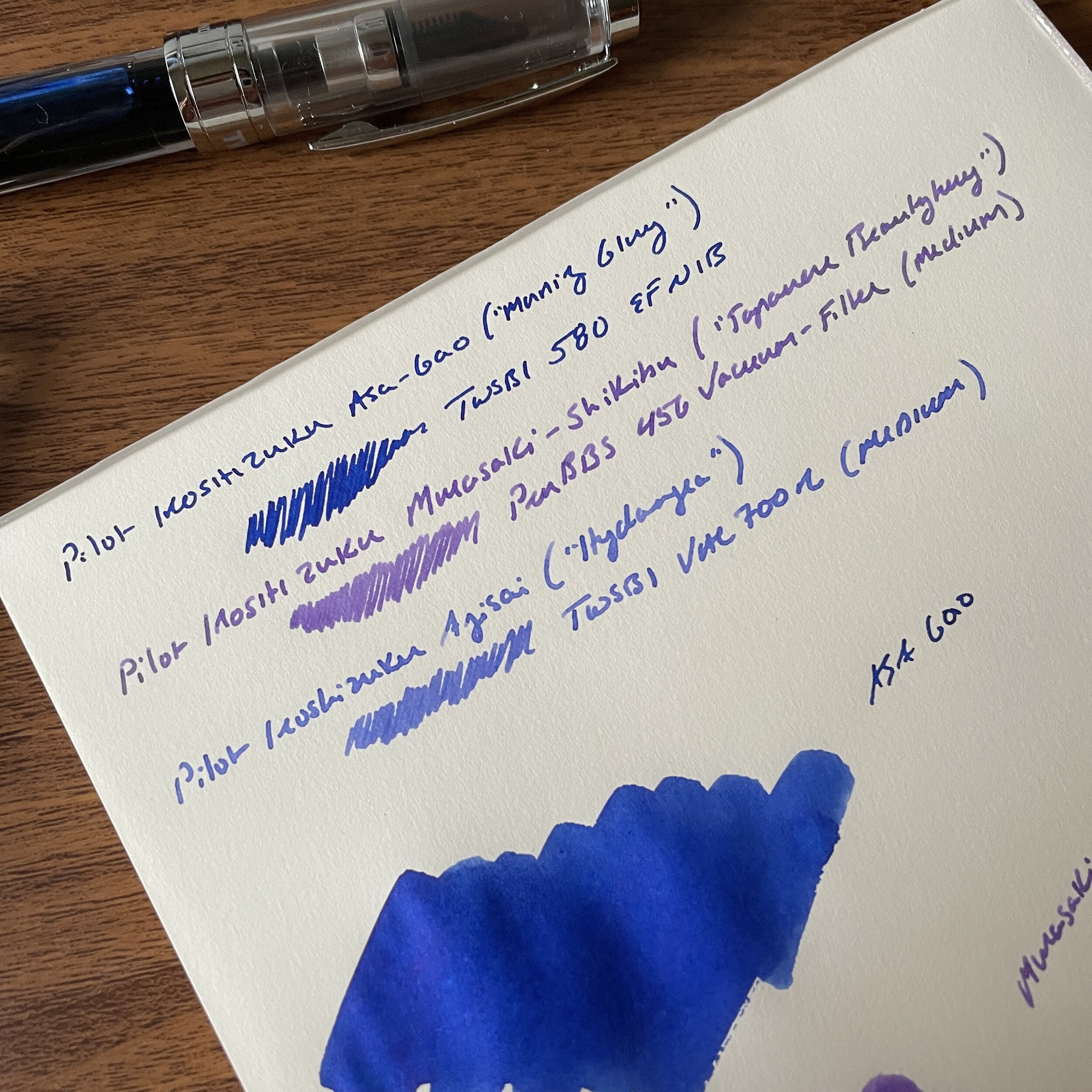
My standard ink testing paper is Midori MD Cotton. It accurately reflects color despite being slightly off-white, and showcases ink properties such as sheen and shading fairly well.

Five Inks of Choice (Blue-Black)

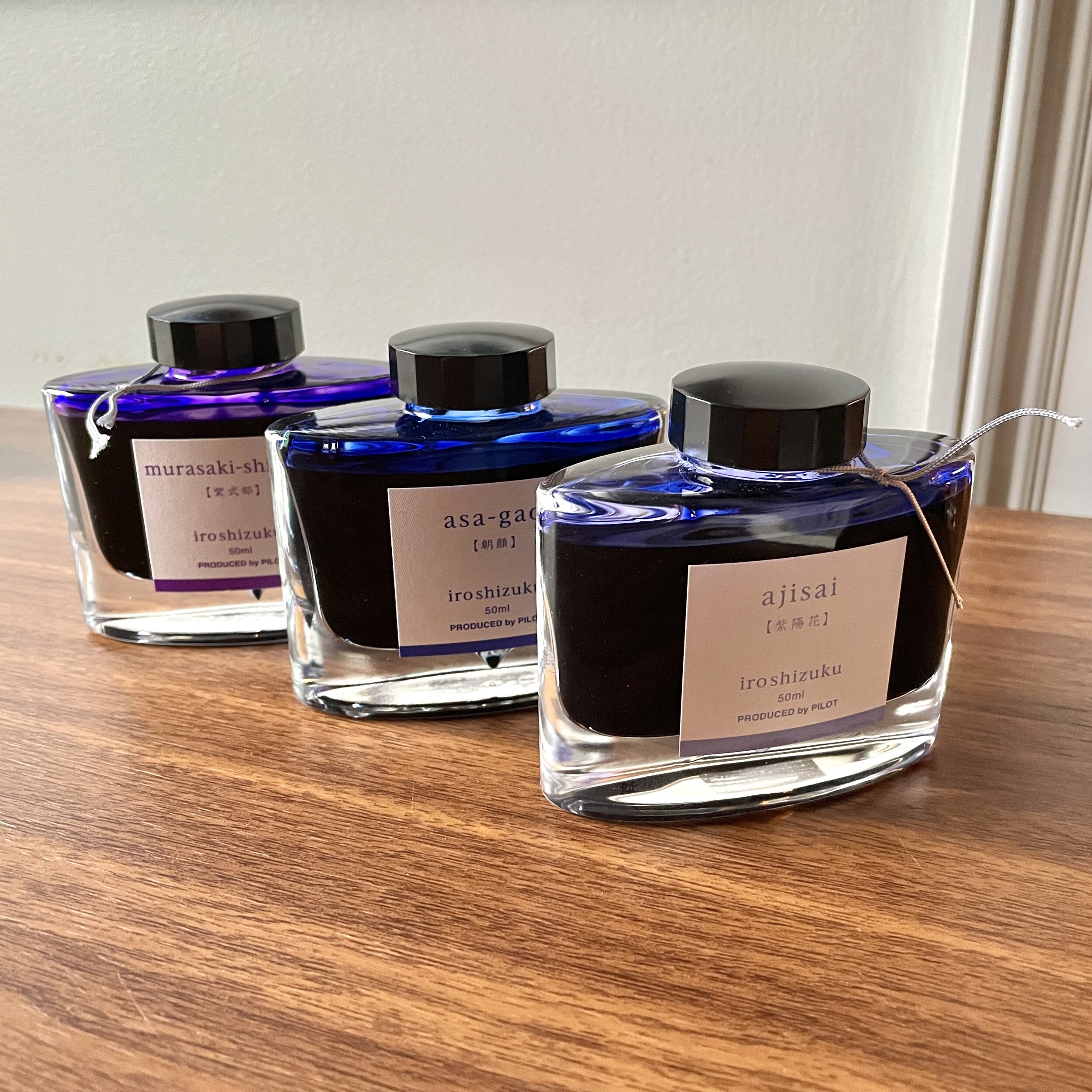
Iroshizuku Tsuki-Yo. Tsuki-Yo won the "Blue-Black" slot in the "Favorite Inks" post, and as I mentioned in that post, the main reason I love Tsuki-Yo so much is because it's not your traditional blue-black ink. Typically translated as "Moonlight", this ink features a navy undertone with reddish sheen - an office-friendly ink with just enough subtlety to make it interesting for fountain pen aficionados.

Iroshizuku Shin-Kai. Shin-Kai is what I would call the "true" blue-black in the Iroshizuku lineup. Typically translated as "Deep Sea," Shin-Kai somewhat resembles standard Pilot Blue-Black, but dries to an almost steel grey with blue undertones and, again, red sheen.

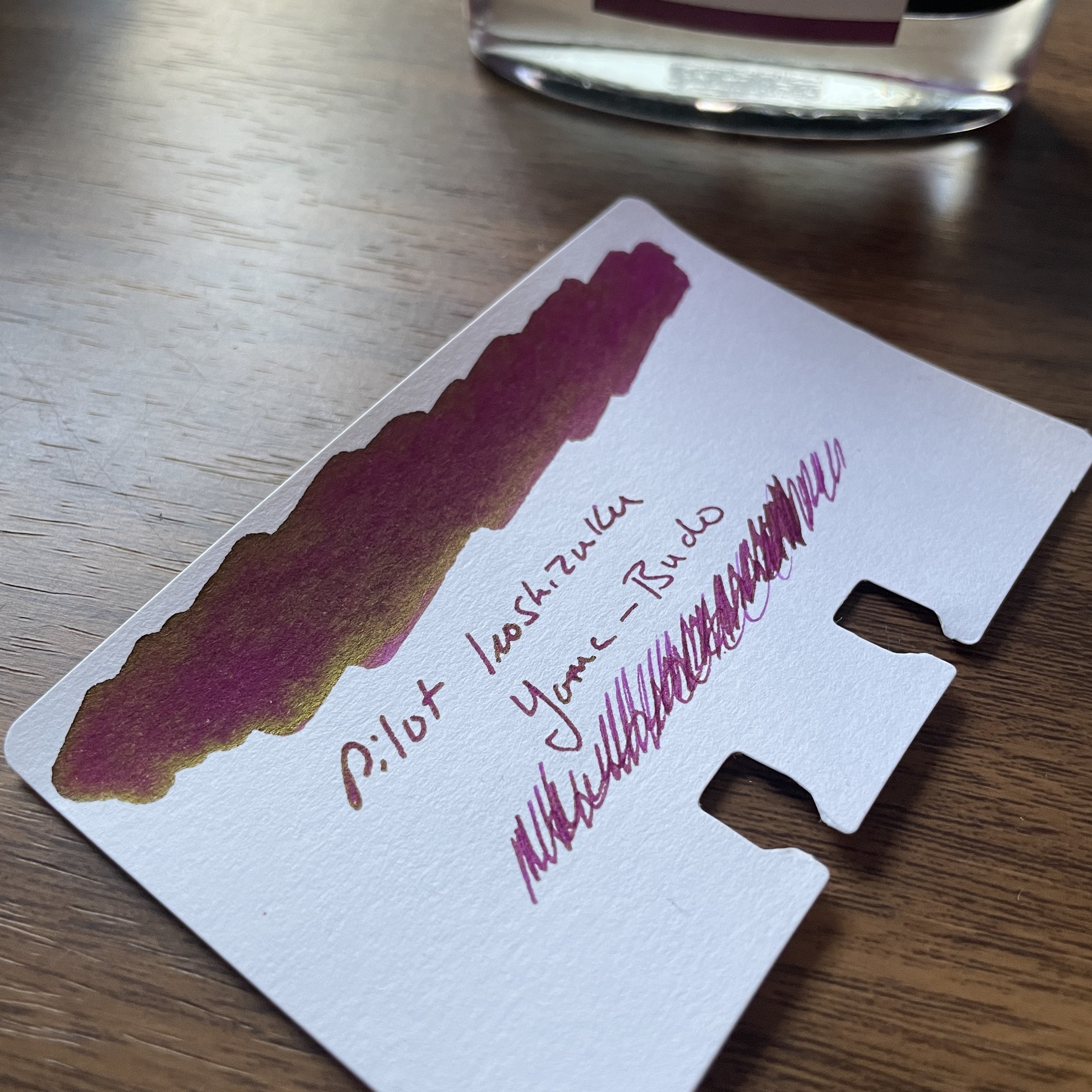
Pilot Blue-Black. Whenever I get a new Vanishing Point or other Pilot cartridge-converter pen, often the first ink to run through that pen is a standard Pilot Blue-Black ink cartridge. This particular ink has a degree of water-resistance, which is one reason why so many people enjoy it. What surprises me the most with this ink is the degree of red sheen this ink exhibits, which is even more pronounced than its Iroshizuku counterparts.

I forget how much red sheen Pilot inks exhibit, until I swatch them next to other brands. The standard Pilot Blue-Black is kind of crazy, though the sheen only really comes out

Caran d'Ache Magnetic Blue. The "Grey-Blue-Black" of this group, albeit with purple (?) undertones when wet, Caran d'Ache Magnetic Blue is the most "traditional" blue-black ink of this group. It exhibits some shading but no sheen.

Platinum Blue-Black. Another standard Japanese blue-black ink that I use primarily in cartridge form, Platinum Blue-Black is more blue than other options, and also shows a good degree of water resistance.

Sailor Nano Souboku. Sailor makes a line of "nano" pigmented inks that are permanent, yet still "safe" for use in fountain pens. I've reviewed Kiwa-Guro (the "Nano-Black") in the past, but I've had this pack of the blue-black Souboku cartridges for more than a year and figured that I needed to put them through the rotation. Souboku looks almost teal when wet, and dries to a lighter blue-black shade than the other inks shown here. I like the Sailor "Nano" pigmented inks because they are permanent and tend to perform well on even the cheapest of office papers.

These three are the more “standard” blue-black inks that I’ve used.

Note: Why so many cartridges, you may ask? During my office reorganization/clean-out project from earlier this year, I came across more than a dozen boxes of cartridges, some of which had to be tossed because the ink had evaporated. Cartridges don't last forever, so if you have them, use them!

The Gentleman Stationer is supported entirely by purchases from the T.G.S. Curated Shop and Pledges via the T.G.S. Patreon Program.

Look Ma! No Bleed-through!

In Ink Reviews Tags Inks of Choice, Blue-Black Inks, Pilot Blue-Black, Iroshizuku, Platinum Blue Black, Caran d'Ache
Comment

Reviews Revisited (2023): Pilot Iroshizuku Tsuki-Yo (Moonlight) and Yama-Budo (Crimson Glory Vine)

April 19, 2023

I’ve been feeling a touch overwhelmed lately, whether it’s the pressure of juggling my work schedule and family responsibilities, or just the sheer volume of stuff I have sitting around my office waiting to be listed and shipped or taken over to the warehouse. Sometimes when this happens, it’s comforting to go back to the basics and ignore the latest-and-greatest, a quick flashback a time when my collection/accumulation included just a handful of pens and five or so bottles of ink. (Hard to believe this was only ten years ago, right?!?) For my first couple of years in this hobby, the two “nicest” inks I owned were Pilot Iroshizuku Tsuki-Yo and Yama-Budo, both of which are still mainstays of my collection.

While I wouldn’t necessarily think of blue-black as having a direct correlation to “Moonlight”, for some reason the name works. The night sky just after dusk, perhaps?

Pilot Iroshizuku Tsuki-Yo

Why do these particular inks have such staying power? Part of it is nostalgia, for sure, but honestly they’re just good. Tsuki-Yo, to me, is a more interesting version of classic Waterman Blue-Black. The name of the ink translates as “Moonlight,” and while it can certainly pass as a standard blue-black ink - making it an excellent choice for the office - there’s just something about this color that causes it to stand out. Maybe it’s the slight red sheen, the hints of teal, or the vintage-style shading? The ink has never given me any problems in any pen or on any paper, and I’ve come close to using up an entire 50ml bottle. (Well, I’ve used about 2/3 of the bottle, and I expect I’ll finish it this year.)

I angled the swatch to get a shot of the slight red sheen.

While Iroshizuku Inks aren’t known as “super-sheeners,” you get the interesting visual effect without any smearing that’s so prevalent with other sheening inks.

Pilot Iroshizuku Yama-Budo

While Yama-Budo isn’t my favorite overall color (it’s an offbeat burgundy-purple-magenta hue with some gold sheen on certain papers), I have a soft spot for it because it was my first “adventurous” ink color. For such a bright ink, it’s also incredibly well-behaved, and while you always have to be cautious in using reds and purples in stain-prone pens such as clear demonstrators, this particular ink cleans out easier than most. Yama-Budo doesn’t get used nearly as much as Tsuki-Yo, but when I do ink it up, well, I kick myself for leaving it out of the regular rotation.

Gold? Green-Gold? Whatever it is, it only appears on certain types of paper. I see it most on Tomoe River and the Col-o-ring paper here.

Takeaways and Where to Buy

Fountain pen ink colors and ink brands can be driven by trends, and fall in and out of favor, but the colors in the Iroshizuku range stand up over time and regularly make their way through my own rotation. Pilot has done an excellent job of selecting a range of interesting, unique colors that can still serve as everyday writers, and they add to the lineup every year or so.

Tsuki-Yo takes on a different look in different nib styles. The top sample is a wet medium stub; the bottom is a medium architect from Mark Bacas. The Yama Budo writing sample is with the Lamy cursive calligraphy nib.

I’ve written a fair bit about Iroshizuku Inks over the years. If you’re curious about reading more, check out my prior reviews of Tsuki-Yo and Yama-Budo, as well as my series on exploring the Iroshizuku line: Part I (Kon-Peki, Shin-Ryoku, and Yama-Budo), and Part II (Asa-Gao, Murasaki Shikibu, and Aji-Sai). I’ve not yet made it through the entire line of Iroshizuku as intended, but now that I have access to all of the inks, well, let’s go!

As I recently announced, we are now able to offer you Pilot pens and inks directly, including the entire Iroshizuku lineup. We currently carry the 50ml bottles of ink, priced at $24. Over the past couple of years I’ve been performing some updates on the site, which includes pruning and updating older content that’s out of date, so you will likely see more “Reviews Revisited” posts in the coming months. It’s been a fun experience to see how my thoughts have changed over the years, and often how my thoughts and opinions haven’t changed much at all!

The Gentleman Stationer is an authorized retailer of all brands sold, including Pilot, and is currently supported solely by purchases from the T.G.S. Curated Shop and pledges via the T.G.S. Patreon Program. Many thanks for your support and patronage!

In Ink Reviews Tags Pilot Ink, Iroshizuku
Comment
Pilot-Iroshizuku-Overview-Part-II.jpeg

Workhorse Inks: Exploring Iroshizuku, Part II (Asa-Gao, Murasaki-Shikibu, and Aji-Sai)

April 28, 2021

Today I’ll delve further into Pilot’s Iroshizuku line, looking at three more inks from Pilot’s luxury ink brand. One of these, Asa-Gao (“Morning Glory”), has served as a core blue ink for me over the years, while the other two are inks with which I have relatively little experience: Muraskai-Shikibu (“Japanese Beautyberry”) and Ajisai (“Hydrangea”). All three are in the blue-purple family, with Asa-Gao being the most blue, Murasaki-Shikibu the most purple, and Ajisai a hybrid of the two.

Three writing samples compared, top to bottom: Asa-Gao, Murasaki-Shikibu, and Ajisai. All writing samples are done on Midori MD Cotton paper, which is now back in stock in The Curated Shop! Pens used for writing samples include a TWSBI Diamond 580 (…

Three writing samples compared, top to bottom: Asa-Gao, Murasaki-Shikibu, and Ajisai. All writing samples are done on Midori MD Cotton paper, which is now back in stock in The Curated Shop! Pens used for writing samples include a TWSBI Diamond 580 (Asa-Gao), a PenBBS 456 Vacuum Filler (Murasaki-Shikibu), and a TWSBI Vac 700R Iris (Ajisai).

Asa-Gao (“Morning Glory”)

I’m not particularly subjective here: Iroshizuku Asa-Gao is one of my favorite inks of all time. A rich royal blue that sometimes shows just the slightest hint of purple, it’s the ultimate workhorse ink because it’s not only gorgeous, but a well-behaved, non-distracting color that will look just as good in your journal as it does in the office. I’ve also found Asa-Gao less likely to take on that faded, washed-out look that some basic blue inks adopt as they dry. Though I haven’t made my way though the entire lineup yet, I can’t imagine liking any two Iroshizuku inks better than Asa-Gao and Yama-Budo.

Iroshizuku Asa-Gao: A “safe” blue ink that really pops.

Iroshizuku Asa-Gao: A “safe” blue ink that really pops.

Murasaki-Shikibu (“Japanese Beautyberry”)

The next two inks, Murasaki Shikibu and Ajisai, fall into the category of inks that I’m probably less likely to use on a regular basis, but are still excellent choices if you like the colors and appreciate shading. Murasaki-Shikibu, the “core purple” of the Iroshizuku lineup, offers a less-saturated purple option for those who love purple inks but perhaps don’t love using them in clear demonstrators, where they can be difficult to clean and even have a tendency to stain. (I’m looking at you, Waterman Violet - sorry, “Tender Purple.”)

Ajisai (“Hydrangea”)

Ajisai was a pleasant surprise! Like Murasaki-Shikibu, Ajisai is a softer color that shades nicely. Online reviews and ink swatches unfortunately tend to show Ajisai as much more washed out than the ink actually is. On more absorbent paper, the color is quite legible, to the point where I can see myself using this one regularly. I also have several massive hydrangea bushes in my yard, and can confirm that Pilot absolutely nailed the color match with a blue-purple hydrangea bloom. (Fun fact: Hydrangea blooms are either pink or blue, depending on the pH of your soil, so you can change the look of your garden with additives!)

In certain light, you can almost detect a touch of double-shading (i.e., when the ink shades in more than one color) in Ajisai. The lighter area of this swab shows the slightest hint of purple.

Takeaways and Where to Buy

The deeper I go into the ink line, the more I love Pilot Iroshizuku. Prior to this year, I had never given much thought to Murasaki-Shikibu or Ajisai, and both ended up as inks that I could easily introduce into the regular rotation. One goal of this longer-term project is to evaluate Iroshizuku as a solution for those looking for perhaps not “one ink,” but a single ink brand from which they can select any color and expect consistent performance across the line. So far, so good!

As of 2023, The T.G.S. Curated Ship is able to offer you Pilot pens and inks directly, including the entire Iroshizuku lineup. We currently carry the 50ml bottles of ink, priced at $24.

Further Reading

Check out Part I of this series here, in which I look at Yama-Budo (Crimson Glory Vine), Shin-Ryoku (Forest Green), and Kon-Peki (Deep Cerulean Blue). I have most of the other inks in this series and will be working my way through them as I write my pens dry and need to refill.

The Gentleman Stationer is supported entirely by purchases from the T.G.S. Curated Shop and pledges via the T.G.S. Patreon Program. We no longer participate in third-party affiliate programs.

In Ink Reviews Tags Pilot Ink, Iroshizuku, Inks, Ink Review
1 Comment

Workhorse Inks: Exploring Iroshizuku in Full (As in, the Entire Line)

April 14, 2021

Pilot’s Iroshizuku ink line regularly makes an appearance on my list of ink recommendations, particularly as a great workhorse ink that behaves well in all pens and on most paper. Unfortunately, while once admired for its gorgeous glass inkwell-style bottle and expansive color range, it seems as though Iroshizuku has been drowned out by the ever-increasing number of boutique ink brands with dozens of colors in their lineup. Why do I keep coming back to Pilot? For one thing, sometimes too much choice can feel paralyzing, and the Iroshizuku line of inks is just big enough to offer a comprehensive selection of colors without having to worry about whether the inks are “safe” for fountain pens or will offer inconsistent performance. While I’ve found certain Iroshizuku colors to be a touch light, and some to feather more than others on cheap recycled paper, PIlot makes consistently good inks across the board and I’d love to help refocus attention on what should be a staple in most ink collections, especially those focused on everyday use.

A year or so ago, I began picking up bottles of Iroshizuku, hoping to collect most of the line so that I could offer a comprehensive overview - a bit of an overwhelming project that didn’t get off the ground until now. I ultimately decided to break this review up into a series of posts, since I can’t reasonably ink up and use all the Iroshizuku inks at once. Today I start with three well-known favorites.

Pilot Iroshizuku Yama-Budo

Yama-Budo, a dark pink-purple sometimes translated as “crimson glory vine,” has remained a favorite ink, though lately I don’t use it as much as I’d like. (That will change.) For me, it’s easily the most usable color on the “pink” spectrum, and over the years it’s made frequent appearances at the office. Yama-Budo has also been one of the better behaved inks in the entire Iroshizuku lineup, and I’ve not had serious issues using it on inexpensive copy or office paper. This ink has a touch of shading and reddish/gold sheen on certain papers.

Pilot Iroshizuku Shin-Ryoku

I haven’t used Shin-Ryoku (“forest green”) much at all, even though it’s one of the more standard “work friendly” colors in the Iroshizuku line. A mid-toned green, Shin-Ryoku starts out with a bit of a blue tone when wet (think Waterman or Pelikan greens) but darkens as it dries. Though perhaps not the most exciting color, sometimes that’s exactly what you need whenever you just want to get some work done. This ink can also have a bit of shading and show some reddish sheen on certain papers.

Pilot Iroshizuku Kon-Peki

I remained a bit contrarian on Kon-Peki (“deep cerulean blue”) for years, before ultimately accepting that it’s a great blue ink with a lot of pop. Though Asa-gao (full review forthcoming) is probably my favorite Iroshizuku blue, Kon-Peki is unique in its vibrancy and presents a safer alternative to some of the “cult favorite” bright blue inks from boutique brands, which can cause clogging and smearing due to their oversaturation with dye.

Takeaways and Where to Buy

I think I’m going to enjoy working my way back through the Iroshizuku lineup. The inks are great and it’s always a pleasure to have a beautiful glass bottle on your desk. I’ll add that the Iroshizuku bottle is as practical as it is pretty, with a wide opening that allows you to fill larger pens, and a depression at the bottom that makes it easier to fill as the ink level in the bottle gets lower.

41605CA5-EED4-470B-AA01-8B777C2B8550_1_201_a.jpeg

As of 2023, The T.G.S. Curated Ship is able to offer you Pilot pens and inks directly, including the entire Iroshizuku lineup. We currently carry the 50ml bottles of ink, priced at $24.

Further Reading

I’ve written about several Iroshizuku inks in the past - including two of the inks featured above - but it’s been years and I intend to revisit them all as I work my way back through the line as part of this current project. If you’d like, check out my previous reviews of Tsuki-Yo, Yama-Budo, Kon-Peki, Asa-Gao, and Yu-Yake.

The Gentleman Stationer is supported entirely by purchases from the T.G.S. Curated Shop and pledges via the T.G.S. Patreon Program. We no longer participate in third-party affiliate programs.

Tags Iroshizuku, Pilot Ink, Yama-Budo, Kon Peki, Shin-Ryoku
3 Comments

Ink Review: Pilot Iroshizuku 100th Anniversary Inks, Bishamonten (Red) and Hoteison (Dark Green)

April 20, 2019

Pilot really puzzled me (and a lot of other people), because the company’s 100th anniversary was last year (2018), yet for some reason their “100th Anniversary Iroshizuku Inks” didn’t hit the states until March 2019. Better late than never, I guess.

The 100th Anniversary Iroshizuku inks consist of a fairly basic lineup of colors: Benzaiten (pink), Bishmonten (red), Daikokuten (yellow), Ebisu (light blue), Fukurokuju (green), Hoteison (dark green), and Jurojin (purple). As you can see, Pilot didn’t go out on too much of a limb here. Benzaiten, Bishamonten, and Hoteison are probably the most unique, whereas the others appear similar to inks already in the standard Iroshizuku lineup, though slightly different in tone. The inks are named to correspond to each of the “Seven Gods of Good Fortune” 100th Anniversary Pens, and if you have $30,000+ to drop, you can play the ultimate pen and ink matching game! (Or you can buy yourself a new BMW. Your choice.)

I like the label design - classic, yet still different, and the Iroshizuku ink bottle might be my current favorite. Bishamonten also has a slight gold sheen, which you can barely make out in this photograph. It’s subtle and will likely only appear in swabs or particularly wet writing pens.

The ink that interested me the most, and in the end, disappointed me somewhat, was Bishamonten . The standard Iroshizuku lineup doesn’t feature a “true red” - the colors that many people characterize as “red” tend to lean pink (Tsutsuji and Momiji) or purple/magenta (Yama Budo). So when I saw a new ink advertised as a “red”, I was thrilled. But while Bishamonten definitely appears less pink or purple than any of the existing inks, there’s still a pinkish hue, which is more pronounced in certain lights. I’m still holding out for Pilot to make an actual red ink, and dare I hope for a burgundy?

Hoteison is a green-black ink that has strong undertones of gray to it once it dries. The dark, muted Iroshizuku colors are some of my favorites, including Shin-Kai (blue-black), Syo-Ro (a dark teal-gray-green), Take-Sumi (a charcoal gray) and Tsuki-Yo (blue-black with teal undertones). Hoteison falls into this category, and will get a lot of use even if I already have a lot of similar shades in my collection.

Both colors are fairly saturated. They won’t appear washed-out. Like all Iroshizuku inks, Hoteison and Bishamonten are low-maintenance inks that don’t bleed or feather on most decent paper. (I’d still caution that Bishamonten, as a red ink, will have the potential to stain certain light-colored, porous, or transparent materials.)

Takeaways and Where to Buy

As always, Pilot makes a quality product, and Iroshizuku inks are among the best and most reliable out there. Bishamonten and Hoteison are no exception. I do have to admit, however, that the 100th Anniversary colors left me a touch disappointed. The two inks I reviewed here are by far the most interesting to me, and they’re a pinkish red and a dark green-black - not exactly imaginative shades. Regardless, these inks will sell well, simply because they’re special edition Iroshizukus, and if you don’t already have similar colors in your collection you can’t go wrong with any of them.

I purchased the two inks featured in this review from Vanness Pens at this year’s Atlanta Pen Show. Hoteison is currently in stock, but Bishamonten is sold out for the time being. Vanness has most of the other colors as well, and I expect they will get at least one other shipment of ink, though I have no insight into how long Pilot intends to make the 100th Anniversary colors before discontinuing them. If they interest you at all, I’d recommend that you purchase these inks now while they’re generally available.

Disclaimer: This post contains links to paid sponsors and affiliates. I purchased the inks featured in this review with my own funds, for my own use, though Vanness Pens did offer me a discount.

In Ink Reviews Tags Ink Review, Pilot, Iroshizuku, 100th Anniversary Iroshizuku
Comment
Older Posts →
Store Location
Visit the T.G.S. Curated SHOP
*New* Updated "Best Pens" Guide (2025)
TGS x Hinze Pens Violet Tendencies Taschenstift Fountain Pen
Hierarchies of Fountain Pen Friendly Paper
Allex Scissors arrayed on a desk showing link to desk accessories

Join Our Patreon!
Subscribe to the TGS E-mail List

Featured Posts

Featured
Pilot-Iroshizuku-Yama-Budo-Writing-Sample.jpeg
May 24, 2025
Joe's Picks: Five Favorite Inks From Pilot's Iroshizuku Lineup
May 24, 2025
May 24, 2025
Yamamoto-Gray-Paper-Sampler-Set.jpeg
May 10, 2025
Discovering Unusual Paper: "Paper Tasting" Sets from Yamamoto Paper
May 10, 2025
May 10, 2025
Four-Micarta-Fountain-Pens.jpeg
Apr 19, 2025
Yes, Micarta for me! I finally got my hands on Some Micarta Pens, Plus My Own Special Edition
Apr 19, 2025
Apr 19, 2025
The Gentleman Stationer RSS

© Digital Divide Media, LLC, 2014-present.

All content is the exclusive property of Digital Divide Media, LLC, d/b/a The Gentleman Stationer, including “The Gentleman Stationer” website and trademark, and should not be reproduced without express written permission.  All rights reserved.

All content containing paid advertising, affiliate links, or sponsored content will be plainly disclosed by a disclaimer when/if featured.

Contact Information

Store Shipping Policy and Return Policy

Privacy Policy

Cookie Policy

Terms and Conditions

Powered by Squarespace