A Great Pen Store and a Vintage Find...

I won't rehash a review of Joe Rodgers' Office Supply in Cleveland, Tennessee (outside of Chattanooga), but if you're ever in the area, it's every bit as good as Bob from My Pen Needs Ink makes it out to be.  (Link Here to his Review).  They have a large fountain pen section at the front of the store that features Conklin, Delta, Visconti, Waterman, Parker, Sheaffer, Lamy, and well, lots of other brands.  They also have a floor to ceiling ink cabinet that is packed full of ink, including THIS: 

J.B.'s "in the wild" Montblanc Bordeaux find.

Don't go inundating them with phone calls, now, because I got the last bottle.  However, they did have some late-1990's vintage bottles of Montblanc Black, Emerald Green, and Ruby Red.  I picked up a bottle of Ruby Red as well but have not tried it out yet.  The best part?  This:

Apparently the owners became Montblanc dealers in the late 1990s, but are in the process of liquidating their stock because the pens did not sell well.  They had a few smaller pens remaining, priced very well, but nothing screamed at me and I was saving my money for D.C.

Apologies for the blurry pic, but yes, they honored that price.  $8.25 for a bottle of discontinued Montblanc Bordeaux, which I might add, is probably the best burgundy ink I have ever used.  I compared it to the new Burgundy color at the DC Pen Show Ink testing station and the new ink is much lighter. 

Unfortunately, I stopped by Joe Rodgers on a brief detour from a work trip, so I did not have time to seriously root around.  Who knows what else you might find? 

Ink Review: Sailor Souten

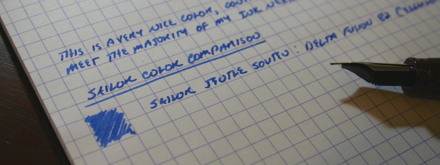
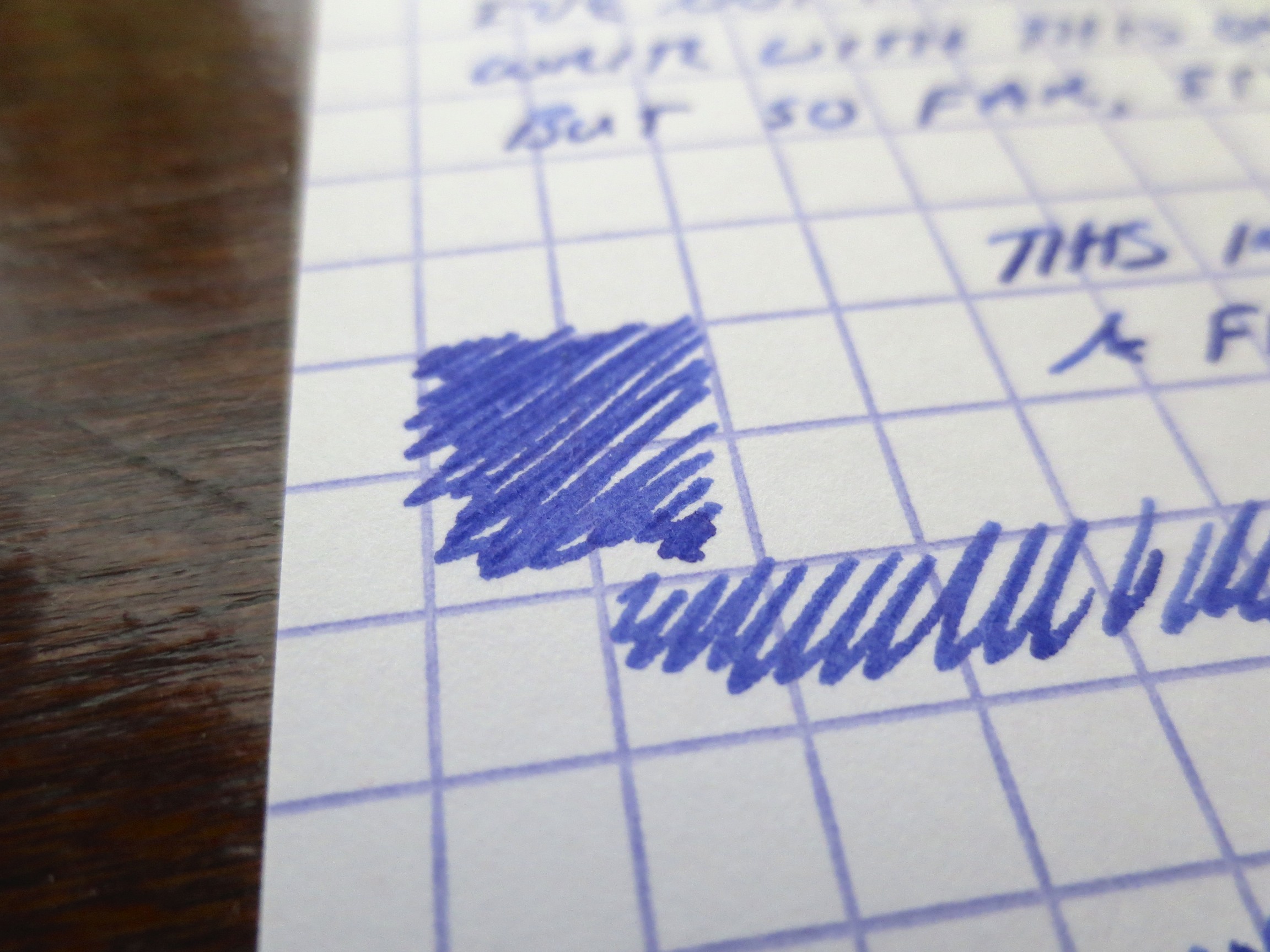
Thanks again to Ron and the folks at Pen Chalet for sending this bottle of Sailor Souten over for review.  Souten is the "replacement" for the now-discontinued Sailor Sky High, the light blue ink that everybody loved and now mourns.  Well, I'm here to tell you that for most people, Souten will be a perfectly satisfactory replacement, but those who loved Sky High for the "red sheen" it left as it dried might be disappointed.  Some of the sheen remains with Souten, but it's more subtle.  Personally, I'm agnostic on this issue.  

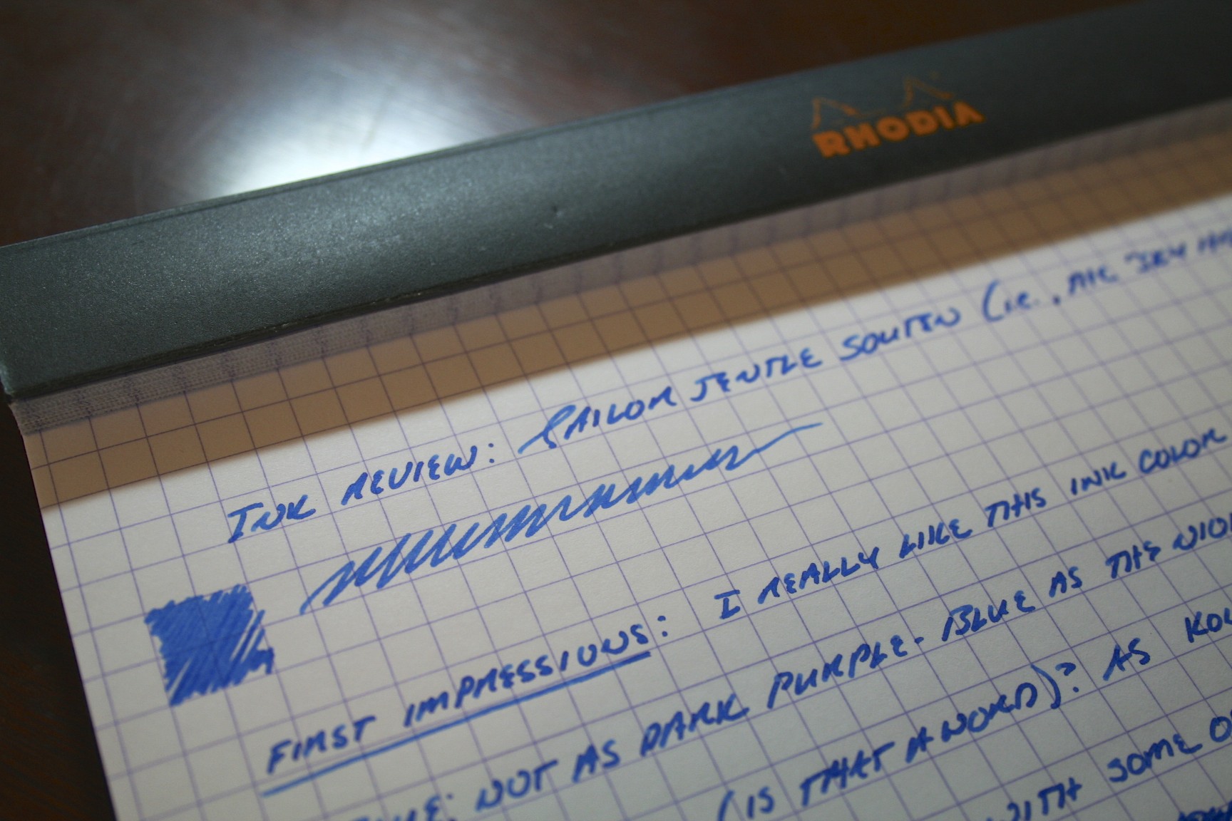
What you have with Souten is a very well-behaved, bright mid-range blue.  I've seen some reviewers describe this ink as too light for daily use, and even washed-out.  I did not find this to be the case in any way whatsoever.  It's similar to Iroshizuku Kon-Peki, but cheaper (even with the new pricing from Sailor) and doesn't feather and bleed as much.  You can see from the writing sample below that I really layered the ink down on Rhodia (which is high quality, but will feather and bleed in extreme cases), and did not see a bit of bleed-through.   

A comparison with Miruai and Yama-Dori, great colors all around.

A comparison with Miruai and Yama-Dori, great colors all around.

This scan is a pretty faithful reproduction of the colors shown above, but as with most scans, the colors probably "pop" more in real life.  The photos below capture that.

Pen Chalet carries the full line of Sailor Ink and Pens. In the interest of full disclosure, I received this ink free of charge for review purposes. 

Ink Review: Rohrer & Klingner Scabiosa

The blog's been a bit heavy on ink reviews this week, but I'm still churning my way through the load of inks I trucked home from the D.C. Pen Show two weeks ago, and I'm writing reviews as I use them up (which I need to do, seeing that I have over a dozen pens inked right now).  Hopefully I will get some pen reviews photographed and finalized this weekend.  But in the meantime, here's today's review:

Rohrer & Klingner inks come in a 50ml glass bottle, which is tall and works well for filling pens that have a larger nib.

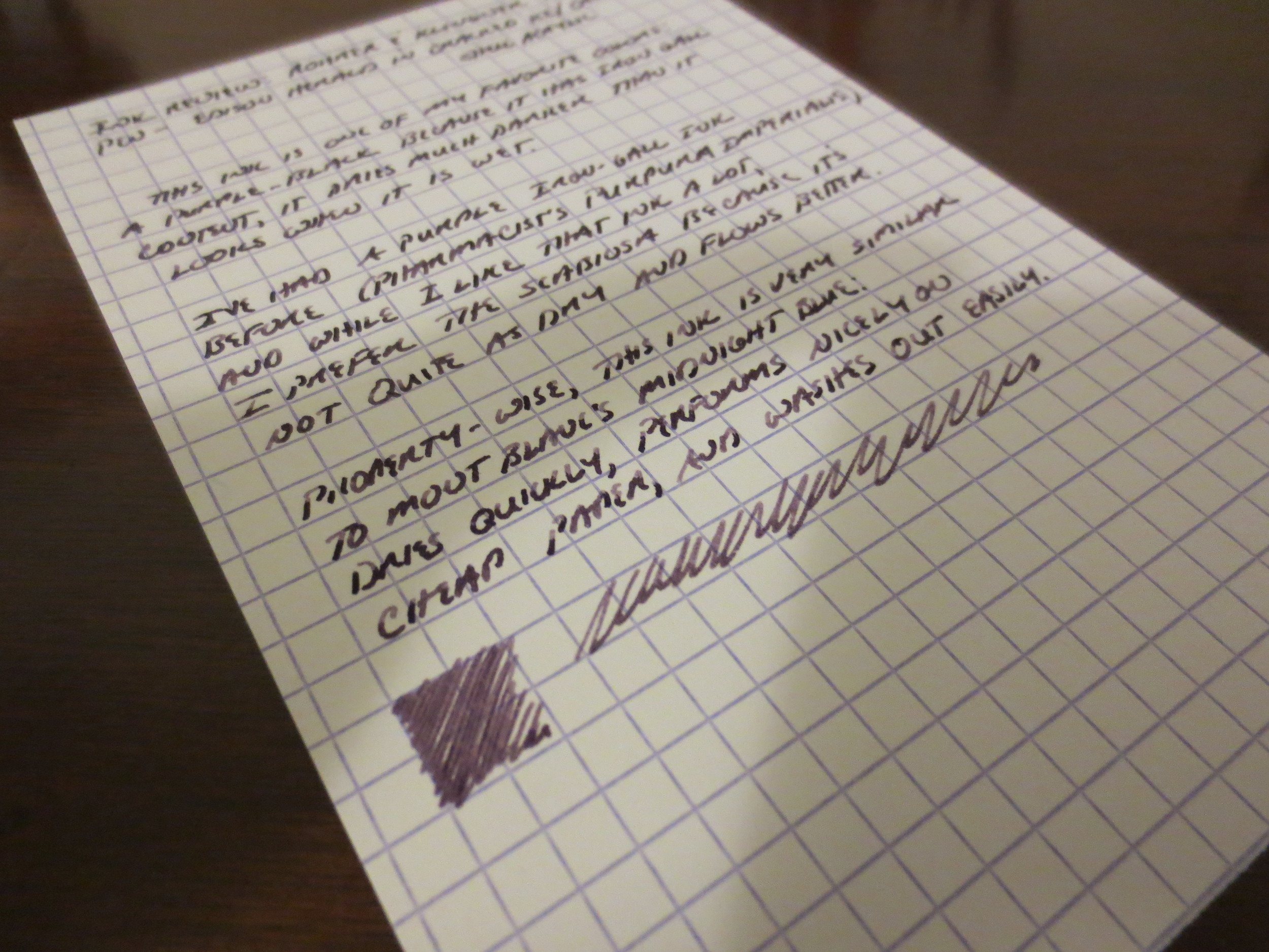
I held off buying this ink because I had a bottle of Pharmacist's Purpura Imperialis, which was a nice enough color but ended up being a bit too dry for me.  (My review of that ink, from a long, long time ago, can be found here.)  The Scabiosa is similar in that it initially writes in a purple tone but dries to a purple-black.  I find, however, that the Scabiosa has slightly better flow and behaves more like Montblanc Midnight Blue (iron gall version).  This is probably because those inks have less iron-gall content than the Pharmacist inks. 

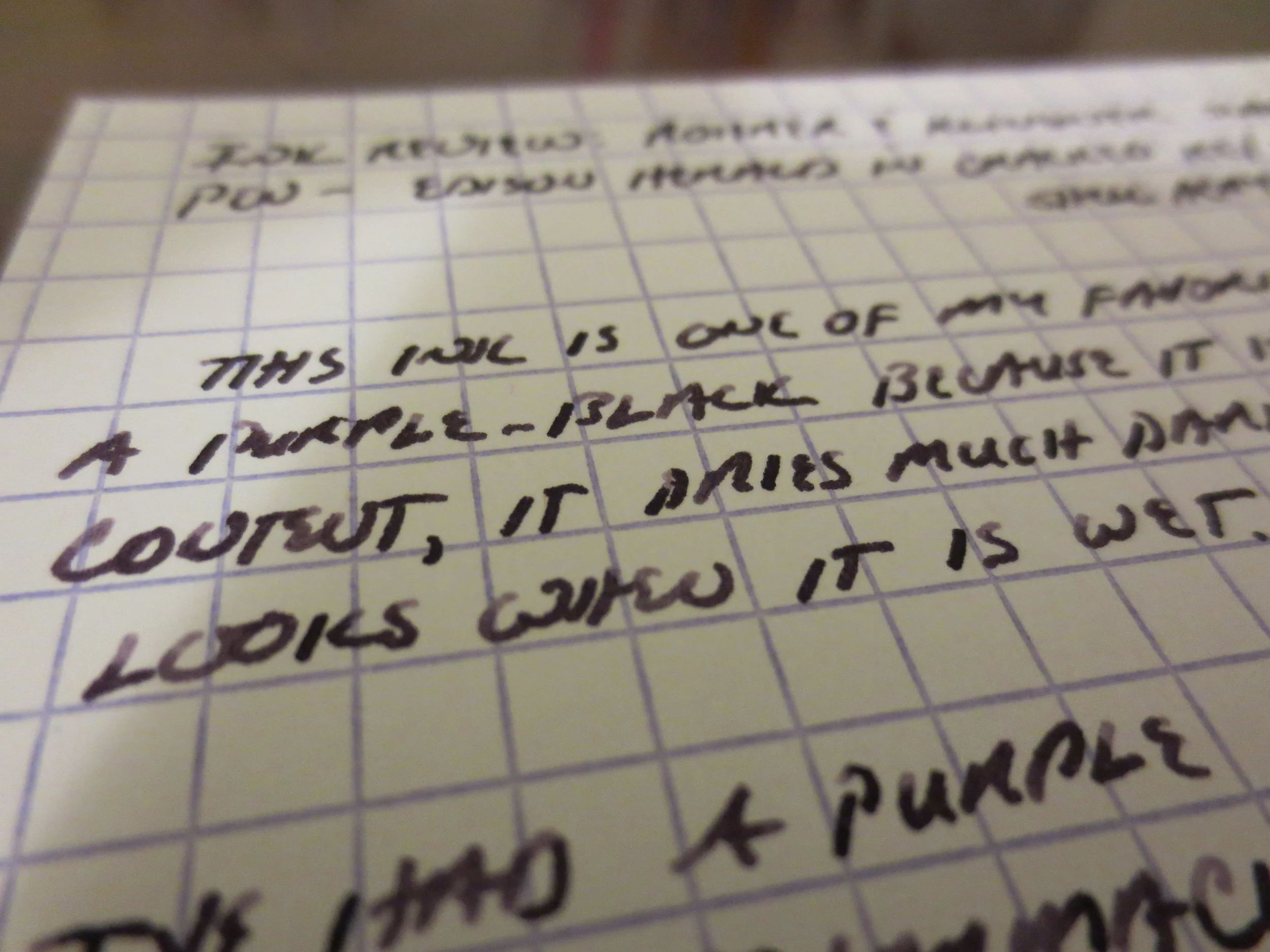
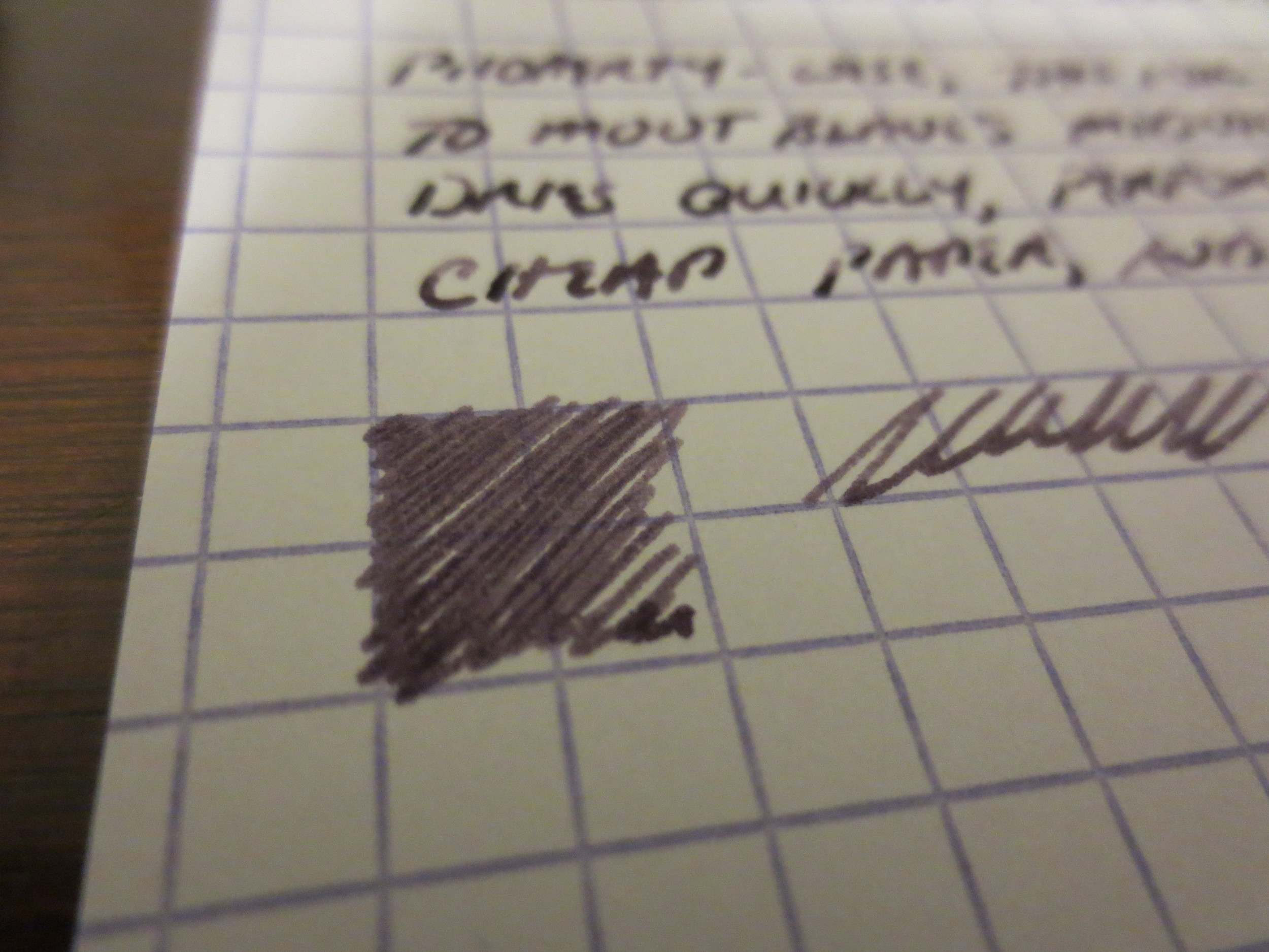
This ink also has been reviewed a lot, and is very popular, so I won't bore everyone with another lengthy discussion of its properties, but it does work well on cheap paper (most iron gall inks do) and dries fairly quickly.  The ink also offers some nice shading, which I've attempted to capture in the photo gallery below, along with the color shift as the ink dries.  You may notice that the "fresh" writing at the bottom of the handwritten sample is notably lighter than the writing at the top.   

I should emphasize that you need to clean your pen out every two weeks or so while using this ink, especially if you use steel nibs and/or pens with metal parts that come into contact with the ink.  Iron Gall can react with and corrode steel and some steel alloys over time, and if you leave a pen inked up for months on end and don't practice good pen hygiene, bad things can happen.  Otherwise, it's perfectly safe to use and enjoy.  I've been using iron gall inks for years without any ill effects.  

Handwritten Review of Roher & Klingner Scabiosa with Edison Herald (Medium Nib) on Exacompta stock. 


Ink Review: Sailor Yama-Dori

I was fully expecting to find this ink overrated, and thought it would be impossible for it to live up to the hype generated before its (re)release.  I was wrong.  While I love Miruai and Nioi-Sumire, Yama-Dori is probably going to end up being my favorite of the new Sailor Jentle line.  

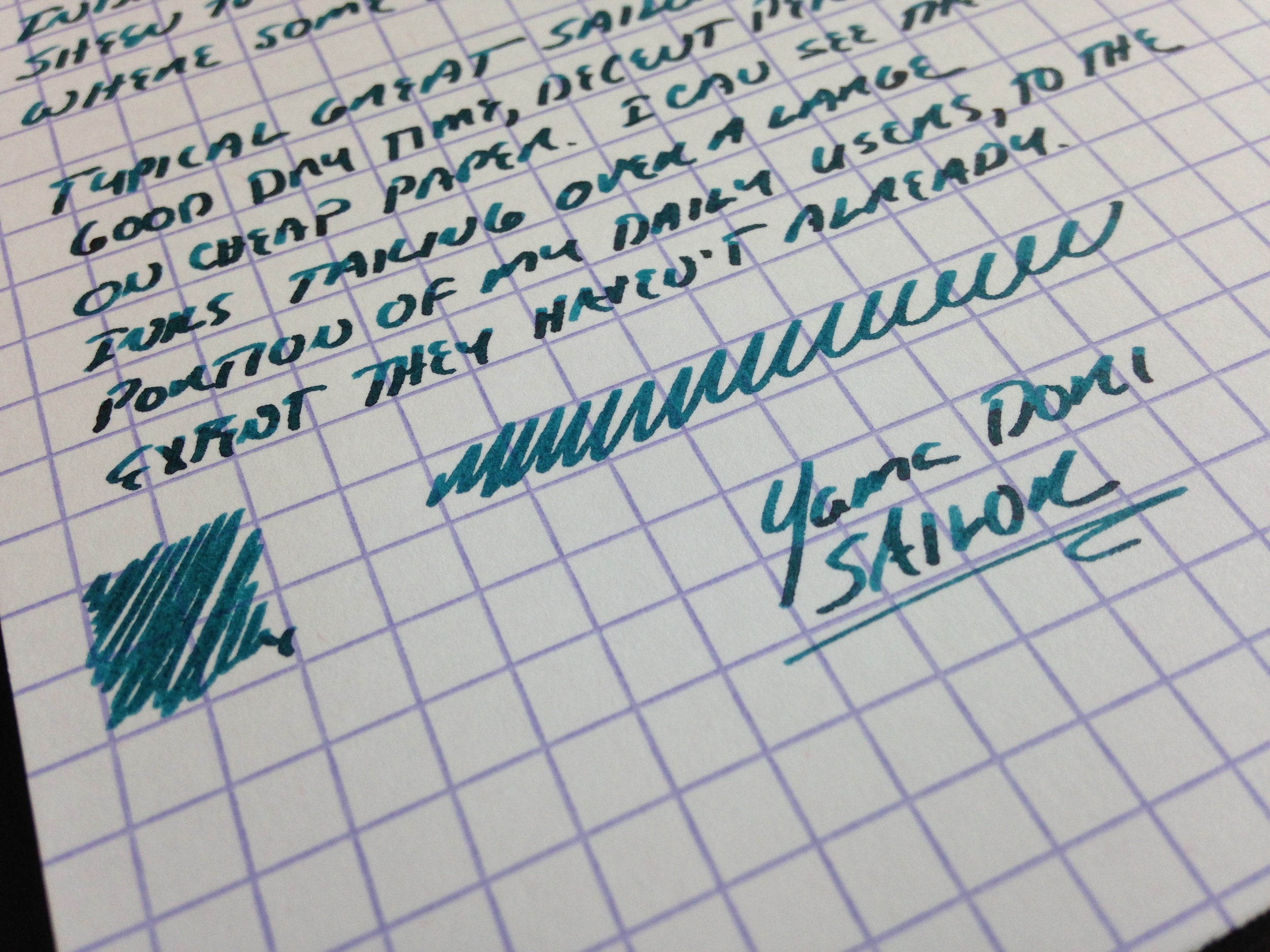
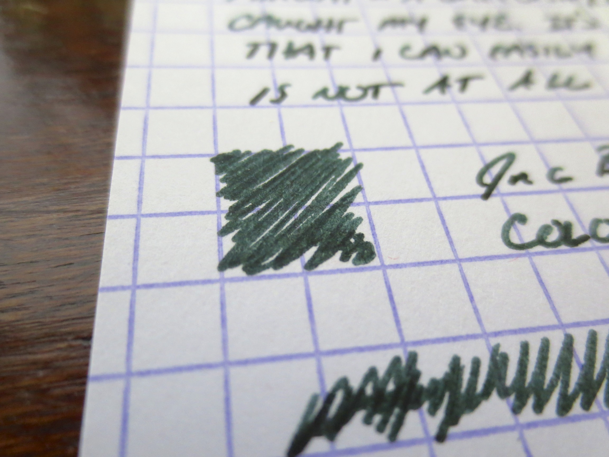
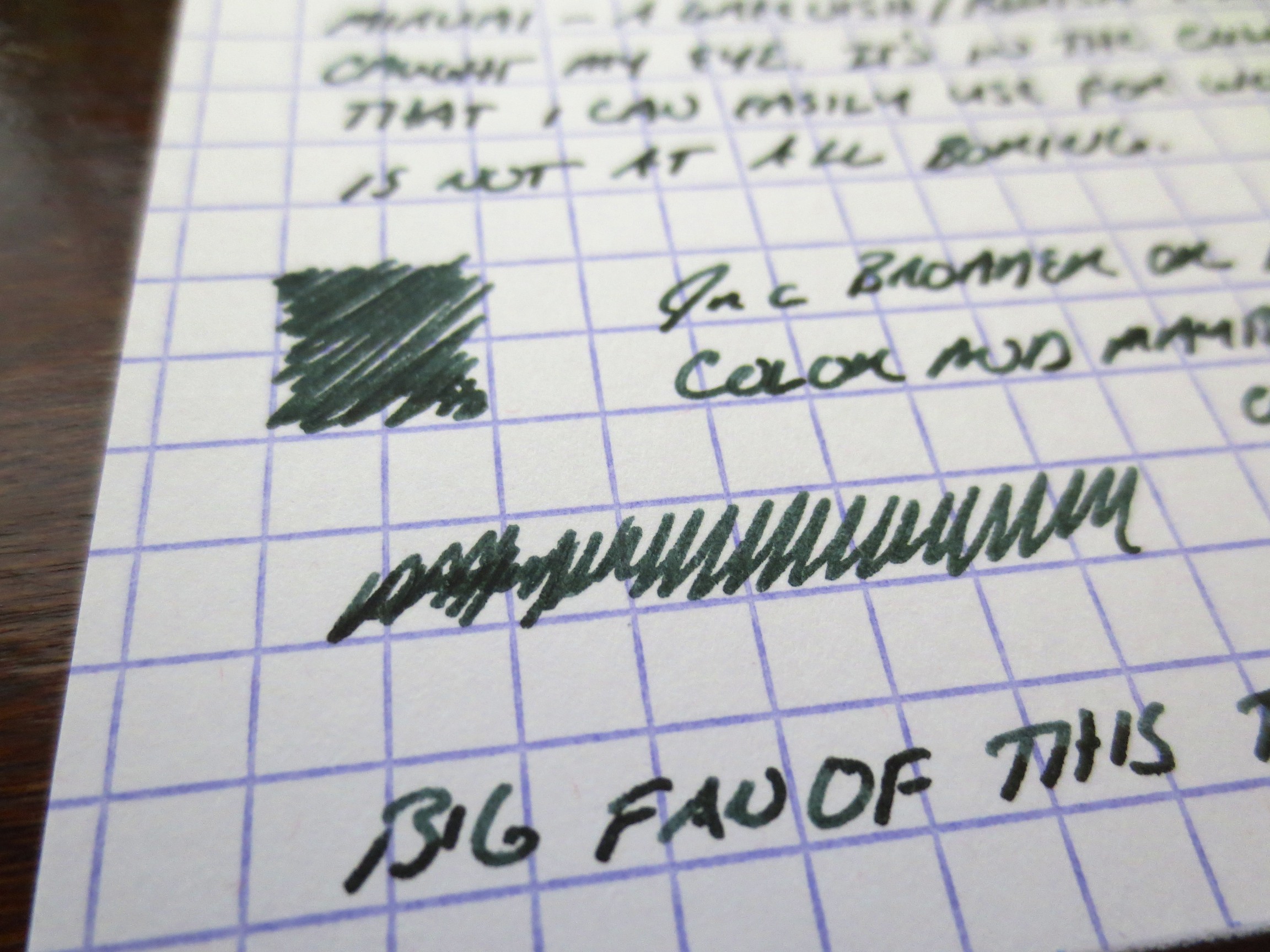
The color is a dark teal.  Miruai could also be considered a very dark teal, but this ink has a different tone altogether because there's more blue in it.  The color has a lot of subtle depth:  there is some reddish sheen to the ink once it dries and you look at it from an angle, but it doesn't photograph very well (at least with my limited skill and equipment).  You do, however, see a lot of shading with some black coming through where the ink is heavily applied to the paper.   

In a way, the ink reminds me of a mix Pendleton Brown does (or did, before Organics Studio started making inks for him) called Blakwa, which I understood to be a 50/50 mix of Waterman Black and Waterman "Inspired Blue" ("formerly South Seas Blue," commonly known as "turquoise").  That mix didn't have the sheen, and wasn't as saturated, but I always thought it was a cool color. 

Yama-Dori has all the properties of the Sailor Jentle ink line:  good dry time, even on super smooth paper; low feathering and bleed-through, even on super cheap paper, and what I would call a very balanced level of color saturation.  It's not watery ink, but it's also not super saturated to the point where it will smear.  What I especially like about this ink is that it's an interesting color that is dark enough to use for work, or pretty much any other purpose.   

Handwritten Ink review of Sailor Yama-Dori Ink on Exacompta card stock.  The pen I used is a Pilot Vanishing Point with a Broad nib stubbed by Mike Masuyama. 


Thanks to our sponsors at Pen Chalet for sending me this bottle. In full disclosure, I received this bottle for review purposes free of charge.   

Double Ink Review: Sailor Jentle Miruai and Nioi-Sumire

Today I'm going to try something new:  In an effort to get these new Sailor Inks reviewed and posted ASAP, I'm going to review them two at a time.  Generally, I keep about six fountain pens inked up at any given time, but carry two with me on any given day.  One is filled with a dark ink for notes, signing documents, etc.  The other is filled with a brighter ink that I use for marking stuff up, and is typically a red, orange or purple.  The past two days I've been using this pair.  Miruai is a deep blue/green-black ink, and apparently translates as "Seaweed."  Nioi-Sumire is a bright blue-violet ("Sweet Violet"), but to me leans more towards the blue end of the spectrum.  I think both are gorgeous.  Thank you Anderson Pens!

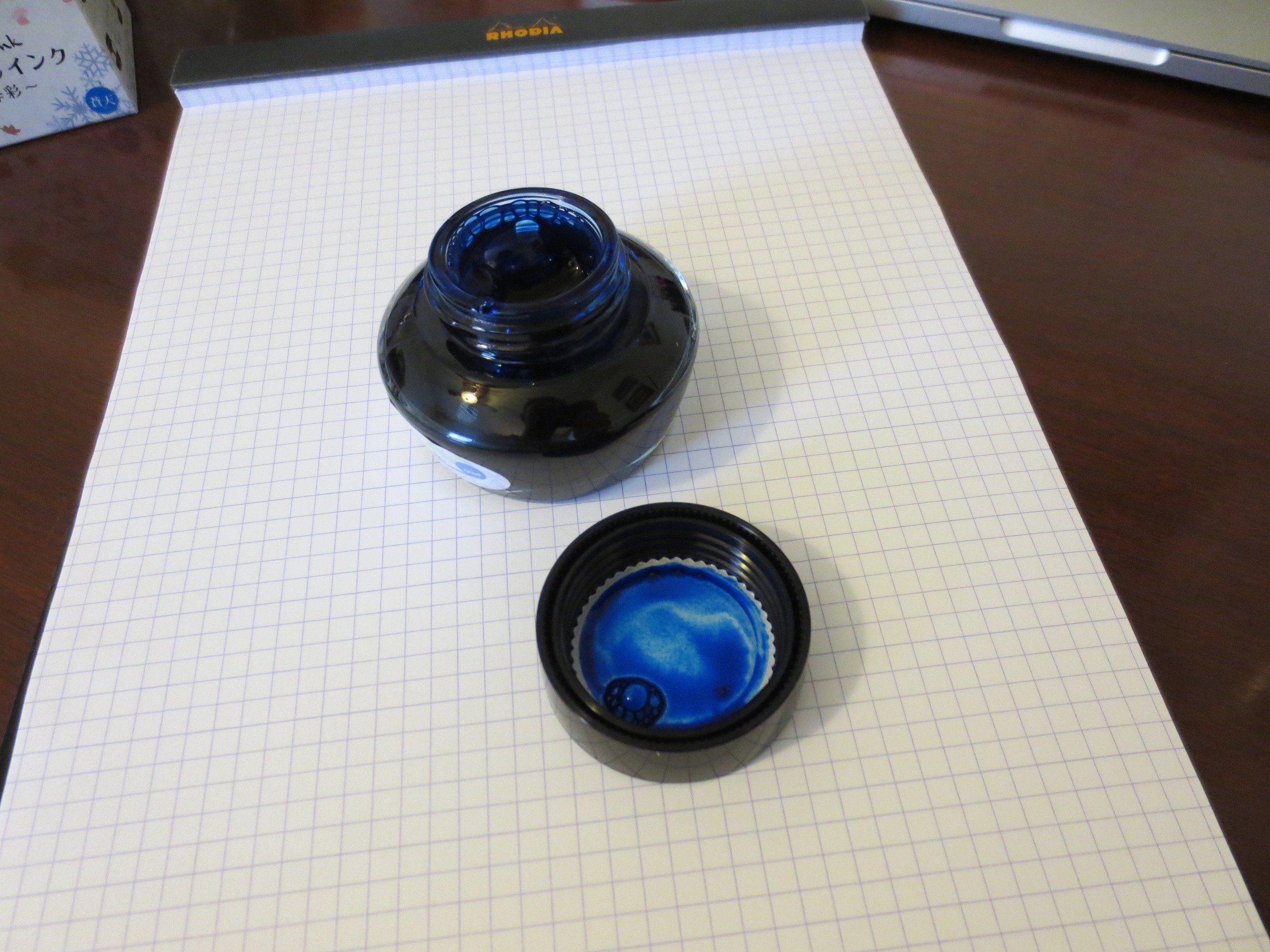
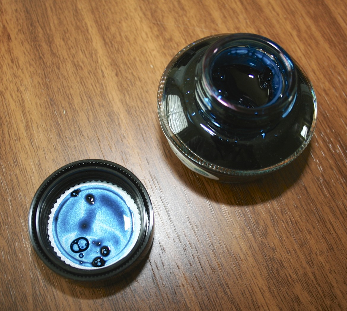
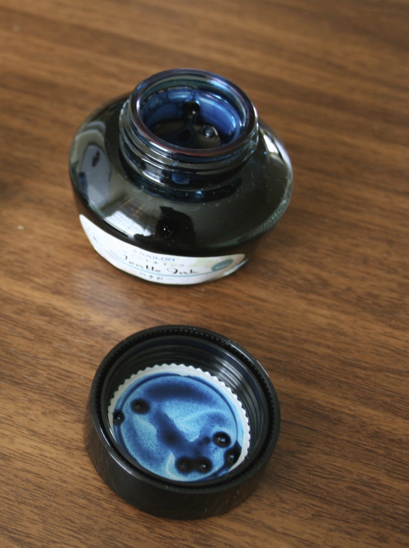
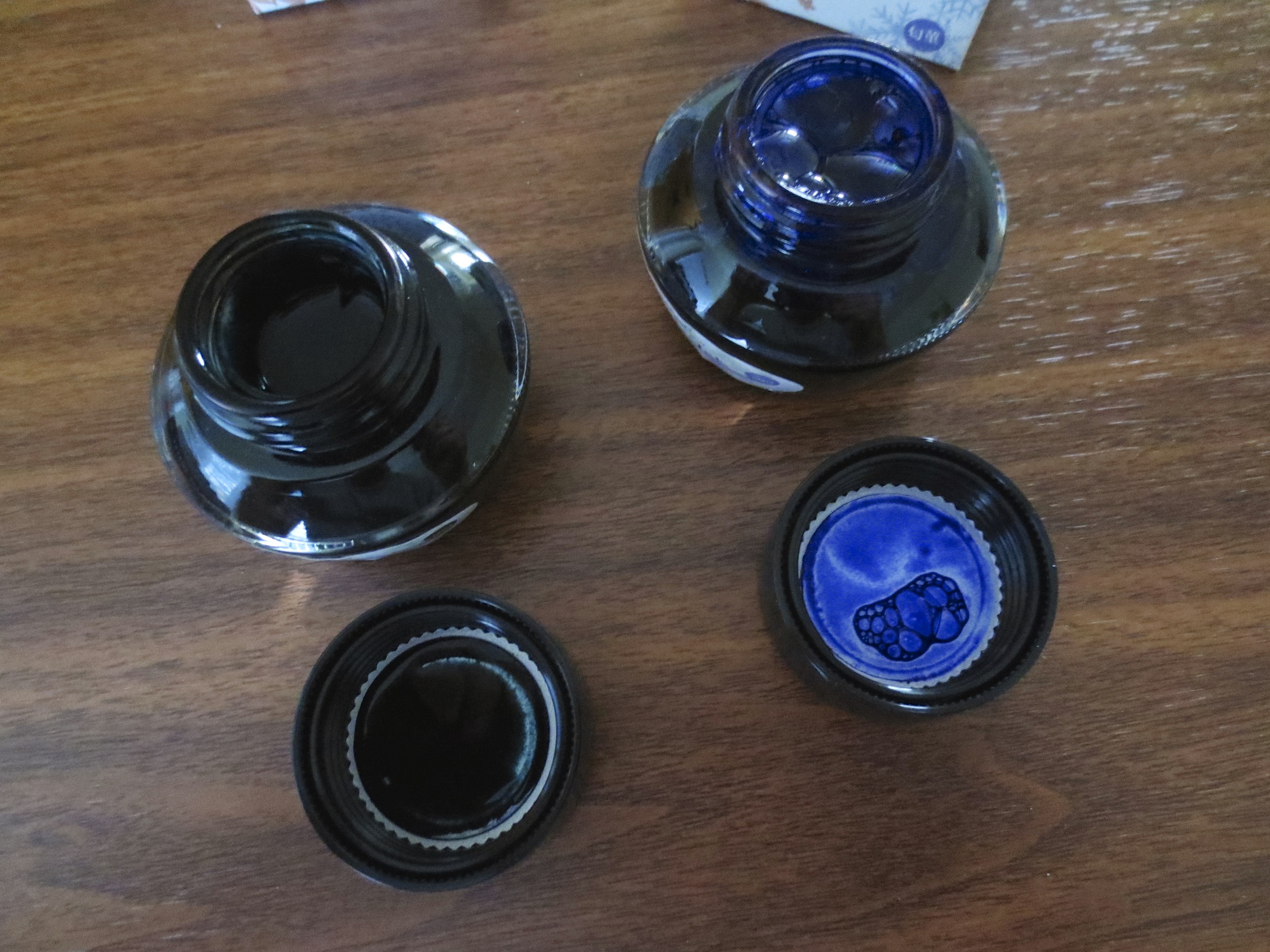
Sailor kept the same bottle with the internal inkwell.  I personally like the Sailor bottle, although some complain that the inkwell makes it difficult to flil pens with larger nibs.

This gives you an idea of how dark Miruai is.  The ink is probably a bit blacker than Epinard, but I have not done a side-by-side comparison.  Miruai has more blue in the color. 

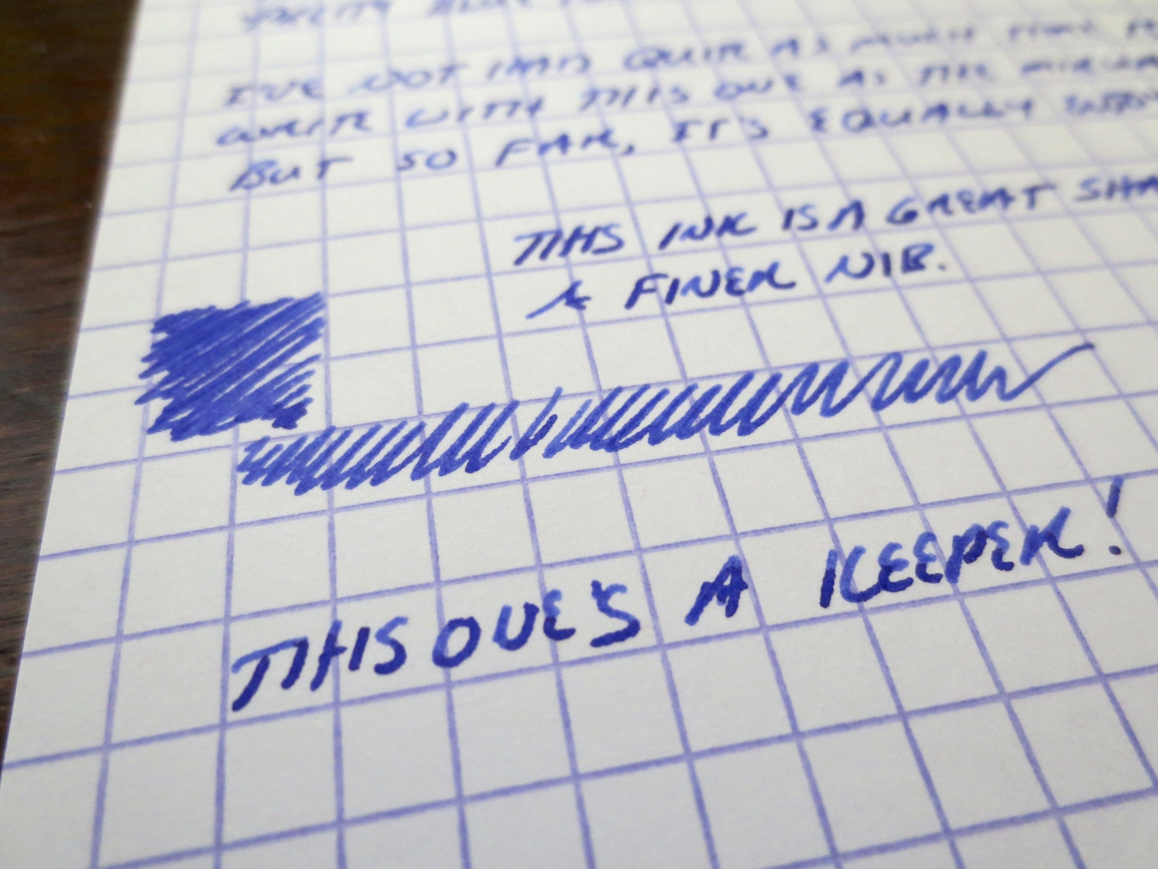
Nioi-Sumire, to me at least, is far more blue than purple.  If you are looking for a very purple ink, try Shigure (review forthcoming). 

I've enjoyed working with both of these inks.  They share the same great properties with the rest of Sailor's Jentle line.  As you may have heard, Sailor discontinued its "regular" line of inks earlier this year, and resurrected several "limited edition" inks from 2010 to replace them.  Because of the somewhat unique range of colors and the fact that these inks were so well-behaved (meaning they clean easy, dry quickly, and don't crust up on nibs), people were up in arms.  Rest easy, folks.  While Apricot, Epinard, Sky High, etc. may be gone (at least until Sailor brings them back as "limited editions" at a higher price point, as some have speculated), we have an entirely new line of great colors to play with.

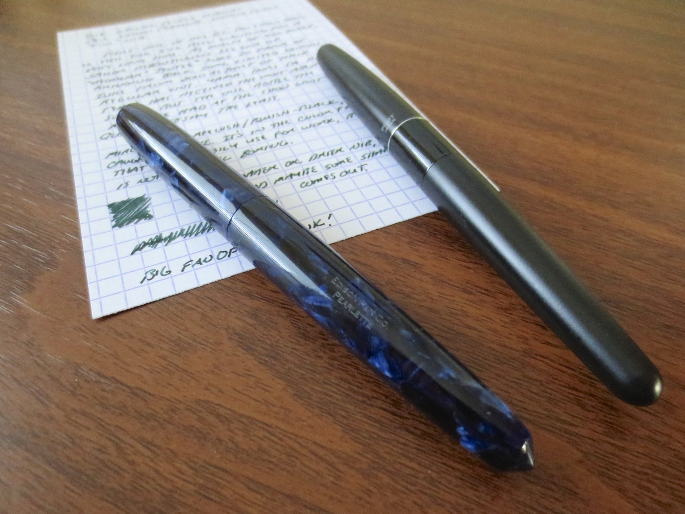
Both of these inks are moderately saturated, and a touch dry, but I had no flow issues with either.  I have the Nioi-Sumire in a Pilot Metropolitan with a medium nib, and the Miruai in a brand-spankin'-new Edison Pearlette in deep indigo flake acrylic (fine nib) which I absolutely love.  Card stock is Exacompta, and the scanner is a Doxie Flip.  Here are the results:

Scan of Nioi-Sumire.  This is a fairly accurate representation of what the color looks like when the ink is dry.  I've also included some photographs in the gallery below to show some of the shading. 

This scan captured the blue-green edge to the Miruai pretty well.  In a very fine nib, the ink can appear almost black.  In this Edison Pearlette "fine," which runs wider than the typical fine nib, you get some shading and a touch of sheen.