• Blog
  • Shop
  • Resources
  • FAQ (Ask TGS)
  • About
  • Archive
  • Contact
  • Sign In My Account
Menu

The Gentleman Stationer

Vintage Living in the Modern World.
  • Blog
  • Shop
  • Resources
  • FAQ (Ask TGS)
  • About
  • Archive
  • Contact
  • Sign In My Account

Worth the Hype? A Close Look at a Montblanc Writers Edition (Virginia Woolf)

November 7, 2020

Though the difference in price and hype is perhaps less pronounced than when the series was first introduced, few limited edition fountain pens attract the same level of attention as Montblanc’s annual “Writers Edition” releases. Typically, Montblanc releases a pen design inspired by the life and work of a particular novelist or poet. For example, this year’s “Homage to Victor Hugo” limited edition features a cap “decorated with gothic arches in relief, and the end of the clip, which is shaped like the clapper of a bell, recall[ing] the the bell ringer Quasimodo and the Bells of Notre-Dame.” Montblanc also engraves the writer’s signature somewhere on the pen, usually on the barrel.

The designs themselves either appeal to you or they don’t. Personally, I find most of the Montblanc Writers Edition pens either (1) too large, or (2) too gaudy, especially those released in recent years. My personal favorites are the older editions, and I have two in my collection: Virginia Woolf (2006), which I review here, and Charles Dickens (2001), which I plan to address in a separate post.

The snowcap on my pen has an off-white patina, and I don’t know whether this is by design or whether it has developed as the pen ages.

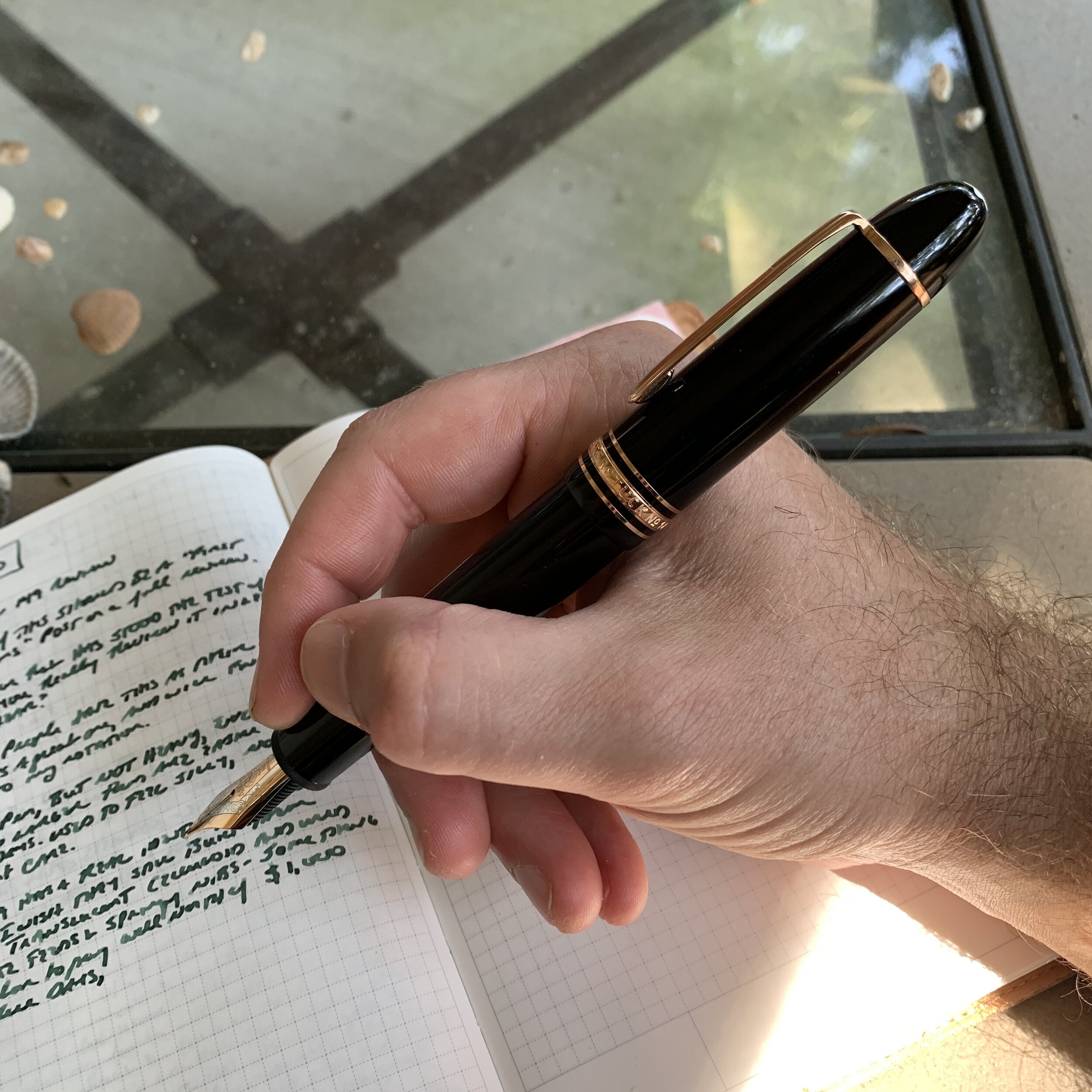
The Montblanc Virginia Woolf Writers Edition fountain pen is, to me, a perfect example of a Writers Edition pen that one can easily use for, well, actual writing. At roughly the size of a Montblanc 146, the pen itself is not too large. The Virginia Woolf edition also features a contoured barrel comfortable to use posted or unposted. When I’ve shown pictures of this pen in the past, readers have asked whether it’s a Bonheur, the so-called “pen for women,” and while it’s not, there is a resemblance, particularly with the cap. Due to the similarities, some regard this as a “gendered pen” unsuitable for a man to use, which is of course absurd.

View fullsize Montblanc Virginia Woolf Unposted
View fullsize Montblanc Virginia Woolf Posted

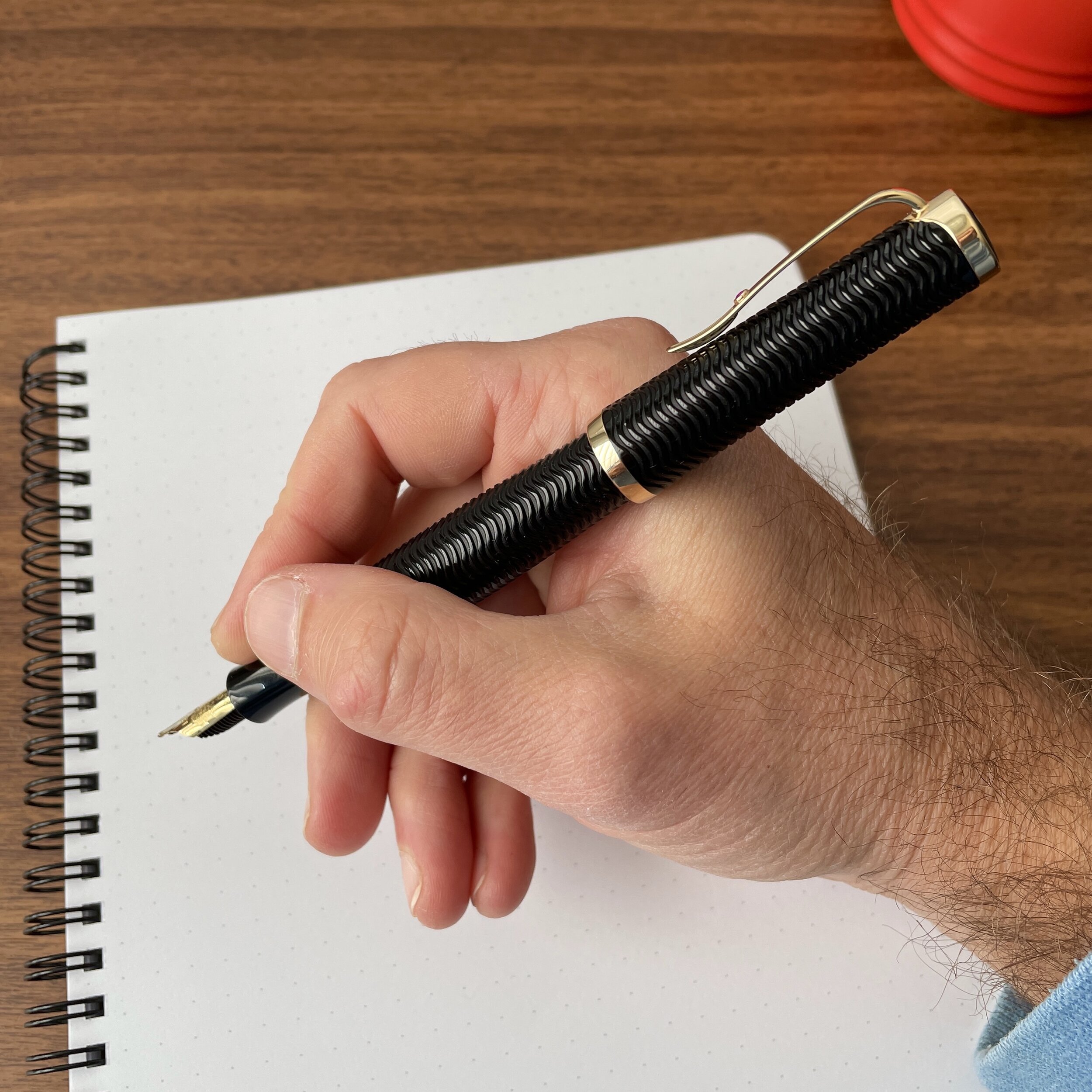
Finally, I appreciate the understated manner in which Montblanc incorporated references to Woolf’s life and work into the pen’s design. The black barrel is engraved with a guilloche pattern, a reference to her novel “The Waves,” and the nib features an engraving of the two elm trees under which she is buried. Her signature appears subtly engraved on the gold piston knob.

The gold blind cap with signature.

Each Writer’s Edition features a custom engraved nib.

Takeaways and Where to Buy

The Virginia Woolf Writers Edition is not just one of my favorite Montblanc Writers Editions, it’s one of my favorite Montblancs in my current collection. I have a hard time leaving this one un-inked. I’ve previously written multiple times about how Montblanc stock broad nibs tend to be stubbish, and this one is no exception. It’s also tuned perfectly, which either shows how Montblanc pays closer attention to the Writers Edition nibs before they go out the door, or that older Montblanc pens in general were subject to better quality control practices. This particular pen wrote exceptionally well out of the box, without any skipping or “baby’s bottom” issues you sometimes see with stock Montblanc nibs.

One of the more polarizing design choices on this pen is the ruby on the clip. I like it, and find that it adds a touch of color to an otherwise very traditional black-with-gold-trim design scheme.

Unfortunately, the Virginia Woolf Writers Edition dates to 2006, so if you’re looking to pick one up you likely need to search the secondary market for used or N.O.S. (new old stock) items. I found this one during a Black Friday sale last year, where a European retailer (I believe La Couronne du Comte) had several older N.O.S. Writers Edition pens available for purchase. Today, many different options exist, but in the U.S. the retailers who typically have the largest selection at any given time are Chatterly Luxuries and The Pen Show. You can always take your chances on eBay, but be aware that Montblanc pens are heavily counterfeited and you should only purchase from a reputable seller. Personally, for pens in this price range (anywhere from $600 to $1500), I would only purchase online from known pen dealers with a reputation for standing behind their products, or else wait until pen shows resume and you can inspect potential acquisitions in person.

Disclaimer: I purchased the pen featured in this review with my own funds, for my own collection. I did not receive a discount on this purchase other than coupon codes available to the public. This post does not contain affiliate links.

In Pens Tags Montblanc, Montblanc Writers Edition, Fountain Pen, Pen Review
2 Comments

First Impressions: Montblanc 149 Fountain Pen

May 31, 2020

I debated whether to frame this post as a “First Impressions” piece or a full review. In the end, I went with “First Impressions,” because the Montblanc 149 is such an iconic pen that I inevitably will revisit it at some point in the future. I’ve used a Montblanc 146 for years, and while that pen now maintains a perpetual spot in my rotation as a true “workhorse” fountain pen, my appreciation for it has certainly grown over time.

Initial Impressions

What strikes everyone at first is the size of the Montblanc 149. You ask yourself, “Can I actually use this pen as an everyday writer?” I’ve written with large fountain pens before, but the Montblanc 149 takes things to another level, at least visually. While the size can be intimidating, you’re also struck by the pen’s beautiful design and proportionality. Though large, it doesn’t appear awkward, like many of the giant oversized fountain pens other pen companies have released in recent years. As I’ll discuss in further detail below, it’s actually quite a comfortable writer.

IMHO, the “Snowcap” looks best on the 149’s oversized cap.

Here, I also opted for Montblanc’s rose gold trim, for the first time ever. I’ve recently written on how pens with rose gold hardware (clips, cap bands, and even nibs) are a new thing for me, and this particular pen was the one that started the trend back in January. The rose gold that Montblanc uses has much more of a reddish hue, as opposed to the pinkish tint you often see, and the effect is subtle. In certain lighting you may have a hard time distinguishing this trim from the standard Montblanc gold trim, but the difference is definitely there.

The Nib and Overall Writing Experience

I noted above how some oversized fountain pens are truly sold as nothing more than objets d’art or status symbols, meaning they are so (comically?) large that unless you have Hulk hands, you’re not going to be using them for actual writing. The Montblanc 149 is not one of those pens. Though initially skeptical, I’m now convinced that the 149 may actually be one of the better pens available for longer writing sessions. That doesn’t mean if you’re accustomed to writing with slimmer writing instruments there won’t be an adjustment period.

Don’t knock it ‘til you’ve tried it: the larger nibs on bigger fountain pens like the Montblanc 149, Montegrappa Extra 1930, and from what I’ve heard, the Sailor King of Pen, all offer a uniquely smooth writing experience.

While I haven’t been able to locate confirmation on its exact size, this handmade 18k gold nib appears to be a No. 8 on par with those fitted to larger flagship pens from Pelikan and Montegrappa. It’s a beautiful piece of work. As I noted in a recent article on stubbish stock nibs, I opted for a broad, which I consider effectively a stub. The nib writes a smooth, wet line with plenty of variation, and isn’t so broad that it can’t be used for regular writing. You may not be able to use this nib to write in your calendar, but at least in my experience, it’s glorious for journaling and perfectly adept at notetaking.

View fullsize Montblanc 149 Unposted
View fullsize Montblanc 149 Posted

First impressions aside, the Montblanc 149 turned out to be surprisingly lightweight for its size. Though the body contains a high-capacity piston filler, the filling system doesn’t add much weight and I can easily use this pen posted or unposted. One thing I’m learning is that after a period of adjustment in which I sometimes have to alter my grip, larger pens are quite comfortable to write with for long periods of time, provided the weight of the pen doesn’t sit too far back. The balance on the 149 is perfect for me, to the point where I can easily post this pen. As you write with it, your (or at least my) hand quickly becomes accustomed to the size, something I’ve struggled with on the larger Pelikan models (M800 and M1000) which incorporate what feels like a heavier piston.

Takeaways and Where to Buy

Though I haven’t owned this pen for longer than a few months, I’m confident the Montblanc 149 will find a place alongside its sibling, the 146, in my core rotation. The 149 is a luxury icon that represents the best of what Montblanc has to offer, if you can afford the steep price. Fortunately, Montblanc pens can be found on the secondary market, often in like new or barely used condition, for a significant discount, and I typically hunt for Montblancs at pen shows, in retailers’ “gently used” sections, or during Fountain Pen Day or “Black Friday” promotions.

I placed an order for this pen during Fontoplumo’s Black Friday sales event, and while the pen took a while to arrive, I’m loving the purchase. Currently, Fontoplumo retails this pen for 810 Euros, which roughly equates to $900 US, though after VAT the European retail price ends up being lower than what you would pay at a Montblanc boutique in the States. Taking advantage of a promotion can knock a bit more off the price, and I’ve seen secondhand 149 fountain pens in very good condition priced as low as $500-600. In any event, I think Montblanc gets a bad rap for its pricing structure, and much of the snide commentary about the brand is better directed at Montblanc’s ubiquitous - and sometimes annoying - lifestyle marketing rather than the value proposition of its pens. Even at full retail, the pricing on the 149 is comparable to that on a Sailor King of Pen and Pelikan M800, and less than the pricing on a Montegrappa Extra 1930 or Pelikan M1000.

Disclaimer: I purchased this pen with my own funds, for my own personal collection. I was not compensated in any way for this post, and did not receive a discount on the pen other than what was available via standard promotions at the time of purchase.

In Pens Tags Montblanc 149, Montblanc, Fountain Pen, Pen Review
11 Comments

Ink Review: Montblanc Writers Edition Rudyard Kipling Limited Edition

April 22, 2020

Reviewing Montblanc limited edition inks formed a staple of my review content in the early days of the blog, back when their seemingly endless stream of ink releases offered something unique that no one else in the market was doing. Things have changed! As other companies expand their ink lines, and get into the special/limited edition and “themed” ink games, often at much lower price points, I’ve become more selective about which of the Montblanc inks I acquire. Lately, those have been limited to a couple inks in the Petit Prince series, the Beatles Psychedelic Purple, and the James A. Purdey & Sons whisky-scented ink. (I skipped the one that smells like cigars.) This past year, I added the Rudyard Kipling ink released in conjunction with Montblanc’s 2019 Writers Edition pen.

Montblanc Kipling is shown here compared against Montblanc Irish Green. The Kipling has much more gray/steel blue to it than the Irish Green, which is much brighter.

Montblanc aptly describes the color of the Kipling ink as “Jungle” green. It’s a mid-toned green similar to the Jonathan Swift “Seaweed Green” ink released several years ago, which I owned at some point before I sold it off in a downsizing only to immediately regret it. This particular shade of green ink looks exceptionally good in a wet pen like a stub or a broad nib, and behaves as well as your typical Montblanc ink.

A writing sample of Montblanc Kipling, shown here on Write Notepads Dot Grid Paper. This particular writing sample was done with a stock broad nib in a Montblanc 149. Montblanc’s stock broad nibs are quite stubbish, and worth trying out unmodified before you decide to have the nib ground.

Takeaways and Where to Buy

Fewer of the Montblanc limited edition inks have caught my eye recently, mainly because Montblanc has been releasing these special editions regularly for over a decade and now the colors are starting to look like repeats in many cases. If I pick one up, it’s typically an ink similar to one that I “missed” the first time around or regretfully sold off - in this case the Jonathan Swift. I’ll likely hang on to my bottle of Kipling since this medium-toned green is something of an uncommon color and I enjoy how it looks in a stubbish nib.

You can currently purchase a 50ml bottle of the Montblanc Kipling Ink from site sponsor Appelboom. At around $32 per bottle (which may fluctuate with the exchange rate), it’s not an inexpensive ink, but then again nothing from Montblanc comes cheap. At least with this particular Writer’s Edition, you get the larger 50ml crystal inkwell bottle as opposed to the smaller 30ml version.

Disclaimer: This post contains affiliate links. I participate in Appelboom’s affiliate program, which generates store credit that I use to acquire products for review purpose, such as this ink. It’s one of many ways I support the blog.

In Ink Reviews Tags Montblanc, Montblanc Kipling, Ink Review
Comment

Pen Review: Montblanc Starwalker Rollerball/Fineliner

January 31, 2019

Before Montblanc introduced the “M” by Marc Newson collection in order to grab some younger market share, the Starwalker was Montblanc’s attempt to introduce a more contemporary design option into their lineup. I avoided Starwalker pens for years because I didn’t like the fact that they were cartridge-only, and had heard reports of temperamental fountain pen nibs (much like the “M”). I also wasn’t sure about the cap. Montblanc abandoned their traditional snowcap in favor of a “floating” emblem encased in clear acrylic, which for years looked a little funky to me but grew on me over time. I still sometimes think of the Starwalker as the “Montblanc pen for those who don’t want a pen that looks like a Montblanc.”

Shown here compared against the Le Petit Prince Classique rollerball. The Starwalker is a larger pen, sitting between the Classique and the 146, but it’s still slender enough for me to characterize it as “slim.”

Honestly, what finally made me pull the trigger on a Starwalker was the fact that I ran across one of the “Midnight Black” versions at a brick-and-mortar pen retailer who was discontinuing the line, and phasing out all of their Montblanc stock. (This was many months ago, so the location of the sale isn’t important because all the pens are gone and weren’t sold online.) I’ll never pass up the opportunity to grab a blacked-out pen with ruthenium trim a steep discount, especially one as nice as this.

Even the threading on the back of the barrel is ruthenium-plated, with the same texture as on the cap band of my Montblanc 146 “Ultra Black.”

Personally, I think the Starwalker design lends itself more to a rollerball/fineliner or ballpoint, as opposed to a fountain pen. The barrel-end is threaded, so if you want to post this pen you will have to thread the cap onto the back. Posting this pen therefore takes some time, and when I’m using it I tend to post the cap and leave it off - something you can’t necessarily do with a fountain pen without the nib drying out.

View fullsize Montblanc Starwalker Unposted
View fullsize Montblanc Starwalker Posted
View fullsize Montblanc Classique Posted

Other notable design touches are the introduction of a knurled metal grip, which emphasizes the pen’s modern look that’s a bit out of character for Montblanc. Some find knurled metal uncomfortable regardless, but this section is very well done. The knurling isn’t particularly sharp, and I’ve had no issues using this pen for long periods of time, posted or unposted. The cap doesn’t add a lot of weight when it’s posted, since it’s acrylic. As always, Montblanc fineliner and rollerball cartridges are of exceptional quality, if somewhat pricey.

Some models of the Starwalker have more prominent texture on the grip than others. The “Midnight Black” edition features fairly pronounced knurling, but it’s not uncomfortable to use.

Montblanc also incorporated a different clip design into the Starwalker - it’s arched rather than flat, and the clip is longer than the cap. “Montblanc” is also engraved around the top, just below the acrylic dome.

Another shot of the “Snowcap” emblem and how it “floats” in the acrylic.

Takeaways and Where to Buy

I enjoy writing with my Starwalker, and typically keep it in a two-pen leather sleeve with my Montblanc Le Petit Prince Classique rollerball, as a two-pen carry for when I can’t use my fountain pens. It makes a great travel set, and I keep one pen loaded with a blue refill; the other red. Because the Starwalker is slightly heavier than the Classique, those bothered by metal sections or heavier pens might want to hold a Starwalker and write with it before purchasing.

It appears that the Midnight Black version of the Starwalker is being phased out. Montblanc currently has them in stock via their website, so if you like the look of this particular edition I’d grab it while you can. Other retailers, such as our sponsor Appelboom, have different versions of the Starwalker Rollerball in stock, such as the standard Black Resin, the “Ultra Black”, or the “Black Mystery”. Pricing on all of these pens run around $400, so as with all Montblanc pens, it’s not a purchase to be made lightly.

Note: You will sometimes see the Rollerball version of the Starwalker advertised as a “fineliner,” but they’re one and the same other than the refill that ships with the pen. Montblanc fineliner and rollerball refills use the same format and are interchangeable in all Montblanc rollerball or fineliner pens.

Disclaimer: This post contains affiliate links. I purchased the pen featured in this post with my own funds, for my own collection.

In Pens Tags Montblanc, Montblanc Rollerball, Rollerball, Montblanc Starwalker, Pen Review
6 Comments

A Modern Classic? Montblanc Heritage Collection 1912

September 29, 2018

The Montblanc Heritage 1912 falls squarely within the “niche pen” category that certainly won’t appeal to everyone, but offers a glimpse of what storied, experienced brands like Montblanc are capable of when they reach into their back catalog for inspiration. I’ve had mine for a couple years now, and while it was an expensive purchase that required me to liquidate a significant chunk of my pen collection to be able to buy it, I’ve enjoyed every minute of owning and using this pen.

The Heritage 1912 is compact, which makes it a fun pen to carry for work, though you do have to mind where you set the cap because the pen doesn’t post.

This pen’s full name is the “Heritage Collection 1912 Fountain Pen,” which for simplicity’s sake I’ll refer to as the “Heritage 1912.” If you’re familiar with fountain pen history, and especially vintage Montblancs, you’ll notice the resemblance to the Simplo “Safety Filler” from the early 20th century. The key innovations of safety fillers like the Simplo included retractable nib mechanisms and a screw-on cap, both of which made early hard-rubber eyedropper pens less likely to leak. This pen, of course, is resin, not hard rubber, and it’s not a true “safety filler” eyedropper pen but rather a piston-filler that features a retractable nib.

The Heritage 1912 with the nib extended, and…

With the nib retracted.

The filling system on this pen is one of the more unique in my collection - it’s a piston filler where the piston knob has been modified to control both the filling system itself and the retractable nib mechanism. (Pictures and descriptions are included below.) Concerned that you might accidentally cap the pen with the nib extended? Worry not, because Montblanc designed a failsafe in the cap that keeps you from screwing the cap on in a manner that damages the nib. There’s a thin metal rod mounted in the end of the cap that blocks the cap from closing and bending the nib tines.

In its standard position, the piston knob rotates to extend/retract the nib.

Once the nib is extended, you pull out on the piston knob to engage the filling mechanism, which works like a regular piston filler. Once you fill the pen, you push the knob back in.

Don’t get me wrong, I own far more functional fountain pens than the Heritage 1912, which has its drawbacks as an everyday writer. For starters, the pen doesn’t post. Also, a smaller ink capacity limits your ability to use the Heritage 1912 with broader nibs: the pen holds less than 1 ml of ink, which I worked around by having Mike Masuyama grind my fine nib to a .4mm cursive italic. If you can overlook these two issues, however, the Heritage 1912 is a superb writer. The resin body has exceptional balance, with the filling system/mechanism lending this smaller pen some weight. The 14k, rhodium-plated nib has quite a bit of spring/bounce (NOT flex) to it, and I’d consider it one of the best Montblanc nibs I’ve ever used.

The design element that drew me to this pen was how Montblanc treated the Snowcap. Montblanc describes its emblem as “encased in transparent resin and coated in mother-of-pearl lacquer.”

A size comparison shot of the Montblanc Heritage 1912 against my recently acquired - and sharp looking - Retro 51 “The System” pencil from Mike Dudek of the Clicky Post!

A size comparison shot of the Montblanc Heritage 1912 against my recently acquired - and sharp looking - Retro 51 “The System” pencil from Mike Dudek of the Clicky Post!

Takeaways and Where to Buy

I count myself an unabashed fan of Montblanc, especially when they branch out of their standard comfort zone of pens based on the Classique/146/149 templates and do something unique like the Heritage 1912. There’s nothing else like this pen in my collection, and if I ever had to narrow my pens to a handful, this one would easily make the cut. I would wholeheartedly recommend this pen to any Montblanc enthusiast or those who’d like to experience the feel of a vintage safety filler but want a pen that they can use everyday without worrying about damaging a valuable antique.  

The Heritage 1912 can be somewhat challenging to find, but it is part of Montblanc’s standard lineup and not a special or limited edition. Site sponsor Appelboom currently has the pen available for around $850 USD (depending on the exchange rate), which certainly isn’t inexpensive but also doesn’t approach Montblanc’s premium pricing on its Writer’s Editions and other limited offerings. (If you really want to blow it out, you could spring for the much larger Heritage 1914, which retails in the many thousands of dollars/euros. I’ve never seen one in person, and presume they were made in much smaller quantities.) Other Montblanc retailers who stock the Heritage 1912 include La Couronne du Compte and Fountain Pen Hospital.

Disclaimer: I purchased the pen featured in this review with my own funds, for my own collection. This post does contain affiliate links.

In Pens Tags Montblanc Heritage Collection 1912, Montblanc, Fountain Pen
4 Comments
Older Posts →
Store Location
Visit the T.G.S. Curated SHOP
*New* Updated "Best Pens" Guide (2025)
TGS x Hinze Pens Violet Tendencies Taschenstift Fountain Pen
Hierarchies of Fountain Pen Friendly Paper
Allex Scissors arrayed on a desk showing link to desk accessories

Join Our Patreon!
Subscribe to the TGS E-mail List

Featured Posts

Featured
Pilot-Iroshizuku-Yama-Budo-Writing-Sample.jpeg
May 24, 2025
Joe's Picks: Five Favorite Inks From Pilot's Iroshizuku Lineup
May 24, 2025
May 24, 2025
Yamamoto-Gray-Paper-Sampler-Set.jpeg
May 10, 2025
Discovering Unusual Paper: "Paper Tasting" Sets from Yamamoto Paper
May 10, 2025
May 10, 2025
Four-Micarta-Fountain-Pens.jpeg
Apr 19, 2025
Yes, Micarta for me! I finally got my hands on Some Micarta Pens, Plus My Own Special Edition
Apr 19, 2025
Apr 19, 2025
The Gentleman Stationer RSS

© Digital Divide Media, LLC, 2014-present.

All content is the exclusive property of Digital Divide Media, LLC, d/b/a The Gentleman Stationer, including “The Gentleman Stationer” website and trademark, and should not be reproduced without express written permission.  All rights reserved.

All content containing paid advertising, affiliate links, or sponsored content will be plainly disclosed by a disclaimer when/if featured.

Contact Information

Store Shipping Policy and Return Policy

Privacy Policy

Cookie Policy

Terms and Conditions

Powered by Squarespace