• Blog
  • Shop
  • Resources
  • FAQ (Ask TGS)
  • About
  • Archive
  • Contact
  • Sign In My Account
Menu

The Gentleman Stationer

Vintage Living in the Modern World.
  • Blog
  • Shop
  • Resources
  • FAQ (Ask TGS)
  • About
  • Archive
  • Contact
  • Sign In My Account

Follow Up: Diamine Music and Flower Ink Sets

April 8, 2020

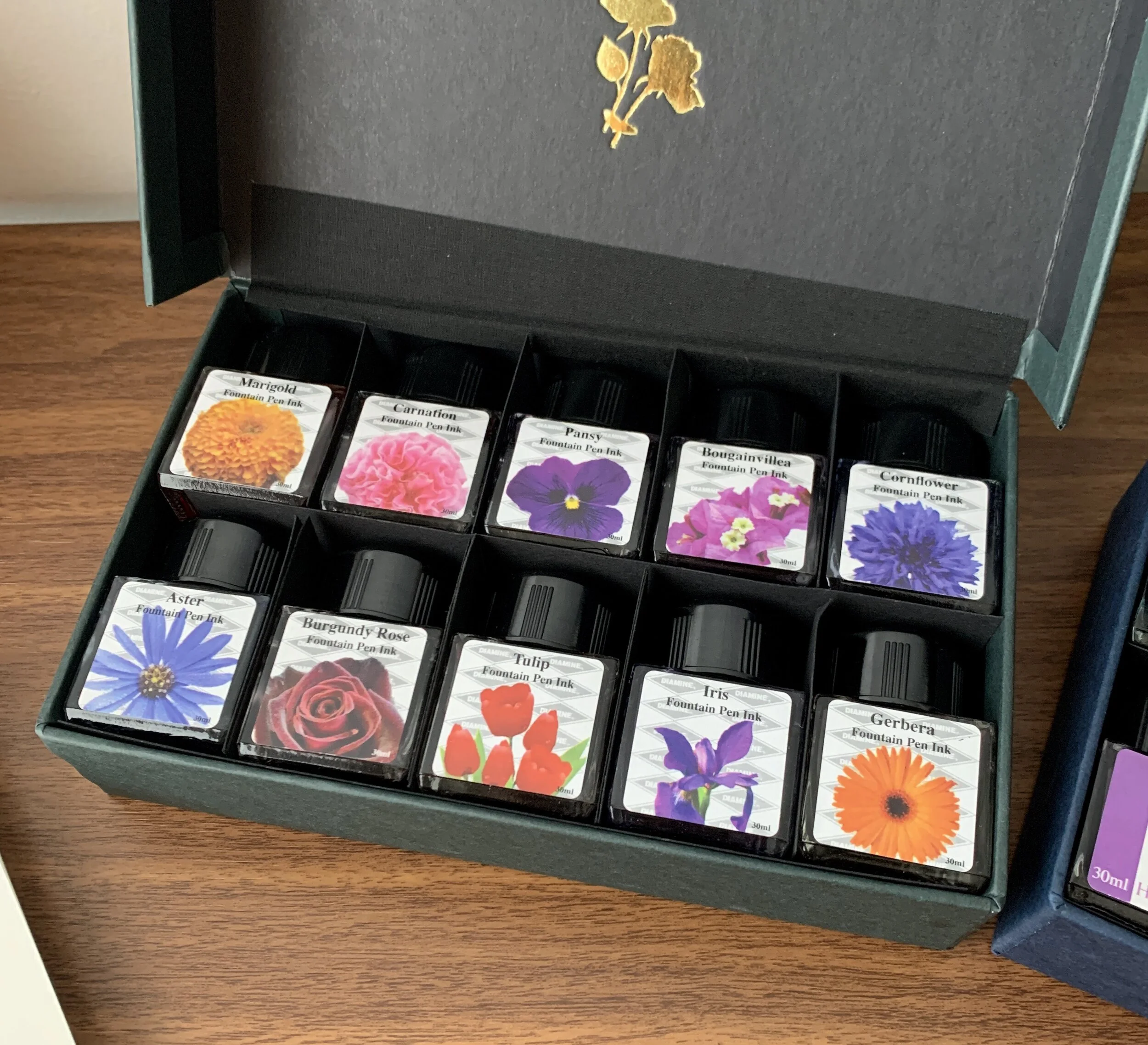
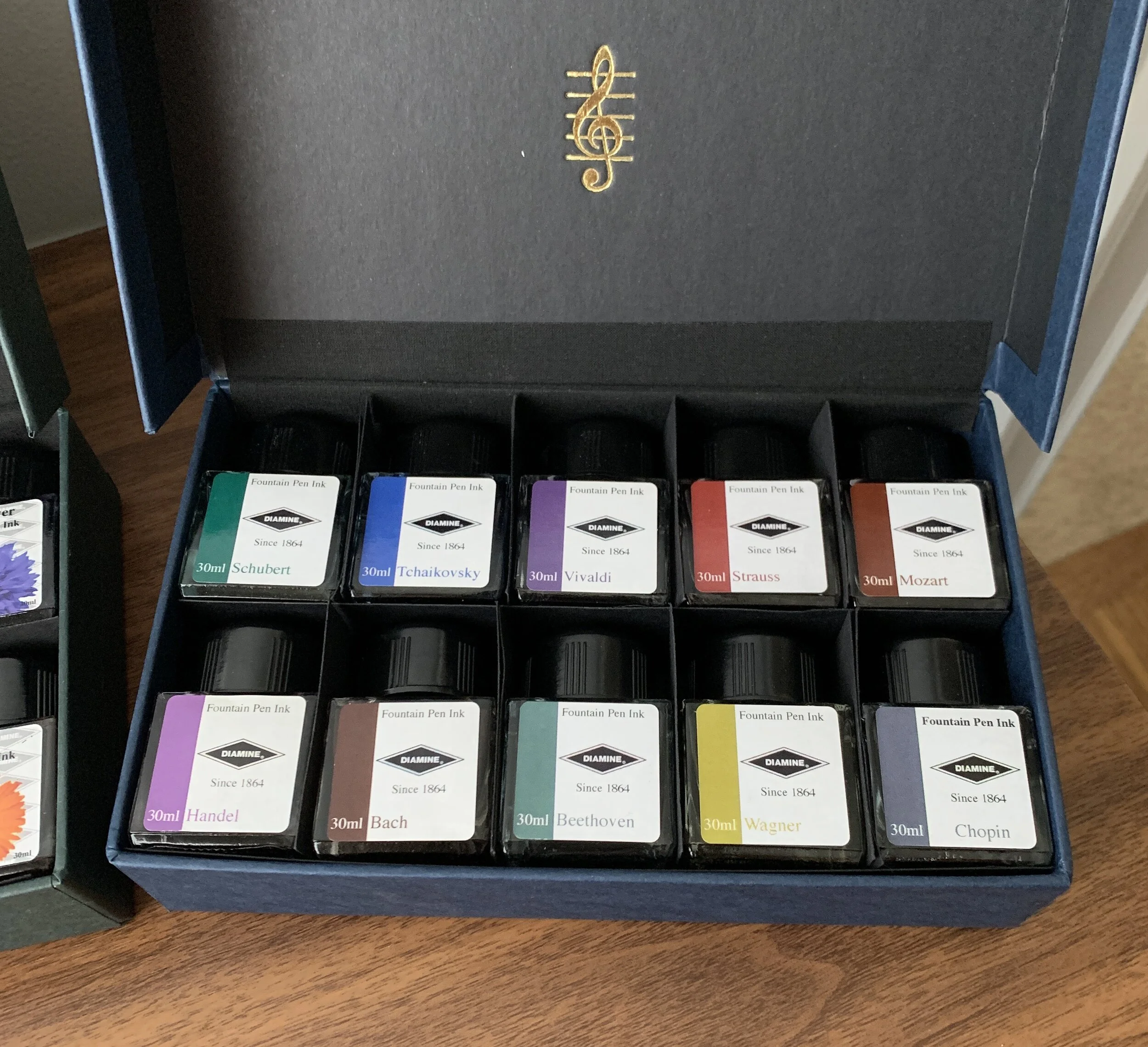
A couple of weeks ago I posted a review of “Vivaldi” and “Strauss,” two inks from Diamine’s ten-bottle Music Set. Since then, I’ve had a chance to sample and swatch the other eight Music inks, each of which is themed around a different composer, as well as the ten inks from Diamine’s other ink set, Flowers. I’m pleased with both purchases - for years I held off ordering these sets because I thought the colors would appear boring, or possibly duplicative of Diamine inks I already owned. Not so - especially Music. I think I’m going to enjoy using these darkly muted colors, especially at work and in other professional settings.

Chopin (a dark blue-grey) and Tchaikovsky (a rich blue) are the two inks from the Music Set that I have lined up to use next, once my fills of Strauss and Vivaldi run out.

Marigold and Cornflower both caught my eye, as did Bougainvillea.

Takeaways and Where to Buy

As I mentioned in my review of “Vivaldi” and “Strauss,” Diamine inks are generally regarded as safe inks that don’t cost a lot of money and behave well on the page in terms of feathering and bleed-through. I’ve not had any issues with Diamine in this regard. The one quibble I do have with Diamine inks is a tendency for some colors to precipitate out on the nib in the form of “nib crud,” which appears as a crust around the tines of the nib that you need to periodically clean. It’s not dangerous - it’s just precipitate from certain dyes used in the ink - and it happens to me most often with oranges and greens if I let the pen sit unused for a few days. So far I’ve not noticed it with any inks in either of these two sets, but I’ve also not used these inks extensively.

View fullsize Diamine Flower Ink Set
View fullsize Diamine Music Ink Set

I purchased both sets pictured here from site sponsor Appelboom. The Diamine Music Ink Set and Flower Ink Set are priced at just under 50 Euros, which comes to around 5 Euros per 30ml bottle. Given that I generally like all of the colors in both sets, it worked out to a pretty good deal for me. I’ve heard anecdotally that you can purchase refills of the individual inks directly from Diamine, but I’ve been unable to find a link on their site and suspect you would need to reach out to them directly.

Disclaimer: I purchased the inks featured in this review from site sponsor Appelboom, using store credit generated through the Appelboom affiliate program, which is one way I support the site and obtain new products for review. This post contains affiliate links.

In Ink Reviews Tags Diamine Music Set, Diamine Flower Set, Diamine Ink, Ink Review
3 Comments

Ink Review: Diamine Music Set Vivaldi & Strauss

March 29, 2020

If it’s one thing I can appreciate, it’s any product designed and built around a core theme. So what exactly do I mean here? You sometimes see “themed” products that just don’t work, mainly because the connection between the theme and the product design isn’t readily apparent, or where the two make a poor match because the release is nothing more than a cash grab. You can also have themed products that are so over-the-top that they end up being more collectible - or even tchotchke — than usable stationery. Diamine avoids both with its conservatively designed ink sets “Music”, a set of ten inks named after various composers, and “Flowers”, another set of ten where the theme is well, self-explanatory.

The understated set design matches the theme: while the bottles themselves won’t win any design awards, the colors themselves were interesting enough to intrigue me, and I’ve not seen these specific colors released under other names.

Diamine’s “Music” set includes the following inks: Chopin (grey-blue), Vivaldi (dusty purple), Handel (brighter purple/magenta), Mozart (darker brick red), Wagner (green-gold), Strauss (orange-red), Schubert (teal-turquoise), Tchaikovsky (a brighter blue), Beethoven (green), and Bach (burgundy/maroon/brown). I don’t know how Diamine picked each ink color to match the composer, but they work, and what’s most interesting about these inks is that the colors themselves are a bit difficult to describe. Being somewhat muted, the tones pair well with classical music (at least in my mind). I immediately inked up “Vivaldi” and “Strauss”, as they suited my mood at the time. Both are very nice colors, flow quite well, and while muted, still show up visibly on the page.

Diamine Vivaldi writing sample was done with the Leonardo Furore (fine nib), and the Strauss Writing Sample with a Lamy 2000 (EF nib). Writing samples are on Write Notepads dot grid paper.

Takeaways and Where to Buy

Ink sets have become more common in recent years, and I wouldn’t be opposed to seeing more of them as long as the colors are thoughtfully curated. Diamine originally pioneered the idea, releasing its Music and Flowers set several years ago, and continues to sell them without much fanfare - these really should get more attention than they do. I’m looking forward to testing out all the other colors in the Music set and digging into Flowers when it arrives.

I purchased the inks featured in this review from site sponsor Appelboom, who currently has the set in stock and priced at just under 50 Euros. That’s roughly 5 Euros per 30ml bottle, representing good value. I’ve heard that you can order refills of the individual colors directly from Diamine if you run out, but I’ve been unable to locate the link on the site.

Disclaimer: I purchased the inks featured in this review from site sponsor Appelboom, using store credit generated through the Appelboom affiliate program, which is one way I support the site and obtain new products for review. This post contains affiliate links.

In Ink Reviews Tags Ink Review, Diamine Ink, Diamine Music Set
Comment

Everyday Writers: The Best Fountain Pen Inks for Daily Use (2020 Edition)

February 26, 2020

It’s been a long time since I’ve updated one of the more popular posts on the website: Best Inks for Everyday Writing. As I was preparing for my seminar at the upcoming Baltimore Pen Show this Saturday, I reviewed this post and was surprised to discover it was somewhat out-of-date. Not substantively, mind you - all five inks that I originally discussed back in 2016 make excellent daily drivers - but a few of them have fallen by the wayside over the course of another four years of daily (and much more intense) fountain pen use.

What Makes a Fountain Pen Ink a Great Everyday Writer?

So what inks am I currently using for most of my everyday writing, and why have I chosen these specific inks? Let’s start by revisiting my criteria for an “everyday writer” ink:

  • Cost. The ink must be relatively inexpensive for those who actually cycle through a high volume of ink in writing-intensive professions. Most of the inks featured on the list below cost anywhere from $0.15 to $0.23 per milliliter, well below the cost of most boutique inks. Sure, the range of available colors isn’t as extensive, but in certain contexts that’s less important than cost and versatility.

  • Versatility. In terms of versatility, these inks work exceptionally well on a range of paper types, from your high quality Clairefontaine and Tomoe River notebooks to standard copy paper. Sure, you might get some feathering and bleedthrough on the latter, but the stuff they give us in my office won’t even handle a gel pen. (In worst-case scenarios, you just have to use a pencil.)

  • Safety. All five of these inks are manufactured by companies that also sell pens, which is a good rule of thumb to follow when looking for inks that won’t damage your fountain pens, vintage or modern. That’s not to say that you should abandon all common sense - for example, don’t use red or purple inks in a clear demonstrator or a light-colored pen you want to keep absolutely stain-free - but you’re not going to melt the feed or tarnish a nib by using any of the inks on this list.

My Top Five Fountain Pen Inks for Everyday Writing

  1. Waterman “Serenity Blue”. In my opinion, one of the best all-around fountain-pen inks ever made. Unlike many standard blue inks, Waterman Blue - which I’ll forever think of by it’s old name, “Florida Blue” - has a bright, jewel-like quality to it, and it mixes well with other colors. (Combine 50/50 with Waterman Violet for the original “Blurple” ink.) Waterman blue is also widely-regarded as one of the safest inks around, especially for vintage pens.

  2. Sheaffer Skrip Red. Red like a fire engine, or from your elementary school report card (or maybe just mine). That’s what I think of when I look for a pure red. Sheaffer Skrip Red has long been regarded as the “safe” red ink that won’t stain your pens. Personally, I take this with a grain of salt. As noted above, if I have a prized transparent or light-colored pen that I don’t want to stain, I’ll avoid any ink other than the aforementioned Waterman Blue.

  3. Lamy Blue-Black. After jumping around for years, I’ve settled on Lamy Blue-Black as my preferred blue-black ink of choice. It’s what I consider a “pure” blue-black, that plays things right down the middle without either leaning too far to the blue or black end of the spectrum, and without appearing gray.

  4. Lamy Black. I used to think of black inks as boring, but as I’ve settled into my fountain pen habits over the years, I’ve come to appreciate (1) how using a somewhat nondescript ink color can help you focus when you’re trying to get difficult work done, and (2) how Lamy Black can’t actually be described as “nondescript,” since the ink has subtle gray-green-purple undertones that make it one of the more interesting black inks out there.

  5. Monteverde Passion Burgundy. This company flies under the radar of many fountain pen enthusiasts, but Monteverde makes excellent inks, and I’m partial to their burgundies. “Passion Burgundy” is one of my personal favorites, since it has a bit more pop than traditional wine-colored inks. When you don’t want to use a standard blue, black, or blue-black, and red ink feels too loud for professional correspondence, a deep burgundy offers a classy alternative. (Dark green is another option, but burgundy remains my favorite.)

“Everyday Writers” Sample Packs and Where to Buy Full Bottles

As noted above, one great thing about all of these inks is widespread availability. We carry Lamy inks directly (as well as a diverse selection of others). The great thing about these four brands (especially Waterman, Sheaffer, and Lamy) is that most pen shops carry them and they remain relatively easy to find. either online or brick-and-mortar. If you regularly rely on one of these inks to get your work done, you shouldn’t have to worry about these inks becoming unavailable.

In Ink Reviews Tags Everyday Writers, Best Inks, Fountain Pen Inks, Ink Review, Top 5
Comment

Why Everyone Needs at Least One Green Ink

February 5, 2020

In a more traditional professional setting, you can sometimes find yourself a bit restricted in terms of what ink you feel comfortable using at the office. Sure, blue, black, and blue-black are the “safe” choices, but there are benefits to choosing a color that stands out a bit more. Whether your job involves project-based collaborations, or drafting documents subject to comments and revisions by multiple people, situations will arise when you’ll want your comments and input to stand out from the rest of the herd. Personally, that’s when I reach for the red or the green.

While both Montblanc Irish Green and Bungubox Norwegian Wood are darker greens, I wouldn’t call them green-blacks. They have more blue in them.

Before I go further: Yes, I know that green ink carries some baggage. Apparently, in the UK especially, green ink has become associated with so-called “green ink letters.” Back in the day when people actually still wrote physical letters to the newspaper, the more “interesting” submissions were stereotypically written in green ink. Just look up the term “Green Ink Brigade.” That said, there is also a tradition of green ink being used by MI6 and the British intelligence services, so you’re not necessarily labeling yourself as a nut by signing that memo to your boss in green.

Writing samples done with the Kanilea Pen Co. Mauna Kea (left) and Leonardo Momento Zero Grande Arlecchino (right).

For professional purposes, I prefer a classic darker green, but not necessarily a “green-black.” Green-black inks tend to see use as substitutes for standard blues or blacks as a drafting ink, whereas for editing or annotation I prefer a true green. The two I have been using lately are Montblanc’s Irish Green, which has been a favorite for years and previously reviewed on its own, as well as Bungubox Norwegian Wood Emerald, which is a shop-exclusive Sailor ink that made an appearance in my list of Best Fountain Pen Inks for Editing and Annotation. I traveled with both loaded into pens on my trip last week, and what I love about both inks is that they are generally low-maintenance and dry quickly, a key consideration for a professional road trip where you have to take quick notes in a conference or on a trade show floor.

Takeaways and Where To Buy

Both green and red inks sometimes bear an unfair connotation as unnecessarily loud or obnoxious colors for writing. That needs to change. You can only take so many blues, blacks, blue-blacks, and even purples in the professional context, and greens present an opportunity to distinguish yourself a bit without going full-on orange shimmer ink. I get more comments - nice ones - on my green inks at work than any other color, and they show especially well in written correspondence.

Both of these inks look exceptional on bright white paper, here Clairefontaine French Ruled.

As luck would have it, of course, these two specific inks are becoming somewhat difficult to find. While Montblanc Irish Green is a standard option in Montblanc’s ink lineup, it’s becoming harder to find an independent U.S. pen retailer that stocks Montblanc due to what I understand to be a policy that all authorized retailers have a brick-and-mortar store. Both Dromgoole’s and Appelboom currently have Irish Green ink in stock. On the other hand, Bungubox inks are made in much smaller runs, and I heard that Sailor recently required that they impose a hefty price increase on these inks in the U.S., so that Bungubox inks now cost nearly $40 for a 30ml bottle. I love Norwegian Wood, but there are other options and I likely won’t be purchasing the ink again at the new price point unless something changes. If you absolutely must have this color, Pen Chalet stocks most Bungubox colors.

If you’re interested in reading further, I’ve previously reviewed dark greens that lean more green-black, as well as lighter “grass green” inks.

Disclaimer: I purchased both bottles of ink featured in this review with my own funds, for my own use. This post contains affiliate links.

In Ink Reviews Tags Ink Review, Green Ink Brigade, Green Inks
5 Comments

Ink Brand Profile: Platinum Mix-Free Inks

January 25, 2020

Occasionally I get to review a product (or line of products) that has been around for a long time, but that I’ve never reviewed. Platinum’s “Mix-Free” inks fall into that category. While Platinum has manufactured these inks for years, availability has been spotty at times, and the Mix-Free inks have never received the kind of attention you would expect for a product of this quality, especially given enthusiasts’ obsession with color-matching discontinued inks and the ability to create unique mixes from scratch.

Part of the issue is likely Platinum itself, which until recently never made much of an effort to promote their products heavily outside of Japan, and therefore trailed Pilot and Sailor as a “distant third” in terms of popular Japanese pen companies around the world. As Platinum’s limited and special edition pens have taken off in popularity, Platinum’s inks have also received more attention, including the Mix-Free line.

The nine base colors, unmixed. Ink swabs done on Canson White Mixed Media Paper. These colors are quite vibrant, and I plan to try out a few of them on their own.

How Do the Mix-Free Inks Work?

It’s pretty self-explanatory: Platinum sells nine base inks (Aqua Blue, Aurora Blue, Cyclamen Pink, Earth Brown, Flame Red, Leaf Green, Silky Purple, Smoke Black, and Sunny Yellow) that you can combine to form your own colors, whether that be your perfect shade of blue-black, or a reproduction of that long-discontinued Montblanc Writer’s edition ink. As long as you have a syringe or pipette and a sample vial or empty ink bottle, it’s quite easy to experiment. (I’d personally recommend a syringe, since it’s easier to get precise measurements.)

I’ve come up with two different mixes that I like a lot: a “Racing Green” mix, the base formula for which I found online and modified somewhat (Top) and a mix of my own creation that I refer to as “Alfred” (second from bottom). Montblanc Hitchcock is one of the hardest discontinued inks to duplicate, in part because of the rust-colored sheen it leaves. For now, I’m happy with how close I’ve gotten.

Formulas are: Racing Green (1 part Leaf Green, .5 parts Earth Brown, .5 parts Sunny Yellow, .3 parts Aurora Blue, and .3 parts Black); and “Alfred” (3 parts Earth Brown, 1 part Flame Red, 1 part Silky Purple, .5 parts Sunny Yellow). Forgive the janky measurements - for mixing purposes, equate “parts” with “milliliters” as measured on an ink syringe.

I’ve found the Mix-Free inks to be well-behaved and low-maintenance. The mixes that I use flow better than other Platinum inks (which can be on the dry side), and none of mine have feathered or bled on decent paper. I’ve also not had any trouble with staining or difficulty flushing the inks out of pens.

A Note of Caution: I’ve been warned by a couple different people that Platinum Mix-Free inks don’t “play nice” with Sailor and Pilot inks, due to their different chemical compositions. While I have used the Mix Free inks in pens that have previously held inks from Sailor and Pilot, I’ve always been sure to flush the pens thoroughly to avoid any clogging that might occur. If you are considering mixing inks, only mix the Platinum Mix-Free inks with other Platinum Mix Free inks, and not with inks from any other brand.

Takeaways and Where to Buy

I have had Platinum Mix-Free inks loaded into several pens more or less nonstop since early December. Sure, I’ve used ink lines exclusively for long stretches before, but eventually I do get tired of the same colors. Here, with the ability to change up the colors, that same risk of boredom doesn’t really exist, and you can experiment with creating your own unique mixes without worrying whether your signature ink is “safe” for all pens, since the ink is still made by a reputable pen company.

In recent years, Platinum Mix-Free Inks have been hard to find at times, but that’s changed as the brand has improved distribution and experienced a surge in popularity. Not only are these inks in stock, but they sit at an attractive price point and come in two bottle sizes: larger 60ml bottles and smaller 20ml bottles. Given there is only a $4 price difference between the two sizes (currently $16 vs. $12 at site sponsor Pen Chalet), the larger bottles are a no-brainer for me. If you don’t already have syringes, pipettes, and leftover ink sample vials or empty ink bottles to hold your new creations, you can also purchase a “mixing kit” for $16, which also contains “dilution liquid” (i.e. ink with no dye) to soften colors. I don’t have the kit or the dilution liquid, so I can’t speak to its capabilities, but I’d imagine you could simply use distilled water to achieve the same effect.

I’m really enjoying these inks and look forward to sharing new mixes in the future as I get more experience mixing the colors. Stay tuned! After I dial in the formulas, maybe I’ll giveaway some samples of my creations.

Disclaimer: This post contains links to paid sponsors and affiliates. I purchased the inks featured in this review from site sponsor Pen Chalet, using store credit generated through the Pen Chalet affiliate program, which is one of many ways I support the blog.

In Ink Reviews Tags Platinum Mix-Free Inks, Platinum Ink, Inks, Ink Review, Ink Mixing
Comment
← Newer Posts Older Posts →
Store Hours and Location
Visit the T.G.S. Curated SHOP
*New* Updated "Best Pens" Guide (2025)
TGS x Hinze Pens Violet Tendencies Taschenstift Fountain Pen
Hierarchies of Fountain Pen Friendly Paper
Allex Scissors arrayed on a desk showing link to desk accessories

Join Our Patreon!
Subscribe to the TGS E-mail List

Featured Posts

Featured
Iro-Utsushi-Fine-Dip-Pens.jpeg
Oct 1, 2025
The Pilot Iro-Utsushi Dip Pen (and in General, Simple vs. Fancy Dip Pens)
Oct 1, 2025
Oct 1, 2025
Levenger-Annotation-Pad.jpeg
Sep 20, 2025
Five Boutique Paper Brands I'm Watching Closely and Why
Sep 20, 2025
Sep 20, 2025
Playing-ink-MD-Cotton-Glass-Pens.jpeg
Sep 17, 2025
What's On Your Desk? My Personal Favorite Papers for Fountain Pens, 2025
Sep 17, 2025
Sep 17, 2025
The Gentleman Stationer RSS

© Digital Divide Media, LLC, 2014-present.

All content is the exclusive property of Digital Divide Media, LLC, d/b/a The Gentleman Stationer, including “The Gentleman Stationer” website and trademark, and should not be reproduced without express written permission.  All rights reserved.

All content containing paid advertising, affiliate links, or sponsored content will be plainly disclosed by a disclaimer when/if featured.

Contact Information

Store Shipping Policy and Return Policy

Privacy Policy

Cookie Policy

Terms and Conditions

Powered by Squarespace