• Blog
  • Shop
  • Resources
  • FAQ (Ask TGS)
  • About
  • Archive
  • Contact
  • Sign In My Account
Menu

The Gentleman Stationer

Vintage Living in the Modern World.
  • Blog
  • Shop
  • Resources
  • FAQ (Ask TGS)
  • About
  • Archive
  • Contact
  • Sign In My Account

If you run into any problems with a fountain pen, your first order of business should be to clean it. That solves 80% of issues, including most skipping and hard-starting.

Ask TGS: Common Questions on Fountain Pens, including Hard Starting Pens and Staining Inks

January 31, 2024

Welcome back to another installment of “Ask TGS”! I get a LOT of mail, whether it’s e-mail, snail mail, or social media DMs, and unfortunately there’s no way I can respond to it all. I’m therefore trying to devote at least one post per month to answering the more frequently asked questions, and eventually plan to compile these posts into a FAQ resource. This week’s selection of questions focuses on fountain pens and common performance issues, including skipping/hard-starting and - gasp - the possibility of ink staining the pen.

Question 1: I recently purchased my first fountain pen and inked it up out of the box. The pen tends to skip and hard start. Is this normal for a new Pen?

I get this question in the mailbag a few times each year. While it’s never “normal” for a fountain pen to skip and/or hard start, it’s not uncommon, especially in brand new pens. The usual culprit is residual oil or other miscellaneous residue in the nib left over from the manufacturing process. For this reason, I hardly ever ink a pen right out of the box - typically I’ll use a bulb syringe to flush the pen with a mixture of water and a drop of diluted dish soap, and then flush the pen again with water before inking it up for the first time.

If problems persist, I usually suggest that you write with the pen for a day or two and see whether the issue resolves itself. For whatever reason, some fountain pen nibs need a “break in” period to adjust themselves to your hand, but this should never take longer than a couple of days of writing. If you are still having issues at that point, I would contact the seller or manufacturer and follow their instructions.

A note on terminology: “Skipping” occurs when the ink stops flowing while you are writing. A “hard start” occurs when you can’t get ink to flow after you cap the pen or stop writing for a bit.

Don’t automatically assume that gold nibs are “better” than steel nibs just because they’re more expensive. It all comes down to feel and personal writing preference.

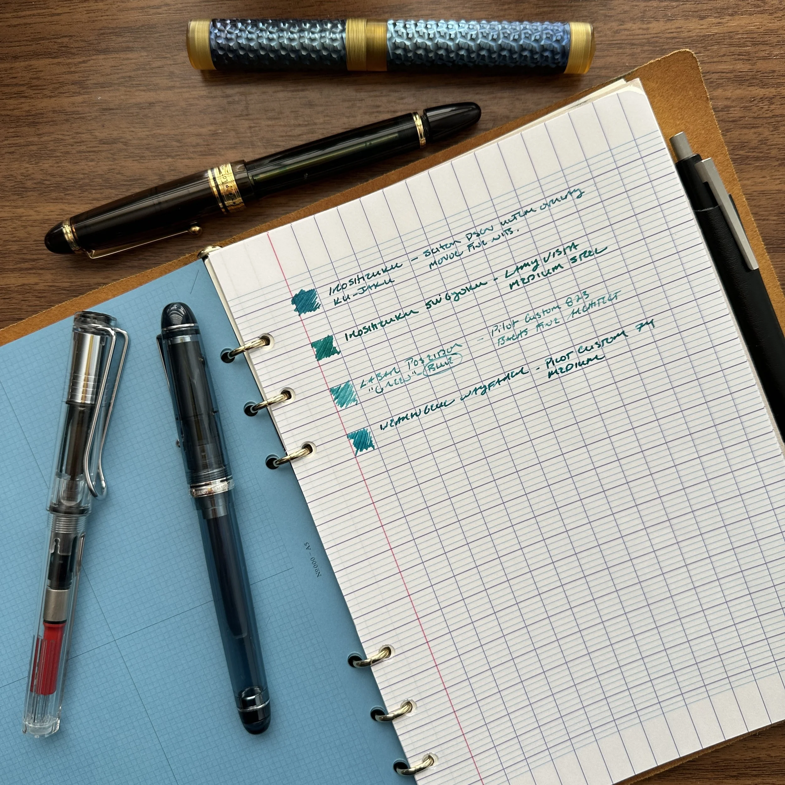
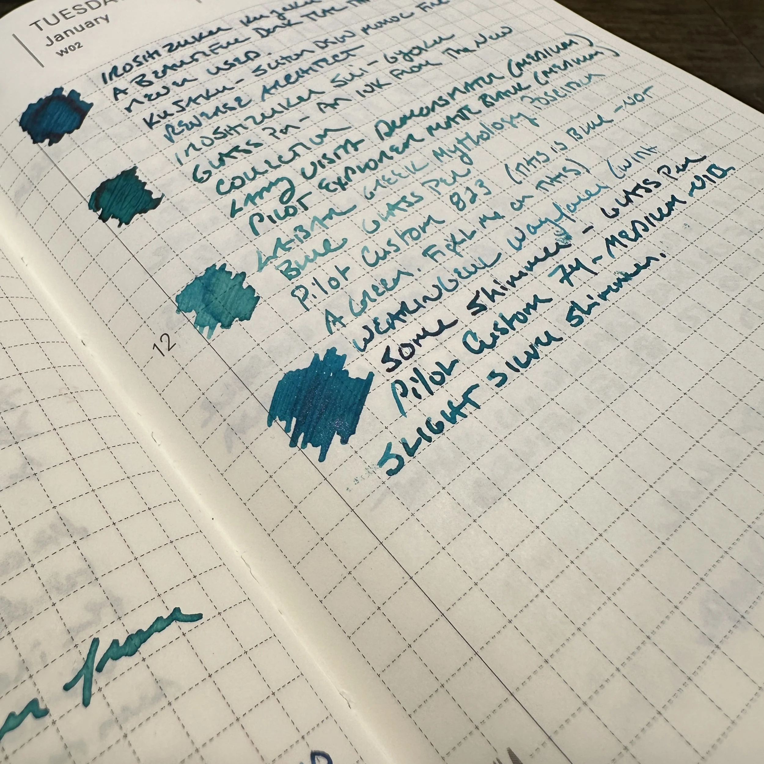
Question 2: What is the difference between a gold nib and a steel nib on a fountain pen? Does the gold nib cost more because it performs better?

The gold nib costs more because it is made of gold and sometimes has a more involved manufacturing/finishing process. While you will often see gold nibs referred to as “higher quality” and an “upgrade,” that’s not necessarily the case in terms of performance. Many fountain pen users - especially those who prefer a firmer nib that writes a drier line - favor steel nibs, and I’ve even used softer steel nibs that I’ve found indistinguishable from gold. Generally speaking, gold nibs tend to write “softer” and “wetter” than steel nibs, and a wet pen nearly always feels “smoother” on the page, leading to the common misconception that gold nibs are always smoother writers than steel. It really comes down to personal preference: If you’ve never used a fountain pen with a gold nib, I strongly encourage new users to either visit a pen show or pen club and test one out in person before making the investment. If you don’t have access to in-person meetups and events, pens like the Pilot Custom 74 and certain models of the Lamy Studio still feature a gold nib option for around the same price point as a more expensive steel nib pens (sub-$200), allowing you to experiment without breaking the bank.

I love my crazy Inkvent inks but probably would not use them in my prized celluloid pens.

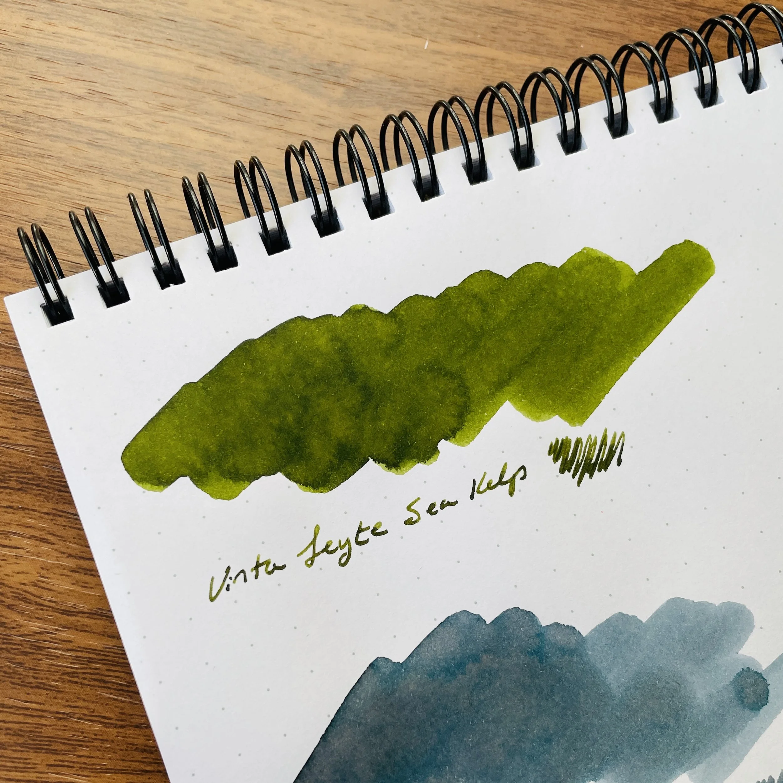
Will ___ Ink Stain My Pen? Is it “Safe” to Use?

There’s really no way to make a categorical statement about what inks are “safe” and what inks are capable of staining or ruining a pen, because so many different variables are in play. My response to this question is always the same: If you have a specific pen that you are concerned about staining, then you should only use blue or black ink made by a company that manufactures fountain pens (preferably the company that made your pen). Even this doesn’t guarantee that your pen will remain pristine. It will, however, keep the pen under warranty. Many pen companies reserve the right to refuse to honor warranties for things like staining and discoloration if you use inks manufactured by another company.

That said, the only materials I really worry about staining are celluloids and clear, white or cream colored resins. Outside of these materials, I’ve found that most acrylics and resins used in modern fountain pens typically clean fairly easily. In terms of colors, purple and red inks tend to stain the most, and highly saturated inks (including with heavy sheen) should be used with caution in pens susceptible to staining.

I hope you find this post helpful. If you have questions that you’d like answered, please send an e-mail through the “Contact” link with “Ask TGS” in the subject line. I maintain a list of questions to be answered and will hopefully be able to respond in some form or fashion. You can view earlier installments here and here.

The Gentleman Stationer is supported entirely through The T.G.S. Curated Shop and the TGS Patreon Program. We truly appreciate all of our readers and customers!

In Ask TGS Tags Ask TGS, Editorial, Inks, Fountain Pen Maintenance
1 Comment
Four Offbeat Blue Inks for the Office: Writing Sample on Clairefontaine Paper

Offbeat Blue Inks: Trying Darker Teals and Turquoises

January 17, 2024

While blue ink is often the “safest” fountain pen ink out there - both for your pens and your reputation at the office - using a standard blue as your daily driver can eventually start to feel stale. I love my Waterman Blue, but given how much writing I actually do on a daily basis, I always try to keep a steady stream of “alternative blues” at the ready to avoid ink burnout. One of my favorite color families to explore are dark teals and turquoises, which add variety and possibly even a touch of sophistication to your notes and/or signatures.

Did you know that it was National Rubber Duck day at the Philly Pen Show last weekend?

Lately, I’ve focused on four inks for my core “office” rotation: Pilot Iroshizuku Sui-Gyoku, a new release which might be my current favorite from the line; Pilot Iroshizuku Ku-Jaku, an old favorite which shares many of the same tones as Sui-Gyoku, only slightly darker; Laban Poseidon Green, which I consider a blue ink despite how it’s marketed; and Wearingeul Wayfarer, a shimmer ink with subtle pink sparkles that can also be used as a standard ink if you fill the pen without first shaking the bottle.

For my “office paper” writing sample, I chose Clairefontaine Seyes/French-Ruled.

None of these inks would typically be considered exciting, but for work they strike an appropriate balance. “Professional” doesn’t have to mean “boring” - you just have to know where to draw the line. My own rule of thumb is that the ink you use in the office shouldn’t overshadow or distract from the substance of the work you are trying to do. (i.e., You want the person whose memo you are commenting on to focus on the substance of your edits, not the fact that you wrote said edits in fluorescent orange shimmer ink.) On most standard office paper, and to the fountain-pen-uninitiated, these inks will appear blue. When you’re back at your own desk, however, writing on your quality paper of choice, you’ll enjoy the bit of dark red sheen on the Iroshizuku Inks, the shading on the Laban Poseidon Blue, and if you’re really daring, the faintest hint of pink/red shimmer on the Wayfarer!

Writing samples on Tomoe River paper in a Hobonichi A6 Journal.

General Takeaways and Where to Buy

If I recommend an ink for “office use”, it’s because I’ve found the ink to dry relatively quickly, and to resist bleeding and feathering on all but the cheapest of papers. All three meet these requirements, and they’re also relatively inexpensive. The Iroshizuku and Laban inks are priced at under $25 for a full 50ml bottle, and while Wayfarer is a bit pricier at $22 for 30ml, you do tend to pay more for inks with special properties like shimmer. I have to add that I love the look of the Iroshizuku bottles, and have for years kept at least one on my desk at the office as a conversation piece.

If you enjoy our content and are interested in any of the inks featured, we would greatly appreciate your support by visiting and purchasing via our shop. We carry both Pilot Iroshizuku and Laban Greek Mythology Inks in the T.G.S. Curated Shop, and for brands we don’t carry (such as Wearingeul), we would refer you to our friends at Vanness Pens!

Wearingeul Wayfarer Close-Up Shimmer Shot

Every so slight shimmer can be work-appropriate. Just know your workplace!

Editor’s Note: Why Should You Care About Ink Color?

Whenever I write a post like this one, I receive questions and comments about “why I care what people think” about the ink I use in the office. First of all, let’s be realistic - while there are workplaces that would tolerate the use of glitter/shimmer ink on professional correspondence, many do not. You know your office and what you can get away with. For many of us, simply writing with a fountain pen - and the “messiness” it entails - pushes the envelope in and of itself.

Second, many professions (like law) require the use of certain ink colors for specific purposes, with blue the most common for signatures and official documents. In my experience, standard blue ink tends to be the most universally accepted and to behave the best on the widest range of different paper, including cheap recycled copy paper. Teals and turquoises, such as those shown here in today’s post, have mostly similar ink formulations so the performance does not change dramatically.

The Gentleman Stationer is supported entirely by purchases from the T.G.S. Curated Shop and pledges via the T.G.S. Patreon Program. We greatly appreciate your support!

In Ink Reviews Tags Inks, Workhorse Inks, Inks of Choice
3 Comments

New Arrivals: Inks from Laban, Including Aphrodite Pink!

June 27, 2023

Yesterday we received a restock of the Laban Greek Mythology Ink Series, including favorites such as Athena Grey, Artemis Blue, and the seemingly perpetually backordered Aphrodite Pink. The latter we have in very low stock, so if you’re looking for this particular bottle, please do act fast. I plan to continue to carry these inks in the future, so if you miss out on a preferred color this shipment, there will be more.

We’ve also received some updates to our collection of desk accessories, including new colors in these Midori rulers that have sold phenomenally well. Between the Traveler’s Company Brass Ruler, one of these Midori versions, or the compact tape measure in the Midori XS Stationery Kits, my measuring game is strong!

The Gentleman Stationer is an authorized retailer of all brands sold, including Laban, Midori, and other brands shown here.

In TGS Curated Shop Tags Laban, Laban Greek Mythology, Inks, T.G.S. Curated Shop
Comment

"Boring" Can Be Better: In Defense of Standard Stationery

March 1, 2023

Sometimes what’s fun from a hobby perspective isn’t always what’s best for everyday use. That multichromatic triple-shading ink with shimmer? Probably not the best choice for quick meeting notes or signing closing paperwork on your mortgage. That triple-broad double-eagle reversible stub architect nib? That’s gonna bleed through a legal pad. While most of us enjoy our crazy stationery, it can’t take us everywhere.

The most common questions I get, both here on the blog and in-person when I’m behind a table at a pen show, concern what pen/ink/paper I can use everyday, without worrying how it’s going to perform. I often recommend that those planning on using their pens for everyday writing keep at least a couple of “workhorses,” or pens designed to write, without regard to unique design, collectibility, etc. I feel so strongly about this that I’ve devoted an entire series of articles on the blog to this topic, which I’ve compiled into an archive that’s constantly being updated.

So-called “safe”- dare I say “boring” - inks don’t have to be ugly, especially if you like muted shades. It’s when you get into super-saturated colors and special properties when things get tricky.

But while pens get the most attention, more critical components of “everyday writing” are ink and paper. With fountain pens, I would say that ink is the key variable, since you often cannot control the paper you’re forced to use in a context such as the office. You therefore need to have a handful of “workhorse” inks in addition to your “workhorse” pens, that you can use knowing that they will likely perform decently on most paper options. Back in 2020, I even put together a sample pack of some of my favorite inks, including Waterman Blue, Sheaffer Skrip Red, and Lamy Black. While I may consider running that one back in the future, I’m not sure that recommending specific inks is all that helpful or necessary. For the most part, standard inks made by major pen company such as Waterman, Lamy, Sheaffer, Pilot, TWSBI, etc. will generally be “safe” to use in most pens and on most papers, and even boutique lines such as J. Herbin and Diamine - both made by ink companies that have existed for a very long time - are extremely reliable provided you stick to the water-based core lineup for your office writing, as opposed to inks with special properties such as shimmer that can be unpredictable on anything other than high-quality paper.

“Boring” is relative. I’d consider all three of the inks pictured here to be “safe” inks in the sense that they water-based inks from longstanding, well-regarded brands. The Herbin “Vert de Gris” is a new discovery that I spent all day yesterday using at the office.

Advantages and Considerations When Using So-Called “Boring” Inks

So why don’t quality, reliable inks get more attention? Honestly, the fountain pen internet and social media tends to be driven in large part by people who either don’t actually write with their pens everyday, or use their inks for art and journaling where practical considerations are less relevant. When those creating the content consider the inks “boring,” they don’t get promoted and fall by the wayside. But I’m here to tell you that sometimes “boring” has a lot to offer! Consider:

  • Ease of Cleaning. While some exceptions exist (pinks and purples in particular tend to be hard to clean no matter what), I value inks that flush out of pens quickly when you refill or change colors. Most of the brands I mentioned above take little to no effort to flush, and shouldn’t stain most materials, vintage or modern.

  • Expense. Looking for an ink that you’re going to use a lot? While ink isn’t the most expensive part of this hobby, if you write through several converters a week like I can when I’m really busy, you probably don’t want to be stocking up on ink at $50 per bottle. Most of the inks I consider workhorses are less than $20 for 30-50ml.

  • Permanence. People tend to treat “permanence” (more specifically, the lack thereof) as a negative rather than a positive when it comes to fountain pen ink, but I’ve come to believe it’s overrated. While it’s nice to have some water resistance, I can count on one hand the number of times I’ve spilled water or a drink on some notes, and completely lost what I had written. On the other hand, I’ve frequently spilled ink when filling pens, when a pen leaks during travel, or when I accidentally drag a shirtsleeve across some writing that’s not quite dry. If it’s permanent ink, it’s probably going to stain. On the other hand, a few weeks ago I spilled a sample vial of Iroshizuku Tsukushi onto the rug in my office. I ran the rug through the washing machine and the ink washed out completely on the first try. On the other hand, I spilled a bottle of permanent blue-black on some carpet several years back and had to recarpet the room. Personally, I’ll take the safe/impermanent/washable option for those inks I plan to use everyday, but I’m also a klutz.

Oops.

Now here’s the part where I sort of contradict myself: When I first entered this hobby, it used to be a reliable rule-of-thumb that if you were looking for a “safe” ink (i.e., to use in a finicky, valuable, or vintage pen) any ink made by a “pen company” was generally suitable. Today, I still get e-mails from people asking whether “X” shimmer ink is safe for vintage pens, since it’s made by “X” pen company. Having seen the rapidly expanding market for fountain pen ink, including inks that shimmer, sheen, and multi-shade, pen companies are expanding into these more specialized offerings. So while you can take the “pen company manufacturer rule” into account, it’s no longer something you can solely rely upon, and you have to do some homework. I generally advise people that if you want to purchase a particular ink for use everyday, and you want the ink to be versatile enough to use in as many different pens, on as many different papers as possible, it’s wise to avoid inks with special properties.

Come Visit Us At an upcoming pen show!

As I mentioned above, I’m getting ready to visit this year’s Baltimore Washington International Pen Show, as well as the Arkansas Pen Show the following week, and at both shows I’ll be conducting a free workshop tentatively titled “Stationery for Daily Use with the Gentleman Stationer,” in which I plan to discuss pens, inks, paper, and notebook systems appropriate for managing your daily life and work. The class will be similar to the “Everyday Writers: Choosing the Best Pens for Home and Office” seminar that I held at the last Baltimore Show I attended as a vendor, back in 2020.

We will also plan to bring a curated selection of pens, inks, and notebooks with us to both shows, so you’ll have the opportunity to test out many of the goods in our shop in person. We hope to see you there!

The Gentleman Stationer is supported entirely by purchases from the T.G.S. Curated Shop and pledges via the T.G.S. Patreon Program, and is an authorized retailer of all brands sold, including certain ink brands mentioned in this article.

In Editorial, Ink Reviews, Workhorse Pens Series Tags Workhorse Inks, Fountain Pen Inks, Inks, Editorial
2 Comments

Ink Review: Vinta Aegean Armada and Leyte Sea Kelp

February 5, 2022

I included both Vinta and Ferris Wheel Press in my year-end review as favorite ink lines that I discovered in 2021. This was somewhat unusual for me - typically I avoid boutique inks, particularly those from non-pen manufacturers that focus on special properties such as sheen, shading, and shimmer. Not that these inks are dangerous to use in your pens - they hardly ever are - it’s just that they don’t usually work well for everyday writing, and I value inks that dry quickly and perform decently on cheap paper given the demands of my day job. Vinta seems to have found a sweet spot in their formulation, however, because nearly all of the inks I’ve tried not only work well in most fountain pens and on most papers, but they dry fairly quickly and, with respect to the “shaders”, remain legible even in extra-fine (and ultra extra-fine) nibs.

Vinta Aegean Armada

After avoiding the color family for the better part of my pen “career,” I’ve developed a bit of a thing for grey inks over the past six months. Currently, my two favorites are Scribo Grigio and the ink pictured here, Vinta Aegean Armada 1944. Inspired by the Battle of Leyte, the largest naval engagement in military history, Armada was designed to mimic the color of a fleet of ships reflected onto the sea, “which can transform its color from grey to blue to everything in between.” Armada shades beautifully - in finer nibs it will appear as a darker grey, and with broader nibs you will see some double shading that includes steel blue and even faint pink hues. Armada behaves very well on most papers, even cheap office paper as long as you use a finer nib.

Vinta Aegean Armada was one of the most difficult inks to photograph accurately - it’s hard to show the pinkish/reddish double shading that comes through as the ink dries, but you can sort of see it here.

If I had to pick an ink to which I could compare Armada, it would be Iroshizuku Fuyu-Syogun, only darker and with slightly more depth to keep it interesting. I’ve tried to love Fuyu-Syogun (“Old Man Winter”), but it’s just not quite legible enough for me to use in everyday writing.

All writing samples shown here (and in most of my recent ink reviews) are on Write Notepads bright white paper. The Leyte Sea Kelp writing sample was done with a JoWo No. 6 18k Gold Nib (in a Kasama Una fountain pen), and the Aegean Armada writing sample was done with a Lamy AL-Star medium steel nib.

Vinta Leyte Sea Kelp

In another nod to Philippines history, Vinta’s Leyte “Sea Kelp” green pays tribute to not only the Battle of Leyte Gulf in 1944, but the area’s kelp industry. Leyte green is intended to evoke “the color of kelp as it floats in the bright clear seawaters of Leyte.” I’ve been looking for a solid mid-tone green ink, and this one perfectly fills that gap in the collection.

Vinta Leyte undergoes a bit of a color shift as it dries. In the first picture, it appears darker when wet, but as the ink dries it takes on a slightly more yellow-olive hue.

Takeaways and Where to Buy

Count me in as a big fan of Vinta Inks. I have three bottles in my current collection, as well as a handful of samples, so look for more reviews to come. Vinta regularly releases new colors and store collaborations, so keep an eye on their website and social media for updates.

I love the design of the Vinta Inks bottle and packaging.

You can purchase Vinta Inks directly from the manufacturer, located in the Philippines, or from authorized retailers around the world. Our friends at Vanness Pens stock the entire Vinta lineup, which is where I acquired the inks pictured here. Vinta Inks come in 30ml amber glass bottles, priced at $12.50, placing Vinta in the lower-middle price segment. In my opinion, they’re excellent value given the combination of quality and unique colors and properties they offer.

I purchased the inks featured in this review at Vanness Pens, with my own funds for my own use, though I did receive a discount on the purchase. This post does not contain paid third-party affiliate links, and I was not otherwise compensated for this review. The Gentleman Stationer is supported by purchases from the T.G.S. Curated Shop and the T.G.S. Patreon Program.

In Ink Reviews Tags Ink Review, Vinta Inks, Inks
Comment
Older Posts →
Store Location
Visit the T.G.S. Curated SHOP
*New* Updated "Best Pens" Guide (2025)
TGS x Hinze Pens Violet Tendencies Taschenstift Fountain Pen
Hierarchies of Fountain Pen Friendly Paper
Allex Scissors arrayed on a desk showing link to desk accessories

Join Our Patreon!
Subscribe to the TGS E-mail List

Featured Posts

Featured
Pilot-Iroshizuku-Yama-Budo-Writing-Sample.jpeg
May 24, 2025
Joe's Picks: Five Favorite Inks From Pilot's Iroshizuku Lineup
May 24, 2025
May 24, 2025
Yamamoto-Gray-Paper-Sampler-Set.jpeg
May 10, 2025
Discovering Unusual Paper: "Paper Tasting" Sets from Yamamoto Paper
May 10, 2025
May 10, 2025
Four-Micarta-Fountain-Pens.jpeg
Apr 19, 2025
Yes, Micarta for me! I finally got my hands on Some Micarta Pens, Plus My Own Special Edition
Apr 19, 2025
Apr 19, 2025
The Gentleman Stationer RSS

© Digital Divide Media, LLC, 2014-present.

All content is the exclusive property of Digital Divide Media, LLC, d/b/a The Gentleman Stationer, including “The Gentleman Stationer” website and trademark, and should not be reproduced without express written permission.  All rights reserved.

All content containing paid advertising, affiliate links, or sponsored content will be plainly disclosed by a disclaimer when/if featured.

Contact Information

Store Shipping Policy and Return Policy

Privacy Policy

Cookie Policy

Terms and Conditions

Powered by Squarespace