• Blog
  • Shop
  • Resources
  • FAQ (Ask TGS)
  • About
  • Archive
  • Contact
  • Sign In My Account
Menu

The Gentleman Stationer

Vintage Living in the Modern World.
  • Blog
  • Shop
  • Resources
  • FAQ (Ask TGS)
  • About
  • Archive
  • Contact
  • Sign In My Account

Ink Review: Sailor Ink Studio 140

September 16, 2020

In Japan, Sailor holds "Studio” ink events, where you can have their master ink blenders custom blend a bottle of ink tailored to your preferences. Looking to further capitalize on the ink collecting craze, Sailor released 100 of these blends into the global market, and they hit U.S. retailers in 2019. I confess that I’m not as much of an ink obsessive as I used to be. Don’t get me wrong - I still have more ink than I will ever be able to use in my lifetime, but at some point when I see companies like Sailor and Colorverse releasing dozens of inks at a time, much less hundreds, I sort of throw up my hands and stop trying to keep track.

Some people are frustrated that Sailor moved to a smaller 20ml bottle while keeping the same pricing. Honestly, after thinking on it, the shift doesn’t bother me all that much. I’ve used maybe 3 or 4 full bottles of ink in my lifetime, and it’s probably less wasteful to purchase smaller bottles. Bringing this many different colors to market also increases production costs.

That said, the more pictures I saw of some of these Sailor Studio inks, the more they intrigued me, particularly the “double shaders,” a term that refers to inks that exhibit not just shading in terms of different tones of the same color, but different colors entirely. For example, Sailor Ink Studio 140 shown here has lavender undertones that emerge in a swab and when you write with a wetter nib.

You can see the shading, but the double-shading on this particular ink is more subtle and it didn’t photograph well. In person, you will see hints of light purple/lavender (even pink, maybe?) in the darker areas of the swab and handwriting sample.

The best thing about the Ink Studio lineup is that it’s reliable Sailor ink. Adding special properties such as sheen and shading (particularly sheen) can sometimes cause problems with ink failing to dry quickly and smearing. Not so much with Sailor, as I’ve had uniform success using any ink released by the company, and it has long been one of my favorite brands of ink to use in any pen.

The paper used for this ink review is Write Notepads Dot Grid Paper, which holds up beautifully to a wet ink swab and really shows off ink colors well.

Sailor Ink Studio 140, which is the ink pictured in this review, is a sky blue similar to Souten from the Jentle series, but perhaps a touch lighter. I had heard others remarking that some of the double-shading Studio inks can be very light, so I had some concerns that this one would be unusable for me. As it turns out, while No. 140 is light, it’s quite legible, and I had no issues using this for everyday writing, especially in a slightly wet Franklin-Christoph steel flex nib.

Takeaways and Where to Buy

As long as you’re not an “ink completionist” who feels compelled to sample every ink in a lineup, you can have a lot of fun with the Sailor Ink Studio lineup. Personally, I want to try a lot more of these “double shaders” like No. 140. The Studio Inks are sold in Sailor’s smaller, 20ml bottles priced at $18 each, and are available at site sponsor Goldspot, who provided this ink for review. Many thanks to Goldspot for making this review possible!

Disclaimer: This post contains links to paid sponsors and affiliates. Goldspot provided the bottle of ink featured in this review free of charge, for review purposes.
In Ink Reviews Tags Sailor Ink Studio, Sailor Ink Studio 140
Comment

First Look: Van Dieman's Ink

June 17, 2020

While it’s uncommon for me to run across “undiscovered” lines of ink, occasionally it happens. Such was the case with Van Dieman’s Ink, an Australian brand based in Launceston, Tasmania. Per the company’s website, they have 54 inks in their collection, 12 of which are shimmering, organized into five themed series: “The Original Colours of Tasmania,” “Hollywood,” “Midnight,” “Wilderness,” and “Tassie Seasons.” According to Yagan (Macchiato Man), who previously reviewed the brand, “Van Dieman’s Ink” is a reference to “Van Dieman’s Land,” the former name for Tasmania given for Anthony Van Dieman, a Dutch colonial governor and a backer of early expeditions to Tasmania. While Van Dieman’s Ink has been available to Australian fountain pen users for a while, U.S. retailers only recently have begun stocking these inks.

The box art on the “Wilderness” and “Midnight” series somewhat reminds me of Noodler’s Ink.

I ordered four bottles: Three inks from the “Wilderness” series and one ink from the Midnight Series. Of these four, I’ve spent the most time with the Wilderness Inks. “Black Tongue Spider Orchid” is a dusty purple, “Firetail Finch” is what I would characterize as a “pure red,” and “Eucalyptus Regnans” - my personal favorite - is a mid-to-dark green. The Midnight ink (“Eclipse”) is an off-black/dark gray.

Many thanks to Ana at the Well-Appointed Desk for supplying the Col-o-ring “Dipper” that I used for the ink swatches!

Van Dieman’s Ink seems to behave well on most papers. I experienced some slight feathering and bleedthrough after my first fill of the Black Tongue Spider Orchid, but I’m fairly sure that was due to the feed being oversaturated after filling and the pen (a TWSBI Eco) writing very wet for a while. The issue went away after a few lines. Firetail Finch and Eucalyptus Regnans both perform well, and while I’ve not had the chance to use Eclipse extensively, it appears to have similar properties.

The writing sample pictured here was done on a Baron Fig Mastermind Desk Pad, one of my favorite tools for everyday work.

Takeaways and Where to Buy

Given my experience (albeit limited) with these four inks, I plan to keep an eye on Van Dieman’s and try more of the colors. Personally, I always appreciate brands that not only make a good product, but embrace their origins and offer the opportunity to learn something new about another part of the world. For example, I knew little about the history of Tasmania, much less Tasmanian flora and fauna. Check out all 54 colors of Van Dieman’s Ink and you stand to learn a lot!

Van Dieman’s Ink is sold in 30ml bottles, and you can currently purchase at site sponsor Pen Chalet for $12.95 per bottle. All four series feature the same pricing.

Disclaimer: This post contains affiliate links. The inks featured in this review were acquired from Pen Chalet using store credit generated through Pen Chalet’s affiliate program, which is one way I support this site. Many thanks to Pen Chalet for making this review possible.

In Ink Reviews Tags Van Dieman's Ink, Ink Review, Australia
1 Comment

Ink Review: Montblanc Writers Edition Rudyard Kipling Limited Edition

April 22, 2020

Reviewing Montblanc limited edition inks formed a staple of my review content in the early days of the blog, back when their seemingly endless stream of ink releases offered something unique that no one else in the market was doing. Things have changed! As other companies expand their ink lines, and get into the special/limited edition and “themed” ink games, often at much lower price points, I’ve become more selective about which of the Montblanc inks I acquire. Lately, those have been limited to a couple inks in the Petit Prince series, the Beatles Psychedelic Purple, and the James A. Purdey & Sons whisky-scented ink. (I skipped the one that smells like cigars.) This past year, I added the Rudyard Kipling ink released in conjunction with Montblanc’s 2019 Writers Edition pen.

Montblanc Kipling is shown here compared against Montblanc Irish Green. The Kipling has much more gray/steel blue to it than the Irish Green, which is much brighter.

Montblanc aptly describes the color of the Kipling ink as “Jungle” green. It’s a mid-toned green similar to the Jonathan Swift “Seaweed Green” ink released several years ago, which I owned at some point before I sold it off in a downsizing only to immediately regret it. This particular shade of green ink looks exceptionally good in a wet pen like a stub or a broad nib, and behaves as well as your typical Montblanc ink.

A writing sample of Montblanc Kipling, shown here on Write Notepads Dot Grid Paper. This particular writing sample was done with a stock broad nib in a Montblanc 149. Montblanc’s stock broad nibs are quite stubbish, and worth trying out unmodified before you decide to have the nib ground.

Takeaways and Where to Buy

Fewer of the Montblanc limited edition inks have caught my eye recently, mainly because Montblanc has been releasing these special editions regularly for over a decade and now the colors are starting to look like repeats in many cases. If I pick one up, it’s typically an ink similar to one that I “missed” the first time around or regretfully sold off - in this case the Jonathan Swift. I’ll likely hang on to my bottle of Kipling since this medium-toned green is something of an uncommon color and I enjoy how it looks in a stubbish nib.

You can currently purchase a 50ml bottle of the Montblanc Kipling Ink from site sponsor Appelboom. At around $32 per bottle (which may fluctuate with the exchange rate), it’s not an inexpensive ink, but then again nothing from Montblanc comes cheap. At least with this particular Writer’s Edition, you get the larger 50ml crystal inkwell bottle as opposed to the smaller 30ml version.

Disclaimer: This post contains affiliate links. I participate in Appelboom’s affiliate program, which generates store credit that I use to acquire products for review purpose, such as this ink. It’s one of many ways I support the blog.

In Ink Reviews Tags Montblanc, Montblanc Kipling, Ink Review
Comment

Follow Up: Diamine Music and Flower Ink Sets

April 8, 2020

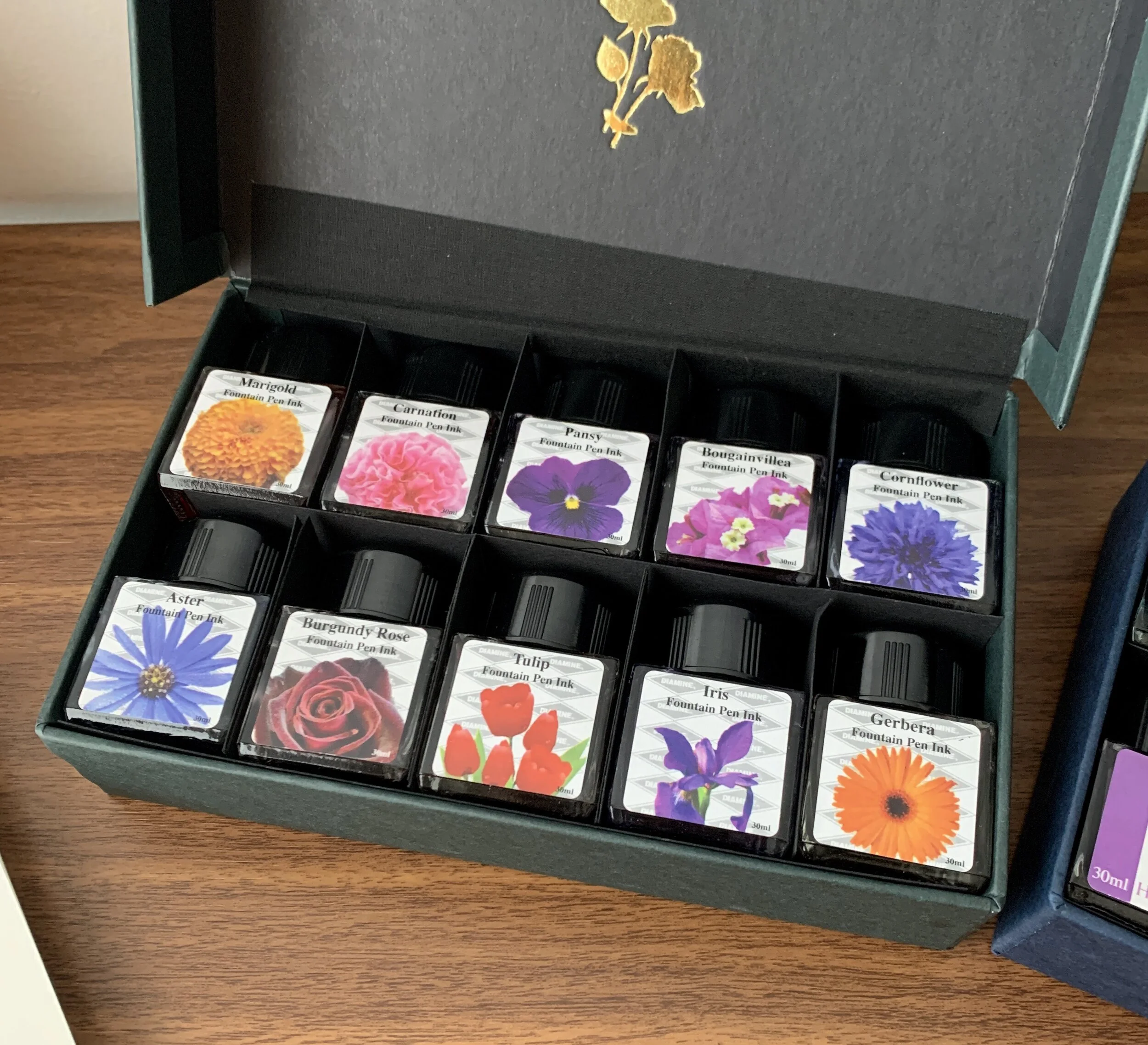
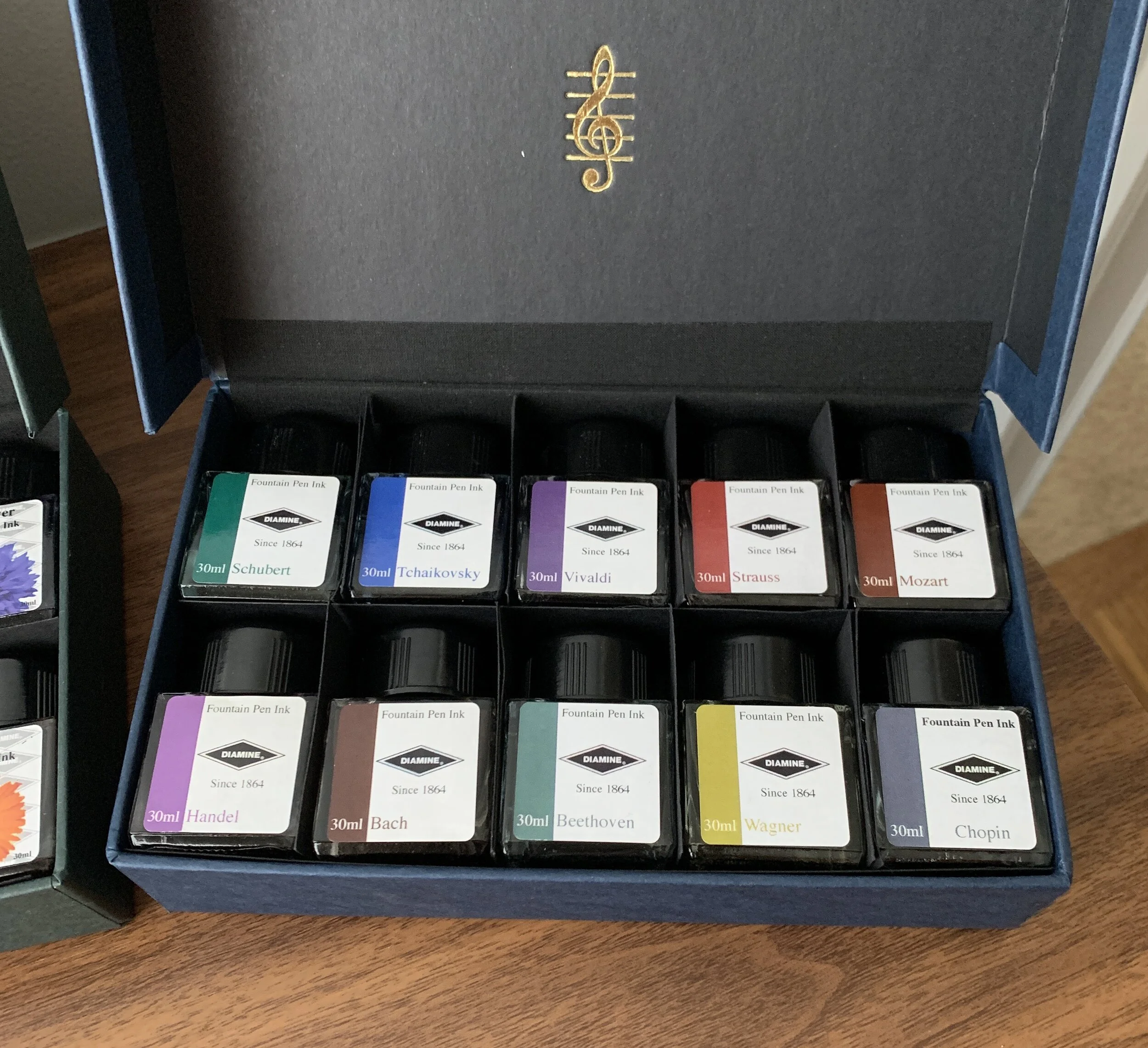
A couple of weeks ago I posted a review of “Vivaldi” and “Strauss,” two inks from Diamine’s ten-bottle Music Set. Since then, I’ve had a chance to sample and swatch the other eight Music inks, each of which is themed around a different composer, as well as the ten inks from Diamine’s other ink set, Flowers. I’m pleased with both purchases - for years I held off ordering these sets because I thought the colors would appear boring, or possibly duplicative of Diamine inks I already owned. Not so - especially Music. I think I’m going to enjoy using these darkly muted colors, especially at work and in other professional settings.

Chopin (a dark blue-grey) and Tchaikovsky (a rich blue) are the two inks from the Music Set that I have lined up to use next, once my fills of Strauss and Vivaldi run out.

Marigold and Cornflower both caught my eye, as did Bougainvillea.

Takeaways and Where to Buy

As I mentioned in my review of “Vivaldi” and “Strauss,” Diamine inks are generally regarded as safe inks that don’t cost a lot of money and behave well on the page in terms of feathering and bleed-through. I’ve not had any issues with Diamine in this regard. The one quibble I do have with Diamine inks is a tendency for some colors to precipitate out on the nib in the form of “nib crud,” which appears as a crust around the tines of the nib that you need to periodically clean. It’s not dangerous - it’s just precipitate from certain dyes used in the ink - and it happens to me most often with oranges and greens if I let the pen sit unused for a few days. So far I’ve not noticed it with any inks in either of these two sets, but I’ve also not used these inks extensively.

View fullsize Diamine Flower Ink Set
View fullsize Diamine Music Ink Set

I purchased both sets pictured here from site sponsor Appelboom. The Diamine Music Ink Set and Flower Ink Set are priced at just under 50 Euros, which comes to around 5 Euros per 30ml bottle. Given that I generally like all of the colors in both sets, it worked out to a pretty good deal for me. I’ve heard anecdotally that you can purchase refills of the individual inks directly from Diamine, but I’ve been unable to find a link on their site and suspect you would need to reach out to them directly.

Disclaimer: I purchased the inks featured in this review from site sponsor Appelboom, using store credit generated through the Appelboom affiliate program, which is one way I support the site and obtain new products for review. This post contains affiliate links.

In Ink Reviews Tags Diamine Music Set, Diamine Flower Set, Diamine Ink, Ink Review
3 Comments

Ink Review: Diamine Music Set Vivaldi & Strauss

March 29, 2020

If it’s one thing I can appreciate, it’s any product designed and built around a core theme. So what exactly do I mean here? You sometimes see “themed” products that just don’t work, mainly because the connection between the theme and the product design isn’t readily apparent, or where the two make a poor match because the release is nothing more than a cash grab. You can also have themed products that are so over-the-top that they end up being more collectible - or even tchotchke — than usable stationery. Diamine avoids both with its conservatively designed ink sets “Music”, a set of ten inks named after various composers, and “Flowers”, another set of ten where the theme is well, self-explanatory.

The understated set design matches the theme: while the bottles themselves won’t win any design awards, the colors themselves were interesting enough to intrigue me, and I’ve not seen these specific colors released under other names.

Diamine’s “Music” set includes the following inks: Chopin (grey-blue), Vivaldi (dusty purple), Handel (brighter purple/magenta), Mozart (darker brick red), Wagner (green-gold), Strauss (orange-red), Schubert (teal-turquoise), Tchaikovsky (a brighter blue), Beethoven (green), and Bach (burgundy/maroon/brown). I don’t know how Diamine picked each ink color to match the composer, but they work, and what’s most interesting about these inks is that the colors themselves are a bit difficult to describe. Being somewhat muted, the tones pair well with classical music (at least in my mind). I immediately inked up “Vivaldi” and “Strauss”, as they suited my mood at the time. Both are very nice colors, flow quite well, and while muted, still show up visibly on the page.

Diamine Vivaldi writing sample was done with the Leonardo Furore (fine nib), and the Strauss Writing Sample with a Lamy 2000 (EF nib). Writing samples are on Write Notepads dot grid paper.

Takeaways and Where to Buy

Ink sets have become more common in recent years, and I wouldn’t be opposed to seeing more of them as long as the colors are thoughtfully curated. Diamine originally pioneered the idea, releasing its Music and Flowers set several years ago, and continues to sell them without much fanfare - these really should get more attention than they do. I’m looking forward to testing out all the other colors in the Music set and digging into Flowers when it arrives.

I purchased the inks featured in this review from site sponsor Appelboom, who currently has the set in stock and priced at just under 50 Euros. That’s roughly 5 Euros per 30ml bottle, representing good value. I’ve heard that you can order refills of the individual colors directly from Diamine if you run out, but I’ve been unable to locate the link on the site.

Disclaimer: I purchased the inks featured in this review from site sponsor Appelboom, using store credit generated through the Appelboom affiliate program, which is one way I support the site and obtain new products for review. This post contains affiliate links.

In Ink Reviews Tags Ink Review, Diamine Ink, Diamine Music Set
Comment
← Newer Posts Older Posts →
Store Hours and Location
Visit the T.G.S. Curated SHOP
*New* Updated "Best Pens" Guide (2025)
T.G.S. 2025 Holiday Gift Guide
TGS x Roterfaden TGS_25
Hierarchies of Fountain Pen Friendly Paper

Join Our Patreon!
Subscribe to the TGS E-mail List

Featured Posts

Featured
Cover On the Paper Trail Intro Clip.jpeg
Dec 3, 2025
Introducing "On the Paper Trail," a New Podcast/Video Collaboration with Lisa Vanness of Vanness Pens!
Dec 3, 2025
Dec 3, 2025
Iro-Utsushi-Fine-Dip-Pens.jpeg
Oct 1, 2025
The Pilot Iro-Utsushi Dip Pen (and in General, Simple vs. Fancy Dip Pens)
Oct 1, 2025
Oct 1, 2025
Levenger-Annotation-Pad.jpeg
Sep 20, 2025
Five Boutique Paper Brands I'm Watching Closely and Why
Sep 20, 2025
Sep 20, 2025
The Gentleman Stationer RSS

© Digital Divide Media, LLC, 2014-present.

All content is the exclusive property of Digital Divide Media, LLC, d/b/a The Gentleman Stationer, including “The Gentleman Stationer” website and trademark, and should not be reproduced without express written permission.  All rights reserved.

All content containing paid advertising, affiliate links, or sponsored content will be plainly disclosed by a disclaimer when/if featured.

Contact Information

Store Shipping Policy and Return Policy

Privacy Policy

Cookie Policy

Terms and Conditions

Powered by Squarespace