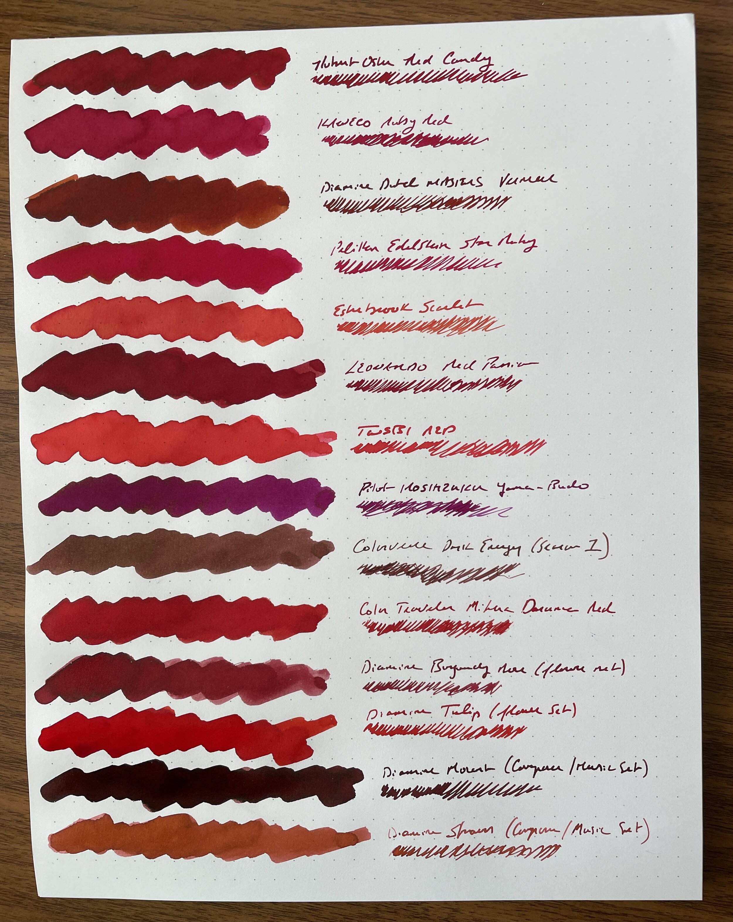
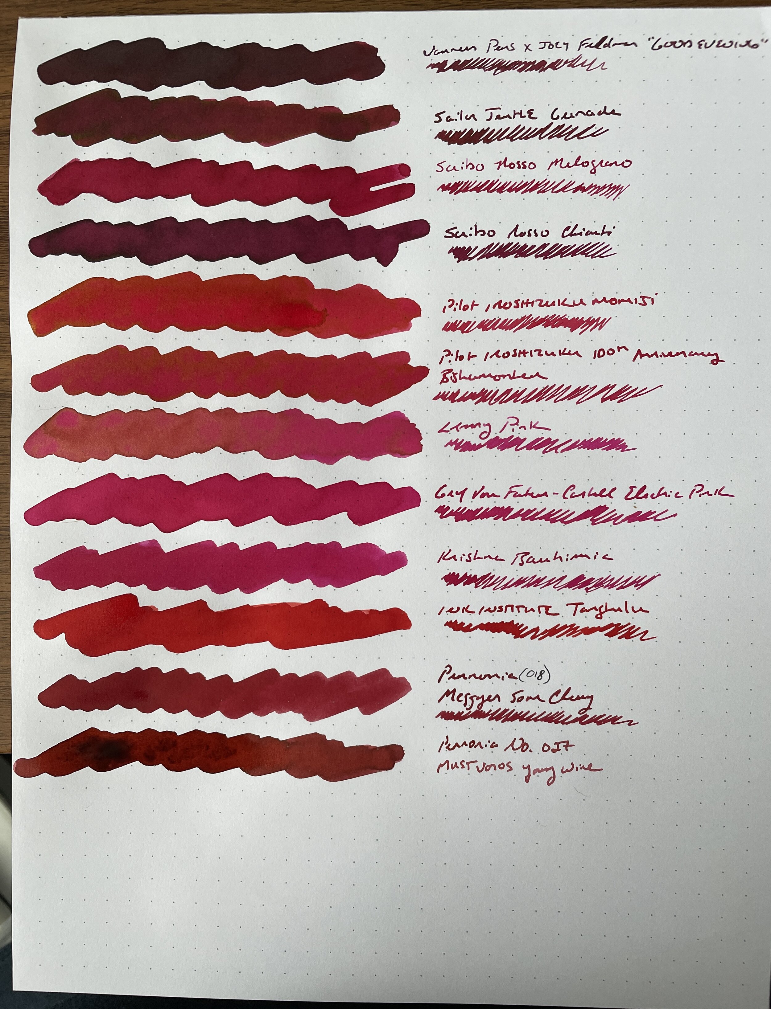
I’ve decided to push through, and to post my ink inventories consecutively, as opposed to stretching these posts out over the coming months. (As I previously mentioned, I’m focused on really paring down the amount of ink that I have accumulated, and this is the most effective way to compare the various colors and decide what I like and what I can move on from.) Next up are the purple inks, a color that’s less represented in my collection in terms of number of bottles, but which is still one of my favorite “fun” colors to write with, especially for annotation purposes.
Of course, the one that everyone wants to see is Lamy “Dark Lilac,” with Montblanc “Beatles Psychedelic Purple” a close second. So these are the top two inks on the sheet. The bottom two, leaning more heavily blue, are Colorverse “Hayabusa” and “Hayabusa Glistening.”
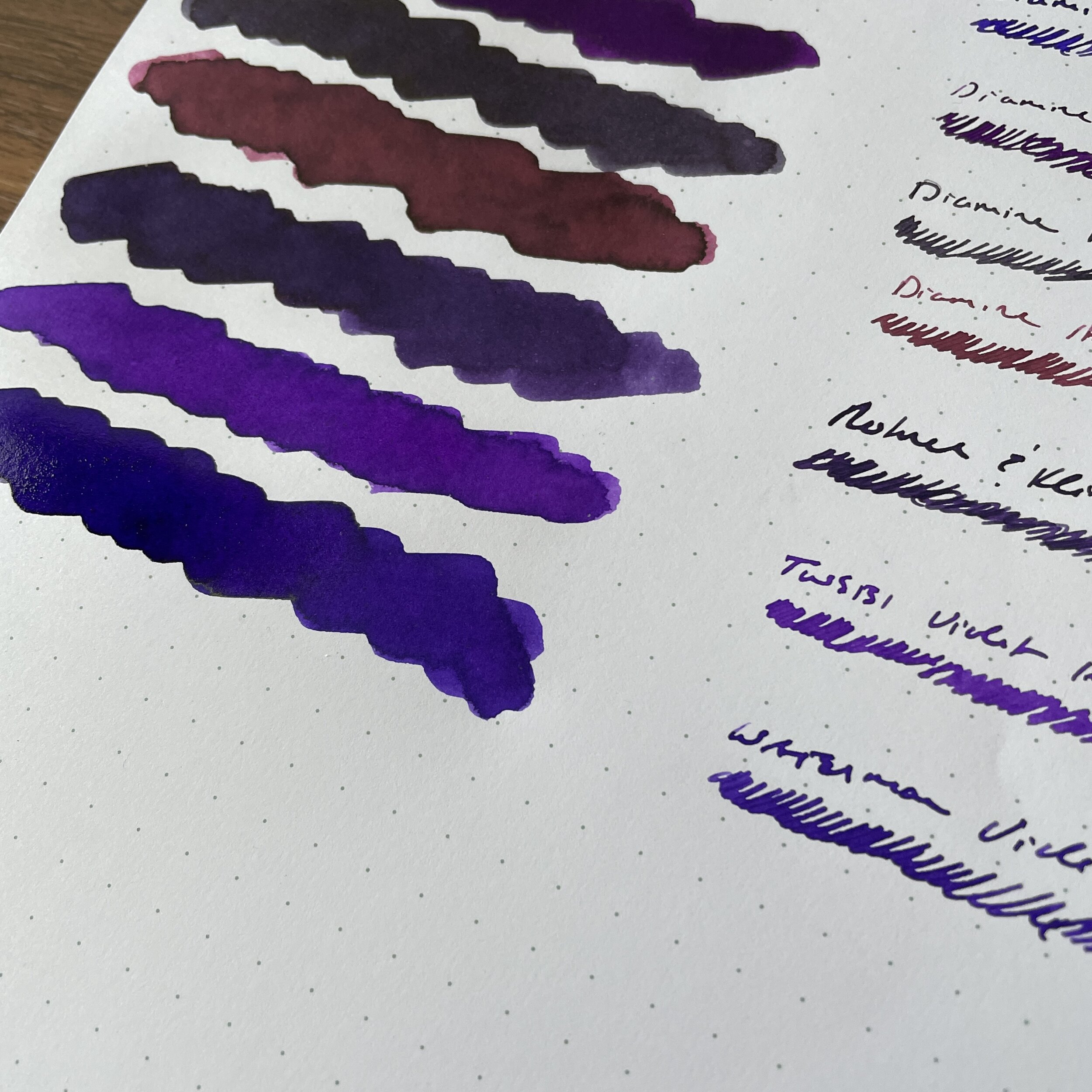
You don’t need to spend a lot of money to get a great purple ink. Waterman “Tender Purple” (formerly “Violet”) is a bright, intense purple ink that I believe rivals many of the “cult” purples that command such a premium on the secondary market. TWSBI Violet is another sleeper, which I think approaches the tone of Montblanc Beatles Purple with slightly less vibrancy.


Key Takeaways and Conclusions
I don’t use my purple inks as often as other colors, and even though I don’t have as many, I don’t really need what I have. Therefore, I’ve decided to make some hard choices to pare down the collection:
After much consideration, I’m going to move on from a lot of the “popular” inks that I’ve accumulated over the years. While Lamy Dark Lilac and Montblanc Beatles Purple are great colors, I don’t use them enough to justify keeping them around when others will likely enjoy them more. These are going in the Patreon Sale today along with several others.
The purple inks that I enjoy the most are the ones that aren’t very expensive. Waterman Tender Purple and TWSBI Violet can be had for a song, so there’s no need for me to have a ton of money locked up in (much) more expensive inks, some purchased at a premium on the secondary market, especially where there are relatively close equivalents should I occasionally want to write in that particular shade.
For those looking for a substitute for Lamy Dark Lilac, consider picking up Diamine “Pansy” from the Flower Set, or Diamine Monboddo’s Hat, which I’ve not personally tried but many swear by as a close match. Montblanc Beatles Purple is a bit harder to duplicate. While the shade of purple is fairly common (it’s a bright violet), other inks have a hard time matching the vibrancy after the ink dries. Both TWSBI Violet and Iroshizuku Murasaki Shikibu have somewhat similar tones but don’t maintain the brightness when dry.
I’m partial to purple inks that lean heavily blue, such as Colorverse Hayabusa and Diamine Iris (another from the exceptional Flower Set). Over time, I’ve become less enamored with very dark purples-black inks, such as Sailor-Bungubox Ink of Witch and the Lamy Dark Lilac. I guess tastes evolve.
Further Reading and Personal Ink Sale Details
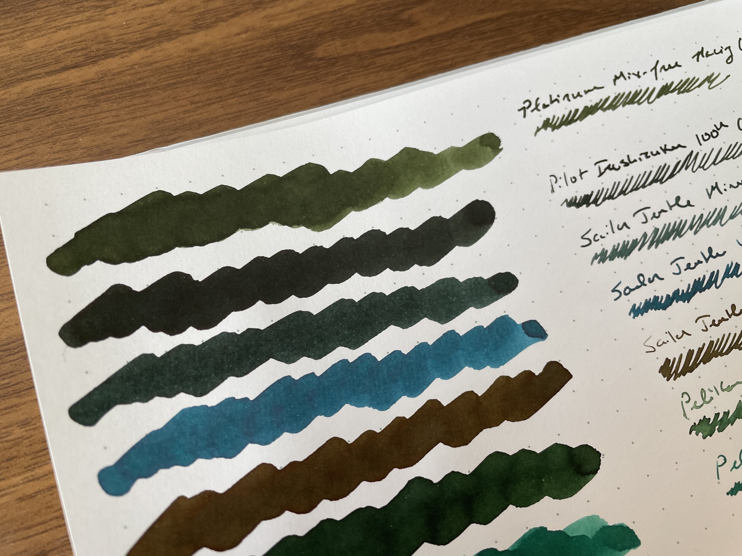
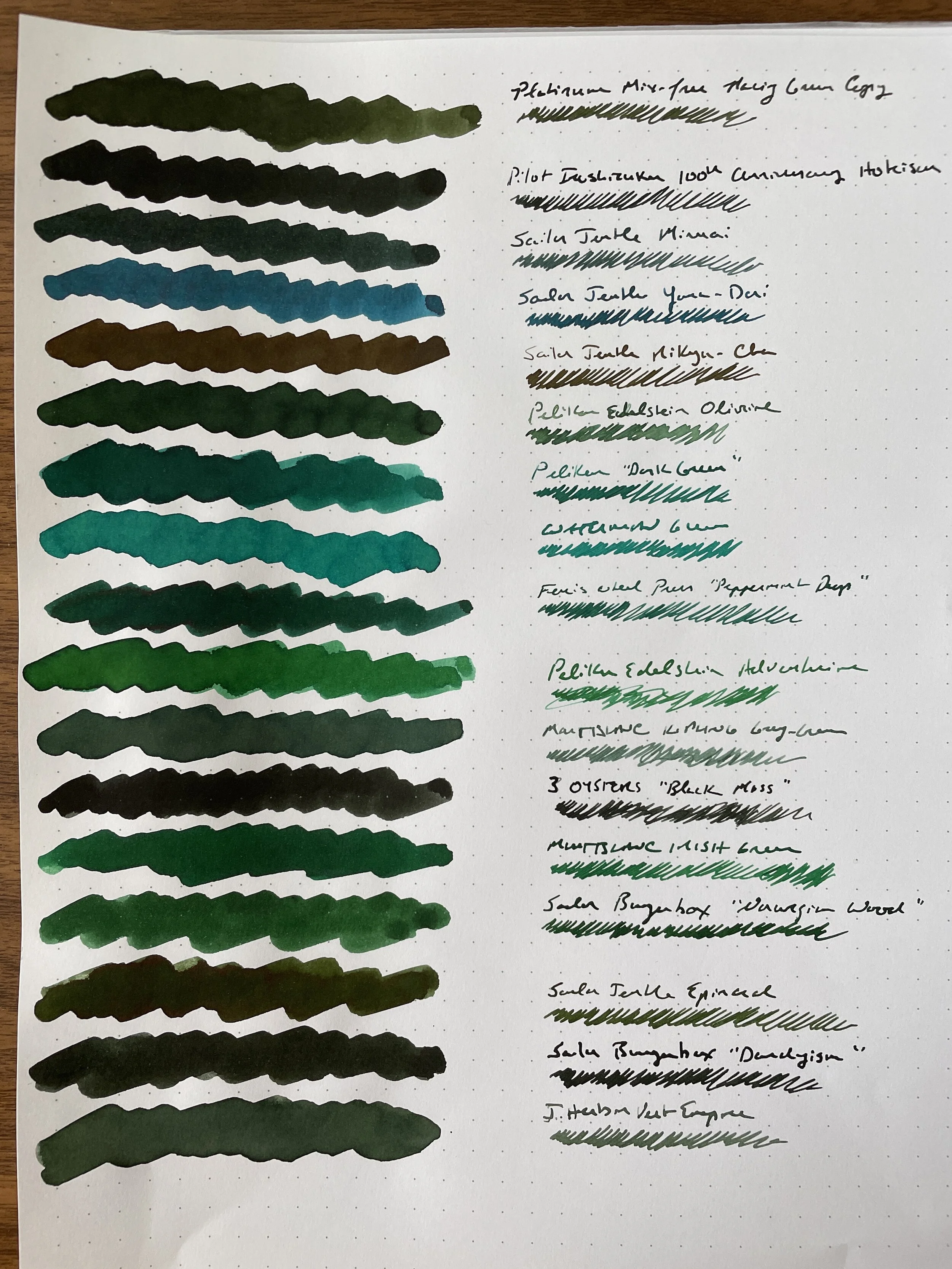
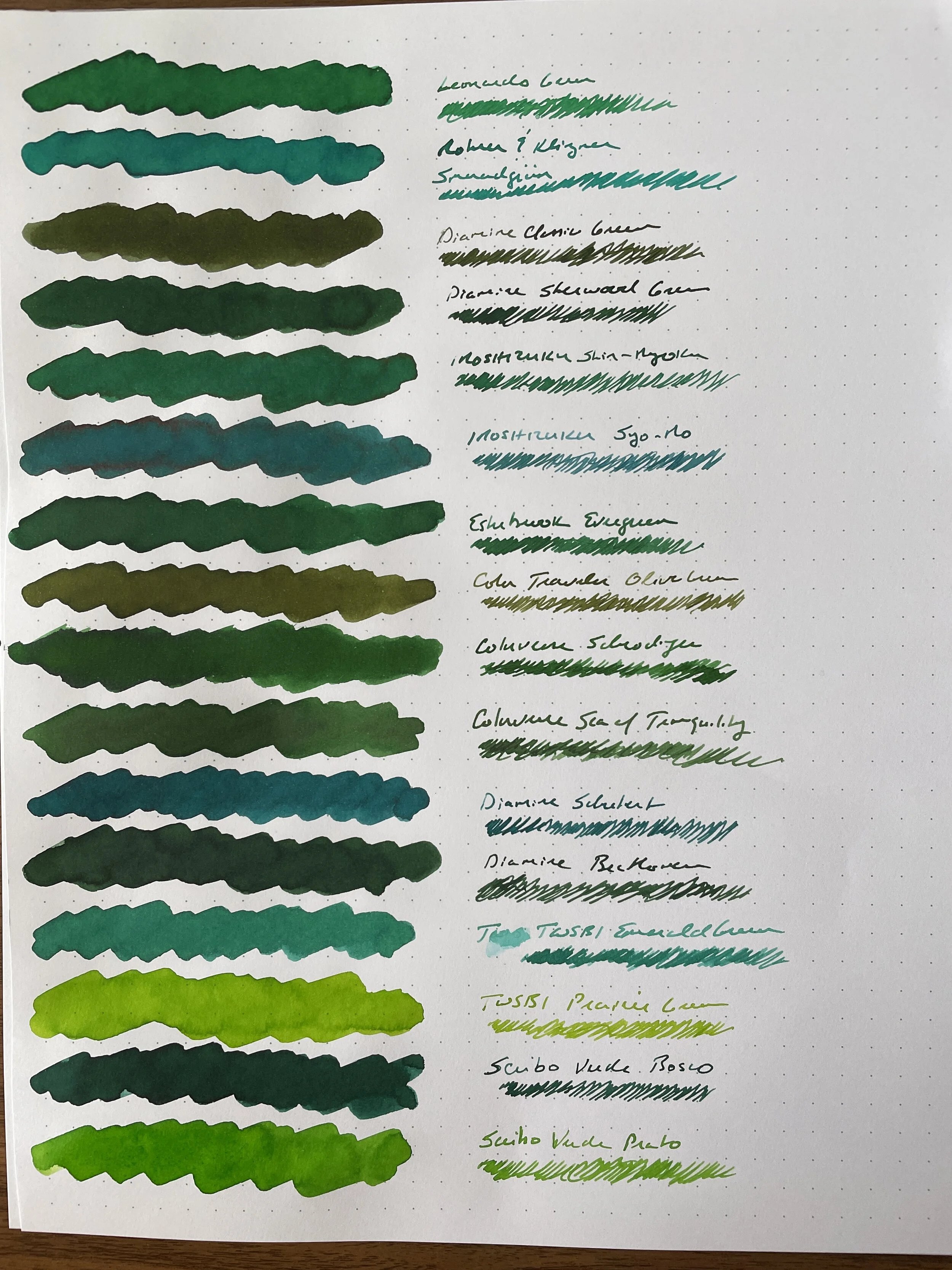
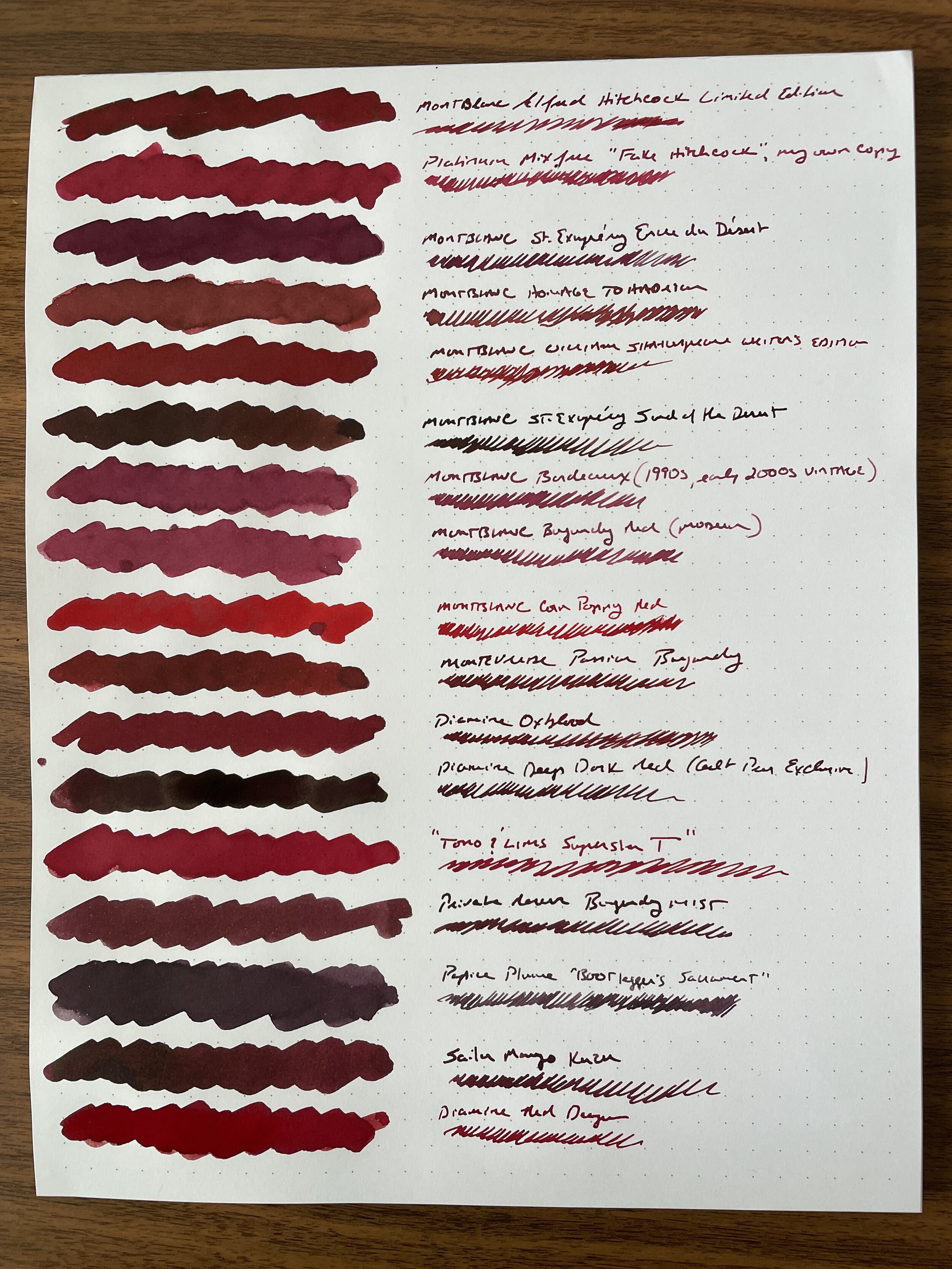
If you missed the first installments of my multi-part ink comparison, check out my post on “All the Red Inks” here, and “All the Green Inks” here. (I have many more red and green inks in my collection than any other color, so these will be the most comprehensive.) Also, here’s how I’m handling my “ink liquidation”: All bottles that I decide to sell go into the Patreon sale page for a week, and anything that Patreon members don’t claim goes to the public “Gently Used” page, where I occasionally post stuff from my own personal collection for sale. I recently moved a bunch of green and red inks, as well as vintage pencils and other items, to that page. Though I am not an official retailer of any of the items listed, any gently used orders can be combined with Curated Shop orders to meet the free shipping threshold. I’m not looking to profiteer here - nearly everything is listed at below retail, and where a premium is charged, it’s for a bottle I had to work hard to get or for which I paid over retail on the secondary market.
Disclaimer: This post does not contain paid affiliate links. Going forward, T.G.S is supported entirely by purchases from the T.G.S. Curated Shop and the T.G.S. Patreon Program, which offers access to online meetups, exclusive discounts and pre-orders, and more!