• Blog
  • Shop
  • Resources
  • FAQ (Ask TGS)
  • About
  • Archive
  • Contact
  • Sign In My Account
Menu

The Gentleman Stationer

Vintage Living in the Modern World.
  • Blog
  • Shop
  • Resources
  • FAQ (Ask TGS)
  • About
  • Archive
  • Contact
  • Sign In My Account
Anderillium Inks Cuttlefish Brown Sepia

Anderillium Ink Cuttlefish Brown: Note the shift in tone as the ink dries around the edges.

Ink Review: Anderillium Inks "Cuttlefish Brown" (Cephalopod Series)

November 17, 2021

What could be more fun than nature-themed inks created by scientists? Tampa, FL-based Anderillium Inks has been around for a few years, but I had never experienced their inks until this year’s Chicago Pen Show, where they had a table with two full ink series (“Cephalopod” and “Avian”) and all of their inks loaded into tester pens. I walked away with two: “Cuttlefish Brown” and “Shoebill Stork Grey”, one from each series, respectively.

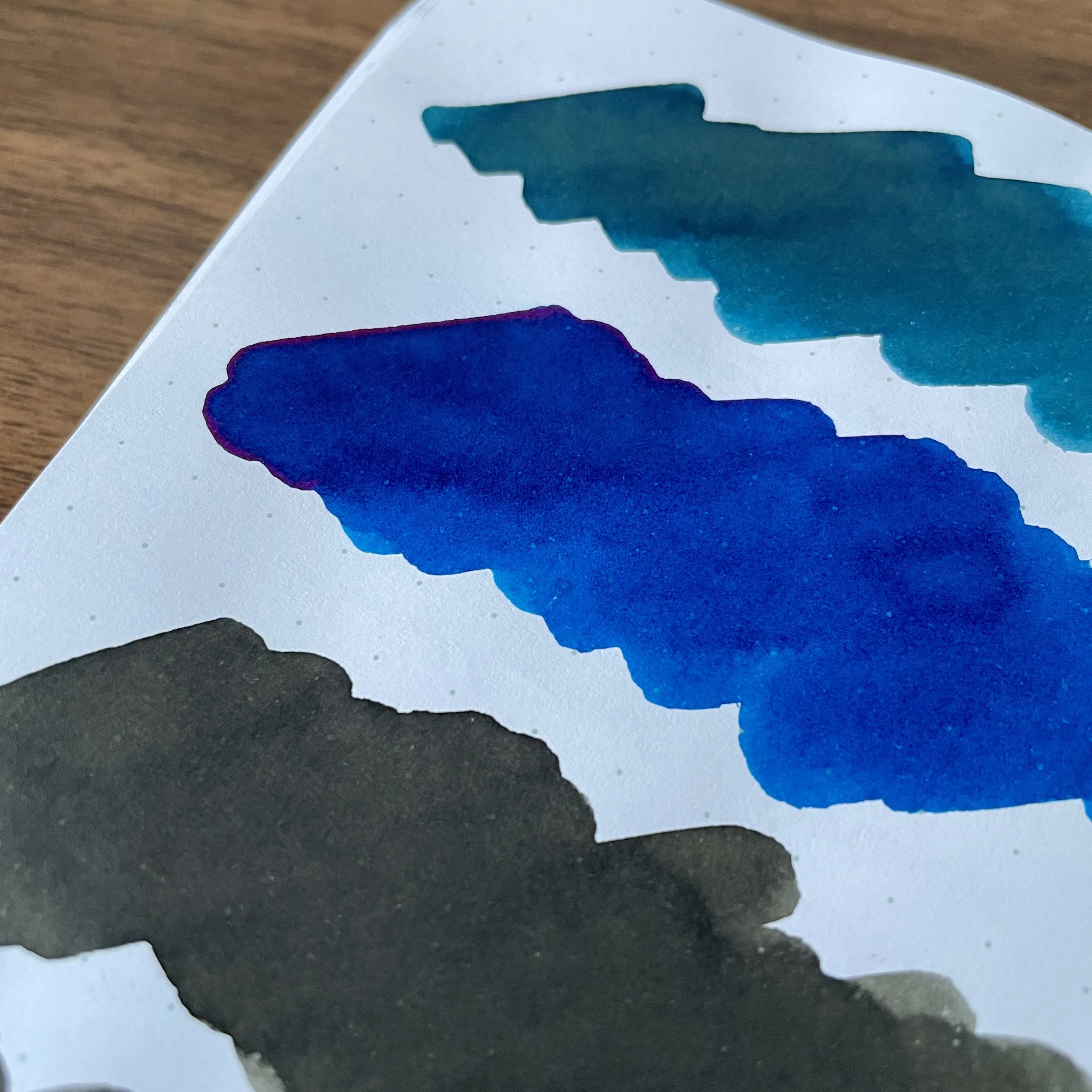
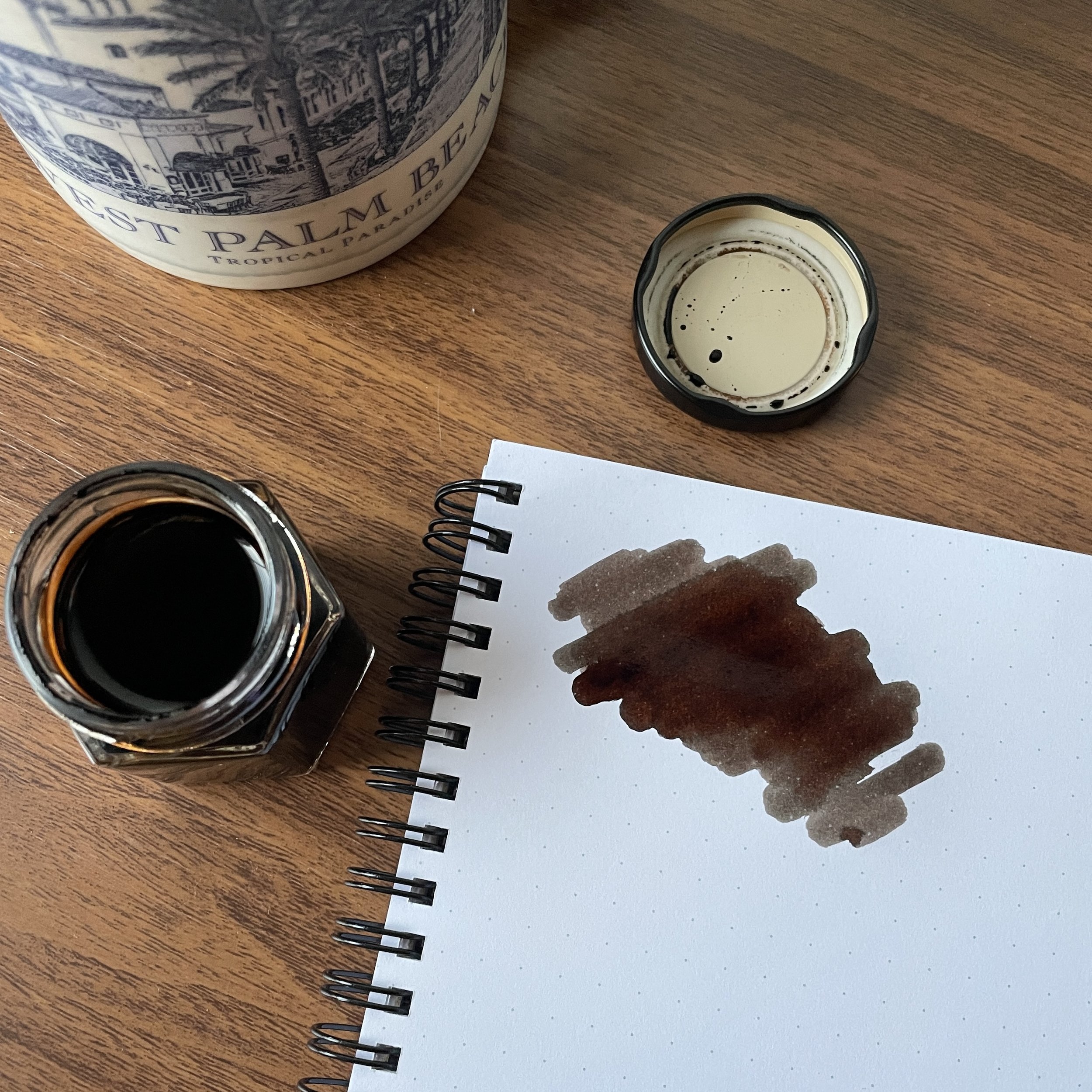
I had read mixed reviews of early renditions of the Anderillium Inks from a few years ago. While people enjoyed the colors, some experienced feathering and other issues. I’m pleased to report that the two inks I purchased in Chicago are near-perfect: I love the colors, and they both behave quite well on even inexpensive office paper. The Cuttlefish Brown is the one I’ve written with the most, and it’s what I would consider a “true sepia,” meaning that it’s intended to mimic the look of actual cuttlefish ink that was traditionally used in vintage writing applications (minus the fishy smell, as Anderillium points out on their website).

Cuttlefish Brown was the ink that I chose for my other Chicago Pen Show Purchase, this Chicago Pen Company Sheba fountain pen (review forthcoming)!

It’s an inside pen-show joke that everybody comes to a show looking for an “authentic sepia”, but nobody actually has a clue what sepia is supposed to look like. Well, IMHO, this is it. Anderillium Cuttlefish Brown lays down a dark brown line, but as the ink dries it shifts to a subtle brownish-grey that I consider the hallmark of a true “sepia” color that you see in vintage writing samples and photographs.

Takeaways and Where to Buy

I’ve enjoyed using this Cuttlefish Brown ink, and the muted brown-grey tones are perfect for the office. This ink should see some serious use in my work pens. As of September 2022, You can purchase this ink and others directly from the T.G.S. Curated Shop, priced at $14.50 for a 1.5oz (approximately 45ml) bottle of ink. The Anderillium Ink bottles resemble jelly jars (in fact, they might be jelly jars), which means that for at least the first half of the bottle, you can easily refill larger-diameter pens with big nibs.

Anderillium mentions on their website that all of their inks are made in-house by their own resident chemist, without using animal products and with an eye to sustainability and environmental preservation. You can read more about the company, its practices, and even the artwork on the website and ink bottles here.

This post does not contain affiliate links, and I purchased the inks featured in this post with my own funds, for my own use. The Gentleman Stationer is supported by purchases from The T.G.S. Curated Shop and the T.G.S. Patreon Program. Be sure to check out our recently published 2021 Holiday Gift Guide!

In Ink Reviews Tags Anderillium Ink, Cuttlefish Brown, Brown Ink
3 Comments

Ink Review: How About A Super Sheener? A Look at Birmingham Pen Company "Angelfish"

November 10, 2021

I’ve spent a fair bit of time this year exploring the range of “super-shading” inks that have seemingly taken over the ink market, particularly the shading series from Pennonia, some of the lighter colors from Ferris Wheel Press such as the outstanding Madame Mulberry and Dusk In Bloom, and the “Cat” series from Ink Institute. (The Pennonia inks are currently the only ones I’ve reviewed, but I have posts in the works on the others as well.) Shading inks use a desaturated formulation to create varying tones in your writing and lend your lettering a vintage look.

Birmingham Angelfish features a red sheen over a royal blue ink, shown here on Tomoe River paper.

On the flip side, “sheening” inks typically increase the dye saturation for a different effect. Not only does your writing take on a solid, more even tone, but you will see an overlay of red, green, or purple sheen once the ink dries. I’ve always been drawn to the vibrant dark-blue “sheener” inks, such as Organics Studio Nitrogen, Private Reserve D.C. Supershow Blue, and Diamine Majestic Blue, but have tended to experience slow dry times, poor flow, and a lot of smearing even weeks after the ink has dried. It wasn’t until I tried the ink pictured here, “Angelfish” from the Birmingham Pen Company, that I found a blue sheener I’ve been able to use every day.

Pen and Ink Matching: Birmingham Angelfish paired with a Ryan Krusac x Lucky Star Pens L14 (no longer available).

The Birmingham Pen Company is a small pen and ink manufacturer based in Pittsburgh, Pennsylvania, with a focus on small-batch fountain pens and hand-mixed and bottled ink. While I’ve not yet tried one of their pens, a few months ago I purchased several bottles of their inks, including a few from each of their different formulations. For those unfamiliar with the company, Birmingham makes their inks in a variety of formulas, ranging from the quick-drying “Swift” formula to the all-purpose “Crisp". The ink pictured here is from the “Rich” category, “built with a unique vehicle and dye combination to produce vibrant colors and intermittent sheen.”

Sheen from another angle.

I’ve been using Birmingham Angelfish for several months, and I’ve not experienced any smearing, bleeding, feathering, or slow dry times. It’s been a true pleasure to find a super-sheening royal blue ink that produces an effect I love without any of the undesirable side effects. I’m looking forward to experimenting with the other Birmingham colors, including the muted, earthy shades for which the company has become known.

Sheen can be much less visible on more absorbent paper (such as the Write Notepads paper pictured here), but Angelfish still gives you a bit of red!

To my knowledge, Birmingham inks are only sold directly via the Birmingham Pen Company website and not through other retail channels. Birmingham inks are quite reasonably priced, especially for a boutique brand, and are available in three different bottle sizes: 30ml ($13), 60ml ($16), and 120ml ($19). In addition to Angelfish, Birmingham makes three other “Rich” formula inks that are intended to sheen nicely. Be sure to check them out.

This post does not contain affiliate links, and I purchased the inks featured in this post with my own funds, for my own use. The Gentleman Stationer is supported by purchases from The T.G.S. Curated Shop and the T.G.S. Patreon Program.

In Ink Reviews Tags Birmingham Pen Company, Inks, Ink Review
5 Comments

Water-Resistance in Fountain Pen Inks: How Important Is It Anyway?

October 30, 2021

I don’t do as many ink reviews as some bloggers, and when I do, it’s mainly a high-level review of (1) how I like the color, and (2) how the ink behaves on the paper that I use on a day-to-day basis, meaning whether it feathers, bleeds, or takes forever to dry. I typically don’t review properties such as the degree of lightfastness (i.e., whether the ink will fade if exposed to sunlight over a long period of time) or water-resistance. So why not? First of all, I don’t have the scientific background or personal experience necessary to make an informed judgment much beyond “I splashed some water on this page of writing and it did/did not smear.” Second, these properties aren’t as important to me as being able to get the ink down on the page with as little fuss as possible. I don’t necessarily need my notes and drafts to be archivally bulletproof, and if I do, I’ll take notes in ballpoint or pencil, or will type them up for electronic storage.

Testing inks at pen club in “everyday” situations.

That said, I’ve actually been fairly surprised at the water-resistance of many modern fountain pen inks, even those that don’t advertise themselves as “waterproof” or “bulletproof.” You may have seen some pictures I posted on my Instagram account from last week’s meeting of the Middle Tennessee Fountain Pen Club, where several of us were comparing shades of dark green, and I got curious and splashed some water (not beer) on my writing samples. All five inks actually held up fairly well, with two qualifying as what I would call “waterproof” for my purposes. Here, the Kakimori pigmented ink held up the best (as pigmented ink should do); Noodler’s “Zhivago” came in second (it’s “semi-bulletproof” after all), followed by Cross Black, Birmingham Inks Ancho Chili Pepper, and Diamine Salamander, all of which remained highly legible even if some of the color washed out.

The results from water testing at pen club. Paper used in this test is Write Notepads Dot Grid Paper.

Water testing TWSBI Inks under “less ordinary” circumstances

Similarly, a while back I did a “soak test” of all five TWSBI standard inks and found that the Blue-Black was more or less completely waterproof, while the Black and Midnight Blue showed high levels of water-resistance. This is a far cry from when I first started getting into the pen hobby, and my beloved Waterman inks would essentially wash off the page if I got caught in a rainstorm or spilled a drink.

Results of my TWSBI waterproof testing from a while back. Testing paper is Rhodia.

Suggestions for Waterproof and Water-Resistant Inks

While I still wouldn’t expect fountain pens to be the best choice for signing legal documents or in situations like drawings or technical plans where you absolutely don’t want the ink to run, in light of this experiment I remain relatively unconcerned about the water-resistance of my fountain pen inks, expecting that most of them will remain “legible enough” in the event of a spill. That said, if I want to sign a legal document or am in some other situation where I do want a waterproof (or “highly water-resistant”) ink, here are my favorites:

  • TWSBI Blue-Black. A great classic steel-blue color, and water-resistant due to iron-gall content.

  • Pilot Blue-Black. Another classic blue-black ink with high water-resistance that behaves well in most pens. If you shop internationally, you can sometimes order this ink in very large bottles.

  • Sailor Kiwa-Guro. A pigmented black ink that dries to a matte finish. Blue and Blue-Black pigmented inks are also available from Sailor.

  • TWSBI Black. For a standard black ink, this ink surprised me with how well it held up when soaked in a glass of water. If you’re looking for a workhorse black, why not choose one where you won’t have to worry if your notebook gets wet?

  • Noodler’s Zhivago. Not quite as waterproof as Noodler’s “Bulletproof Black,” but I find that this one behaves better, and is a nice green-black shade.

  • Platinum Carbon Black. Another pigmented ink that’s a favorite of artists as well as writers.

Please note that this is absolutely NOT an exhaustive list of all the “waterproof” fountain pen inks available. Noodler’s makes an entire line of “bulletproof” and “eternal” inks, and companies such as Kakimori, Platinum, and Rohrer & Klingner all make iron-gall, pigmented and “document” inks expressly intended for maximum water-resistance. Also, most permanent inks will need to be regularly cleaned out of your pens every couple of weeks, if not more frequently. (As long as an ink is intended for use in fountain pens, it most likely will not harm your pens, per se, but you may start to have clogging and hard-starting issues if you leave these inks in a pen for a long time.)

This post does not contain paid third-party affiliate links, and unless otherwise noted, all links are to the T.G.S. Curated Shop, an authorized retailer of all brands we carry. By shopping with us directly, you are supporting original content, pen reviews, pen show events, etc. from The Gentleman Stationer. If you would like to support us even further, please consider checking out the T.G.S. Patreon Program, which offers access to online meetups, exclusive discounts and pre-orders, and more!

In Ink Reviews Tags Inks, Waterproof Inks, Ink Review, Editorial
4 Comments

Throughout this post, you will have to endure my lack of any real calligraphy skills ;)

Well, No Vacation After All...But Let's Play with Some Pens and Inks to Forget That!

October 9, 2021

Just a quick update: I was up early and packed and on the road to go to NYC for a long awaited family vacation…. only to arrive at the airport and have Southwest cancel our flight one hour beforehand and tell us there were no openings on any other flights, direct or indirect, for the next three days. Oh well! I didn’t have any fresh review content prepared, but I CAN show you all what I was playing around with last night as I was getting ready for some time off.

Shading Inks from Pennonia, Courtesy of Vanness Pens

I’m not typically a crazy ink enthusiast, but after spending a fun weekend at the Chicago Pen Show experimenting with all sorts of flexible nibs and shading inks, I decided to break into my ink sample stash and play around with several inks from Pennonia that I’ve been admiring online. Pennonia is a Romanian/Hugarian ink company that hand-mixes an enormous line of fountain pen inks, ranging from vibrant blues to more subdued super shaders and double-shaders. You can even purchase shimmer powder in various colors to customize your inks! I’ve been testing out four different Pennonia inks in a wide variety of pens, ranging from standard broad and stub nibs to Pilot Parallels to folded and flex calligraphy nibs. These inks have all behaved wonderfully, even if the specific colors work best for different types of writing.

Pennonia “Danuvius Danube” on mixed-media art paper, writing sample done with a folded nib (top) and a Zebra G dip nib (bottom). The ink shades grey-blue with purple and pink tones, and reminds me somewhat of Vinta Armada, though lighter.

Pennonia Zuzmo Lichen is one of the more interesting inks of the four. Originally, I thought it was far too light but it’s grown on me, especially when I started deploying it in flex nibs and really wet stubs. It’s a light green ink that shades beautifully with yellow and pink tones.

Pennonia Orgona Lilac is a gorgeous ink, but probably the least practical because it’s not very legible without a very broad or wet nib. Even then, the ink is rather light, though it shows dark lavender and blue shading. Writing sample shown here is on bright white Write Notepads dot grid paper.

Pennonia Orgona Lilac is a gorgeous ink, but probably the least practical because it’s not very legible without a very broad or wet nib. Even then, the ink is rather light, though it shows dark lavender and blue shading. Writing sample shown here is on bright white Write Notepads dot grid paper.

Pennonia Balaton Blue is a Best-Seller for a reason: It shades with a hit of purple/pink but is also legible enough for easy reading. So what’s that nib? See below:

Yes, that’s a Platinum 3776 14k Medium Nib retrofitted into an Opus 88 Jazz, using a Platinum-compatible JoWo Nib Housing from Flexible Nib Factory. I’m playing around with several “Frankenpens,” so stay tuned!

Yes, that’s a Platinum 3776 14k Medium Nib retrofitted into an Opus 88 Jazz, using a Platinum-compatible JoWo Nib Housing from Flexible Nib Factory. I’m playing around with several “Frankenpens,” so stay tuned!

The Gentleman Stationer is reader-supported. If you would like to support us, please consider purchasing from the T.G.S. Curated Shop or checking out the T.G.S. Patreon Program, which offers access to online meetups, exclusive discounts and pre-orders, and more!

In Ink Reviews Tags Pennonia, Shading Inks, Double Shading Inks, Ink Review
Comment

Ink Review: Color Traveler Shodoshima Olive Green and Mihara Daruma Red

September 15, 2021

I’ve always strongly believed that the best stationery brands - or at least my favorite stationery brands - are those that draw strongly on their own origins and sense of place when developing their brand identity and aesthetic. Color Traveler, an ink brand from Hiroshima, Japan-based stationer Tayama Bungu, is one of those brands. Like other boutique Japanese inks, the roughly 20 colors in the Color Traveler lineup are all named after regional “destination towns and their histories, special products and local goods, and other items which can accompany trips.” The two inks I’m reviewing today, Shodoshima Olive Green and Mihara Daruma Red, are perfect examples: the olive green is named after Shodoshima island, described as the first locale to successfully grow olives in Japan; the red is named after Mihara City, Hiroshima, which is famous for the production of Daruma, a traditional Japanese doll known as a “symbol of tenacity and good luck.” (Note: I don’t read Japanese, so all of my background information is drawn from the Shigure Inks website, where I acquired these two inks.)

Shodoshima Olive Green

The olive green is easily my favorite of these two inks, which will come as a surprise to most readers since you know how much I enjoy writing with my reds. Olive green is a difficult color to get right - it’s typically either too yellow and pale, in which case it ends up barely legible, or it’s too dark, in which case it’s not really an olive green. Color Traveler nailed the tone, plus the ink shades nicely, dries quickly, and is generally well-behaved, even in a broader, wetter nib. If you’re interested in seeing how this green compares to others, you can check out my green ink comparison here.

I used two pens for my ink testing: a Leonardo Momento Zero Grande with a 14k medium (a very wet writer), and a Sailor 1911 Black Luster with a fine nib. I swapped both inks between these two pens, and the combination shown here worked the best for reasons discussed below. All ink samples in this review are done on bright white Write Notepads paper.

Mihara Daruma Red

My experience with the Mihara Daruma Red was a bit more mixed. While a gorgeous color that strikes me as a dead ringer for the now-discontinued Montblanc Corn Poppy Red, in a broader nib I experienced extremely slow dry times and some smearing/tackiness up to an hour later. When I swapped the ink into a Japanese fine, I had no problems, but be warned if you like broader, wetter writers. Since the Shodoshima Olive Green dries quickly, I’m curious whether the slow dry time is unique to the dye used in the red ink, or whether other colors in the Color Traveler lineup have the same issue. If you know, please drop me a line or leave a comment. To see how this particular shade of red compares to others, you can check out my red ink comparison here.

Color Traveler inks come packaged with a small glass sample vial and a pipette.

Packaging and Overall Takeaways

Apart from the Mihara Daruma Red’s slow dry time, I had no other issues with these two Color Traveler inks. Neither bled or feathered on good paper. Moreover, the packaging/presentation are top notch, with an aesthetic similar to Colorverse. Each bottle of Color Traveler ink ships with a smaller vial for sampling/sharing, a pipette for pulling ink samples or filling an eyedropper fountain pen, plus some stickers. While not a huge selling point for me personally, I can see how the packaging and included extras could serve to raise the brand’s profile in an ink market that’s growing increasingly crowded.

I purchased the ink featured in this review from Shigure Inks, and paid full retail price. At $20 per 30ml bottle, I would say that Color Traveler is fairly priced for an imported Japanese ink, and in line with other similar brands such as Lennon Tool Bar and Tono & Lims.

Disclaimer: This post does not contain affiliate links, nor have I been compensated in any way for this review. Going forward, T.G.S is supported entirely by purchases from the T.G.S. Curated Shop and the T.G.S. Patreon Program, which offers access to online meetups, exclusive discounts and pre-orders, and more!

In Ink Reviews Tags Ink Review, Color Traveler Ink
Comment
← Newer Posts Older Posts →
Store Hours and Location
Visit the T.G.S. Curated SHOP
*New* Updated "Best Pens" Guide (2025)
TGS x Hinze Pens Violet Tendencies Taschenstift Fountain Pen
Hierarchies of Fountain Pen Friendly Paper
Allex Scissors arrayed on a desk showing link to desk accessories

Join Our Patreon!
Subscribe to the TGS E-mail List

Featured Posts

Featured
Iro-Utsushi-Fine-Dip-Pens.jpeg
Oct 1, 2025
The Pilot Iro-Utsushi Dip Pen (and in General, Simple vs. Fancy Dip Pens)
Oct 1, 2025
Oct 1, 2025
Levenger-Annotation-Pad.jpeg
Sep 20, 2025
Five Boutique Paper Brands I'm Watching Closely and Why
Sep 20, 2025
Sep 20, 2025
Playing-ink-MD-Cotton-Glass-Pens.jpeg
Sep 17, 2025
What's On Your Desk? My Personal Favorite Papers for Fountain Pens, 2025
Sep 17, 2025
Sep 17, 2025
The Gentleman Stationer RSS

© Digital Divide Media, LLC, 2014-present.

All content is the exclusive property of Digital Divide Media, LLC, d/b/a The Gentleman Stationer, including “The Gentleman Stationer” website and trademark, and should not be reproduced without express written permission.  All rights reserved.

All content containing paid advertising, affiliate links, or sponsored content will be plainly disclosed by a disclaimer when/if featured.

Contact Information

Store Shipping Policy and Return Policy

Privacy Policy

Cookie Policy

Terms and Conditions

Powered by Squarespace