Pen Review: Edison Pearlette

I've had a mixed history with Edison.  Several years ago I purchased a Mina (regular length) that I really loved, at least aesthetically.  The trouble was that I could never get the nib to write consistently enough for me:  it was periodically dry and skippy.  This continued through two different replacement fine nibs, and then with a broad replacement nib that I purchased from Goulet Pens.  Needless to say, I grew frustrated with that pen and sold it. 

Over the years, I kept hearing great things about the brand, and I really admired their design.  Past experience, however, kept me from trying again, until I read a review on one of the forums written by a user discussing how he had similar difficulties with the Edison nibs until he purchased one set up by Richard Binder.  So I decided to take the plunge, and try again.  

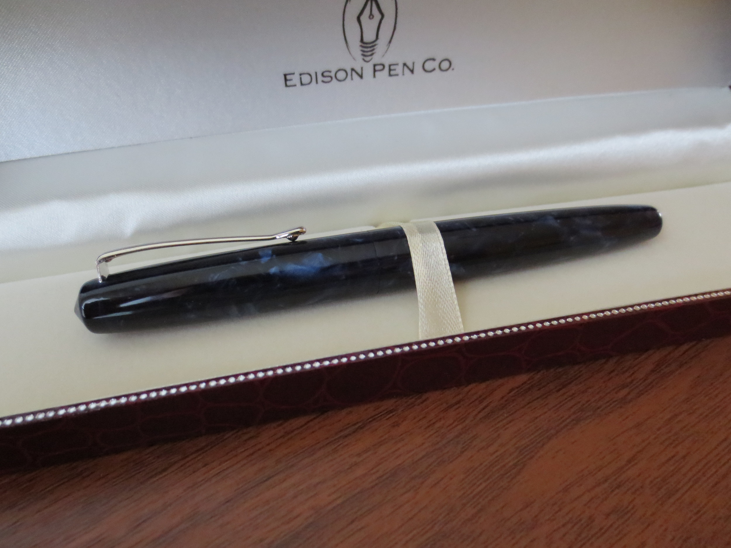
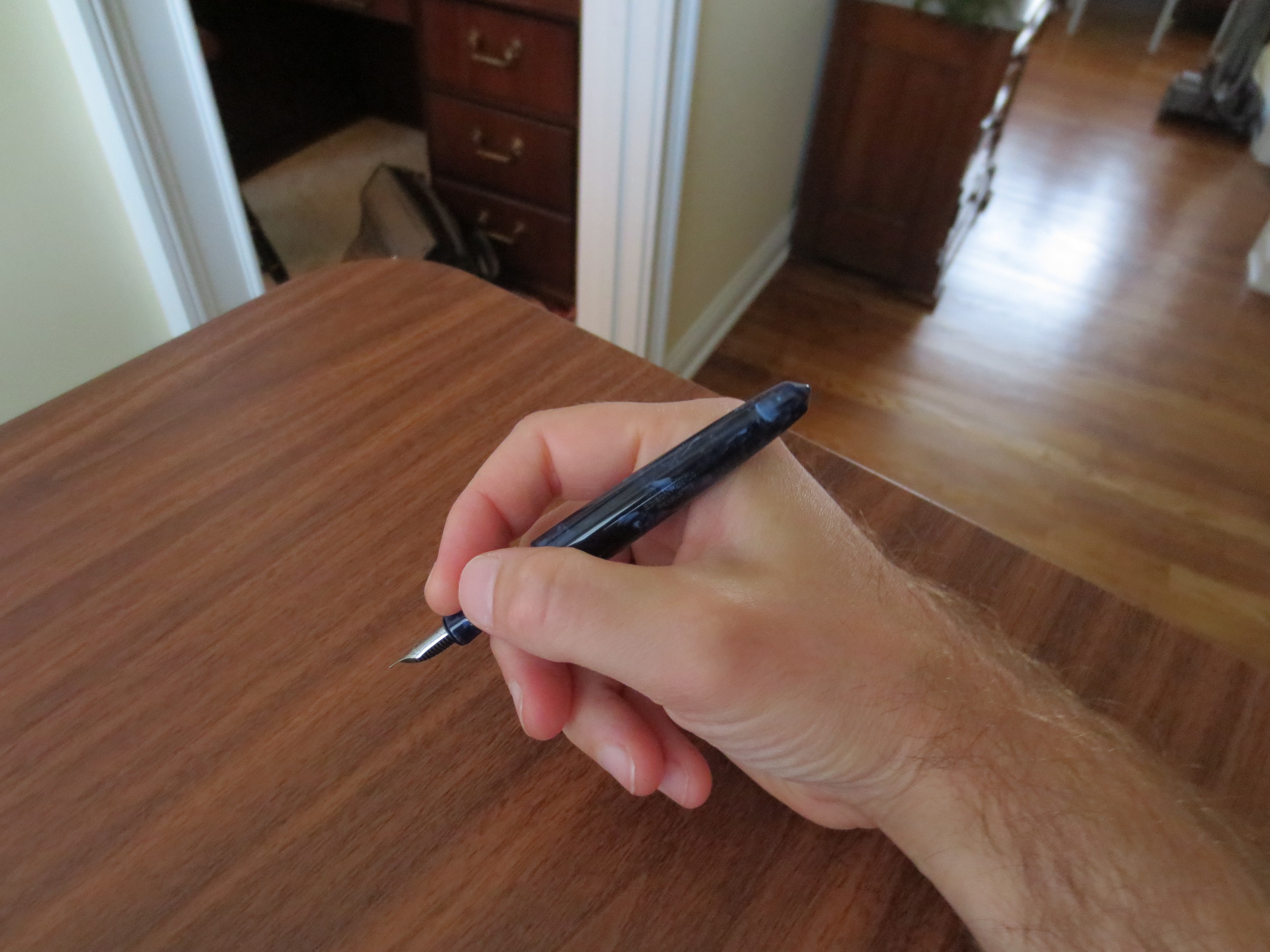
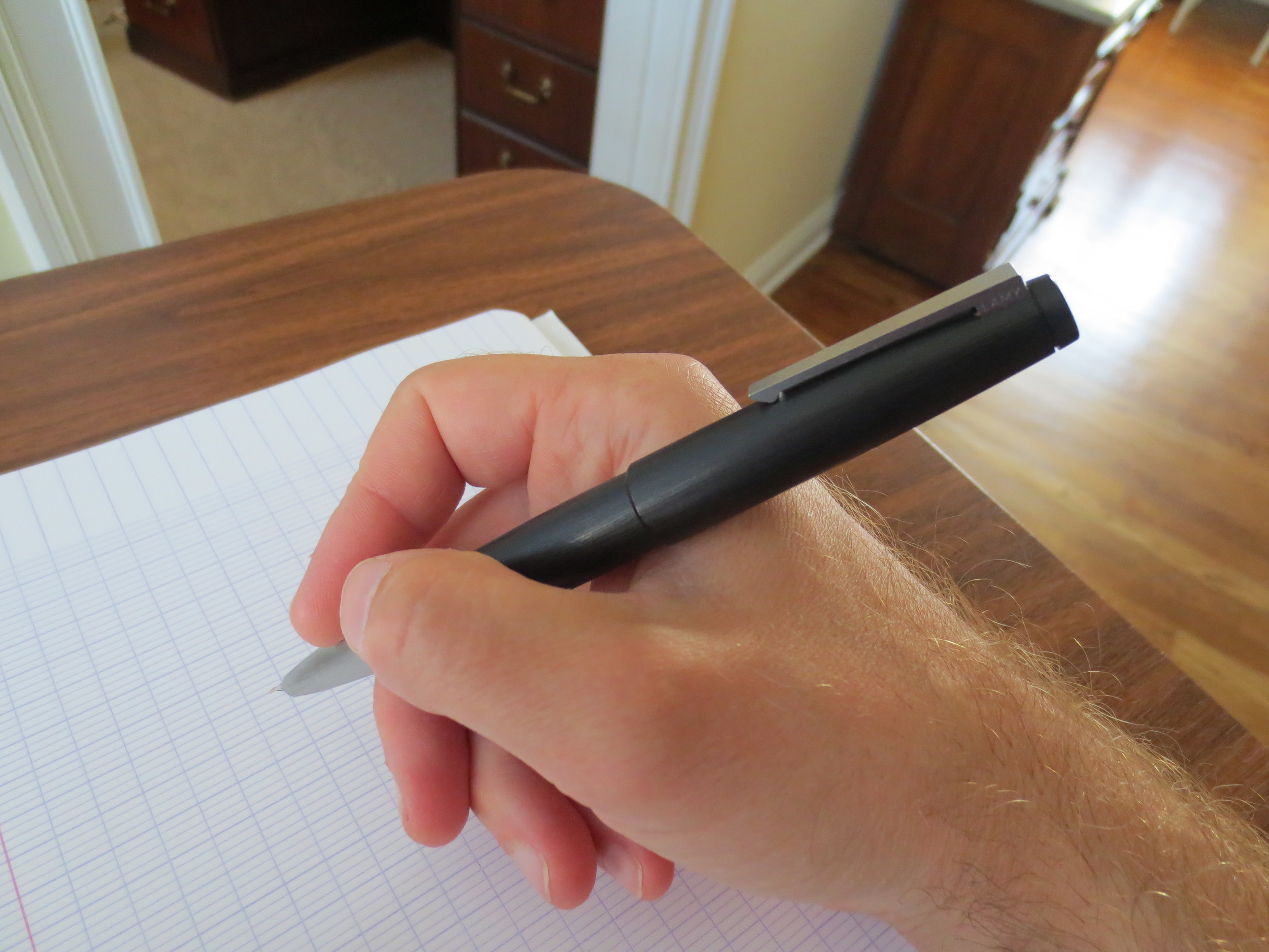
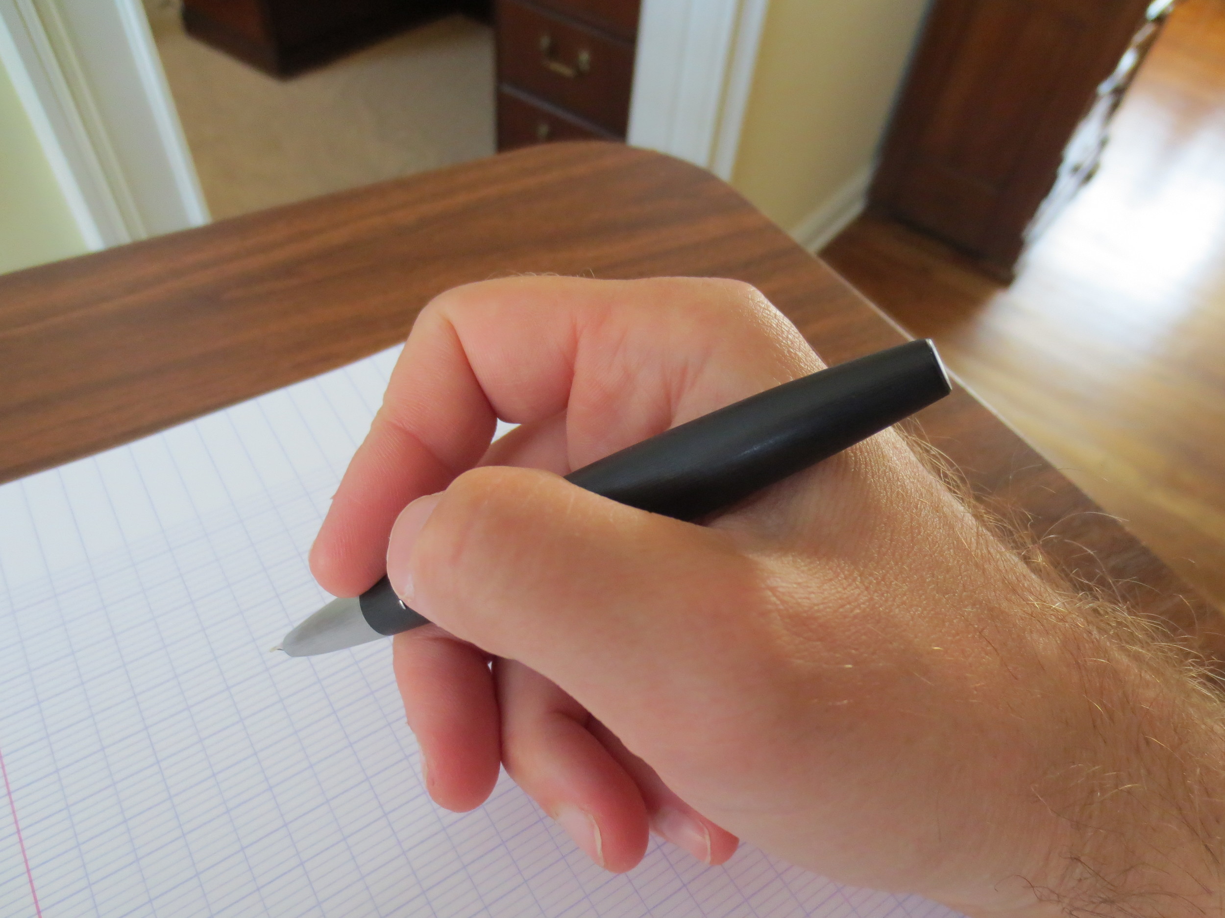
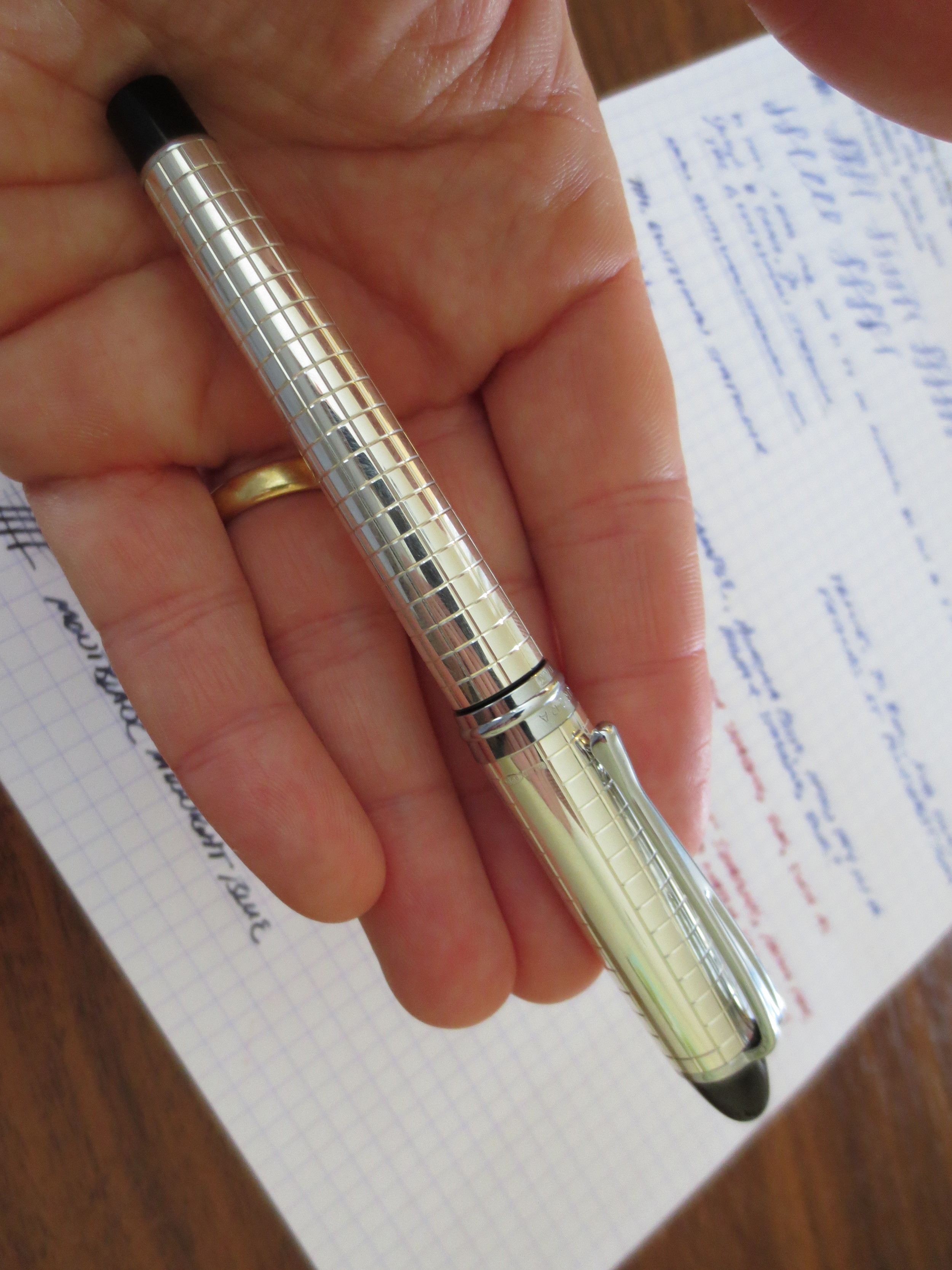
My first of two Binderized Edisons:  a Pearlette in Deep Indigo Flake.

Confession:  I actually purchased two Edisons from Richard at the D.C. Pen Show.  I picked up a Pearlette in Deep Indigo Flake, which is a very dark blue acrylic (pictured and reviewed here), and an Edison Herald in Crushed Shell Acrylic.  I thought about going for a Menlo direct from Edison (and I very well may in the future), but I wanted to purchase through Richard first to see if he could resolve the nib issues. 

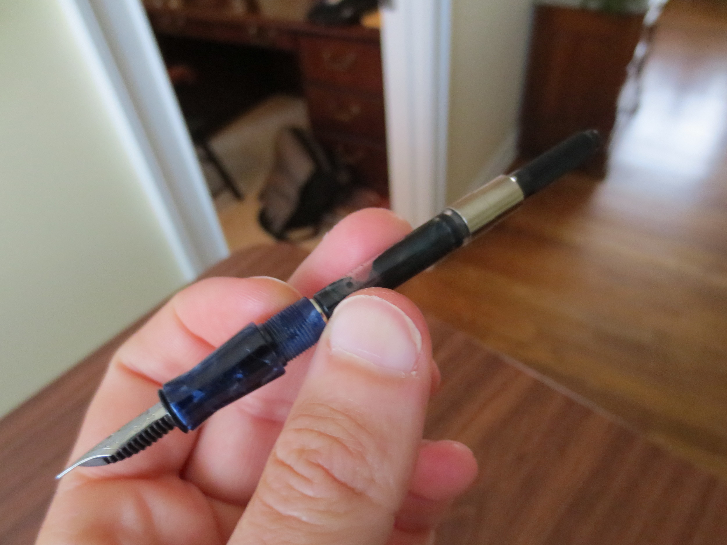
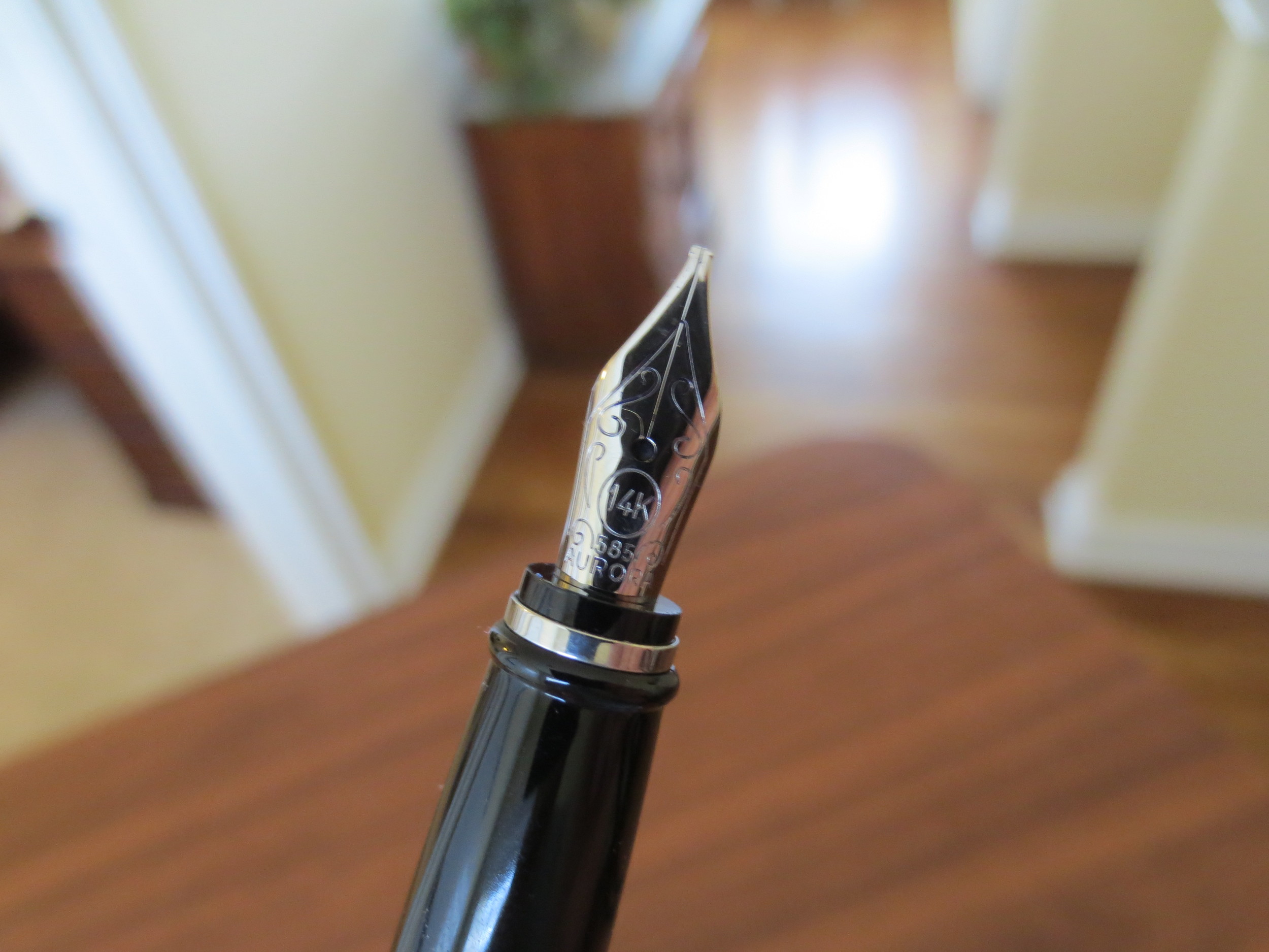
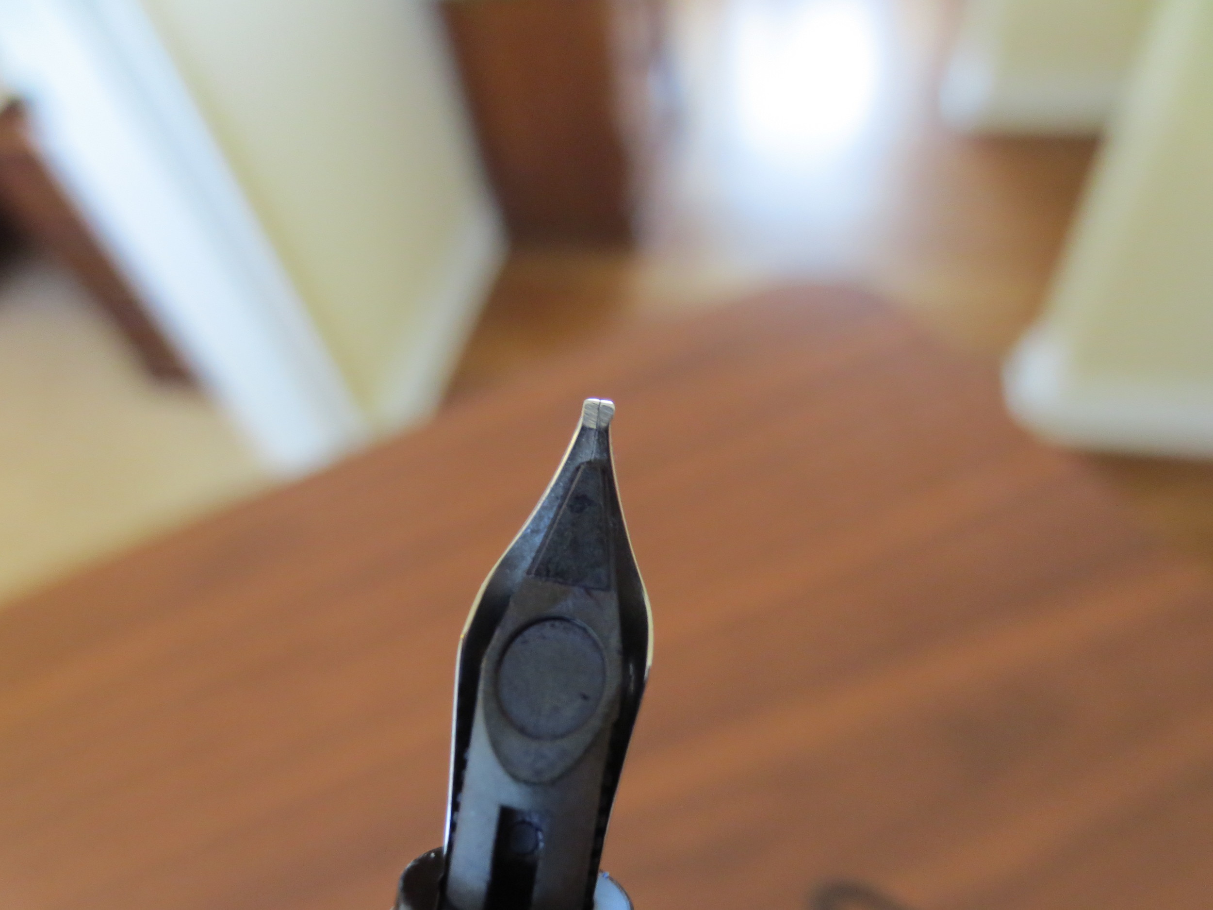
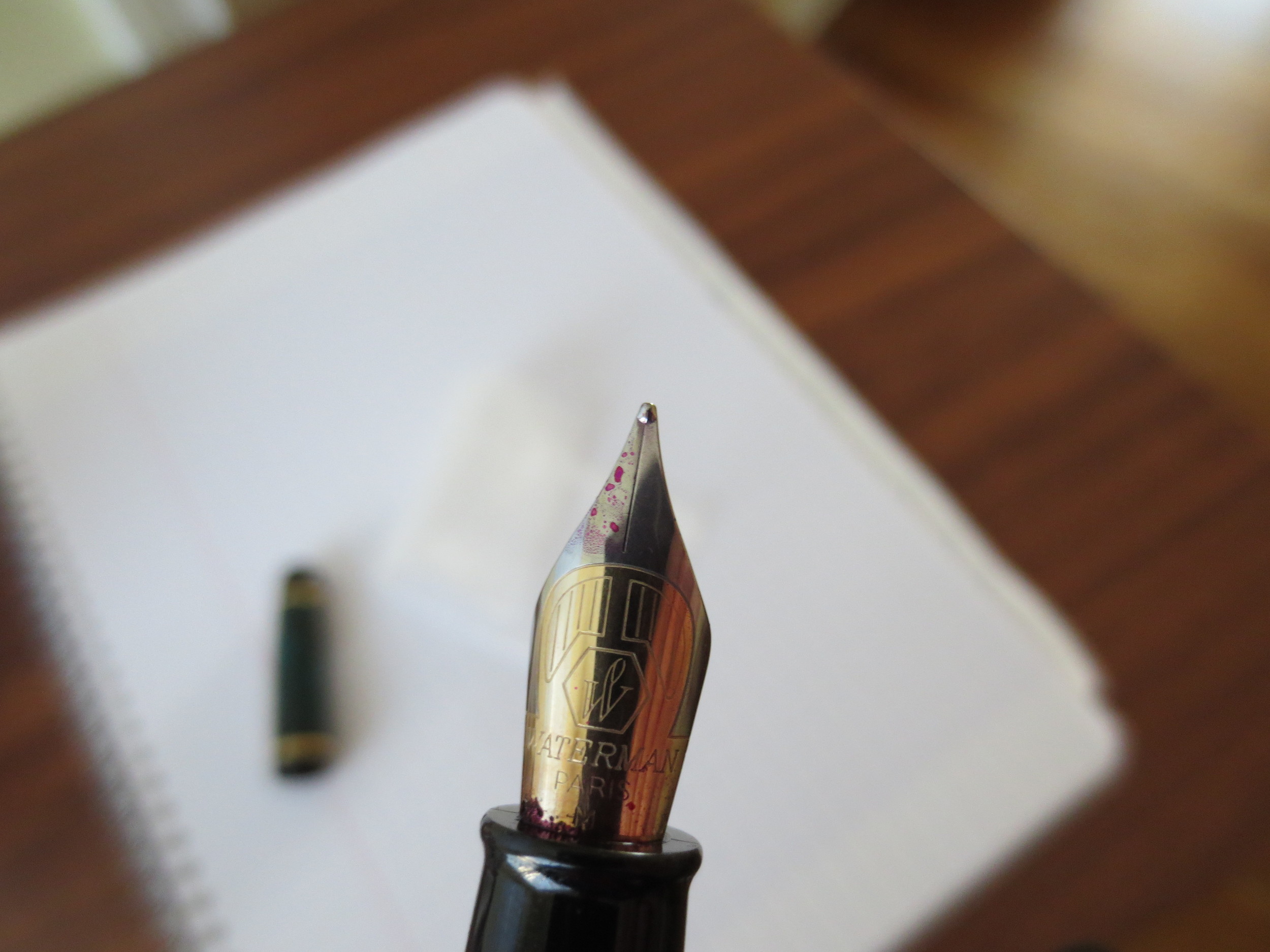
I purchased my Pearlette with a fine stainless steel nib.  Edison Nibs are made in Germany by Jowo, and I believe, but am not 100% certain, that Edison Pens is Jowo's North American distributor.  All Edison Nibs are laser-etched with the Edison logo.

The Nib.  I won't keep you all in suspense.  The nib writes superbly, but did not do so out of the box.  Howard Levy (of Bexley Pens) was sharing a table with Richard and inspecting all newly purchased pens to see if they needed tweaking prior to purchase.  He determined that both of mine needed to have the tines aligned and the flow increased.  Once Richard worked on it, however, the pen wrote perfectly.  Honestly, I'm wishing that I had not sold the Mina but rather just bought a replacement nib from Richard. 

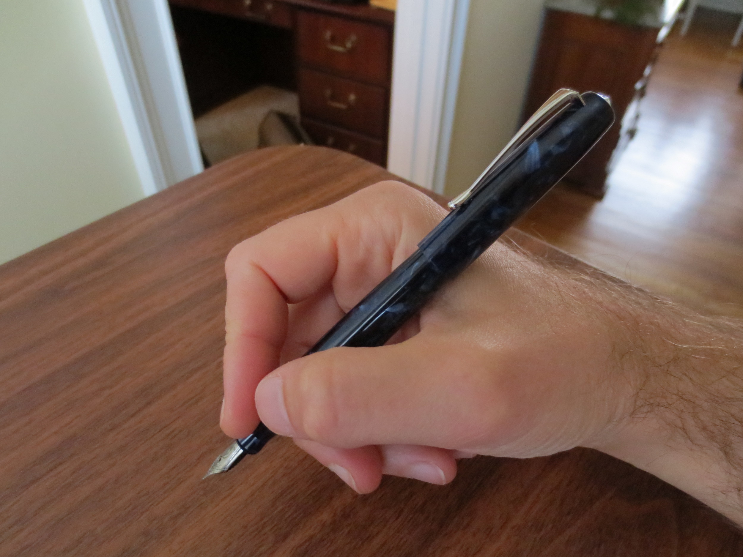
Build:  Brian Gray of Edison designs and makes all of his own pens.  The build quality and machining is superb.  The threads are perfect:  tight, and the cap closes flush with the body of the pen without leaving a gap or an ugly misalignment you sometimes see on pens of lesser quality. 

I will note that this pen is from Edison's "production" line.  Edison makes two lines of pens:  the "production line" is mass produced (by Edison) and comes in a set range of colors, while the "signature" line is customizable--the buyer can work with Brian to design and build his or her own pen from a variety of materials, using one of several very cool filling mechanisms ranging from the traditional cartridge converter to the "pump filler" featured on the Menlo.  The difference is price:  the production line pens run at approximately $150 for a pen with a steel nib, while custom pens start at $250 and go up from there, depending on what features you want.  (Edison sometimes offers "group buy" discounts on the custom pens, and I believe they have one running right now.)  Anyone interested should check out their website, available here.

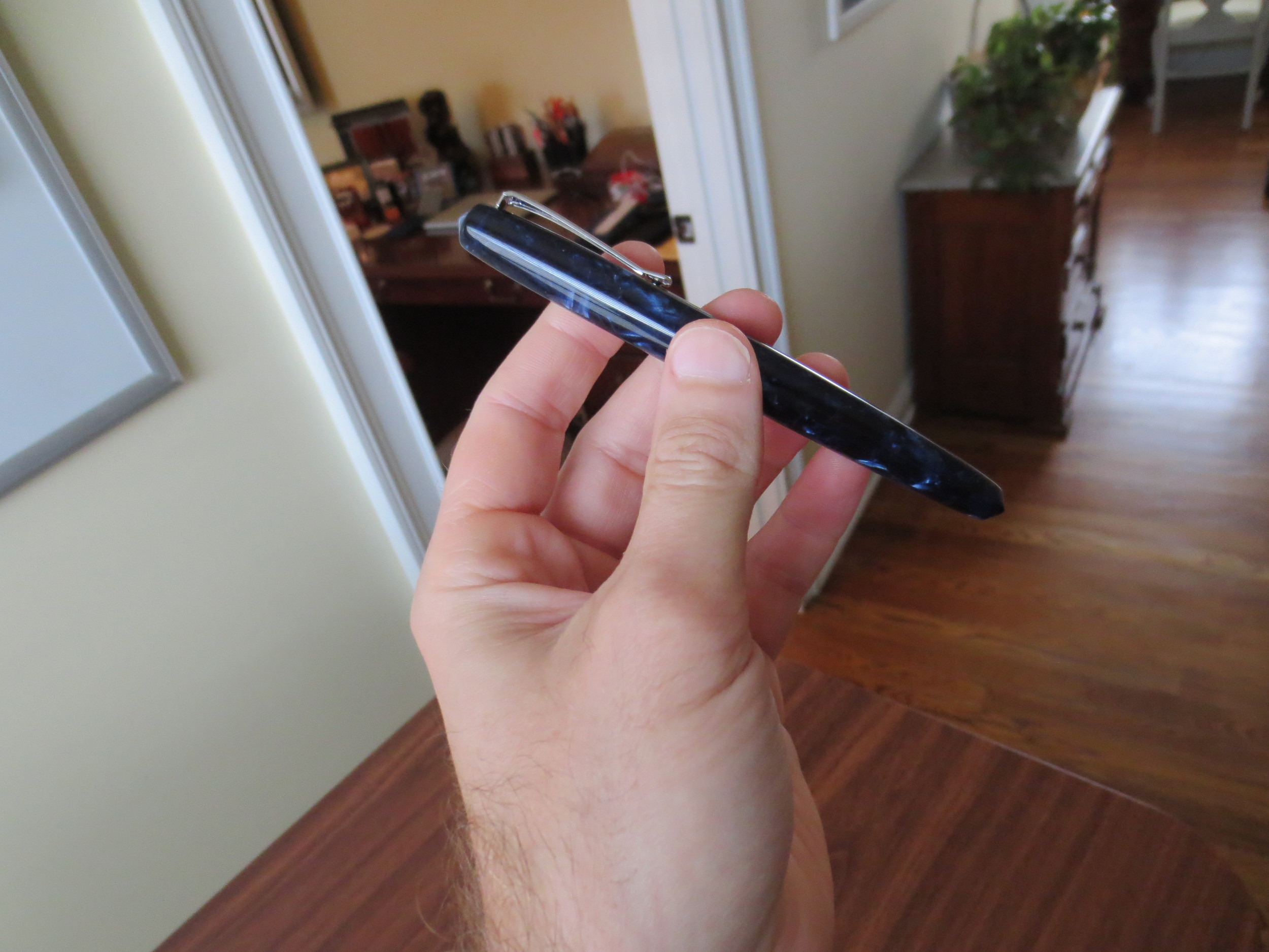
Material:  The production line Pearlette comes in three acrylic options:  Aztec Gold, Deep Indigo Flake, and Violet Flake.  All of them were gorgeous, but I feel in love with the color of the Indigo pen.  Of course, you can purchase a signature line Pearlette as well and get it in any of the countless colors and/or materials Edison offers.

Close-up of the Deep Indigo Flake material, which I find stunning.

The Verdict:  Great pen, and one I've been using nearly every day since I bought it earlier this month.  Edisons are exceptionally built, and the nibs are quality, though it's worth the few extra dollars to have them set up by Richard or another nibmeister if you are extremely finicky about how your nibs write, like me.  To buy one from Richard, follow this link here.

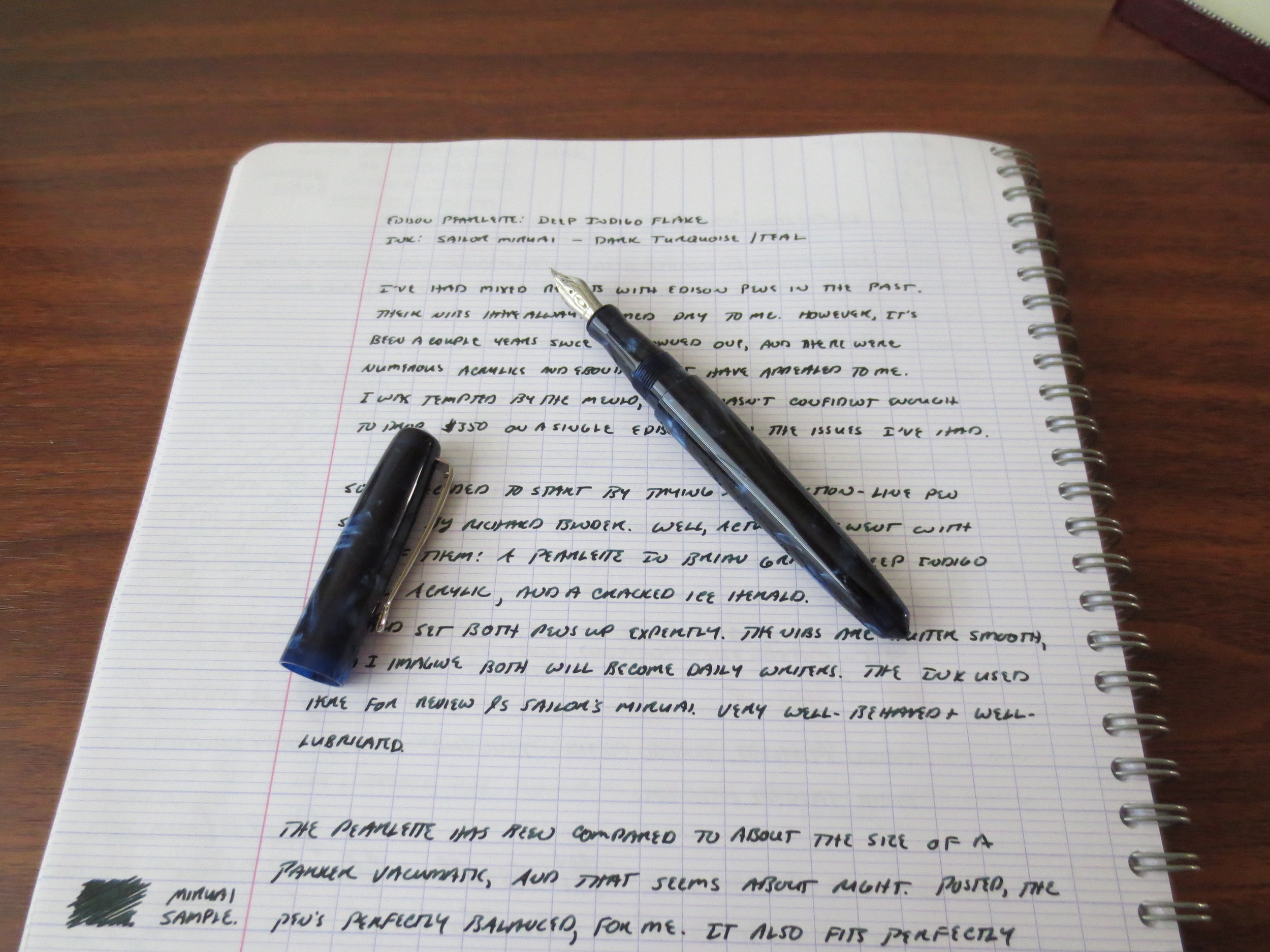
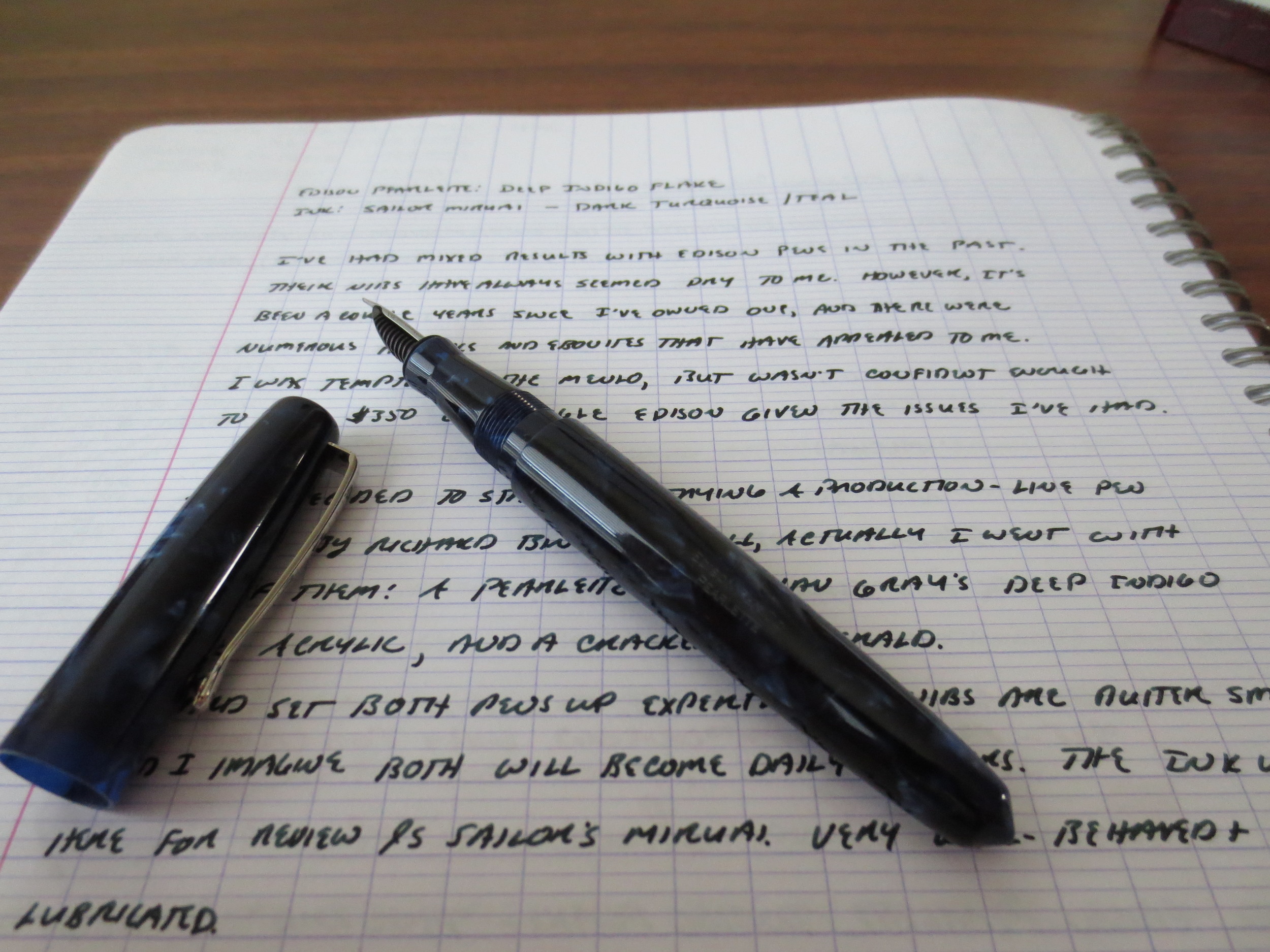
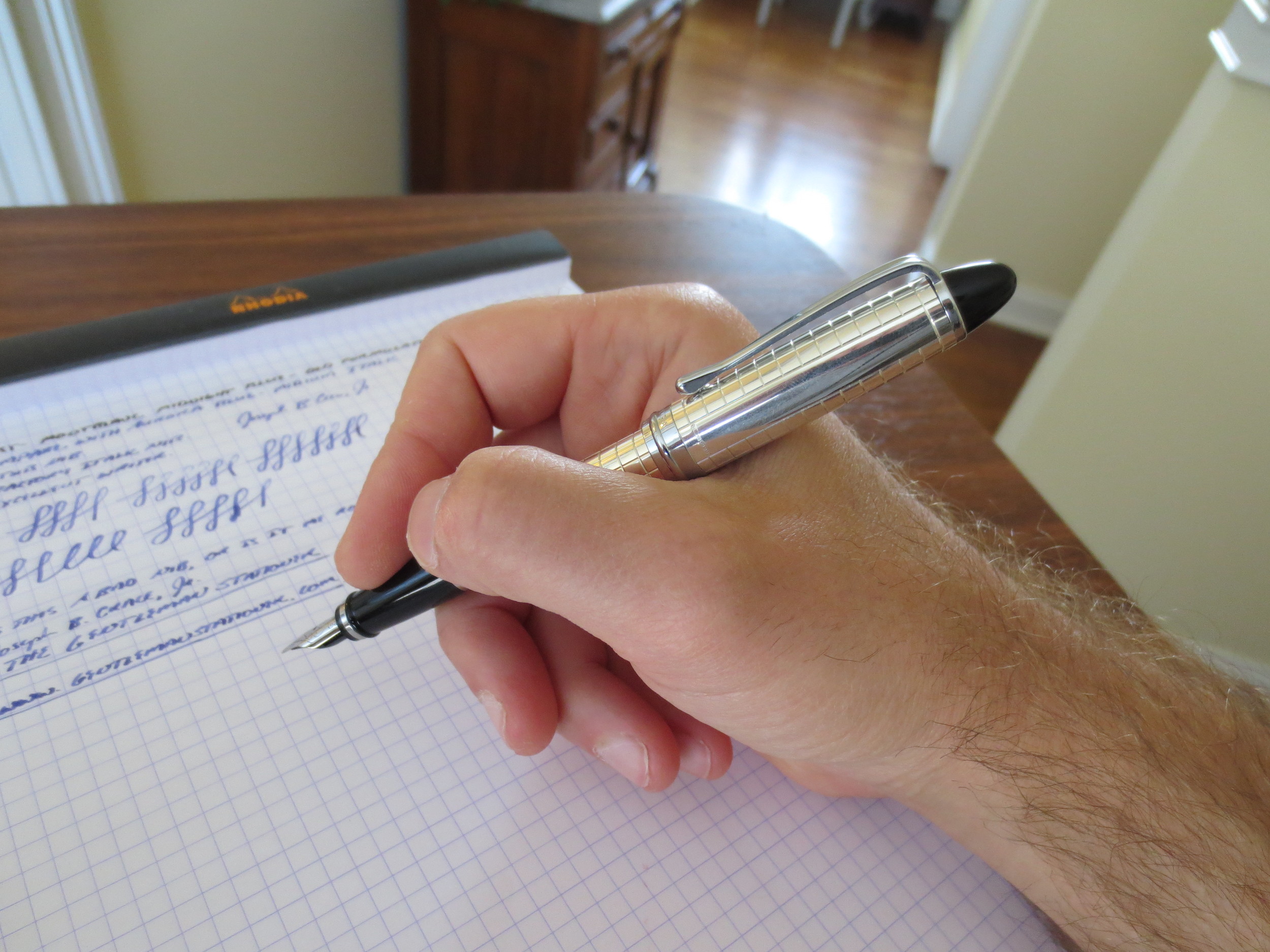
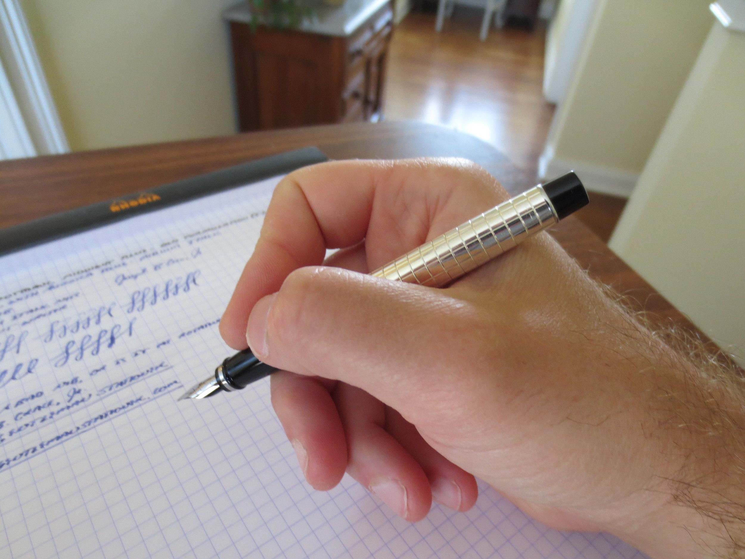
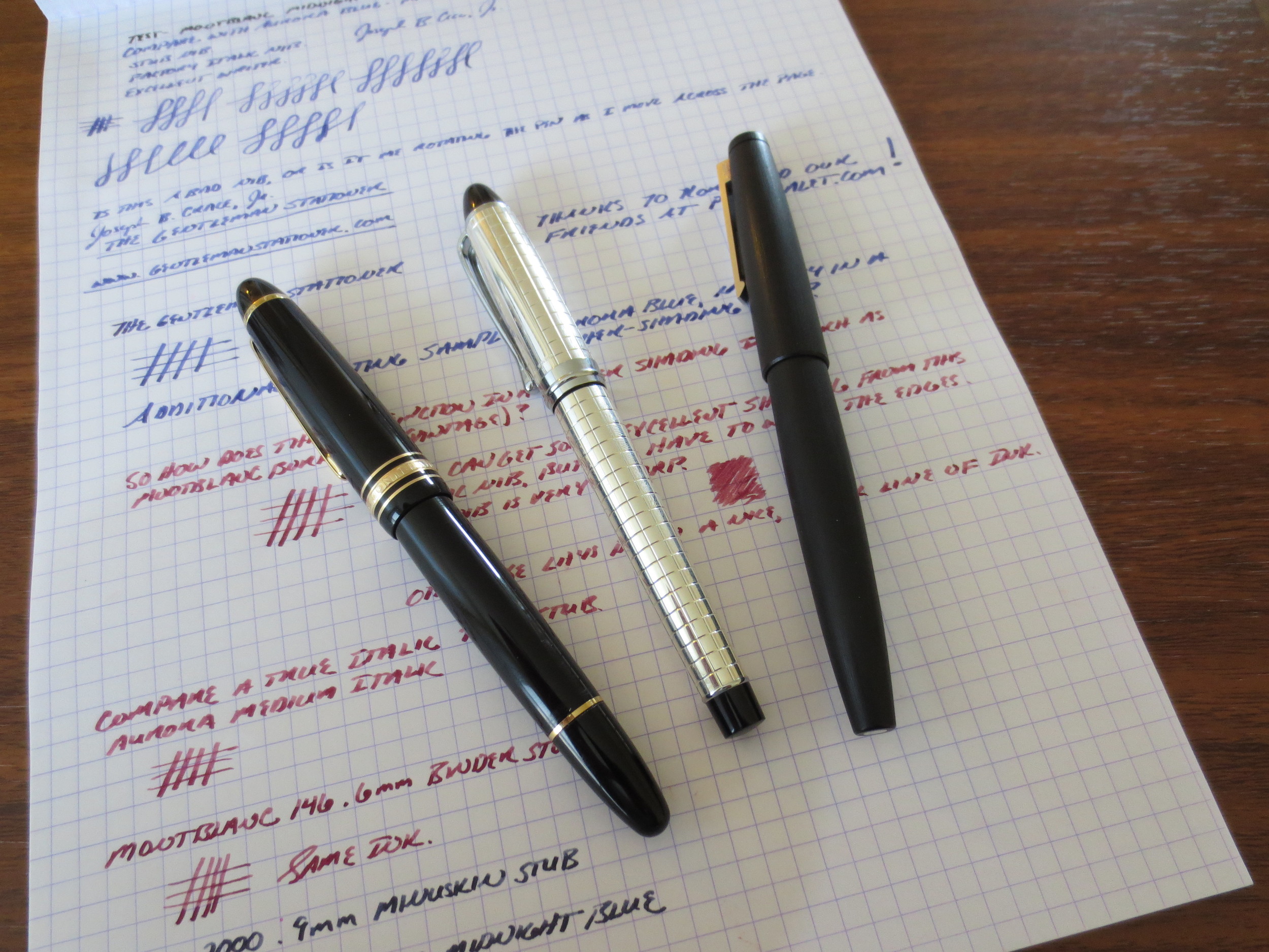
Here's a scan of a handwritten review using my Edison Pearlette.  The ink is Sailor Jentle Miruai.  Paper is Clairefontaine French Ruled.

Pen Review: Karas Kustoms Render K

I've been looking forward to photographing and reviewing this pen for a while, because it's probably my favorite non-fountain pen that I own, and the pen that I end up using the most when, for whatever reason, a fountain pen is impractical.  It's also been a while since I've reviewed a non-fountain pen, so I'm overdue.

Karas Kustoms Render K (Hi-Tec-C Version) in red anodized aluminum. 

The Render K is produced by Karas Kustoms, a shop located in Arizona that produces machined goods, including multiple pens that accept the Pilot-Hi-Tec-C, G2, and Juice refills, along with others that will work once they are cut down or slightly modified. 

All of Karas Kustoms' pens, including the Render K, were launched on Kickstarter.  Being late to the game, I did not get the opportunity to participate in any of the early Kickstarter campaigns, and ran out of money in the pen budget while the "Ink" fountain pen campaign was going on.  The pens are easy to pick up through Karas Kustoms' website (link here), although they do run out of the various anodized color options from time to time.  There are also raw aluminum, copper, and brass options.

The Build.  This pen is rock solid.  I've been unable to find a single flaw in the machining.  Again, I would call the Render K a "solid" pen, but it's not too heavy, and it still fits well in the hand.  Due to the weight and the way the threads are cut on the cap, the pen does not post well, but the size is adequate and I find posting the pen unnecessary.  The anodized aluminum coating is durable, but it will scratch and show some wear if it is carried loose in a bag or pocket with other metal objects (such as keys).

.4mm Pilot Hi-Tec-C Refill in--what else--red. 

The Refill.  I chose the version of the Render K that accepts Pilot's Hi-Tec-C refill, and opted for the .4mm.  I like a smoother refill, and I find that .4mm is the sweet spot for me:  fine enough to use for annotations, but not too scratchy to use as a daily writer.  You can also purchase a version of this pen that accepts the Pilot G2.  My other two Karas Kustoms pens, the Retrakt and the Bolt, both use the G2 refill, which I enjoy. 

The Pilot Hi-Tec-C has a good "classic red pen" color.  It's nothing eye-popping, like some of the red fountain pen inks you see out there, but it gets the job done.

Close-up shot of the color.

The Verdict.  I enjoy this pen.  It's sturdy and its always on my desk or in my bag.  I swap out the refills to alternate between red and black, depending on my needs, but give that I'm a sucker for red pens and red ink you can guess which one I use the most.  If you want a pen that's virtually indestructible and can accept one of the more popular "ultra fine" Japanese gel refills out there,**  the Render K is one of your best options.

** I will note that with some slight hacking (trimming down the refill with a pair of scissors), the Render K will also accept the Signo DX gel pen refill, although I have not used that pen extensively so I have not reviewed it here. 

My First Aurora: Ipsilon Quadra Sterling Silver

I've been jonesing for an Aurora pen for a very long time, but something else always seemed to get in the way.  Finally, two weeks ago, I pulled the trigger and selected the Aurora Ipsilon Quadra in Sterling Silver from Pen Chalet.  I'm a big fan of the chiseled sterling look, as you may know from last week's review of the Parker Sonnet, and Aurora does something different with this pen that raises the bar.  But first off, some unboxing photos.   

Aurora Presentation box.  If it's faux leather (which it probably is), they do the best job I've seen.  It feels nice and has a true leather smell. 

Props to Aurora on their packaging and presentation.  The branding details and interior trim are superb. 

Presentation.  The presentation of the pen in the box is outstanding.  Honestly, Aurora's packaging is some of the best I've seen.  It's not tacky and overdone, but it's not cheap.  It feels equal to the price and quality of the pen.  This is one of the few boxes I will keep.  Now, on to the pen itself.

Build Quality.  It sounds trite, but the Ipsilon Quadra is simply a well-made pen.  Both the cap and the barrel are sterling silver.  The clip and cap band are not.  The pen is lighter than I would expect for a metal pen, but has good heft.  You can tell that it's not thinly plated.  Another thing I like is the finish.  My Parker Sonnet's finish is "antiqued," meaning that the silver is given a patina to make it look older.  The Ipsilon Quadra is shiny, at least until the silver develops a patina of its own.  If you want to keep this pen shiny and "new" looking, you'll have to polish it.  

The cap is friction fit, and it snaps on and off firmly.  The plastic end-cap on the pen also "snaps" the cap into place when you post the pen.  While the pen can be used unposted, I'm pretty sure this one is intended to be used posted, and that's how it best fits my hand.  

You can see that the cap has a non-patterned area, presumably for engraving.

Another close-up look at the detailing.

The Nib.  The nib is where I decided to step out of my comfort zone.  This 14k nib is Aurora's stock medium italic, which is a size and grind that's pretty difficult to find.  It is a very sharp italic--not a stub--and takes a bit of getting used to.  If you don't slow your writing down to give yourself time to adapt to the nib's sweet spot and how it likes to be held oriented to the paper, the edges will dig in and you'll have a pretty rough go at it.  But once you get the hang of it, this nib gives you incredible line variation and brings out any shading properties in the ink you are using.  I decided to fill this pen for the first time with Aurora blue.  Sometimes I like to test a new pen with the manufacturer's ink, because if a pen doesn't write with ink made by the company that made the pen, there's probably something wrong.  No problems, here, of course.     

It's hard to see in the picture, but the Italic nib has very sharp corners.

It's hard to see in the picture, but the Italic nib has very sharp corners.

A writing sample from when I first filled and tested the pen.  Notice the rough edges and some skipping as I had to adjust my writing slightly to compensate for the sharp edges on the Italic nib.  Things got MUCH better for me once I broke the nib in a bit. 

After writing with the Aurora blue for a couple of days, I switched things up and loaded the pen with Montblanc Bordeaux (the late-1990s version).  I also did some side-by-side writing samples with two custom stubs I have on a MB 146 and a Lamy 2000.  Note the shading in the italic nib, while the stubs write a wetter line and have slightly less line variation. 

The Verdict.  I absolutely love this pen and am thrilled to finally add an Aurora to my collection.  I'm also pleased with the Italic nib, something that I've hesitated to buy in the past.  This pen may make me less reluctant to try stock italics in the future.  Buyer beware:  I cannot emphasize enough that an italic nib is NOT the same thing as a stub nib.  Stubs are meant to create subtle line variation without sacrificing the ability to write relatively quickly and fluidly.  For the most part, italic nibs require you to slow down and pay attention to your handwriting. 

Like I said, I purchased this pen from Pen Chalet. This pen, while not cheap, is priced very well for a sterling silver pen, and Pen Chalet's prices are as good as any, especially when you use one of the various discounts floating around and take advantage of their free shipping on orders over $50.  The pen came to me in pristine condition and shipped fairly quickly.  Ron carries a pretty wide variety of Auroras, including some of their entry-level models.  Note that some Auroras can take up to a week or so to ship; most retailers do not always have the full line of models/nibs in stock so they may have to order it from the distributor.  

When (Decent) Fountain Pens Were Sold at Staples....

Last month, I received this pen in a trade from a friend.  He had decided to pass it on because the pen was underused in his collection and was cleaning out some space (something that I'm trying to do myself by selling/trading some extremely underused pens and inks).  

Introducing the Waterman Phileas, once Waterman's flagship "economy" pen, and the starter pen of choice for many.  

I was thrilled to have this pen in my collection.  For those of you who don't recognize it, this pen is a Waterman Phileas, which was discontinued by Waterman approximately 2-3 years ago.  Prior to that, the pen was fairly ubiquitous in that it could be found in office supply stores in the U.S., not to mention abroad.  I still remember when you could find "fountain pen starter kits" at Staples or Office Depot that included the Phileas, a bottle of Waterman Florida Blue Ink, a converter and some cartridges for around $30.  Personally, my introduction to the Phileas came when I was in school in France in 2000-2001, and everybody had some sort of fountain pen, with these being a popular choice.  At that time, I had the lower-end Waterman Kultur, which was a Phileas without the art-deco trim, but nonetheless a great writer. 

The pen has nice gold plated trim on the cap.  The material is marbled green resin. 

Note the art deco styling--something you don't see very often in budget pens anymore. 

What's remarkable about the Phileas is the fact that it includes some very nice detail that's hard to find in $30 pens these days.  Note the gold-plated trim with art deco details.  Also, the tolerances seem very high.  The edges of the pen are well rounded and the slip-on cap both closes and posts securely.  The marbled green resin is very understated, professional, and not at all "cheap" looking.  The pen also has some heft to it, as Waterman lined the inside of the barrel with brass.  

The Phileas Nib is a two-toned steel nib that writes well.  This one is a medium.  

The Phileas Nib is a two-toned steel nib that writes well.  This one is a medium.  

The nib is nothing remarkable, but it's a solid writer that does what it's asked to do:  write reliably.  It doesn't skip and I've never had a hard start.  I've been using this pen for the past week, filled with Iroshizuku Yama-Budo, and it's caused me no problems.  

The Phileas disassembled.  This one came with the Waterman threaded converter, which I like.  

A writing sample from the Phileas, using Edelstein Turmaline during my review of that ink.  Paper is Clairefontaine French-ruled. 

The Verdict.  This is a great pen that, in my opinion, never should have been discontinued.  For years, it was probably the go-to entry level pen out there.  If you can find one, it's still a great option for everyday use.  There has been much speculation as to why Waterman discontinued this pen (example link here), but IMHO the most plausible explanation is that Sanford, the parent company, wanted to take the Waterman line to a more upscale market position, at least here in the U.S, and therefore discontinued their "budget" line.  I was last in Europe a year ago, and I still saw some Phileas and Kultur pens on shelves.  Whether those pens were NOS or not, I couldn't say.