I've been jonesing for an Aurora pen for a very long time, but something else always seemed to get in the way. Finally, two weeks ago, I pulled the trigger and selected the Aurora Ipsilon Quadra in Sterling Silver from Pen Chalet. I'm a big fan of the chiseled sterling look, as you may know from last week's review of the Parker Sonnet, and Aurora does something different with this pen that raises the bar. But first off, some unboxing photos.
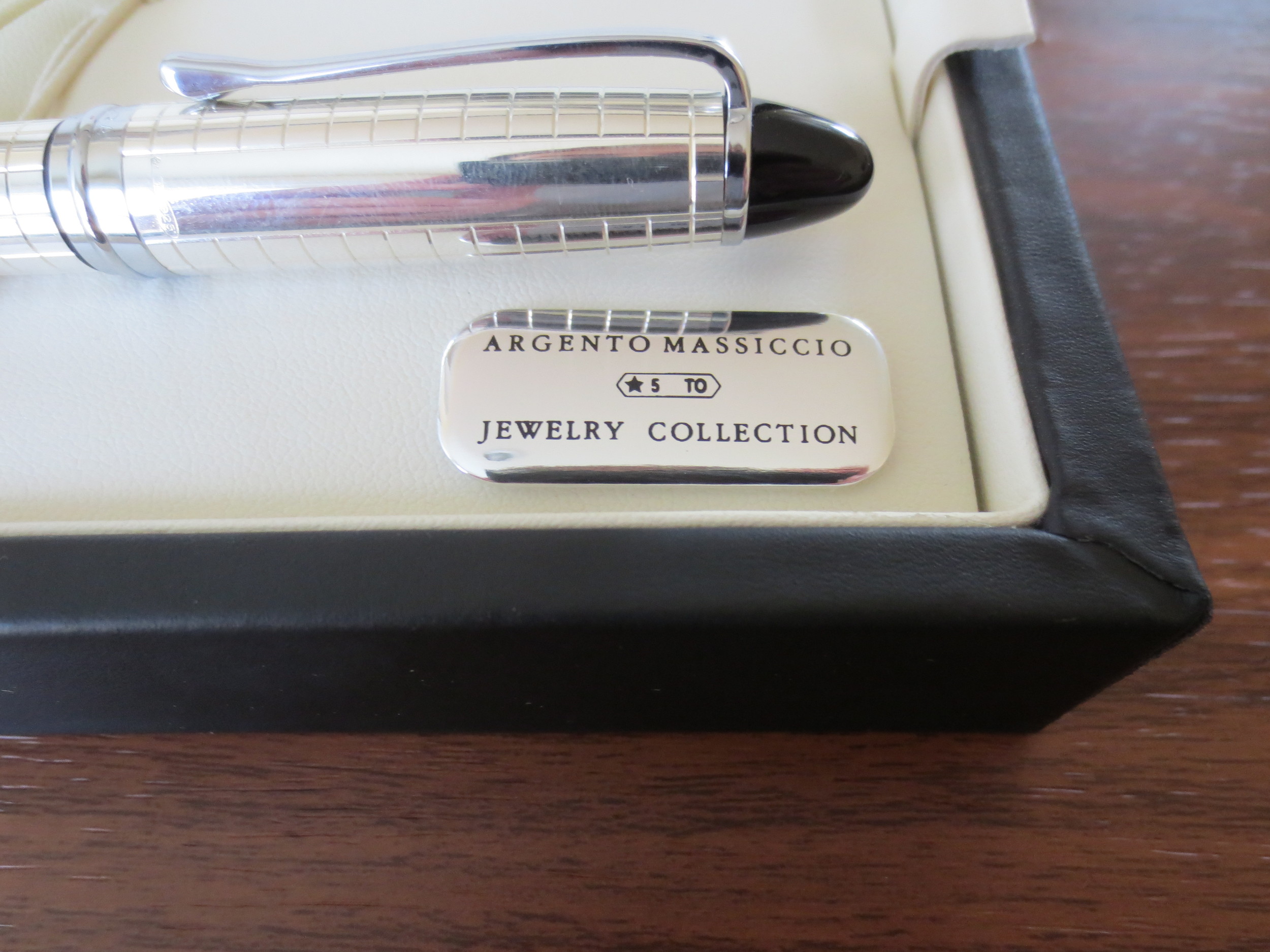
Aurora Presentation box. If it's faux leather (which it probably is), they do the best job I've seen. It feels nice and has a true leather smell.
Props to Aurora on their packaging and presentation. The branding details and interior trim are superb.
Presentation. The presentation of the pen in the box is outstanding. Honestly, Aurora's packaging is some of the best I've seen. It's not tacky and overdone, but it's not cheap. It feels equal to the price and quality of the pen. This is one of the few boxes I will keep. Now, on to the pen itself.
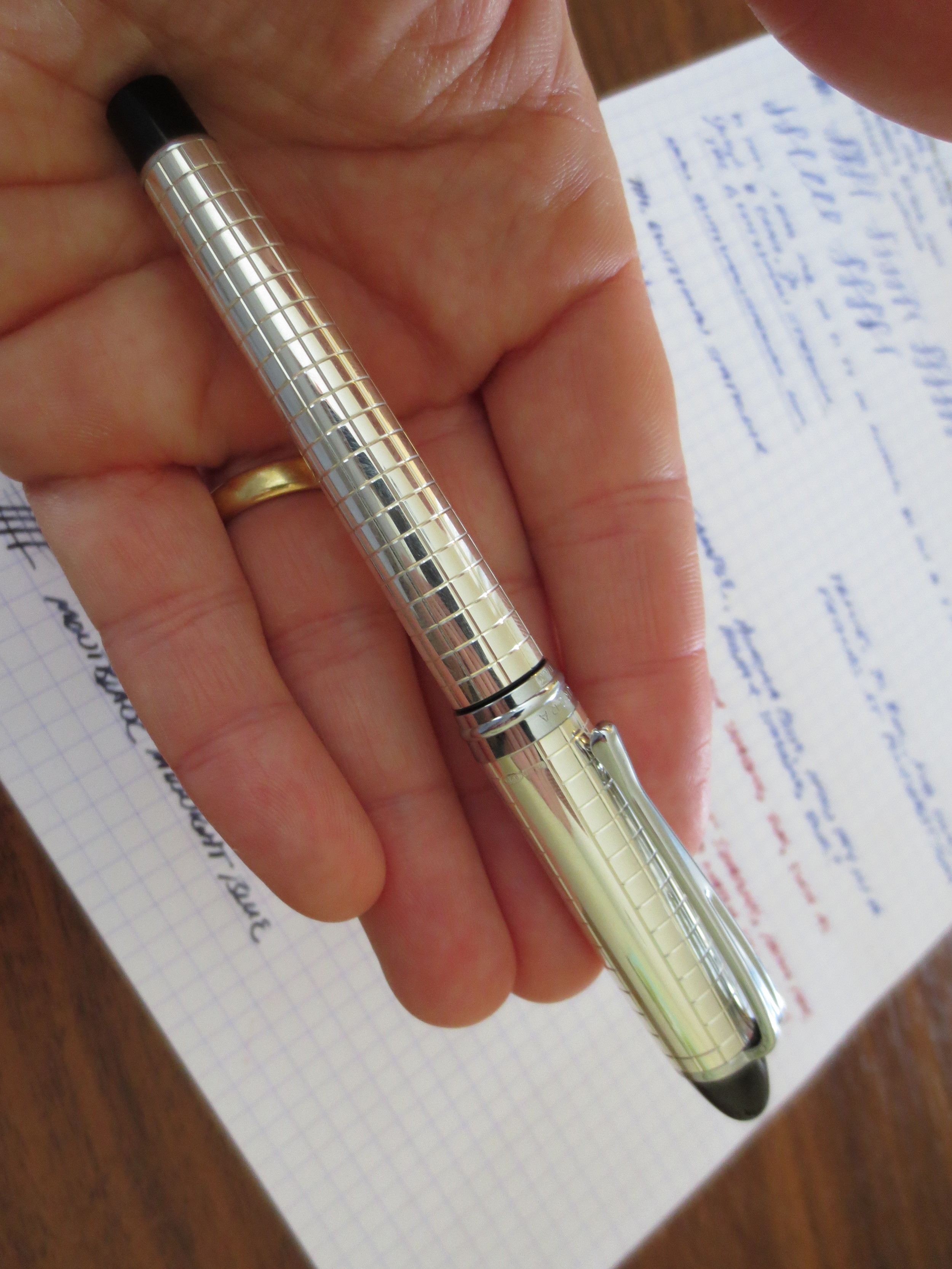
Build Quality. It sounds trite, but the Ipsilon Quadra is simply a well-made pen. Both the cap and the barrel are sterling silver. The clip and cap band are not. The pen is lighter than I would expect for a metal pen, but has good heft. You can tell that it's not thinly plated. Another thing I like is the finish. My Parker Sonnet's finish is "antiqued," meaning that the silver is given a patina to make it look older. The Ipsilon Quadra is shiny, at least until the silver develops a patina of its own. If you want to keep this pen shiny and "new" looking, you'll have to polish it.
The cap is friction fit, and it snaps on and off firmly. The plastic end-cap on the pen also "snaps" the cap into place when you post the pen. While the pen can be used unposted, I'm pretty sure this one is intended to be used posted, and that's how it best fits my hand.
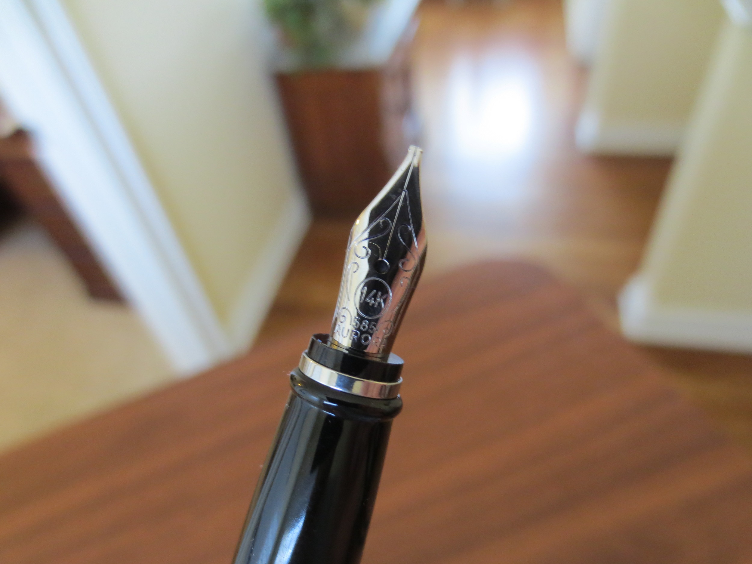
You can see that the cap has a non-patterned area, presumably for engraving.
Another close-up look at the detailing.
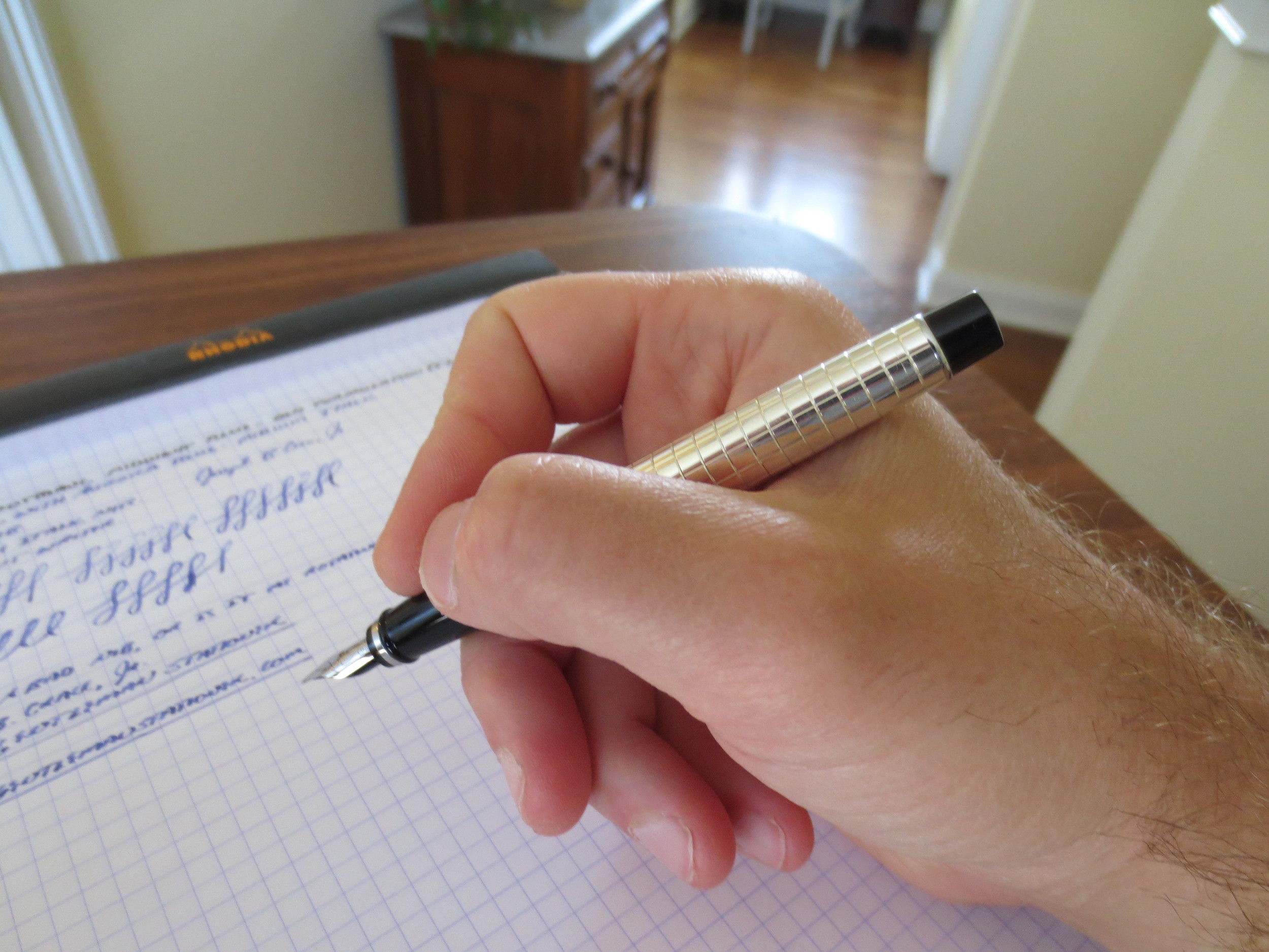
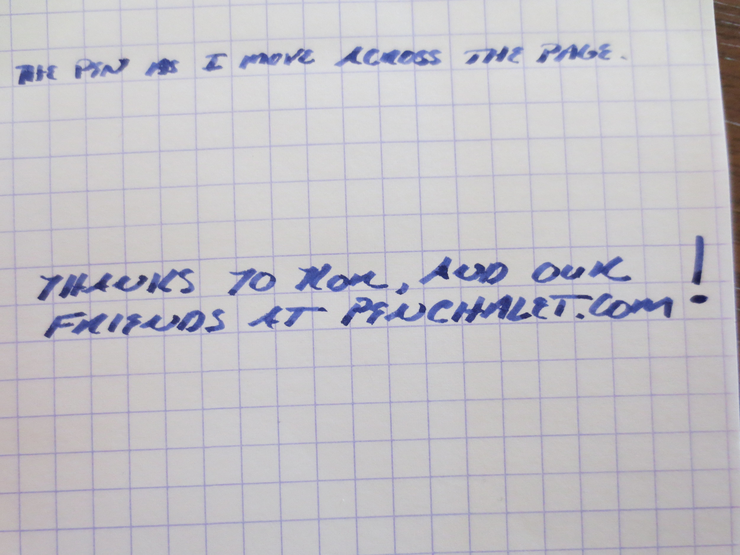
The Nib. The nib is where I decided to step out of my comfort zone. This 14k nib is Aurora's stock medium italic, which is a size and grind that's pretty difficult to find. It is a very sharp italic--not a stub--and takes a bit of getting used to. If you don't slow your writing down to give yourself time to adapt to the nib's sweet spot and how it likes to be held oriented to the paper, the edges will dig in and you'll have a pretty rough go at it. But once you get the hang of it, this nib gives you incredible line variation and brings out any shading properties in the ink you are using. I decided to fill this pen for the first time with Aurora blue. Sometimes I like to test a new pen with the manufacturer's ink, because if a pen doesn't write with ink made by the company that made the pen, there's probably something wrong. No problems, here, of course.
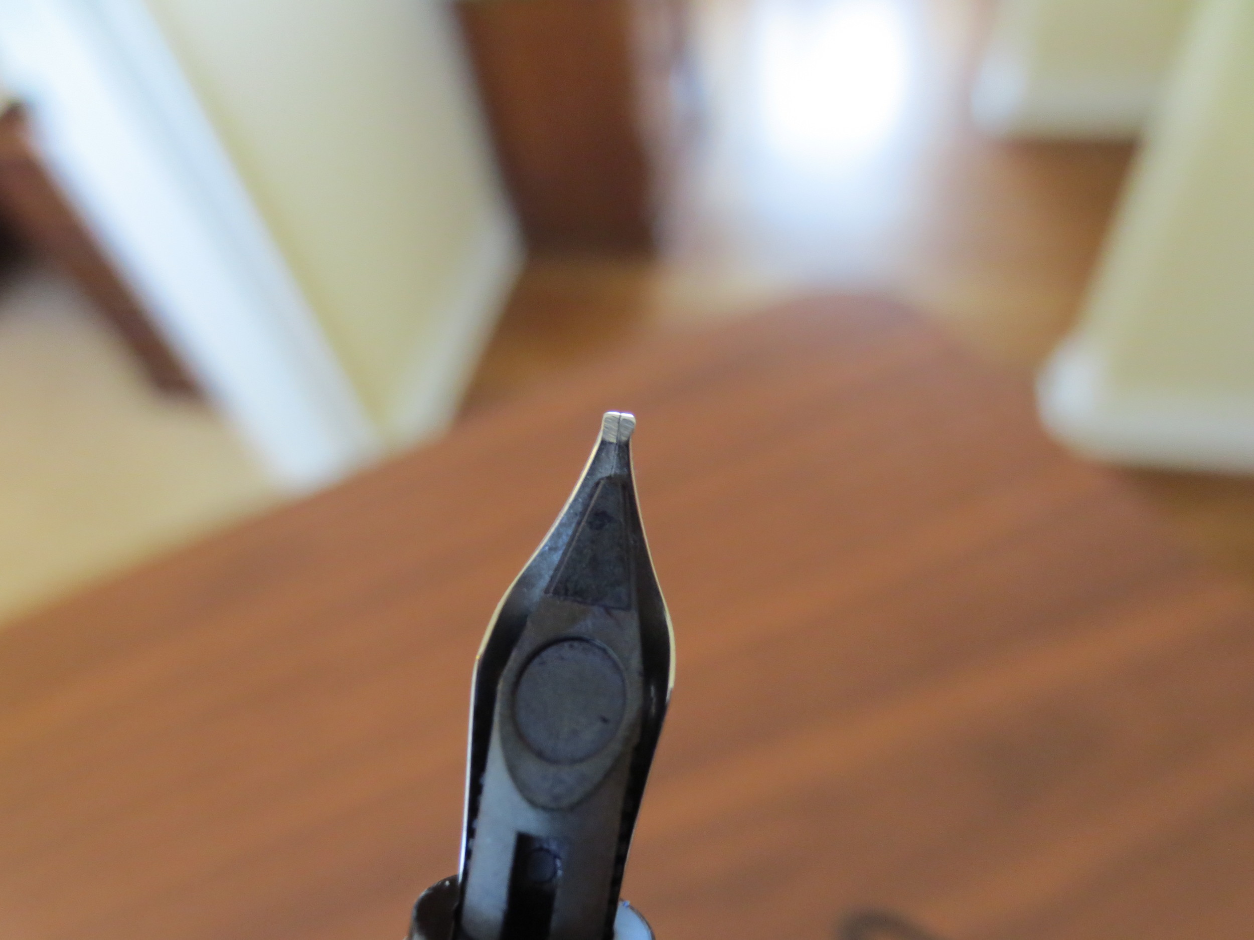
It's hard to see in the picture, but the Italic nib has very sharp corners.
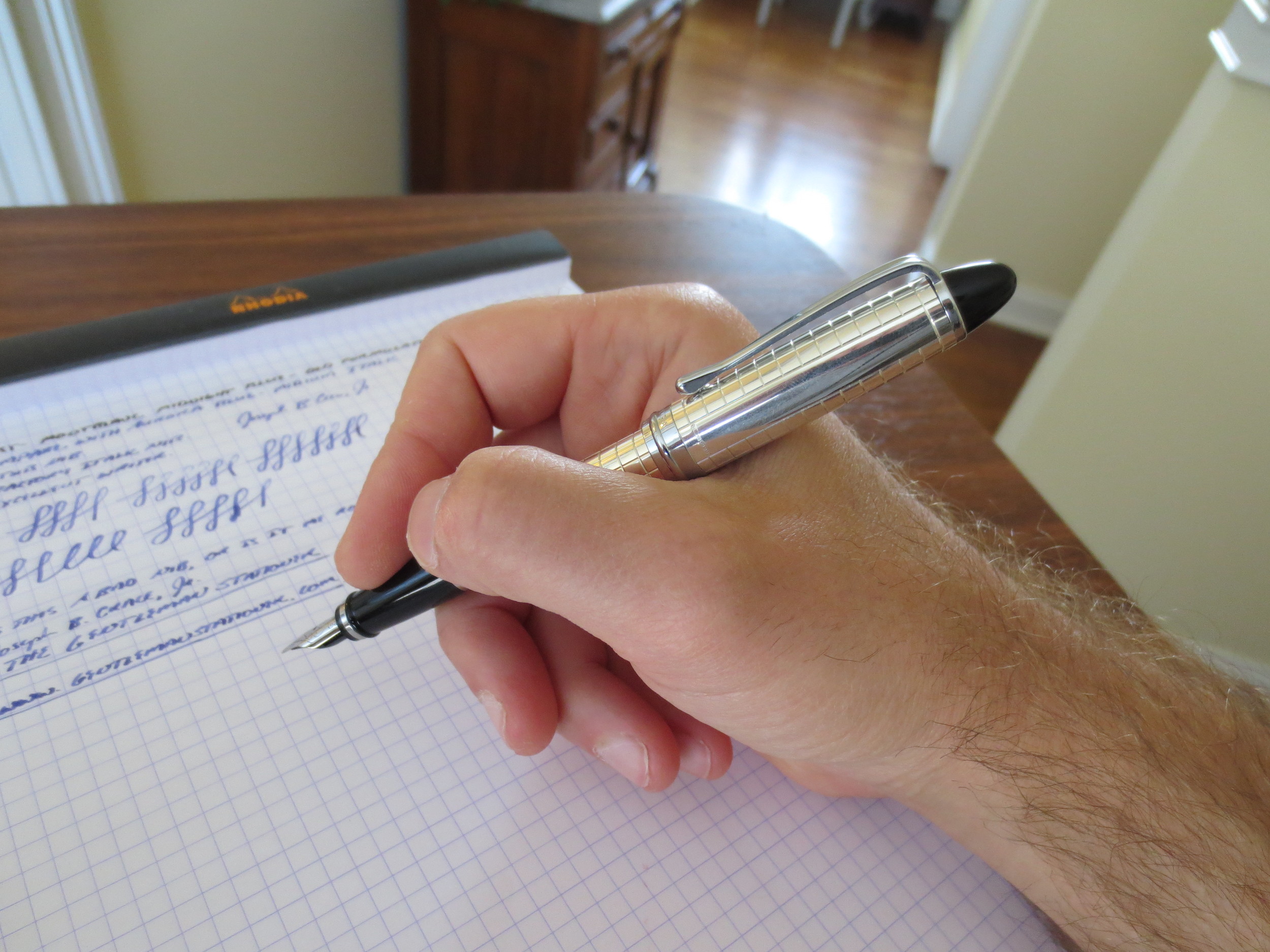
A writing sample from when I first filled and tested the pen. Notice the rough edges and some skipping as I had to adjust my writing slightly to compensate for the sharp edges on the Italic nib. Things got MUCH better for me once I broke the nib in a bit.
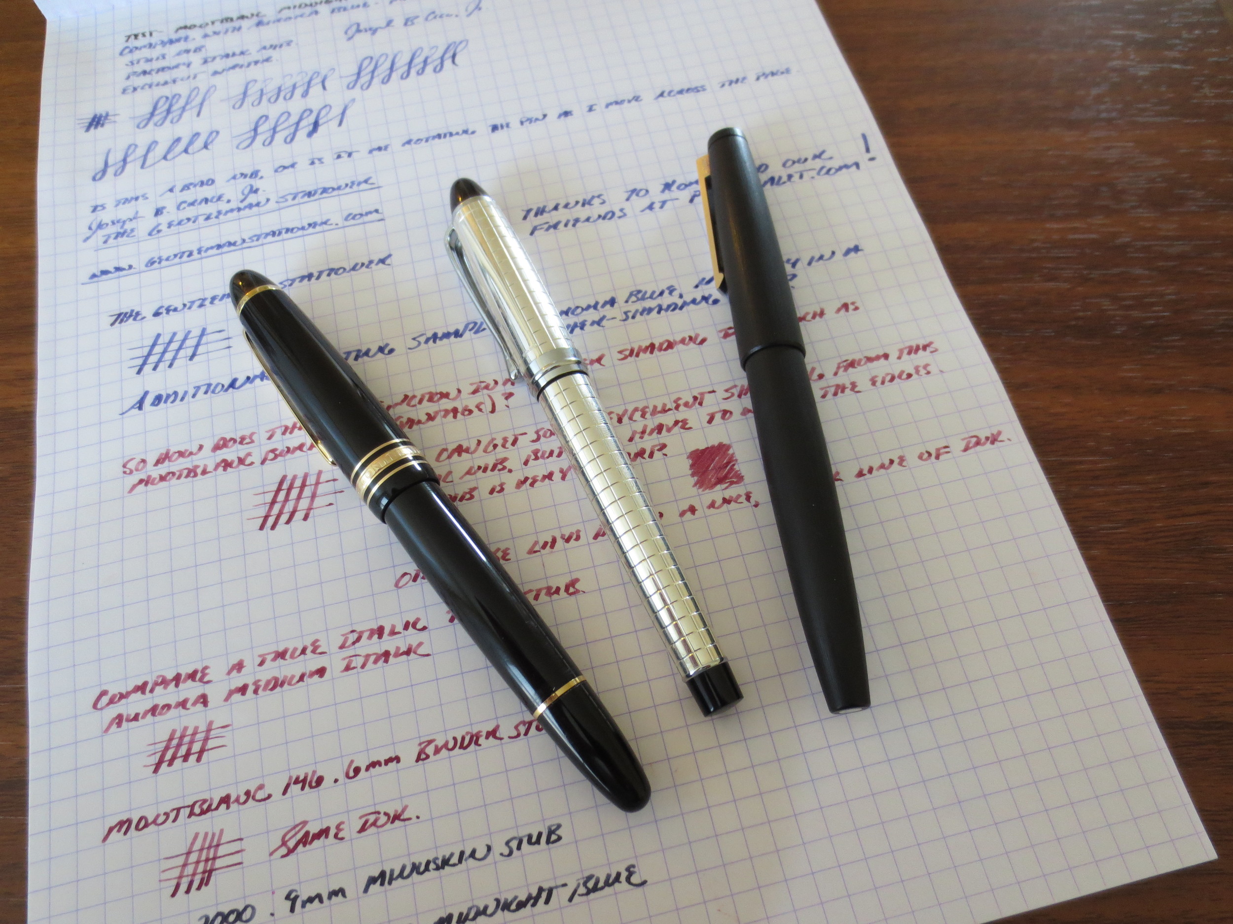
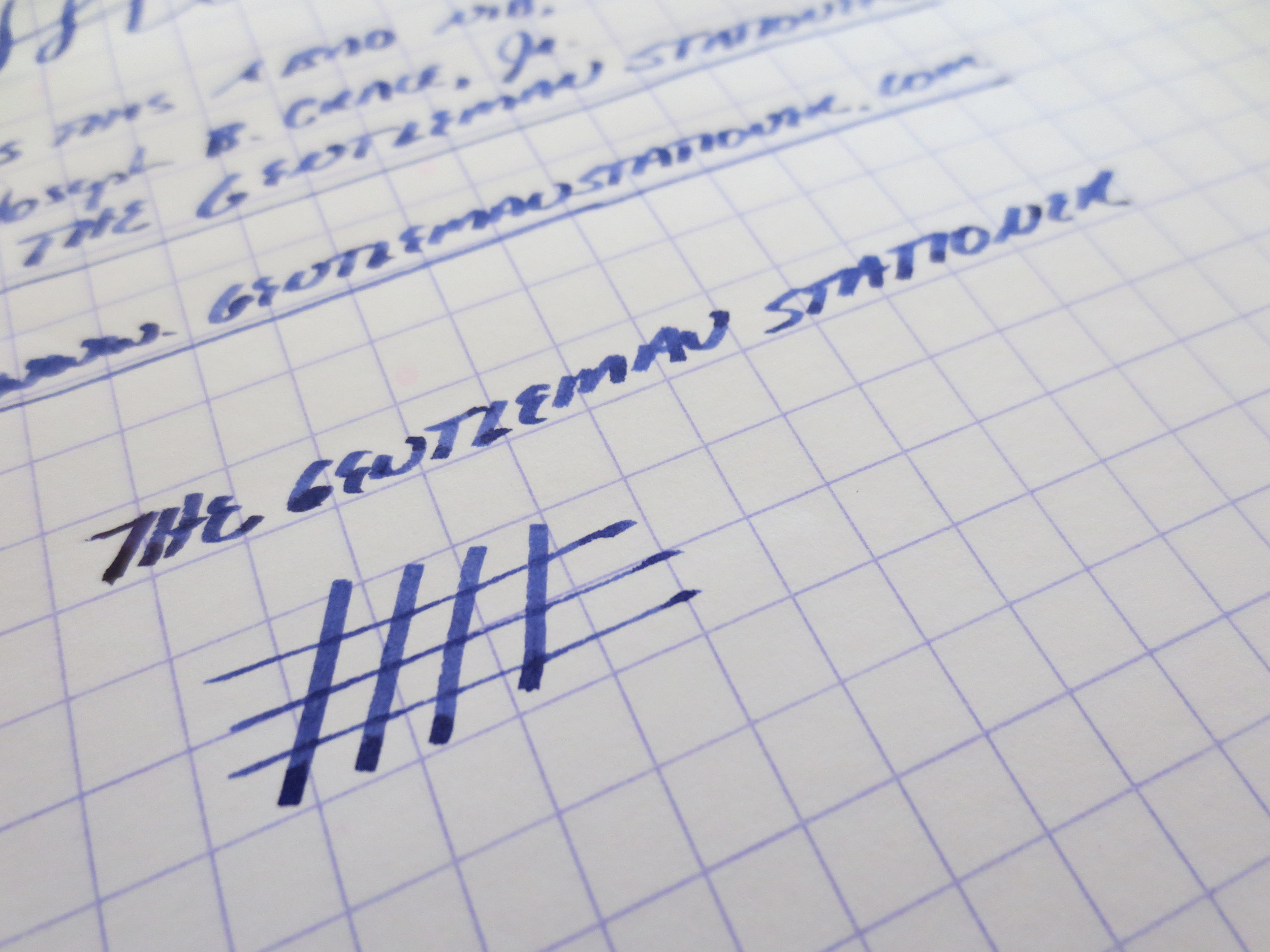
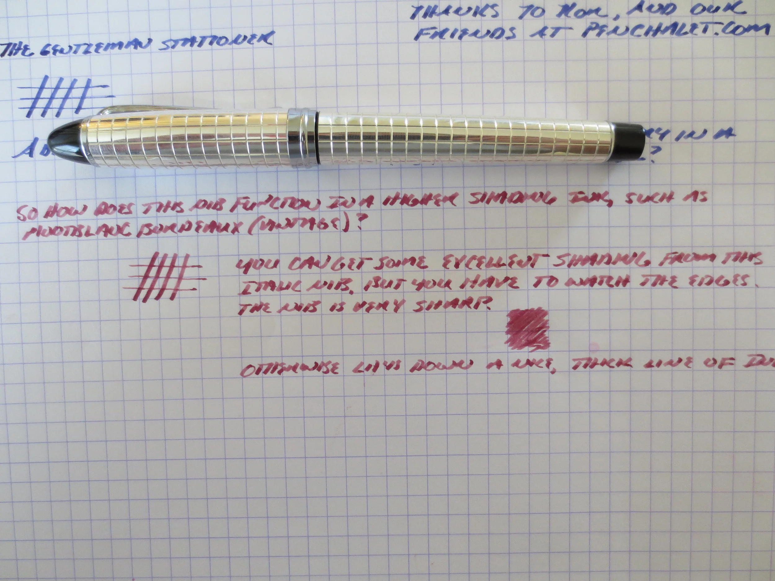
After writing with the Aurora blue for a couple of days, I switched things up and loaded the pen with Montblanc Bordeaux (the late-1990s version). I also did some side-by-side writing samples with two custom stubs I have on a MB 146 and a Lamy 2000. Note the shading in the italic nib, while the stubs write a wetter line and have slightly less line variation.


The Verdict. I absolutely love this pen and am thrilled to finally add an Aurora to my collection. I'm also pleased with the Italic nib, something that I've hesitated to buy in the past. This pen may make me less reluctant to try stock italics in the future. Buyer beware: I cannot emphasize enough that an italic nib is NOT the same thing as a stub nib. Stubs are meant to create subtle line variation without sacrificing the ability to write relatively quickly and fluidly. For the most part, italic nibs require you to slow down and pay attention to your handwriting.
Like I said, I purchased this pen from Pen Chalet. This pen, while not cheap, is priced very well for a sterling silver pen, and Pen Chalet's prices are as good as any, especially when you use one of the various discounts floating around and take advantage of their free shipping on orders over $50. The pen came to me in pristine condition and shipped fairly quickly. Ron carries a pretty wide variety of Auroras, including some of their entry-level models. Note that some Auroras can take up to a week or so to ship; most retailers do not always have the full line of models/nibs in stock so they may have to order it from the distributor.