• Blog
  • Shop
  • Resources
  • FAQ (Ask TGS)
  • About
  • Archive
  • Contact
  • Sign In My Account
Menu

The Gentleman Stationer

Vintage Living in the Modern World.
  • Blog
  • Shop
  • Resources
  • FAQ (Ask TGS)
  • About
  • Archive
  • Contact
  • Sign In My Account

Pen Review: Sailor 1911 Black Luster

May 10, 2017

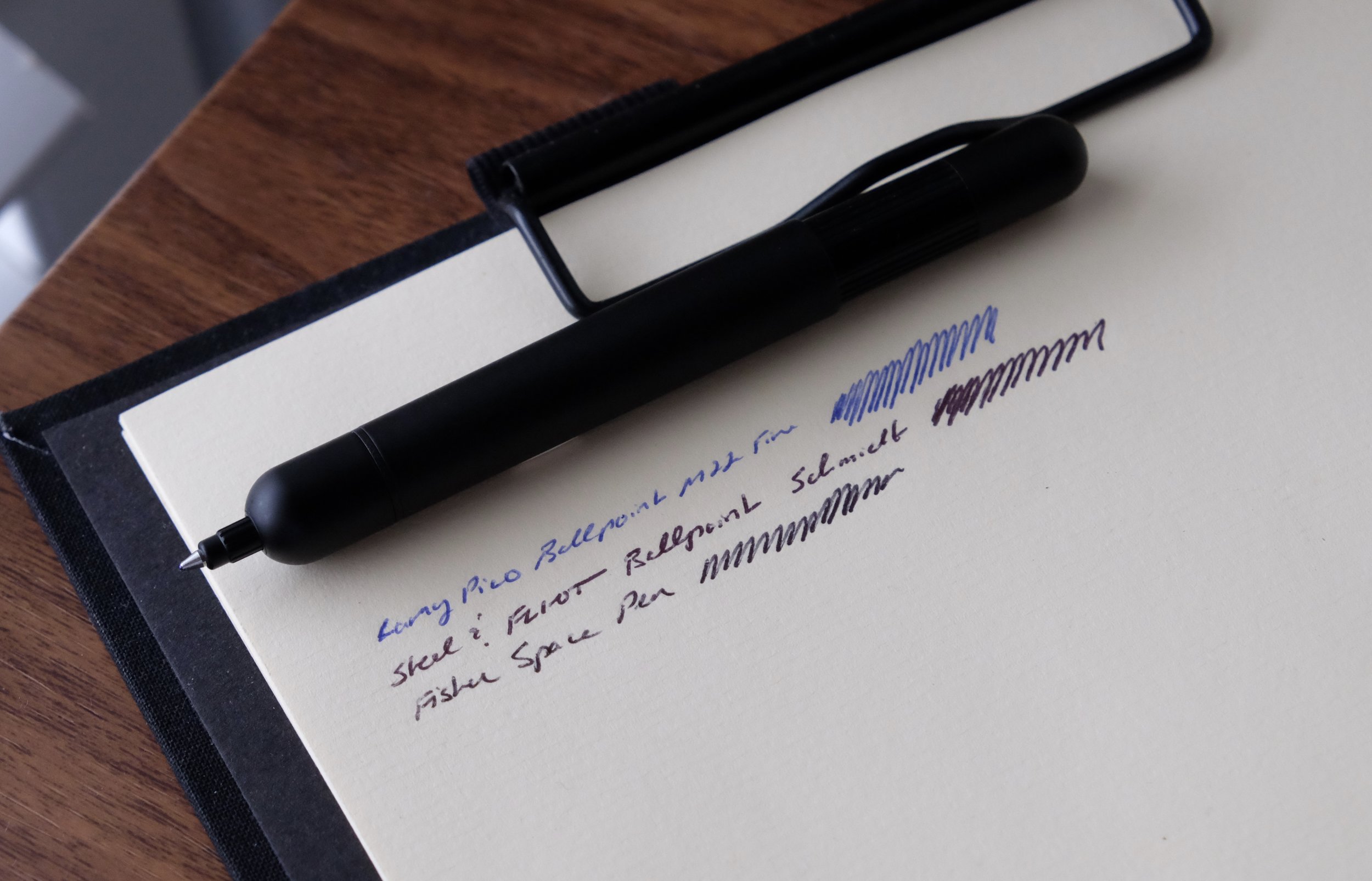
This was a very hard review for me to write, and it's been in the works for quite some time. Not because I don't like the pen: to the contrary, the Sailor 1911 Black Luster is one of my favorite writers, alongside the Sailor Pro Gear Imperial Black. But while I enjoy the build quality, the "blacked out" color scheme, and the excellent all-around writing experience that this pen offers, I do believe that it's priced too high, at least in the U.S. market.

Design and Build Quality

The Sailor 1911 Black Luster compared to a Montblanc 146.

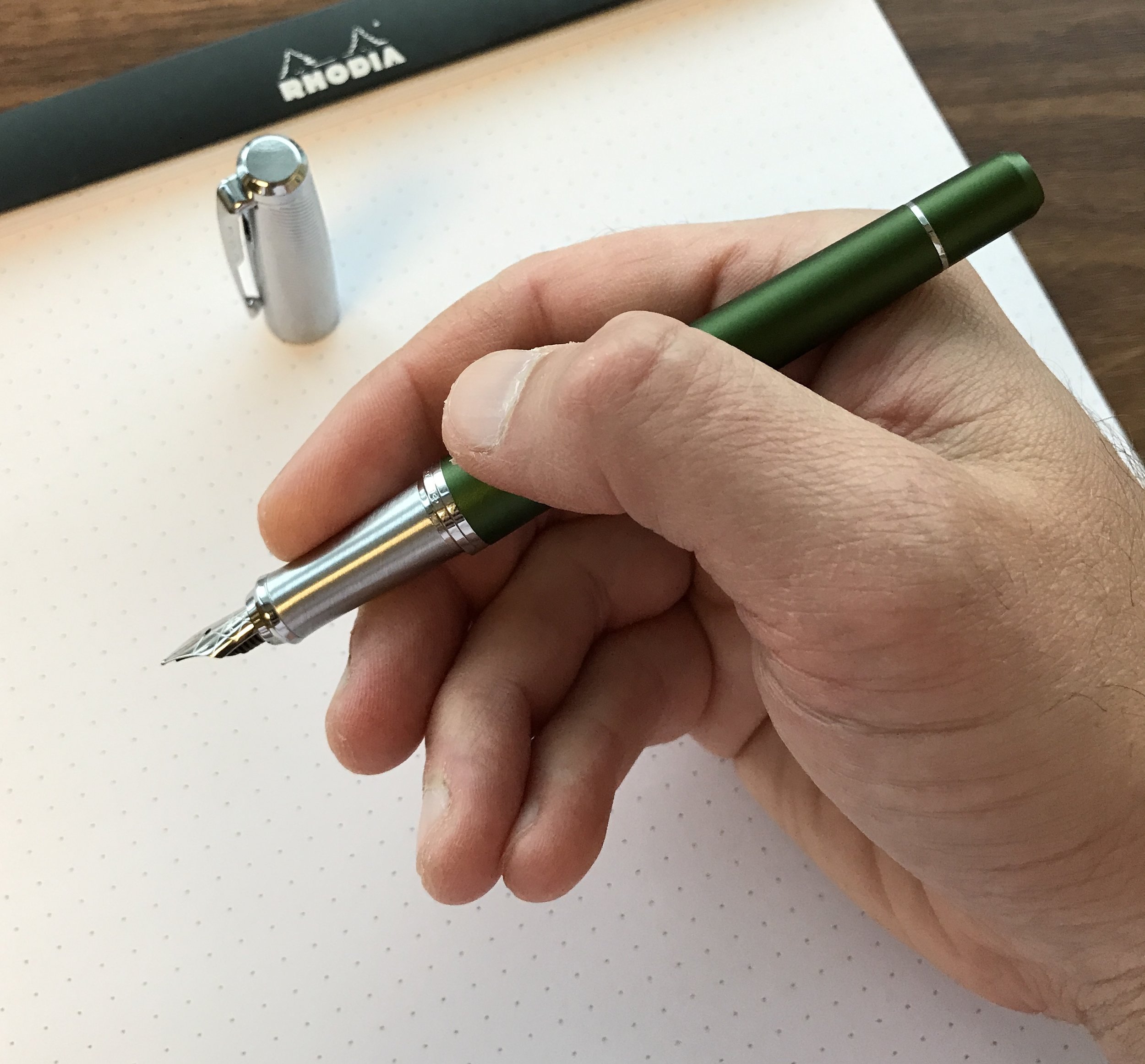
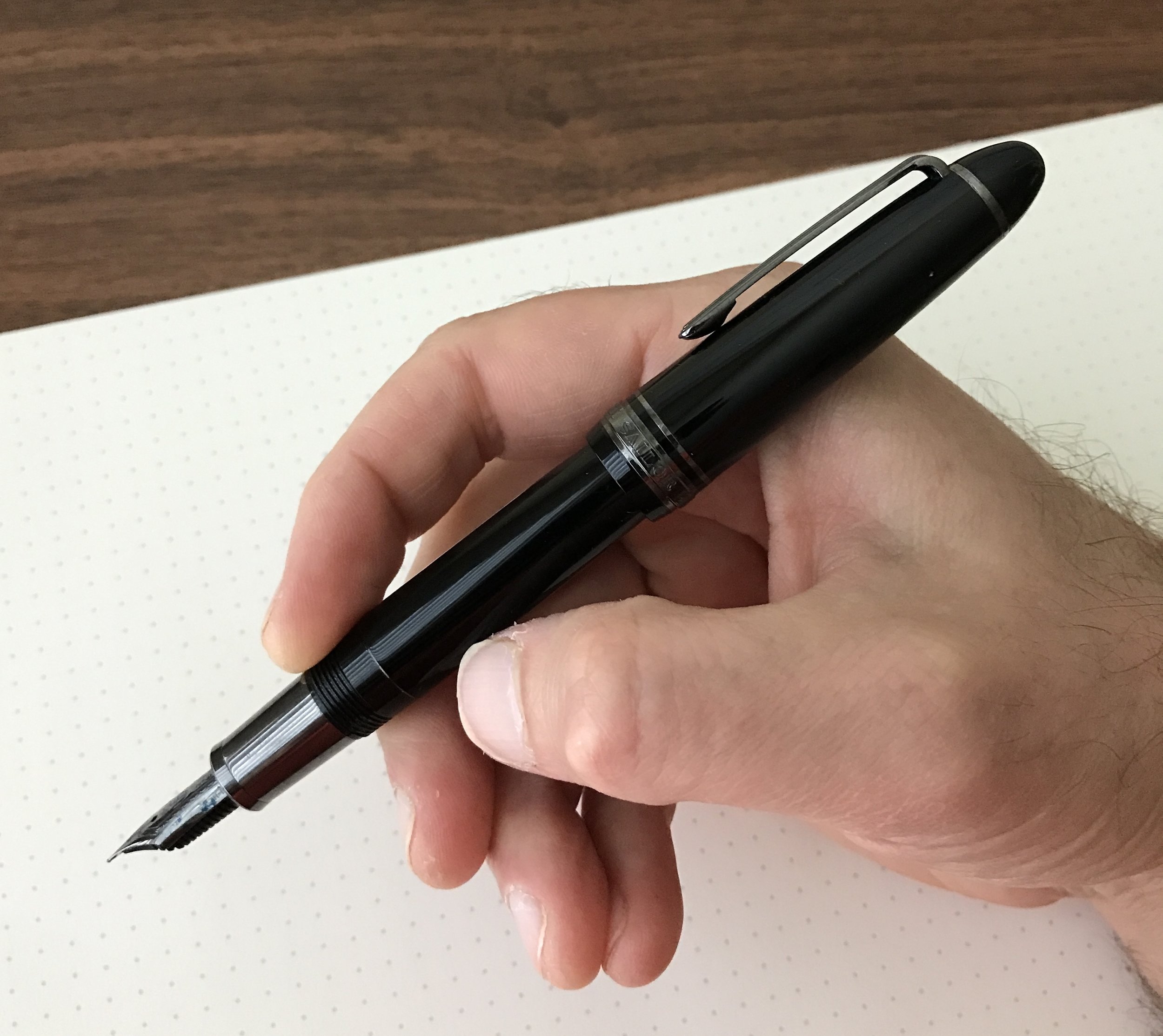
I've reviewed the regular Sailor 1911 Large before, and as I observed in my previous review, to the untrained eye this pen would be a dead-ringer for a Montblanc 146 (without the Snowcap and piston-filler, of course). The 1911 Black Luster, however, does have some significant differences, featuring black ion-plated trim on the clip, cap band, and barrel. It also has a metal ion-plated section, which gives the pen a totally different feel in-hand. It's front-weighted, which when paired with the somewhat softer ion-plated nib (discussed further below), makes for a comfortable writing experience without throwing off the balance. Ordinarily I'm not the biggest fan of pens with metal sections, but something about this one is different. Perhaps the ion plating gives it a slightly "grippier" texture? For whatever reason, I haven't had any issues with the section slipping out of my fingers.

View fullsize Sailor 1911 Black Luster Unposted
View fullsize Sailor 1911 Black Luster Posted
View fullsize Sailor 1911 Black Luster Trim
View fullsize Sailor 1911 Black Luster Closed

Nib and Writing Experience

Like most Sailor nibs, this Hard Fine (or H-F) was an exceptional writer straight out of the box, and wrote a very fine, yet still wet, line. The 21k ion-plated nibs on the Pro Gear Imperial Black and the Black Luster are somewhat "springier" than the standard Sailor nib. They're not flexible, or even close to semi-flex, but they have a bit more cushion and write a slightly wetter line than the hard-as-a-nail H-F or H-M non-plated nibs. 

The scrollwork on the Sailor nibs looks especially nice on the black ion-plating.

On a cautionary note: since these blacked out 21k nibs are softer, they are VERY easy to bend and/or spring. I've had to send a couple of them off to be adjusted/straightened due to minor drops that probably wouldn't have affected a 14k (and certainly not a stainless) nib.

Takeaways and Where to Buy

The Sailor 1911 Black Luster is one of those pens that falls victim to Sailor's strange pricing differences between the U.S. and Japan. While Sailor always prices their "blacked out" pens higher than their other models, here the U.S. "street price" of a 1911 Black Luster is $392, compared to $248 for the regular 1911 Large. To make things even more difficult for U.S. retailers, Japanese sellers typically have the Black Luster listed anywhere from $200-260 on eBay, while there's not nearly as large of an "eBay discount" on the regular 1911.

Note: I'm not going to link to any specific eBay sellers here, because I haven't put any serious effort into vetting specific individual sellers and any eBay purchase should be made only if one is well-aware of the risks (i.e. potential fakes, long shipping times, bait-and-switch, etc.).

I love this pen, but at the nearly $400 price point, I would say that you'd have to want this pen pretty badly to pay Sailor's current asking price. While the ion-plated nib and section obviously adds some cost to the pen, the total price strikes me as a bit steep. That said, I much prefer the balance and the nib of the 1911 Black Luster over the Montblanc Meisterstuck Ultra Black, and the pricing on the Black Luster compares favorably to the Montblanc. If you're considering spending $650+ on the blacked-out Montblanc, I'd consider the Black Luster as an alternative.     

Disclaimer: I purchased the pen featured in this review with my own funds, for my own collection. This post contains affiliate links. Any discussion of pricing and availability is current as of the time of publication of this review. 

In Pens Tags Sailor 1911, Sailor
2 Comments

Pen Review: Cleo Skribent Classic and Colour

May 4, 2017

After years of pen blogging, It’s becoming increasingly difficult to find brands that I haven’t tried. Sure, new brands come out occasionally, but it’s rare that I come across an established pen manufacturer with which I have little to no familiarity. When I visited New Orleans last month, I made sure to stop in at Papier Plume in the French Quarter, one of the few retailers of Cleo Skribent writing instruments in the United States. I ended up purchasing two pens: the Classic Palladium (piston filler version) and the Cleo Skribent Colour edition in burgundy.    

Both the Classic Palladium (right) and the Colour (left) have the Cleo Skribent logo set into the cap finial.

About the Brand

Cleo Skribent is based in Bad Wilsnack, Germany, in the Prignitz region. Because the brand developed and emerged in East Germany prior to German reunification, Cleo writing instruments are less well-known in the United States and Western Europe, but have a storied reputation for quality in Eastern and Central Europe.

The Cleo Skribent branding on the Classic Palladium is tasteful and understated.

The Company now, of course, sells worldwide, and bills itself as “one of only a few companies to truly produce completely in Germany.” While they operate their own factory, it is unclear whether or not the Company manufactures all of its parts in house, or source components such as nibs from other German manufacturers like Bock and JoWo. 

Build

The Cleo Skribent Classic model has a nice ink window, and holds a good amount of ink. 

These pens are both solidly built. Let’s start with the Cleo Skribent Classic with Palladium trim. I chose this pen in white, with the piston filler and large clear ink window. The piston mechanism is accessed via a vintage-style removable blind cap. Cleo Skribent also makes a cartridge/converter model of the Classic, without the ink window and blind cap. One of the more remarkable things about this pen is the weight: even with a piston, the pen is feather-light. Hand fatigue will not be an issue, even if you're someone who needs your fountain pen to churn out pages of notes or schoolwork on a daily basis. The Classic could be your workhorse.

You don't see this much anymore in modern pens: a piston-knob concealed by a blind cap. 

Made from brushed aluminum, the Cleo Skribent Colour is heftier than the Classic, though still light enough to be comfortable for long periods of writing. The clip and the section are both accented in burgundy, are very "grippy" for a metal pen, and the hand-enameled nib lends the pen a unique look. The friction-fit cap closes securely and, important for me, posts deeply - this pen is a better length posted than the Classic, though the Classic’s light weight more than offsets any awkwardness. The Colour uses a cartridge-converter filling system.    

View fullsize Cleo Skribent Colour Unposted
View fullsize Cleo Skribent Colour Posted
View fullsize Cleo Skribent Classic Unposted
View fullsize Cleo Skribent Classic Posted

Nibs/Writing Experience

I was going to purchase just a Classic, but the hand-enameling sold me on picking up a Colour edition as well. 

I’ve written in the past about how good steel nibs can be, and some of the German brands such as Cleo Skribent, Otto Hutt, Diplomat, Pelikan and Faber-Castell excel at both smoothness and reliability, even where the pen companies don’t manufacture the nibs themselves. The nibs on both of these pens are exceptionally smooth writers, with no scratchiness or flow issues that you sometimes see with stainless steel. I opted for a medium nib on the Classic and a Broad nib on the Colour, and while I'm happy with both, I found, somewhat to my surprise, that the two nibs wrote on the narrow side of their designations: the medium writes more like a western fine, and the broad writes more like a traditional medium. 

The writing sample for the medium nib was done with Papier Plume Midnight Blue Ink, and the broad nib shows off Papier Plume's limited edition "Streetcar Green".  (All of their limited editions are New Orleans-themed.)

While I found the nibs on these Cleo Skribent pens exceptional, my personal preference would be to have slightly less length and a bit more girth on the barrels. In other words, these pens are long and thin, and don't give those with larger hands much to grip. Again, that’s entirely a personal preference, and I must note that I could still use both pens comfortably for long periods of time. 

Takeaways and Where to Buy

As I mentioned, I purchased both of these pens at Papier Plume in New Orleans, Louisiana. Papier Plume carries a wide variety of Cleo Skribent pens at various price points. Both pens sell for $110 as featured in this review. The Classic is available in a variety of other color and trim options, and the cartridge-converter model comes in slightly less expensive at $99. The Colour Series fountain pen is also available with aqua blue accents, in addition to the burgundy model. 

At $110, I think these pens are a solid value. As others have done, I'd compare Cleo Skribent pens favorably to the Pelikan M200/M205 series, and Cleo Skribent sells at a lower price point. Whether or not you prefer Cleo or Pelikan nibs would be up to you. I would peg these pens as, overall, definitely better writers than something like a TWSBI. Overall, I'm impressed, and I'm excited to try one of Cleo Skribent's higher-end offerings at some point in the future. 

Disclaimer: I purchased these pens with my own funds, for my own collection, and was not compensated for writing this review. This post does contain affiliate links.  

In Pens Tags Cleo Skribent, Pen Review
1 Comment

Pen Review: The Lamy Pico Pocket Ballpoint

April 29, 2017

A good ballpoint pen has been my pocket carry pen of choice for a while now, including various versions of the Fisher Space Pen, the Steel and Flint Pen, the Pokka Pen, and, of course, my Lamy 2000 ballpoint and multifunction 5-Color Ballpoint. I recently added yet another to my arsenal, the Lamy Pico.

In my opinion, Lamy makes some of the best ballpoint pens on the market. I used to think their refills were too light and "skippy," but in the past couple years they must have changed the formula because the last two refills that I've purchased have been excellent. I also enjoy Lamy's pens because their designs are nothing short of iconic, and you can pretty much guarantee that the pen you buy isn't going to look much like anything else on the market. The Pico is no exception. 

Per Lamy's website, the Pico was designed to be approximately the size of a tube of lipstick or a cigarette lighter, and slip easily into your pocket or bag.

The Pico's key attribute is its ability to expand from a fairly tiny "capsule" that you can conceal in the palm of your hand into a full-size ballpoint. When you depress the "nock" at the back, it not only extends the tip, but the barrel as well. Since the Pico expands to 12cm / 4.7in, it basically becomes a full-size pen that's extremely comfortable to write with, even for longer sessions. As a point of reference, it's just ever-so-slightly shorter than the Steel and Flint Pen and the Fisher Space Shuttle Pen.

The silver Lamy logo is slightly raised, functioning as a roll-stop. Since the Pico is otherwise perfectly round, it would roll off the desk without some assistance.

I picked up the Pico on a whim, and had my doubts that this pen would be good for anything more than writing few lines here and there due to the size. This pen has surprised me with how practical it is. Lamy's promotional materials mention that it's designed with the traveler in mind, the goal being to create a pen that, when closed, was no larger than a tube of lipstick or a cigarette lighter, but that expands to a full size pen when you need it, such as when you're working on a train or airplane.  

A shot of the Lamy Pico extended into "writing mode." The pen is light and very comfortable.

And while the title of "best ballpoint refill" will probably always go to the Schmidt Easyflow 9000, the Lamy M22 compact refill isn't bad at all. Here's a comparison writing sample of the Lamy Pico against a few other comparable pocket ballpoints. 

A ballpoint pen writing sample comparison. The Schmidt wins on overall darkness and smoothness, but Lamy's refill works just fine.

A ballpoint pen writing sample comparison. The Schmidt wins on overall darkness and smoothness, but Lamy's refill works just fine.

Takeaway and Where to Buy

You can find the Lamy Pico at most Lamy retailers, which as of April 2023 includes the T.G.S. Curated Shop! The pen comes in a wide array of colors, from the somewhat staid (dark blue and matte black) to the crazy (bright orange and eye-searing hot pink). Today’s standard pricing on the Pico is around $40.

Warning: Because of how compact this pen is, it's extremely easy to forget that it's in your pocket, and my Pico has already taken its first trip through the washing machine. While the pen contained any ink seepage and no clothes were ruined, it was a bit of a mess to clean and I had to replace the refill. The Lamy M22 refills can be somewhat pricey, though they do last a long time assuming they don't take a bath. 

In Pens Tags Lamy, Lamy Pico, Pocket Pens, Ballpoint
2 Comments

Pen Review: The New Parker Urban Fountain Pen

April 19, 2017

The Parker Pen Company is a conundrum. Once a venerable U.S.-based manufacturer, the past ten-plus years have not been kind, to put it charitably. While Parker's higher-end pens such as the Sonnet and Duofold have done ok, and certainly have their fans, the company's entry and mid-level offerings have been subpar. I'm specifically talking about the Parker Urban and the Parker Vector, which you may have seen in - or even purchased from - the "luxury writing instrument" section of your local big box store such as Staples or Office Depot. 

A few years ago I purchased one of the "Urban Premium" fountain pens in the special edition "Mandarin Yellow" color, which bore absolutely no resemblance to the iconic "Mandarin Yellow" Parker Duofold: it was a cheap looking gold. The nib was mediocre at best, and suffered from skipping and ink starvation. I managed to turn it into a serviceable writer with some extensive tinkering (and using extremely wet inks), but it was never going to make it into my rotation so I sold it off at a steep discount to what I paid. Lesson learned, right? 

Well, maybe. In late 2016, Parker announced a complete redesign of it's entire pen lineup. The design of its higher-end pens (i.e., the Duofold, the Premiere, and the Sonnet) didn't change much, though Parker tweaked the engravings on the nibs. The lower-end pens (the Urban and the Vector) saw the most drastic changes, and, supposedly, the greatest improvements in quality control. Massdrop sent me one of the new "Urban Premiums," so I decided to put it through the paces and see whether the "new Parker" was for real, or just more of the same.

Note: The U.S. Parker website still shows the old pen designs, while the U.K. website shows the new collections. More on this below, but I hope to see the new pens coming to U.S. retailers soon.   

The new redesigned nib on the Parker Urban. Parker chose to ditch the tubular-style nib and go with something closer to the Sonnet. I like it, and it writes much better than the old pens. 

Pros and Cons

Short answer: I like the new Parker Urban much better than the old one.  This is a good fountain pen, but the current price point is going to hurt its market share.  I'll break it down further.

What I like: 

  • New Nib. Parker has abandoned the tubular-style nib on the old Urban for what looks like a standard No. 4 or No. 5. The nib on my Urban Premium has a cross-hatching pattern etched into it, and writes what I would call a fine-medium line. (The nib is labeled a fine.) It's a smooth, fairly wet writer - the direct opposite of the old Urban.
  • Solid Cap. At least with respect to the Urban Premium, this isn't a flimsy pen with a thin aluminum cap that will warp and dent from the slightest knock or drop. I'm not sure what the material is (probably still aluminum) but it's got a nice weight to it and feels substantial. The cap posts easily, and is friction fit with very little wiggle.  The clip is tight.  
  • Overall Redesign. Parker ditched the "hourglass" shape of the old pen in favor of a tapered design that sits very comfortably in your hand, posted or unposted.

What I don't like: 

  • The Price Point. This is a good pen, but not a good value.  I've seen the Urban priced at anywhere from $40-50 for the standard pen, to $60-100 for the "Urban Premium" featured here. (The Urban Premium features the chrome cap and section.) The Parker Urban is not a $60+ pen, period, just like the Parker Sonnet is not a $300 pen. It could, however, be a very good to great sub-$50 fountain pen.  I'm curious to see what the street price will be once these pens become more widely available, OR whether the high MSRP combined with Parker's history of QC issues on their cheaper pens will scare retailers away from stocking them in the first place. 
  • No Converter. If you're pricing a pen in the $60-80 range, include a damned converter, especially if the cartridge you're including with the pen is only going to be 1/3 full of ink.
  • Slippery Section. While the brushed metal section has some texture to it, it's still pretty slick. The step between the body and the grip is also sharp, which may cause problems for some people depending on how they grip the pen.   

No converter and an empty cartridge - this thing was literally empty after a page of writing, if that.

View fullsize Parker Arrow Clip
View fullsize Posted in-hand
View fullsize Textured Metal Cap
View fullsize Unposted in-hand

Takeaways and Where to Buy

Given that I went into this review prepared to dislike this pen, you could fairly say that I've been blown away by how well it writes, especially given my past experiences with the Parker Urban. The current price point is way too high, in my opinion, but pricing can change, and if that's the cost of improving Parker's quality, it's probably better for them to have an overpriced $60-80 fountain pen that writes well and functions as intended than to sell a $40-50 piece of junk that makes people write off your brand (or worse, never want to pick up a fountain pen again). The new Urban has placed Parker back on my radar and has me thinking of moving outside my Sonnet comfort zone. (That new "Big Red" vintage-inspired Duofold is calling my name....)  

The textured cap and a brushed metal section lend the new Parker Urban Premiere a classy look. I just wish the price point were slightly lower. 

So far, Parker's new lineup appears to be regularly available only from non-U.S. retailers and Amazon, with U.S. retailers still stocking the old product line. Even Parker's U.S. online store shows only the old offerings. I assume they're trying to sell off old stock before introducing the updated lineup, but I'm still surprised that it's taken this long. For now, taking into account shipping costs on a pen at this price point, Amazon is probably your best bet, and certain colors are less expensive than others.   

Further Reading

The Parker Sonnet is still my favorite pen in Parker's current lineup, and I've done a couple reviews of different models. Here are some links to my reviews of the "Great Expectations" edition, as well as the Chiseled Sterling Silver version. 

Disclaimer: I was sent the pen featured in this review free of charge by Massdrop, which is not currently running a drop for the Urban. This post contains affiliate links. Any discussion of price and availability is current as of the time of publication of this review, and subject to change. 

In Pens Tags Parker Urban, Parker, Pen Review
1 Comment

Pen Review: Sailor Pro Gear Realo "Soleil" Limited Edition

April 12, 2017

The Sailor Professional Gear - known to most pen nerds as simply the "Pro Gear" - is my favorite fountain pen of all time. I appreciate it's compact form factor, comfortable shape, and excellent 21k nibs. As of the time of writing, I own four Sailor Pro Gears, and I usually keep two inked. My collection includes the Pro Gear Imperial Black Edition, the Pro Gear "Sky" Limited Edition, a Pro Gear Classic in yellow, and the pen I'm reviewing here, the Pro Gear Realo "Soleil," a limited edition pen that Sailor made specially for retailer Bungubox (or Bung Box) in Hamamatsu, Japan.

Comments on the Soleil

Yellow pens are one of "my things," and this is an especially bright, sunny shade (hence the name). The color stops just short of Lamy Safari/AL-Star neon - which is a good thing - and the yellow gold trim complements the material nicely. I could do without the "Soleil" engraving on the barrel, but this is such a unique piece I don't really mind. 

This special edition Pro Gear Realo has "Soleil" engraved on the barrel. 

This particular pen sports a H-F, or "Hard Fine," nib. If you prefer stiff, slightly dry writers, then the Sailor HF will probably work for you right out of the box. I tend to prefer pens with slightly wetter ink flow, so this one will probably take a trip to Mike Masuyama at the Atlanta Pen Show for a tuning. It's also a touch toothy for my taste and can hard start every once in a while, but nothing that keeps me from regularly cycling this pen through my rotation.

The Pro Gear Realo Soleil comes with the standard 21K Sailor Gold Nib, with the typical Sailor "1911" engravings.   

Side Note: In general, I've noticed that the rhodium plated and black coated Sailor nibs tend to write a bit smoother and, at least in the case of the black nibs on the Pro Gear Imperial Black and 1911 Black Luster editions, write a bit softer than the standard yellow gold nibs. I assume this has something to do with the fact that these nibs are plated/coated.   

I've always kept this pen loaded up with an orange ink - fitting, no? The ink featured here is the now-discontinued Sailor Jentle Apricot. For a similar color in Sailor's current ink lineup, check out Sailor Jentle Kin-Mokusei, 

Realo vs. Pro Gear Classic

So what about the bigger question: if you're looking to buy a Sailor Pro Gear, do you go for the "Classic" model or the Realo? If you prefer piston-filling fountain pens, then you really only have one choice: the Realo. The Pro Gear Classic is a cartridge-converter pen. Some people quibble with the quality of Sailor converters - and I agree they're not great - but I also hesitate to recommend that people pay nearly $100 extra just to get the piston filler on the Realo, especially given the limited range of colors in which the pen is available. 

A shot of the Pro Gear Realo Soleil Compared to my yellow Pro Gear from the Classic "Color" Series. I like both pens, but overall I prefer the shade of yellow on the Classic. Sort of like the vintage Parker Duofold Mandarin.

While the Realo is a good pen, with a quality piston and a convenient ink window, I think the Classic has a cleaner, more balanced look overall. The Realo also tapers more towards the piston knob, which makes it look "pinched," in my opinion. That said, I post my pens when I write, so I don't really notice.

Where to Buy

Sorry, but you can't buy this particular version of the Realo anymore, at least not from a retailer. Like many of Bung Box's other Limited Editions, the Soleil sold out relatively quickly and you're now limited to whatever shows up on the secondary market. I picked this one up secondhand from an eBay seller, and jumped on it the minute I saw the listing.

That said, if what you're looking for is a piston-filling version of the Pro Gear, most Sailor retailers (such as sponsor Pen Chalet) carry the standard Realo model, but the color/trim combinations are few outside of the periodic limited editions. The standard Pro Gear Realo comes in two colors: black or burgundy, both with gold trim, priced at around $330. Currently, Classic Fountain Pens (nibs.com) is offering a 22nd Anniversary Yellow and Black Limited Edition, but it's pricey at $520. I love my Pro Gears, but I'm not sure it justifies that sort of expenditure.

Further Reading

I've reviewed a few other versions of the Sailor Pro Gear. If you're interested, check out my reviews of the Pro Gear Imperial Black Edition, and the Pro Gear Sky Limited Edition.

Disclaimer: I purchased this pen with my own funds, for my own collection. This post contains affiliate links.       

In Pens Tags Sailor, Sailor Pro Gear, Bungubox, Bung Box, Sailor Pro Gear Soleil, Pen Review
Comment
← Newer Posts Older Posts →
Store Hours and Location
Visit the T.G.S. Curated SHOP
Updated "Best Pens" Guide
On the Paper Trail Podcast
TGS x Roterfaden TGS_25
Hierarchies of Fountain Pen Friendly Paper

Join Our Patreon!
Subscribe to the TGS E-mail List

Featured Posts

Featured
Cover On the Paper Trail Intro Clip.jpeg
Dec 3, 2025
Introducing "On the Paper Trail," a New Podcast/Video Collaboration with Lisa Vanness of Vanness Pens!
Dec 3, 2025
Dec 3, 2025
Iro-Utsushi-Fine-Dip-Pens.jpeg
Oct 1, 2025
The Pilot Iro-Utsushi Dip Pen (and in General, Simple vs. Fancy Dip Pens)
Oct 1, 2025
Oct 1, 2025
Levenger-Annotation-Pad.jpeg
Sep 20, 2025
Five Boutique Paper Brands I'm Watching Closely and Why
Sep 20, 2025
Sep 20, 2025
The Gentleman Stationer RSS

© Digital Divide Media, LLC, 2014-present.

All content is the exclusive property of Digital Divide Media, LLC, d/b/a The Gentleman Stationer, including “The Gentleman Stationer” website and trademark, and should not be reproduced without express written permission.  All rights reserved.

All content containing paid advertising, affiliate links, or sponsored content will be plainly disclosed by a disclaimer when/if featured.

Contact Information

Store Shipping Policy and Return Policy

Privacy Policy

Cookie Policy

Terms and Conditions

Powered by Squarespace