• Blog
  • Shop
  • Resources
  • FAQ (Ask TGS)
  • About
  • Archive
  • Contact
  • Sign In My Account
Menu

The Gentleman Stationer

Vintage Living in the Modern World.
  • Blog
  • Shop
  • Resources
  • FAQ (Ask TGS)
  • About
  • Archive
  • Contact
  • Sign In My Account

On the Low End: The Nemosine Singularity and the Monteverde Monza

January 6, 2018

“Low-End” here refers to price, not quality - well, at least that’s what I hope for. Fortunately, there’s a bounty of lower-priced pens on the market right now, including many great options that you can find for less than $20. Today I’ll take a look at two pens I recently picked up for the first time: the Nemosine Singularity and the Monteverde Monza. The Singularity has been around for a while, developing what turns out to be a well-deserved cult following, but I can’t see Monteverde getting any traction with the Monza (much less their more expensive pens like the Giant Sequoia) unless they improve the quality control on their nibs.

Nemosine Singularity: A Solid Budget Option

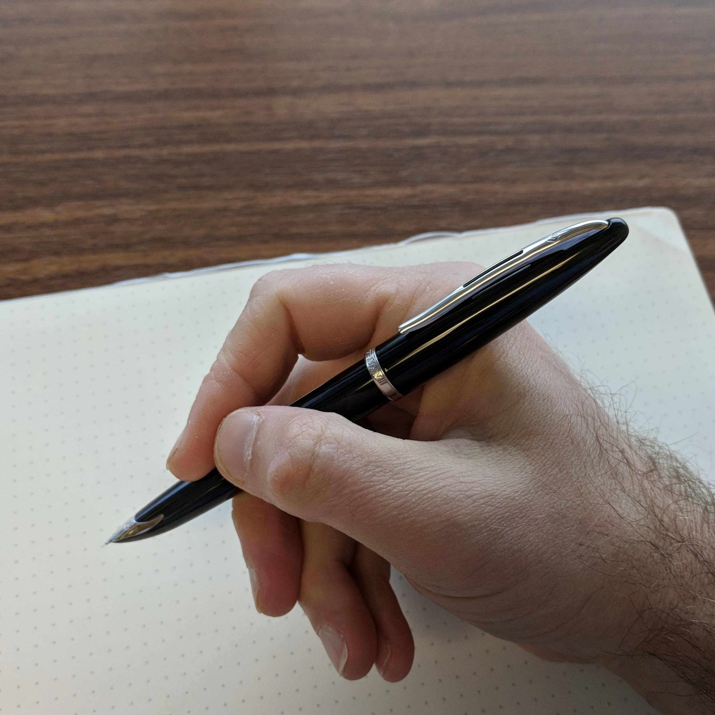
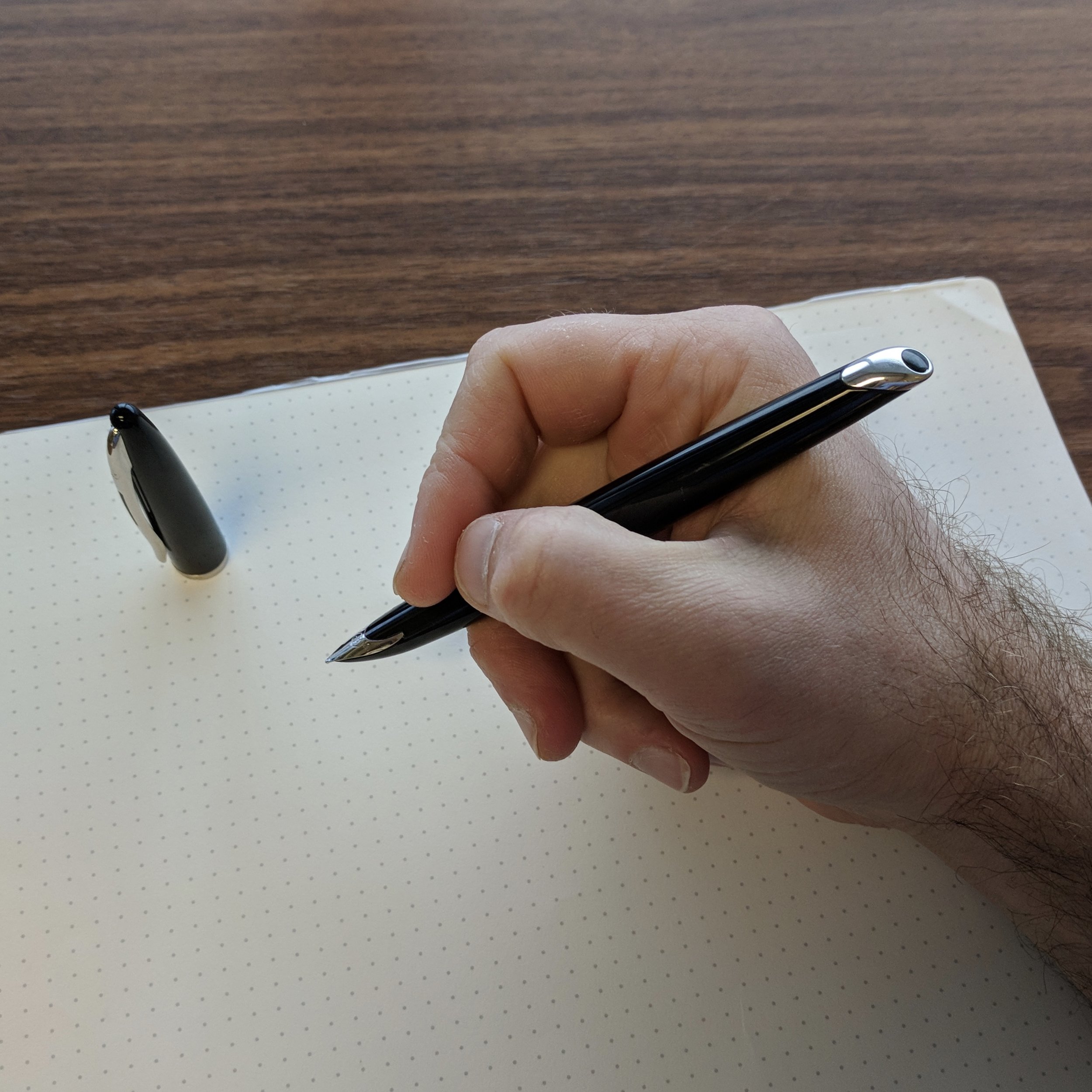
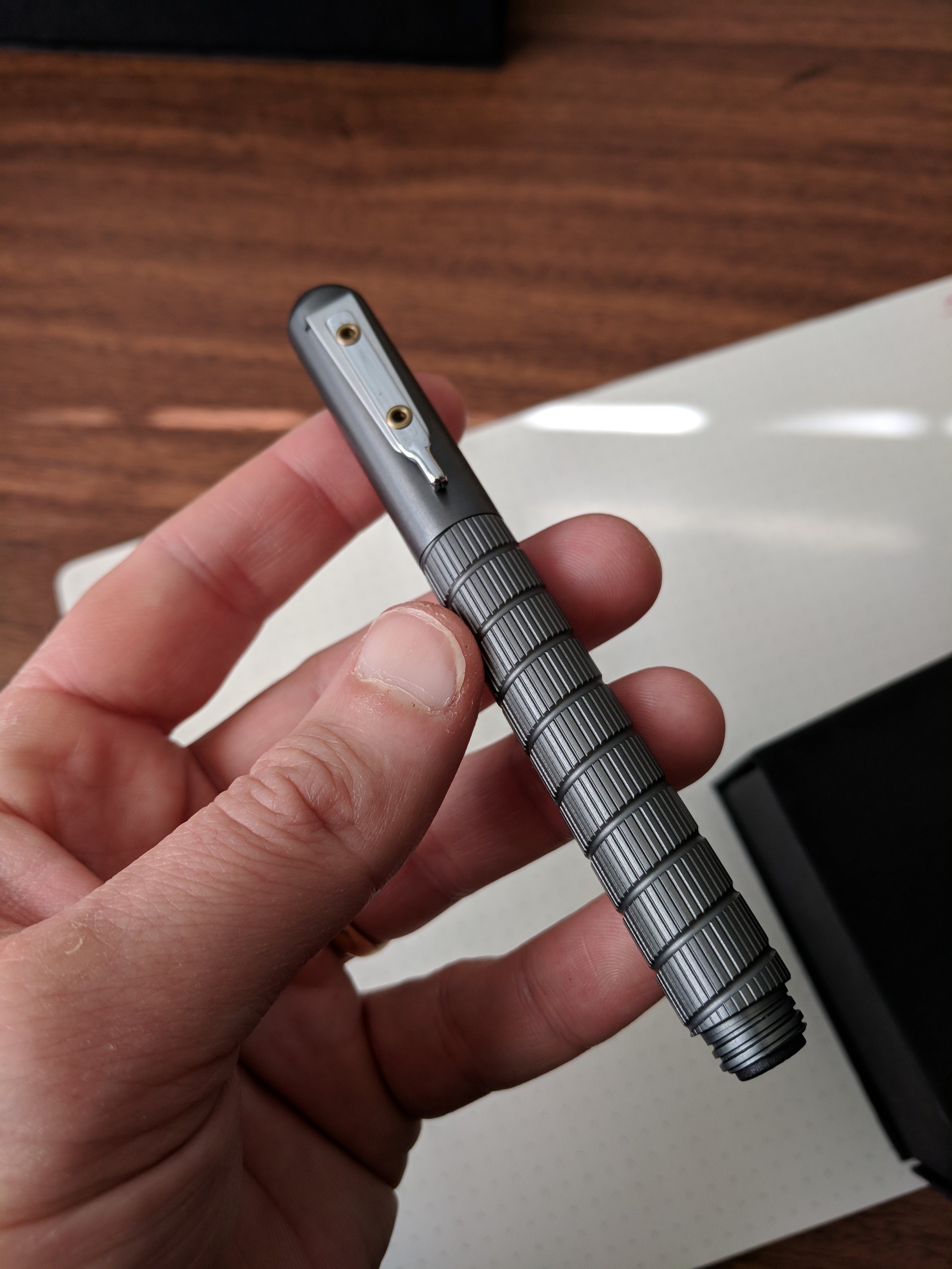
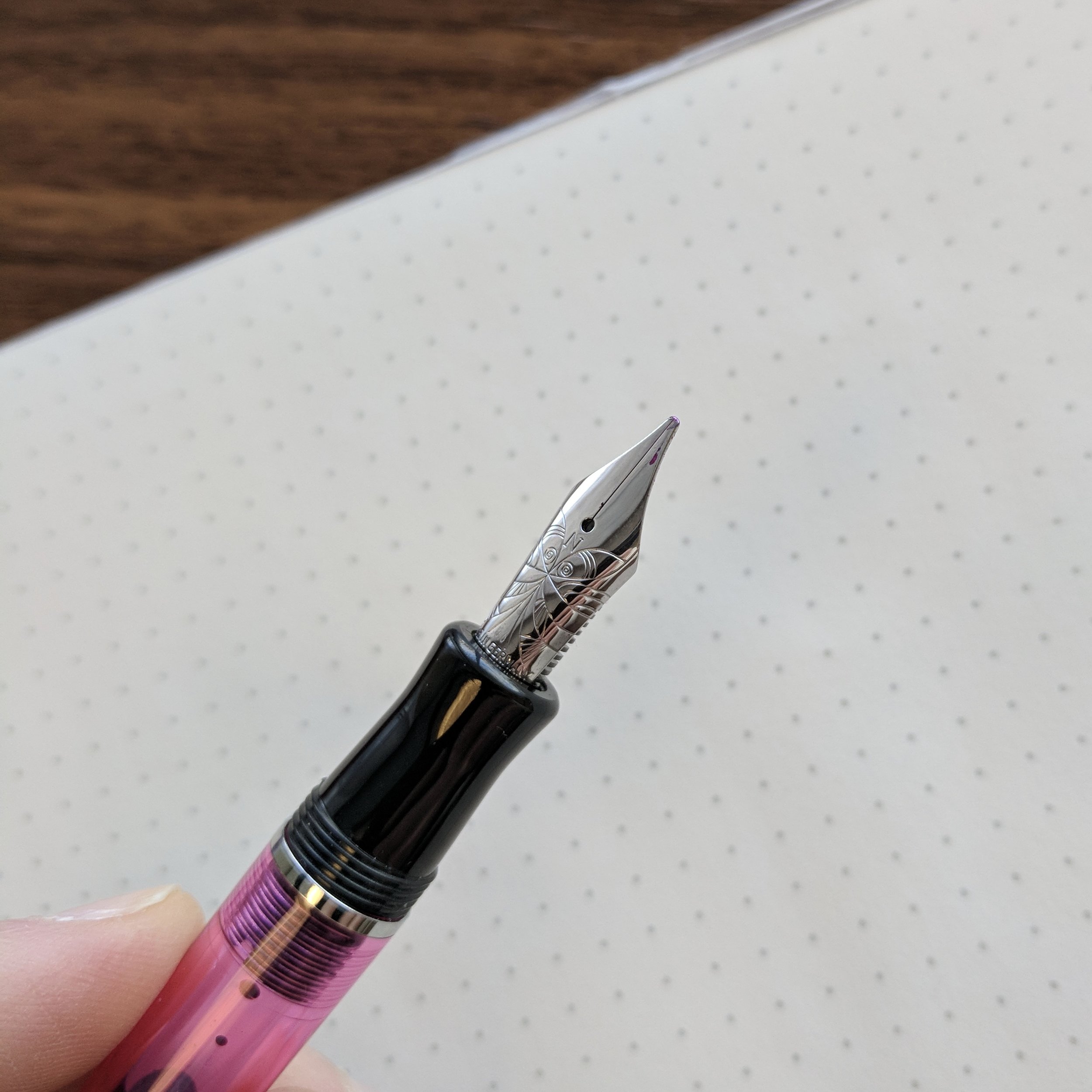
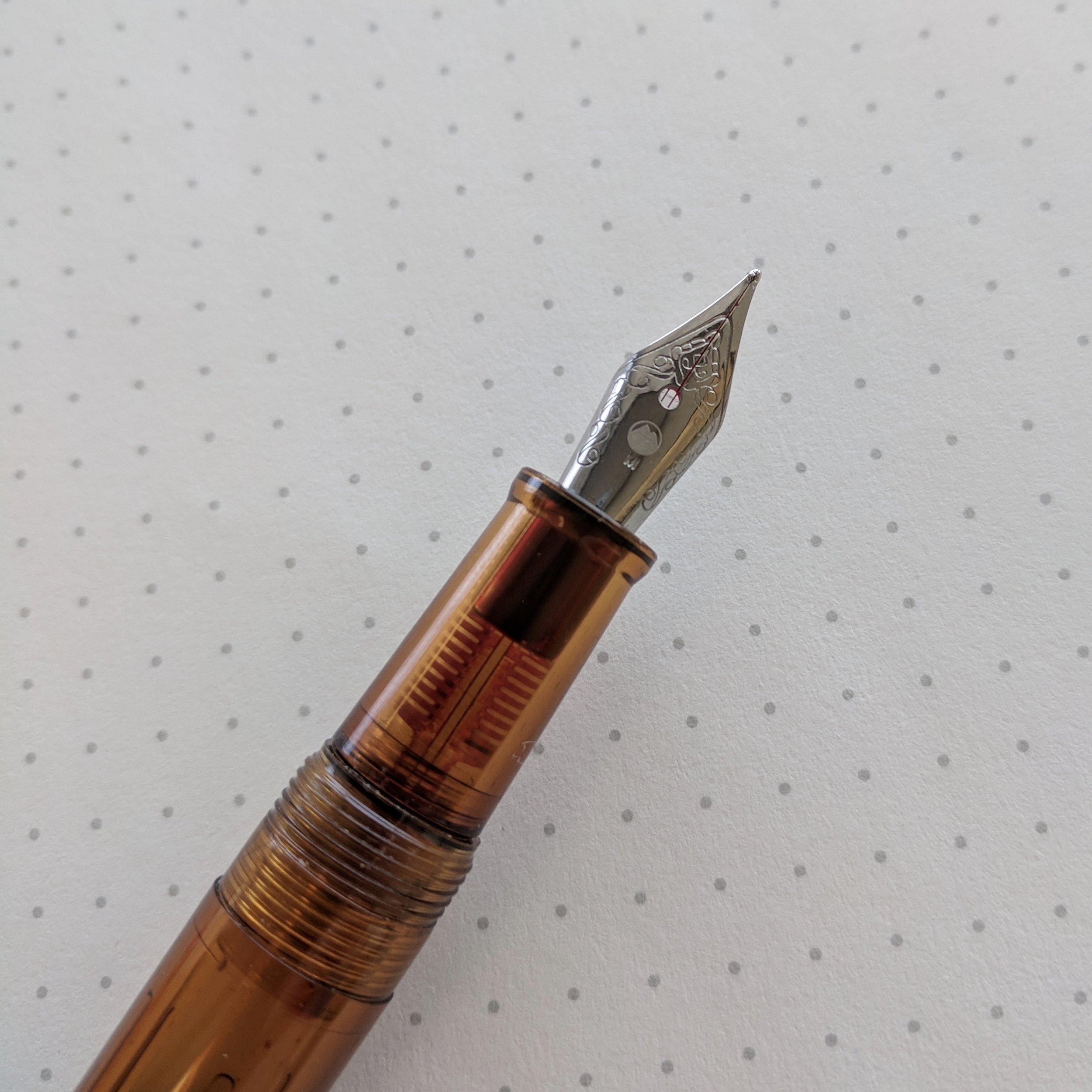
My review of the Nemosine Singularity is pretty straightforward: at the $20 or less price point, it’s a great pen. For a while now I’ve heard about Nemosine’s stub nibs: how they are narrower than you’re typical stainless steel stock stub (this one is .6mm, my sweet spot for stubs/italics), and are relatively smooth writers. All true, and the pen itself seems well-built and should hold up fairly well for a sub-$20 plastic demonstrator.

I enjoy the detailing and scrollwork on the Nemosine nib, but that's personal preference. Some might find it "busy". 

One of the Singularity’s key selling points is the wide range of available colors. I opted for the pink “Azalea” demonstrator, but the Singularity is also available in Aqua, Clear, Magenta, and Onyx. With the exception of the “Clear” and “Onyx” versions, these are brightly colored pens that manage to pull off pastel colors without seeming childish or cheap.  The plastic feels thick and relatively durable, though I wouldn’t expect a $20 pen to last forever, and you may have issues with the threads or cap cracking over time. (I’ve not experienced this or heard an inordinate number of complaints, it’s just a general observation about how less-expensive pens seem to wear. This would apply to basically any plastic pen at this price point, and even TWSBI has not been able to avoid the issue with much higher-priced products.)  

View fullsize Nemosine Singularity .6mm Stub
View fullsize Nemosine Singularity Posted
View fullsize Nemosine Singularity Unposted

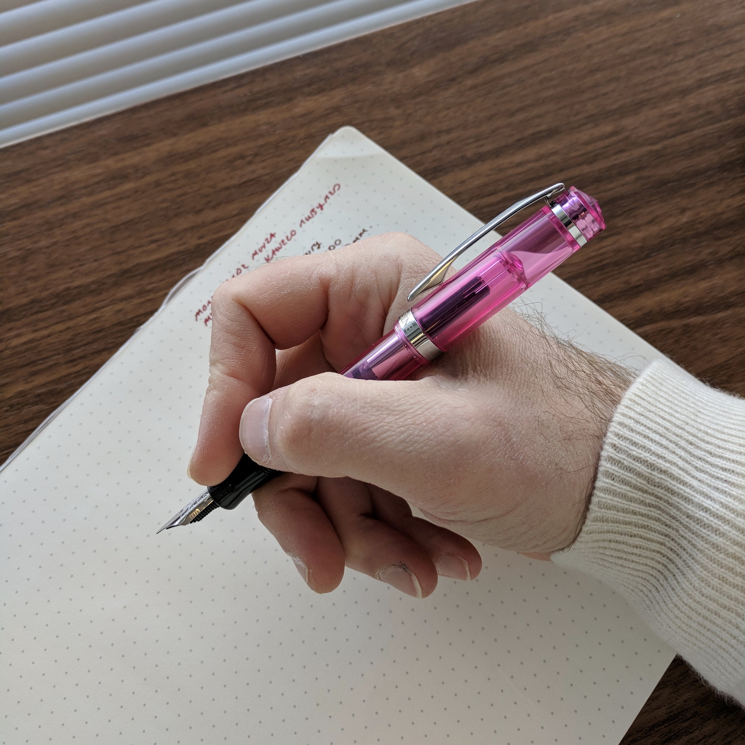
The Singularity fits nicely in my hand, posted or unposted, though the pen’s light weight lends itself more to posting.  The black plastic section is slightly concave and comfortable, though if I had one gripe I’d like to see just a touch more length to avoid rubbing up against the threads.

No issues here. The Singularity sports one of the best inexpensive stub nibs that I've used, though it's actually a .6mm, not a .9mm. I may need to revisit and supplement my article on steel stub nibs at a later date. 

If I had been deep into fountain pens as a college student, the Singularity would be up there with the Pilot Metropolitan and the Lamy Safari as a great student pen that would offer a serviceable writing experience without breaking the bank.  The Monteverde Monza, on the other hand….  

Monteverde Monza: Save Your Money  

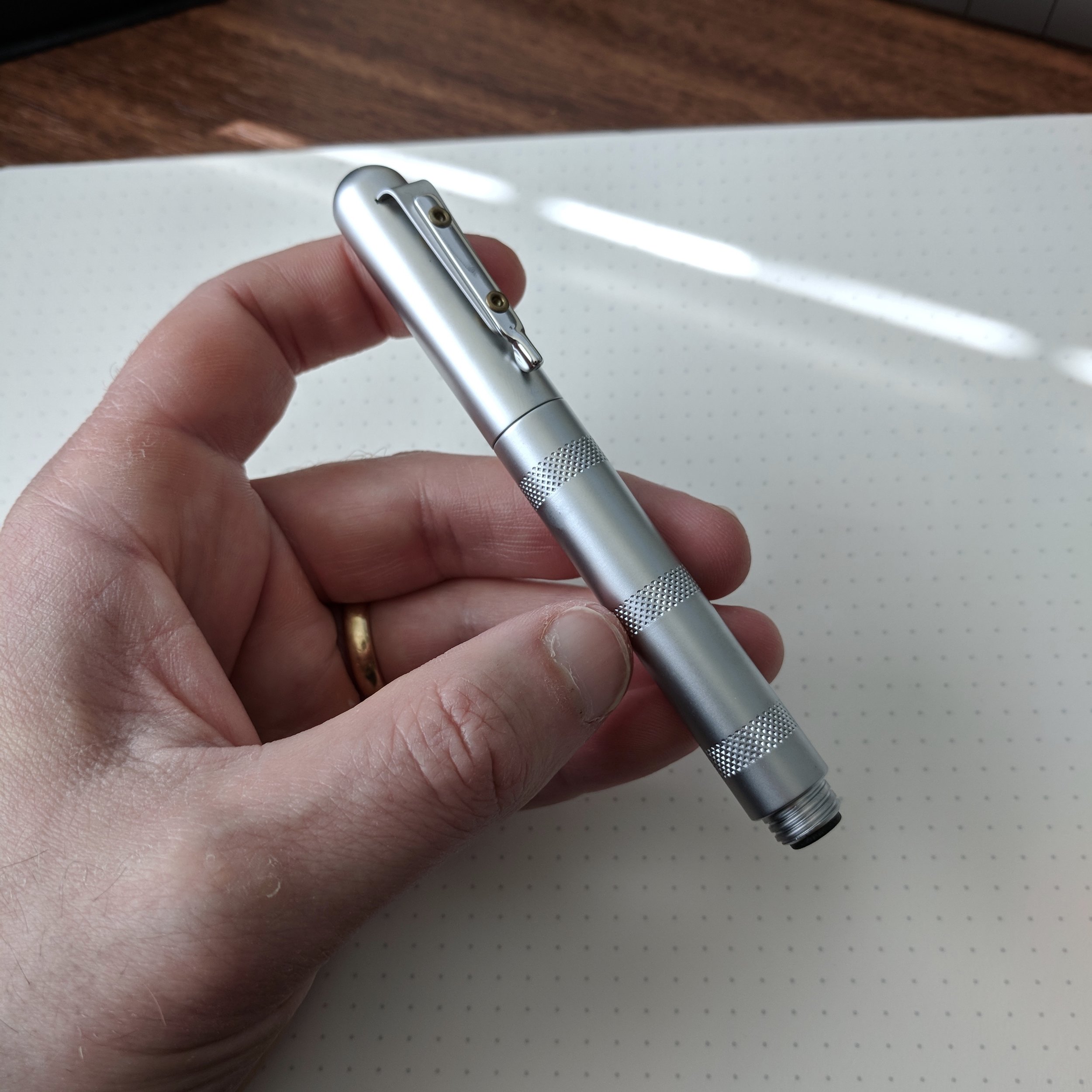
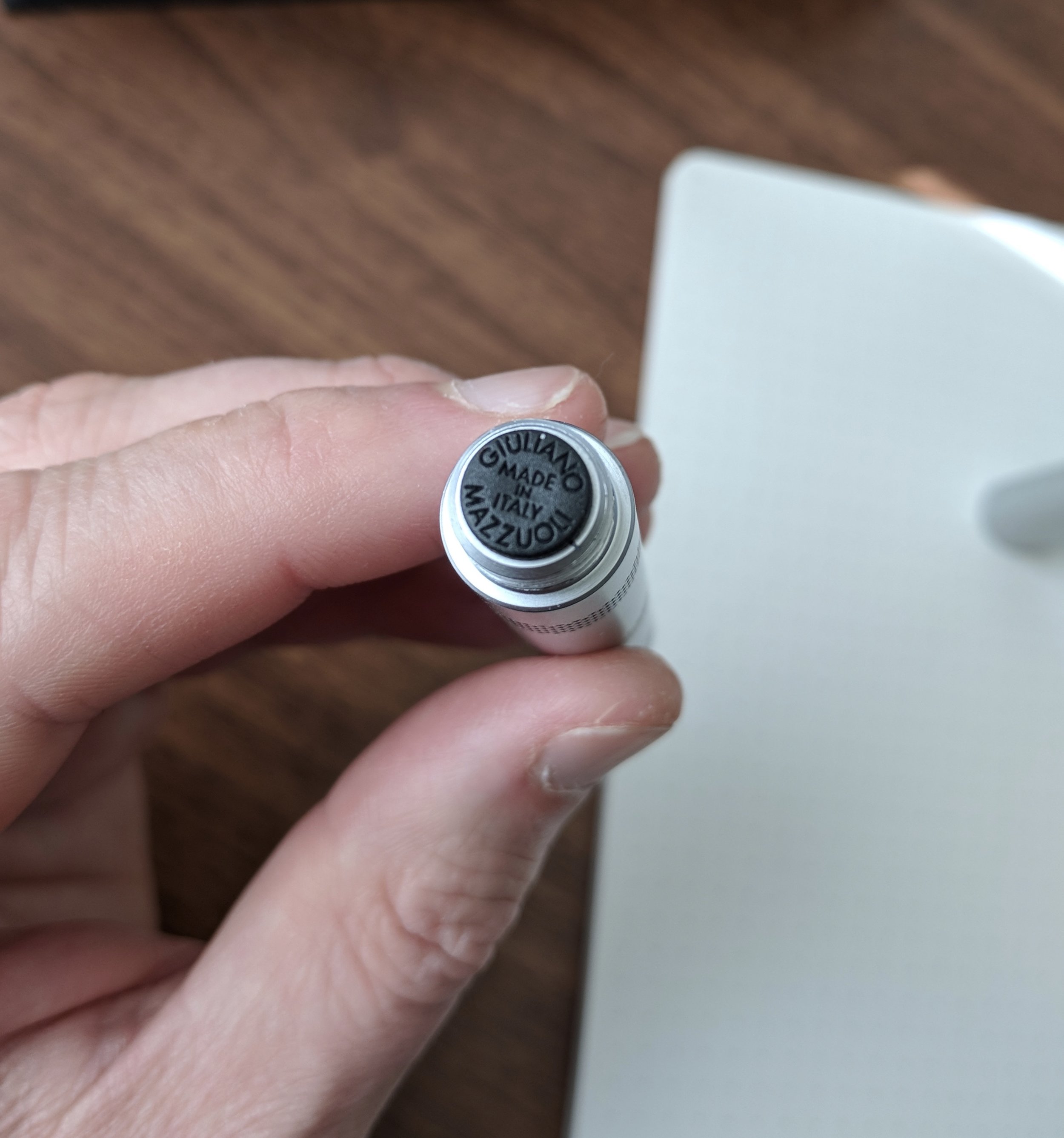
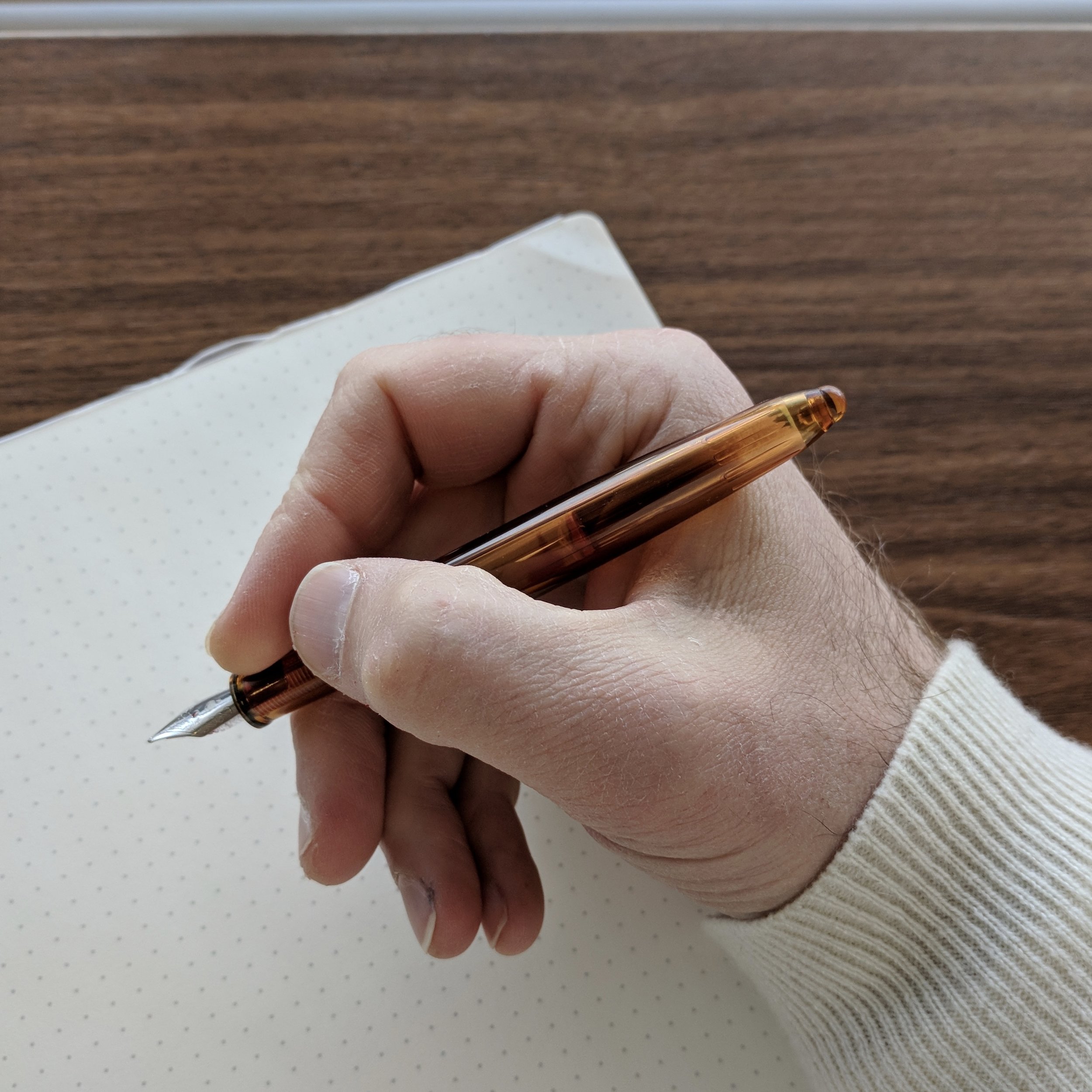
Monteverde has gone on a bit of a tear recently, releasing multiple new pens at various price points. The Monza is apparently Monteverde’s attempt to break into the “inexpensive plastic demonstrator” segment, and rather than develop an original design they’ve gone with what appears to be an “homage” to cigar-shaped pens like the Sailor 1911 Standard and the Montblanc 144/146. That said, the Monza looks nice, and I opted for the “Honey Amber” demonstrator. Other color options include “Gray Sky”, “Island Blue”, and “Crystal Clear”.

My frustration with the Monza started early. First of all, I went to ink it up and the converter didn’t fit in the pen. Based on what I’ve read online, some retailers advise to “push really hard” to seat the converter on the back of the feed, but I had no luck. Maybe I didn’t push hard enough, but I was already so skeptical of the quality that I didn’t want to risk shattering the feed (or even the section itself). That gives you some idea of how bad the fit was.

The Monteverde Monza features a clear feed, much like some of the old third-tier vintage fountain pens like Wearever. I do like the look because it shows you how the ink flows to the nib.

After tossing the converter aside, I ended up going with a cartridge (Kaweco Ruby), and spent a solid 10 minutes attempting to get ink to flow. The nib barely wrote out of the box. The culprit was a misaligned feed, inserted so poorly that it caused the tines to twist. In other words, what looked like a complete absence of quality control on the part of the manufacturer. This isn't an isolated incident with Monteverde nibs, and it's not limited to their lower-priced pens.)

Note: If I recall correctly, my Monza box came shrink-wrapped in plastic. If you like the look of this pen, and want to go ahead and buy one, be sure to request that your retailer open it up so they can check the nib, unless you’re comfortable doing adjustments yourself.

I frankly don’t understand how Monteverde can put so much effort into making their pens - packaging included - look pretty good, but apparently take no steps to make sure they actually write. I’d gladly pay $10-15 more for a pen if it meant the pen had been tested, though I’m not sure such a drastic price increase would be necessary, given that Nemosine can sell the Singularity for $3 more.

View fullsize Monteverde Monza Unposted
View fullsize Monteverde Monza Posted
View fullsize Monteverde Monza Medium Nib

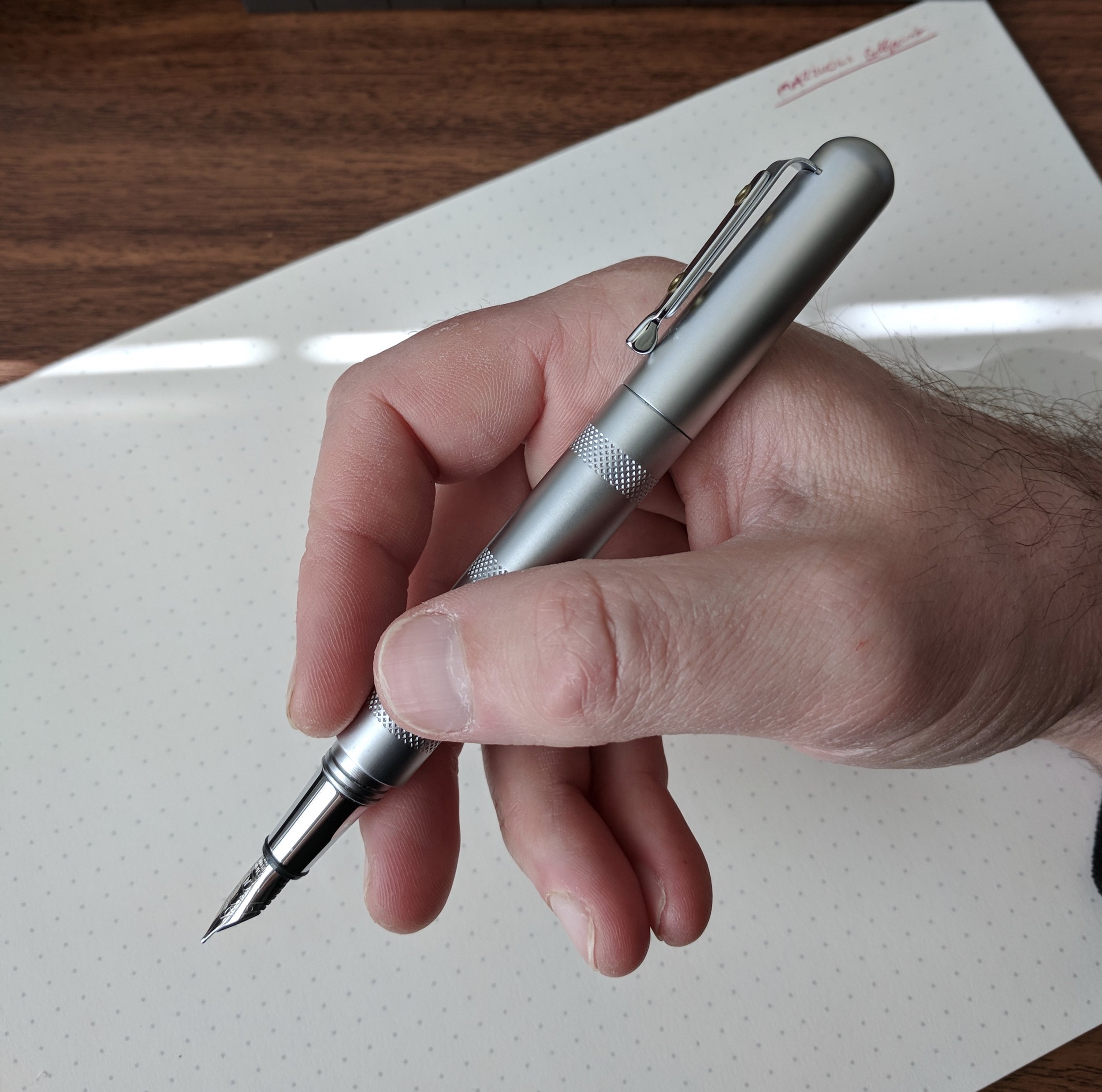
Why should Monteverde invest the time and resources into quality control? Because once I pulled, reset, and aligned the nib, the Monza is actually a very good writer. The stock medium steel nib is nothing to write home about in terms of line variation or character, but this one is very smooth, and the pen itself - once it was fixed - makes a great knockaround pen: one that I would have loved to have had as a student. Even now, it's one I'll keep around in my travel bag. 

A nice writer, but after waaay too much effort on my part. 

Takeaways and Where to Buy

Of these two pens, the Nemosine Singularity is the clear winner and would get my recommendation. The relatively solid build and excellent stub nib for this price point makes it pretty much a no-brainer for someone looking for a colorful demonstrator in the beginner / “student pen” category, or simply anyone looking for an inexpensive fountain pen that they don't have to worry about losing or damaging. 

The Monteverde Monza, on the other hand, has some potential but the quality control is far below what I’ve seen elsewhere at (or even below) this price point. The fact that I had to pull, reseat, and straighten the nib, in addition to the fact that the supplied converter didn’t fit the pen, drops this into the “yes, if you’re prepared to tinker with it” category along with the Noodler’s pens and $0.99 Chinese pens from eBay. I suspect, however, that most in this pen’s target audience would either return the pen or throw it away if they received it in the shape that I got this one.

You can purchase both pens from Pen Chalet. The Nemosine is currently priced at $19.99 and the Monza goes for $16 (both before any applicable coupon codes).

Disclaimer: This post contains affiliate links. While I purchased these pens from Pen Chalet, I did receive a discount due to my sponsor/affiliate relationship.

In Pens Tags Nemosine, On the Low End, Monteverde, Monteverde Monza, Nemosine Singularity, Pen Review
2 Comments

The Bic Cristal Is (Arguably) The Greatest Pen Ever Made.

December 13, 2017

Clickbait headline? Especially coming from a dedicated fountain pen user, who at one point would regularly lament how the ballpoint and the gel pen contributed to the downfall of polite civilization by driving the fountain pen to the brink of extinction? But from a sheer numbers and longevity perspective, you can easily make the case. Bic has sold over 100 billion of these pens since they were first launched in 1950. The pen sits in the permanent collection of the Museum of Modern Art. And it’s become the gold standard for how a basic ballpoint pen should look and write.

Though Europe gets the awesome orange barrels, in the States we’re “stuck” with what to me is the "classic" Bic Cristal, featuring a clear plastic hexagonal barrel and a plastic cap that matches the ink color. The design hasn’t changed much in the nearly 70 years this pen has been in existence, and the history of the Bic Cristal makes for fascinating reading.

For awesome write-anywhere portability (like in the car), I don't think you can beat the Cristal, especially if you tend to lose a lot of pens outside the house. 

People tend to hate cheap ballpoint pens for one of two reasons: they require too much pressure to write, and/or the ink won’t leave a solid line. The oil-based ink in really cheap ballpoints can also blob and smear all over the page (or in your pocket), making a serious mess. Of all the pure ballpoints out there on the market, however, I consider Bic Cristal and the Schmidt Easyflow 9000 to be the best options, because you don’t usually see any of these issues. (As with any mass-produced product at a lower price point, there are exceptions.)

Two current Bic Cristal models: on the left the .8mm Xtra Precision, which sports a needle tip, and on the right, the most common Bic Cristal available, the 1.0mm "medium". 

Though it certainly doesn’t write the same dark line as a gel or hybrid-gel pen, the Bic Cristal performs pretty well for a ballpoint. Bic’s shade of blue ink is much more vibrant than what you’ll find in a Papermate Write Bros., or the various store-brand generics. The 1.0mm “medium” tip can even show some line variation, depending on the pressure you use. For this reason, many artists use Bic pens to draw insanely detailed portraits. While I find gel pens pretty much unusable in tip sizes above .7mm, I have no trouble writing relatively small with the 1.0mm Bic Cristal, since oil-based ink doesn't feather and bleed.

Though ballpoint ink is never going to be as dark as gel, liquid rollerball, or most other types of ink, Bic's formulation is among the best. It also dries near-instantaneously on non-coated paper, including cheap office-supply stock. 

Takeaways and Where to Buy

In a world where pen companies and big box stores are starting to charge $15 for a dozen mediocre gel pens, there’s something to be said for taking the opposite approach by picking up a pack of Bic Cristals. Sure, you'll probably lose the pen, give it away, or the plastic barrel may crack long before you use up the ink, but like the most basic woodcase pencils, sometimes you just want to get some work done with a reliable tool that presents the least amount of distraction. Moreover, with the concept of handwriting generally under attack, we should be doing all we can to preserve it by promoting the entire range of writing tools available. The Bic Cristal offers a low-cost, zero-barrier-to-entry option. Anyone can jump online or run down to the corner store, and get started handwriting.  

As I mentioned, the 1.0mm medium point will probably give you the smoothest writing experience, and is generally my recommended starting point. For editing and annotation (or if you just write really small), the “Xtra Precision” needle-tip pens are fantastic. If you write large, there's even an "Xtra Bold" 1.6mm version, though I've not tried them. 

Finally, if the Bic Cristal interests you from a design or historical perspective, both Philip Hensher's The Missing Ink and James Ward's The Perfection of the Paper Clip discuss the history and development of the Bic ballpoint pen in some detail (as well as diving deep into other aspects of stationery minutiae). I highly recommend both books. 

Disclaimer: I purchased the pens featured in this review with my own funds, for my own use.

In Pens Tags Bic, Bic Cristal, Cristal Xtra Precision
13 Comments

New Pen Alert: Lamy Studio in Racing Green

December 9, 2017

I hardly ever "re-review" pens, and I won't really do that here, but I did want to take the opportunity to talk about Lamy's absolutely gorgeous new special edition Studio, in Racing Green. 

Everything that I wrote about in my previous review of the Lamy Studio remains true: It's a sleek, modern, nicely balanced pen with a metal section that offsets the weight of the cap when the pen is posted. The pen caps and posts securely, using a clutch mechanism that has an audible "click" or "snick" (choose your adjective). Lamy has chosen not to sell the Racing Green Studio with the 14K nib, opting instead to travel at a lower price point using the same stainless nib featured on the Safari, AL-Star, and Studio. 

The sub-$80 Lamy Studio features the same stainless steel nib as on the Safari, AL-Star, LX, etc. For another $90, you can separately purchase one of Lamy's 14kt nibs, which are outstanding, but the price is pretty steep. 

I previously reviewed another special edition Studio (the Ruby/Royal Red), which I regrettably sold off a couple years back. (Regrettable because I can't find another one.) Lamy seems to make fewer special edition Studio pens than they do special edition Safaris or AL-Stars. You can typically still find the latter in stock at retailers up to a year later, but the Studios tend to sell out relatively quickly. I imagine this is due to the higher price point and the lower profile of the Studio translating into lower demand; Lamy likely has an easier time selling the less-expensive Safaris and AL-Stars than the $70-plus Studio. Thus, it's also more difficult to find special edition Lamy Studios on the secondary market. 

I touched up this photo a bit to try to bring out some of the iridescence.  It's not noticeable at first, but when the light hits this pen in a certain way....

The Racing Green studio is an incredibly attractive pen, coated in an almost iridescent dark green matte finish. It remains to be seen how the matte finish on this pen will hold up over time. My red Studio looked pretty beat after a while, with the powdered coating wearing off underneath the clip and around the edges of the cap, which ultimately frustrated me and led me to sell the pen despite the excellent nib. I will say that the coating on the Racing Green feels thicker, and I haven't seen any dings or scratches yet despite carrying this pen in a bag for a week. 

Takeaways and Where to Buy

I stand by my previous review of the Lamy Studio as a great option in the sparsely populated "great pens under $100 category" that TWSBI typically dominates. The Studio is also widely available and relatively easy to find, and with a coupon code you can get some colors for as low as $65. To me, that's a no-brainer (provided you can live with the metal section).

As I mentioned, the "Racing Green" Lamy Studio pictured here is a special edition, meaning that they will be made for a short time. Currently available from Pen Chalet at $79 retail (less with a coupon code), these may not last long, given how quickly past special edition Studios have sold out. Pen Chalet currently only has medium nibs in stock, but fines are still available on special order.

In Pens Tags Lamy, Lamy Studio, Special Edition, Pens
3 Comments

Pen Review: The Waterman Carène

December 6, 2017

Of all the high-end pens on the market that receive far less attention than they should, the Waterman Carène sits near the top of the list. I have a soft spot for modern Watermans (defining “modern” as 1980s forward, when the pens were exclusively made in France), mainly because a Waterman Laureate was the first “nice” fountain pen I ever purchased. To date, I haven't reviewed that many Watermans on the blog, which is something I plan to change in the coming year because these pens deserve better. They're reliable, "long-haul" workhorses that really stand up to daily use.  

Waterman has scaled back its offerings in recent years. The Carène’s mid-tier companion, the Charleston, is currently very hard to find, and the Edson and the Exception - Waterman’s $500-plus luxury offerings - have been or are in the process of being discontinued, leaving the Carène and the Élégance at the head of Waterman’s product line. Due to my love for the brand, I hope this represents a simple consolidation as opposed to financial trouble, though given the company’s general lack of marketing to and connection with the pen enthusiast community, I can see how they might be missing out on the analog writing renaissance that’s occurring right now.   

Waterman designed the Carène to invoke the hull of a racing yacht. (“Carene” means “hull” in French.)

After the discontinuation of the Edson, the Carène emerged as easily the most distinctive pen in Waterman's lineup. Waterman designed the Carène to invoke the hull of a racing yacht. (“Carène” means “hull” in French.) Personally, when I look at the Carène I see more of an "Orca"-shape, but regardless, Waterman really doubles down on the "yacht" theme in their marketing materials.

“Carène rides the crest of the innovation wave. Taking inspiration from luxury boat design, the result is our most distinguished example of pioneering vision. Crafted in noble materials, with an artist’s attention to detail, its pure fluid curves conjure up the sleekest lines of a leisure cruiser, or the billowing sails of a luxury yacht. Set sail for the adventure of a lifetime.”
— Waterman Website

A bit over the top, but you get the drift. It’s inspired by boats. 

Despite the lacquered metal construction, I've never found Waterman pens uncomfortably heavy. The company designs them in such a way that they maintain a nice balance. The clip on this pen is well-made and spring-loaded, like the Lamy 2000, so the pen clips easily to a shirt pocket or into the slot of a pen case.  

Like most modern Waterman pens, the Carène features a lacquered metal body and cap, but also sports something relatively uncommon today: an 18kt integrated nib incorporated into the design, tapered like a ship's bow. 

I love the classic black-and-rhodium combination of the Carène "Black Sea" model. 

The Carène features Waterman’s high quality cartridge/converter system, and will take the high-capacity “long international” cartridges in addition to the standard shorter ones. I consider Waterman converters to be among the best. They’re well-designed in that they generally don’t leak or cause inkflow issues, and also have a relatively large capacity.

In order to get a full fill, make sure to fully submerge the breather hole on the bottom of the nib section. This can be challenging with certain ink bottles. (Ahem, Sailor.)

Note: I’ve owned a few Carènes in my “career” as a pen enthusiast. The first I ever purchased I ended up selling because of an issue with ink leaking out of the integrated nib onto the section, presumably due to the clutch cap creating suction and pulling ink out of the feed when I uncapped the pen. After asking around, and realizing that this issue was probably an anomaly, I tried again with the pen featured in this review. Several months in, I’ve not experienced any leaks or inky fingers. Looking back, I probably should have returned the pen for repair or replacement rather than sell it. 

Writing Experience

The Carène is one of the more comfortable writers in my collection. Despite the metal construction, the streamlined body sits in your hand quite comfortably, and the length/girth are perfect for me when the pen is posted. Unposted, it’s a touch narrow for my taste but definitely usable.

View fullsize Waterman Carene Posted
View fullsize Waterman Carene Unposted

The 18kt integrated nibs are smooth, wet writers - not quite a "firehose", but this pen will put some ink on the page. The nib on this pen has a lot of tipping material for a “medium,” and writes on the fat side of it’s designation. If you’re used to writing with Japanese nibs or German stainless steel nibs from Bock or JoWo, you could mistake this for a broad. Waterman does make nib sizes other than fine or medium, including extra fine, broad, and a stock stub, but they typically are available only via special order. Some retailers also sell nib units separately, though the cost represents a substantial portion of the price of a new pen. 

A writing sample with Sailor Bung Box Dandyism, a very dark green-black. Don't expect any bounce or flex whatsoever out of modern Waterman nibs. They're very firm, and it would be fair to call them "nails." 

Takeaways and Where to Buy

You can’t go wrong with a modern classic like the Waterman Carène. If you appreciate the aesthetics, the Carène makes for a durable, reliable writer that I’m going to have a hard time keeping off my recommendations list for a “first pen over $200.” The Carène also forms a key part of my "work carry" rotation. Like the Lamy 2000, due to the unusual nib the casual observer who knows nothing about pens might assume that this was a nice Waterman rollerball or ballpoint, which are still common in the corporate world. This isn't a distracting or flashy pen and therefore great for a stodgy office environment. 

Since Waterman still maintains a fairly large retail footprint, it’s somewhat easy to find the Carène in brick-and-mortar stores, even at non-specialized retailers that have a small “luxury” pen selection. You therefore shouldn’t have much trouble at all locating one from an online pen retailer. I acquired this pen from Pen Chalet, which as of the time of publication of this review stocks the Carène in four different models: black with gold or chrome trim (the “Black Sea” models, featured here), Blue ST, and a matte Charcoal Grey with chrome trim. While not inexpensive at around $220 retail, the Carène’s price is in-line with (or below) other cartridge-converter pens with gold nibs such as the Sailor 1911 Large and the Sailor Pro Gear.  Many other variations of the Carène exist, including some that are special editions and therefore more expensive.

Disclaimer: I acquired the pen featured in this review from Pen Chalet with my own funds.

In Pens Tags Pen Review, Waterman, Waterman Carene
10 Comments

Pen Review: Giuliano Mazzuoli Officina Ballpoint and Fountain Pen

November 22, 2017

Giuliano Mazzuoli is one of those brands that’s come on and off my radar over the past few years. I recall reading about one of their pens on the now-dormant FPGeeks website four or five years ago, but then they seemed to have dropped out of sight until this year’s D.C. Pen Show, when I noticed them at the table for distributor Luxury Brands. A month or so later, Carol from Luxury Brands reached out and asked whether I would be interested in borrowing some pens for review.

A Bit About Mazzuoli, the Company

Mazzuoli pens are the product of their eponymous designer, and are sold as part of his 3.6.5 sub-brand that focuses on writing instruments. (Giuliano Mazzuoli also designs a line of wristwatches.) Per the company, the pens are made in the Chianti region of Tuscany, Italy, and the website references a design partnership with motorcycle company Ducati. 

While I have a few different Mazzuoli models to review, I figured that I would start with the most classic design, the “Officina,” which Luxury Brands sent me in both a fountain pen and ballpoint version. Capped, the fountain pen and ballpoint look the same: a medium-sized, semi-cigar shaped metal pen (but for a flat back-end), featuring different patterns of knurling on the barrel. The first thing I noticed was the weight: these are very light metal pens, made from aluminum, yet they don’t feel insubstantial. The pens were a touch short for me to use unposted, but posting the cap did not affect the weight and balance at all.    

Officina “CassetTa” Ballpoint

The Officina "Cassetta" includes a leather pen sleeve. 

The Officina ballpoint (dubbed the “Cassetta”) is my favorite of these two pens. And it’s not just a ballpoint - it’s a convertible clutch pencil! While not a true “multi pen,” the option to swap in a pencil scratches that itch for me, and I love how Mazzuoli includes all of the necessary accessories in the box, so you don’t have to go searching for a lead pointer, etc.

Under the "false bottom" of the box, you'll find three additional Schmidt Easyflow Refills, the clutch pencil insert with multicolor leads, a lead pointer, and an eraser.

One note on the ballpoint’s design: I had to adjust my grip a bit to account for the lack of a smooth section on the Cassetta. In order to avoid holding the pen by the somewhat sharp threads, I had to either slide my grip back higher than I normally would, or move it down almost to the tip. Since I don’t use ballpoints for longer writing sessions, but rather only for shorter notes, this didn’t end up being that big of a deal, but it warrants mentioning here.

View fullsize Cassetta Ballpoint
View fullsize Mazzuoli Cassetta Ballpoint
View fullsize Mazzuoli Cassetta Ballpoint Capped

Officina Fountain Pen

The fountain pen version of the Officina that I received sported a different design, called “Micrometer Chrome.” While the pen kept the same shape, it featured three “bands” of knurling on an otherwise smooth metal pen. (Note, the fountain pen is also available in the “End Mill” and “Knurler Chrome” designs, if you prefer a completely textured barrel.)

Giuliano Mazzuoli fountain pens feature stock Schmidt stainless steel nibs. Not particularly exciting, but quality and reliable.

The fountain pen does not have the same section as the ballpoint. It instead sports a polished metal section that offers more room to grip the pen, and as a result the Officina fountain pen ended up being quite comfortable during my limited test. Mazzuoli chose to go with a Schmidt stainless steel nib - a reliable German workhorse that is relatively inexpensive, and has the added benefit of keeping the price of the pen down. The Officina uses a cartridge/converter filling system.    

View fullsize Mazzuoli Officina Fountain Pen Capped
View fullsize Mazzuoli Officina Fountain Pen Posted
View fullsize Mazzuoli Officina Fountain Pen Unposted
View fullsize Mazzuoli Medallion End Cap

Takeaways and Where to Buy

The Mazzuoli Officina collection is a fun set of writing instruments all around, but if I had to choose, I’d probably go with the Cassetta ballpoint. For starters, it’s a good value, considering what is included in the package. In the box, you receive the pen, three Schmidt Easyflow refills (red, black, and blue), a swappable clutch pencil mechanism, a set of clutch pencil leads, and eraser, lead pointer, and a leather pen sleeve. I love the presentation, and the Officina Cassetta would make a great gift idea for a ballpoint fan who also draws or enjoys writing with pencils. MSRP on the Cassetta ranges from $172-183, depending on the model, with the retailer "street" price typically coming in lower. MSRP on the Officina fountain pen ranges from $103-112 (again, typically with a lower price at actual retail) and also represents good value, but for some reason the uniqueness of the Cassetta "system" really drew me in - I've never seen anything like it on the market.       

While more retailers are starting to stock Giuliano Mazzuoli writing instruments, the pens are still relatively difficult to find. Currently, you can purchase them from our sponsor Pen Chalet, who carries both of the Officina pens reviewed here (the fountain pen and the “Cassetta” ballpoint) as well as other available models. Stay tuned for additional reviews!

Disclaimer: These two pens were sent to me on loan by Luxury Brands, the U.S. distributor for Giuliano Mazzuoli writing instruments, as well as Platinum, Noodler’s Ink, and others. Many thanks to Carol for making this review possible. This post contains affiliate links. 

EDIT: This post has been modified to clarify some information on pricing. 

In Pens Tags Giuliano Mazzuoli, Officina, Ballpoint, Pen Review, Pens
Comment
← Newer Posts Older Posts →
Store Location
Visit the T.G.S. Curated SHOP
*New* Updated "Best Pens" Guide (2025)
TGS x Hinze Pens Violet Tendencies Taschenstift Fountain Pen
Hierarchies of Fountain Pen Friendly Paper
Allex Scissors arrayed on a desk showing link to desk accessories

Join Our Patreon!
Subscribe to the TGS E-mail List

Featured Posts

Featured
Pilot-Iroshizuku-Yama-Budo-Writing-Sample.jpeg
May 24, 2025
Joe's Picks: Five Favorite Inks From Pilot's Iroshizuku Lineup
May 24, 2025
May 24, 2025
Yamamoto-Gray-Paper-Sampler-Set.jpeg
May 10, 2025
Discovering Unusual Paper: "Paper Tasting" Sets from Yamamoto Paper
May 10, 2025
May 10, 2025
Four-Micarta-Fountain-Pens.jpeg
Apr 19, 2025
Yes, Micarta for me! I finally got my hands on Some Micarta Pens, Plus My Own Special Edition
Apr 19, 2025
Apr 19, 2025
The Gentleman Stationer RSS

© Digital Divide Media, LLC, 2014-present.

All content is the exclusive property of Digital Divide Media, LLC, d/b/a The Gentleman Stationer, including “The Gentleman Stationer” website and trademark, and should not be reproduced without express written permission.  All rights reserved.

All content containing paid advertising, affiliate links, or sponsored content will be plainly disclosed by a disclaimer when/if featured.

Contact Information

Store Shipping Policy and Return Policy

Privacy Policy

Cookie Policy

Terms and Conditions

Powered by Squarespace