• Blog
  • Shop
  • Resources
  • FAQ (Ask TGS)
  • About
  • Archive
  • Contact
  • Sign In My Account
Menu

The Gentleman Stationer

Vintage Living in the Modern World.
  • Blog
  • Shop
  • Resources
  • FAQ (Ask TGS)
  • About
  • Archive
  • Contact
  • Sign In My Account

My First Fountain Pen Revisited: The Waterman Laureat

May 25, 2024

I write a lot about recommendations for a "first fountain pen", and readers/customers frequently ask me for advice on which fountain pens they should they should buy based on various price points and other criteria. BUT, I realize I haven't written much at all on my own first "nice" fountain pen: the Waterman Laureat.

The Laureat features the classic Waterman clip and branding around the cap band.

Waterman made the Laureat during the mid-to-late 1990s, and possibly into the early 2000s. (I'm not a vintage expert - all I know is that it's no longer available and by the time I was back into the hobby in 2010, they had disappeared from store shelves.) I purchased this particular pen in London, in 1999, when I lived in Strasbourg, France and spent many a weekend visiting friends who were studying in London at the same time. As a slimmer pen, the Laureat made for a great introduction into the world of fountain pens because at the time it felt very similar to the "stick" ballpoints and rollerballs that I regularly used in school. It slotted easily into my Filofax pen loop, and the cap was designed to post easily onto the back of the barrel. Despite the lacquered brass construction, the slim barrel meant that the pen maintained a usable weight and decent balance.

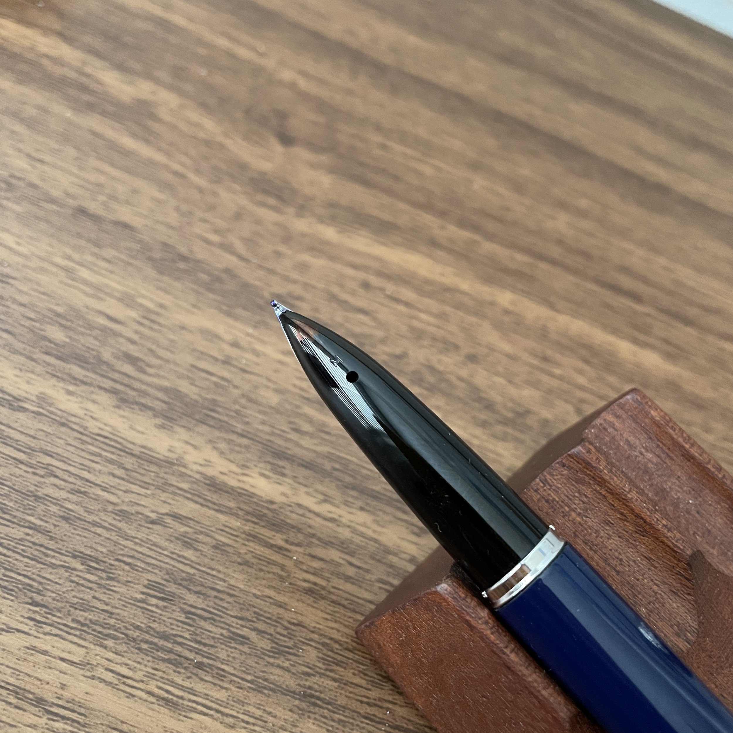
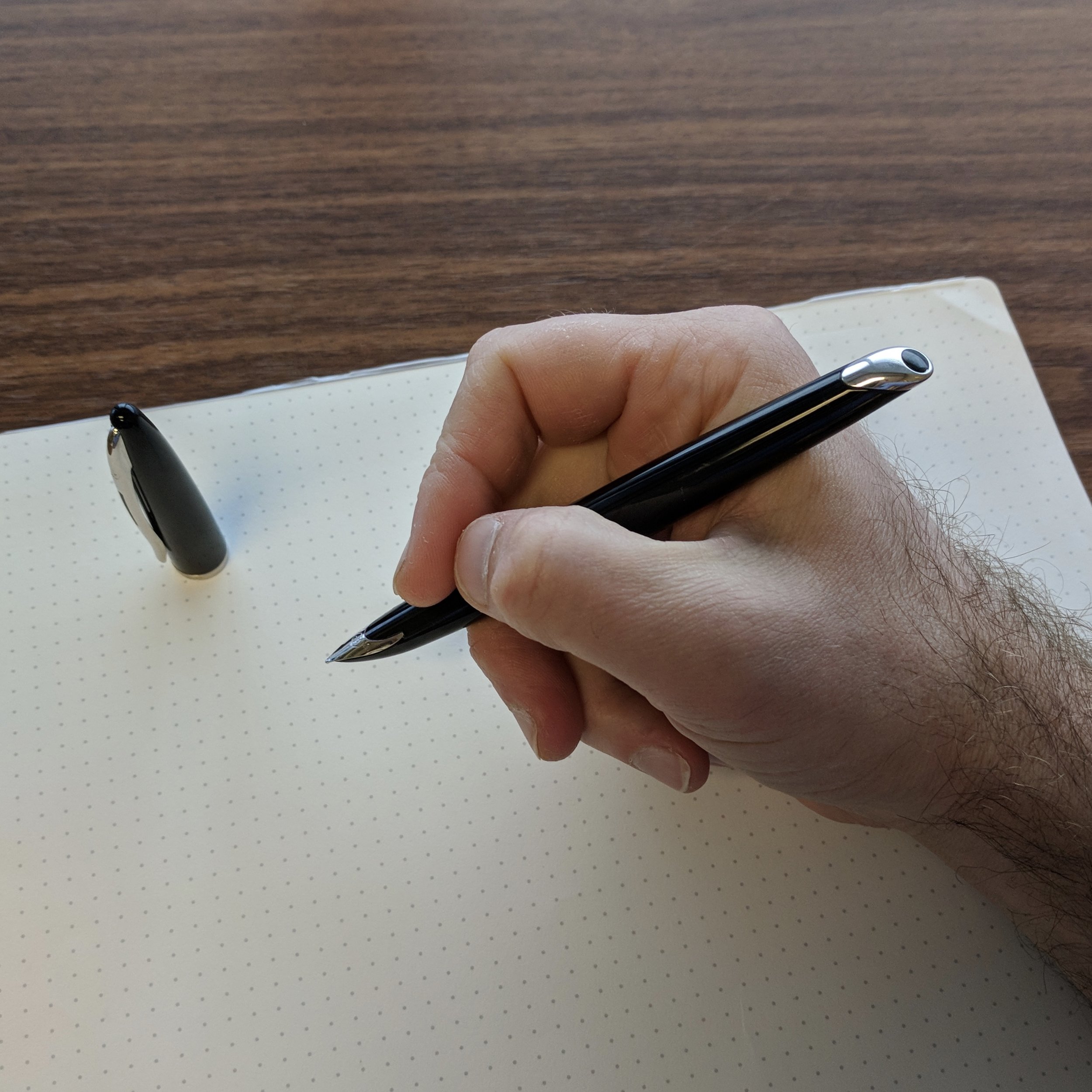
You can make out the ring of ink around the base of the nib. There is also some wear to the gold plating, which is to be expected after 25 years!

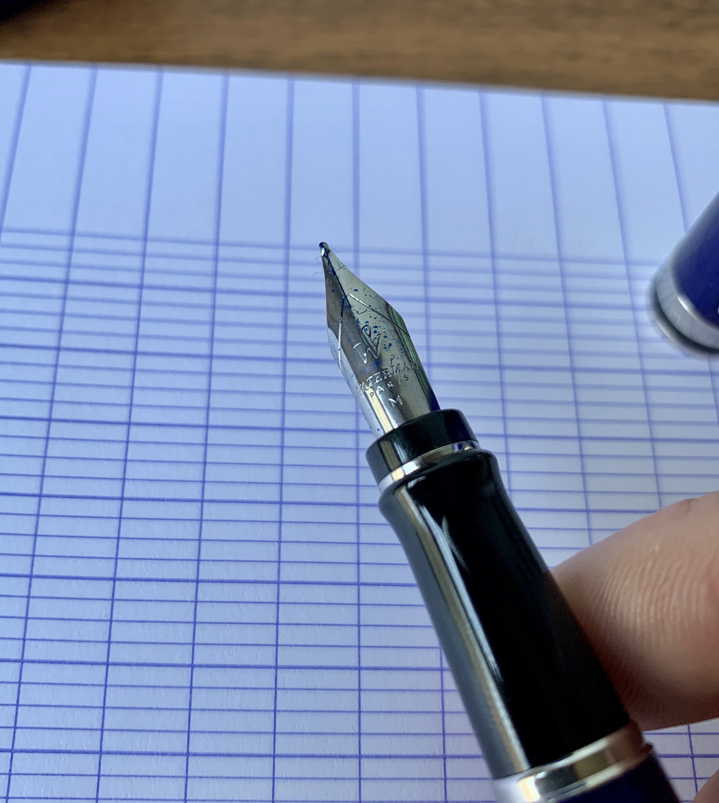
Nonetheless, like a few different 1990s-era Waterman pens, the Laureat had one glaring flaw: It is, by far, the messiest fountain pen I have ever used. The Laureat features a friction-fit cap and a ribbed grip that somehow interact to pull a drop of ink from the nib whenever you cap/uncap the pen. The result is a ring of ink around the end of the section, just below the nib, that's not enough to constitute a full-on leak, but is just enough to stain your fingers. You can avoid the issue somewhat by gripping the pen higher up on the section, but I've always accepted this as my "inevitably inky fingers" fountain pen and dealt with it. Waterman pens from this era feature some of the most consistently good stainless steel nibs available, and the gold nibs are among my all-time favorite. (I have at least five vintage or “near-vintage” Watermans that see regular use.)

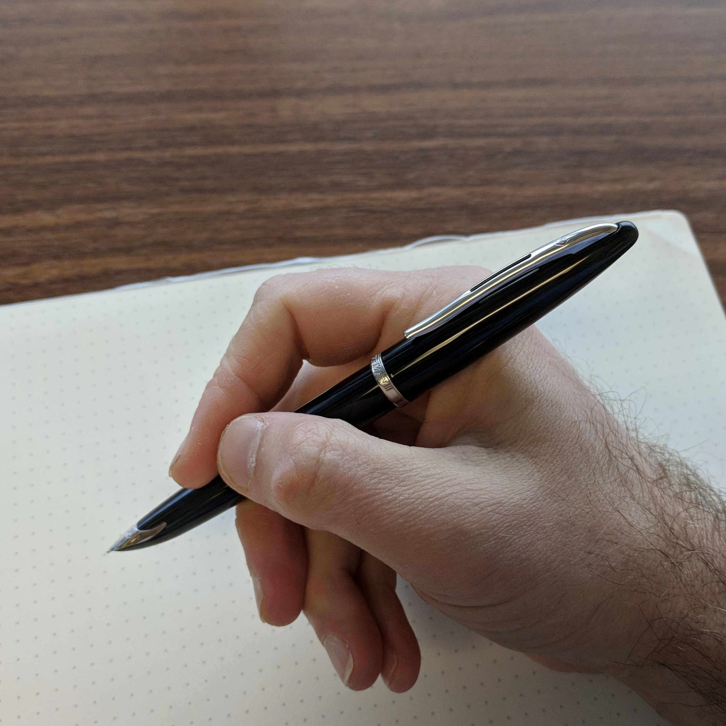
The Waterman Laureat remains an incredibly comfortable fountain pen to use.

Is There a Modern Equivalent of the Waterman Laureat?

There are a couple different options, but in terms of pure feel, the Scriveiner fountain pen that I was recently sent to review (one of which we are giving away!) are close. Scriveiner uses the same lacquered brass barrel design, and while the color options don't feature quite as much depth as the Laureat, the pens don't suffer from the "inky section" issue. Scriveiner pens use Schmidt nibs, which are some of the most consistent steel nibs on the market, and the feel of the medium nib I've been testing actually comes pretty close to the Laureat.

For those who don't like the weight of a brass barrel, another option would be the Pilot Explorer, which has a similarly slim shape, excellent steel nib and a much lighter feel in the hand. At $25, the Explorer is also much less expensive than the Laureat was (I believe I paid close to $200 for a matching fountain pen/rollerball set?)

Waterman Laureat next to a Scriveiner fountain pen (center) and the Pilot Explorer.

Finally, the modern equivalent of the Laureat in the current Waterman lineup would probably be the Waterman Hemisphere. I haven't used one of these pens, so I have no first-hand experience, but I have not heard of any ink issues like the ones that plagued the Laureat. The Hemisphere appears to feature a similar grip/inner cap to the Waterman Expert, with which I've had no such problems.

The Laureat next to the Scriveiner, uncapped.

What was your first "quality" fountain pen? Do you still use it? Does it still hold up? Or did you ink it up again after many years only think "What the heck did I ever see in this?" I love to hear these stories, so please drop a line in the comments over this long weekend!

The Gentleman Stationer is supported entirely by purchases from the T.G.S. Curated Shop and pledges via the T.G.S. Patreon Program. Through Monday May 27, we are running a sale in the shop using the coupon code “SUMMERSALE” at checkout. If you enjoy our content, we greatly appreciate your support!

In Pens Tags Waterman, First Fountain Pen, Fountain Pens, Waterman Laureat
3 Comments

Review Revisited: The Waterman Carène "L'Essence du Bleu" Edition

September 21, 2022

As Waterman has revamped and updated its lineup of fountain pens over the past several years, the company has focused on five core models: the high-end Exception and Carène, the mid-tier Expert and Hémisphère, and the more entry-level Emblème. The yacht-inspired Carène, to me, remains an all-time classic, and it’s encouraging, in terms of the future of both Waterman as a brand and this particular model, to see the Carène receiving the special edition treatment. The pen shown here is the Carène “L’Essence du Bleu” special edition fountain pen, featuring an engraved palladium cap atop a dark navy blue lacquered barrel.

The “L’Essence du Bleu” special edition Carène, right, pictured next to the standard “Black Sea” finish with silver trim. The latter pen remains in my collection five years later.

I first reviewed the Waterman Carène in the standard “Black Sea” finish a bit less than five years ago. I’ve owned multiple Carènes over the years, and I can’t recall a time when I haven’t had at least one in my collection. (I’m a huge fan of Waterman pens in general: check out my review of other models by visiting the T.G.S. Fountain Pen Review Archive.) The reasons why I enjoy the Carène are, in many ways, identical to why I enjoy the Lamy 2000: the comfortable, streamlined shape; a subtle integrated nib that’s not overly ostentatious if you want to use it at work, and a consistent writing experience, especially if paired with one of Waterman’s excellent fountain pen inks.

I love the engraving on this cap - it definitely complement’s the Carène’s nautical theme.

This specific pen represents something you don’t see very often: a Waterman special edition. While Waterman has released other models, like the Expert, in the “L’Essence du Bleu” series, the Carène seems particularly well-suited to this design scheme, given the pen’s maritime inspiration. The metal cap features an engraved “wave” pattern, which looks great paired with the dark navy lacquer on the barrel.

While you can certainly use the Carène unposted, I prefer the balance and overall feel of the pen posted.

I’ve always found Carène nibs slightly wet and stubbish, and this 18k medium nib is no exception. This particular Carène lays down a consistent line of ink, even using thicker, non-Waterman inks like the Scribo Blue Cosmico shown here. Waterman quality remains on display in the Carène lineup, and this pen certainly isn’t going anywhere in terms of my own personal collection.

View fullsize Waterman Carène Nib Engraving
View fullsize Waterman Carène Medium Nib

Writing sample showing a stubbish medium Carène nib on Midori MD Cotton Paper. (Lined Plotter version is an experimental release not yet generally available for purchase.)

The Carène is slim enough to fit most planner loops, such as the A5 Plotter shown here.

Takeaways and Where to Buy

The Waterman Carène is a beautiful fountain pen that manages to remain eminently practical. With a comfortable shape that’s neither too wide nor too narrow (allowing it to fit many planner and notebook pen loops), an excellent nib, and a subtle design that doesn’t scream “look at my flashy fountain pen,” the Carène has always been a highly recommended daily workhorse here at T.G.S. As I noted above, the particular model pictured here is the “L’Essence du Bleu” special edition, which retails for around $290. This price point is excellent for a special edition with an 18k gold nib, and the “Black Sea” version with silver trim can be found priced as low as $215, with oblique broad and stub nib options available. That’s serious value in today’s market. Many thanks to our friends at Pen Heaven in the UK for providing this particular pen for review! They are full-service Waterman retailers who carry the full line of Waterman fountain pens and ink, in addition to many other brands.

Disclaimer: The Waterman Carène pictured here was provided by Pen Heaven for review purposes, free of charge. I was not otherwise compensated for this review, and this post does not contain affiliate links.

In Pens Tags Waterman Carene, Waterman, Fountain Pens, Pen Review
7 Comments

Unsung Heroes: The Waterman Expert Fountain Pen

July 4, 2020

The popularity of some pen brands has ebbed and flowed over the years, as tastes, ownership, and management change. In my mind, no company exemplifies this more than Waterman. Those of us who came of age in the 1980s and the 1990s may fondly recall Waterman as a popular brand that you would regularly see available for sale in brick-and-mortar office supply stores (remember those?), with a quality build and classy design at a lower cost than brands like Montblanc. For a brief history of Waterman pens and the modern company (which is actually a corporate descendant of the original U.S. company’s French subsidiary), check out my review of the Waterman Man 100 Patrician.

This navy blue Waterman Expert ballpoint with gold trim is the oldest pen in my collection. I think I received it when I was twelve.

Though Waterman may be a shadow of its former self, I still have a soft spot for their pens, and over the years have accumulated a micro-collection of sorts. All of my Watermans are either modern or what I would consider “near modern,” pens like the Man 100 that aren’t made anymore but are still modern enough in construction and build that I wouldn’t call them vintage. One of my favorites - and probably the first “nice” pen I’ve ever owned - is an early 1990s Waterman Expert ballpoint that a relative gifted to me for a birthday. I recently had the opportunity to add a sort-of-matching Expert fountain pen, a model I’ve never owned despite the fact that it’s still readily available at retail.

Small details such as the imprint has changed, but most of the design language remains the same over the thirty years that separate these two pens.

Since Waterman has discontinued its true entry-level options such as the Phileas and Kultur - wonderful pens that never should have been allowed to go out of production - the Expert has stood a the lower end of Waterman’s reduced lineup, at least in terms of price. While it appears that the company is introducing a few new entry-level pens that haven’t yet made it to widespread distribution in the United States, for most the Expert is their introduction to the Waterman brand.

The slanted finial is the Expert’s “signature.” I appreciate how it lends a touch of flair to an otherwise standard basic pen design.

The design of this pen has not changed over the years. I would describe the Expert as a moderately sized, streamlined pen with flat ends (though the cap finial is angled in a signature design touch). The pen features a stainless steel nib, a friction fit cap that also “clicks” to post securely, and a cartridge-converter filling system. (The pen does NOT ship with converter - a pet peeve of mine at the $100+ price point). Waterman has clearly designed the Expert to appeal to the maximum range of tastes, not only in terms of design but also size preference. It fits my moderately sized hands perfectly, and I tend to see more Experts in the workplace than any other fountain pen or rollerball, in the hands of both men and women. It’s a great “universal” size for a writing instrument - relatively lightweight and exceptionally well-balanced. The medium nib offers exactly what I expect from Waterman: reliable, moderately wet ink flow and what I consider to be a classic “Western medium” line width. Again - middle of the road, and designed to appeal to as many people as possible. And there is absolutely nothing wrong with that given the market for this pen.

The perfect size for me. I could write with this pen for hours.

Notwithstanding the fact that I still love Waterman, the quality of the modern Expert doesn’t feel quite as good as on my now 30+ year-old ballpoint. That’s not necessarily surprising, since “mainstream” companies like Parker, Waterman, and even Montblanc all seem to have cut some corners in recent years, giving their modern pens a less substantial feel than those you might have picked up as recently as 10 years ago. On the Expert, it’s most noticeable on the finials. The black plastic feels harder and more brittle, whereas on my vintage version they feel more like softer resin, almost rubbery. Only time will tell whether this change in materials affects long-term durability.

View fullsize Waterman Stainless Steel Nib
View fullsize Waterman Feed
View fullsize Waterman Expert Writing Sample

Takeaways and Where to Buy

While not as ubiquitous as it used to be, you can still find Waterman fountain pens at most pen retailers. I honestly believe that this storied brand should be getting more attention than it does, especially among those of us who rely on our pens as everyday tools for the office or study and don’t necessarily need something flashy, but rather just want a predictably reliable pen that gets the job done at a reasonable cost. The Expert fountain pen retails for $185 MSRP (which is too high), but you mostly see it priced at less than $150. If you can use a discount code to get the pen down into the $125-130 range, I’d recommend this pen any day of the week.

I acquired the blue Waterman Expert featured here from site sponsor Pen Chalet, which currently has the pen priced at $147.35. There’s always a 10% discount code floating around (such as the current “FREEDOM” Fourth of July promotion), which gets the pen to a very attractive price point. For an extra $15 or so, you can opt for the “Deluxe” version with an engraved metal cap.

Disclaimer: This post contains affiliate links, which allows me to receive a small commission, payable in store credit, that I use to acquire additional pens to review on the site. It’s one of many ways I support the blog.

In Pens Tags Waterman Expert, Waterman, Pen Review
3 Comments
IMG_2214.jpg

Back to Basics: Blue Ink for Everday Writing

November 27, 2019

Ten years ago, I never would have imagined the size and scope of today’s stationery marketplace, much less the depth of the community surrounding it. Indeed, there were times when I was convinced I had picked a hobby that wouldn’t even exist in ten years, much less have expanded so much. While this is mostly a good thing - and a topic I plan to explore in depth in future posts - I sometimes find myself experiencing a sense of overwhelm and paralysis-by-choice. There are simply so many different brands and models of pens, inks, pencils, and paper out there that I can only imagine how confusing it must be to someone diving in for the first time, especially when it comes to fountain pens and fountain pen ink.

In all of our enthusiasm for chasing the next hot thing, I don’t want people to lose sight of the fact that you can always go back to the basics and still have a great experience. When you just want to enjoy a long writing session with a new pen or an old favorite, sometimes the best thing you can do is stop worrying about which ink would make the “perfect pairing,” ditch chasing “shimmer” and “sheen,” and ink up a basic blue or black ink. A few weeks ago I wrote about how I’ve grown to appreciate Lamy’s standard Black and Blue-Black offerings. Not only have I continued to use those two warhorses, but I’ve reached back into my ink cabinet and pulled out a few more favorites, namely some basic blue inks.

Waterman Serenity Blue

My number one work-friendly ink of all time, Waterman “Serenity Blue” (formerly “Florida Blue”) might be the best all-around fountain pen ink ever made. That’s a pretty big claim, but it’s not hard to support. Waterman ink (1) can be found at $12 or less per bottle at retail; (2) is widely regarded as one of the safest fountain pen inks available for use in vintage pens and materials prone to staining, like celluloid; and (3) works well on nearly all types of paper, making it a versatile ink suitable for pretty much any use case. Waterman ink bottles are also extremely functional: the faceted design lets you tilt the bottle for easier filling once the ink level gets low.

Pelikan 4001 Royal Blue

Slightly darker than Waterman Serenity Blue, Pelikan 4001 Royal Blue has its own group of devotees, some of whom love this ink so much that Pelikan sells it in massive 1 liter bottles (though recently I’ve currently only been able to find this size available in Pelikan Brilliant Black in the U.S.). While I personally prefer Waterman’s brighter tone, Pelikan Royal Blue likewise performs well on most papers and is a “safe” ink to use in nearly all pens. Pelikan inks come in a wider variety of bottle sizes than Waterman, with a few more reasonable options than the liter jug: around $11 for a 30ml bottle, or $14 for a 62.5ml bottle. The “historic” bottle of Royal Blue (same ink, different packaging) is priced at $12 for 60ml.

Lamy Blue

Finally, the last of the three basic blue inks that I use on a regular basis is standard Lamy Blue. If you’ve purchased a Lamy cartridge-converter pen, you have a sample of this ink on hand, since Lamy includes a blue cartridge with every pen sold. Though I still use it fairly regularly - mainly for the convenience of cartridge form - Lamy Blue is my least favorite of the three inks discussed here. It’s less vibrant than both Waterman Serenity Blue and Pelikan Royal Blue, with a tendency to take on a washed-out tone and fade after the ink dries. What this ink does have going for it is Lamy’s excellent ink bottle (complete with blotting paper) as well as the fact that it’s erasable using one of Lamy’s Ink Eraser Pens.

Takeaways and Where to Buy

You can’t go wrong with any of these three blue inks, all of which are inexpensive, reliable, and widely available. While nothing is certain, you probably don’t have to worry about getting attached to any of these three inks, only to have the formulation change or the ink disappear from the market. Waterman, Pelikan, and Lamy inks have all been around forever and I haven’t seen any signs that is about to change.

The one drawback is impermanence: none of these inks are waterproof, so if you’re looking for that you should go elsewhere (Pilot Blue-Black is an exceptional ink with decent water resistance, also available in large quantities).

You can purchase these three inks from nearly all major pen retailers, including site sponsors Pen Chalet and Vanness Pens.

Disclaimer: This post contains links to paid sponsors and affiliates. I believe that I purchased the inks featured in this review with my own funds, for my own use, though it’s possible I used store credit generated through affiliate programs in which I participate. I’ve gone through multiple bottles of Waterman Blue over the years so I can’t be sure.

In Ink Reviews Tags Basic Inks, Blue Ink, Waterman, Pelikan, Lamy, Ink Review
5 Comments

Pen Review: The Waterman Carène

December 6, 2017

Of all the high-end pens on the market that receive far less attention than they should, the Waterman Carène sits near the top of the list. I have a soft spot for modern Watermans (defining “modern” as 1980s forward, when the pens were exclusively made in France), mainly because a Waterman Laureate was the first “nice” fountain pen I ever purchased. To date, I haven't reviewed that many Watermans on the blog, which is something I plan to change in the coming year because these pens deserve better. They're reliable, "long-haul" workhorses that really stand up to daily use.  

Waterman has scaled back its offerings in recent years. The Carène’s mid-tier companion, the Charleston, is currently very hard to find, and the Edson and the Exception - Waterman’s $500-plus luxury offerings - have been or are in the process of being discontinued, leaving the Carène and the Élégance at the head of Waterman’s product line. Due to my love for the brand, I hope this represents a simple consolidation as opposed to financial trouble, though given the company’s general lack of marketing to and connection with the pen enthusiast community, I can see how they might be missing out on the analog writing renaissance that’s occurring right now.   

Waterman designed the Carène to invoke the hull of a racing yacht. (“Carene” means “hull” in French.)

After the discontinuation of the Edson, the Carène emerged as easily the most distinctive pen in Waterman's lineup. Waterman designed the Carène to invoke the hull of a racing yacht. (“Carène” means “hull” in French.) Personally, when I look at the Carène I see more of an "Orca"-shape, but regardless, Waterman really doubles down on the "yacht" theme in their marketing materials.

“Carène rides the crest of the innovation wave. Taking inspiration from luxury boat design, the result is our most distinguished example of pioneering vision. Crafted in noble materials, with an artist’s attention to detail, its pure fluid curves conjure up the sleekest lines of a leisure cruiser, or the billowing sails of a luxury yacht. Set sail for the adventure of a lifetime.”
— Waterman Website

A bit over the top, but you get the drift. It’s inspired by boats. 

Despite the lacquered metal construction, I've never found Waterman pens uncomfortably heavy. The company designs them in such a way that they maintain a nice balance. The clip on this pen is well-made and spring-loaded, like the Lamy 2000, so the pen clips easily to a shirt pocket or into the slot of a pen case.  

Like most modern Waterman pens, the Carène features a lacquered metal body and cap, but also sports something relatively uncommon today: an 18kt integrated nib incorporated into the design, tapered like a ship's bow. 

I love the classic black-and-rhodium combination of the Carène "Black Sea" model. 

The Carène features Waterman’s high quality cartridge/converter system, and will take the high-capacity “long international” cartridges in addition to the standard shorter ones. I consider Waterman converters to be among the best. They’re well-designed in that they generally don’t leak or cause inkflow issues, and also have a relatively large capacity.

In order to get a full fill, make sure to fully submerge the breather hole on the bottom of the nib section. This can be challenging with certain ink bottles. (Ahem, Sailor.)

Note: I’ve owned a few Carènes in my “career” as a pen enthusiast. The first I ever purchased I ended up selling because of an issue with ink leaking out of the integrated nib onto the section, presumably due to the clutch cap creating suction and pulling ink out of the feed when I uncapped the pen. After asking around, and realizing that this issue was probably an anomaly, I tried again with the pen featured in this review. Several months in, I’ve not experienced any leaks or inky fingers. Looking back, I probably should have returned the pen for repair or replacement rather than sell it. 

Writing Experience

The Carène is one of the more comfortable writers in my collection. Despite the metal construction, the streamlined body sits in your hand quite comfortably, and the length/girth are perfect for me when the pen is posted. Unposted, it’s a touch narrow for my taste but definitely usable.

View fullsize Waterman Carene Posted
View fullsize Waterman Carene Unposted

The 18kt integrated nibs are smooth, wet writers - not quite a "firehose", but this pen will put some ink on the page. The nib on this pen has a lot of tipping material for a “medium,” and writes on the fat side of it’s designation. If you’re used to writing with Japanese nibs or German stainless steel nibs from Bock or JoWo, you could mistake this for a broad. Waterman does make nib sizes other than fine or medium, including extra fine, broad, and a stock stub, but they typically are available only via special order. Some retailers also sell nib units separately, though the cost represents a substantial portion of the price of a new pen. 

A writing sample with Sailor Bung Box Dandyism, a very dark green-black. Don't expect any bounce or flex whatsoever out of modern Waterman nibs. They're very firm, and it would be fair to call them "nails." 

Takeaways and Where to Buy

You can’t go wrong with a modern classic like the Waterman Carène. If you appreciate the aesthetics, the Carène makes for a durable, reliable writer that I’m going to have a hard time keeping off my recommendations list for a “first pen over $200.” The Carène also forms a key part of my "work carry" rotation. Like the Lamy 2000, due to the unusual nib the casual observer who knows nothing about pens might assume that this was a nice Waterman rollerball or ballpoint, which are still common in the corporate world. This isn't a distracting or flashy pen and therefore great for a stodgy office environment. 

Since Waterman still maintains a fairly large retail footprint, it’s somewhat easy to find the Carène in brick-and-mortar stores, even at non-specialized retailers that have a small “luxury” pen selection. You therefore shouldn’t have much trouble at all locating one from an online pen retailer. I acquired this pen from Pen Chalet, which as of the time of publication of this review stocks the Carène in four different models: black with gold or chrome trim (the “Black Sea” models, featured here), Blue ST, and a matte Charcoal Grey with chrome trim. While not inexpensive at around $220 retail, the Carène’s price is in-line with (or below) other cartridge-converter pens with gold nibs such as the Sailor 1911 Large and the Sailor Pro Gear.  Many other variations of the Carène exist, including some that are special editions and therefore more expensive.

Disclaimer: I acquired the pen featured in this review from Pen Chalet with my own funds.

In Pens Tags Pen Review, Waterman, Waterman Carene
10 Comments
Older Posts →
Store Location
Visit the T.G.S. Curated SHOP
*New* Updated "Best Pens" Guide (2025)
TGS x Hinze Pens Violet Tendencies Taschenstift Fountain Pen
Hierarchies of Fountain Pen Friendly Paper
Allex Scissors arrayed on a desk showing link to desk accessories

Join Our Patreon!
Subscribe to the TGS E-mail List

Featured Posts

Featured
Pilot-Iroshizuku-Yama-Budo-Writing-Sample.jpeg
May 24, 2025
Joe's Picks: Five Favorite Inks From Pilot's Iroshizuku Lineup
May 24, 2025
May 24, 2025
Yamamoto-Gray-Paper-Sampler-Set.jpeg
May 10, 2025
Discovering Unusual Paper: "Paper Tasting" Sets from Yamamoto Paper
May 10, 2025
May 10, 2025
Four-Micarta-Fountain-Pens.jpeg
Apr 19, 2025
Yes, Micarta for me! I finally got my hands on Some Micarta Pens, Plus My Own Special Edition
Apr 19, 2025
Apr 19, 2025
The Gentleman Stationer RSS

© Digital Divide Media, LLC, 2014-present.

All content is the exclusive property of Digital Divide Media, LLC, d/b/a The Gentleman Stationer, including “The Gentleman Stationer” website and trademark, and should not be reproduced without express written permission.  All rights reserved.

All content containing paid advertising, affiliate links, or sponsored content will be plainly disclosed by a disclaimer when/if featured.

Contact Information

Store Shipping Policy and Return Policy

Privacy Policy

Cookie Policy

Terms and Conditions

Powered by Squarespace