• Blog
  • Shop
  • Podcast
  • Resources
  • About
  • Archive
  • Contact
  • Cart
  • Sign In My Account
Menu

The Gentleman Stationer

Vintage Living in the Modern World.
  • Blog
  • Shop
  • Podcast
  • Resources
  • About
  • Archive
  • Contact
  • Cart
  • Sign In My Account

Initial Thoughts: The Platinum Curidas

April 30, 2020

With an emergency court proceeding blowing up this week (which means lots of writing!) my two new Platinum Curidas fountain pens received the proverbial baptism by fire. I’m happy to offer you my initial impressions. The general takeaway: The Curidas is a solid retractable fountain pen that feels well-built and is fun to use, but at the end of the day it’s definitely over-engineered and targeted to the pen geek, and certain design choices will almost certainly keep Platinum’s latest release from becoming something that most people are going to want to use every day. I’ll break down my reactions into three categories.

First, The Positives:

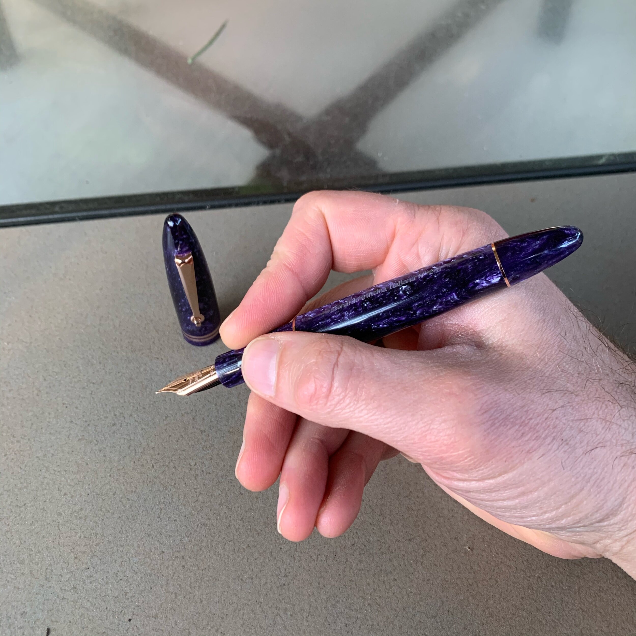
  • Writing Comfort. Based on how I hold the pen, I easily find the Curidas more comfortable than it’s main (or only) competitor, the Pilot Vanishing Point. Whereas the clip on the V.P. runs all the way down to the nib and basically forces you to wrap your fingers around it, Platinum opted to leave additional space for those with a more traditional grip to hold the pen naturally without adjusting for the “bumps” created by a clip or the plastic nub on the bottom of the pen, which also serves as a roll-stop. This is hard to explain, so take a look at the pictures below. If you use a similar grip, you’ll probably be fine. If your grip is different, YMMV.

  • Build Quality. Platinum makes excellent pens, and the Curidas is no exception. To keep the price below $100, Platinum went with mostly plastic construction, but the pen feels sturdy - not at all inexpensive or flimsy. While I have my own thoughts on the design of the knock (discussed further below), the mechanism deploys and retracts the nib smoothly, and it’s admirable that Platinum managed to keep the price down on a pen with so many moving pieces, all of which must have been custom designed.

  • Colors and Transparent Materials. I love Platinum’s 3776 demonstrator pens. The colors they use always seem to pop, and the plastic never looks cheap. The Curidas is no exception. I opted for the “Gran Red” and “Urban Green” pens, both of which look great. I normally prefer red pens, but the Urban Green is particularly stunning in person.

View fullsize Platinum Curidas with Nib Extended
View fullsize Platinum Curidas Grip Close-up

The Negatives:

  • Convoluted and Difficult Assembly. In order to refill the Curidas, you have to completely disassemble the pen, which is no small undertaking. As show in the photo gallery below, this entails removing the back half of the barrel (not a big deal); removing the spring-loaded nib assembly (a little more complicated, since Platinum uses a tongue-and-groove system to secure it); and removing yet another metal piece covering the converter and/or cartridge. It’s a remarkable feat of design and engineering, and it allows you to use the standard Platinum converter, but it creates a lot more complications than the average fountain pen user is going to want to deal with.

  • Awkward Sizing. With the knock depressed and the nib deployed for writing, the Curidas fits my hand perfectly. The pen is properly weighted and well-balanced for longer writing sessions. The issue I have is with the size of the pen with the nib retracted. I have average-sized hands, and I really have to stretch to use the knock. Plus, it just makes the pen look awkward. Couldn’t they have reduced the length by a centimeter or so?

View fullsize Platinum Curidas Disassembly, Stage 1
View fullsize Platinum Curidas Disassembly, Stage 2
View fullsize Platinum Curidas Disassembly, Stage 3

With the knock extended, the Curidas is an extremely long, and even awkward pen, both in terms of looks and feel. I don’t find the mechanism all that comfortable to use. It’s a stretch to get my thumb over the end.

The So-So:

  • The Nib. The medium stainless steel nib on the green pen is exceptional, and the fine nib was not. So, overall, a mixed bag. Let’s start with the good; the medium wrote a relatively wide, wet line, that others have accurately described as stubbish. For a stock steel medium nib - typically a very boring option - my green Curidas offers a spectacular writing experience, as long as you get a good one. Now for the bad: the fine nib on my red pen was extremely dry and scratchy out of the box. Curiously, I had the same experience with my Platinum 3776 Ultra-Extra Fine (UEF) nib. Platinum generally has an excellent reputation when it comes to nibs, especially fine and extra-fines, and I’m surprised I’ve had this happen to me on a pen with as much pre-launch hype as the Curidas.

View fullsize Platinum Curidas Medium Nib
View fullsize Platinum Curidas Fine Nib

Takeaways and Where to Buy

Obviously, I haven’t had the Curidas in my rotation for very long, but I did put Platinum’s latest release through the paces during a particularly strenuous week of work that involved a lot of writing. Retractable nib fountain pens are generally going to have a very specialized target audience - true pen geeks - and as long as Platinum realizes that casual users may be turned off by the pen’s complexity, I can appreciate Platinum’s efforts to grow the category. That said, the knock design bothers me a lot, both functionally and aesthetically, and I plan to withhold final judgment until I get a better sense of how much I’ll actually use this pen on a day-to-day basis, and whether I hear additional reports of spotty nib quality.

I acquired the Platinum Curidas fountain pens featured in this review from site sponsor Pen Chalet, which still has several colors in stock priced at $80. Platinum does not allow discounting on this pen. Other Platinum retailers (such as site sponsors Vanness Pens, Goldspot, and Appelboom), also carry the Curidas, but availability will likely be uneven given delays in distribution and shipping in light of current events.

Disclaimer: This post contains affiliate links. I am a participant in the Pen Chalet affiliate program, which allows me to earn store credit that I can use to acquire items for review on the blog, like the pens featured here.

In Pens Tags First Impressions, Platinum, Platinum Curidas, Retractable Fountain Pens, Pen Review
1 Comment

Pen Review: Leonardo Furore with Rose Gold Trim

March 15, 2020

Today’s review looks at the “Furore” fountain pen from Leonardo Officina Italiana, the penmakers based in Naples, Italy who have exploded in popularity over the past two years. Their Momento Zero and Momento Zero Grande are some of my favorite fountain pens on the market right now, and the “Furore” is their first attempt at a new shape that, to date, has received less attention than the Momento Zero but presents an equally excellent value proposition. 

Back to Basics: Pen Design from the 1920s Remains Relevant Today

For its second model, Leonardo chose another vintage-inspired design: a classic streamlined shape that borrows from pens like the Sheaffer Balance, an icon of 1920s-1930s penmaking. Although the larger size and bright acrylic material give this away as a modern pen, the shape and design elements such as the double cap band and roller clip will have the Furore looking right at home in your pen case next to your vintage pieces. Other things I immediately noticed upon unboxing my Furore are that (1) the ends are far less pronounced and pointy than Leonardo’s stock images make them appear, and (2) the pen itself is not long and skinny, something that also concerned me from images I had seen online. Sadly, while I’ve had opportunities to glance at the Furore on tables at pen shows, I never took the time to do a thorough overview until now.

I’m not sure whether the “Deep Purple” Furore is a limited edition, but my pen is numbered.

Where the Momento Zero incorporates a wide range of acrylics and other materials in patterns reminiscent of vintage celluloid, the Furore line comes in solid colors inspired by landscapes along the Amalfi Coast. Leonardo has chosen colors they characterize as “bright and strong,” and that’s a good description of the lineup, which includes: “Arancio” (orange), “Blue Emerald” (turquoise), “Blue Emerald” (a darker ocean blue), “Bronze” (pearlescent brown), “Deep Purple” (pearlescent purple, pictured here), “Grey Vulcano” (pearlescent grey), “Red Passion” (pearlescent red), “White Salt” (pearlescent white), and “Yellow Sun” (pearlescent yellow). Most colors are available with either gold or rhodium trim, and the Deep Purple model shown here is offered with rose gold. Since I’m trying to reduce the total number of pens that I own at any given time, my goal is to limit myself to a single Furore, but as with the Momento Zero, it’s going to be hard. 

View fullsize Leonardo Furore Unposted
View fullsize Leonardo Furore Posted

As I’ve said before about many other vintage-inspired fountain pen designs, there’s a good reason these particular shapes have withstood the test of time and continue to appear on pens nearly a century later. Both the Momento Zero and the Furore are insanely comfortable pens to use, posted or unposted. I love the fact that the caps post deeply, allowing Leonardo to make a larger pen that you can use unposted, but that we “posters” can still use in our preferred way without adding excess length or throwing off the balance. 

The Leonardo Furore uses the same filling system as the Momento Zero: a threaded converter that can be used in the traditional manner or “piston style” by removing the blind cap.

Bored with the Standard Choice Between Gold and Rhodium? Give Rose Gold A Try

Speaking frankly, I’ve been a little bored with my fountain pens. Over the past few years, I’ve fallen into a rut where I’ve accumulated a lot of pens that may not appear identical, but definitely share a common design theme. There’s nothing wrong with that - it tends to happen in collecting, especially to those who have been in a hobby for a long time and learned what they like. But the line between developing strong preferences and locking yourself into a “rut” where you stop exploring new things is fairly thin. For the longest time, I resisted picking up a rose gold pen. Now I own two. 

I knew little to nothing about rose gold as a material until recently. Rose gold derives its reddish hue from mixing pure gold with a copper and/or silver alloy, and the specific reddish tone can vary depending on the proportions used in the mix. Some rose gold trim appears almost pink, while others take on darker, more coppery hues. The rose gold used by Leonardo on my Furore leans toward the darker end of the spectrum, and accentuates the Deep Purple acrylic quite well.

Even the converter/“piston knob” is plated in the rose gold trim. I’ve previously remarked on Leonardo’s attention to detail, which continues with this pen.

Takeaways and Where to Buy

I regret waiting so long to give the Leonardo Furore an extended tryout, and purple pen fans will want to give this particular model serious consideration. For whatever reason, my perception of the Furore ended up skewed by the stock images available online, which made the Furore seem like a narrower pen than it actually is. The streamlined design turned out to be extremely comfortable posted or unposted. Most notable about this purchase for me is the fact that this Furore represents the first pen with rose gold trim in my collection, I love it, and it prompted the purchase of another rose gold pen, which you all will be seeing soon. Could rose gold be a new “thing” for me? We’ll see.

While certainly not “cheap,” Leonardo pens are notable for their relatively accessible price points: you can purchase one of their designs for as little as $160 in a standard material, which will net you an exceptional pen, and you can spend more if you desire a gold nib or aesthetic upgrades such as a rare material like Italian celluloid. I purchased this pen from site sponsor Appelboom, who carries the entire Leonardo Officina Italiana lineup, including not only the Furore but the acclaimed Momento Zero and the newly released Messenger. With a steel nib, the Furore runs 147 Euros / $163 USD, depending on the exchange rate. If you opt to upgrade to the 14k gold nib, the price jumps to 328 Euros / $365 USD. Here, the 14k nib in rose gold absolutely kills it in terms of overall finish and appearance. Personally, I find Bock gold nibs much more consistent in terms of overall performance than the standard steel. While Leonardo tunes their steel nibs, and the ones in my collection are all nice writers, I prefer the feel of the gold. 

Finally, this rose gold Furore is special for another reason: it’s the first pen chose for review by my Patreon backers. One benefit I offer to my Patreon subscribers (at the “Bespoke” and “Special Edition” tiers) is the ability to vote on reviews. The Leonardo Furore won the first poll, and I have additional content in the works based on subscriber input. Many thanks to the generous Patreon supporters who made this review possible.

Disclaimer: This post contains links to paid sponsors and affiliates. I purchased the pen featured in this review from site sponsor Appelboom, using affiliate credit generated through the Appelboom affiliate program, which is one way I support the blog.

In Pens Tags Fountain Pen, Pen Review, Leonardo Officina Italiana
Comment

Pen Review: Matthew C. Martin OG1 Fountain Pen

March 8, 2020

Though I’ve attended two pen shows, I’ve purchased very few pens in 2020, including none in Baltimore. One of my stated goals for the New Year was to continue to focus on refining my collection into a more personally meaningful set of pens and to own less stuff overall. I’ve mostly managed to stick to the “plan”, but Philly got me at both the Matthew C. Martin Custom Pens and Schon DSGN tables. For today’s review, I’m going to take an in-depth look at a pen that’s become a constant travel companion over the past six weeks: the Matthew C. Martin/”MCM Pens” Original, or as Matthew calls it, the “OG1”. 

Machined metal fountain pens and I have had an inconsistent relationship over the years. I’ve owned metal pens from Karas Kustoms and Tactile Turn, as well as various Kickstarter pens, but with the sole exception of the second iteration of the Tactile Turn Gist (which is excellent), none have stuck in my rotation for a meaningful amount of time. The primary reason is weight: It’s extremely difficult to design a machined fountain pen that most people can comfortably use for long periods of time (i.e., why many people turn to fountain pens in the first place). Since nearly all of these pens feature metal grip sections, the added weight from the barrel makes the pen even more awkward to hold by increasing the probability of the pen sliding around in a sweaty hand, which will be working harder to keep the nib under control. 

Capped, the MCM Pens OG1 is roughly the same size as a Lamy 2000, and perhaps slightly more compact.

Machinist and penmaker Matthew Martin has, in my opinion, done the best job of controlling for these factors using both smaller designs and what he refers to as “weight reduction machining.” In other words, he thins the walls of the barrel and cap, resulting in pens that are exceptionally light and comfortable to use even when made from heavy metals such as copper and brass. Combining this technique with other design choices, such as his use of the grooves in the pen pictured here, reduces the weight even further. MCM titanium and zirconium pens end up being so light that it’s fair to describe them as “featherweight.” 

Build Quality 

The MCM pens OG1 is easily the best-made machined metal pen I have ever used. Period. As I noted above, Matthew’s combination of excellent design and weight-reduction techniques creates a pen that is just as, if not more, comfortable to use than many acrylic pens, and I’ve never been able to say that before. But it’s not just about utility. The artistry involved in machining the grooves in the barrel and cap makes these pens instant conversation pieces, and don’t say I didn’t warn you that it’s the type of pen that will go “walking off” an office desk. 

If you carry a grooved pen around in a pen case or a bag, it will eventually collect lint and dust. I recommend using a can of compressed air to clean it out periodically.

The pen I purchased is made from a combination of zirconium and blue anodized titanium. Matthew also machines his own clips, and recently released pens featuring exotic metals more commonly used in the knife industry, such as Mokume-gane (Japanese-style “wood grain metal).  Matthew has made knives as well, and his father is a well-known knifemaker. 

Despite its high price, zirconium pens are among my favorite. The darker tone of the zirconium pairs well with anodized materials.

Nib and Overall Writing Experience

Matthew wisely chose to use standard JoWo No. 6 nibs, meaning that those of us with larger collections can swap in favorites like the Franklin-Christoph EF SIG pictured in this review. The standard medium nib that came with this pen, however, was also well-tuned and has a place in my stash of good JoWo writers. 

Where this pen shines is comfort. In terms of length, the MCM OG1 pushes the boundaries of how short a pen I can reasonably use. The OG1 doesn’t post, and measures 4.75 inches uncapped. While the added weight of a metal pen makes the shorter body more usable for me as a daily writer, I can’t say the lack of postability is a total non-issue. For pure EDC, I’d prefer to not have to worry about keeping track of the cap, or having it roll away while writing, but that’s a design choice that I’m willing to overlook here for the unique grooved design. For my next MCM pen, however, I will likely opt for a model with a milled clip, which can act as a roll-stopper.

I recognize that the grooved design I chose won’t be comfortable for many people. Since I don’t have sensitive hands, the grooves on the barrel and ridges on the grip section don’t bother me, but others might prefer a smooth barrel and/or a different grip texture, both of which are available.

Takeaways and Where to Buy  

Since I picked up this pen at the Philadelphia Pen Show in January, it hasn’t left my pen case, and has barely left my hand. Matthew Martin represents the best of the new, emerging generation of penmakers, and his work shows a combination of creativity and technical expertise that you don’t see often, especially with someone working out of a small shop. Visiting his table has been a highlight of the past few pen shows - each time he shows up with something that pushes the envelope even further. 

As you might expect given the choice of materials, advanced machining techniques, and overall level of craftsmanship, MCM pens are not inexpensive. The blue-anodized titanium and zirconium pen featured in this review cost me $575. Currently, the least expensive model starts at $275 (for a bronze or copper pen), with pens priced as high as $1,750 for a pen made from layered zirconium and titanium with a milled zirconium clip. Matthew sells his pens directly on his website, and he mentioned in Philadelphia that he intends to increase the number of U.S. pen shows he attends as long as he can keep up inventory. Many thanks to Matthew for taking the time in Philly (both at the table, and in the evening at Ian Schon’s open house) to offer insight into his machining techniques and design theory.

Disclaimer: I purchased the pen featured in this review with my own funds, for my own personal collection.   

In Pens Tags MCM Pens, Matthew C. Martin, Machined Pens, Fountain Pen, Pen Review
Comment

A Tale of Two Limited Anniversary Editions: The Lamy 2000 Black Amber

February 19, 2020

Last year, at the time of the Lamy 2000 100th Anniversary Bauhaus edition, I looked at Lamy’s struggles with managing its limited edition portfolio. While most criticism of the “Blue Bauhaus” fountain pen focused on Lamy’s decision to release fewer than 2000 pens - not coming close to satisfying demand - it’s easy to see how the company ended up in that place: three years later, they still haven’t sold out of their previous anniversary edition, the Lamy 2000 Black Amber, released to commemorate the 50th anniversary of Lamy’s flagship writing instrument.

Others (namely Dr. Deans at Pen Economics) have written in depth on the nature of the problems with this release from a business perspective. In short, Lamy grossly overestimated how many limited edition Black Amber Lamy 2000s they could sell at the 500 Euro / $600 USD price point. While most U.S. retailers no longer have the pen in stock, that’s likely the result of the heavy discounting and promotional offers they used to unload inventory. Some European retailers still have pens available for purchase, so at this point I wanted to take advantage of a couple years’ worth of perspective and re-evaluate the Black Amber with some distance, focusing more on this limited edition release as a pen rather than a marketing case study.

Beyond black makrolon: From left, Lamy 2000 Black Amber 50th Anniversary Edition; Stainless Steel Lamy 2000M, and the Bauhaus 100th Anniversary Blue Makrolon pen.

The Black Amber Is Still a Lamy 2000 - And An Exceptional Pen

Disclaimer up front: I don’t necessarily come to this review from a rational standpoint. The Lamy 2000 is easily my favorite fountain pen of all time, and as with the Bauhaus 100th Anniversary Pen, I was eventually going to track down a Black Amber and add one to my core collection. And, it’s going to be no surprise to you all that I love this pen. I disagree with those who criticized this release on the grounds that it was “too similar” to the standard stainless steel Lamy 2000M. The electroplated finish on the Black Amber gives the pen a much different feel in the hand, and it’s noticeably lighter. When I weighed these two pens on my digital scale, the standard stainless steel pen came back at 2.0 oz, and the Black Amber 1.9 oz (and the Black Amber was fully inked at the time). The difference is enough to change the balance of the pen when posted, at least for me. Curiously, much of the extra weight on the stainless model is in the cap, which weighs .8 oz as opposed to .6 oz on the Black Amber.

How does one describe the color? Let me say this: after seeing the Lamy 2000 Black Amber in person, I finally understood the name. The finish alternately appears dark grey, brownish, or even a champagne gold, depending on the lighting. It’s beautiful. Sure, the Black Amber will never appease those clamoring for a yellow or orange or translucent green demonstrator, but I’ve never felt that wild color schemes would be consistent with the Lamy 2000’s design heritage. At the end of the day, I think I’m fine with the decision to explore more subtle variations in color and texture.

I have pen No. 3497/5000. The size of the releases have significance (5000 pens for the 50th Anniversary, and 1919 pens for the 100th Anniversary of the Bauhaus, founded in 1919.)

The engraving on the cap is very subtle, requiring me to enhance the picture so that it’s even visible.

Overall Writing Experience

I’ve previously reviewed both the standard Lamy 2000 and the Stainless Steel Lamy 2000M at length, and to be honest the experience of putting nib to paper with the Black Amber doesn’t differ all that much from Lamy’s standard lineup. The medium nib on my Black Amber writes a smooth, wet line, consistent with the platinum-coated 14k nibs on the other Lamy 2000 fountain pens I currently have in rotation. At one point, the Lamy 2000 developed a reputation for finicky nibs, but I have to say that I’ve not experienced any issues with the pens I’ve owned, and I’ve purchased five or so within the last several years, through regular retail channels.

View fullsize Lamy 2000 Black Amber Unposted
View fullsize Lamy 2000 Black Amber Posted

Takeaways and Where to Buy

I remain convinced that the primary obstacle to the Black Amber selling well was the price, widely perceived as too high for “what the pen was.” While I’m not sure this is fair - other companies have implemented much more egregious price hikes on their limited editions (including instances where the editions weren’t really limited at all), the discomfort I have with high price points on the Lamy 2000 is that it seems somewhat inconsistent with the Bauhaus ethos: well designed, functional items meant to be used, not necessarily collected. But lots of factors go into companies’ pricing decisions that are beyond the scope of this article, including costs of material, manufacture, and distribution, all of which affect how a company can price the pen without losing money. And, don’t forget that the entire run of Bauhaus 100th Anniversary pens sold out immediately, despite similar pricing to the Black Amber, so what do I know? It could simply be an issue of Lamy feeling out the size of the market for a limited edition Lamy 2000, which sits somewhere between 1919 and 5000 pens.

The texture on the Lamy 2000 Black Amber makes for a perfect pairing with my Raven Venture.

Like any limited edition pen priced at a premium, whether the purchase is “worth it” to you remains a highly personal decision. Anytime you move past the $300 mark, you’re buying the pen because it moves you in some way, or, like me, you’re concerned that if you let this pen sell out without acquiring one your status as a Lamy 2000 super-user will be revoked. But in all seriousness, my overall take on the pen is this: I love it, especially the finish, and the pen itself doesn’t deserve the degree of negative attention it’s received. If you appreciate Lamy’s understated designs, especially the subtle variations in finish and texture they’ve chosen for their limited editions on the 2000, and can handle the weight of the stainless steel body, you probably won’t regret the Black Amber. Ignore the hype/haters and trust your own preferences.

I purchased my Lamy 2000 Black Amber from site sponsor Appelboom last year, around the same time that I ordered my blue Bauhaus 100th Anniversary fountain pen. Although I recognize that the Black Amber is not for everyone, I’m somewhat amazed that this pen remains available for purchase, even at the discounted (but still-expensive) 400 Euro price point.

Further Reading on the Black Amber and the Lamy 2000

One reason I wanted to review the Lamy 2000 Black Amber is because so few reviews of this pen exist. Dries over at The Pencilcase Blog is the only one I can find who reviewed the Black Amber, back in 2016 at the time of its release, and had much the same reaction as I did. I’m glad that I can add my own voice to what little is out there, and make sure this gem doesn’t fall into obscurity.

Disclaimer: I purchased the pen featured in this review with my own funds, for my own use. This post contains affiliate links.

In Pens Tags Lamy, Lamy 2000 Black Amber, Lamy 2000, Limited Edition, Pen Review
1 Comment

First Impressions: The AmazonBasics Fountain Pen Is Surprisingly Good

February 15, 2020

As something of an Amazon junkie, I couldn’t help but place an order for the AmazonBasics “Refillable Fountain Pen” after reading Evan’s review over at The Penquisition. His take on this pen is consistent with my own: Amazon has created (or more likely, sourced) an excellent inexpensive fountain pen that deserves consideration as a “First Fountain Pen” recommendation for new users, or as an inexpensive cartridge pen to leave at the office or keep in your travel bag.

The packaging includes a nice presentation box for a $10 pen, so if you’re looking for an inexpensive gift to give someone potentially interested in fountain pens without dropping a ton of money. The pen does not ship with a converter, and I’ve only tested with the short international cartridges that ship in the box. I would expect a converter would work, though you may have to try a few sizes. The pen barrel is fairly narrow.

Design and Build Quality

Look, this pen won’t win any design awards, but for what I paid I’m more than happy with the somewhat generic lacquered brass body with chrome trim, and I’ll even forgive the “AmazonBasics” branding stamped on the clip. Frankly, if Amazon had foregone the latter, this could easily pass to the casual observer as a Cross or Waterman pen that sells for $100 plus.

The AmazonBasics fountain pen features a classic shape and design, sort of similar to my Otto Hutt Design 06, but no one is going to confuse these two pens.

The build quality also feels far above the price point. Inexpensive pens often suffer from loose friction-fit caps that spin or rattle, but this one feels tight. The balance on this pen reminds me of my Otto Hutt Model 06, in that both can be used posted and unposted, and offer a slimmer profile without being too slim for longer writing sessions. The cap posts securely, and though some will find the metal section slippery, the overall weight of the pen is appropriate for a daily writer.

View fullsize AmazonBasics Fountain Pen Posted
View fullsize AmazonBasics Fountain Pen Unposted

Nib and Writing Experience

Amazon’s target customer for the AmazonBasics fountain pen will be perfectly happy with the medium nib on this pen. I actually like the clean design - Amazon didn’t try to stamp a logo on the nib, but rather left it plain save for an engraved “M” to designate the nib width. At the present, only fine and medium nib widths are available, which is consistent with most pens at this price point.

I have no idea who made this No. 5 stainless steel nib. Based on the look of the feed, if it’s a German nib I would say it’s a Schmidt, but it could very well be of Chinese manufacture. It doesn’t matter because my nib writes a smooth, classic western medium line. It worked well out of the box and didn’t require any adjustment whatsoever. As Evan noted in his review, this nib also writes a surprisingly smooth extra fine line if you flip it over and write using the reverse side. That’s apparently not a fluke unique to his specific pen.

Takeaways and Where to Buy

Amazon delivers the goods here: a no-frills black lacquered and chrome cartridge-converter fountain pen with a steel nib that works as advertised. For just under $10, you can’t argue that this pen isn’t good value. I actually find the AmazonBasics Fountain Pen (much) more comfortable than the Pilot Metropolitan, and for those who desire a work friendly “beater” pen made from a material other than plastic, or who are looking for a low-risk way to test the fountain pen waters for the first time, there’s no reason not to give this pen a try.

No surprises on where to buy this pen: Amazon is currently selling the AmazonBasics Fountain Pen in both fine and medium nib sizes. Currently, only one color is available, but again that could change if this pen catches on.

Disclaimer: This post contains affiliate links.

AmazonBasics Fountain Pen compared against, from left: Lamy 2000; Otto Hutt Design 06; TWSBI Eco.

In Pens Tags Fountain Pen, First Impressions, AmazonBasics, Amazon, Pen Review
1 Comment
← Newer Posts Older Posts →
Store Hours and Location
Visit the T.G.S. Curated SHOP
Updated "Best Pens" Guide
On the Paper Trail Podcast
TGS_25 Roterfaden New Stock Available
Hierarchies of Fountain Pen Friendly Paper

Join Our Patreon!
Subscribe to the TGS E-mail List

Featured Posts

Featured
Pilot-Custom-Series-Pens-overview.jpg
Mar 14, 2026
The Pilot "Custom" Series: An Overview of Some of My Favorite Fountain Pens
Mar 14, 2026
Mar 14, 2026
Pentel-Sign-Pen-Cover.JPG
Feb 28, 2026
Pen Review: The Pentel Sign Pen (Craft Design Technology Version)
Feb 28, 2026
Feb 28, 2026
Cover On the Paper Trail Intro Clip.jpeg
Dec 3, 2025
Introducing "On the Paper Trail," a New Podcast/Video Collaboration with Lisa Vanness of Vanness Pens!
Dec 3, 2025
Dec 3, 2025
The Gentleman Stationer RSS

View Cart

© Digital Divide Media, LLC, 2014-present.

All content is the exclusive property of Digital Divide Media, LLC, d/b/a The Gentleman Stationer, including “The Gentleman Stationer” website and trademark, and should not be reproduced without express written permission.  All rights reserved.

All content containing paid advertising, affiliate links, or sponsored content will be plainly disclosed by a disclaimer when/if featured.

Contact Information

Store Shipping Policy and Return Policy

Privacy Policy

Cookie Policy

Terms and Conditions

Powered by Squarespace