• Blog
  • Shop
  • Resources
  • FAQ (Ask TGS)
  • About
  • Archive
  • Contact
  • Sign In My Account
Menu

The Gentleman Stationer

Vintage Living in the Modern World.
  • Blog
  • Shop
  • Resources
  • FAQ (Ask TGS)
  • About
  • Archive
  • Contact
  • Sign In My Account

First Impressions: Esterbrook JR Pocket Pen in Tuxedo Black

September 5, 2020

This week, Esterbrook announced arguably its biggest release to date: the “JR Pocket Pen”, which is the first modern Esterbrook that actually attempts to replicate the design of the famed vintage “J” pen. As such, Esterbrook knew that there would be heavy expectations piled on this release, and there was no room for error. So how did they do?

While I’ve only had the pen for a week, what I’ve seen so far leads me to believe that the JR will be widely viewed as a success. As with all “heritage” releases - which is how I generally refer to products such as pens and watches that draw inspiration from a vintage product without copying it exactly - the JR borrows from those aspects of the original “J” that translate best into a modern fountain pen, and dispenses with others that, well, wouldn’t work so well today. I’ll briefly run through the similarities and differences:

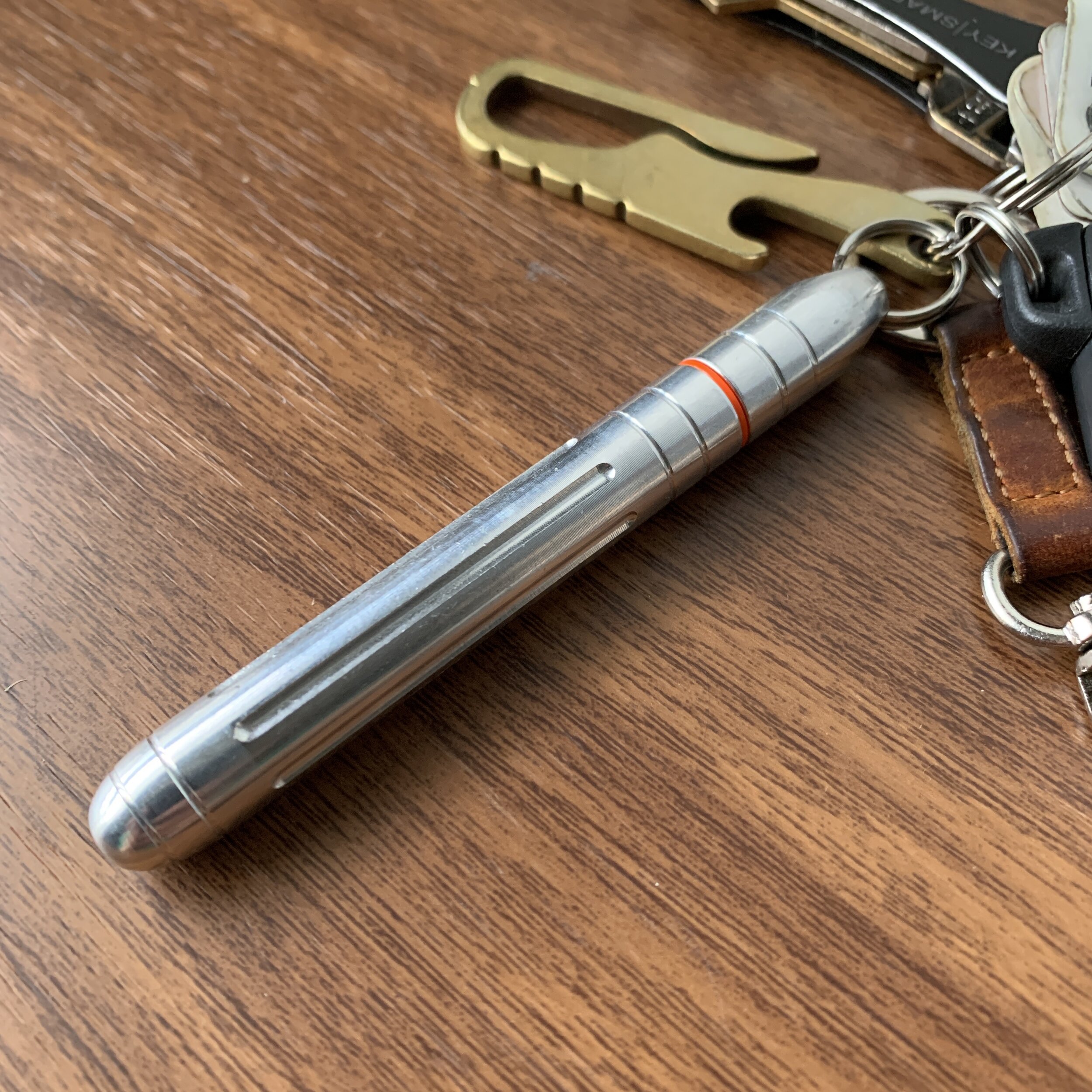
The Esterbrook JR comes in three different colors: Tuxedo Black (shown here), Carmine Red, and Capri Blue (which is the only one with gold trim). Based on pictures alone, the Tuxedo Black and Capri Blue are my favorites.

First of All, What’s Changed?

  • The new Esterbrook JR is slightly slimmer than a standard vintage Esterbrook J, and the barrel and ends less rounded. While I don’t currently have any vintage Esterbrooks in my collection, Ana over at the Well-Appointed Desk has published her own review and has some extremely thorough comparison photos that show the JR compared against various vintage Esterbrook fountain pens.

  • Esterbrook has dispensed with the black plastic cap jewels in favor of metal finials. The finial on the cap bears the Esterbrook “infinity” logo also found on the Camden. While the black plastic finials lent the original J a unique, almost Art Deco look, they also grew fragile over time and had a tendency to crack and/or fall out if you accidentally dropped the pen. Here, I would say that gains in long-term durability make up for any losses in terms of aesthetics and faithfulness to the original design.

  • The filling system on the JR, predictably, is cartridge-converter instead of a lever-filler. I’m sure many vintage pen die-hards will complain (loudly) about this fact, but seriously, is Esterbrook really going to release a lever-filling fountain pen that would require periodic ink sac replacement? No. Nor should they. Even back in its heyday, Esterbrook was a mass-market brand, and to me, going with cartridge-converter is more faithful to the original vision of Esterbrook than releasing a throwback pen with a high-maintenance lever-filling system.

Size comparison, show here between a Kokuyo Sketch Notebook (left) and a Hobonichi Techo A6. Writing samples in this review are shown in the Kokuyo Sketch.

What’s the Same or Similar?

  • The overall look, feel, and aesthetic of the pen are very similar. As someone who has used vintage Esterbrooks extensively, I will say that the modern iteration of the company has definitely managed to “recapture the magic” of the original brand. A key part of this reissue is the choice of pearlescent acrylic: Vintage Esterbrooks are known for the depth of the material used to make the barrels, which was largely unique to that brand. The black, blue, and red materials chosen for the JR, while not an exact match, replicates at least some of that same depth.

  • While slightly longer and slimmer than the clip on the original J, the clip on the JR retains the same ribbed look while omitting the “Esterbrook” engraving, which moves to the cap band. While I’m glad they retained some version of the classic clip, I’m torn over the placement of the engraving. Could they have gone with a wider clip and kept the vintage-style engraving? Possibly, but I suspect this would present production issues, whereas placing the Esterbrook engraving on the cap band also creates branding consistency with the Estie and the Camden.

  • The JR features an interchangeable stainless steel JoWo No. 5 nib unit, which allows you to swap in different nib sizes, and even JoWo nib units you may have had ground to a stub, italic, architect, etc. It remains to be seen whether the JR will get its own adapter that will allow you to use the full array of vintage Esterbrook nib units.

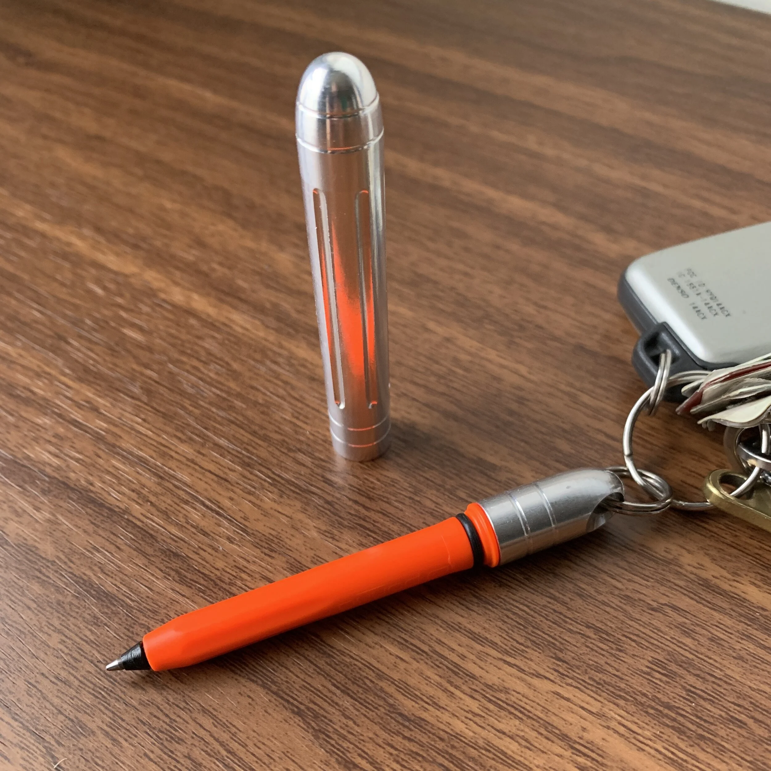
Esterbrook is marketing the JR as a “pocket pen.” I typically don’t pocket-carry pens like this one - it’s slightly too large for that purpose, at least for me - but it’s quite portable. The JR would make a great planner pen. (Picture below)

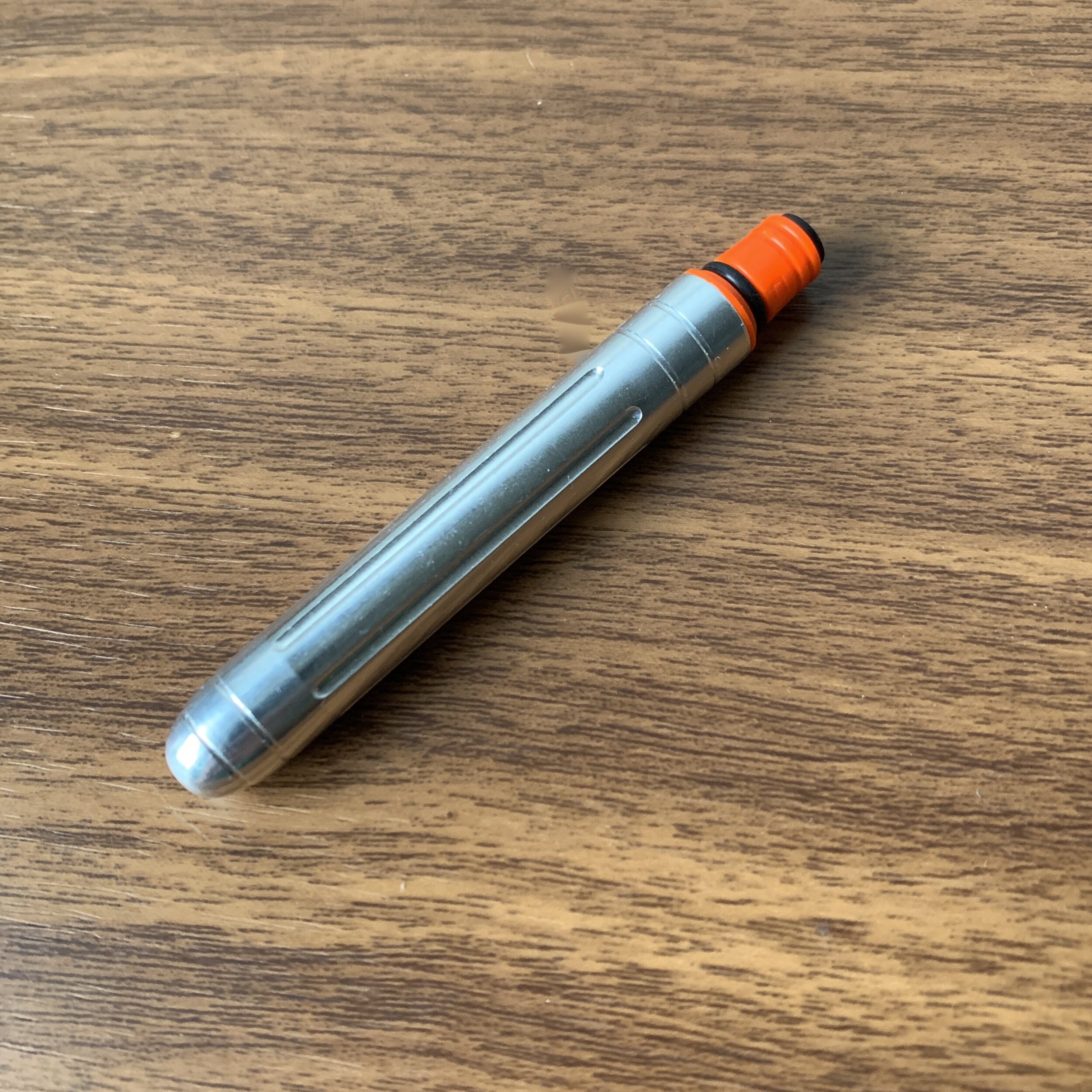
Perhaps my one critique of this pen is that I wish the cap posted a touch deeper as it looks a little awkward. The pen itself is so light, however, that it makes very little difference from a functionality perspective.

No surprises with the line written by a medium No. 5 JoWo nib.

Takeaways and Where to Buy

The Esterbrook JR is a very well done heritage pen that I expect will please the majority of Esterbrook fans while still managing to tick off those few who would only be pleased with a “J” replica. As evidenced by the visceral reaction to Parker’s recently announced Parker 51 re-release, attempting to recreate a vintage pen design for modern users can be a risky move, in that you need to strike a balance between catering to fans of the original pen while still making a product that is marketable to new customers. So far, Esterbrook seems to have done just that, and I’m excited to see where they take this pen design over the next year or so. The next logical step would be to introduce additional colors, either special editions or green and grey pens to match the original lineup, as well as a vintage nib adapter.

You should now be able to purchase the Esterbrook JR at most Esterbrook retailers, including site sponsors Vanness Pens and Goldspot. Current MSRP on the Esterbrook JR is $175, with most retailers so far pricing this pen at $140, which is becoming the standard price point for a steel-nib pen of this quality.

The Esterbrook JR fits perfectly in the pen slots on my Hobonichi Techo. Planner pen, anyone?

Disclaimer: Many thanks to Esterbrook/Kenro Industries for sending me this pen for review. This post contains links to paid sponsors/affiliates.

In Pens Tags Esterbrook, Esterbrook JR
6 Comments

Pen Review: Kaweco x Galen Leather Classic Sport

September 2, 2020

Ok, so I’ve been teasing pictures of this pen for a couple of weeks now, and it’s only fair that I go ahead and write up this new fountain pen from Galen Leather. As Galen expands their retail offerings outside of traditional leather goods into desk accessories, paper, and now fountain pens, what better way to launch a new product category than a collaboration with Kaweco!

The Galen Leather + Kaweco release is a special edition from the Classic Sport “Transparent” line, meaning that it’s a demonstrator version of Kaweco’s Classic Sport workhorse. Galen has chosen a “cognac” acrylic, which Kaweco has paired with their gold-plated trim. I’ve never owned one of the transparent Sports, so this is a first for me and I’m enjoying the look.

In addition to the standard Kaweco logo, Galen Leather has included their own branding.

I’ve previously reviewed the Kaweco Sport fountain pen in multiple iterations on this blog (additional links below), so I’ll only briefly recap the specs. The Sport is intended as a pocket pen, and it lives up to Kaweco’s slogan, “small in the pocket; large in the hand.” Once you unscrew the cap and post the Sport, it becomes a full-size writing instrument that’s as comfortable as any standard fountain pen, even for long periods of time. Kaweco Sports use a small No. 4 Bock nib, which over the years has had its share of quality control issues, but recently Kaweco and Bock seem to have figured things out and the last few Kaweco nibs I’ve used, ranging from EF to B, have been solid. The medium nib on this particular pen is an excellent writer, and I will go ahead and mention that the best Kaweco nibs I’ve used have all been mediums. It’s become my default for this brand.

As you might expect, the “special” attribute on this edition is the cognac acrylic. Kaweco absolutely killed it, and the pen is stunning to look at. For whatever reason, I like to pair translucent brown pens with dark red or burgundy ink, and I inked this one up with a Diamine Oxblood cartridge. It’s a perfect pairing, and Oxblood might be the ink for this pen (at least until my cartridges run out).

For a cognac or whiskey-colored pen, gold trim is really the only option.

Takeaways and Where to Buy

You can’t go wrong with a Kaweco Sport, and if you’re looking to rejuvenate your office space with some elegant wood and leather accessories from Galen Leather, I would encourage you to consider adding one of these pens to your order before they sell out. Currently, you can purchase the Galen Leather + Kaweco special edition fountain pen directly from Galen Leather in their online store, as part of their growing selection of fountain pens. Since this is a special edition, pricing is slightly higher ($30) than you would otherwise find on a standard Sport, but still reasonable.

Many thanks to Galen Leather for providing this item for review!

Further Reading

I’ve previously reviewed several iterations of the Kaweco Sport, including not only the Classic but also the Art Sport, the AL Sport (aluminum), the AC Sport (Carbon Fiber), and the all-metal Brass Sport. I even reviewed a vintage Kaweco Sport with a piston filler a couple of months ago. Check out these reviews to learn more about Kaweco’s Sport series.

Disclaimer: I received the pen featured in this review from Galen Leather for review purposes, free of charge. I was not otherwise compensated for this review.

In Pens Tags Kaweco, Galen Leather, Kaweco Sport, Kaweco Transparent Sport
4 Comments

Pen Review: Cross Peerless 125 Fountain Pen

August 22, 2020

Many would argue that the remaining old-line American pen brands are mere shells of their former selves. Parker and Sheaffer, the two most known for fountain pens, have changed ownership multiple times, and while they have consistently produced pens for more than a hundred years, quality has varied wildly. A.T. Cross, (or “Cross”) traditionally has been known more for its ballpoints, mechanical pencils, and rollerballs, and particularly for serving as the official supplier of pens to the White House for use in bill signing ceremonies. From the 1960s to the present, the ultra slim Cross “Century” became a ubiquitous college and/or high school graduation gift in the United States. In recent years, Cross has taken steps to expand their offerings to include more higher-end fountain pens, a move that coincides with the company’s acquisition of Sheaffer from BIC.

Cross fountain pens first came to my attention a few years ago when I reviewed a Star Wars-themed Cross Townsend from Goldspot, which featured a “Stormtrooper”-inspired design and a Pelikan nib. Perhaps recognizing their own manufacturing limitations, higher-end Cross pens have begun to incorporate nibs from other manufacturers, including not only Pelikan but Japanese company Sailor, who made the nib on the pen I plan to review today, the Cross Peerless 125.

According to the Cross website, the Peerless line incorporates design elements from several earlier pens in the Cross catalog, fusing them together into a much larger pen than you typically see Cross release. (One critique I’ve had of the brand in the past is that I tend to find the mainline Cross pens, such as the Century, far too slim.) The Cross Peerless 125 reminds me more of chunkier American pens such as Sheaffer’s Legacy Heritage, which may not be coincidental since Cross now owns Sheaffer.

Don’t get me wrong, the Peerless 125 is a big pen, and this combination of size/weight is likely at the limit of what I can use comfortably.

The Peerless 125 features a lacquered metal body with an oversized cap, which posts deeply and comfortably despite its size. The threaded cap closes securely with 2-3 turns. I enjoy how the threads are compressed so as not to interfere with your grip when writing with this pen, and I find the wider section quite comfortable to use. If you’ve been following me on Instagram, where I’ve been posting my “daily user” to the Stories over the past week or two, you’ve seen the Peerless 125 get a lot of use.

As I mentioned earlier, the 18k nib on the Peerless is manufactured by Sailor for Cross. Though there are no “Sailor” markings, the nib and feed are unmistakeable, as is the quality. This stiff medium nib writes a smooth, Japanese medium line with just a touch of tooth - all Sailor hallmarks. For those who can’t stand the Sailor converter due to its low ink capacity and tendency to fall apart, you’ll be glad to hear that the Peerless 125 uses a Cross proprietary converter, which holds more ink and feels fairly solid. It also threads into the section for a secure fit.

The one design feature I’m not crazy about is the Swarovski Crystal embedded into the cap, in place of a traditional finial. At the same time, given the gloss finish of the pens and the engraved striations on the lacquer, it does sort of work.

Takeaways and Where to Buy

You have to give credit where credit is due: Cross has upped its game over the past few years, not only increasing the overall quality of its fountain pen offerings, but also moving away from the staid “high school graduation gift” market and taking on a more creative, even playful, tone with its designs. I’ve enjoyed using the Peerless 125 and could certainly see myself keeping this pen in my personal collection as a daily user. Cross uses the tagline, “The finest writing instrument we’ve ever brought to market.” I wholeheartedly agree.

As a bit of a personal interest project over the coming months, I plan to explore more modern offerings from “traditional” pen companies such as Parker, Sheaffer, Cross, and Waterman, which modern enthusiasts tend to overlook. While pens from these companies arguably aren’t what they once were, back in their “golden age” heyday, their offerings have improved quite a bit from even five years ago.

The Cross Peerless 125 is available in three lacquered variants - Obsidian Black, Quartz Blue Engraved (pictured here), and Titanium Grey Engraved - priced at $350 MSRP with most selling for $250-280 at retail. This price point places the Peerless in direct competition with Sailor’s 1911 and Pro Gear offerings, and since the Peerless features a Sailor nib, it’s a nice option for those looking for the writing experience that a Sailor nib offers but prefer a larger pen with more heft, not to mention a higher-capacity threaded converter.

Cross also makes the Peerless 125 in a more expensive 23k Gold Plated “Citizen” special edition finish (priced at $625), and a “Medalist” finish (selling for around $452). While I acquired my Peerless 125 from Pen Chalet, these two finishes are available at site sponsor Goldspot.

Disclaimer: I purchased this pen from Pen Chalet, using store credit generated through the Pen Chalet affiliate program. Since I am in the process of winding down participation in third-party affiliate programs in favor of a reader-supported model (via Patreon and the Curated Shop), this post does not contain affiliate links, but I do encourage you to purchase from Pen Chalet! Many thanks.

In Pens Tags Cross Peerless 125, A.T. Cross, Fountain Pen, Pen Review
6 Comments

First Impressions: Leonardo Momento Zero in Primary Manipulation

August 15, 2020

It’s been a while since any pen has received as much acclaim as the recent collaboration between Leonardo Officina Italiana and Jonathon Brooks of the Carolina Pen Company. Jonathon’s “Primary Manipulation” acrylic features more than six pigments mixed to create a swirled pattern of incredible depth, and back when we still had pen shows, pens made from these materials were always the subject of an early rush at the Carolina Pen Company table. So, when Leonardo first teased this collaboration a couple of months ago, you can imagine the hype. I was lucky enough to snag a pen in each of the two patterns: “Stromboli” (with green as the predominant color) and “Vesuvio” (where red predominates).

I’ve previously reviewed the Leonardo Momento Zero and the Momento Zero Grande, with the special edition Arlecchino making my list of favorite products from the first half of the year. The “Primary Manipulation” MZG easily knocks that one off the list (though the Arlecchino is still a great pen). Leonardo did justice to this unique material, in that the design and finish on the Momento Zero Grande really shows off its depth and vibrancy.

The depth on this particular area of my Stromboli pen is absolutely stunning. Check out that purple swirl! Given the nature of this material, no two pens are alike.

In addition to the unique materials, this version of the Momento Zero Grande is the first pen in my collection to feature Leonardo’s new high-capacity piston filler, which holds 1.5ml of ink. Prior versions of the Momento Zero Grande, such as the Arlecchino, featured a “captured converter,” which still held a good amount of ink but wasn’t a true integrated piston. I believe that going forward, new models of the Momento Zero Grande will feature the high-capacity piston.

The “Vesuvio” model in-hand. Despite its size, the Momento Zero Grande feels incredibly light posted.

As I’ve mentioned before, the Momento Zero Grande shows that an oversized fountain pen can still be comfortable to use, provided the pen is well-balanced and steps are taken to keep the weight down. Comparing the two pens in hand, the Primary Manipulation featuring the integrated piston is actually lighter and less back-weighted than the Arlecchino, making it the easier pen to post. (Overall, the Primary Manipulation weights 1.2oz inked, while the Arlecchino weighs in at 1.4oz. Neither is particularly heavy as far as larger pens go.)

I’m developing quite a collection of special edition Leonardo’s in rare materials. From left, the Arlecchino Momento Zero Grande, a standard Momento Zero in OMAS “Burkina” celluloid, the Stromboli, a standard Momento Zero in OMAS “Burlwood” celluloid, the Vesuvio, and a standard Momento Zero in OMAS “Arco Verde” celluloid. The three pens in OMAS materials formed part of a limited edition “Maestro” set of which only 15 were made.

Takeaways and Where to Buy

Everything that Leonardo continues to do impresses me, and hopefully this collaboration with Jonathon on the “Primary Manipulation” model is the beginning of a trend where pen companies and smaller artisan makers like Jonathon collaborate to bring some truly unique pens to the market. Personally, things have seemed a bit stale lately, and this project was just what I needed to rekindle my interest.

The two Primary Manipulation models shown here with the Arlecchino limited edition (far left).

The standard Momento Zero Grande is priced at $329 for a steel nib version, and $549 for a 14kt version, which I consider very good value for a pen of this quality. Special editions such as the Momento Zero Primary Manipulation are priced slightly higher, with Goldspot selling it from $599 (an incredible value given the uniqueness and current limited availability). While Leonardo produced a relatively small number of pens for this initial run, the Primary Manipulation pens form a non-numbered special edition, and the word on the street is that more pens are on the way. I ended up having to hunt for my pens, since this edition was in high demand, and ordered my Stromboli and Vesuvio pens from Appelboom in the Netherlands and Casa della Stilografica in Italy, respectively.

Disclaimer: I purchased both pens pictured here with my own funds for my own collection. I did not receive any discount unavailable to the general public and paid standard retail. This post contains links to paid sponsors and affiliates.

In Pens Tags Pen Review, Leonardo Officina Italiana, Leonardo Momento Zero Grande
2 Comments

Introducing New Pokka Accessories: Aluminum Cap and Keyring Dock

August 4, 2020

People love their Pokka Pens, and Pokka recently released a new line of accessories that can make your Pokka an even more essential part of your everyday carry. I’m currently stocking both the Pokka “Dokk” keyring docking system, as well as the Pokka “Jakket” aluminum cap, both of which you can pair with any Pokka Pen using the secure Pokka o-rings included on every pen barrel. Note that all Dokks and Jakkets are sold separately, and do not come with a pen.

View fullsize Pokka Jakket on Pokka Dokk
View fullsize Pokka Jakket Uncapped
View fullsize Pokka Dokk Keyring
View fullsize Pokka Jakket Capped

Finally, in response to multiple requests, I’m now stocking three-packs of Pokka Refills, available in blue and red. If you’ve been despairing because you don’t like the black ink included with your Pokkas, swap ‘em all out!

In Pens, TGS Curated Shop Tags TGS Curated Shop, Pokka Pens
Comment
← Newer Posts Older Posts →
Store Location
Visit the T.G.S. Curated SHOP
*New* Updated "Best Pens" Guide (2025)
TGS x Hinze Pens Violet Tendencies Taschenstift Fountain Pen
Hierarchies of Fountain Pen Friendly Paper
Allex Scissors arrayed on a desk showing link to desk accessories

Join Our Patreon!
Subscribe to the TGS E-mail List

Featured Posts

Featured
Pilot-Iroshizuku-Yama-Budo-Writing-Sample.jpeg
May 24, 2025
Joe's Picks: Five Favorite Inks From Pilot's Iroshizuku Lineup
May 24, 2025
May 24, 2025
Yamamoto-Gray-Paper-Sampler-Set.jpeg
May 10, 2025
Discovering Unusual Paper: "Paper Tasting" Sets from Yamamoto Paper
May 10, 2025
May 10, 2025
Four-Micarta-Fountain-Pens.jpeg
Apr 19, 2025
Yes, Micarta for me! I finally got my hands on Some Micarta Pens, Plus My Own Special Edition
Apr 19, 2025
Apr 19, 2025
The Gentleman Stationer RSS

© Digital Divide Media, LLC, 2014-present.

All content is the exclusive property of Digital Divide Media, LLC, d/b/a The Gentleman Stationer, including “The Gentleman Stationer” website and trademark, and should not be reproduced without express written permission.  All rights reserved.

All content containing paid advertising, affiliate links, or sponsored content will be plainly disclosed by a disclaimer when/if featured.

Contact Information

Store Shipping Policy and Return Policy

Privacy Policy

Cookie Policy

Terms and Conditions

Powered by Squarespace