• Blog
  • Shop
  • Resources
  • FAQ (Ask TGS)
  • About
  • Archive
  • Contact
  • Sign In My Account
Menu

The Gentleman Stationer

Vintage Living in the Modern World.
  • Blog
  • Shop
  • Resources
  • FAQ (Ask TGS)
  • About
  • Archive
  • Contact
  • Sign In My Account

Exploring Stock Custom Nibs: The Esterbrook Needlepoint by Kirk Speer

May 11, 2022

In my past few pen show reviews, particularly my review of the Baltimore Pen Show, I remarked on how there are many more nib grinders working at pen shows than there used to be. The result is not only shorter wait times and more options for those looking to tune or customize their fountain pens to their personal preferences, but a wider range of styles and specialties that only make this hobby more fun and more interesting.

A secondary benefit to having more working nib grinders is yet another trend: manufacturers offering pre-ground specialty nibs as an add-on to standard pens. While Franklin-Christoph has done this for years, with their Masuyama, SIG, and Nagahara-ground nibs, Esterbrook now offers a cursive italic (“Journaler”), an architect (“Scribe”), and now a needlepoint, from Kirk Speer of Pen Realm.

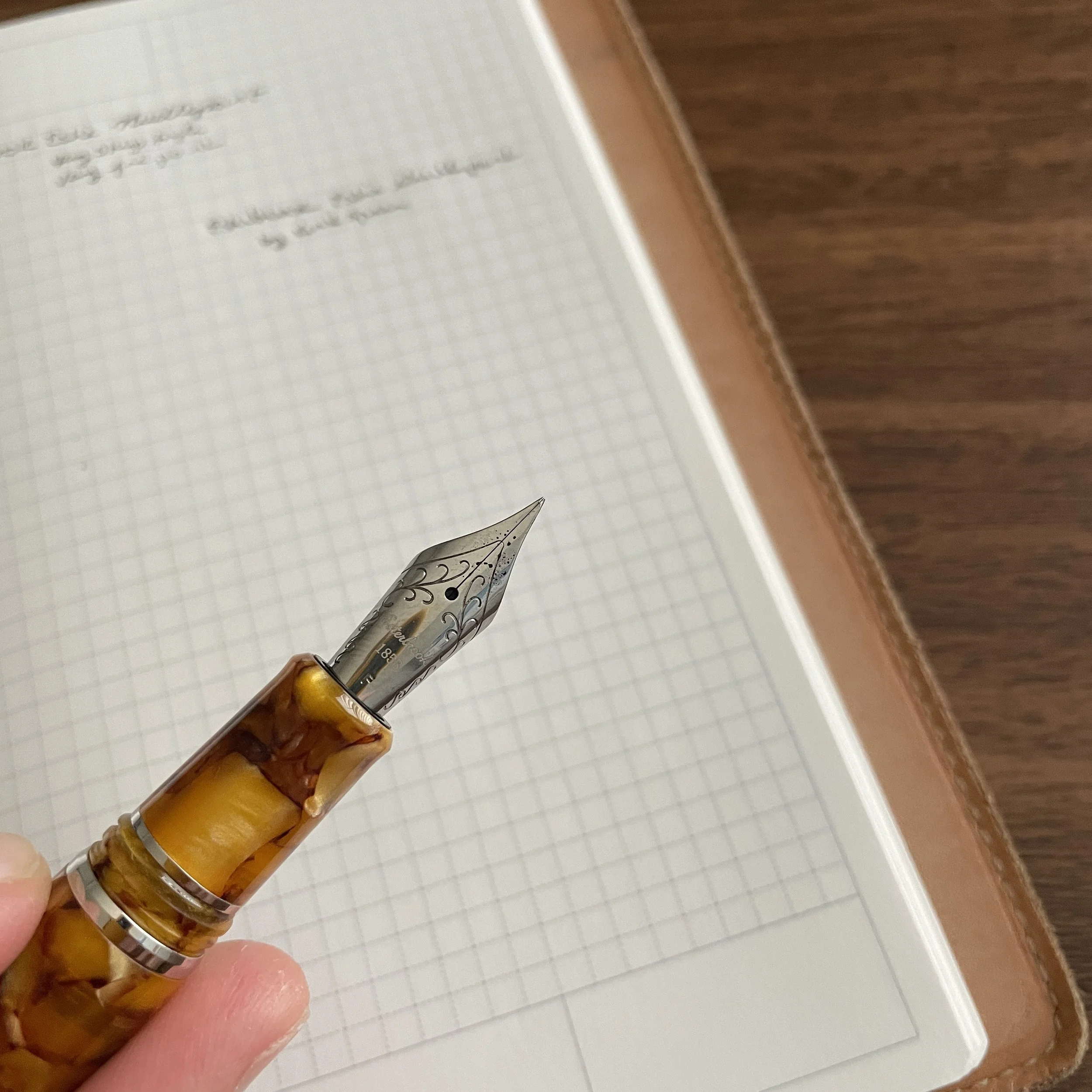
This Kirk Speer needlepoint nib from Esterbrook balances a narrow line with smooth writing.

Needlepoint grinds, or “extra, extra-fine” or “ultra-extra fine” nibs, aren’t necessarily as popular among enthusiasts as stubs, italics, and architects. They require you to use light writing pressure, or else the sharp tip will dig into the paper, and even with a light hand needlepoint nibs can feel toothy, which some people consider “scratchy.” That said, if you have small handwriting, or need a fountain pen to use for annotations or marginalia, I’m a firm believer that you need at least one needlepoint nib in your collection.

Kirk ground this needlepoint from a fine, as opposed to an extra-fine. Having more tipping to work with on the original nib often leads to better results, in my experience, especially if you value smoothness.

This particular nib, ground for Esterbrook by Kirk Speer of Pen Realm, is smoother than most needlepoints I’ve used, making it a perfect nib for those who want something that writes a narrower line than your typical JoWo steel extra fine nib, but isn’t so fine that it can’t easily be used for everyday writing. I would compare this needlepoint nib to a standard Japanese extra-fine nib (or even some Japanese fine nibs), rather than something like the Platinum Ultra-Extra Fine or the Franklin-Christoph Nagahara nibs. That said, because these nibs are ground by hand, there will lbe at least some variation between them, and the nib I received may not be identical to every nib out there.

Comparing the line from a Platinum Ultra-Extra Fine Nib (top), the Franklin-Christoph Nagahara needlepoint (middle), and the Esterbrook by Kirk Speer needlepoint (bottom). The Esterbrook nib writes a wider line, but is much smoother and better for everyday writing than the other two, which many people find too toothy. (I personally love them, but I have situations where I need to write very, very small.)

Takeaways and Where to Buy

Esterbrook has done the pen community a great service by introducing these custom nib options into its standard lineup, and by making it easier to get a custom nib grind as an add-on to your purchase of an Esterbrook pen without having to travel to a pen show or separately send your pen off to a nib grinder for what can be a weeks-long waiting period. While an ultra-fine needlepoint grind may not be for everyone, I found this particular nib to be well-made, and it will have a permanent home among my various Esties.

The Esterbrook featured here is the Honeycomb with Chrome Trim, one of my favorite materials.

You can purchase the nib and pen featured in this review from most Esterbrook retailers, including our friends at Vanness Pens. Typically, the custom-ground Esterbrook nibs cost an additional $48, with most of the markup going to cover the cost of the nib work. (To compare, having a pen ground to a needlepoint typically costs around $50, excluding the cost of shipping.) If you’re interested in further exploring Kirk’s work and having him grind or modify a pen for you, visit his site at Pen Realm.

Further Reading

Those interested in reading further on different types of custom nib grinds should start with this post I wrote a couple of years ago. In terms of other specialty Esterbrook nibs, I have reviewed the Esterbrook “Journaler” nib - a cursive italic nib ground by Gena Salorino of Custom Nib Studio, which is still available. There is also an architect nib, the “Scribe”, ground by Josh Lax of J.J. Lax Pen Co., which I’ve not had the opportunity to try but I have used Josh’s architect nibs and enjoy them.

Disclaimer: Esterbrook provided me with the nib featured in this review free of charge, for review purposes. This post does not contain paid third-party affiliate links. The Gentleman Stationer is supported entirely by purchases made through the T.G.S. Curated Shop and the T.G.S. Patreon Program.
In Pens Tags Esterbrook Needlepoint, Custom Nibs, Nib Grinding, Fountain Pen, Esterbrook
2 Comments

Esterbrook x Accutron: The Collaboration Continues with New Esties, Including an Oversize!

November 24, 2021

When we last looked at the collaboration between American “heritage” brands Esterbrook and Accutron, it was limited to a special edition Esterbrook Camden fountain pen in a gorgeous green shade. Recently, Esterbrook and Accutron have followed up with two new limited edition Estie fountain pens in green and gold DiamondCast material, in both standard and oversized versions. All feature details such as the Accutron “tuning fork” logo on the cap and nib that set these pens apart from the standard Esterbrook lineup.

To recap a bit from my previous post, the “Accutron” brand was first associated with a line of watches manufactured by Bulova, and recently relaunched as a separate company by the Citizen Group. You can read more about both vintage and modern Accutron watches on dedicated watch sites such as Hodinkee, and the story behind the development of the technology is fascinating. Short version: Accutron watches bridged the gap between traditional mechanical watches and modern quartz watches, introducing a unique “tuning fork” movement that was one of the first mass-market electronic watches available. Esterbrook distributor Kenro and Accutron were kind enough to send me the modern Accutron “Spaceview” watch pictured here, so that I could get a sense of the current company’s aesthetic and how it complements the limited edition Esterbrook pens. I won’t do a full watch review, since that steps out side my area of expertise, but I did enjoy wearing the watch for a few days, and if you enjoy the Accutron look, I’d encourage you to read the full Hodinkee write-up of the Spaceview 2020 here.

My First Experience with the Oversized Estie

This particular post will focus on one of the two pens I was sent for review: the Accutron x Esterbrook Oversized Estie, which - believe it or not - I’ve never had the opportunity to test for an extended period of time. I’ve always though I would remain partial to the “standard” size Estie fountain pen, since (1) it’s quite comfortable and nearly the perfect size for me; and (2) it posts, which can be important given how/where I do much of my daily writing. That said, after having a few weeks to test out the oversized version, I’m beginning to reconsider.

Here’s what I enjoy about the Oversized Estie:

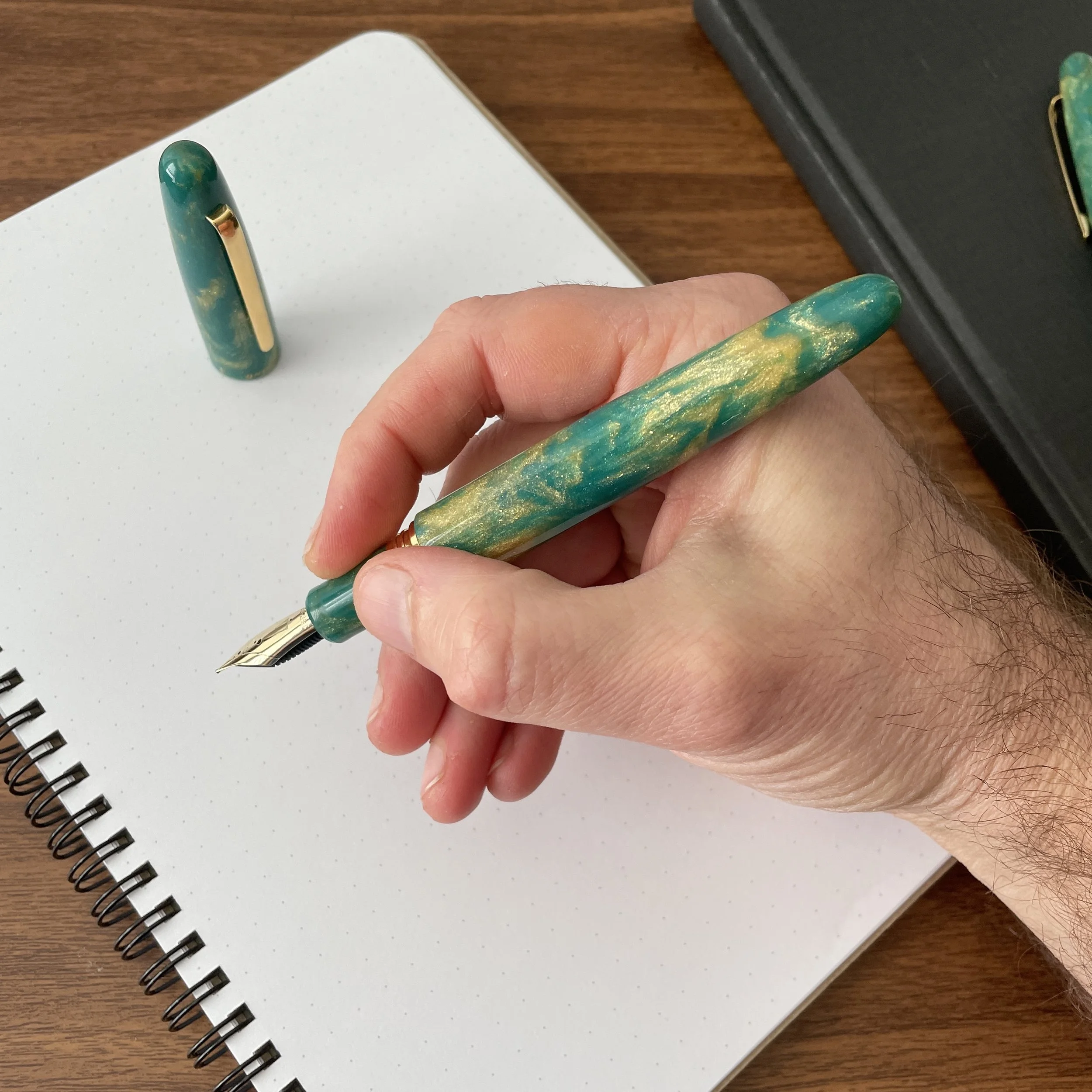
  • This pen has fantastic balance. While the standard Estie is extremely comfortable to use, the Oversized pen is perfectly weighted for unposted use, and even though it’s a big pen, you don’t notice the size. I would compare the overall length and proportions to a slightly slimmer Opus 88 Jazz.

  • JoWo 18k nibs are among my favorite stock nib units. I’ve had several JoWo 18k gold nibs in my collection over the years, and they never fail to disappoint. This medium nib arrived perfectly tuned, and I’ve not experienced any issues with skipping or hard-starting.

  • The larger pen body is the perfect canvas for showcasing the DiamondCast material. If you’re unfamiliar with “DiamondCast”, it’s a material made by McKenzie Penworks in here in Tennessee, which features a mixture of alumilite, pigment and real diamond dust. You can read more on the McKenzie Penworks website.

View fullsize Estie Oversized Unposted
View fullsize Estie Standard Unposted
View fullsize Estie Standard Posted

If there’s anything that I don’t enjoy about the Estie Oversized, it would be the metal threads on the barrel, which, in my opinion, somewhat disrupts the streamlined design of the pen. At the same time, the threads are not sharp at all, so they don’t interfere with a comfortable grip, and the added bit of metal front-weights the pen which likely contributes to the excellent balance I noted above. Taken as a whole, this is an aesthetic preference for me that at the end of the day, won’t prevent me from adding an Oversized Estie to my collection.

The Accutron “Tuning Fork” logo dates back to the “tuning fork movement” used in vintage Accutron watches.

Takeaways and Where to Buy

Unlike the Camden, which was available only from select Accutron watch retailers, the new Esterbrook x Accutron Diamondcast Esties pictured here are also available through most major Esterbrook pen retailers. Like other Esties made from Diamondcast material, the price point is higher than standard Estie fountain pens, with the standard model bearing an MSRP of $395 / $316 retail, and the oversized priced at $750 MSRP / $675 retail. (The Oversized version comes only with a 18k JoWo Nib.) If you’re a fan of this green and gold Diamondcast material, or looking for an Accutron-branded Estie to match a recent watch purchase, I’d act quickly because these pens are part of a limited edition series and won’t be around forever. In fact, they’re already sold out at some retailers.

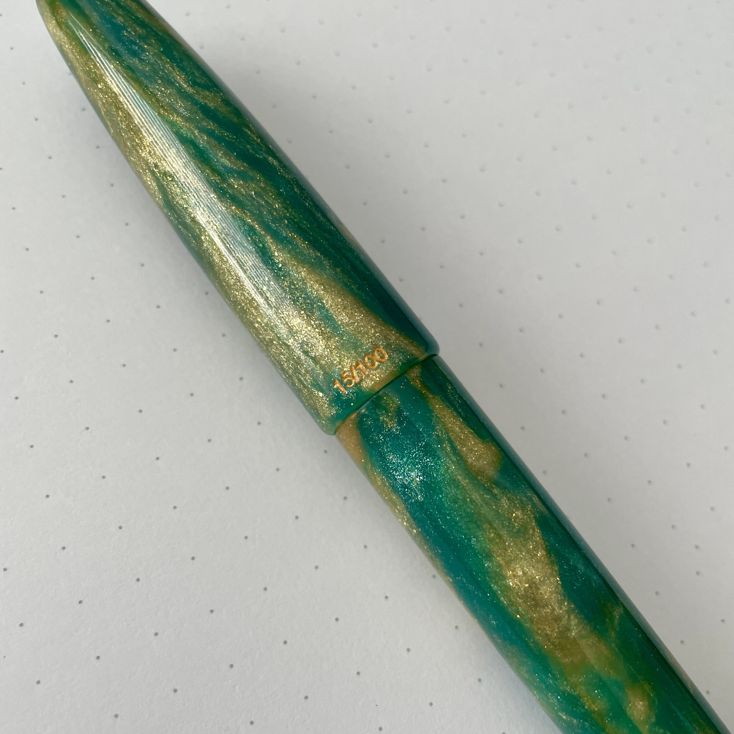
The Esterbrook x Accutron Estie Oversize pens are numbered in an edition of 100.

On a more general note, count me a fan of the Estie Oversized! I’m already looking for the perfect model to add to the permanent rotation, and strongly considering one of the “Nouveau Bleu” models with the gold trim, perhaps adding a “Scribe” specialty nib.

Many thanks to Esterbrook and Kenro Industries for making this review possible. This post does not contain affiliate links, nor was I compensated for this review. All products shown here were lent to The Gentleman Stationer for review purposes and returned afterwards.

In Pens Tags Esterbrook Estie, Esterbrook x Accutron, Kenro, Esterbrook Accutron, Esterbrook, Pen Review
Comment

Accutron x Esterbrook Camden: A Heritage Brand Collaboration

February 3, 2021

What I refer to as “heritage brands” have taken off in recent years, and in the pen world, Esterbrook serves as the best example of a brand resurrection done correctly. While I certainly can’t speak for everyone, I’ve personally enjoyed both the Estie (Esterbrook’s first release), and the Camden (the second). This past year, Esterbrook has begun issuing both pens in special and limited edition finishes, and recently announced an exclusive collaboration with another heritage brand, watch company Accutron.

Those who follow the watch world may be familiar with Accutron, a line of watches formerly manufactured by Bulova and recently relaunched as a separate company by the Citizen Group. You can read more about both vintage and modern Accutron watches on dedicated watch sites such as Hodinkee, and the story behind the development of the technology is fascinating. Short version: Accutron watches bridged the gap between traditional mechanical watches and modern quartz watches, introducing a unique “tuning fork” movement that was one of the first mass-market electronic watches available. The vintage Accutron pictured here belonged to my father, and dates from the early 1970s.

Vintage-Accutron-Esterbrook-Camden-Comparison

To commemorate the release of the new Accutron watches, the company has partnered with Esterbrook and other American boutique brands to offer special release products that compliment the new lines, including a green Esterbrook Camden. While clearly an Esterbrook fountain pen (and marketed as such), the Esterbrook branding has been replaced by Accutron’s, including the Accutron “tuning fork” logo on the cap finial and engraving around the base of the cap.

View fullsize Esterbrook+Accutron Camden
View fullsize Accutron x Esterbrook in hand

Takeaways and Where to Buy

As I noted in my original review of the Camden, Esterbrook fountain pens make excellent writers, and the Camden is no exception. The dark green color on this pen is stunning. That said, accessibility on this particular release will be limited. The Accutron Camden limited edition is priced at $295, approximately $100 more than the MSRP on a standard Esterbrook Camden, and from what I can tell, is currently available exclusively from Accutron dealers. Clearly, this pen is targeted towards the Accutron collector and enthusiast, and if you are looking for a fountain pen to match your new electrostatic Spaceview watch, the two will pair together nicely. Most interesting to me about this collaboration, however, are Esterbrook’s emergence as a higher profile presence outside the niche of fountain pen enthusiasts, and the convergence of the watch and pen communities. As a small-scale watch collector, I’ve always believed that pens and watches complement each other, and two companies with similar histories successfully embracing the overlap in their customer bases should generate a lot of excitement about similar collaborations in the future.

Disclaimer: I received the pen featured in this review from Esterbrook and Accutron for review purposes, free of charge. This post does not contain affiliate links.

In Pens Tags Esterbrook, Esterbrook Accutron, Esterbrook Camden
1 Comment

Merry Christmas to Me! Esterbrook Estie "Rocky Top"!

December 22, 2020

I haven’t purchased a new pen for my own collection in a while, and I finally gave in, ordering one I couldn’t pass up: the Esterbrook Estie “Rocky Top” featuring Diamondcast Alumilite from McKenzie Penworks. Gotta show that Tennessee pride! “Rocky Top” contains swirls of Tennessee orange, silver, gold, and white that show off the depth of the material and the real reclaimed diamond dust mixed in. Read more about Diamondcast here.

As I’ve mentioned before, I love the shape of the Estie, and the standard pen has such excellent weight and balance that I’ve never had a reason to go to the oversized model (though they’re now available in nearly all materials). What’s new about this particular pen is that I added a “Journaler” nib, developed by Gena Salorino from Custom Nib Studio in collaboration with Esterbrook and offered as an add-on at select Esterbrook retailers. While I haven’t had much time with this nib, I’m liking it so far, and I would say that it writes like a soft cursive italic, with medium width.

I could’ve gone with an orange ink, but instead I decided to try Scribo Classico Seppia, and earthy brown ink that works just as well.

Journaler Nib Writing Sample, on Midori MD Cotton Paper.

Vanness Pens still has Diamondcast Esties in stock, in both “Rocky Top” and “Peacock” finishes, as well as Journaler nibs. Diamondcast pens are bit more expensive than standard Esterbrooks, given the makeup of the material, and retail for $280 for the standard version and $316 for oversized. The Journaler nib adds $50 to the price. Through December, if you order an Esterbrook from Vanness, you will also receive an Esterbrook rubber stamp (while supplies last)!

I’d share a sample of the rubber stamp but I don’t have an ink pad, unfortunately! The packaging on Rocky Top is top-notch, btw.

Disclaimer: Vanness Pens is a paid sponsor of this blog. While I purchased this pen with my own funds, for my own collection, I did receive a discount.

In Pens Tags Esterbrook Estie Rocky Top, Diamondcast, Vanness Pens, Esterbrook
1 Comment

First Impressions: Esterbrook JR Pocket Pen in Tuxedo Black

September 5, 2020

This week, Esterbrook announced arguably its biggest release to date: the “JR Pocket Pen”, which is the first modern Esterbrook that actually attempts to replicate the design of the famed vintage “J” pen. As such, Esterbrook knew that there would be heavy expectations piled on this release, and there was no room for error. So how did they do?

While I’ve only had the pen for a week, what I’ve seen so far leads me to believe that the JR will be widely viewed as a success. As with all “heritage” releases - which is how I generally refer to products such as pens and watches that draw inspiration from a vintage product without copying it exactly - the JR borrows from those aspects of the original “J” that translate best into a modern fountain pen, and dispenses with others that, well, wouldn’t work so well today. I’ll briefly run through the similarities and differences:

The Esterbrook JR comes in three different colors: Tuxedo Black (shown here), Carmine Red, and Capri Blue (which is the only one with gold trim). Based on pictures alone, the Tuxedo Black and Capri Blue are my favorites.

First of All, What’s Changed?

  • The new Esterbrook JR is slightly slimmer than a standard vintage Esterbrook J, and the barrel and ends less rounded. While I don’t currently have any vintage Esterbrooks in my collection, Ana over at the Well-Appointed Desk has published her own review and has some extremely thorough comparison photos that show the JR compared against various vintage Esterbrook fountain pens.

  • Esterbrook has dispensed with the black plastic cap jewels in favor of metal finials. The finial on the cap bears the Esterbrook “infinity” logo also found on the Camden. While the black plastic finials lent the original J a unique, almost Art Deco look, they also grew fragile over time and had a tendency to crack and/or fall out if you accidentally dropped the pen. Here, I would say that gains in long-term durability make up for any losses in terms of aesthetics and faithfulness to the original design.

  • The filling system on the JR, predictably, is cartridge-converter instead of a lever-filler. I’m sure many vintage pen die-hards will complain (loudly) about this fact, but seriously, is Esterbrook really going to release a lever-filling fountain pen that would require periodic ink sac replacement? No. Nor should they. Even back in its heyday, Esterbrook was a mass-market brand, and to me, going with cartridge-converter is more faithful to the original vision of Esterbrook than releasing a throwback pen with a high-maintenance lever-filling system.

Size comparison, show here between a Kokuyo Sketch Notebook (left) and a Hobonichi Techo A6. Writing samples in this review are shown in the Kokuyo Sketch.

What’s the Same or Similar?

  • The overall look, feel, and aesthetic of the pen are very similar. As someone who has used vintage Esterbrooks extensively, I will say that the modern iteration of the company has definitely managed to “recapture the magic” of the original brand. A key part of this reissue is the choice of pearlescent acrylic: Vintage Esterbrooks are known for the depth of the material used to make the barrels, which was largely unique to that brand. The black, blue, and red materials chosen for the JR, while not an exact match, replicates at least some of that same depth.

  • While slightly longer and slimmer than the clip on the original J, the clip on the JR retains the same ribbed look while omitting the “Esterbrook” engraving, which moves to the cap band. While I’m glad they retained some version of the classic clip, I’m torn over the placement of the engraving. Could they have gone with a wider clip and kept the vintage-style engraving? Possibly, but I suspect this would present production issues, whereas placing the Esterbrook engraving on the cap band also creates branding consistency with the Estie and the Camden.

  • The JR features an interchangeable stainless steel JoWo No. 5 nib unit, which allows you to swap in different nib sizes, and even JoWo nib units you may have had ground to a stub, italic, architect, etc. It remains to be seen whether the JR will get its own adapter that will allow you to use the full array of vintage Esterbrook nib units.

Esterbrook is marketing the JR as a “pocket pen.” I typically don’t pocket-carry pens like this one - it’s slightly too large for that purpose, at least for me - but it’s quite portable. The JR would make a great planner pen. (Picture below)

Perhaps my one critique of this pen is that I wish the cap posted a touch deeper as it looks a little awkward. The pen itself is so light, however, that it makes very little difference from a functionality perspective.

No surprises with the line written by a medium No. 5 JoWo nib.

Takeaways and Where to Buy

The Esterbrook JR is a very well done heritage pen that I expect will please the majority of Esterbrook fans while still managing to tick off those few who would only be pleased with a “J” replica. As evidenced by the visceral reaction to Parker’s recently announced Parker 51 re-release, attempting to recreate a vintage pen design for modern users can be a risky move, in that you need to strike a balance between catering to fans of the original pen while still making a product that is marketable to new customers. So far, Esterbrook seems to have done just that, and I’m excited to see where they take this pen design over the next year or so. The next logical step would be to introduce additional colors, either special editions or green and grey pens to match the original lineup, as well as a vintage nib adapter.

You should now be able to purchase the Esterbrook JR at most Esterbrook retailers, including site sponsors Vanness Pens and Goldspot. Current MSRP on the Esterbrook JR is $175, with most retailers so far pricing this pen at $140, which is becoming the standard price point for a steel-nib pen of this quality.

The Esterbrook JR fits perfectly in the pen slots on my Hobonichi Techo. Planner pen, anyone?

Disclaimer: Many thanks to Esterbrook/Kenro Industries for sending me this pen for review. This post contains links to paid sponsors/affiliates.

In Pens Tags Esterbrook, Esterbrook JR
6 Comments
Older Posts →
Store Location
Visit the T.G.S. Curated SHOP
*New* Updated "Best Pens" Guide (2025)
TGS x Hinze Pens Violet Tendencies Taschenstift Fountain Pen
Hierarchies of Fountain Pen Friendly Paper
Allex Scissors arrayed on a desk showing link to desk accessories

Join Our Patreon!
Subscribe to the TGS E-mail List

Featured Posts

Featured
Pilot-Iroshizuku-Yama-Budo-Writing-Sample.jpeg
May 24, 2025
Joe's Picks: Five Favorite Inks From Pilot's Iroshizuku Lineup
May 24, 2025
May 24, 2025
Yamamoto-Gray-Paper-Sampler-Set.jpeg
May 10, 2025
Discovering Unusual Paper: "Paper Tasting" Sets from Yamamoto Paper
May 10, 2025
May 10, 2025
Four-Micarta-Fountain-Pens.jpeg
Apr 19, 2025
Yes, Micarta for me! I finally got my hands on Some Micarta Pens, Plus My Own Special Edition
Apr 19, 2025
Apr 19, 2025
The Gentleman Stationer RSS

© Digital Divide Media, LLC, 2014-present.

All content is the exclusive property of Digital Divide Media, LLC, d/b/a The Gentleman Stationer, including “The Gentleman Stationer” website and trademark, and should not be reproduced without express written permission.  All rights reserved.

All content containing paid advertising, affiliate links, or sponsored content will be plainly disclosed by a disclaimer when/if featured.

Contact Information

Store Shipping Policy and Return Policy

Privacy Policy

Cookie Policy

Terms and Conditions

Powered by Squarespace