• Blog
  • Shop
  • Resources
  • FAQ (Ask TGS)
  • About
  • Archive
  • Contact
  • Sign In My Account
Menu

The Gentleman Stationer

Vintage Living in the Modern World.
  • Blog
  • Shop
  • Resources
  • FAQ (Ask TGS)
  • About
  • Archive
  • Contact
  • Sign In My Account

Triangular Grip Pens: Love 'em or Leave 'em?

February 25, 2023

In the world of pens, there are a handful of highly polarizing products, and I’d place “molded grip” or “triangular grip” pens in the top five. The most well-known, of course, is the iconic Lamy Safari, with the Lamy AL-Star, TWSBI ECO-T, Kaweco Perkeo and others falling into this category. So why do pen companies opt for this type of design? How big of a “real world” issue is it? And how has it affected my own ability to use these pens?

The Lamy Safari’s grip gives rise to strong opinions.

Triangular Grip Pens: Origins and Purpose

Before they went hipster mainstream (j/k), pens like the Lamy Safari were intended for students - particularly students learning to write with a fountain pen for the first time. Most molded grip sections are shaped similarly to those slide-on pencil grips that teachers in the 1980s would force on those of us who refused to hold our pencils “correctly,” in order to guide our hands into the “proper” position. These days, Lamy markets the Safari/AL-Star pens to a market beyond students, billing the section as an “[e]rgonomically shaped grip area to enable writing for long periods of time without tiring,” but as with most things ergonomic, these pens don’t work for everyone. While I’ve not done any sort of survey, anecdotally, lefties tend to have more issues with the grip, since they’re designed with the right-handed majority in mind. And even those righties with nontraditional finger placement can have a difficult time with a shaped section.

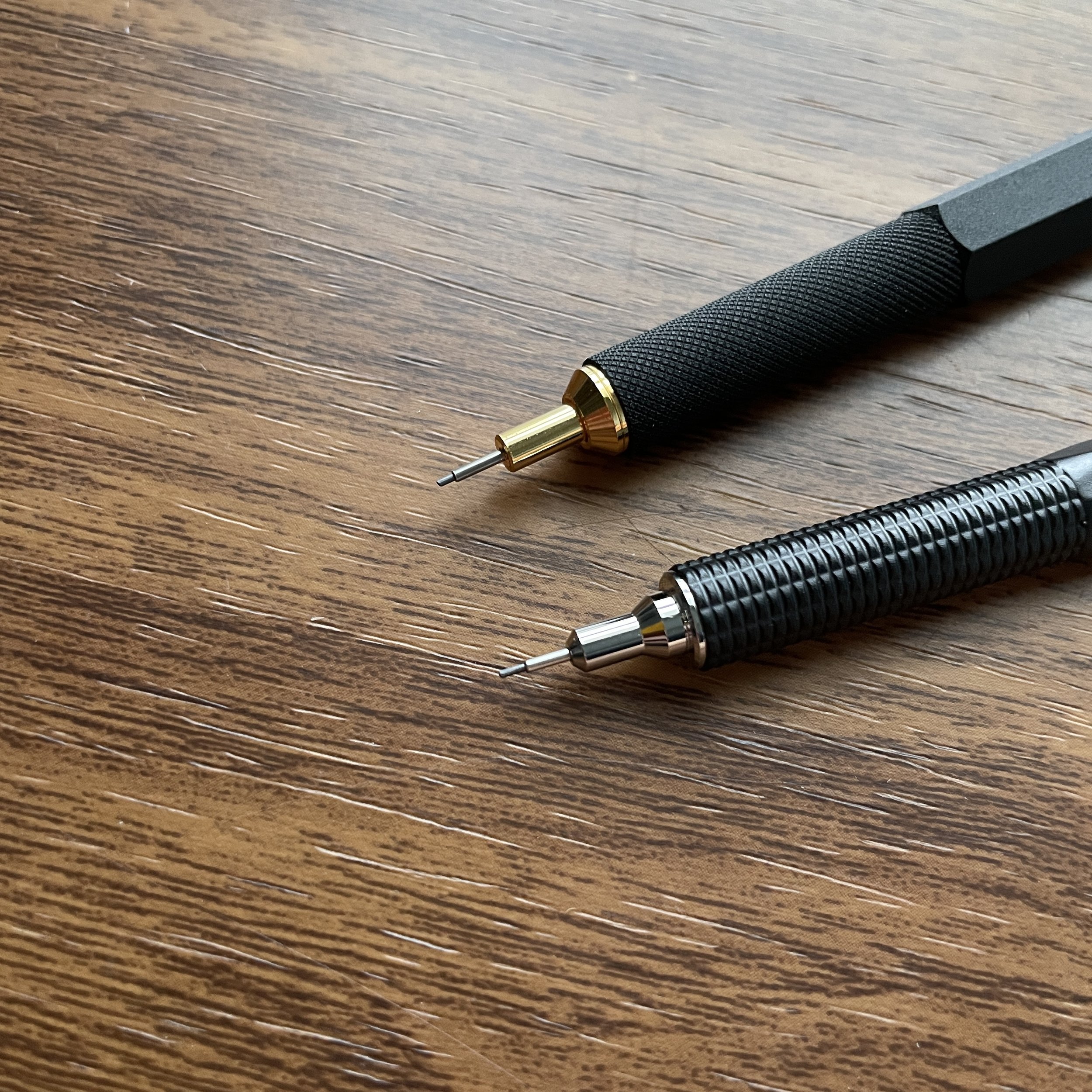
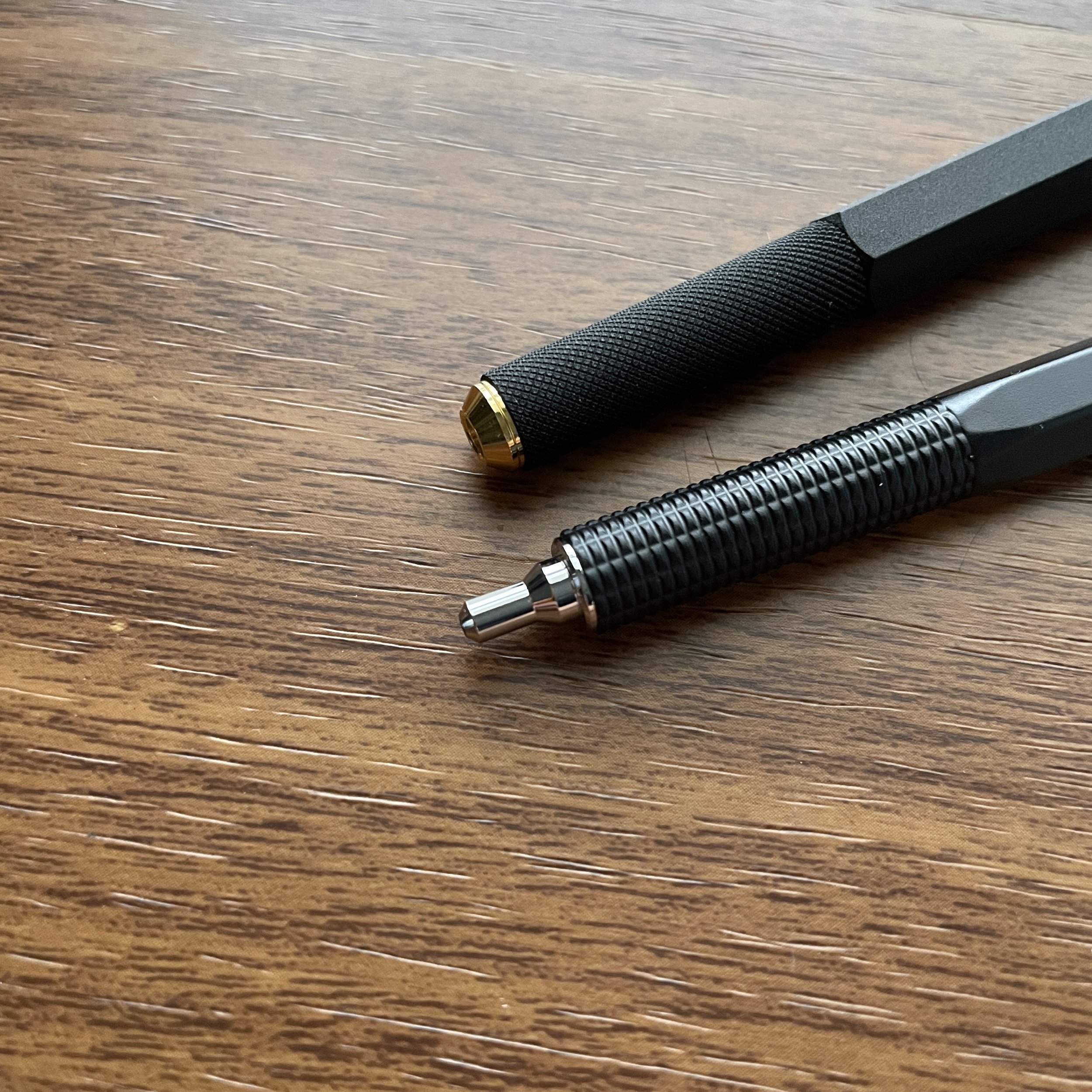
The Lamy AL-Star grip section, left, vs. the TWSBI ECO-T. The AL-Star features a grip similar to the Safari, but due to the difference in materials doesn’t feel quite as sharp, at least to me. The TWSBI ECO-T has a subtly triangular shape that I don’t really notice much at all, though it is there.

My Own Personal Handwriting Struggles and Preferences

I have a history of handwriting struggles. Until I entered college, I used what could charitably be described as an “unusual” pencil grip. Nobody could understand how it worked, how I learned it, and why I continued to write that way. Despite the fact that I was generally a good student, with visually excellent script, I regularly received a “C” or “D” in “handwriting” on my report card, solely due to how I held my pencil. I had one elementary school teacher dub my grip “The Claw”, and made it their personal mission in life to change it. They failed.

I had another teacher in high school “jokingly” offer to break my right hand so that I could relearn how to write as a lefty. (I went to an all-boys high school. It was a different time.) Honestly, I’m really not sure how I ever wrote like this, much less for hours at a time. I certainly would never have been able to use a fountain pen like this.

At some point The Claw became a matter of personal pride, not to mention practicality. If you grip your pen or pencil a certain way for years, you reach a point in high school where you can’t change it because to do so would sacrifice speed. (To add some context, I graduated from high school in 1998, which dates me but it’s necessary here. I was probably one of the last classes where e-mail and internet access was available to us, but not required, and all of our examinations and most of our homework, including research papers, had to be handwritten as opposed to typed. Handwriting speed was therefore a factor. I understand that this changed at my school a couple of years after I graduated.) It wasn’t until late college/early law school, when I started transcribing most of my lecture notes on a laptop, that I was able to change my grip because I had the luxury of slowing down.

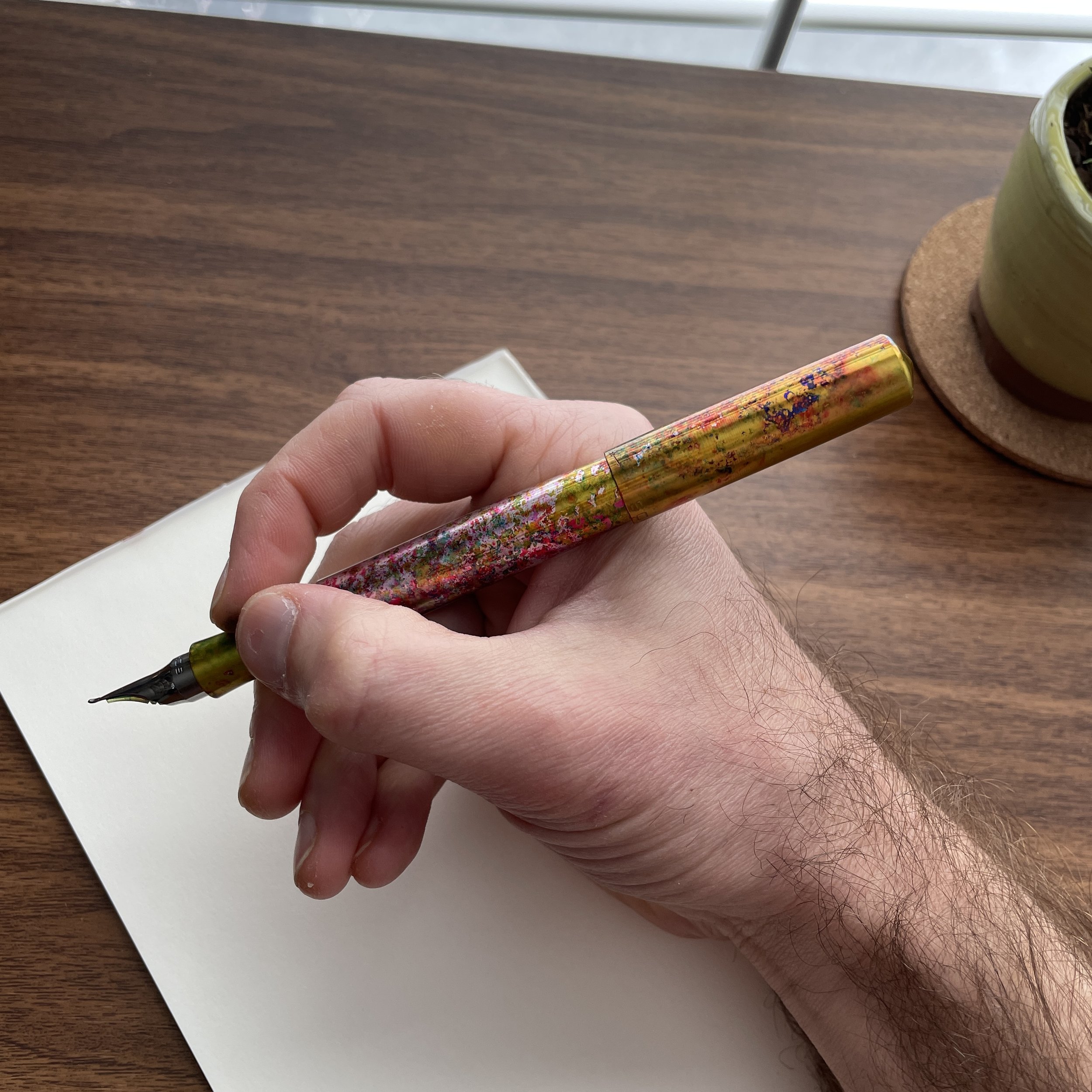
How I hold a pencil today.

So why did I change? RSI issues in my hand and wrist, as well as a semi-deformed right ring finger that had a huge, painful callous that only completely disappeared three or four years ago - nearly 20 years after I changed my handwriting style. While my current grip isn’t “textbook,” it’s closer to what’s contemplated by most molded-grip pens, and if I’m honest, probably could have saved me a lot of trouble over the long-term if I hadn’t been so stubborn.

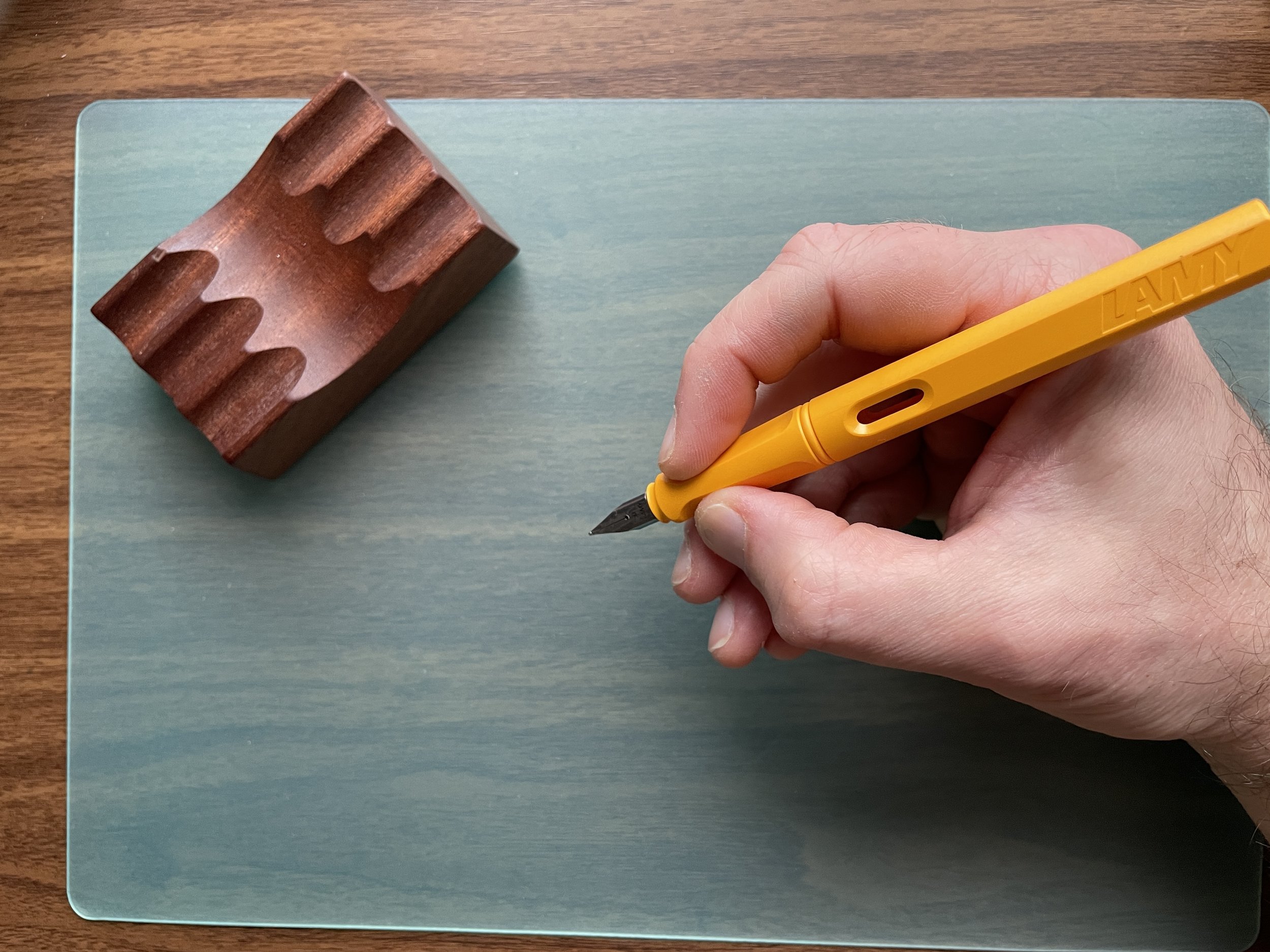
My new grip works fairly well with the Safari and most other molded-grip pens.

How to Use a Triangular or Molded-Grip Pen

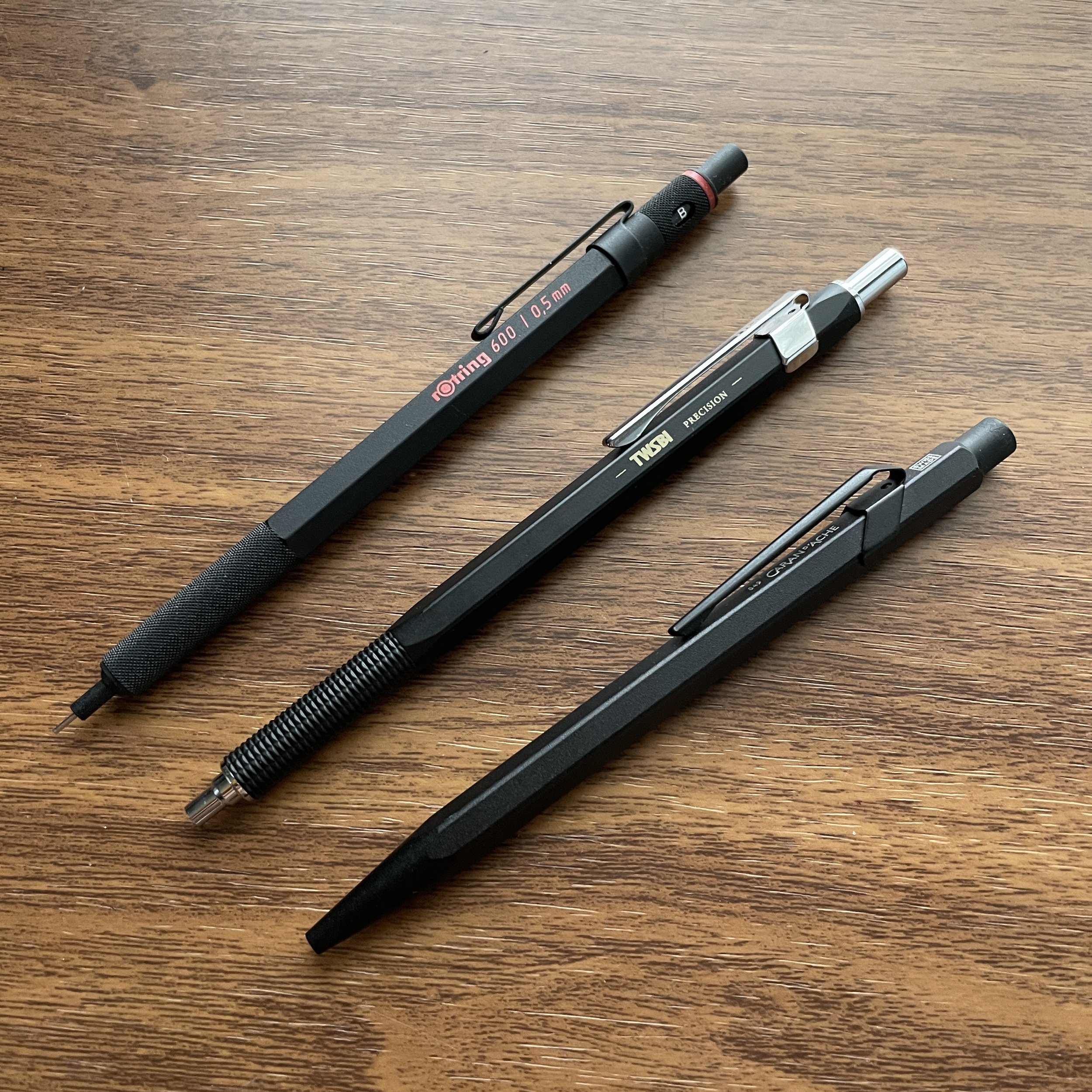
Unfortunately, the truth is that unless you’re willing to change your grip, these pens either work for you or they don’t. Some pens, like the TWSBI ECO-T and the Kaweco Perkeo, feature a “softer” triangular grip that’s much more forgiving. The sharper edges of the Safari and AL-Star tend to cause more problems for people. While the Lamy pens aren’t a perfect fit, and for this reason have never become “favorite” everyday writers, they’re not incompatible with my current grip because I can rest my index finger on the top ridge, similar to how I’m able to rest my finger atop the clip of a Pilot Vanishing Point and Decimo. The good thing is that these pens are relatively inexpensive to test out, coming in at $35 or less. If you’re considering a more expensive pen like one of the retractable nib Pilot pens, I’ve found that how one’s hand holds the Safari approximates how you would have to grip a Vanishing Point or Decimo, so if you can’t get to a pen show and try one of these in person, picking up a less expensive pen with a triangular grip might save you from a more costly mistake.

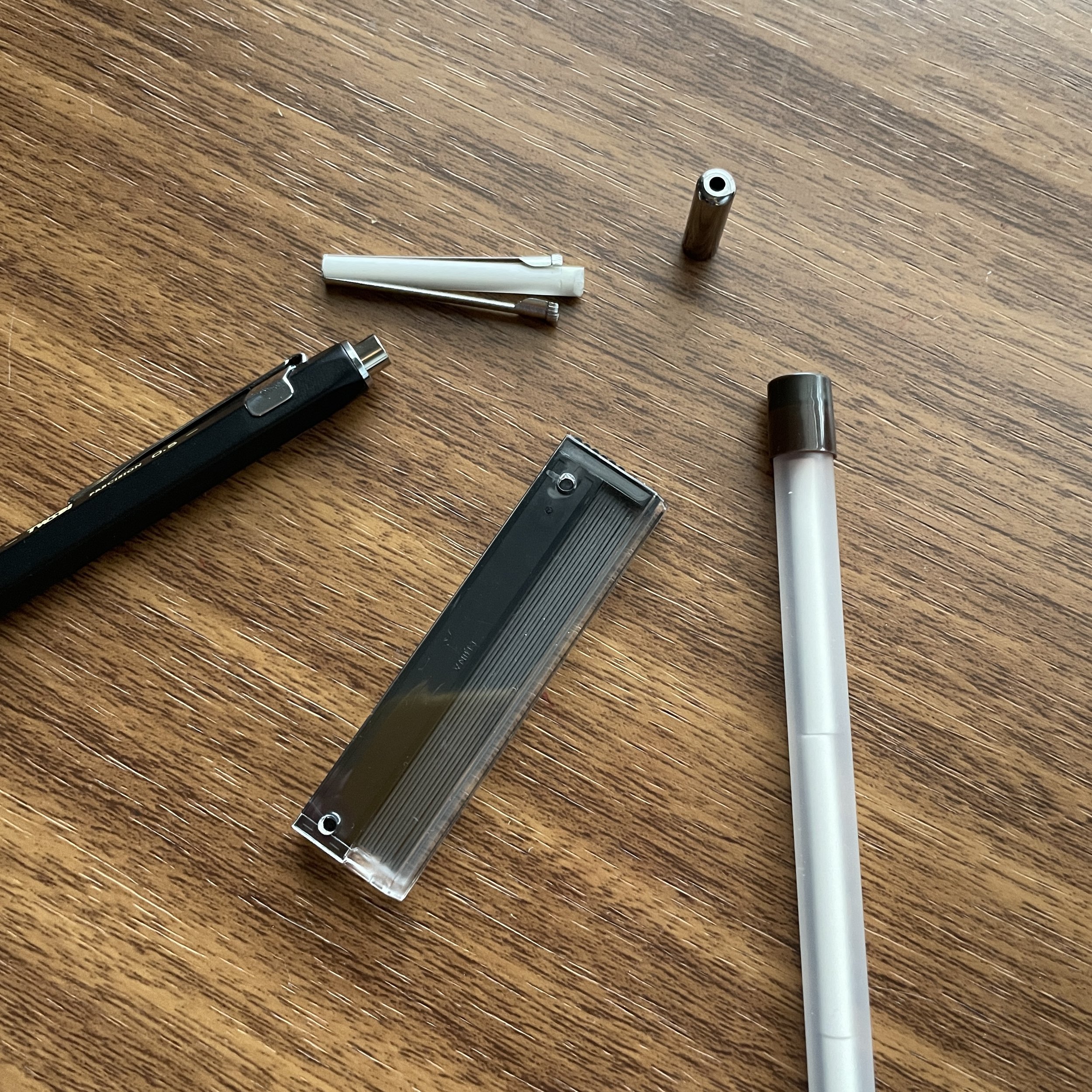
A shot of the TWSBI ECO-T (right) vs. the standard TWSBI ECO (left). You can barely make out a ridge (more like a ripple) on the ECO-T, which shows you how subtle the shape is. Honestly, I might prefer the ECO-T to the ECO, but again that’s personal preference.

I’m interested in hearing: How many of you can’t use these types of pens at all? Also, I rarely hear from anyone who purchases a pen with a shaped grip specifically for that section, but does anyone particularly enjoy this feature? Personally, I’ve really been enjoying the the ECO-T, which has a much more subtle grip shape, and I have plans to get my hands on another Kaweco Perkeo soon.

The Gentleman Stationer is supported entirely by purchases from the T.G.S. Curated Shop, and pledges via the T.G.S. Patreon Program. While this post does not contain third-party affiliate links or paid advertising, the Gentleman Stationer is an authorized retailer of certain brands discussed in this article. Please view the shop for the full range of brands sold, which is subject to change.

In Editorial, Pens Tags Lamy Safari, Triangular Grip Pens, Handwriting
13 Comments

From left, the Uniball Jetstream, Traveler’s Company Brass Ballpoint, Mark’s “Tous Les Jours,” Penco Perfection, Penco Perfection Light, and Mark’s x Anterique “Days” Click Pen.

Workhorse Pens: Low-Viscosity Ballpoint Pens

February 18, 2023

Let’s face it: When it comes to actually getting work done, a fountain pen is never the most practical option. For me, it’s not so much the messiness, but more the added mental load and distraction. In addition to the work itself, you have to consider the nib, ink, paper, and how all three of these factors interact with one another. If any single thing goes wrong, it will break your focus, and while I’ve been in this long enough to have a pretty good instinct about what combinations do well enough to allow me to “just work”, lately half of my everyday writing has been with a ballpoint. But not just any ballpoint….

“Low-Viscosity” Ballpoints: An Excellent All-Around Workhorse Option

By now, you’ve likely heard the term “low-viscosity” ballpoint and wondered what the heck that means. I won’t get too deep into the science here, but it seems to be the new marketing term for what I’ve always referred to as “hybrid gel” ballpoint pens such as the Uniball Jetstream and the Pilot Acroball. Pen companies have modified their traditional oil-based ballpoint ink formulations to make them less “sticky,” which allows the pen to write darker, crisper lines, and results in quicker dry times with less smearing. As a result, today it’s actually fairly easy to find ballpoint pens in the .5mm (and even .38mm) tip sizes, which is difficult to pull off in a more traditional ballpoint ink formulations without clogging and skipping.

Lately I’ve been using a lot of needle-tip ballpoints. Low-viscosity ink allows you to have a very fine ballpoint line without running into problems with skipping. From left, the Mark’style Tous Les Jours ballpoint, the Traveler’s Company Brass Ballpoint, and my ever-reliable Lamy 2000 multipen with a Penco Needle-tip refill.

Five Excellent Low-Viscosity Ballpoint Pens

Unsurprisingly, Japanese companies dominate this product category. The Uniball Jetstream and Pilot Acroball tend to be the “gold standard” pens/refills, though there are boutique options available that, in my opinion, offer even crisper and finer ballpoint lines, including in needle-tip formats. Here are five to consider:

  1. Uniball Jetstream and Pilot Acroball. Though they’re not necessarily exciting, these remain exceptionally good pens and excellent low-cost options. If I were stocking a workplace or office supply closet, this is where I would start. Uniball actually makes a Parker-style cartridge called the Jetstream SXR-600, which I have used to convert many of my rollerball pens like my Grey Caran d’Ache 849.

  2. Traveler’s Company Ballpoint Pen and Needle-Tip Refill. A favorite for years, I own three of these pens. One is permanently clipped to my Plotter Mini-5, and the other two live in the breast pockets of my two winter coats, so they’re always available. I’ve found the needle-tips reliable, and despite the small size, the refills last for a very long time and are cheap to replace.

  3. Mark’style “Tous Les Jours” Ballpoint with Ohto Needle-Tip Refill. If you don’t enjoy the format of the Traveler’s Company Ballpoint, and want something longer for better balance, these hexagonal wooden click pens from Mark’s Inc. contain an Ohto needle-tip ballpoint refill and feel like you’re writing with a woodcase pencil. The “Tous Les Jours” series from Mark’s is insanely popular, with what might be the finest needle tip on a ballpoint I have ever seen.

  4. Penco “Perfection” Pocket Ballpoints and Pocket Drafting Ballpoint. I suspect that Penco uses a .7mm version of the Jetstream D1 refill (or something very similar) for it’s “Perfection” line of pocket ballpoints, and the pocket-sized “Drafting” Ballpoint uses a D1 needle-tip ballpoint refill that is an excellent option for other D1-compatible pens like the Lamy 2000 Multipen. I feel like both refills write a finer line than their respective .7mm and .5mm designation.

  5. Mark’style x Anterique “Mach” Ballpoint. A new addition to the Curated Shop - one which I plan to continue to stock in additional formats - I discovered the “Mach” ballpoint refill by Japanese stationer Anterique during my trade show travels earlier this month. The .5mm, super-sharp ballpoint refill leaves a clean line, and as discussed below, is sold separately from the pen body and can be used to jazz up your collection of vintage Bic Clics.

Pen Hacks: Saving the Classic Mid-Century “Click” Pen

I don’t write about “refill hacks” very often, but when I discovered the Mark’s/Anterique pens earlier this month, and learned that the refill was sold separately, it got me wondering. I have a rather large personal collection of vintage and vintage-inspired “clic” ballpoints, which is ironic in the sense that while I love the format of this pen, I’ve grown to despise the standard refill. In my experience, these pens write much more inconsistently than the Bic Cristal, and I find the refills almost always skippy and too light. It begs the question: Can you use the Anterique “Mach” refill to upgrade your classic click pens? Maybe.

The fit isn’t perfect. The standard Bic Clic has thinner plastic around the opening. As a result, even with the upgraded refill you will have tip wiggle and rattling. Then again, it’s <$2. I still love it.

One odd thing I’ve noticed is that while the external design of the “Bic Clic”-style ballpoint hasn’t changed much over the years, these pens are far from identical on the inside. Some (frustratingly) use refills that are slightly longer and/or thicker than others, and there’s no real way to know which pens contain which parts other than to disassemble them. For pens designed to take the longer refills, there is an easy hack/fix that you can use to get the Anterique refill to fit. My notes below:

  • Field Notes Clic Pens and Pen Addict “Loaner” Pens are based on a version of the Bic Clic ballpoint that should take the Anterique refill without modification. (I say “should” because all that I can be certain of is that the Anterique refills fit the specific pens in my possession. It’s possible there isn’t refill or manufacturing consistency across product lines with these sorts of ballpoints, so YMMV.)

  • “Higher-end” Clic-style pens may need modification. I have a handful of “demonstrator” Bic Clics and some “fancy” Clic-style Kikkerland pens that required mild hacking to get them to work. Specifically, the Anterique refill was too short, but I was mostly able to fix the problem by wrapping a small piece of washi tape around the end of the refill to lengthen it. I was never able to get the Kikkerland pens to work 100% consistently, so if you don’t already own these I wouldn’t buy them for the purpose of modification.

You can adjust the length of the refill by wrapping a piece of tape around the end. Alternatively, if a refill is too long, you can trim the plastic a bit.

Of course, if you want to save yourself the trouble of refill hacking, or you don’t already have a large collection of vintage ballpoints, the Mark’s/Anterique pen bodies are a nice upgrade. The plastic is thicker, especially around the tip/opening, and as a result there is zero wiggle or annoying rattling when you write with them. (While Anterique pens are designed to mimic the vintage “disposable” pens in design, they’re actually intended to serve as nicer refillable pens. Stay tuned for a bunch of different colors and body styles that I have on the way, in addition to the Mark’s versions currently in stock.)

Writing Samples - various low-viscosity / needle-tip ballpoint inks on Write Notepads paper.

Further Reading

I’ve written a lot on ballpoint pens recently, and as I’ve explored the category it’s surprised me with both it’s relative depth and popularity among the surprising number of ballpoint pen enthusiasts. First of all, not everyone necessarily likes ultra-fine lines, and some people actually prefer the broader, slicker writing experience of a traditional ballpoint pen. If that’s you, there are some great options out there. In this post from November, I discuss two of my favorites: the Schmidt P900 (a “less goopy” version of the Schmidt Easyflow), and the Caran d’Ache Swissride, which fits the delightfully inexpensive Caran d’Ache Infinite 888 ballpoint pen. You can also get into “technical”-style ballpoints like the Rotring 600 or the TWSBI Precision, or explore the world of pressurized “write anywhere” refills like the Fisher Space Pen family. There’s an entire universe out there beyond fountain pens!

The Gentleman Stationer is supported entirely by purchases from the T.G.S. Curated Shop and pledges via the T.G.S. Patreon Program. This post does not contain paid affiliate links or third-party advertising.

In Workhorse Pens Series, Pens Tags Workhorse Pens, Ballpoint, Ballpoint Pens
4 Comments

Pen Review: Schon DSGN Full-Sized Fountain Pen and Monoc Nib First Impressions

February 11, 2023

For a fountain pen that’s been available for a couple of years now, the Schon DSGN Full-Sized Fountain Pen has gone a conspicuously long time without a T.G.S. review. There’s a couple of reasons for that. First, the fountain pen itself, from a purely functional perspective, is fairly similar to the Ultem and Peek “Engineered Plastics” fountain pens, which I’ve already reviewed. Second, I’ve known for several months now that Schon DSGN’s in-house Monoc nib was on the cusp of release, and given that the Full-Sized Fountain Pen serves as the main platform for both Schon DSGN’s wild anodizations and the new nib, I wanted to hold the review until I had samples of each to show you. Here goes!

Each Full-Sized Fountain Pen comes with an emoji. If you visit the Schon DSGN table at a pen show, you might have several to choose from!

The Full-Sized Fountain Pen Is a Perfect Platform to Showcase Different designs

There are certain pen brands that people consider highly collectible. Franklin-Christoph comes to mind, with a lineup of classic shapes made available in different “prototype” finishes at pen shows and limited online events. Schon DSGN has taken a similar approach with the Full-Sized Fountain Pen, using a standard shape and machined aluminum body as a platform for showing off a wide range of anodized finishes that cycle in and out of stock in the same way the Pocket 6 fountain pens do. The Schon DSGN table is a popular stop at pen shows, and I always encourage show attendees to visit the table in person if they can before making a selection online, because many finishes look completely different in person - nearly always for the better - as opposed to viewing them online. Plus you can select your emoji!

While I typically love a matte finish on a metal fountain pen, my latest addition - ‘80s spraypaint-style “Rainbow Sprinkles’ - is growing on me and might just become my favorite!

Currently, I have three Full-Sized Fountain Pens in my collection. If you’ve read my reviews of the Ultem and “Peek-a-Boo” models, you’ll know that I’m a fan of the shape, and especially the hourglass-style section which is insanely comfortable for long writing sessions. These metal pens, however, really show off the skill of Ian Schon and his team. Despite being heavier than the ultra-light Ultem and Peek, you don’t lose any of the comfort or balance in moving to the aluminum body. Some might actually find the heavier body more comfortable to use, even when posted, because the weight adds balance. (Since there’s an o-ring inside the cap, I haven’t noticed any wear from metal-on-metal contact while posting, but post at your own risk.)

View fullsize Full-Sized Fountain Pen Unposted
Full-Sized Fountain Pen Unposted
View fullsize Full-Sized Fountain Pen Posted
Full-Sized Fountain Pen Posted

First Impressions: The Schon DSGN Monoc Nib

Next up: the recently released “Monoc” nib! I’ve had my Monoc for a few weeks now, and have written through a couple of fills, so I feel comfortable offering first impressions. On the whole, this is a tremendous accomplishment by Ian and his team. What they have done is design and manufacture not just a nib, but a complete nib unit - nib + feed + housing - completely in-house, using materials and techniques not commonly used in nib manufacture.

The Monoc is machined from a single piece of Grade 5 titanium, meaning that the nib, collar, housing, and tip are all integrated into a single piece of metal, hence the name “Monoc.” From the Schon DSGN blog:

“The name Monoc being short for Monocoque - mänəˌkōk- French for ‘single shell’, often used in aerospace and racing applications where the structural body and external shell of a vehicle are made from one solid piece.”
— Schon DSGN

There have been several attempts at similar nibs, most famously the Parker T1, Pilot Myu, and Pilot Murex, which remain coveted items among rare pen enthusiasts. Though not exactly the same (the Monoc is a nib unit that technically isn’t integrated into the pen body itself, and can be swapped into any JoWo-compatible pen), these nibs all offer the same extremely tactile, direct feel that is hard to describe and, at least with the Monoc, is derived from the fact that you are writing on the nib itself and not separate tipping material welded to the nib. Made from Grade 5 titanium, the Monoc is not a “springy” titanium nib like the Bock nibs that are so widely available; I find it quite stiff and you won’t get line variation via additional pressure. So why choose this material? Again, let’s look at what Schon DSGN said in their announcement post:

“With our unique approach of machining the nib from solid stock, we opted to utilize the properties of the Grade 5 titanium to create an integrated nib tip rather than welding additional tipping material onto the nib. This integrated nib tip allows for closer control of the geometry of the tip and writing surface, while the titanium offers a soft graphite-like quality that is a great writing experience. To achieve this specific writing quality, each nib is hand finished, assembled, ground, and tested to ensure it is ready for use. Due to the additional nib tip thickness of our design, the Monoc Nib is very friendly to customization as well. While some traditional fountain pen users may be uncomfortable with the idea of an integrated titanium tip, we feel the Grade 5 Titanium we use offers plenty of durability which negates the need for harder tipping material.”
— Schon DSGN

Schon DSGN Amber Ultem feed (featuring turquoise ink), with the Star emoji to signal that it’s from the first batch of Monoc nibs. I believe each run will have a different symbol.

There’s a lot to unpack here. First, obviously a LOT of work has gone into the design and manufacture of this nib, from the shape of the nib unit itself to the “geometry” of the tipping. If you look closely at the tip of your Monoc, you’ll notice that it’s been carefully shaped into a slightly upturned writing surface that to the naked eye appears almost architect-like. You can’t do this via machining - each nib has to be hand finished via a process that involves grinding, tuning, and polishing, which of course increases both manufacturing time and the overall cost. Recognizing that the pen enthusiast willing to shell out $400+ on a nib like this one might also prefer to have the nib ground, Schon DSGN apparently took this into account when engineering the thickness of the tip.

A close up of the Monoc’s tip. You can see how well-polished it is, and the work that went into shaping the Grade 5 titanium.

The second point relates to durability. Titanium is softer than other metals (like iridium) typically used to tip fountain pens. That means eventually it will wear down, but the rate at which Grade 5 titanium - more durable than most - will actually wear remains to be seen. Someone who purchases the Monoc as their only fountain pen and writes with it for hours every day over a period of years might find this something to consider. That said, I find it hard to believe that this pen’s target audience - hard core fountain pen fans who likely have multiple pens they are using at any given time - will use this nib enough to have to worry about the titanium tip degrading. But again, we will have to see. The Monoc is an experimental design that likely will go through many iterations in the next year or two, based on real world user feedback.

A writing sample, showing a medium to fine-medium line with Laban Poseidon Blue on Midori MD Cotton paper.

Personally, I’ve enjoyed writing with my Monoc nib. The purchase was a no-brainer for me, ever since I first had the chance to write with this pen at the 2022 D.C. Pen Show. Currently, only one nib size is available, and I would call mine a fine-medium, understanding that the exact tip size and line width will vary slightly given that these nibs are hand-tuned. Schon DSGN made the decision to use an ultem feed as opposed to plastic or ebonite, an interesting choice from both an engineering and a design perspective. Of course I opted for amber ultem, since I’m a fan of transparent feeds. So far, the nib and feed have functioned well with the inks I’ve tried, writing what I would consider a medium-wet line. I’ve heard other reports of Monoc nibs writing wider and wetter than mine, but I’ve also been using somewhat drier turquoise inks so I’ll need to report back, which I plan to do anyway after a longer period with this nib in rotation.

Rainbow Sprinkles + Schon DSGN Monoc Titanium Nib with rainbow lettering.

Takeaways and Where to Buy

I consider Schon DSGN to be one of the more innovative penmakers working today, pushing the envelope in terms of what can be done in literally every aspect of pen making, whether it’s the design of the pen body, the design of the nib, or materials and anodized finishes. While their pens aren’t inexpensive, I personally consider them an insanely good value given the quality and the work that goes into them.

The Monoc (center) shown with two different Steel No. 6 JoWo nibs. The Monoc’s slimmer, tubular design transforms the look of the Full-Sized Fountain Pen.

A Schon DSGN Full-Sized Fountain Pen with a standard JoWo nib (not the Monoc) will run you $195, well within the current range of reasonableness for products from a smaller, independent manufacturer. On the Monoc, cost will present an issue for many people. For the initial launch, Schon DSGN has priced the Monoc at $400 USD, which includes not just the nib but a matte black Full-Sized Fountain Pen. (You can change the pen color to a finish of your choice for an extra $100.) That’s a lot of money, sure, but for what it is, I don’t consider this product “expensive.” There are plenty of companies out there trying to push the $400-500 envelope with less innovative pens (including some with generic JoWo or Bock nibs), so this price point for a completely in-house titanium nib actually strikes me as fairly reasonable, especially when you factor in the work involved on each individual piece and the fact that the nibs are currently made to order. The Monoc represents the kind of innovation that I’m happy to support.

Note: I purchased the Monoc nib and Schon DSGN pens featured in this review with my own funds. Pens can be purchased directly through the Schon DSGN website. Please be aware that the Monoc nib is a “made-to-order” product. These nibs are assembled and hand-tuned in small batches, by a small team, so if you place an order you are committing to purchase one, with a 15% cancellation fee if you change your mind. This is plainly disclosed on the order page.

The Gentleman Stationer is supported entirely by purchases from the T.G.S. Curated Shop and pledges via the T.G.S. Patreon Program. This post does not contain paid affiliate links or advertising.

In Pens Tags Schon DSGN Full Sized Fountain Pen, Schon DSGN, Schon DSGN Monoc Nib, Titanium Nib
6 Comments

Pen Review: Graf von Faber-Castell Classic Macassar Fountain Pen

February 1, 2023

If there’s one thing that I’ve learned during my near decade in the pen world, it’s that sometimes you enjoy things that you shouldn’t enjoy. What do I mean by that? Well, as a general rule, I tend not to like slimmer pens that don’t post. While there are exceptions, I typically find slim, non-posting pens unbalanced (posting the cap can give an otherwise too-skinny pen a necessary bit of heft), and in any event it can be a hassle to keep track of the loose cap while writing. Did I mention there are exceptions…?

I’ve previously reviewed the Graf von Faber-Castell Classic fountain pen, and enjoyed that pen when I had it on loan, but ended up returning the review sample due to concerns about the dimensions and how well those would work for me as an everyday writer. Since posting that review (back in 2018), I’ve acquired two Graf von Faber-Castell fountain pens, and after a longer test period, held on to both of them in my permanent collection. Of the two (a Guilloche and the pen featured here, the Classic Macassar), the larger Classic Macassar is my favorite.

Graf von Faber-Castell makes fountain pens in a range of sizes. The Classic series, which features most of their wood barrels, is larger than the Guilloche series, shown on the right.

I have a fair number of black-trimmed pens in my collection, ranging from Sailor’s Pro Gear Imperial Black and Black Luster to the Montblanc 149 Ultra Black release from a few years ago, so if I was every going to invest in one of Graf von Faber-Castell’s flagship pens, it would be this one. Featuring an 18k ruthenium-plated nib and PVD-coated titanium trim, the Classic Macassar is stunning to look at. The darker trim perfectly complements the darker Macassar Ebony wood, and like pretty much every other pen I’ve ever tried from Graf von Faber-Castell, the nib writes perfectly. The Company states that each of these nibs is “run-in by hand,” which I take to mean that it’s hand-tested and tuned before it leaves the factory.

The PVD coating on the metal section gives it a nice grip, and the elongated concave shape is exceptionally comfortable.

As I mentioned, design-wise, I shouldn’t love this pen as much as I do. The cap is extremely impractical, but I love the oversized, top-heavy look, and the spring-loaded clip works wonderfully. That said, this pen absolutely does not post. While the Graf von Faber-Castell website shows a photograph of the Classic Macassar posting relatively deeply, my pen barely posts at all, to the point where I don’t even want to post the pen for photography purposes because I don’t want to risk damaging the threads or internal cap. If posting is an absolute necessity for how you use pens, I’d consider the Graf von Faber-Castell Guilloche series, a slightly smaller, slimmer fountain pen that posts more securely.

For comparison purposes, I’ll show a photograph of my Graf von Faber-Castell Guilloche fountain pen, which is a slimmer pen that posts, even if the end result is a touch long for my taste.

Personally, I find that the Classic Macassar is just heavy enough for me to comfortably use unposted, and while the inability to post the cap will likely leave this particular fountain pen outside the “daily Workhorse” category, I’ve had a hard time putting it away. Even though I’ve told myself I should sell it, because it’s not an everyday user for me, I can’t. Do you have pens in your collection that you have some sort of inexplicable draw to, that you enjoy using even though it’s a pen that your experience tells you that you absolutely shouldn’t like, but you do anyway? Well, this is one of those for me.

The Graf von Faber-Castell Classic Macassar in-hand.

Takeaways and Where to Buy

Though an exceptional fountain pen with a unique look, like most GvFC products, the Classic Macassar retails at an extremely high price point. As of the time of writing, MSRP on this pen is $685 as shown on the Graf von Faber Castell US website, with most retailers having it priced around $550. That’s expensive, but then again, on par for a ruthenium-plated nib pen with blacked out titanium parts. (Compare with the Sailor Pro Gear Imperial Black, which now lists for $472, or the Montblanc 146 Ultra Black, which apparently has a secondary market value north of $1200?) Whether the pen is "worth it” to you goes far beyond practicality - for me, the combination of black trim and dark wood, as well as the wonderful writing experience offered by the Graf von Faber-Castell Classic pens in general, keeps this one in my collection.

For this review, I chose to ink this Graf pen with Ferris Wheel Press Roaring Patina Black, and the review paper is the excellent Life Noble Note.

I acquired this pen years ago, and can’t remember exactly where (though it was probably either Appelboom or the now-closed La Couronne du Compte). This post does not contain third-party affiliate links or advertising. The Gentleman Stationer is supported entirely by purchases from the T.G.S. Curated Shop, and pledges via the T.G.S. Patreon Program.

In Pens Tags Graf von Faber-Castell, Fountain Pen, Fountain Pens
4 Comments

Technical Pens and Pencils: The TWSBI Precision Ballpoint and Mechanical Pencil

January 18, 2023

So-called “drafting” pens and pencils are sometimes considered a category unto themselves, or as a subset of the slightly broader “technical” pen and pencil category. Long-dominated by the beloved (and excellent) Rotring 600 and 800, many companies have shied away from introducing their own version of this classic piece of stationery kit, despite it’s enduring popularity. Not TWSBI, who over the years has introduced four different mechanical pencils, two ballpoint pens, and a technical-style fountain pen through their “Precision” line of products. Today I’ll take a look at the Precision mechanical pencil and ballpoint.

The Precision Mechanical Pencil comes in both fixed and retractable-pipe versions.

So What Distinguishes the TWSBI Precision Line of Pens?

If you (like me) already own multiple Rotring 600 and Rotring 800 pens and mechanical pencils, what differentiates the TWSBI Precision to the point that you might want to give this particular pen and/or pencil a shot? Here are my main points to consider:

  • Different Knurling on the Grip. The primary difference I would highlight is the knurling (or grip texture), because this aspect will likely affect your everyday writing the most. Rotring uses a rougher, almost sandpaper-like texture that people either love or dislike depending on whether it hurts their fingers. Personally, I’m a big fan of the Rotring grip, which I think gives the pen a tactile writing experience that’s not duplicated elsewhere, but I also enjoy TWSBI’s approach. The Precision grip appears to be molded into the barrel as opposed to machined, so the knurling is slightly more raised and can have a softer feel. It all comes down to personal preference.

  • Slightly Softer Edges on the Hexagonal Barrel. I’ve never noticed it until this direct comparison, but the edges on the Rotring pens are pretty sharp. The TWSBI Precision is more rounded, akin to the Caran d’Ache 849, though I would place the Precision “in the middle” between the other two.

  • Different Aesthetics. Rotring famously adheres to a black/silver + red color scheme, and though they’ve moved away from that in recent years with a few new base colors, the overall aesthetic remains consistent. I would characterize the finish on the TWSBI Precision as more “satin” as opposed to Rotring’s true “matte”, and the TWSBI’s chrome clip, knock, and tip look nice on either the black or silver pen/pencil.

  • Different Mechanism on the Retractable Pipe Mechanical Pencil. I previously reviewed the Rotring 800, and I love how that pen features a twist mechanism on the knock that allows you to retract the sleeve / “pipe” for pocket carry. The TWSBI Precision has a similar feature, though you need to depress the knock and press down gently to get the pipe to retract. It’s less convenient, but it’s also a less expensive pencil.

The knurling on the TWSBI Precision (top) and the Rotring 600 (bottom) is very different. One is not better than the other - they just have a completely different feel. Note that the tip on the TWSBI Precision ballpoint extends slightly farther than on the Rotring 600. Personally, I like this because I enjoy more needle-tip pens that feel as though they provide more control over my writing. Others prefer how the Rotring looks.

See the gallery below for a comparison between the Rotring 800 retractable mechanical pencil and the TWSBI precision mechanical pencil, both retracted (right) and extended (left).

View fullsize TWSBI Precision vs. Rotring 800 Retractable
View fullsize TWSBI Precision vs. Rotring 800 Retracted

General Functionality and Writing Experience

Overall, the Precision provides a very nice writing experience for the price point. The Precision pens and pencils are approximately the same weight and length as the Rotring 600, and slightly shorter/slimmer than the Rotring 800. Due to the different texture, the feel in the hand is more akin to the Caran d’Ache 849, and those who appreciate the 849 line of writing instruments but find themselves wanting a more textured grip section and slightly longer barrel should consider the TWSBI Precision.

While the pens discussed here all share certain design elements, they have their own unique feel in hand and will appeal to different users in terms of both aesthetics and functionality.

Though not a game changer, I wanted to point out that TWSBI adds value by including a pack of leads and replacement erasers with the Precision mechanical pencil, and a second Parker-style ballpoint cartridge with the ballpoint pen. The erasers are a cool touch - they’re super long, do their job well, and should last you for a while. The TWSBI-branded ballpoint refill is quite nice, but if you prefer something else it’s Parker-style so you can swap in your choice of the endless Parker-style ballpoint/gel/capless roller refills out there.

I love the long eraser on the TWSBI Precision. Plus you get three of them, likely enough to last you years unless you really enjoy your mechanical pencil erasers.

Takeaways and Where to Buy

To be perfectly honest, now that I’ve been using my own Precision ballpoint and Precision .5mm retractable mechanical pencil for a couple of months now, I’m kicking myself for having waited this long. In my opinion, TWSBI doesn’t do a great job of promoting their non-fountain pen product line, and even though many people have commented about how nice their mechanical pencils are, it’s one of those products that I put off trying and reviewing for years. I’m now wondering whether it’s time to pick up a Precision fountain pen.

Three different pens/pencils, three great options: the Rotring 600 (top), the TWSBI Precision (center), and the Caran d’Ache 849.

We recently added the TWSBI Precision line to the T.G.S. Curated Shop, and currently stock both the Precision Ballpoint and Precision Mechanical Pencil in all colors and subtypes. As noted above, the mechanical pencil is available with both .5mm and .7mm lead sizes, with a fixed or retractable pipe. Both Precision Ballpoint Pens and Mechanical Pencils are priced at $25, which I personally consider a very fair value.

Disclaimer: The T.G.S. Curated Shop is an authorized retailer of TWSBI products, including the Precision pens featured in this review. This post does not contain third-party advertising and affiliate links, and we are supported entirely by shop purchases and pledges via the T.G.S. Patreon Program.

In Mechanical Pencils, Pens Tags TWSBI Precision, Mechanical Pencil, Drafting Pencil, Drafting Pen, Ballpoint, Pen Review
1 Comment
← Newer Posts Older Posts →
Store Location
Visit the T.G.S. Curated SHOP
*New* Updated "Best Pens" Guide (2025)
TGS x Hinze Pens Violet Tendencies Taschenstift Fountain Pen
Hierarchies of Fountain Pen Friendly Paper
Allex Scissors arrayed on a desk showing link to desk accessories

Join Our Patreon!
Subscribe to the TGS E-mail List

Featured Posts

Featured
Yamamoto-Gray-Paper-Sampler-Set.jpeg
May 10, 2025
Discovering Unusual Paper: "Paper Tasting" Sets from Yamamoto Paper
May 10, 2025
May 10, 2025
Four-Micarta-Fountain-Pens.jpeg
Apr 19, 2025
Yes, Micarta for me! I finally got my hands on Some Micarta Pens, Plus My Own Special Edition
Apr 19, 2025
Apr 19, 2025
2025-Arkansas-Pen-Show-haul.jpeg
Mar 29, 2025
Unboxing the Arkansas Pen Show Haul! Two Nib Grinds, Inks, and a New Pen
Mar 29, 2025
Mar 29, 2025
The Gentleman Stationer RSS

© Digital Divide Media, LLC, 2014-present.

All content is the exclusive property of Digital Divide Media, LLC, d/b/a The Gentleman Stationer, including “The Gentleman Stationer” website and trademark, and should not be reproduced without express written permission.  All rights reserved.

All content containing paid advertising, affiliate links, or sponsored content will be plainly disclosed by a disclaimer when/if featured.

Contact Information

Store Shipping Policy and Return Policy

Privacy Policy

Cookie Policy

Terms and Conditions

Powered by Squarespace