• Blog
  • Shop
  • Resources
  • FAQ (Ask TGS)
  • About
  • Archive
  • Contact
  • Sign In My Account
Menu

The Gentleman Stationer

Vintage Living in the Modern World.
  • Blog
  • Shop
  • Resources
  • FAQ (Ask TGS)
  • About
  • Archive
  • Contact
  • Sign In My Account

Uni-Ball One or Zebra Sarasa Grand: A High-End Gel Pen Showdown?

June 19, 2024

If there's a category of stationery that I've somewhat neglected in my writing over the years, it's the gel pen. Why? Not because I dislike them as a writing instrument; rather, it's because I haven't noticed much innovation from major manufacturers since the late 2010s, with most of the attention in the community paid to third-party machined pen bodies designed to work with the standard refills from the "big pen" companies. Nothing released by Pilot, Uni, Zebra, etc. themselves has caught my eye, until recently.

The best of both worlds? Gel pens sit somewhere between a ballpoint and rollerball in terms of smoothness, but what sets them apart as a category are the nearly unlimited color possibilities. Shown here are few of Zebra’s “Vintage” ink colors. Three different options for sepia/brown-toned ink?

What Makes a Good Gel Pen?

Gel ink's core selling points are (1) smoothness; (2) paper versatility; and (3) vibrancy. In other words, you get the cleaner lines and feather-resistance of a ballpoint without the messy bleedthrough and smearing common with rollerballs, with the added ability to source refills in pretty much any color you can think of. Personally, I rarely use rollerballs anymore, and while the low-viscosity ballpoint remains my non-fountain pen workhorse of choice, I'll never turn down a good gel pen provided that it flows well and dries quickly.

The Uni-ball One is a perfect length and diameter. It’s hard to find a gel pen I can comfortably use for longer writing sessions but this one checks most of my boxes.

Uni-ball One "F" Series: My Favorite of Uni's Current Gel Options

Despite the amount of attention Uni receives in the pen and stationery blogosphere, I've mainly used Pilot gel pens over the years, probably more out of habit than anything else because I've never had a Uni pen body that clicked with me. (Pun intended.) That's changed with the Uni-ball One Series F. I actually first tried these pens when my wife and daughter picked up a couple of them at Kinokuniya because they liked the look of the "Earth Texture" series. As it turns out, these are really good pens!

A close up of the material from the “Earth Texture” pens. I love the mottled look.

The Uni-ball One serves as the vehicle for a "new" gel ink formulation that Uni released a few years ago, which they say contains a proprietary pigmented ink that uses larger particles of pigment to increase the darkness and/or vibrancy of the ink. The initial release had a few hiccups, with reports of skipping and other refill issues. Apparently Uni tweaked the ink formulation and recent manufacturing runs (including all the pens I personally have used) write much better. Personally, I can't tell much of a difference between the Uni-ball One and most other Uni gel ink pens, other than, yes, possibly darker blacks and brighter colors to some degree. What I really like about these pens is the pen body itself.

A close-up of the clip on the Uni-ball One Series F. I’ve found this clip design to be functional, though I don’t personally use clips all that much anymore.

Uni has foregone a rubberized "cushion" grip in favor of a larger-diameter plastic barrel that I find very comfortable to hold. While there is some texture to the barrel, it's not over-pronounced but enough to keep the pen from slipping in your hand. The "F" series also adds a metal tip which gives the pen better balance than your typical plastic gel pen body, and all versions of the One feature a springy industrial-style clip. Best of all? Because there's no sticky rubber grip, the pen doesn't collect dust and gunk in your desk/bag/pen case like many inexpensive gel pens.

Zebra Sarasa Grand Vintage: A "Professional" Option

Even though the Uni-ball One is a "nice" looking pen, it still has that "inexpensive plastic gel pen look" because, well, it's a relatively inexpensive plastic gel pen and you can't pretend it's something that it's not. As I alluded to above, a source of frustration over the years has been the seeming lack of "professional" first-party gel pen options that feature the same broad range of color options as the less expensive pens. Enter something like the Zebra Sarasa Grand Vintage.

When you start releasing pens in colors like “Brown-Grey”, you have my attention.

The Zebra Sarasa is a somewhat odd product line, spanning everything from extremely inexpensive office-supply gel pens to the higher-quality "Sarasa Clip" series to even higher-end pens like the Sarasa Grand and Sarasa Grand "Vintage" lines. The Sarasa Grand has a much different feel than something like the Uni-ball One or even the standard Zebra Sarasa - it's a slimmer pen with a metal (aluminum) barrel and a much more substantial feel in the hand. I've seen it described as "sleek," "slender," and "streamlined" - all of these hold true. Zebra recently redesiged this particular model, substituting aluminum for brass and reducing the length of the metal barrel component to make the pen lighter and better balanced. (You can see a comparison photo in yesterday's announcement post.) The barrel has a slightly matte/brushed texture to it, for added grip.

The full line of colors that we carry. .3mm options in the group on the left, .5mm options on the right. No I can’t name them all.

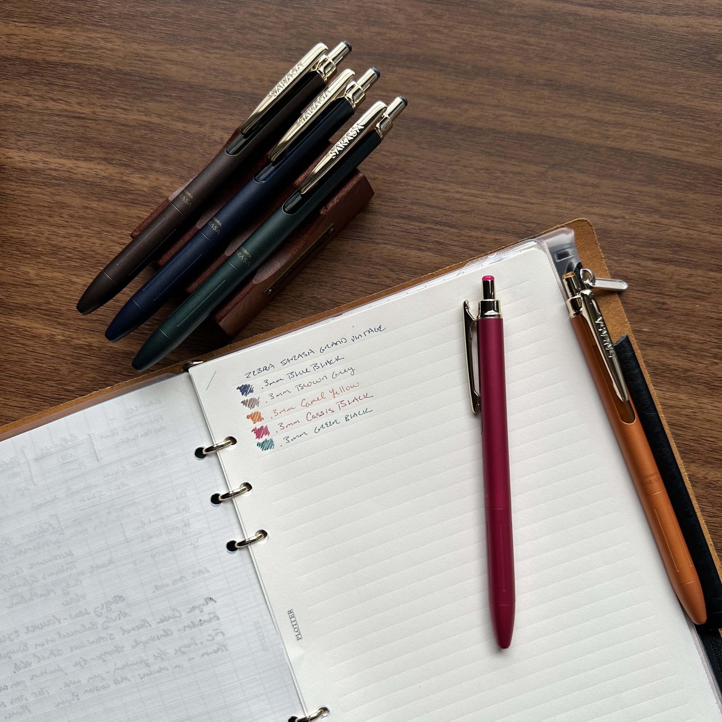
I've long admired the Sarasa Grand Vintage series from afar, but one thing that I couldn't tell from online advertisements (until I saw them in person and confirmed), was whether the color designation referred to the pen barrel or the ink or both. Turns out it's both! Not only do you have some wild vintage-style barrel colors - mostly muted shades of grey and black-infused tones - but the inks match, and you can purchase all of them in stand-alone refills in either .3mm or .5mm tip sizes. Currently, my favorites have been "Sepia Black," "Red Black" (of course), Blue-Black, and "Camel Yellow." The Sarasa JF refill dries quickly without smearing or smudging and I understand, anecdotally, that it may fit other Japanese gel pen barrels including the Uni-ball One, though I've also heard that they randomly won't fit perfectly from time-to-time and may require modification. YMMV and attempt any mods at your own risk.

“Camel Yellow”: a gorgeous orange-gold with a matching ink tone.

Takeaways and Where to Buy

So which of these two "high-end" gel pens do I prefer? Honestly, for the complete overall writing experience, probably the Sarasa Grand Vintage. It's a more premium pen, and feels like it. I've been using one of the older models in my personal testing, and while I'm not sure that the redesign would justify replacing a pen you're already happy with, I can absolutely feel a difference with respect to the balance in the 2024 model. Plus, these colors just speak to me. For a lighter weight plastic pen, the Uni-ball One is a solid option that will likely replace the various Signo DX and Signo RT pens that I have in rotation simply because the barrel is that much more comfortable for me to use.

Both pens have very precise tips, with a .38mm/.3mm size available.

We've carried certain select versions of the Uni-ball One F in our shop for a while, and as I mentioned yesterday, we now stock the Zebra Sarasa Grand Vintage (new 2024 versions). Both of these are relatively inexpensive upgrades for those who want something a bit more “professional” than your standard clear plastic office supply closet gel pen. The Uni-ball One F series pens are priced at just under $5, while the Sarasa Grand Vintage is at $20. Refills for both pens are also available in our shop.

Update: Many of you have asked about our exclusive Sunderland mk1 collaboration, and whether it will be making a return. The answer is yes! I've spoken with Brad at Sunderland and things are underway. Look for an update on a third run later this summer! I'm glad this pen resonated with so many of you and I look forward to its return.

The Gentleman Stationer is supported entirely by purchases from the T.G.S. Curated Shop and pledges via the T.G.S. Patreon Program. We greatly appreciate your support.

In Pens Tags Gel Pens, Uni-ball One, Zebra Sarasa Grand Vintage
2 Comments

Pen Review: Skogsy Pens Low Volume Eyedropper

May 29, 2024

Now that we're about four weeks removed from the 2024 Chicago Pen Show, I'm in a position to share my thoughts on the first of several pens I acquired at that show, including the one featured here: the Skogsy Pens Low Volume Eyedropper! Skogsy Pens is run by Zach and Amy Skogsberg, a husband-and-wife team where Zach is the primary maker and Amy can always be found handling the business end behind the table at pen shows! It’s been delightful to get to know them over the past couple of years, and what's amazing to me is that Zach has only been making pens since 2021, yet I've found his pens to be of consistently high quality with unique designs and material combinations. My favorites include Micarta and, as shown here, polished ebonite.

The combination of polished acrylic and ebonite is gorgeous and immediately when I saw this pen at the Skogsy Pens table I knew that I would not leave the show without it.

So What is The “Low Volume Eyedropper” System

The Low Volume Eyedropper showcases Zach’s creativity and innovation, combining beige and black ebonite for the cap and section with a polished clear acrylic barrel, drilled out to function as an eyedropper. It’s a cool look. For the uninitiated, eyedropper pens can feel intimidating. They typically involve filling the barrel of the fountain pen directly with ink using a pipette or dropper, and sealing the barrel threads with silicone grease or an o-ring. Most eyedroppers hold a LOT of ink, which newer users often perceive as risky because it can cause a big mess if the pen leaks from the barrel or section or "burps" ink out the front of the nib due to changes in air pressure or temperature. The Skogsy "Low Volume" eyedropper is an experimental design that looks to mitigate some of the everyday complications inherent in eyedropper pens, and make them more user friendly.

While this pen is on the shorter side for me, it’s proportionate enough in terms of diameter to maintain comfort.

The Low Volume Eyedropper - as the name implies - has been intentionally designed to hold a smaller volume of ink than your typical eyedropper in order to limit the amount of ink flowing to the feed and to allow for additional insulation of the ink chamber. (i.e., The smaller the ink chamber, the thicker the barrel, which means more material between the ink and your hand, which in turn limits temperature fluctuations that cause burping.) I understand that some additional modifications have also been made to the ebonite feed and the section to moderate the ink flow - something that can be particularly important with an eyedropper as most eyedroppers are wet writers to begin with and an ebonite feed will exacerbate that issue. I'm pleased to report that that system functions as intended: Even as I've emptied the pen, I've experienced no burping or excess flow as the eyedropper writes toward empty, and the ebonite feed maintains a steady stream of ink that's pretty much perfect for my preferences with a broad nib.

The cap/barrel seam sits dead center. The cap is 2.75” long and the exposed portion of the barrel is the same length.

The Pen's Design: Relatively Short and Sweet with a no. 8 magna carta nib

Zach originally got into making fountain pens because he had a hard time finding a size and shape that appealed to him. As he points out in his introduction, compact pens with wider grip and barrel can be difficult to find, especially at an accessible price point. It can be even harder to find a pen with these proportions that features a larger nib - personally I feel that a No. 8 nib simply looks better on a pen of this size than a No. 6. Fortunately, lower-cost stainless steel No. 8 nibs have become more widely available as both JoWo and Magna Carta now supply them to penmakers, with Magna Carta currently the most popular. (Both the Skogsy Low Volume Eyedropper and the Edison Jameson that I picked up in Chicago feature these Magna Carta nibs.)

My pen came with two nib options. The Magna Carta has been installed since the Chicago Pen Show, but I also love that surfboard design on the JoWo No. 6! (Skogsy Pens is located in San Diego.)

I will note that the Magna Carta nibs can need some tuning, which may include not only smoothing but heat-setting the nib to the feed. This process is not terribly complicated for an experienced user to do by themselves, but if you're not comfortable performing minor work on your own nibs I would highly recommend purchasing your pen at a pen show where Zach can adjust your nib in person to fit your preferences.

The Magna Carta stainless steel nib features no branding. It’s a nice standard broad nib, but….

The ebonite feed is what makes the writing experience! Adding extra flow really does up the game here.

The finish on my pen is flawless. The clear acrylic barrel is polished to perfection without any noticeable tool marks, the threads are smooth, and the ebonite on the cap and section shines. And check out that swirl at the top of the cap....

Perfectly centered.

The Low Volume Eyedropper measures approximately 5.5 inches capped, 5 inches uncapped, and 6.5 inches posted. It's a very comfortable length for me to use either posted or unposted, though I think I prefer unposted as the pen feels more balanced. The gently concave, wider-diameter section offers a good grip area, and ebonite is one of my favorite materials to write with because it takes on a warm feeling in the hand. This pen practically begs to be used everyday, and offers an extremely pleasant writing experience over longer sessions at work or at home in my journal(s).

The cap posts deeply and securely, though I think I prefer to use this one unposted.

What About the Ink and Paper Used in This Review?

In addition to test-driving the Low Volume Eyedropper, I used this review as an opportunity to try out a new ink and rediscover a favorite paper. I've always found brown/beige pens - and definitely clear-barreled eyedroppers - as excellent vehicles for showcasing red inks, so for this review I inked the pen up with Tom's Studio "Mulberry". Mulberry is a gorgeous deep burgundy that is what I consider a "solid color": without shading or sheen but it has a beautiful dark red hue with purple undertones.

What is it about brown/beige/grey pens and red inks?

As I mentioned above, the broad No. 8 Magna Carta Nib writes a bold wet line, and I had no issues with the Mulberry feathering or bleeding on the paper I've used here, which is the Blackwing "Illegal Pad". I've written before on my frustration with finding decent, reasonably priced legal-style pads capable of handling fountain pen ink, and I'm glad that Blackwing has now made these pads more widely available. Cool Note: The lined pads shown here feature a legal/steno layout, which is a lined pad with a center dividing line that we attorneys have traditionally used for various purposes such as organizing questions and corresponding answers at deposition or in court, as well as for checklists and research task management.

The Skogsy Low Volume Eyedropper (center), compared to two pens I’ve recently reviewed: the TWSBI ECO Caffé Bronze (right) and the Kaweco Sport Piston Filler (left).

Takeaways and Where to Buy

At the Chicago Pen Show, the Skogsy Low Volume Eyedropper was priced at $340, which included a stainless steel Magna Carta No. 8 nib AND an extra Jowo No. 6 section and nib with the Skogsy surfboard design. I consider this excellent value given the craftsmanship and versatility. I have not yet tried out this pen with a No. 6 nib, and I’ll be interested to see whether it changes my perception of the balance or the writing experience.

The polished ebonite showcases a good bit of grain. Polished ebonite is one of my favorite fountain pen materials, and highly underrated.

As of the date of this post, Skogsy Pens does not have any Low Volume eyedroppers listed for sale on their website, as they are in the middle of Pen Show Season and stock needs to be reserved for shows (This is frequently the case with many smaller makers.) If you're interested in this particular pen, you have a few different options: Keep checking their online shop or contact them directly to place an order for a commission, follow Skogsy Pens on Instagram, or even better, visit them at a pen show! They list all upcoming shows online, and will be appearing at the Dutch Pen Show in June, the D.C. Pen Show at the beginning of August, and the San Francisco Pen Show at the end of August.

Another writing sample with the Mulberry ink, this time on Midori MD Cotton Paper.

The ink and paper featured in this review can be purchased in our own shop, as we carry the entire line of Tom's Studio Fountain Pen Inks, including Mulberry. You can read more about these inks ($16 for a 50ml bottle) and view swatches here. We also sell the Blackwing "Illegal Pads", which come in packs of two pads (priced at $20) and are available in blank, dot, and classic "legal pad lined" formats.

Did you enjoy our content? Consider supporting us directly by visiting the T.G.S. Curated Shop, or pledging via the T.G.S. Patreon Program. We greatly appreciate all our reader and customer support. I purchased the Skogsy pen shown here with my own funds, for review purposes, and was not compensated for this review.

In Pens Tags Pen Review, Fountain Pens, Eyedropper, Skogsy Pens, Skogsy Pens Low Volume Eyedropper
Comment

My First Fountain Pen Revisited: The Waterman Laureat

May 25, 2024

I write a lot about recommendations for a "first fountain pen", and readers/customers frequently ask me for advice on which fountain pens they should they should buy based on various price points and other criteria. BUT, I realize I haven't written much at all on my own first "nice" fountain pen: the Waterman Laureat.

The Laureat features the classic Waterman clip and branding around the cap band.

Waterman made the Laureat during the mid-to-late 1990s, and possibly into the early 2000s. (I'm not a vintage expert - all I know is that it's no longer available and by the time I was back into the hobby in 2010, they had disappeared from store shelves.) I purchased this particular pen in London, in 1999, when I lived in Strasbourg, France and spent many a weekend visiting friends who were studying in London at the same time. As a slimmer pen, the Laureat made for a great introduction into the world of fountain pens because at the time it felt very similar to the "stick" ballpoints and rollerballs that I regularly used in school. It slotted easily into my Filofax pen loop, and the cap was designed to post easily onto the back of the barrel. Despite the lacquered brass construction, the slim barrel meant that the pen maintained a usable weight and decent balance.

You can make out the ring of ink around the base of the nib. There is also some wear to the gold plating, which is to be expected after 25 years!

Nonetheless, like a few different 1990s-era Waterman pens, the Laureat had one glaring flaw: It is, by far, the messiest fountain pen I have ever used. The Laureat features a friction-fit cap and a ribbed grip that somehow interact to pull a drop of ink from the nib whenever you cap/uncap the pen. The result is a ring of ink around the end of the section, just below the nib, that's not enough to constitute a full-on leak, but is just enough to stain your fingers. You can avoid the issue somewhat by gripping the pen higher up on the section, but I've always accepted this as my "inevitably inky fingers" fountain pen and dealt with it. Waterman pens from this era feature some of the most consistently good stainless steel nibs available, and the gold nibs are among my all-time favorite. (I have at least five vintage or “near-vintage” Watermans that see regular use.)

The Waterman Laureat remains an incredibly comfortable fountain pen to use.

Is There a Modern Equivalent of the Waterman Laureat?

There are a couple different options, but in terms of pure feel, the Scriveiner fountain pen that I was recently sent to review (one of which we are giving away!) are close. Scriveiner uses the same lacquered brass barrel design, and while the color options don't feature quite as much depth as the Laureat, the pens don't suffer from the "inky section" issue. Scriveiner pens use Schmidt nibs, which are some of the most consistent steel nibs on the market, and the feel of the medium nib I've been testing actually comes pretty close to the Laureat.

For those who don't like the weight of a brass barrel, another option would be the Pilot Explorer, which has a similarly slim shape, excellent steel nib and a much lighter feel in the hand. At $25, the Explorer is also much less expensive than the Laureat was (I believe I paid close to $200 for a matching fountain pen/rollerball set?)

Waterman Laureat next to a Scriveiner fountain pen (center) and the Pilot Explorer.

Finally, the modern equivalent of the Laureat in the current Waterman lineup would probably be the Waterman Hemisphere. I haven't used one of these pens, so I have no first-hand experience, but I have not heard of any ink issues like the ones that plagued the Laureat. The Hemisphere appears to feature a similar grip/inner cap to the Waterman Expert, with which I've had no such problems.

The Laureat next to the Scriveiner, uncapped.

What was your first "quality" fountain pen? Do you still use it? Does it still hold up? Or did you ink it up again after many years only think "What the heck did I ever see in this?" I love to hear these stories, so please drop a line in the comments over this long weekend!

The Gentleman Stationer is supported entirely by purchases from the T.G.S. Curated Shop and pledges via the T.G.S. Patreon Program. Through Monday May 27, we are running a sale in the shop using the coupon code “SUMMERSALE” at checkout. If you enjoy our content, we greatly appreciate your support!

In Pens Tags Waterman, First Fountain Pen, Fountain Pens, Waterman Laureat
3 Comments

Pen Review: TWSBI ECO Caffé Bronze - What is it About These Muted Colors?

May 22, 2024

I've not formally reviewed a TWSBI since the release of the TWSBI "Kai" special edition piston filler last year, and it's been longer since I've reviewed a TWSBI ECO, so in light of TWSBI's recent blitz of new pens in a broad assortment of different color and trim combinations, this one's overdue. While I won't rehash much of what I've already written on the ECO in terms of origin, construction, design, etc. (you can read that here), I will say that it's one of my top pen recommendations in the "under $50" category.

The TWSBI ECO Caffé Bronze (left) with Indigo Blue + Bronze (right)

The TWSBI ECO serves as one of the premier value fountain pens on the market. Priced as low as $32.99 for a pen with the standard steel trim, the ECO features a reliable piston filling system and generally appeals to a wide range of enthusiasts, from beginners looking for their first pen to experienced users who want a reliable everyday writer that doesn't break the bank. Over the past few years, TWSBI has gradually introduced variations into the ECO lineup, including the "ECO-T" (triangular section), the ECO Rose Gold (with rose gold trim), and, as shown here, the ECO “BRZ” (with bronze trim). While the rose gold and bronze trims raise the price of the ECO to $49.99, even this still amazes me somewhat as many manufacturers would have tried to price the standard ECO at $50.

Is “ECO BRZ” a thing now? I like it. Now I need to go matching Subaru shopping.

The pen I’m looking at today features the new bronze-toned trim. The TWSBI ECO "Caffé Bronze", as you might expect from the name, draws on coffee as its inspiration. Featuring the same faceted hexagonal cap and round barrel as the standard ECO fountain pen, TWSBI began experimenting with bronze last year, releasing it for the first time with the ECO "Indigo Blue + Bronze" model. It's proven wildly popular, especially among those looking for something similar to rose gold but perhaps with a touch less red.

Personally, the combination of light coffee-colored acrylic and bronze trim screams for J. Herbin “Cafe des Iles” ink.

While I enjoy rose gold trim on pens, the bronze adds a new dimension due to its deeper tone. When you combine this trim with a more muted color acrylic, like the light "caffé brown" acrylic used here, you get a pen that's perfectly tailored to my own preferences. For so many years, pen makers and manufacturers have catered to the segment of the community that wants bright, wild acrylics, but what about those of us looking for something a touch demure? TWSBI has done a good job of mixing in crazy colors (see the "Glow Green" and "Glow Purple", which actually glow in the dark) with the more subdued (see the Creme and Rose Gold, Dark Sapphire). I hope this trend continues, and that other manufacturers follow suit.

Overall Thoughts on the TWSBI ECO and Where to Buy

The ECO has become my default everyday TWSBI because (1) they're relatively inexpensive, and I have a handful of these pens, so don't necessarily need to worry about damage while carrying them around with me or leaving them at my office; (2) the nib writes a reliably wet line; and (3) I can post the cap, which attaches securely to the end of the pen via an o-ring. I can’t wait to see what else TWSBI has coming, as I've enjoyed most of the new additions even if they sometimes make it hard to keep up.

You can see a trend here: The TWSBI ECO Caffé Bronze (center) with my Kaweco Art Sport in Terrazzo (right) and my recently acquired Good Made Better pocket pen.

I can’t say whether these new TWSBI releases are intended to be permanent additions to the lineup or special editions that will eventually be retired - to my knowledge, TWSBI hasn’t specified. In the past, TWSBI has typically released a color and kept it around for a year or so, replacing it with something else once interest wanes. That said, many of the new releases from 2023 and even 2022 are still available to retailers, as I've had no problem restocking so I expect there’s no immediate danger of the 2024 releases disappearing.

If you would like to support T.G.S. directly, you can purchase the TWSBI ECO Caffé Bronze from our own shop, along with most other TWSBI products including pens, mechanical pencils, and inks. As I mentioned above, the specific pen shown here is priced at $49.99. All TWSBI ECO fountain pens are piston fillers, and take bottled ink only, so plan accordingly!

The Gentleman Stationer is supported entirely by purchases from the T.G.S. Curated Shop and pledges via the T.G.S. Patreon Program. We greatly appreciate your support!

In Pens Tags TWSBI ECO, TWSBI ECO Bronze, TWSBI ECO BRZ, Pen Review
2 Comments

Pen Review: Uni Jetstream 4&1 Multi Pen

May 8, 2024

Today's post is somewhat of a hybrid between an entry in the "Review Revisited" and "Mini Collection" series. Since I've somehow managed to collect 5 or 6 of the Uni Jetstream 4&1 Multi Pens over the years, I figured I should revisit my last review and comment some on why I enjoy this pen so much. While I consider myself a multi pen enthusiast, I really use two on a daily basis: (1) the Lamy 2000 Multi Pen, and (2) one of these various Uni Jetstream models.

All of the various renditions of the Uni Jetstream multi pens use different materials in the body and grip section.

My Use Case For Multi Pens

Long-time readers of the blog know that I'm a fairly prolific reader and serial annotator, both in my day job and my personal life. For me, multi pens are one of the ultimate annotation tools because they allow you to mark up documents in multiple colors (different colors for different types of notes), and an added mechanical pencil option is a great bonus because it allows you to erase as necessary. The multi pen is a lifesaver when I'm traveling - particularly when I'm working on a airplane - as it eliminates the need to have multiple writing instruments available and minimizes the risk of something getting lost or falling under the seat. Multi pens are also great for when you want to read out on the patio, work on the couch, or another similar context in which you're not necessarily seated and/or writing on a flat surface.

If I had to pick a favorite to use daily, it would probably be the versions with the bamboo grip. It’s quite tactile and I imagine they will age/patina with time. The Karimoku edition is not bamboo, but rather reclaimed wood from furniture manufacturing, if I’m not mistaken. It also features a ceramic-like coating (possibly Cerakote or something similar).

What Makes a Good Multi Pen?

For me, because I’m not necessarily using this particular pen to write a novel, it all comes down to the refill and how reliable it is. While the Lamy 2000 Multi Pen (ok, "4-Color Ballpoint") might be one of the most versatile multi pens because it accepts universal D1 refills, I find myself using Uni Jetstream refills nearly exclusively in all of my ballpoints, so I've also managed to accumulate a significant collection of the Uni Jetstream 4&1 and 3&1 multi pens. These take a proprietary cartridge, but because I’m pretty much all-in on the Jetstream at this point, I don’t care as much. The "&1" refers to the added mechanical pencil - something the Lamy 2000 doesn't have.

The 4&1 contains four different Jetstream refills: black, blue, red, and green. All of them write smoothly. It can be extremely difficult to find decent ballpoints in colors other than black and blue, but the red and green refills here write a legible line and have been reliable over time. Jetstream refills tend to last forever without drying up, something that's especially important with a multi pen where you might not use a specific color on a daily basis.

While some might find the Jetstream 4&1 too large for their hand, I personally find it fairly comfortable due to its light weight. Uni makes this pen with multiple grip styles, however, so be sure to choose the one most comfortable for you. For example, those who tend to grip their pen hard might want to avoid the metal section models in favor of the gel grip, while the plastic and bamboo options present more of a middle ground.

Takeaways and Where to Buy

And this brings us to the "mini collection" portion of this post. At last count, I have in my personal collection six of these Uni Jetstream Multi Pens in various finishes: two of the standard Bamboo models, one model in the limited edition Karimoku finish, one metal-grip "Tokyo Bike" special release, one Tokyo Bike 3-color (no mechanical pencil), and a standard black gel grip 4&1. Five of the six pens are the 4&1 model, so I'm pretty much sold on that version. And yes, I know there are countless more editions and releases out there, but I can only use so many multi pens, and I plan to just pick them up as I come across them "in the wild" as opposed to tracking them down via eBay, etc.

If you’re interested in hearing more about why I like this pen, and multi pens in general, check out this YouTube video that I recently released that discusses how the Uni Jetstream 4&1 compares to other favorites, including the Lamy 2000.

From left: Sage, Mimosa Yellow, Oregano, Blue-Grey, and Gerbera Pink.

In the meantime, in the interest of making this long-time personal favorite more accessible, I did order an assortment of the Bamboo-grip 4&1 Multi Pens for the shop. I currently have them in five muted pastel shades, including Mimosa Yellow, Oregano Green, Blue Grey, Gerbera Pink, and Sage. If you've never tried a good multi pen, this is an excellent place to start, given the combination of quality and price point ($25). The four included starter refills will last you a very long time, but if you think you might want more, or need to replace refills in an existing Jetstream Multi Pen, we sell all colors, as well as .5mm Uni mechanical pencil leads.

The Gentleman Stationer is supported entirely by purchases from the T.G.S. Curated Shop and pledges via the T.G.S. Patreon Program.

In Pens Tags Uni Jetstream Multi Pen, Uni Jetstream, Multi Pen, Pen Review
6 Comments
← Newer Posts Older Posts →
Store Location
Visit the T.G.S. Curated SHOP
*New* Updated "Best Pens" Guide (2025)
TGS x Hinze Pens Violet Tendencies Taschenstift Fountain Pen
Hierarchies of Fountain Pen Friendly Paper
Allex Scissors arrayed on a desk showing link to desk accessories

Join Our Patreon!
Subscribe to the TGS E-mail List

Featured Posts

Featured
Joe's-Journals-New-Old.jpeg
Jul 2, 2025
Time to Pick a New Personal Journal: Maruman Mnemosyne Hardcover A5 Journal
Jul 2, 2025
Jul 2, 2025
Desk-Accessoris-Unstaged.jpeg
Jun 25, 2025
Getting Personal: Five "Stationery Adjacent" Items I Can't Live Without
Jun 25, 2025
Jun 25, 2025
Pilot-Iroshizuku-Yama-Budo-Writing-Sample.jpeg
May 24, 2025
Joe's Picks: Five Favorite Inks From Pilot's Iroshizuku Lineup
May 24, 2025
May 24, 2025
The Gentleman Stationer RSS

© Digital Divide Media, LLC, 2014-present.

All content is the exclusive property of Digital Divide Media, LLC, d/b/a The Gentleman Stationer, including “The Gentleman Stationer” website and trademark, and should not be reproduced without express written permission.  All rights reserved.

All content containing paid advertising, affiliate links, or sponsored content will be plainly disclosed by a disclaimer when/if featured.

Contact Information

Store Shipping Policy and Return Policy

Privacy Policy

Cookie Policy

Terms and Conditions

Powered by Squarespace