Last month, I received this pen in a trade from a friend. He had decided to pass it on because the pen was underused in his collection and was cleaning out some space (something that I'm trying to do myself by selling/trading some extremely underused pens and inks).
Introducing the Waterman Phileas, once Waterman's flagship "economy" pen, and the starter pen of choice for many.
I was thrilled to have this pen in my collection. For those of you who don't recognize it, this pen is a Waterman Phileas, which was discontinued by Waterman approximately 2-3 years ago. Prior to that, the pen was fairly ubiquitous in that it could be found in office supply stores in the U.S., not to mention abroad. I still remember when you could find "fountain pen starter kits" at Staples or Office Depot that included the Phileas, a bottle of Waterman Florida Blue Ink, a converter and some cartridges for around $30. Personally, my introduction to the Phileas came when I was in school in France in 2000-2001, and everybody had some sort of fountain pen, with these being a popular choice. At that time, I had the lower-end Waterman Kultur, which was a Phileas without the art-deco trim, but nonetheless a great writer.
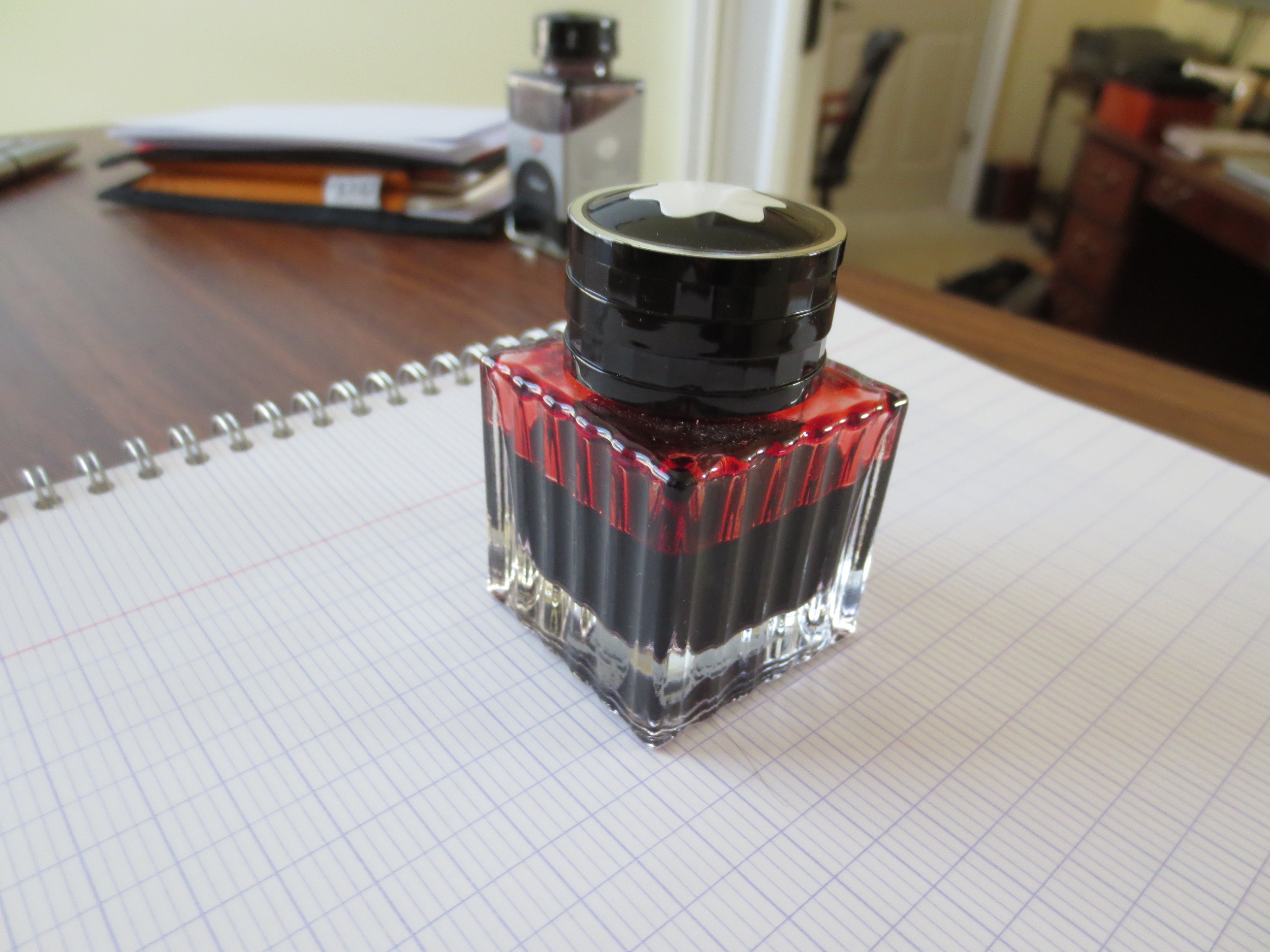
The pen has nice gold plated trim on the cap. The material is marbled green resin.
Note the art deco styling--something you don't see very often in budget pens anymore.
What's remarkable about the Phileas is the fact that it includes some very nice detail that's hard to find in $30 pens these days. Note the gold-plated trim with art deco details. Also, the tolerances seem very high. The edges of the pen are well rounded and the slip-on cap both closes and posts securely. The marbled green resin is very understated, professional, and not at all "cheap" looking. The pen also has some heft to it, as Waterman lined the inside of the barrel with brass.
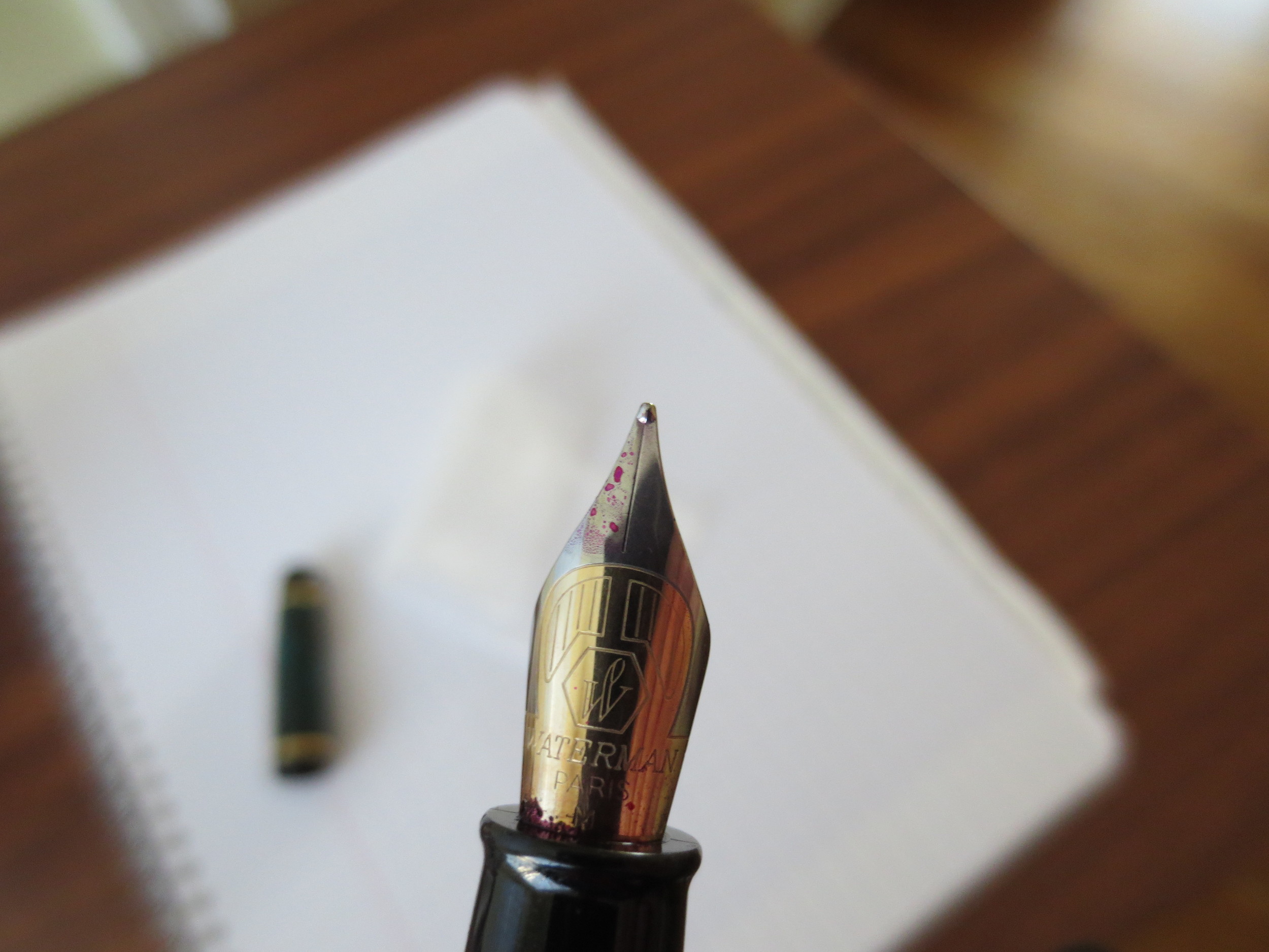
The Phileas Nib is a two-toned steel nib that writes well. This one is a medium.
The nib is nothing remarkable, but it's a solid writer that does what it's asked to do: write reliably. It doesn't skip and I've never had a hard start. I've been using this pen for the past week, filled with Iroshizuku Yama-Budo, and it's caused me no problems.
The Phileas disassembled. This one came with the Waterman threaded converter, which I like.
A writing sample from the Phileas, using Edelstein Turmaline during my review of that ink. Paper is Clairefontaine French-ruled.
The Verdict. This is a great pen that, in my opinion, never should have been discontinued. For years, it was probably the go-to entry level pen out there. If you can find one, it's still a great option for everyday use. There has been much speculation as to why Waterman discontinued this pen (example link here), but IMHO the most plausible explanation is that Sanford, the parent company, wanted to take the Waterman line to a more upscale market position, at least here in the U.S, and therefore discontinued their "budget" line. I was last in Europe a year ago, and I still saw some Phileas and Kultur pens on shelves. Whether those pens were NOS or not, I couldn't say.