My First Aurora: Ipsilon Quadra Sterling Silver

I've been jonesing for an Aurora pen for a very long time, but something else always seemed to get in the way.  Finally, two weeks ago, I pulled the trigger and selected the Aurora Ipsilon Quadra in Sterling Silver from Pen Chalet.  I'm a big fan of the chiseled sterling look, as you may know from last week's review of the Parker Sonnet, and Aurora does something different with this pen that raises the bar.  But first off, some unboxing photos.   

Aurora Presentation box.  If it's faux leather (which it probably is), they do the best job I've seen.  It feels nice and has a true leather smell. 

Props to Aurora on their packaging and presentation.  The branding details and interior trim are superb. 

Presentation.  The presentation of the pen in the box is outstanding.  Honestly, Aurora's packaging is some of the best I've seen.  It's not tacky and overdone, but it's not cheap.  It feels equal to the price and quality of the pen.  This is one of the few boxes I will keep.  Now, on to the pen itself.

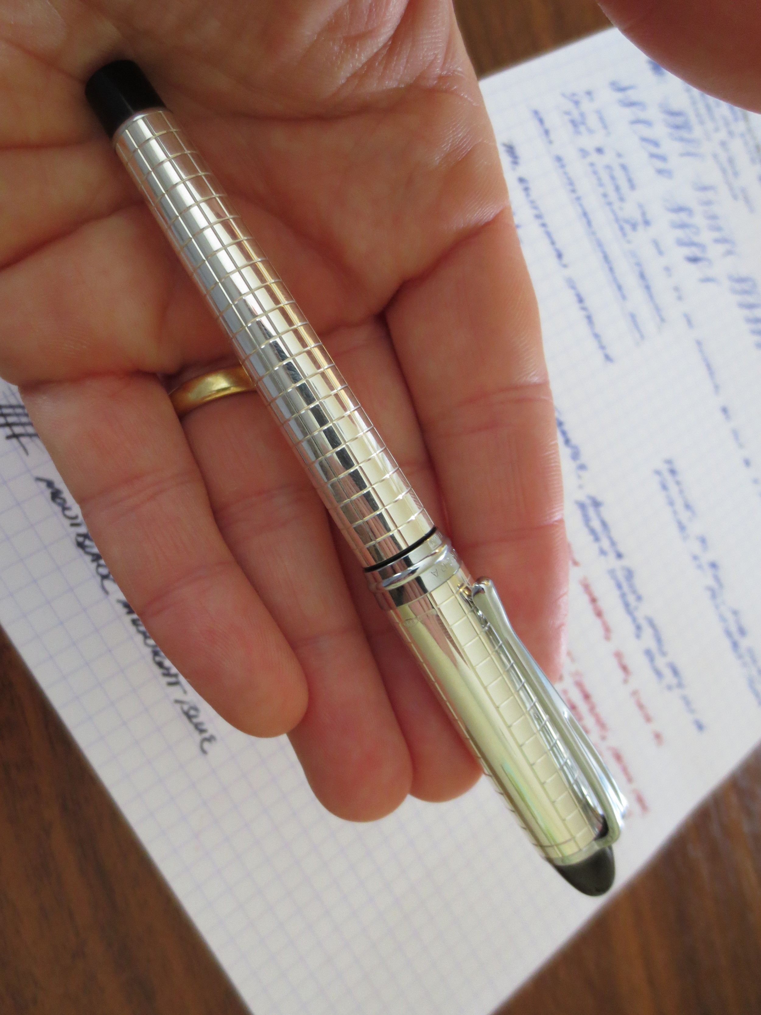
Build Quality.  It sounds trite, but the Ipsilon Quadra is simply a well-made pen.  Both the cap and the barrel are sterling silver.  The clip and cap band are not.  The pen is lighter than I would expect for a metal pen, but has good heft.  You can tell that it's not thinly plated.  Another thing I like is the finish.  My Parker Sonnet's finish is "antiqued," meaning that the silver is given a patina to make it look older.  The Ipsilon Quadra is shiny, at least until the silver develops a patina of its own.  If you want to keep this pen shiny and "new" looking, you'll have to polish it.  

The cap is friction fit, and it snaps on and off firmly.  The plastic end-cap on the pen also "snaps" the cap into place when you post the pen.  While the pen can be used unposted, I'm pretty sure this one is intended to be used posted, and that's how it best fits my hand.  

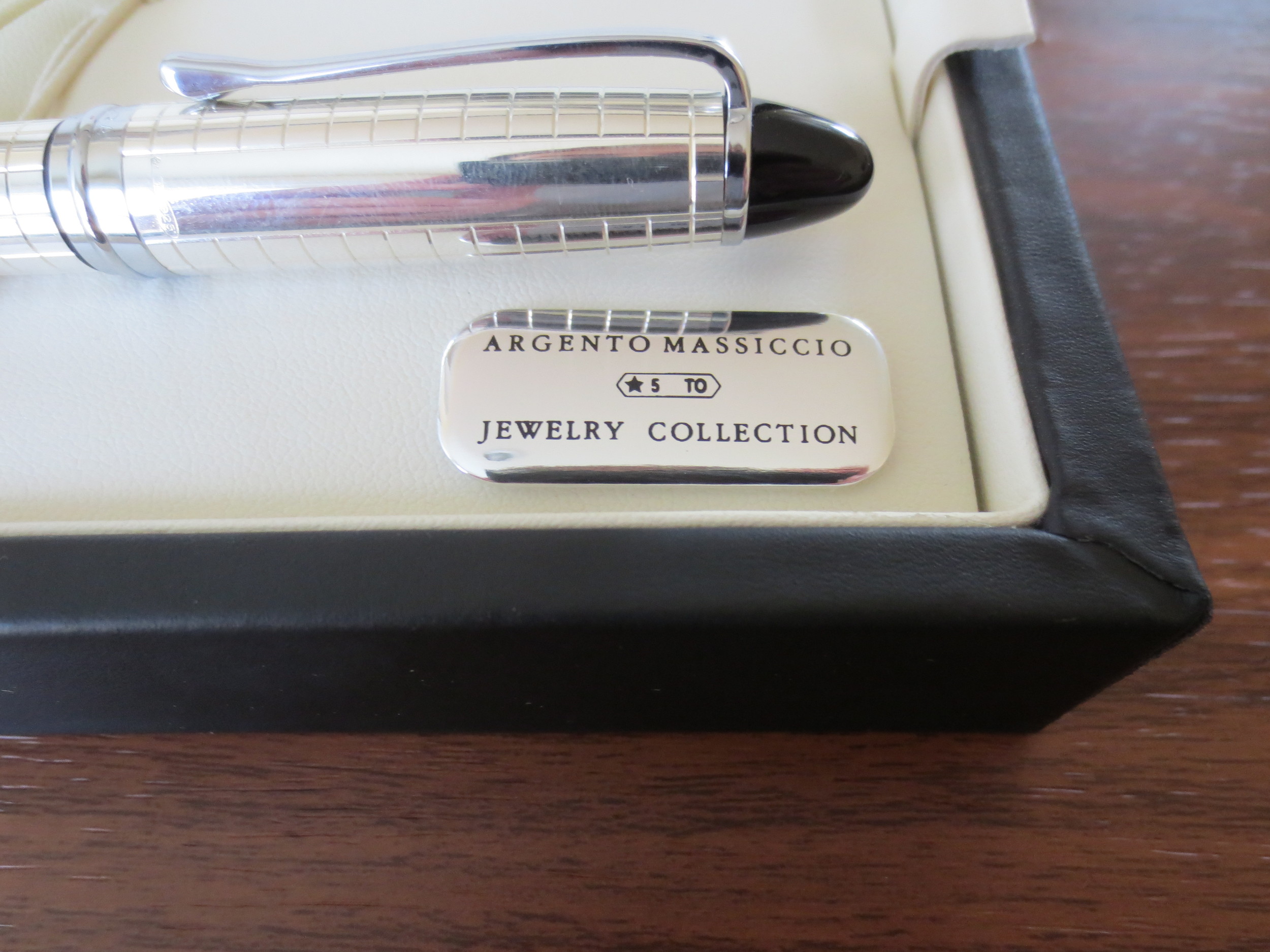
You can see that the cap has a non-patterned area, presumably for engraving.

Another close-up look at the detailing.

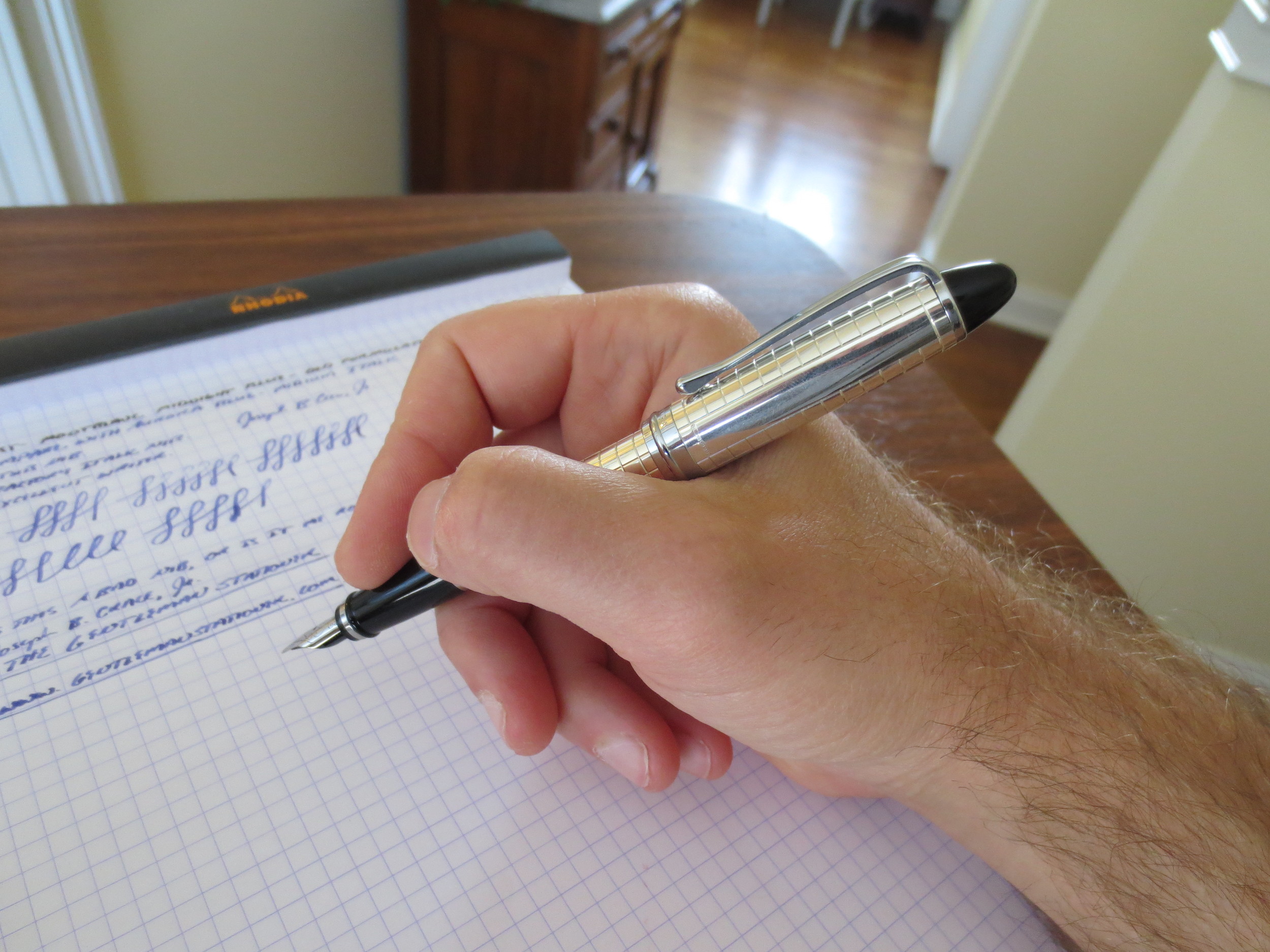
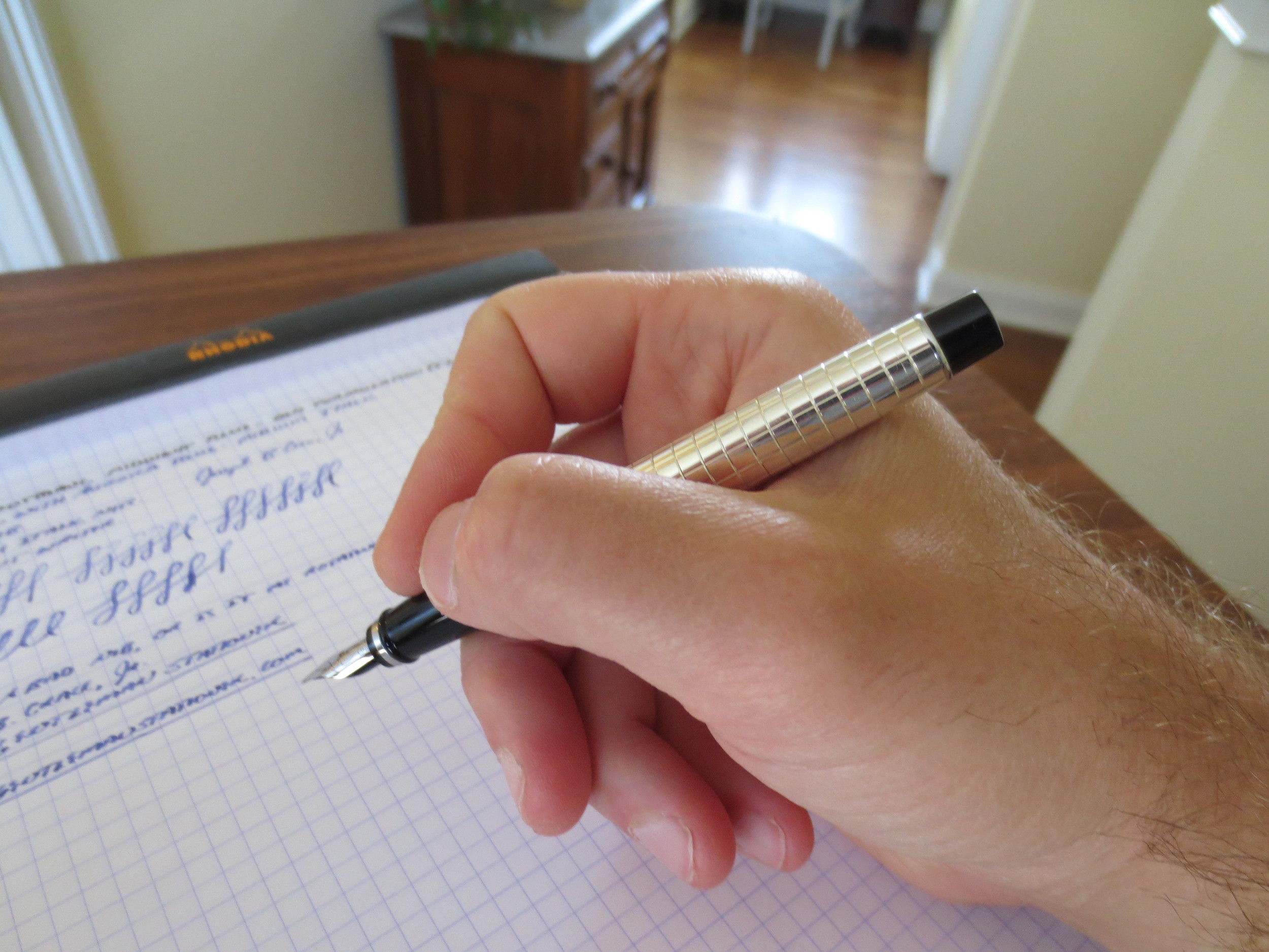
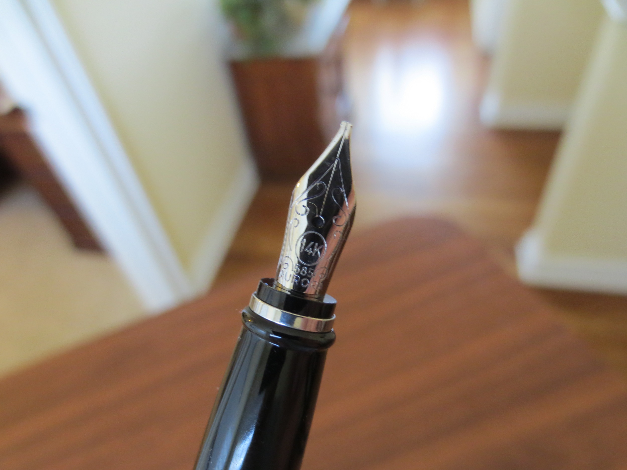
The Nib.  The nib is where I decided to step out of my comfort zone.  This 14k nib is Aurora's stock medium italic, which is a size and grind that's pretty difficult to find.  It is a very sharp italic--not a stub--and takes a bit of getting used to.  If you don't slow your writing down to give yourself time to adapt to the nib's sweet spot and how it likes to be held oriented to the paper, the edges will dig in and you'll have a pretty rough go at it.  But once you get the hang of it, this nib gives you incredible line variation and brings out any shading properties in the ink you are using.  I decided to fill this pen for the first time with Aurora blue.  Sometimes I like to test a new pen with the manufacturer's ink, because if a pen doesn't write with ink made by the company that made the pen, there's probably something wrong.  No problems, here, of course.     
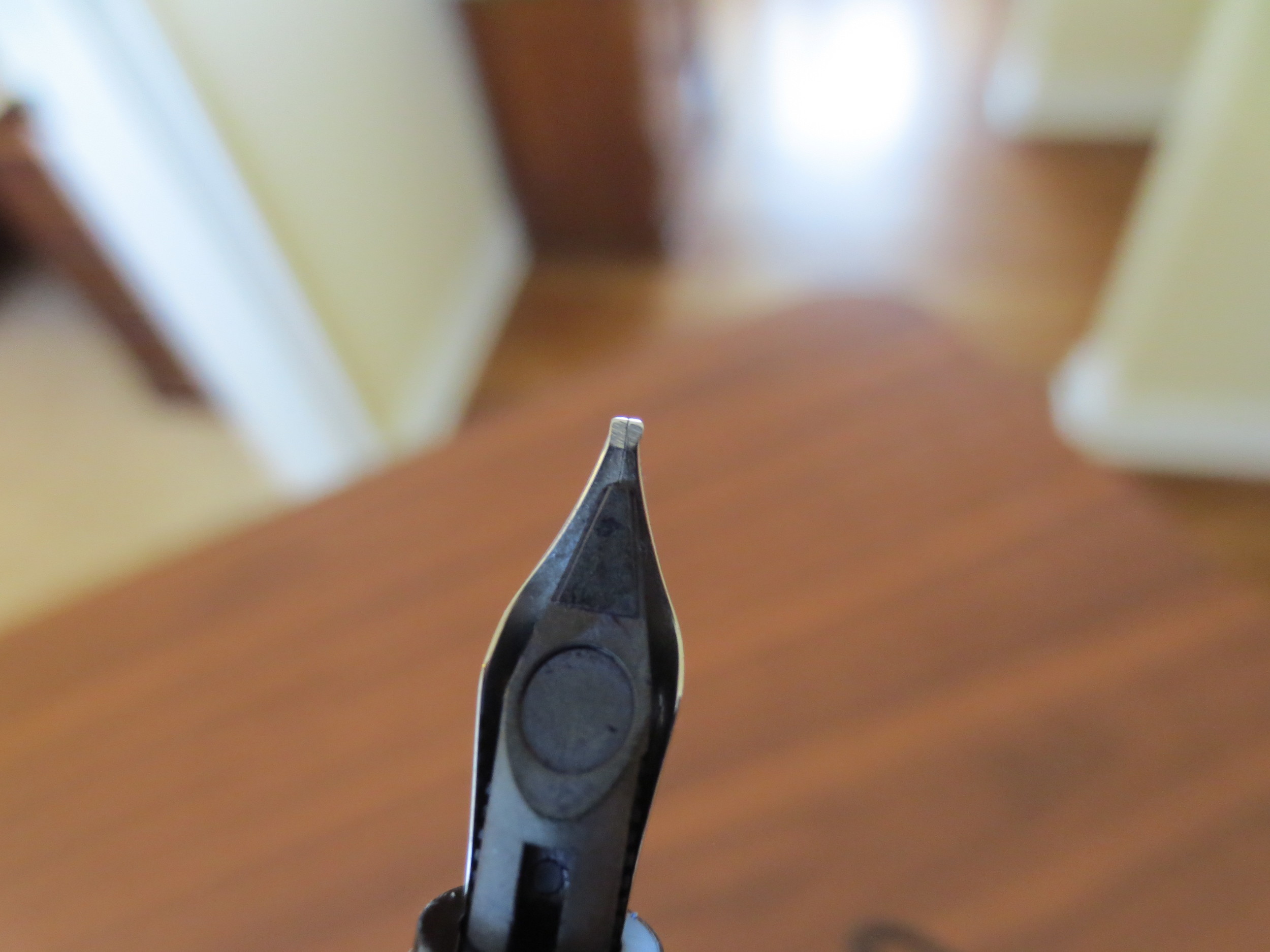
It's hard to see in the picture, but the Italic nib has very sharp corners.

It's hard to see in the picture, but the Italic nib has very sharp corners.

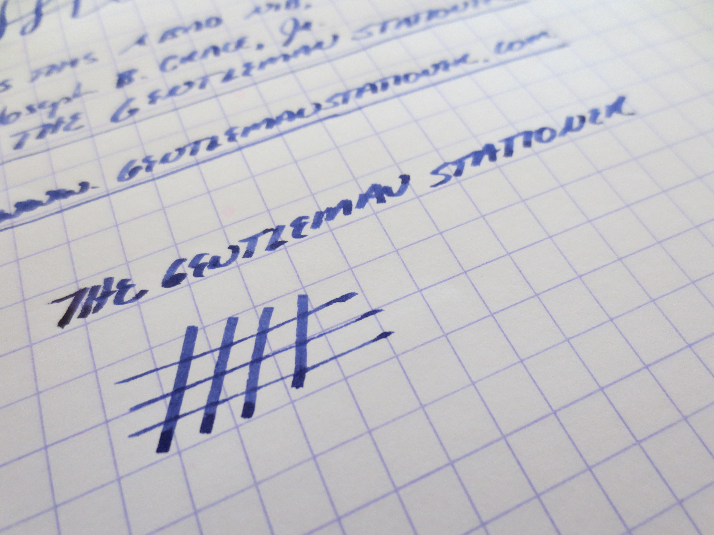
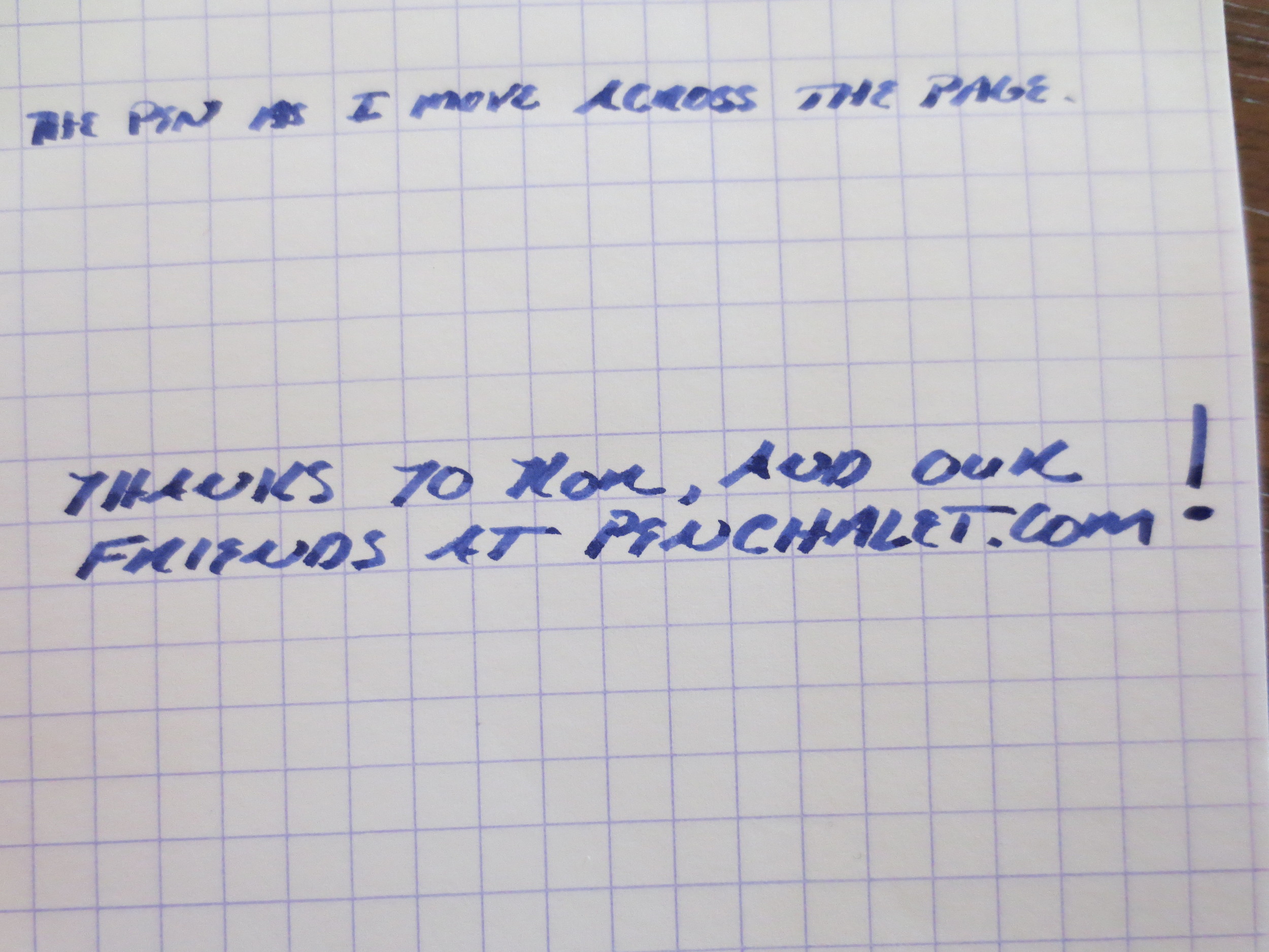
A writing sample from when I first filled and tested the pen.  Notice the rough edges and some skipping as I had to adjust my writing slightly to compensate for the sharp edges on the Italic nib.  Things got MUCH better for me once I broke the nib in a bit. 

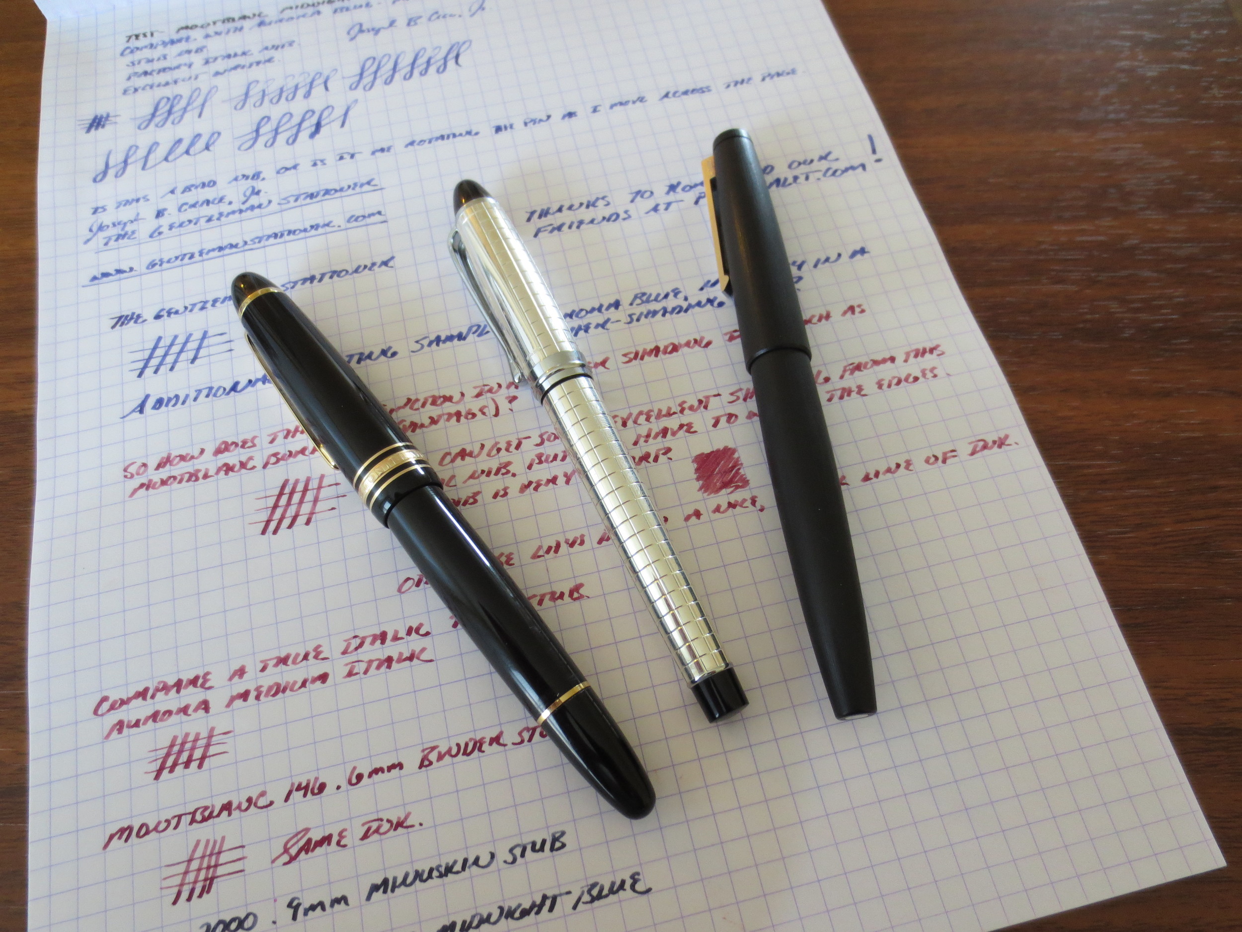
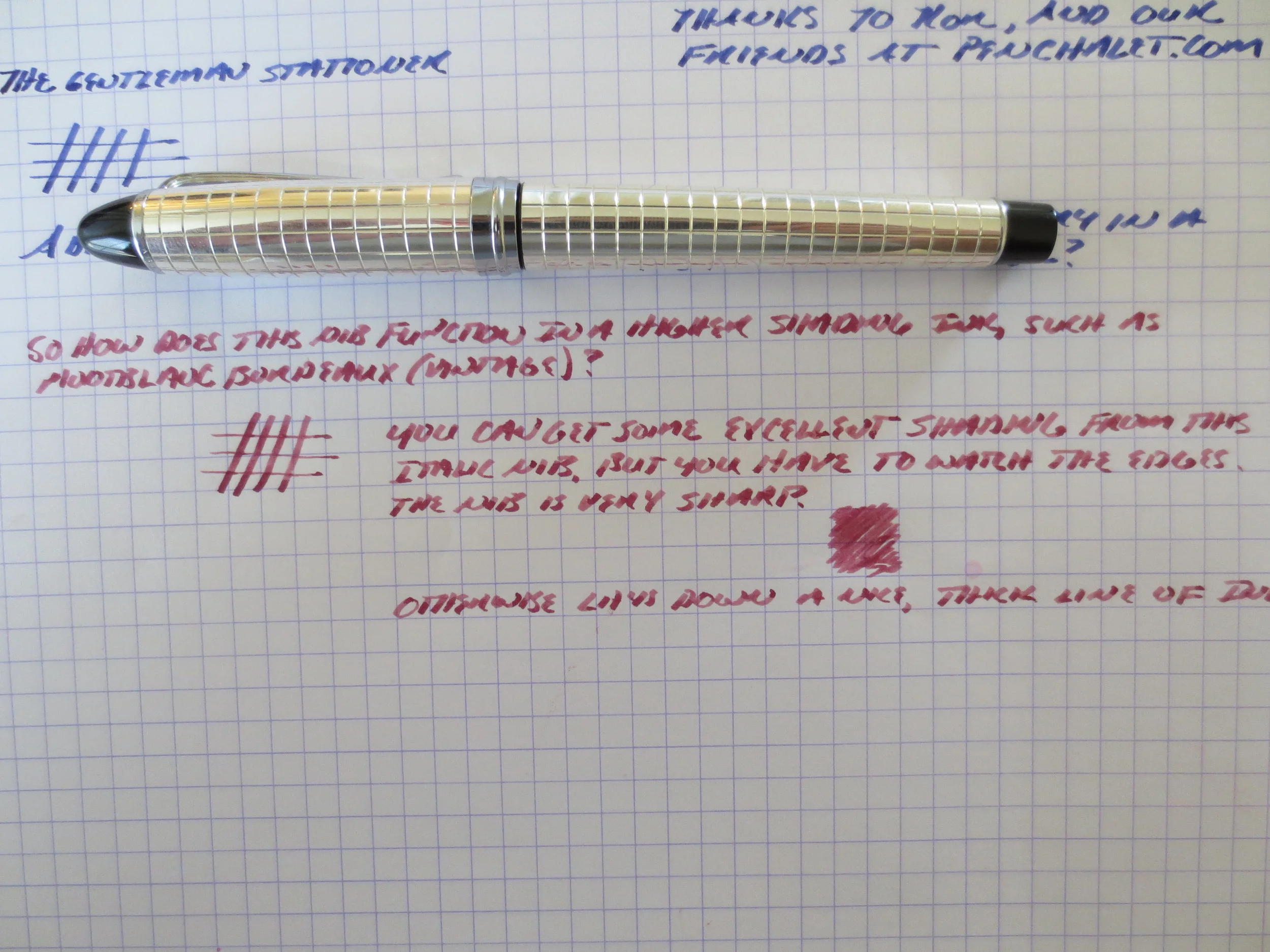
After writing with the Aurora blue for a couple of days, I switched things up and loaded the pen with Montblanc Bordeaux (the late-1990s version).  I also did some side-by-side writing samples with two custom stubs I have on a MB 146 and a Lamy 2000.  Note the shading in the italic nib, while the stubs write a wetter line and have slightly less line variation. 
The Verdict.  I absolutely love this pen and am thrilled to finally add an Aurora to my collection.  I'm also pleased with the Italic nib, something that I've hesitated to buy in the past.  This pen may make me less reluctant to try stock italics in the future.  Buyer beware:  I cannot emphasize enough that an italic nib is NOT the same thing as a stub nib.  Stubs are meant to create subtle line variation without sacrificing the ability to write relatively quickly and fluidly.  For the most part, italic nibs require you to slow down and pay attention to your handwriting. 

Like I said, I purchased this pen from Pen Chalet. This pen, while not cheap, is priced very well for a sterling silver pen, and Pen Chalet's prices are as good as any, especially when you use one of the various discounts floating around and take advantage of their free shipping on orders over $50.  The pen came to me in pristine condition and shipped fairly quickly.  Ron carries a pretty wide variety of Auroras, including some of their entry-level models.  Note that some Auroras can take up to a week or so to ship; most retailers do not always have the full line of models/nibs in stock so they may have to order it from the distributor.  
Stuff I've Been Reading...And a Rant

I've resisted doing a weekly links post, simply because it's been hard to find the time to squeeze it in, but so many people have been kind enough to link to me over the past few weeks that I felt it was time to pay it forward.  This may or may not become a regular feature, but when something interests me I will make every effort to pass it along here.

  1. Pete Denison has an excellent piece on the "Analog vs. Digital "debate" that has been raging on the internet over the past week.  (See more below)
  2. Patrick Rhone reviews the Pilot Metropolitan over at The Cramped (which contains plenty of great writing on a daily basis).
  3. Pencil Revolution Turns 10 Years Old. 
  4. Pens, Paper Pencils Reviews two of my favorite things, The Knock Co Sassafras and Sailor Jentle Grenade Ink.
  5. And finally, what weekly review would be complete without Nick Bilton's magisterial piece on the demise of writing implements in favor of "the finger." 

I have to hand it to Mr. Bilton, this latter piece was "thought provoking," and most of us who pay attention to pen-related news read this article at some point during the past week.  I won't add to the myriad takedowns of some of Mr. Bilton's ridiculous statements in the article, which has been done far more eloquently (here) and hilariously (here) than I could hope to offer.  I also won't attack him personally.  For all I know, he very well could be a world-class asshat, or he could be a perfectly pleasant human being working for a distressed publication and struggling to come up with a good idea in time for his deadline.

I will say, however, that the underlying premise of the article--that pens and pencils and paper and other writing instruments are somehow being put out to pasture in favor people writing with their fingers on smartphones and tablets--is flat-out wrong.  Handwriting isn't going anywhere anytime soon, nor should it, and it's not just going to survive in the realm of people keeping their personal journals, writing greeting cards, or running marginally relevant websites devoted to their esoteric hobbies.  

The organization that I work for is probably a pretty good representation of corporate America in general.  Of the 250 people who work in my local office, I know of one--read that, one--who takes notes on an ipad using a stylus.  (And it's not really a stylus, it's a ballpoint pen with a stylus tip.)  He does it because he claims to be incapable of organizing anything, and this is the one thing he's found that works for him.  I know of absolutely nobody who uses their finger to write and take notes.  Those people who take all their notes on a laptop are also in the minority, and junior people joining us are actually counseled not to do so.  Why?  The reasons are too numerous to list here, but I can give you a few:

  1. It makes people uncomfortable, and even ticks people off.  I've been in meetings where someone has been asked to turn their laptop off because the person speaking or presenting either (a) didn't like the feeling that every word he was saying was being recorded or taken down verbatim, or (b) more commonly, didn't feel like the person clacking away at their keyboard was paying attention to them.  IMHO, it's much more polite (and, dare I say it, human), to make eye contact with someone while they are speaking and take discrete notes on the important stuff as necessary or appropriate.
  2. Again, taking notes by hand makes you focus on the important stuff.  I can't tell you how many memos summarizing a meeting or interview I've received where four of the five pages consist of mindless recitation of useless information that should never have been recorded in the first place, and the time spent typing it up would have been better spent considering what was actually being said and organizing the writer's thoughts into a more expressive format.  
  3. IT'S NOT PERMANENT.  (or at least, you have the choice to make it non-permanent).  One of the joyous things about writing by hand is that you can shred/crumple up/scratch out your ill-formed first drafts and preliminary thoughts/conclusions, not to mention that angry rant about your boss or co-worker, and not have it come back to haunt you 5 years later when someone finds it in an old e-mail or in your dropbox.  (I have seen this happen more times than I can count, mainly in litigation discovery).  I think we're only beginning to see the implications of digitally archiving our entire personal/professional/social/intellectual life for eternity on social media or "in the cloud."   

For the record, I'm no Luddite longing for the pre-internet days.  I'm 34, own multiple computers, too much software, and love to blog.  I do, however, spend a lot of time--way too much time--dealing with the fallout caused by people retaining sensitive digital information in an insecure manner, when they probably didn't need to retain that information at all.  I'll stop for now, and go enjoy my Sunday, but we need to take a step back from the mindset that "just because we can make it digital, we should," and carefully consider the advantages and disadvantages of doing so.           


When (Decent) Fountain Pens Were Sold at Staples....

Last month, I received this pen in a trade from a friend.  He had decided to pass it on because the pen was underused in his collection and was cleaning out some space (something that I'm trying to do myself by selling/trading some extremely underused pens and inks).  

Introducing the Waterman Phileas, once Waterman's flagship "economy" pen, and the starter pen of choice for many.  

I was thrilled to have this pen in my collection.  For those of you who don't recognize it, this pen is a Waterman Phileas, which was discontinued by Waterman approximately 2-3 years ago.  Prior to that, the pen was fairly ubiquitous in that it could be found in office supply stores in the U.S., not to mention abroad.  I still remember when you could find "fountain pen starter kits" at Staples or Office Depot that included the Phileas, a bottle of Waterman Florida Blue Ink, a converter and some cartridges for around $30.  Personally, my introduction to the Phileas came when I was in school in France in 2000-2001, and everybody had some sort of fountain pen, with these being a popular choice.  At that time, I had the lower-end Waterman Kultur, which was a Phileas without the art-deco trim, but nonetheless a great writer. 

The pen has nice gold plated trim on the cap.  The material is marbled green resin. 

Note the art deco styling--something you don't see very often in budget pens anymore. 

What's remarkable about the Phileas is the fact that it includes some very nice detail that's hard to find in $30 pens these days.  Note the gold-plated trim with art deco details.  Also, the tolerances seem very high.  The edges of the pen are well rounded and the slip-on cap both closes and posts securely.  The marbled green resin is very understated, professional, and not at all "cheap" looking.  The pen also has some heft to it, as Waterman lined the inside of the barrel with brass.  

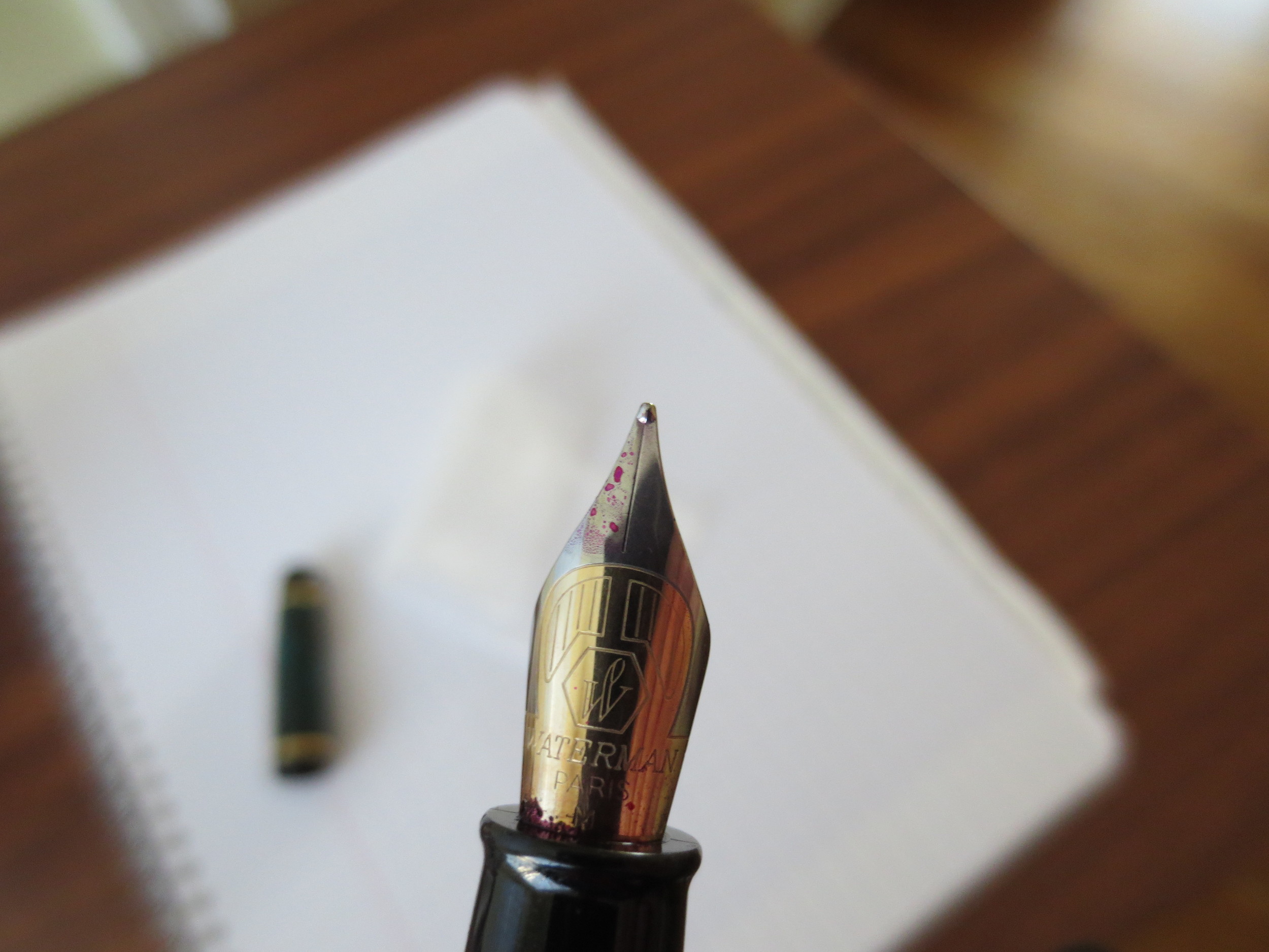
The Phileas Nib is a two-toned steel nib that writes well.  This one is a medium.  

The Phileas Nib is a two-toned steel nib that writes well.  This one is a medium.  

The nib is nothing remarkable, but it's a solid writer that does what it's asked to do:  write reliably.  It doesn't skip and I've never had a hard start.  I've been using this pen for the past week, filled with Iroshizuku Yama-Budo, and it's caused me no problems.  

The Phileas disassembled.  This one came with the Waterman threaded converter, which I like.  

A writing sample from the Phileas, using Edelstein Turmaline during my review of that ink.  Paper is Clairefontaine French-ruled. 

The Verdict.  This is a great pen that, in my opinion, never should have been discontinued.  For years, it was probably the go-to entry level pen out there.  If you can find one, it's still a great option for everyday use.  There has been much speculation as to why Waterman discontinued this pen (example link here), but IMHO the most plausible explanation is that Sanford, the parent company, wanted to take the Waterman line to a more upscale market position, at least here in the U.S, and therefore discontinued their "budget" line.  I was last in Europe a year ago, and I still saw some Phileas and Kultur pens on shelves.  Whether those pens were NOS or not, I couldn't say.  

None More Black

"There's something about this that's so black, it's like how much more black could this be?  And the answer is none.  None more black."   ---Nigel Tufnel, composer, describing Aurora black ink.

The blackest of the black. It doesn't get much blacker.

Last night, I was wondering, what if I took a look back at the writing that I've done over the four years or so since I've been an avid fountain pen user, and tried to select the best black ink I've used?  The answer to any question like this is obviously subjective, because people value different things in a basic black ink.  Some want darkness of color, where no shading or hints of other colors are present.  Some want absolute permanence.  Others value the ability to purchase the ink in massive quantities, such as a giant custom-ordered bottle of Noodler's or a liter bottle of Pelikan Brilliant Black.  As for me, I'm not a heavy user of black ink, and only have two bottles.  The first, Sailor's Kiwa-Guro Nano Black, is a pigmented ink that meets my occasional need for permanence.  It's a pigmented ink, however, which is specifically designed for use in very fine Japanese nibs.  I've found that if you use it in a broader nib, especially a wet nib, the pigment "stacks" or "pools" on the paper as the ink dries and it will smear or ghost onto the next page.**  Therefore, for most day-to-day writing, if I'm in the mood for a basic black ink, I choose Aurora black because it's a "true black" and simply works well.  Aurora black is a very dark ink, which dries quickly, flows well, and has worked in every pen I've ever used it in, even the most temperamental of vintage writers.  Some people turn to Waterman Florida/Serenity blue to troubleshoot a pen; I turn to Aurora black.  I highly recommend this ink as a daily user.  The only caveat is that you may see some feathering and bleeding on very cheap copy paper, but that will be minimized in a fine nib.  On moderately heavy paper, you should have no problems. 

Aurora Black is very dark, smooth, and flows generously.  It dries quickly and does not smear.  Aurora makes two colors of ink:  black and blue.  The story may be apocryphal, but supposedly the reason the company sticks with two colors is quality control.  The quality of their ink is so high, they don't want to jeopardize that by expanding beyond what they already do well.

** Noodler's Bulletproof black and Heart of Darkness had the same smearing/ghosting issues for me.  People have recommended diluting them with distilled water, but since permanence is not a serious concern for me, I've stuck with Aurora and saved myself the trouble.  In situations where true permancence is required, I'll happily use ballpoints, a Sharpie pen, or a Sakura Pigma Micron. 

A Modern Classic: The Parker Sonnet

One of the more underloved modern pens is the Parker Sonnet.  There are some good reasons for this.  Parker's quality control has been less than pristine in recent years, since their acquisition by Newell-Rubbermaid and moving production to France.  While I was writing this review, I glanced through the pen forums and many new Sonnet owners complain that their pens skip, or are hard starters after the pen's been sitting for more than a day or so.  I've experienced these problems intermittently and will discuss further below. 

That said, I love the look of this pen and couldn't resist, so when I saw a used Sterling Silver Cisele ("Chiseled") model at the DC Pen Show last year, priced well below what I would have paid for a new one, I jumped and walked it over to Mike Masuyama to tune before I ever used it.  For the most part, it's a good writer, with a springy 18k nib that I ended up landing for sub-$100, including nib work. 

Early model Parker Sonnet Cisele.  My research dates this pen to the early to mid-1990s, because of the two-toned cap band. 

The pen has a black plastic grip section.  It's sturdy, and doesn't become overly slick during long writing sessions. 

The Build.  This pen is hefty, given that it's sterling.  I'm not sure whether it's pure sterling silver or plated, but it looks nice and feels durable.  The cap is a slip-cap, which pops on and off securely.  There's no rattling involved.  The clip is still tight.  To me, this pen has near-perfect weight and balance, posted or unposted.  It sits in my hand well, which is why I find it keeps its place in my rotation despite the fact that it's the one pen in my collection that cannot handle a wide range of inks well (see below).

Posted, this pen is the perfect length and weight for me.

I can use this pen posted or unposted, but I prefer to use it posted.

There is nothing special about the pen's cartridge/converter filling system, but mine came with Parker's old style large-capacity converter, which holds almost 1ml of ink. 

The Nib.  The nib is 18k, which gives it some spring.  Sonnets do NOT have flexible nibs, as many understand that term.  I've heard second hand that more recent versions of this pen (mine likely dates from the early to mid 1990s) have stiffer nibs, with some describing them as nails.  Mine has just enough give in it to lend my writing a bit of flair, but the feed is nowhere near good enough to allow me to actually "flex" the pen.  

Parker's 18k Sonnet Nib is understated and generally an excellent writer, if a bit picky about what types of ink you use it with.

A basic writing sample in Aurora Black, probably my favorite ink to use in this pen.  There's no crazy flexing going on, especially in my day-to-day print-style.  However, under certain circumstances the softer nib can give your handwriting a touch of line variation.

Apparently a common problem with the Sonnet is that the nib skips, and can be a hard starter.  This likely has something to do with the feed not being able to maintain sufficient ink flow to the nib.  If I use a particularly dry ink, and write quickly, I will experience occasional railroading.  For example, well lubricated inks like Iroshizuku Kon-Peki, Aurora Black, or any of the Watermans work fine.  Inks with iron gall content such as Montblanc Midnight Blue (old IG formulation) or Pelikan Blue-Black make the pen temperamental. 

The Finish.  The reason I love this pen so much, and put up with its quirks, is the chiseled sterling silver finish, which is reminiscent of the old sterling silver Parker 75 in a larger pen.  As I mentioned earlier, my pen could use a good polishing to restore its shine, but it still looks great after 20+ years of heavy use.  The silver has developed a patina, which in my opinion adds to its character.  

The Verdict.  For all its quirks, I would still call the Sonnet a modern classic.  Parker has made this pen for nearly twenty-five years, and it has a loyal following, myself included.  If I were to purchase another, I would pick it up at a pen show where I could have a nibmeister tune the nib. For certain pens, this is well-worth a slight premium in price.