Ink Review: Rohrer & Klingner Scabiosa

The blog's been a bit heavy on ink reviews this week, but I'm still churning my way through the load of inks I trucked home from the D.C. Pen Show two weeks ago, and I'm writing reviews as I use them up (which I need to do, seeing that I have over a dozen pens inked right now).  Hopefully I will get some pen reviews photographed and finalized this weekend.  But in the meantime, here's today's review:

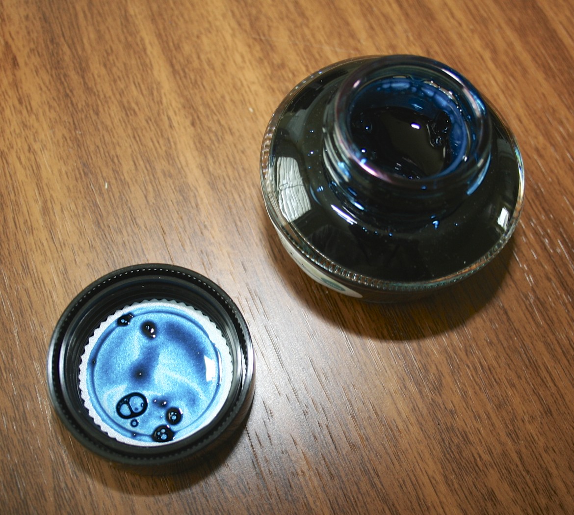
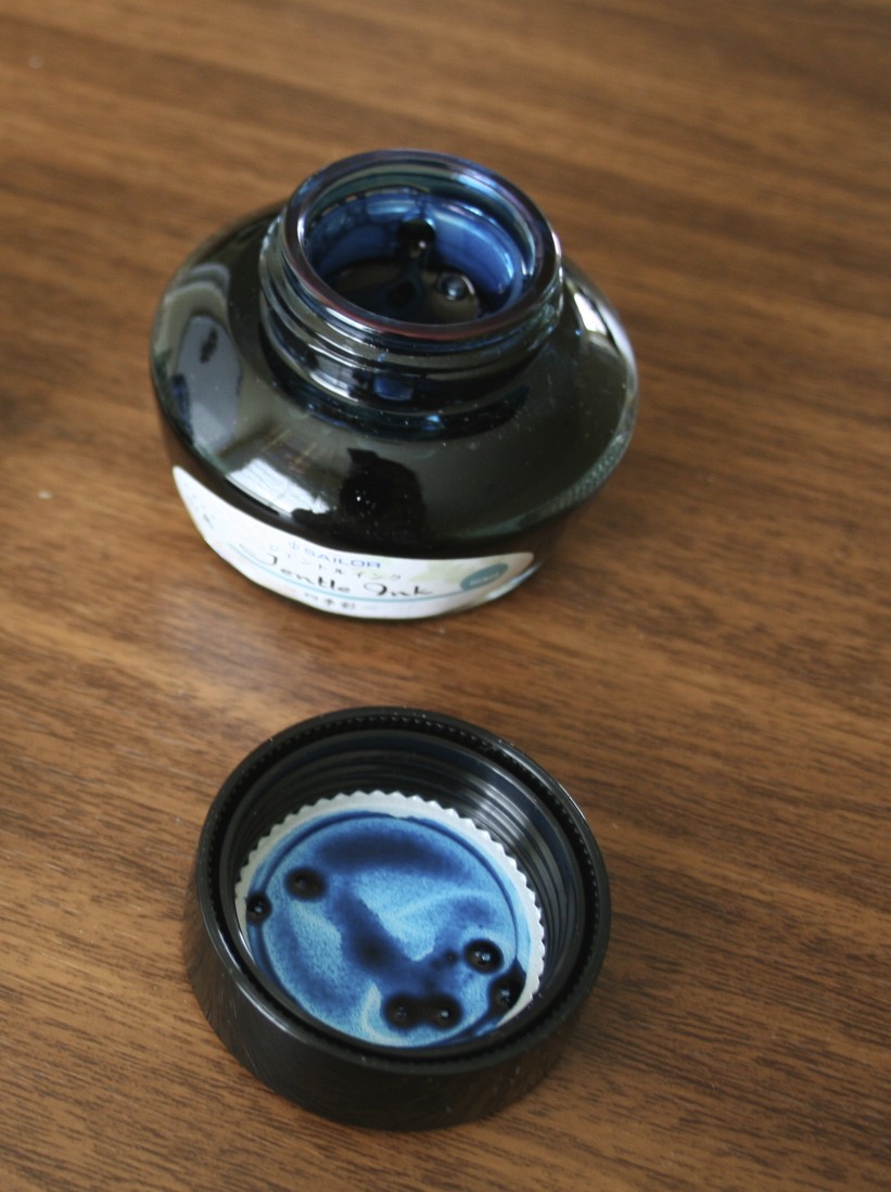
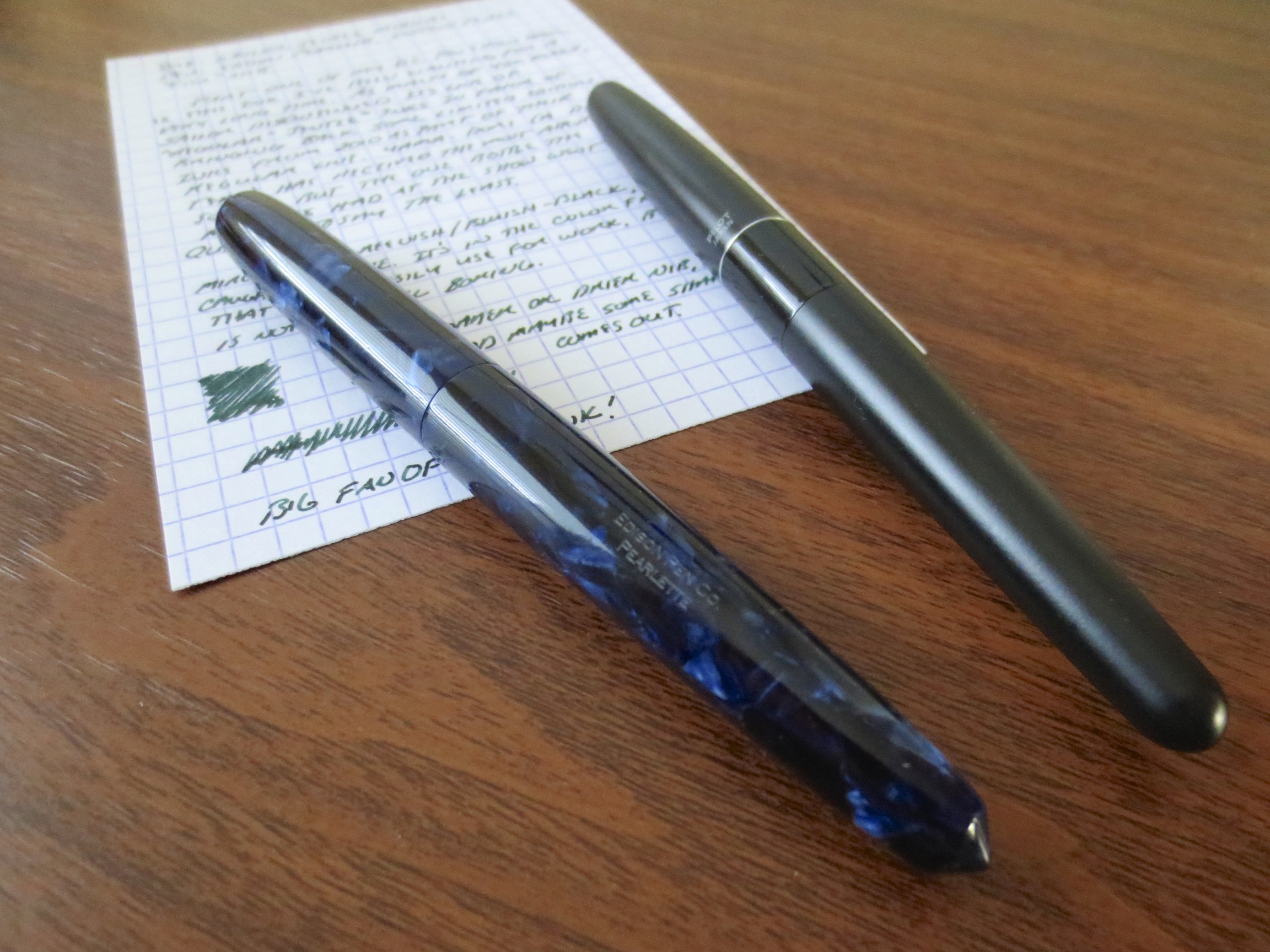
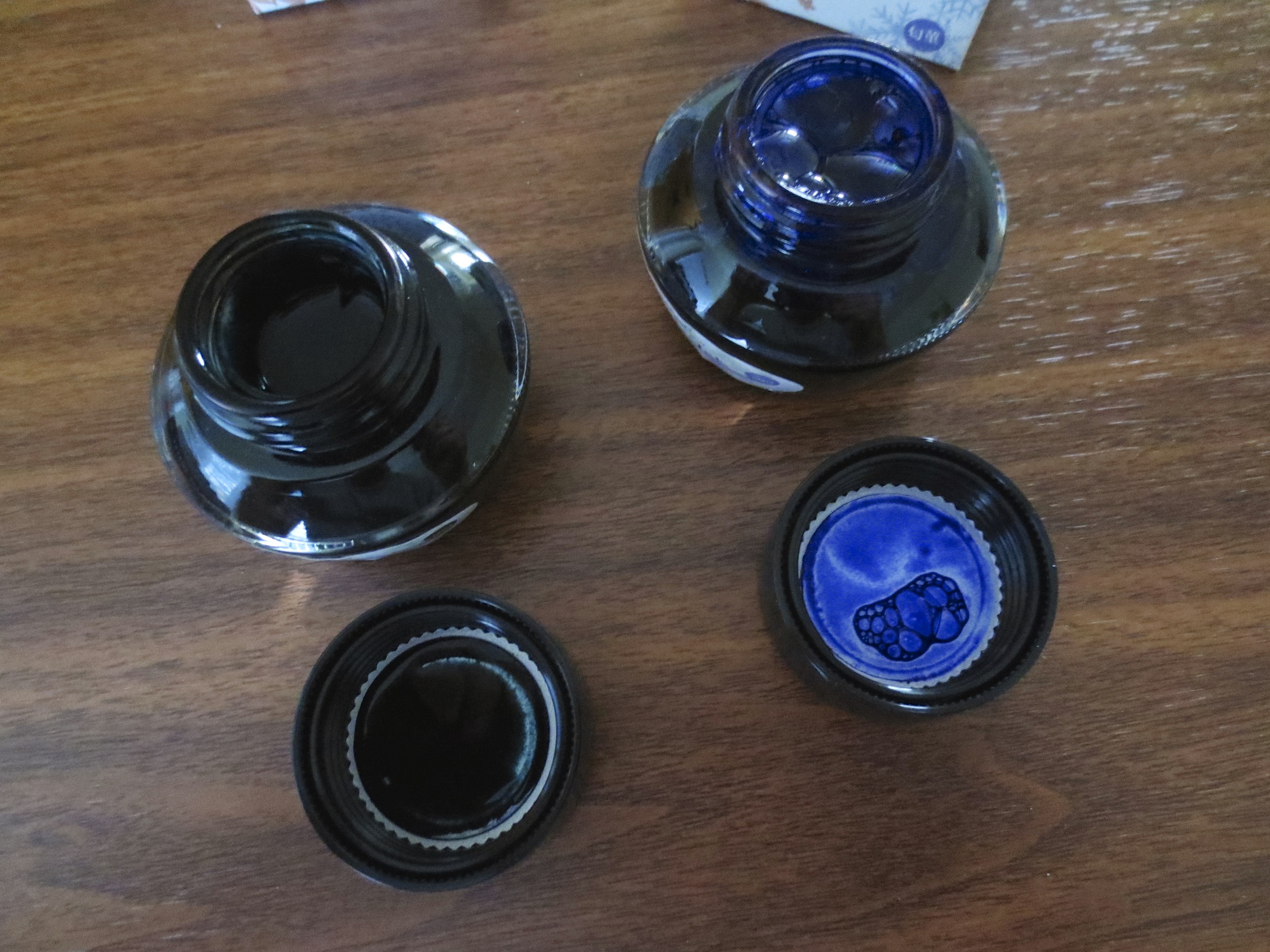
Rohrer & Klingner inks come in a 50ml glass bottle, which is tall and works well for filling pens that have a larger nib.

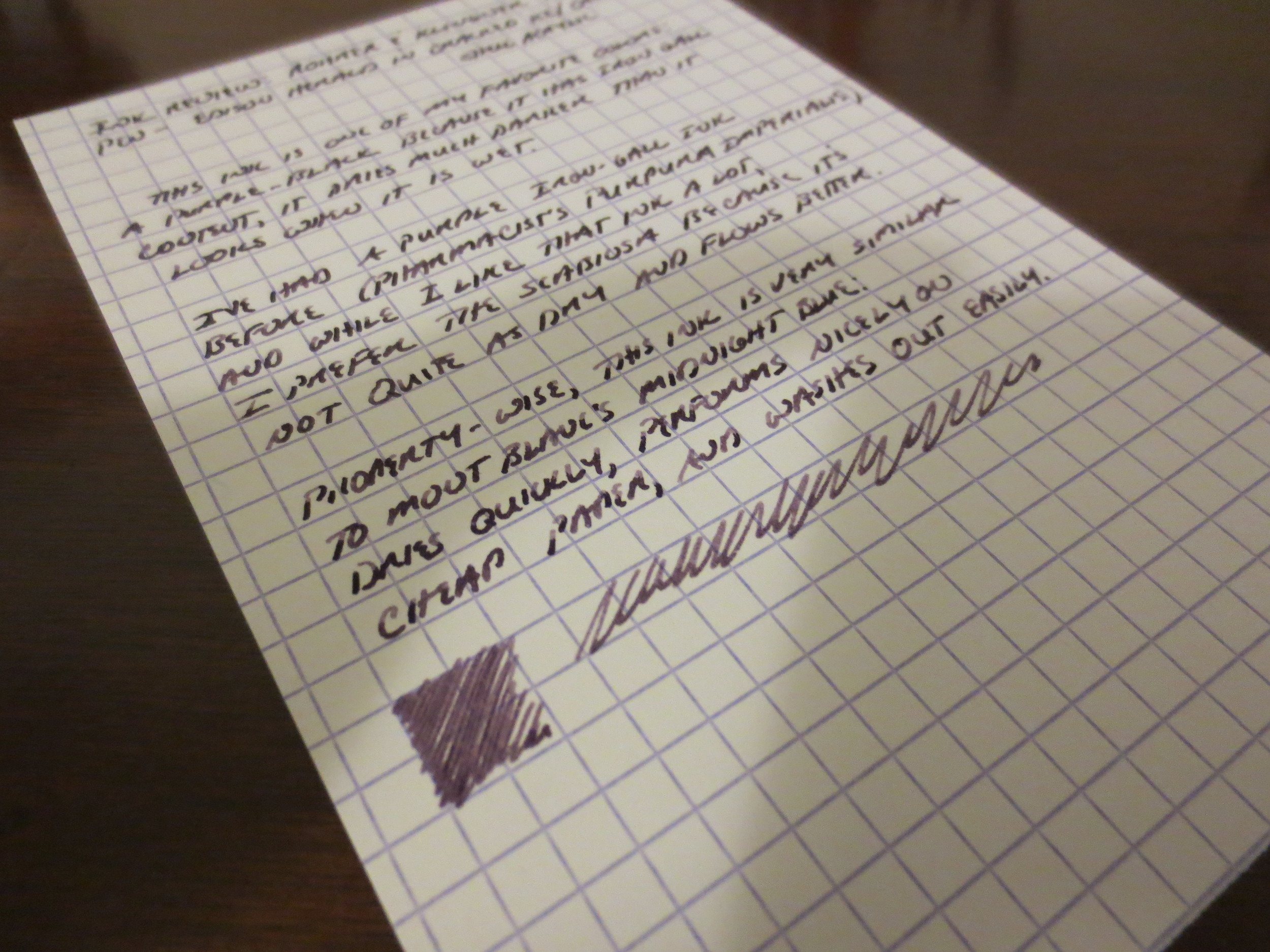
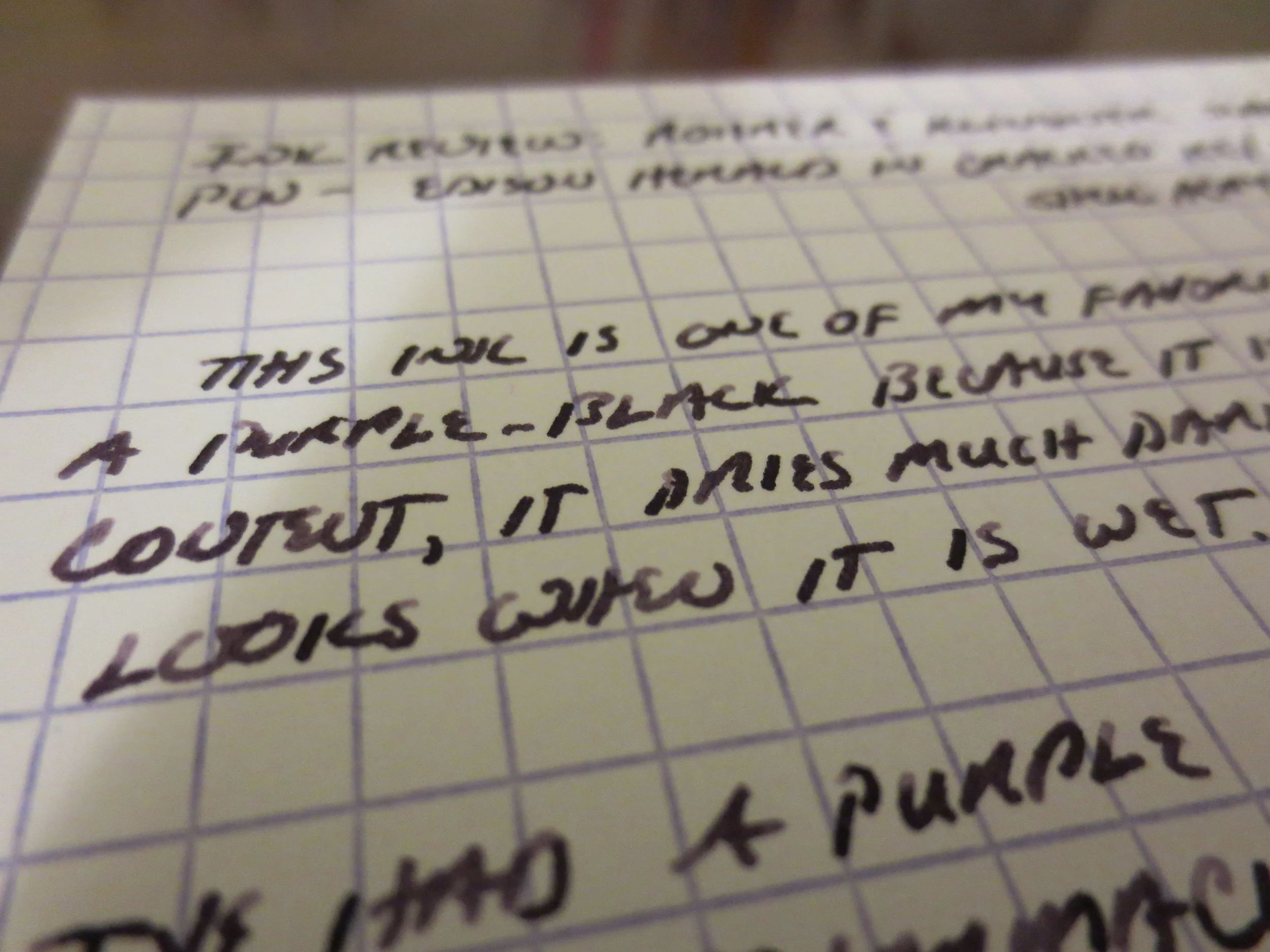
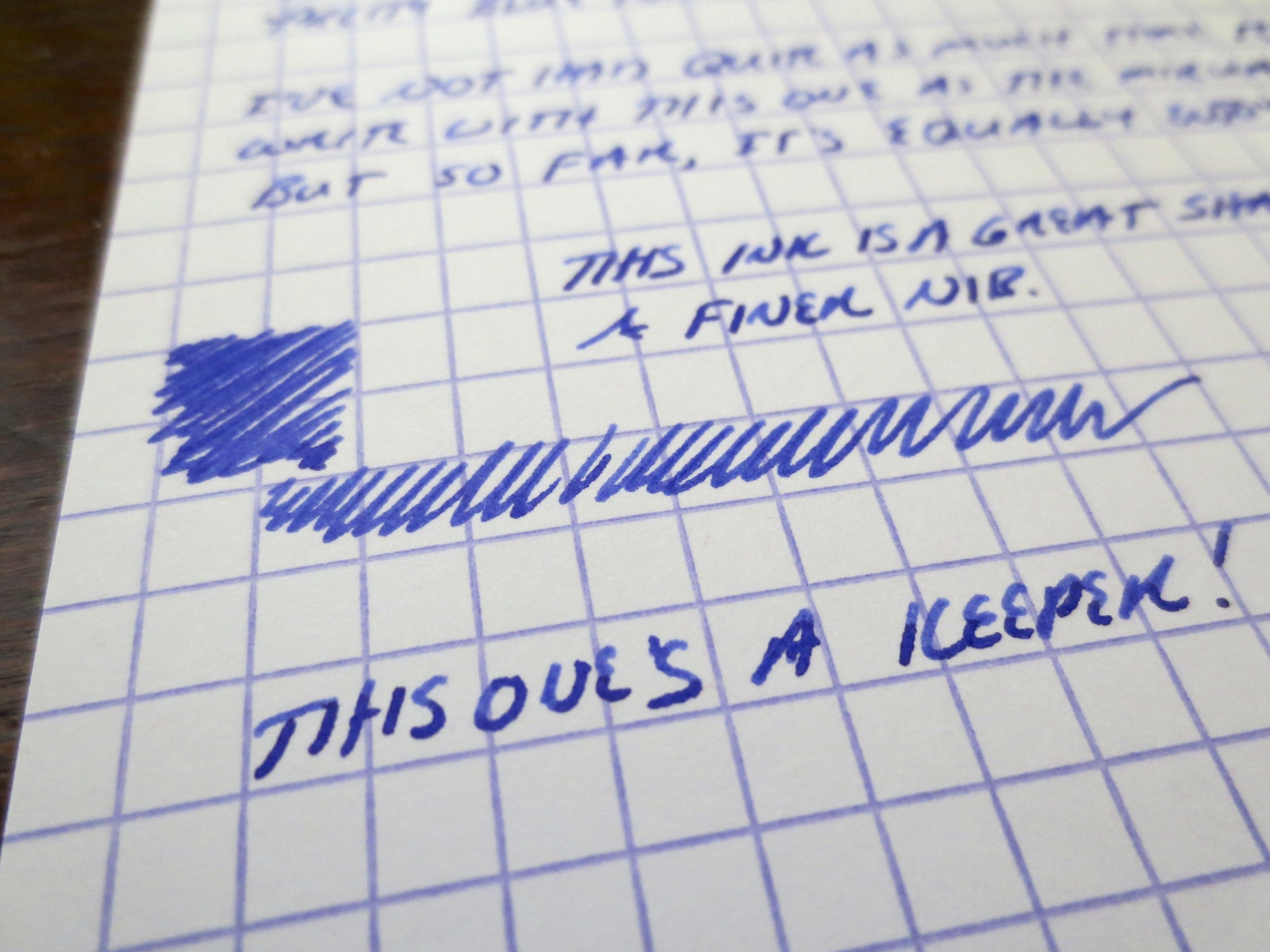
I held off buying this ink because I had a bottle of Pharmacist's Purpura Imperialis, which was a nice enough color but ended up being a bit too dry for me.  (My review of that ink, from a long, long time ago, can be found here.)  The Scabiosa is similar in that it initially writes in a purple tone but dries to a purple-black.  I find, however, that the Scabiosa has slightly better flow and behaves more like Montblanc Midnight Blue (iron gall version).  This is probably because those inks have less iron-gall content than the Pharmacist inks. 

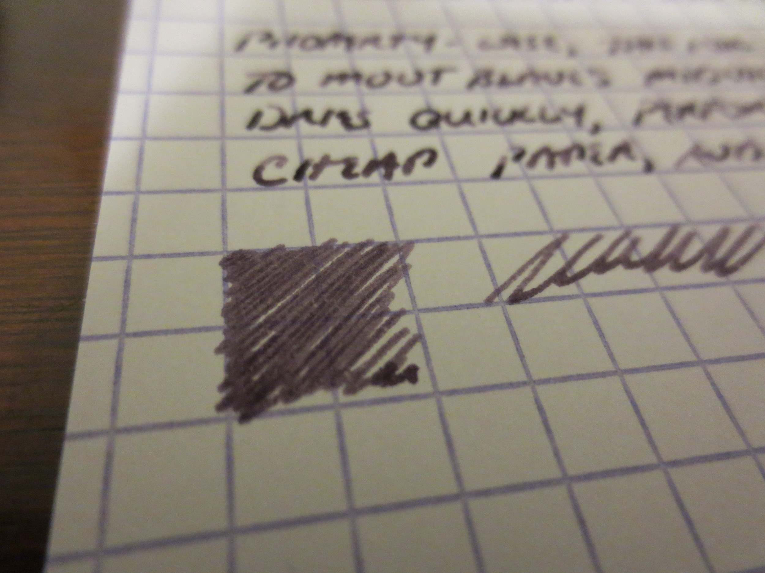
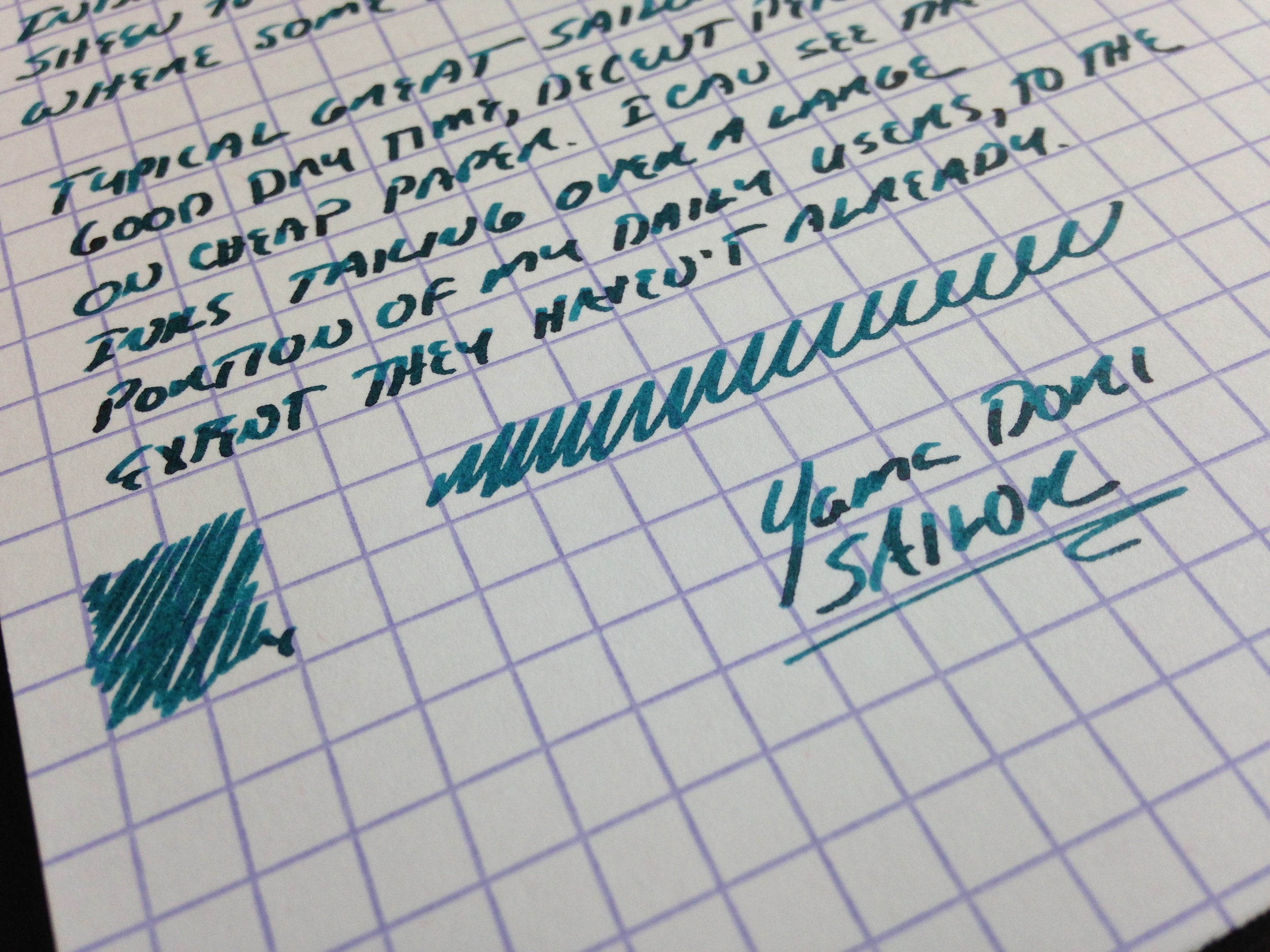
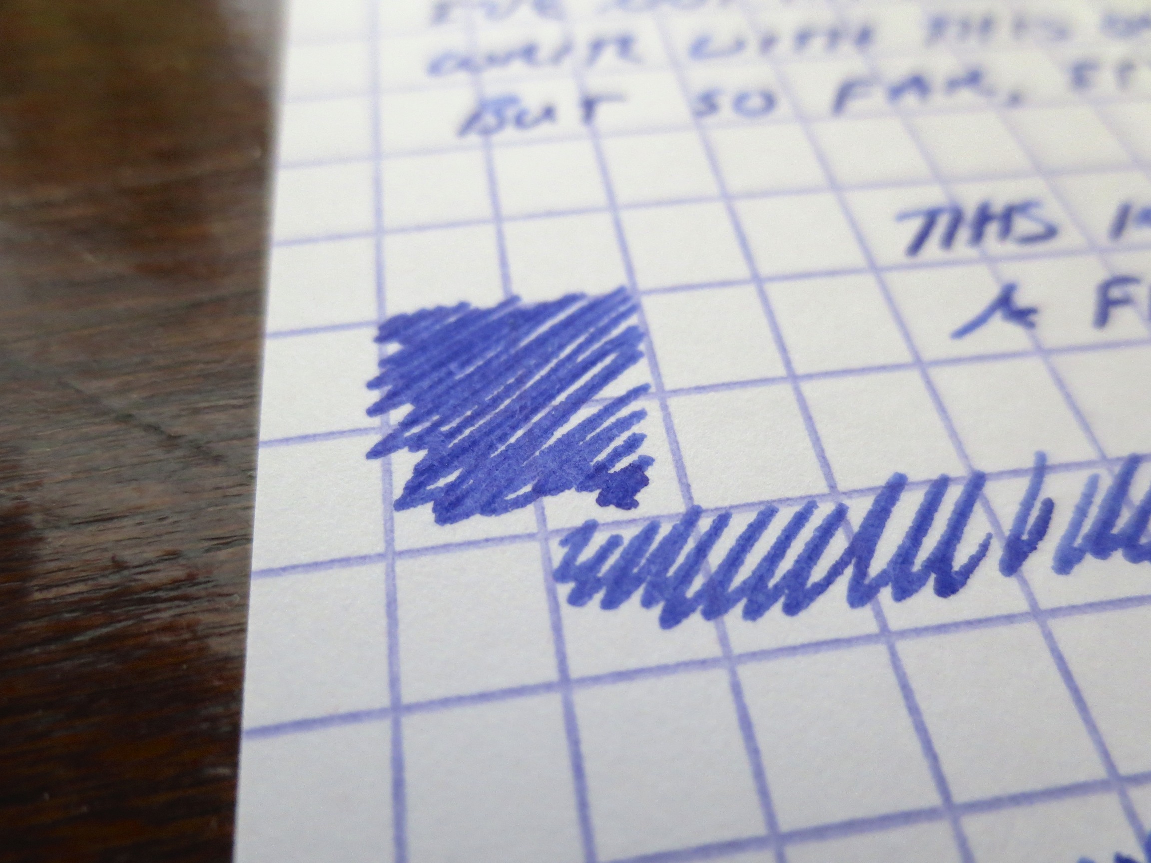
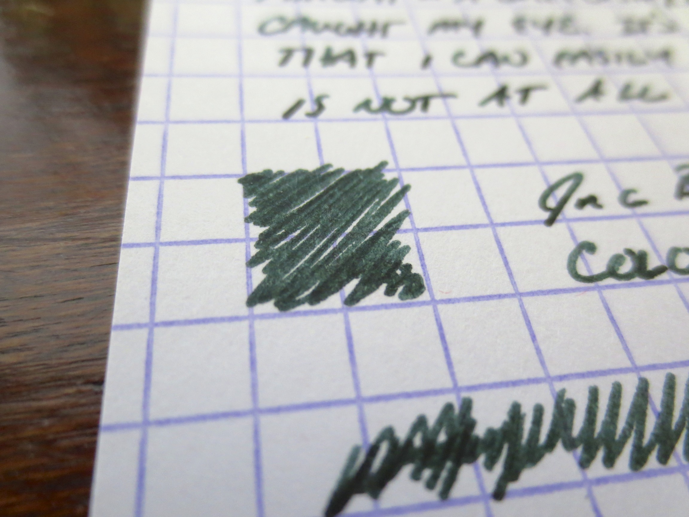
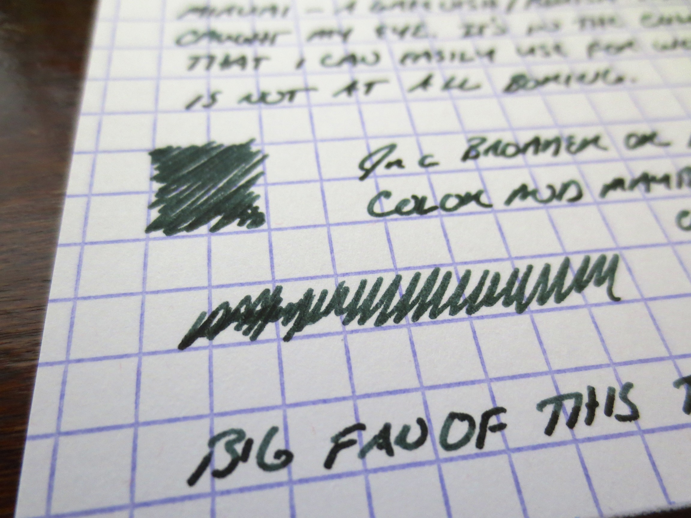
This ink also has been reviewed a lot, and is very popular, so I won't bore everyone with another lengthy discussion of its properties, but it does work well on cheap paper (most iron gall inks do) and dries fairly quickly.  The ink also offers some nice shading, which I've attempted to capture in the photo gallery below, along with the color shift as the ink dries.  You may notice that the "fresh" writing at the bottom of the handwritten sample is notably lighter than the writing at the top.   

I should emphasize that you need to clean your pen out every two weeks or so while using this ink, especially if you use steel nibs and/or pens with metal parts that come into contact with the ink.  Iron Gall can react with and corrode steel and some steel alloys over time, and if you leave a pen inked up for months on end and don't practice good pen hygiene, bad things can happen.  Otherwise, it's perfectly safe to use and enjoy.  I've been using iron gall inks for years without any ill effects.  

Handwritten Review of Roher & Klingner Scabiosa with Edison Herald (Medium Nib) on Exacompta stock. 


Ink Review: Sailor Yama-Dori

I was fully expecting to find this ink overrated, and thought it would be impossible for it to live up to the hype generated before its (re)release.  I was wrong.  While I love Miruai and Nioi-Sumire, Yama-Dori is probably going to end up being my favorite of the new Sailor Jentle line.  

The color is a dark teal.  Miruai could also be considered a very dark teal, but this ink has a different tone altogether because there's more blue in it.  The color has a lot of subtle depth:  there is some reddish sheen to the ink once it dries and you look at it from an angle, but it doesn't photograph very well (at least with my limited skill and equipment).  You do, however, see a lot of shading with some black coming through where the ink is heavily applied to the paper.   

In a way, the ink reminds me of a mix Pendleton Brown does (or did, before Organics Studio started making inks for him) called Blakwa, which I understood to be a 50/50 mix of Waterman Black and Waterman "Inspired Blue" ("formerly South Seas Blue," commonly known as "turquoise").  That mix didn't have the sheen, and wasn't as saturated, but I always thought it was a cool color. 

Yama-Dori has all the properties of the Sailor Jentle ink line:  good dry time, even on super smooth paper; low feathering and bleed-through, even on super cheap paper, and what I would call a very balanced level of color saturation.  It's not watery ink, but it's also not super saturated to the point where it will smear.  What I especially like about this ink is that it's an interesting color that is dark enough to use for work, or pretty much any other purpose.   

Handwritten Ink review of Sailor Yama-Dori Ink on Exacompta card stock.  The pen I used is a Pilot Vanishing Point with a Broad nib stubbed by Mike Masuyama. 


Thanks to our sponsors at Pen Chalet for sending me this bottle. In full disclosure, I received this bottle for review purposes free of charge.   

Pen Review: Karas Kustoms Render K

I've been looking forward to photographing and reviewing this pen for a while, because it's probably my favorite non-fountain pen that I own, and the pen that I end up using the most when, for whatever reason, a fountain pen is impractical.  It's also been a while since I've reviewed a non-fountain pen, so I'm overdue.

Karas Kustoms Render K (Hi-Tec-C Version) in red anodized aluminum. 

The Render K is produced by Karas Kustoms, a shop located in Arizona that produces machined goods, including multiple pens that accept the Pilot-Hi-Tec-C, G2, and Juice refills, along with others that will work once they are cut down or slightly modified. 

All of Karas Kustoms' pens, including the Render K, were launched on Kickstarter.  Being late to the game, I did not get the opportunity to participate in any of the early Kickstarter campaigns, and ran out of money in the pen budget while the "Ink" fountain pen campaign was going on.  The pens are easy to pick up through Karas Kustoms' website (link here), although they do run out of the various anodized color options from time to time.  There are also raw aluminum, copper, and brass options.

The Build.  This pen is rock solid.  I've been unable to find a single flaw in the machining.  Again, I would call the Render K a "solid" pen, but it's not too heavy, and it still fits well in the hand.  Due to the weight and the way the threads are cut on the cap, the pen does not post well, but the size is adequate and I find posting the pen unnecessary.  The anodized aluminum coating is durable, but it will scratch and show some wear if it is carried loose in a bag or pocket with other metal objects (such as keys).

.4mm Pilot Hi-Tec-C Refill in--what else--red. 

The Refill.  I chose the version of the Render K that accepts Pilot's Hi-Tec-C refill, and opted for the .4mm.  I like a smoother refill, and I find that .4mm is the sweet spot for me:  fine enough to use for annotations, but not too scratchy to use as a daily writer.  You can also purchase a version of this pen that accepts the Pilot G2.  My other two Karas Kustoms pens, the Retrakt and the Bolt, both use the G2 refill, which I enjoy. 

The Pilot Hi-Tec-C has a good "classic red pen" color.  It's nothing eye-popping, like some of the red fountain pen inks you see out there, but it gets the job done.

Close-up shot of the color.

The Verdict.  I enjoy this pen.  It's sturdy and its always on my desk or in my bag.  I swap out the refills to alternate between red and black, depending on my needs, but give that I'm a sucker for red pens and red ink you can guess which one I use the most.  If you want a pen that's virtually indestructible and can accept one of the more popular "ultra fine" Japanese gel refills out there,**  the Render K is one of your best options.

** I will note that with some slight hacking (trimming down the refill with a pair of scissors), the Render K will also accept the Signo DX gel pen refill, although I have not used that pen extensively so I have not reviewed it here. 

"Hitlist" Notebook Review

I feel terrible, because a very kind reader, my friend Paul, sent me one of these notebooks a few months back with a couple of ink samples and some pencils, and I'm only now getting a chance to review them.  The notebook immediately piqued my interest, because I've never seen one like it before. 

The Hitlist Notebook has a convenient white strip along the spine for labeling the notebook by subject and date.  That feature is a nice touch, and something I would use more on pocket notebooks.  

Hitlist Notebooks are made in Canada, and are marketed as a more fountain-pen friendly alternative to other pocket-sized notebooks such as Field Notes, Word, etc.  They are only 32 pages, as opposed to the standard pocket-notebook 48, but given that you can easily use both sides of the page while writing with a fountain pen this is not as much of an issue as I initially thought it might be. To put this notebook through its paces, I decided to use it for archiving ink and writing samples, and took it with me to the D.C. Pen Show to play around with.   

The first writing sample in the gallery above contains a few inks I had on hand:  Lamy Turquoise (also from Paul), Kaweco Paradise blue, and Iroshizuku Kon-Peki. The pens I used for the writing sample were fairly wet writers, but there was minimal to no bleed through.  In fact, what you can see on the back side of the page is what I would consider "show through."  For a pocket notebook, this is excellent performance with fountain pens, and both sides of the page are usable.  

The second writing sample was done at the Nibs.com table at the DC Pen Show.  I pretty much tried to abuse this notebook with a series of very broad, wet, even flexy Nakaya nibs customized by John Mottishaw, which was a lot of fun in and of itself.  Check out the flip side:  again, there is hardly any bleedthrough, even with double broad stubs.    

Hitlist Notebooks include a "Pen Dock" notched out of the cover. 

Hitlist notebooks also feature a notch cut out of the top of the cover, which makes a "dock" for clipping your pen to the front.  Since I regularly clip my pens to the front of whatever pocket notebook I am carrying, I consider this a neat feature that might make it more difficult for your pen to slide sideways off the cover.  I have not carried the Hitlist as a "daily carry" notebook yet, so I can't speak to how it might work in practice.  I should also note that the notebook is well constructed, and the cover feels durable enough to stand up to heavy use.  

Hitlist with my Delta Fusion 82 in Pompeii Celluloid.  

Hitlist notebooks are sold directly from their website (link here).  I have not seen them sold at any third-party retailers.  The pocket-sized notebooks will cost you $14.99 US for a pack of three, which is slightly more expensive than Field Notes ($9.95).  However, the paper is premium and those who want to be able to use a fountain pen under any circumstances likely would be willing to pay slightly more for the upgrade.  There is also a larger size, which costs $15.99 for two notebooks that look to be about the size of the Field Notes Arts and Sciences.  I have not had the opportunity to try those but I might once I work my way through my current (embarrassing) stash of pocket notebooks. 

This is my first experience with Hitlist books; the Hitlist website features some other reviews by PenPaperInkLetter, Notebook Stories, and Tyler Dahl. 

Double Ink Review: Sailor Jentle Miruai and Nioi-Sumire

Today I'm going to try something new:  In an effort to get these new Sailor Inks reviewed and posted ASAP, I'm going to review them two at a time.  Generally, I keep about six fountain pens inked up at any given time, but carry two with me on any given day.  One is filled with a dark ink for notes, signing documents, etc.  The other is filled with a brighter ink that I use for marking stuff up, and is typically a red, orange or purple.  The past two days I've been using this pair.  Miruai is a deep blue/green-black ink, and apparently translates as "Seaweed."  Nioi-Sumire is a bright blue-violet ("Sweet Violet"), but to me leans more towards the blue end of the spectrum.  I think both are gorgeous.  Thank you Anderson Pens!

Sailor kept the same bottle with the internal inkwell.  I personally like the Sailor bottle, although some complain that the inkwell makes it difficult to flil pens with larger nibs.

This gives you an idea of how dark Miruai is.  The ink is probably a bit blacker than Epinard, but I have not done a side-by-side comparison.  Miruai has more blue in the color. 

Nioi-Sumire, to me at least, is far more blue than purple.  If you are looking for a very purple ink, try Shigure (review forthcoming). 

I've enjoyed working with both of these inks.  They share the same great properties with the rest of Sailor's Jentle line.  As you may have heard, Sailor discontinued its "regular" line of inks earlier this year, and resurrected several "limited edition" inks from 2010 to replace them.  Because of the somewhat unique range of colors and the fact that these inks were so well-behaved (meaning they clean easy, dry quickly, and don't crust up on nibs), people were up in arms.  Rest easy, folks.  While Apricot, Epinard, Sky High, etc. may be gone (at least until Sailor brings them back as "limited editions" at a higher price point, as some have speculated), we have an entirely new line of great colors to play with.

Both of these inks are moderately saturated, and a touch dry, but I had no flow issues with either.  I have the Nioi-Sumire in a Pilot Metropolitan with a medium nib, and the Miruai in a brand-spankin'-new Edison Pearlette in deep indigo flake acrylic (fine nib) which I absolutely love.  Card stock is Exacompta, and the scanner is a Doxie Flip.  Here are the results:

Scan of Nioi-Sumire.  This is a fairly accurate representation of what the color looks like when the ink is dry.  I've also included some photographs in the gallery below to show some of the shading. 

This scan captured the blue-green edge to the Miruai pretty well.  In a very fine nib, the ink can appear almost black.  In this Edison Pearlette "fine," which runs wider than the typical fine nib, you get some shading and a touch of sheen.