• Blog
  • Shop
  • Resources
  • FAQ (Ask TGS)
  • About
  • Archive
  • Contact
  • Sign In My Account
Menu

The Gentleman Stationer

Vintage Living in the Modern World.
  • Blog
  • Shop
  • Resources
  • FAQ (Ask TGS)
  • About
  • Archive
  • Contact
  • Sign In My Account

The Kaweco Allrounder Ballpoint in red. 

A New Perspective: Kaweco Allrounder Ballpoint

April 2, 2016

A while back I reviewed the Kaweco Allrounder fountain pen, and wasn't overly enthusiastic. While I loved the looks of Kaweco's full-size fountain pen offerings, the fact that Kaweco used the same nib as the smaller Sport and Lilliput pens made the design look awkward.  The Allrounder in particular was a disappointment because other than the nib, I loved the design of the pen.  The shape made the pen extremely comfortable to hold.  Since it was aluminum, it was lightweight, and above-all, it was red!

The Allrounder is a fairly large ballpoint pen.  It's a comfortable size to use for extended periods of time, which I can't say for most ballpoints. 

Enter the Kaweco Allrounder ballpoint.  I've taken to carrying at least one ballpoint pen in my bag at all times.  For work, it serves various purposes:  signing receipts, filling out forms with carbon slips (yes, that still happens), and just having a general quick-deployment writing solution that works for whatever paper might be in front of me.  Depending on where I am, my EDC ballpoint option typically is either my Tactile Turn Mover with a .38mm Uniball Jetstream refill, a Pilot Acroball, my "Wood with a Story" olivewood ballpoint, or more recently, the Kaweco Allrounder.

The Allrounder ballpoint has the same trim as the fountain pen, including the Kaweco "medallion" on the cap. 

My Allrounder is made from red aluminum with chrome trim, the same as the fountain pen that I tested over a year ago.  Instead of a cap, however, the ballpoint has a convenient twist mechanism to deploy the refill, which is a medium Parker-style refill branded as the Kaweco "Soul."  I don't know whether this is a proprietary refill Kaweco, or a rebranded Quink or Schmidt refill.  It doesn't really matter: I suspect it's the latter, but whatever it is, it's nice.  The medium point isn't too wide, and the ink dries fairly quickly and doesn't smear.  

Thanks to Kaweco for sending this pen to me as a promotional gift this Christmas.  The Allrounder ballpoint is somewhat difficult to find, and those sellers that stock it have the pen listed at a high price point.  Fahrney's Pens has this pen listed at a whopping $90, which is too much.  Cultpens sells it for £54 (excluding VAT), which is roughly $76 (still too high). The price point is probably one reason why this otherwise very nice pen doesn't get much attention.  In the $30-50 range, this pen would probably sell quite well.  While I can't recommend that someone purchase this pen as currently priced, I can recommend the Kaweco Soul refill for any Parker-style ballpoints you may have.  It leaves a smooth line and doesn't skip.  I don't know the official line width, but it writes like a .7mm (though it could be a well-behaved 1.0mm).  

The Kaweco Allrounder ballpoint (bottom) compared to the Baron Fig Squire (middle) and the Tactile Turn Mover (top). 

DISCLAIMER:  Kaweco provided me with the pen featured in this review free of charge.  This post contains affiliate links, through which I may be compensated a small amount if you purchase something from any of the sites linked to in this article.  While I'd greatly appreciate it if you use these links to purchase an item you are interested in, you are, of course, under no obligation to do so.  Many thanks!    
 

In Pens Tags Pen Review, Kaweco, Ballpoint, Kaweco Allrounder
Comment

The Leuchtturm 1917 Notebook: my current "daily carry"

Leuchtturm 1917 A5 Notebook: The Fountain-Pen Friendly Basic Black Notebook

March 30, 2016

I always think of the Leuchtturm 1917 notebook as the fountain-pen friendly option for those who like the Moleskine aesthetic but hate Moleskine paper.  I have nothing against Moleskines per se, but I've found the paper so inconsistent that I even had one where I couldn't write on both sides of the page with a ballpoint pen, the show-through was so bad. 

The Leuchtturm 1917 A5 in basic black:  a similar aesthetic to the ubiquitous Moleskine, but the quality is much, much better. 

But paper quality issues aside, I admire Moleskine's simple, functional design, with the elastic closure, ribbon bookmark, back pocket, and relatively durable faux-black-leather cover.  Enter the Leuchtturm 1917 from Hamburg, Germany. This particular notebook that I've been using started life as a bullet journal, but I've since moved on from that system and I'm now using it as miscellaneous ideas/drafts/research notebook.  

The Leuchtturm 1917 also has the catchall "back pocket" folder.

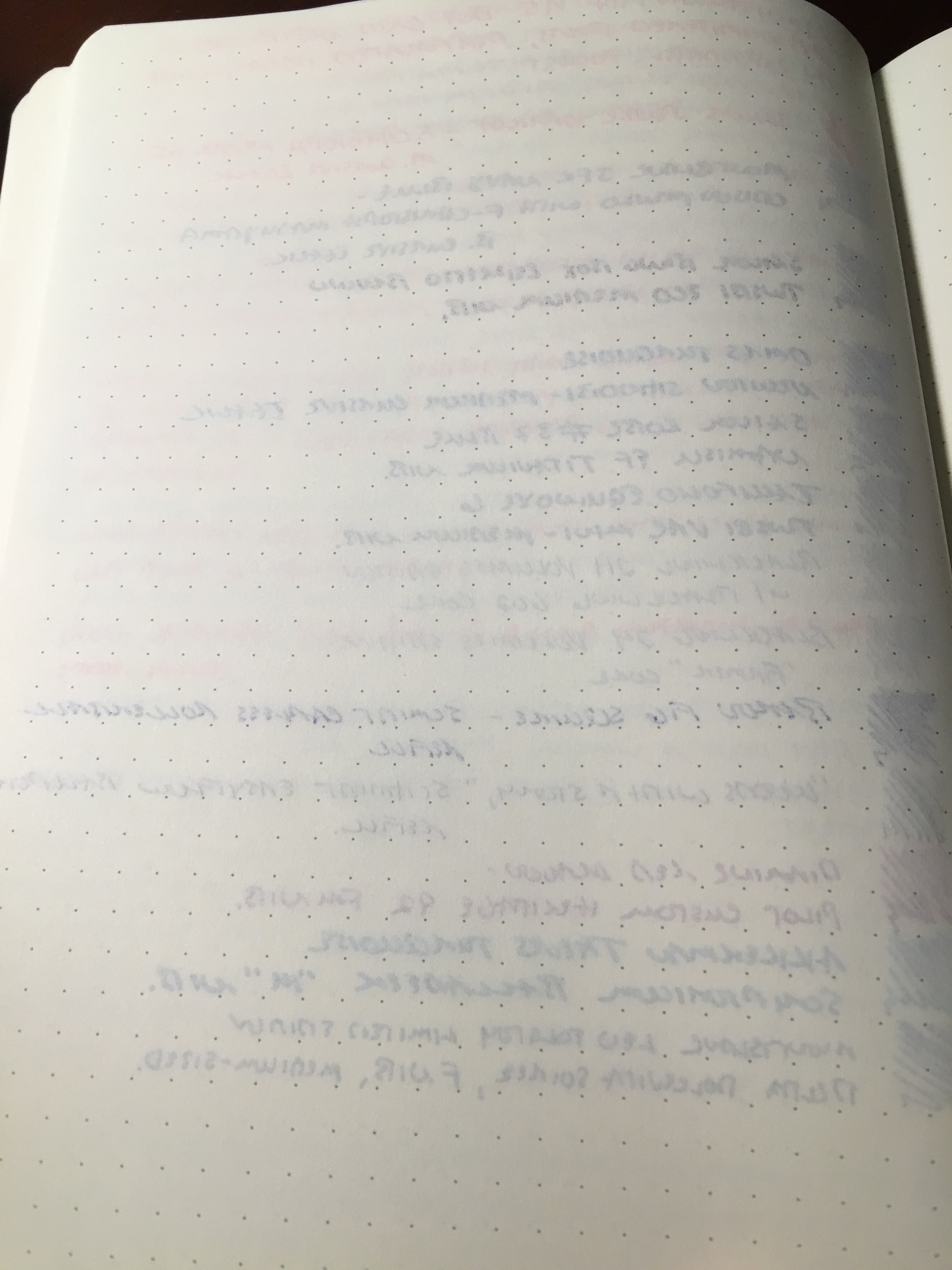
Overall, I've been very pleased with this notebook.  I'm currently about a quarter of the way through it.  This version has well-spaced dot-grid paper, which handles fountain pen ink better than a Baron Fig, but probably not quite as well as a Rhodia Webnotebook or a Quo Vadis Habana.  I did a pretty thorough test yesterday, and the only two pen-ink combinations that I used that had bleed or show-through (albeit minimal) were Sailor Bung Box Espresso Brown in my medium TWSBI Eco, and the Schmidt Capless .6mm Rollerball refill in my Baron Fig Squire.  Neither rendered the other side of the page unusable by any stretch.  

A dozen inks and pencils tested on a Leuchtturm 1917 A5 notebook, dot grid version.  

View fullsize Flip Side of Ink Samples
View fullsize IMG_0927.JPG

My favorite features are the 249 numbered pages and the built-in "table of contents," which make the Leuchtturm 1917 an easy notebook to index and an excellent option for those who work on multiple projects simultaneously and don't like to carry multiple notebooks. 

View fullsize Table of Contents
View fullsize Numbered Pages

Bottom line:  this notebook probably won't turn any heads, but as I mentioned, it's very functional and will stand up well to heavy daily use.  The version that I've reviewed here is the "classic black" A5, but Leuchtturm offers other colors and patterns as well.  Check out the various colors they offer here (though I have no idea how many of these options make it to the U.S.).

The Leuchtturm 1917 A5 Notebooks compare favorably to the Rhodia Webnotebook and the Quo Vadis Habana, both of which are also excellent and can be highly recommended because they feature Clairefontaine paper.  All of these notebooks are pricier than a Moleskine, but you are paying for quality, and plus, I haven't yet found Moleskine hardcover notebooks with dot grid paper as an option! 

DISCLAIMER:  This post contains affiliate links, through which I may be compensated a small amount if you purchase an item from any of the sites linked to in this article.  While I'd greatly appreciate it if you use these links to purchase something you are interested in, you are, of course, under no obligation to do so.  Many thanks!  

In Notebook Review Tags Leuchtturm 1917, Notebook, Notebook Review
5 Comments

The Baron Fig Squire in Charcoal

First Impressions of the Baron Fig Squire: The Pen Is A Mighty Sword

March 26, 2016

I rarely write first impressions of products immediately after I receive them, but I'm going to make an exception for something I've been anticipating for months.  In case you missed it, last fall Baron Fig launched a Kickstarter for their own custom-designed pen, the Squire. The design is unique, and can best be described as something of a hybrid between the Ajoto Pen and the Retro 51 Tornado.  The Squire uses the same great Schmidt P8126 refill as the Retro 51 Tornado (though it's branded Baron Fig).  I've never used this refill in the .6mm form, as opposed to the standard .7mm, and I absolutely love it.  I may need to give Retro 51 another shot, but the Squire sets a high bar.  

Build

This is a brushed aluminum pen, designed with purposeful simplicity.  There were two Kickstarter color options:  silver and charcoal.  I opted for charcoal, since I already have plenty of silver pens lying around here, and I'm glad that I chose this finish, though I'd probably categorize the color as more of a steel gray (or, dare I say it, "blue steel"), than a charcoal.

As described, the pen is medium-sized and perfectly balanced in the hand, and the refill extends using a twist mechanism that functions smoothly.  The only "drawback" on the design front is the branding.  I would have preferred that they omit the "sword logo" and "Baron Fig" from the body of the pen, in favor of just brushed aluminum, but that's a personal preference and others might not care.  The packaging I love.  The bottom half of the box doubles as a desktop pen stand for the Squire.         

View fullsize IMG_0902.jpg
View fullsize IMG_0903.jpg
View fullsize IMG_0904.jpg

Writing Sample

The ink flow on this refill is generous, and on the verge of being slightly too wet.  If you write with a heavy hand, as I tend to, you will experience some show-through and bleed on cheaper paper.  Interestingly, I was able to see the slightest bit of show-through in my Hobonichi Techo, of all things.  BUT, the flip side to that is the smoothness of this refill.  As a daily writer, that alone should keep me coming back to this pen, since pretty much any ink that I use bleeds through the cheap paper I have to use at work. 

A writing sample for the Baron Fig Squire (Schmidt P8126 .6mm capless rollerball refill).  Like any liquid ink pen that writes a wet, smooth line, you're going to have slight feathering and possibly even some bleedthrough on cheaper paper.  This Nock Co. Dot-Dash pad works very well. 

Price

Kickstarter pricing for the Squire started at $50 shipped.  Pre-order pricing on the Baron Fig website is slightly higher, at $55 plus shipping.  That price might fall somewhat if the Squire takes off and Baron Fig benefits from scaled-up production, but it's the same price point as the Karas Kustoms EDK, which uses the same refill.  Both pens are priced fairly for pens of their quality.  

Takeaways

The verdict is still out on things like durability and practicality (particularly the lack of a clip and whether that will affect my personal use) but Baron Fig is onto something with the design of this pen.  Most importantly, they clearly understand how to successfully deliver a high quality product on time, so I think we can look forward to new entries in the Squire line, via Kickstarter or otherwise. Personally, I'd love to see a mechanical and/or clutch pencil in this form factor.  

Further Reading

If I've piqued your interest in the Squire, check out Andy Welfle's Woodclinched blog. Andy took a sneak peek at the Squire prototypes back in November during his visit to Baron Fig HQ (jealous), and has a comprehensive review along with backstory.   

DISCLAIMER:  This post contains affiliate links, through which I may be compensated a small amount if you purchase an item from certain sites linked to in this article.  While I'd greatly appreciate it if you use these links to purchase something you are interested in, you are, of course, under no obligation to do so.  Many thanks! 

In Refills, Pens Tags Pen Review, Baron Fig, Squire, Schmidt P8126
6 Comments

The Platinum 3776 Century demonstrators in Chartres blue (below) and Bourgogne (top).

Pen Review: The Platinum 3776 Century: Chartres and Bourgogne

March 24, 2016

I've really gotten into Japanese pens over the past year.  Sailor and Pilot are quite possibly my two favorite brands at the moment, and now Platinum has caught my eye.  I have very little experience with Platinum's offerings--I owned a preppy or two when I was first starting out, but only recently tested their higher-end pens.  Overall, I'm very impressed.  

First Impressions

The packaging on Platinum pens is unremarkable.  The pens arrive in a blue clamshell box with white satin interior.  It's functional, but that's about it.  What's inside the box is a different story. Platinum's flagship pen is the 3776 Century (apparently the number is a reference to the height of Mt. Fuji), and I opted for the colored demonstrators.  Over the span of a month, I picked up both the "Chartres" blue demonstrator pen, as well as the "Bourgogne" red demonstrator.  These are gorgeous pens: they are translucent, but only slightly so, and the color is incredibly deep and not cheap-looking at all.  You can tell the pen is solidly built.  For those of you not familiar with French history/geography, Bourgogne is a reference to a wine varietal/region, and Chartres blue is a reference to the unique color of the stained glass in the Chartres Cathedral.

Bourgogne Fountain Pen Unposted.  These pens are large enough to use without posting.  Here, you can also get a sense of the material.  It's a demonstrator, but the translucence is only slight.  This gives the pens a higher-quality feel than your ordinary plastic demonstrator.

In a perfect world, I would have purchased the blue pen with rhodium trim, but I wanted Platinum's "Ultra Extra Fine" specialty nib, which only comes in the gold.  The Bourgogne pen also only comes in gold trim, which looks very nice.  Again, the clip strongly resembles the hardware on Nakaya pens.  

Bourgogne pen posted.  The cap posts pretty deeply, 

One pet peeve, however, is that these pens don't come with a converter.  It irritates me to no end when pen companies do this:  anytime you are spending over $50 on a pen (much less the $200+ these pens command on the U.S. market), the converter should get thrown in free of charge.   

Nibs

The nibs on my pens turned out to be a mixed bag.  The UEF nib had some flow issues, and while I've been able to increase inkflow on my own enough to make the pen usable, it will need to be tuned at the Atlanta Pen Show.  The UEF point is tiny, however, and you can write as small as you could ever possibly desire with this nib.  Once it's tuned properly, I imagine that I will like it quite a bit. 

View fullsize Platinum Medium Nib
View fullsize Platinum UEF Nib/Feed
View fullsize Platinum UEF Nib
View fullsize Platinum Medium Nib Writing Sample
View fullsize Platinum UEF Writing Sample

On the other hand, the medium nib in my Bourgogne demonstrator was exceptional out of the box.  I might say that it writes even better than the medium nib on the Nakaya I once owned.  (That's not a coincidence--Nakaya uses Platinum nibs.)  I have not experienced a single skip or hard start with this pen.  Platinum uses a patented "slip-and-seal" internal cap that keeps the pen from drying out for up to a year of non-use.  I don't plan on testing this feature anytime soon, but it's nice to know about, I guess.

Value Proposition

This is where things get tricky.  Platinum pens apparently are much cheaper in Japan than they are here in the U.S.  For example, the Chartres blue demonstrator retails for approximately $228 at U.S.-based retailers, while those based in Japan (or who import directly from Japan) sell this pen at a much lower price point.  While I typically try to support U.S-based retailers where I can, it's too much to expect customers to pay $150 extra on the basis of loyalty alone.  I would note, however, that if you purchase from Amazon or eBay, you might get stuck addressing nib issues, etc. on your own, or experience long wait times returning the pen.  For this good of a deal I'm willing to take that risk, but others may not want to deal with it.     

Takeaways

At $75, the Platinum 3776 is an excellent value proposition and moves itself into competition for the "best first gold-nibbed pen" list (subject to the potential-lack-of-actual-customer-support qualification I mentioned).  For a little more than a TWSBI Vac Mini or a 580 AL, you get a 14K nib that's pretty much the same as you would find on a Nakaya.  I am withholding judgment on the UEF nib for the time being, until I get the issues sorted out, but I can strongly recommend the stock (F,M,B) Platinum nibs.  The medium I have is one of the best mediums I've ever written with.  

If You're Interested in Further Reading...

Check out Azizah's review of the Bourgogne demonstrator at GourmetPens, as well as Junee from Alt. Haven's review of the Chartres pen.  

In Pens Tags Platinum, Pen Review
3 Comments

Pelikan advertises its Stola III fountain pen as a "starter" pen for the business world. 

Pelikan Stola III: A New Entry Level Contender?

March 16, 2016

The Pelikan Stola III has a very professional, understated look.  With this pen, Pelikan clearly is trying to step away from the playful look of the lower-cost Pelikano, Future, and Twist and offer a pen with the same inexpensive quality that won't look out of place on the desk of an office professional in more "traditional" settings.  Pelikan markets this pen as "a modern writing device for a successful start into the business world."  If that's their goal, Pelikan has largely succeeded, though the relatively short barrel, inability to post, and the lack of any variety in nib size will probably limit the size of the audience who can use this pen for a true daily writer.     

Presentation and Build

Starting with the packaging:  very nice and appropriate for the pen's price point.  It won't win any design awards, but the cardboard clamshell box holds the pen nicely and offers better protection than the simple cardboard sleeve used by Lamy for the Safari and the AL-Star.  

The packaging on the Stola is appropriate for the pen's price point:  simple and understated, yet still sophisticated.

Inside the box, the Stola looks solid and well-made.  The body of the pen is entirely crafted from metal:  according to Pelikan, the cap is crafted from aluminum and the barrel from brass, topped with silver lacquer and a black coated metal clip.  For a metal pen, it's not unduly heavy and is fairly well balanced.  The section is plastic. 

If you like to use your pens unposted, the Stola should work fine for you.  Unfortunately, it's a touch short for me to use comfortably for longer writing sessions. 

The one concern I have about build quality on this pen is the "inner cap", which is an insert (typically plastic) fit inside the cap of a fountain pen to create an airtight seal and help keep the pen from drying out.  The internal cap on the Stola appears to be a piece of clear molded plastic friction-fit into the cap, which creates a decent seal when the pen is closed, but won't permit the pen to post easily.  You can jam the cap down onto the barrel, but it will work itself free after a few seconds of writing.  My concern is that posting the pen repeatedly will crack the inner cap and/or cause it to come free--it just doesn't look all that sturdy.  For that reason I would recommend not trying to post this pen.   

Capped in the hand, the Stola is a medium-sized pen.  

Filling system

Again, for the entry-level market, Pelikan bills the Stola as a cartridge pen, but I had no problem inking it up and using it with a Schmidt converter.  Curious Side Note:  like other people who received this pen for review, the Pelikan cartridge that came with the pen exploded inside the pen barrel.  This is probably due to the fact that these pens passed through an area still experiencing below-freezing temperatures in transit rather than any underlying quality issue with the Pelikan cartridges, but I do find it curious that this happened to multiple people. 

Nib

Pelikan makes very nice stainless steel nibs, and the Stola III is no exception.  I don't know whether the nib is made in-house at Pelikan or not, but it's quality, and I haven't experienced any hard starts or skips.  A big drawback for me personally is that the pen is only available in a medium nib.  Due to sturdy build on this pen, it would be a perfect candidate for a "bag" or "car" pen, that I leave inked up for daily writing here and there.  For those kinds of pens, though, I typically prefer a fine or extra-fine point to minimize bleed-through on the cheap paper you inevitably have to write on during the day.  The Stola, at least in its current incarnation, is too broad for me to use consistently. 

The Pelikan Stola only comes in a medium stainless steel nib. 

Pelikan Stola III writing sample.  The medium nib leaves a moderately wet line.  I had no skips or hard starts. 

Takeaways

There is probably a market for this pen, and judging from consumer reviews on Pen Chalet, buyers are generally satisfied.  The $36 retail price places this pen at a slightly higher price point than the Lamy Safari and at about the same level as the AL-Star.  That the Stola only comes in a medium nib, however, docks it a notch in my book.  Also, the inability to post the pen makes it unusable as a true daily writer for me.  That said, I found the section on the Stola very comfortable to use, so if Lamy's triangular grip doesn't work for you, or if you find the Pilot Metropolitan uncomfortable to hold due to the "step-down" from the barrel to section, you may want to give the Pelikan Stola III a try.  On the whole, there wasn't anything about the Stola that nudged this into "great" or "excellent" pen territory, but it's certainly a good writing instrument, and if you're looking for a basic daily knockaround that you don't have to worry about excessively, you could do far worse.      

If you are interested in the Pelikan Stola, it's available from our sponsor Pen Chalet for $36 in both fountain pen and rollerball versions. Pen Chalet offers a wide variety of pens and accessories, and it's where I do a large portion of my pen and ink shopping.  Ron's prices are excellent, he runs regular promotions, and any orders over $50 receive free shipping. Importantly, Pen Chalet is an authorized retailer of all the brands they stock, and will stand by their products if you have any problems.

DISCLAIMER:  I was provided this pen by PenChalet at no cost for review purposes. This post contains affiliate links, through which I may be compensated a small amount if you purchase a pen from any of the sites linked to in this article.  While I'd greatly appreciate it if you use these links to purchase a pen you are interested in, you are, of course, under no obligation to do so.  Many thanks! 
In Pens Tags PenChalet, Pelikan, Pen Review
5 Comments
← Newer Posts Older Posts →
Store Hours and Location
Visit the T.G.S. Curated SHOP
*New* Updated "Best Pens" Guide (2025)
TGS x Hinze Pens Violet Tendencies Taschenstift Fountain Pen
Hierarchies of Fountain Pen Friendly Paper
Allex Scissors arrayed on a desk showing link to desk accessories

Join Our Patreon!
Subscribe to the TGS E-mail List

Featured Posts

Featured
Levenger-Annotation-Pad.jpeg
Sep 20, 2025
Five Boutique Paper Brands I'm Watching Closely and Why
Sep 20, 2025
Sep 20, 2025
Playing-ink-MD-Cotton-Glass-Pens.jpeg
Sep 17, 2025
What's On Your Desk? My Personal Favorite Papers for Fountain Pens, 2025
Sep 17, 2025
Sep 17, 2025
San-Francisco-Pen-Show-Hotel-view.jpeg
Sep 3, 2025
2025 San Francisco Pen Show Recap: Still The Best "Big" Show!
Sep 3, 2025
Sep 3, 2025
The Gentleman Stationer RSS

© Digital Divide Media, LLC, 2014-present.

All content is the exclusive property of Digital Divide Media, LLC, d/b/a The Gentleman Stationer, including “The Gentleman Stationer” website and trademark, and should not be reproduced without express written permission.  All rights reserved.

All content containing paid advertising, affiliate links, or sponsored content will be plainly disclosed by a disclaimer when/if featured.

Contact Information

Store Shipping Policy and Return Policy

Privacy Policy

Cookie Policy

Terms and Conditions

Powered by Squarespace