• Blog
  • Shop
  • Resources
  • FAQ (Ask TGS)
  • About
  • Archive
  • Contact
  • Sign In My Account
Menu

The Gentleman Stationer

Vintage Living in the Modern World.
  • Blog
  • Shop
  • Resources
  • FAQ (Ask TGS)
  • About
  • Archive
  • Contact
  • Sign In My Account

Quick Take: In the Pines, In the Pines ...

January 23, 2017

While I received these a week or so ago, I just got around to cracking the box open over the weekend, and I must say that I continue to be impressed with what Write Notepads is doing with their limited edition pocket notebooks. The latest edition, "In the Pines," just confirms for me that I made the right decision by subscribing this past fall. I love the forest green cover and dot grid paper, and the pencils seem a bit different this time (for the better), with more rounded hexagonal edges and a stronger cedar smell. 

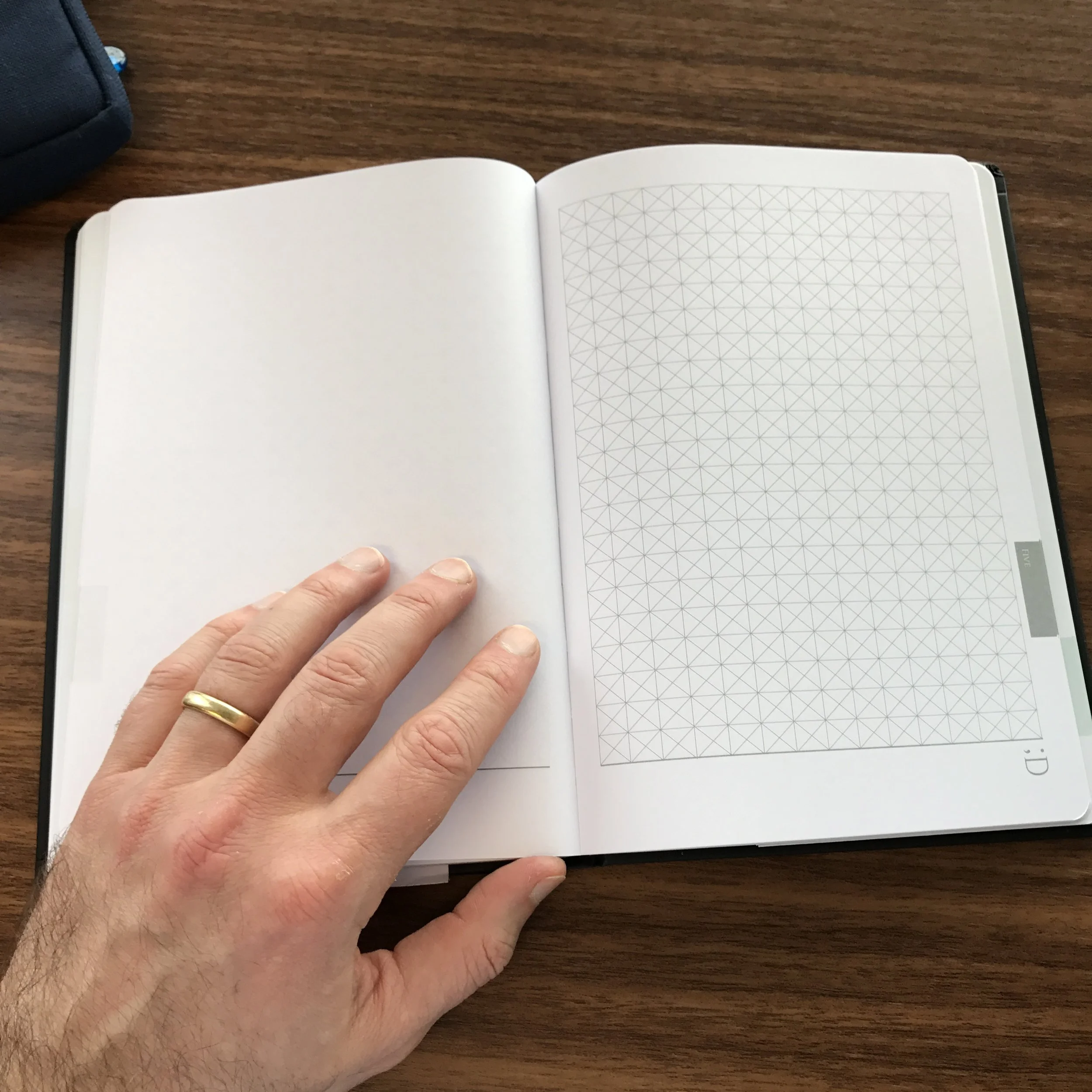
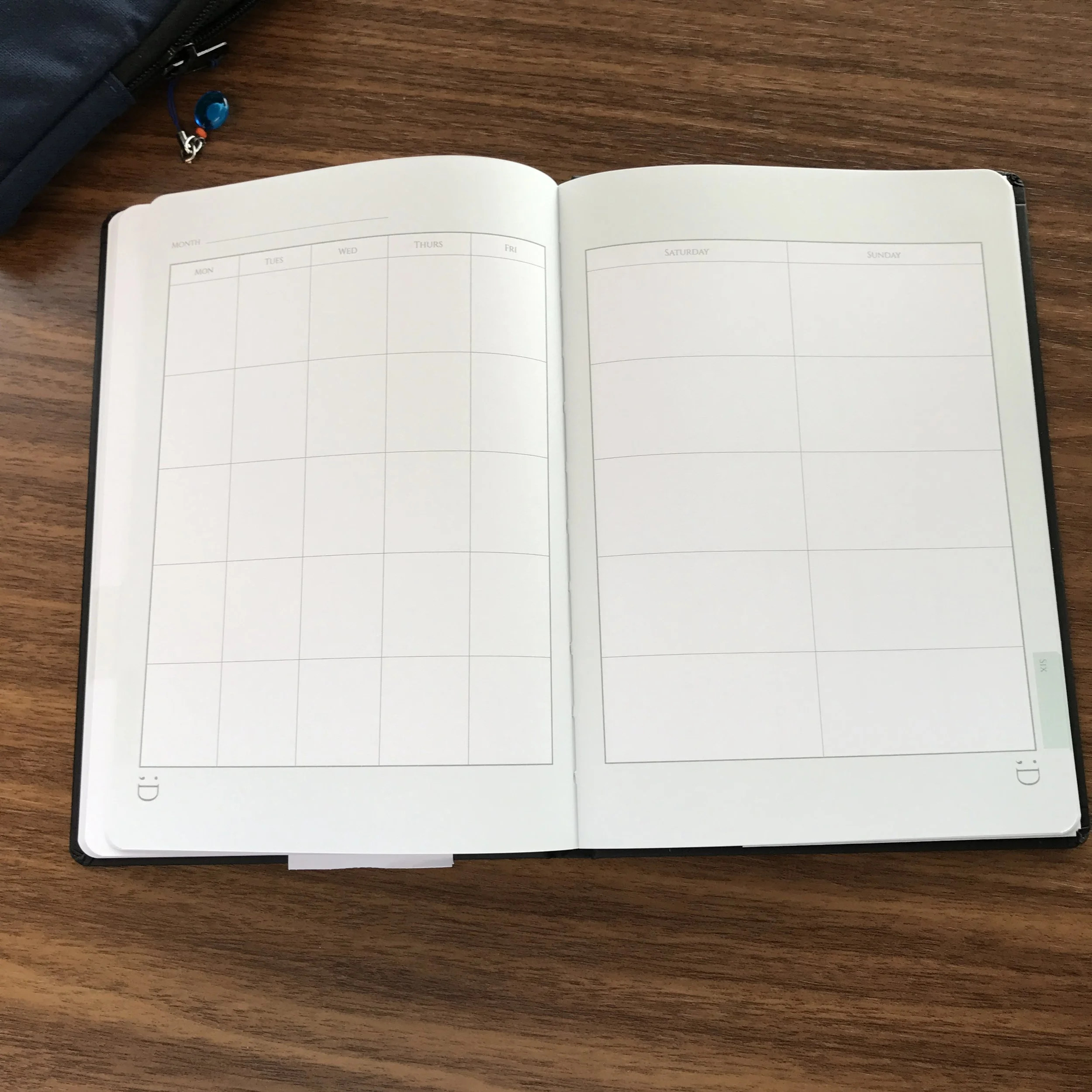
Beautiful simplicity: thus far, Write Notepads has resisted the urge to do "too much" with the design of their notebooks. 

"In the Pines" is a reference to the American folk song of the same name, first popularized by Leadbelly in the 1940s and later by Nirvana on their "MTV Unplugged" album, where it appeared as the closing track under the name "Where Did You Sleep Last Night?" (Great album, by the way - I listened to it for the first time in years this weekend - but I digress.)

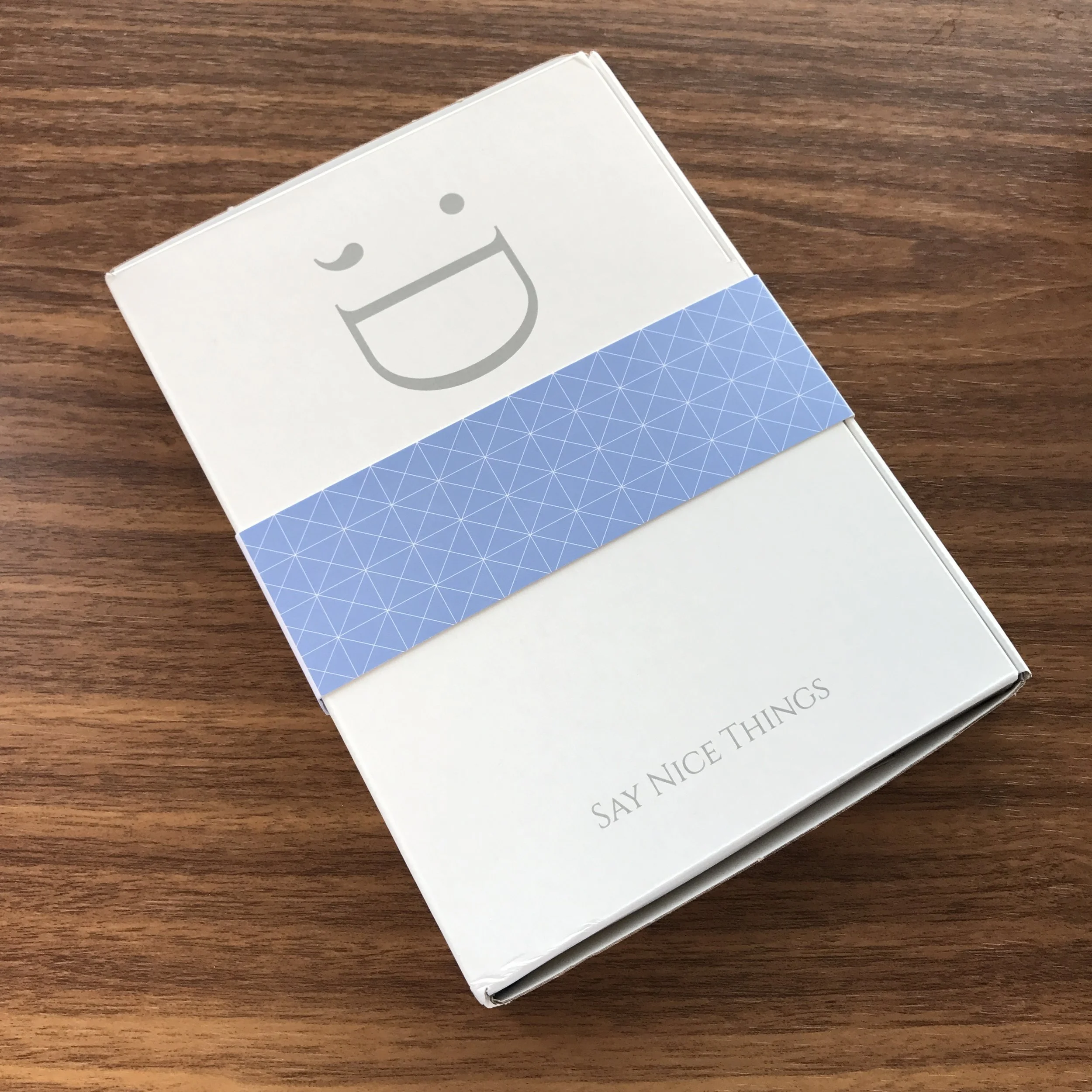
Unlike other pocket notebook brands, Write Notepads sells and ships their books in tastefully designed boxes rather than shrink wrap.

I suspect these will go quickly, since they've received a lot of attention, so grab some now if they pique your interest. For the moment, pencils are subscriber-only, as is the "In the Pines" sticker. You can order directly via the Write Notepads website.

If you're interested in checking out what Write Notepads has done with previous limited editions, check out my review of the "Kindred Spirit" edition. At some point I need to do some photos and a quick take on the "Royal Blue" edition as well, but in the meantime I recommend reading Johnny's review over at Pencil Revolution.

Disclaimer: I purchased these notebooks with my own funds, for my own personal use. 

In Notebook Review Tags Pocket Notebook, Write Notepads, Subscription Services
Comment

Pen Review: Sailor Imperial Black Multifunction Pen

January 21, 2017

Sailor makes great looking pens, and the pens that make up Sailor's "Imperial Black" series are some of the best, IMHO. The Imperial Black Professional Gear fountain pen has long been a stalwart in my collection, and gets regular use. Despite it's high MSRP outside of Japan, it's still one of the pens that I regularly recommend, and I consider it to be the premiere "stealth pen" available. As it turns out, Sailor has expanded the Imperial Black lineup to include both a multifunction pen and a ballpoint at much lower and more readily accessible price points. If you like the look of the Imperial Black pens, but aren't quite ready to make the investment in the Pro Gear fountain pen, you should consider adding the multi pen to your collection. (I can't personally speak to the ballpoint, as I don't own it, but in light of my positive experiences with the other two pens you can probably assume it's good as well.) 

The black ion-plated trim on the multi pen matches the trim on the Professional Gear fountain pen nicely. 

Given the wide disparity in price points, I expected the Imperial Black multi pen to look cheap compared to the fountain pen, and for there to be a noticeable difference in the build quality. Not the case. The black ion-plated clip and trim are the same as on the fountain pen, and the matte black finish is equally well-applied. (Note: Nearly four years later, the matte finish on my Imperial Black fountain pen has become a bit glossy and worn from use. I expect the same from the multi pen, and from any "matte black" pen for that matter. It's normal and gives the pen a nice wabi-sabi effect.) Photographed together, these two pens look stunning. Sailor should consider selling these as a two or three-pen set. 

The Imperial Black fountain pen is a relatively light and compact writing instrument that's easily carried in a shirt pocket. The multi pen also makes a great daily carry tool, but it's heftier than its fountain pen equivalent. While the fountain pen is made from matte-black acrylic, the multi pen appears to be coated brass. The metal construction gives the pen some weight, though I still find it to be well-balanced and very comfortable to use. The pen is almost exactly the same length as the Lamy 2000 four-color ballpoint, but slimmer around the middle.  

The Imperial Black multi pen uses widely available D1 refills. The stock Sailor refill is excellent, though a bit hard to find.   

In my recent Guide to Multifunction Pens, I noted that one of the big decision points when selecting a multi pen is the price/availability of the refills. Fortunately, this pen uses the non-proprietary D1 refill, which is relatively easy to find and available in a wide range of ink types. (There's even a highlighter refill made by Lamy, which I've been using a fair bit.) I will say that Sailor's "Chalana"-brand D1 ballpoint refills have impressed me. I'd compare them to the Uniball Jetstream refills in terms of smoothness, even in the "fine" or "extra fine" tip size. Like the Jetstream, there's not a wide range of colors - you're restricted to black, blue, and red - but they can be shockingly inexpensive for how good they are. Pen Chalet currently has the blue and the black in stock at less than $1.50 each.

The stock Sailor D1 refill writes a fine line that's smooth and very dark for a ballpoint. 

So if I had to make a recommendation between this and the Lamy 2000 multi pen, what would I go with? That's a tough one. For me, it comes down to two things: (1) weight, and (2) whether you need a mechanical pencil function. While I don't consider the Imperial Black multi pen too heavy to use, it's definitely heavier than the Lamy 2000, so anyone particularly sensitive to that sort of thing should be advised. The Sailor also has a built-in .5mm mechanical pencil taking up one of it's four slots, whereas the Lamy is strictly a 4-color pen. Since I use pencils a lot during the workday, I find my self reaching more and more for the Sailor, and if I'm only carrying one pen, more often than not it's the Imperial Black that goes into my shirt pocket. Either one is excellent, however, and what you ultimately choose should determined by your personal needs and preferences.  

One of the big selling points of the Sailor Imperial Black multi pen is the mechanical pencil function. The top of the "cap" unscrews to reveal a pink eraser. 

Where to Buy

As far as I can tell, neither the Imperial Black Multifunction Pen and the Imperial Black Ballpoint (which I have not tried) are available outside Japan, so you have to order both pens from a Japanese vendor. With respect to the multi pen, there are multiple Amazon sources you can purchase from, but as is common with overseas vendors, both price and availability can vary. Shop around.  

Disclaimer: I purchased the pen featured in this review with my own funds, for my own personal collection.

In Multi Pens Tags Sailor, Sailor Imperial Black, Multi Pen
10 Comments

New Product: Say Nice Things Notebooks and Journals

January 18, 2017

As much as I love pens, I have long had a soft spot for good notebooks, especially where a lot of thought has plainly gone into design and manufacturing. The past two years have seen the release of some great new products, and these books from a UK-based company called Say Nice Things are no exception.  

The "Cadence" Notebook from Say Nice Things.

Andy from Say Nice Things sent me two hardcover books, a "Curtis" A5 Journal, and a "Cadence" A5 Notebook, and I'm impressed with both. The covers are made from what the company calls a "soft Peltouch" material (it feels like vinyl) with a screenprint pattern. The "Curtis" features a dark glossy polka dot pattern with a blue highlight in the bottom left-hand corner, while the "Cadence" features a bicycle pattern with a white highlight. The covers feel very durable, lay flat, and close snugly with a tight elastic band.

The "Curtis" A5 Journal from Say Nice Things.

The layout of these notebooks makes them somewhat unique. The journal is a larger book, with 192 pages of 90gsm paper, split into six 32-page sections with an index and tabs for easy navigation. Four of the sections contain lined paper, one contains a combination of blank and graph pages for "sketching and colouring," and the last contains an undated 12-month calendar "for forward planning." 

View fullsize Say Nice Things Curtis Packaging
View fullsize Say Nice Things Curtis Writing Sample Lined Paper (reverse)
View fullsize Say Nice Things Blank/Grid
View fullsize Say Nice Things Curtis Planner
View fullsize Say Nice Things Curtis Rear Pocket
View fullsize Say Nice Things Journal Sections

The notebook is noticeably slimmer, reminiscent of a Quo Vadis Habana, with 128 pages of the same 90gsm paper, but broken into three "sections" of 95 lined pages, 16 plain pages, and 17 reticle grid pages. I like that Say Nice Things has included different sections within their notebooks: the concept reminds me of the five-subject notebooks that I used to use in school, updated for today's popular bound hardback format. These are very attractive, understated notebooks, and I can see myself easily using both in a professional setting.   

View fullsize Say Nice Things Cadence Lined Writing Sample
View fullsize Say Nice Things Cadence Blank Paper
View fullsize Say Nice Things Cadence Reticle Grid

I'm impressed with the paper quality, though there was some disparity between how the white paper in the Cadence notebook and the gray paper in the Curtis journal handled fountain pen ink. I tested the paper in the Cadence with every fountain pen I have inked up at the moment - including a very wet Visconti Homo Sapiens Dark Ages - and did not experience any bleed-through or feathering. It's absorbent paper - not glossy - but it handled the fine and medium nibs I threw at it extremely well. On the other hand, the Curtis's gray paper did ok with fine nibs, but I can definitely see how you might experience show-through and some bleed-through with very wet broad (or even medium) fountain pen nibs. Other types of pens and pencils should be fine. Overall, I would say that the paper quality on both notebooks is very good, and I could easily use both on a daily basis.  

Where to Buy

You can order from Say Nice Things directly via their website. The company just launched a month or so ago, but they already have a wide range of notebooks and journals for sale, including some colorful options. They are competitively priced, with the 128-page A5 notebook coming in at £12.50 ($15.40 US), and the larger 192-page journal priced at £25 ($30.81 US).   

Disclaimer: Say Nice Things sent me these notebooks free of charge for review purposes. 

In Notebook Review Tags Notebook Review, Say Nice Things
2 Comments

The Revenge of Analog

January 14, 2017

You've probably heard me talk before about David Sax's wildly popular new book, The Revenge of Analog: Real Things and Why They Matter, which explores the modern resurgence in "analog" technologies and what the author believes to be the reasons for it. While I'm hesitant to tell anyone that they should read any book, I'm pretty confident that anyone who's a regular reader of a blog like this one would find Revenge of Analog worth their while.  

Sax divides the book into two sections: "The Revenge of Analog Things," and "The Revenge of Analog Ideas." The first talks about the recent resurgence of products previously considered "obsolete": vinyl records, paper, film, and board games. The second takes a broader look at the role of analog in society, specifically with regard to print media, retail space, our work and school lives, and even summer camp. The book confirms what many readers of this blog probably already know: the "purely digital life" can feel pretty empty, even pointless, and making an effort to reemphasize analog can breathe some life back into it.  

The reason our increasingly digital world can be so profoundly unsatisfying is because it can't replace what analog offers: a tactile experience that engages with all our senses, not just "ones and zeros" stored on a hard drive and viewed through a screen. How many of you remember forming a strong emotional attachment to your physical music collection (whether vinyl records, CDs, or tapes)? Now how many of you feel the same about your Apple Music or Spotify library, or even all those songs you have scanned into iTunes?  The same goes for pens. I have pens that I carried through middle and high school, some of which were given to me by friends and family (including a couple people who are no longer with us). Those things were a part of my life for many years, and I can still use them today and recapture some of those memories, unlike the dozen or so now-obsolete computers that I used during that same period. 

“Surrounded by digital, we now crave experiences that are more tactile and human-centric. We want to interact with goods and services with all our senses, and many of us are willing to pay a premium to do so, even if it is more cumbersome and costly than its digital equivalent.”
— The Revenge of Analog

If you're still on the fence about the book, or if you've already read it and want to dive a little deeper, I highly recommend listening to Harry Marks' interview with David Sax on his podcast Covered. During the interview, Sax made a point that resonated with me: much of the analog resurgence is about people giving themselves permission to dive back in. For years, many people - myself included - actually felt guilty about continuing to rely heavily on analog products when the world supposedly was becoming all digital (Why are all those records and CD's still taking up so much room? Why are you killing so many trees still writing on paper, in a notebook?) Once "the establishment" began acknowledging the actual benefits of analog, more and more people realized that they weren't alone out there in feeling that, at least for certain things, analog works better than the "newer" digital alternative. In the news, the narrative has now shifted from predominantly analog companies (i.e., Borders and Kodak) shutting down or severely curtailing their operations, to the current reality of thriving independent book and stationery stores. As Sax put it, "[p]eople don't want to invest in a dying idea, even if they love it, but they will readily pour money into something that seems to be growing, especially if it is against the general trend." 

I don't think the current analog resurgence is a "fad" or "hipster fetishism," as many (especially in the tech community) would have their prospective customers believe. Its benefits are real. Most of us understand with respect to working and writing with pen, pencil, and paper, but this book encourages you to take it further and go out and buy an instant film camera, or rediscover records by picking up an inexpensive turntable. Personally, I've retired my Apple Watch and have gone completely analog with my wrist-wear. I've also got Fuji Instax pictures tacked to my workspaces at home and in the office.  

And at the end of the day, digital vs. analog shouldn't be an "all-or-nothing" proposition. There's room for both. Those of you who subscribe to my Digital Divide newsletter have heard me discuss how embracing digital simply works better for certain things. Somewhat ironically, the internet has actually contributed to keeping analog alive and fueling its growing resurgence, by giving analog enthusiasts a venue in which to form thriving online communities, and retailers of analog goods a new way to connect with consumers, many of whom have no brick-and-mortar options in the town where they live. 

Revenge of Analog has sold incredibly well - so well, in fact, that it initially sold out upon release. If you live near a brick and mortar bookseller, whether it's independent or a Barnes & Noble, you may still be able to find it there, and I highly recommend that you pick up a copy. [Update: Now that it’s been a few years, The Revenge of Analog is readily available, including at used bookstores.]

Disclaimer: This post contains affiliate links.      

In Books Tags Book Review
3 Comments

Pen Review: Parker Sonnet Great Expectations Edition

January 11, 2017

Parker recently announced that they would revamp their entire pen lineup, including not only their lower-priced IM and Urban line, but their flagship Duofold and Sonnet lines as well. The Sonnet "Great Expectations" special editions would be discontinued. Since I'd been eyeing the "Subtle Big Red" model, I jumped before they disappeared from stores. While I enjoy this pen - it's beautiful and a nice writer - Parker's current pricing structure makes this Sonnet difficult to recommend, unless you're a red pen nut (like me) or you can find one on clearance or at a discount. 

The red brushed metal cap band is my favorite aspect of this pen. It's a simple design, but the pen really pops. 

The red brushed metal cap band is my favorite aspect of this pen. It's a simple design, but the pen really pops. 

The name "Subtle Big Red" is an allusion to Parker's traditional "Big Red" hard rubber Duofold from the 1920s, which has become iconic in the world of fountain pens. Parker seems to be going all-in on the nostalgia - their updated lineup features a "Big Red" Duofold tribute. This version of the Sonnet, however, offers a more modern take on the classic, sporting a polished black metal body and cap with a brushed red cap band. The "Big Red" aspect is indeed quite "subtle" and understated, and in my opinion makes the pen quite attractive. This pen does have a metal section, but it's finished with a matte coating that makes it very easy to grip. No slipping and sliding here. 

The clip, section band, and nib are a darker nickel color, which blends nicely with the black and red color scheme.

Writing Experience

My writing experience with this pen was fine overall, but still a bit of a mixed bag in some respects. As with other Sonnets that have passed through my hands, this fine nib had a slight baby's bottom straight out of the box, leading to a few hard starts and skips. The issue wasn't severe, and eased up after a few days of writing on rougher paper as the nib smoothed out and the tines loosened up a bit. While this sort of issue isn't uncommon with modern pens, and can be fairly simple to fix, Parker's aggressive pricing of this pen towards the luxury end of the spectrum raised my expectations (pun intended) and I found it annoying. 

One difference I noticed from other Sonnets I have owned: the nib slit is not cut all the way to the keyhole, which reduces the springiness that 1980s and 1990s-vintage Sonnets were known for. As a result, this nib is firm, and a relatively dry writer.

In terms of comfort, I really like the Sonnet as a daily writer. I used this pen at work for a full week and enjoyed it. The size and shape is close to that of a classic Vacumatic Major, my favorite vintage Parker and perhaps my favorite vintage pen overall. The pen sits well in the hand, though unposted the Sonnet feels a touch too light. The friction-fit cap posts easily.  

View fullsize Parker Sonnet Great Expectations
View fullsize Parker Sonnet Posted
View fullsize Parker Sonnet Unposted

Takeaways and Where to Buy

Parker's Great Expectations line of Sonnets surprised a lot of people with it's adventurous (for Parker) design, showcasing what appears to be a desire to move away from the same general look that Parker has had since the 1990s. Overall, I'd say that I'm happy with the purchase. The design of the Subtle Big Red spoke to me, and since the pen was a special edition I wanted to be sure that I grabbed one before they went away forever. I bought the pen expecting that I might have to do some nib tweaking.   

That said, in terms of recommending that other people buy this pen, it really depends on how much the design of this special edition pen speaks to you.  As I hinted earlier, the price point is too high. Parker priced this pen at $320 MSRP, with the street price at a slightly less insane $250 or so. While you can typically get that price down even further with a coupon code, I can't help but think that the apparent the desire to aggressively price this pen as a "luxury special edition" entry in the Sonnet line resulted in a big missed opportunity for Parker. The designs of the various "Great Expectations" pens are very attractive and modern, but I can't say they justify paying the huge premium the company is asking.  

If, like me, you still want to grab one of these special edition pens before they disappear, Ron at Pen Chalet has them priced at $256 (and you can use whatever great Pen Chalet coupon code or promotional discount Ron is running at any given time to reduce that further).

Further Reading

If you're interested in reading further on the Sonnet line in general, check out my earlier review of a 1990's-era model, and I'd also recommend that you read Brad's review of the Subtle Big Red over at the Pen Addict (his take is similar to mine).      

Disclaimer: This post contains affiliate links. 

In Pens Tags Parker Sonnet, Great Expectations, Pen Review
1 Comment
← Newer Posts Older Posts →
Store Hours and Location
Visit the T.G.S. Curated SHOP
*New* Updated "Best Pens" Guide (2025)
TGS x Hinze Pens Violet Tendencies Taschenstift Fountain Pen
Hierarchies of Fountain Pen Friendly Paper
Allex Scissors arrayed on a desk showing link to desk accessories

Join Our Patreon!
Subscribe to the TGS E-mail List

Featured Posts

Featured
Levenger-Annotation-Pad.jpeg
Sep 20, 2025
Five Boutique Paper Brands I'm Watching Closely and Why
Sep 20, 2025
Sep 20, 2025
Playing-ink-MD-Cotton-Glass-Pens.jpeg
Sep 17, 2025
What's On Your Desk? My Personal Favorite Papers for Fountain Pens, 2025
Sep 17, 2025
Sep 17, 2025
San-Francisco-Pen-Show-Hotel-view.jpeg
Sep 3, 2025
2025 San Francisco Pen Show Recap: Still The Best "Big" Show!
Sep 3, 2025
Sep 3, 2025
The Gentleman Stationer RSS

© Digital Divide Media, LLC, 2014-present.

All content is the exclusive property of Digital Divide Media, LLC, d/b/a The Gentleman Stationer, including “The Gentleman Stationer” website and trademark, and should not be reproduced without express written permission.  All rights reserved.

All content containing paid advertising, affiliate links, or sponsored content will be plainly disclosed by a disclaimer when/if featured.

Contact Information

Store Shipping Policy and Return Policy

Privacy Policy

Cookie Policy

Terms and Conditions

Powered by Squarespace