A good ballpoint pen has been my pocket carry pen of choice for a while now, including various versions of the Fisher Space Pen, the Steel and Flint Pen, the Pokka Pen, and, of course, my Lamy 2000 ballpoint and multifunction 5-Color Ballpoint. I recently added yet another to my arsenal, the Lamy Pico.
In my opinion, Lamy makes some of the best ballpoint pens on the market. I used to think their refills were too light and "skippy," but in the past couple years they must have changed the formula because the last two refills that I've purchased have been excellent. I also enjoy Lamy's pens because their designs are nothing short of iconic, and you can pretty much guarantee that the pen you buy isn't going to look much like anything else on the market. The Pico is no exception.
Per Lamy's website, the Pico was designed to be approximately the size of a tube of lipstick or a cigarette lighter, and slip easily into your pocket or bag.
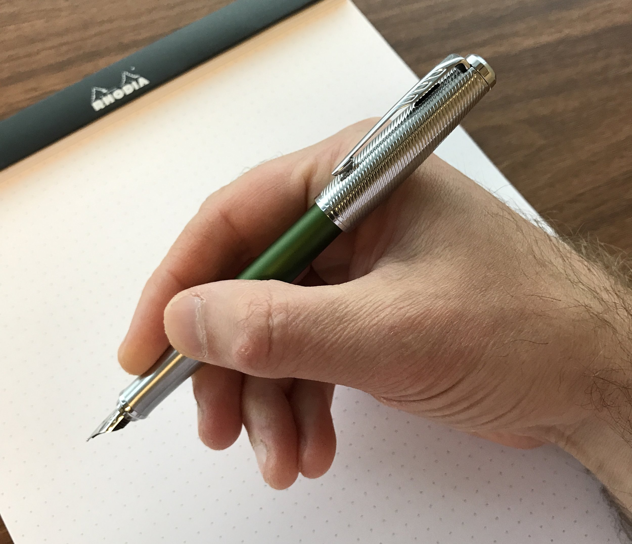
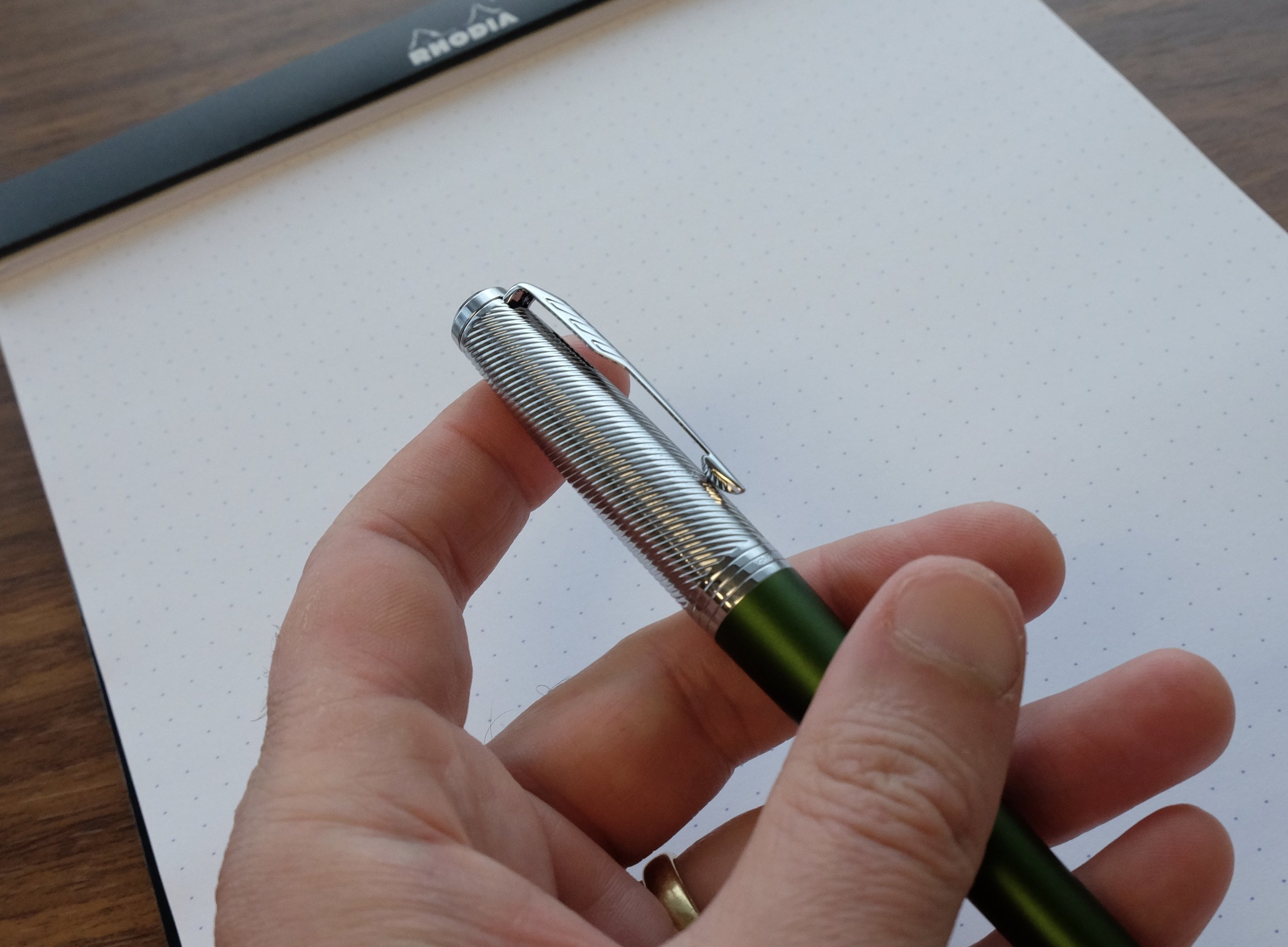
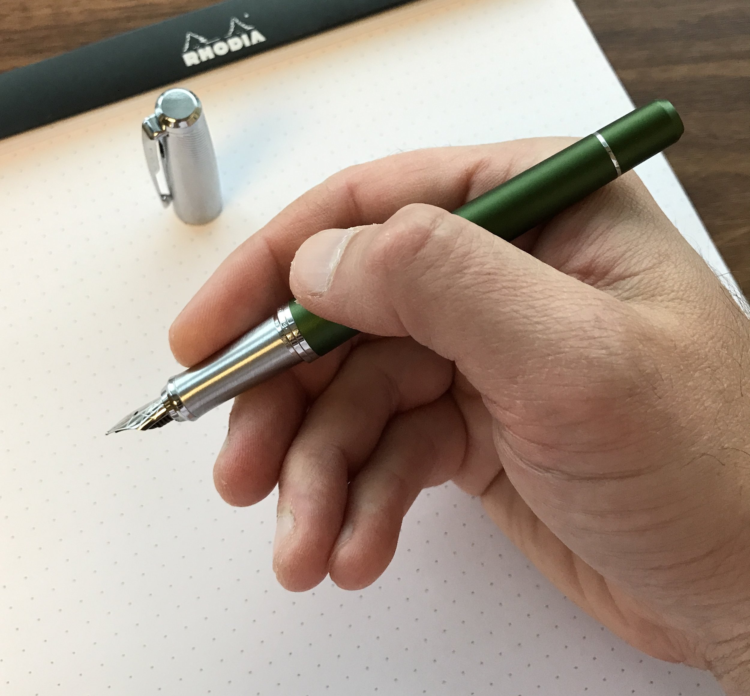
The Pico's key attribute is its ability to expand from a fairly tiny "capsule" that you can conceal in the palm of your hand into a full-size ballpoint. When you depress the "nock" at the back, it not only extends the tip, but the barrel as well. Since the Pico expands to 12cm / 4.7in, it basically becomes a full-size pen that's extremely comfortable to write with, even for longer sessions. As a point of reference, it's just ever-so-slightly shorter than the Steel and Flint Pen and the Fisher Space Shuttle Pen.
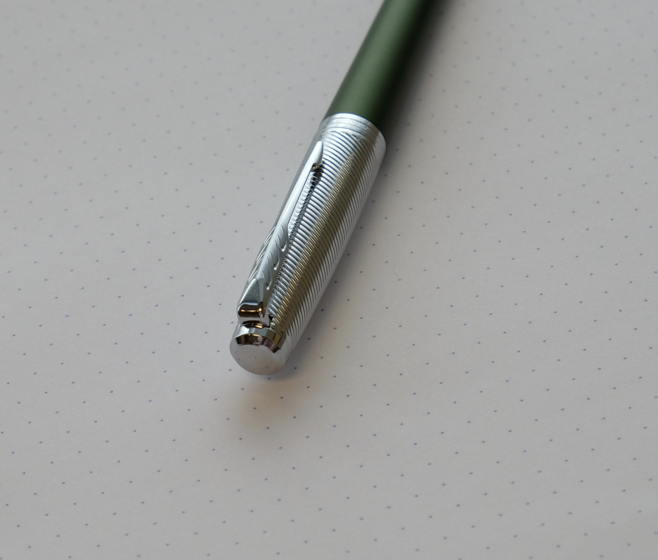
The silver Lamy logo is slightly raised, functioning as a roll-stop. Since the Pico is otherwise perfectly round, it would roll off the desk without some assistance.
I picked up the Pico on a whim, and had my doubts that this pen would be good for anything more than writing few lines here and there due to the size. This pen has surprised me with how practical it is. Lamy's promotional materials mention that it's designed with the traveler in mind, the goal being to create a pen that, when closed, was no larger than a tube of lipstick or a cigarette lighter, but that expands to a full size pen when you need it, such as when you're working on a train or airplane.
A shot of the Lamy Pico extended into "writing mode." The pen is light and very comfortable.
And while the title of "best ballpoint refill" will probably always go to the Schmidt Easyflow 9000, the Lamy M22 compact refill isn't bad at all. Here's a comparison writing sample of the Lamy Pico against a few other comparable pocket ballpoints.
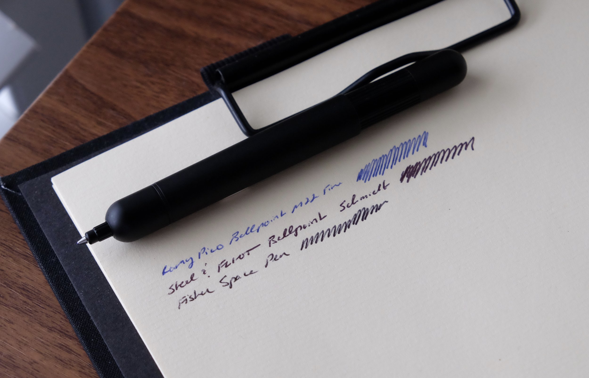
A ballpoint pen writing sample comparison. The Schmidt wins on overall darkness and smoothness, but Lamy's refill works just fine.
Takeaway and Where to Buy
You can find the Lamy Pico at most Lamy retailers, which as of April 2023 includes the T.G.S. Curated Shop! The pen comes in a wide array of colors, from the somewhat staid (dark blue and matte black) to the crazy (bright orange and eye-searing hot pink). Today’s standard pricing on the Pico is around $40.
Warning: Because of how compact this pen is, it's extremely easy to forget that it's in your pocket, and my Pico has already taken its first trip through the washing machine. While the pen contained any ink seepage and no clothes were ruined, it was a bit of a mess to clean and I had to replace the refill. The Lamy M22 refills can be somewhat pricey, though they do last a long time assuming they don't take a bath.