• Blog
  • Shop
  • Podcast
  • Resources
  • About
  • Archive
  • Contact
  • Cart
  • Sign In My Account
Menu

The Gentleman Stationer

Vintage Living in the Modern World.
  • Blog
  • Shop
  • Podcast
  • Resources
  • About
  • Archive
  • Contact
  • Cart
  • Sign In My Account
IMG_1376.jpg

Pen Review: Leonardo Officina Italiana Momento Zero

May 19, 2019

It's definitely true that some reviews write themselves, and others take a longer time to develop. Not because of any ambivalence about the pen itself - no, from the minute I picked up a Leonardo Momento Zero (and possibly from the minute I first saw the pictures online) I knew that this would be a pen for me. Nevertheless, it’s taken me a while to put this review together, if for no other reason that it takes some time to photograph five pens!

I don't know all the details of the story behind the founding of Leonardo Officina Italiana, but from what I can piece together from conversations I've had at pen shows and brand descriptions, Leonardo was founded by former penmakers at Delta, the now-defunct Italian company. Though Delta took a lot of flack for a tendency towards gaudy special editions and marketing gimmicks (fusion nib, anyone?), I could never argue with the actual writing experience that their pens offered. Montegrappa was far outside my price point; Omas was plagued with nib issues and just wrote too wet in general, leaving Delta and Aurora as the pens for people who actually want to use their pens for work. Of course, in the years since I've entered this hobby, both Delta and Omas are now defunct, and Aurora and Montegrappa have both made strides in making their products both more accessible and useable as daily writers. That said, I still feel the loss of Delta, and it left a void, especially for those of us who prized celluloid pens.

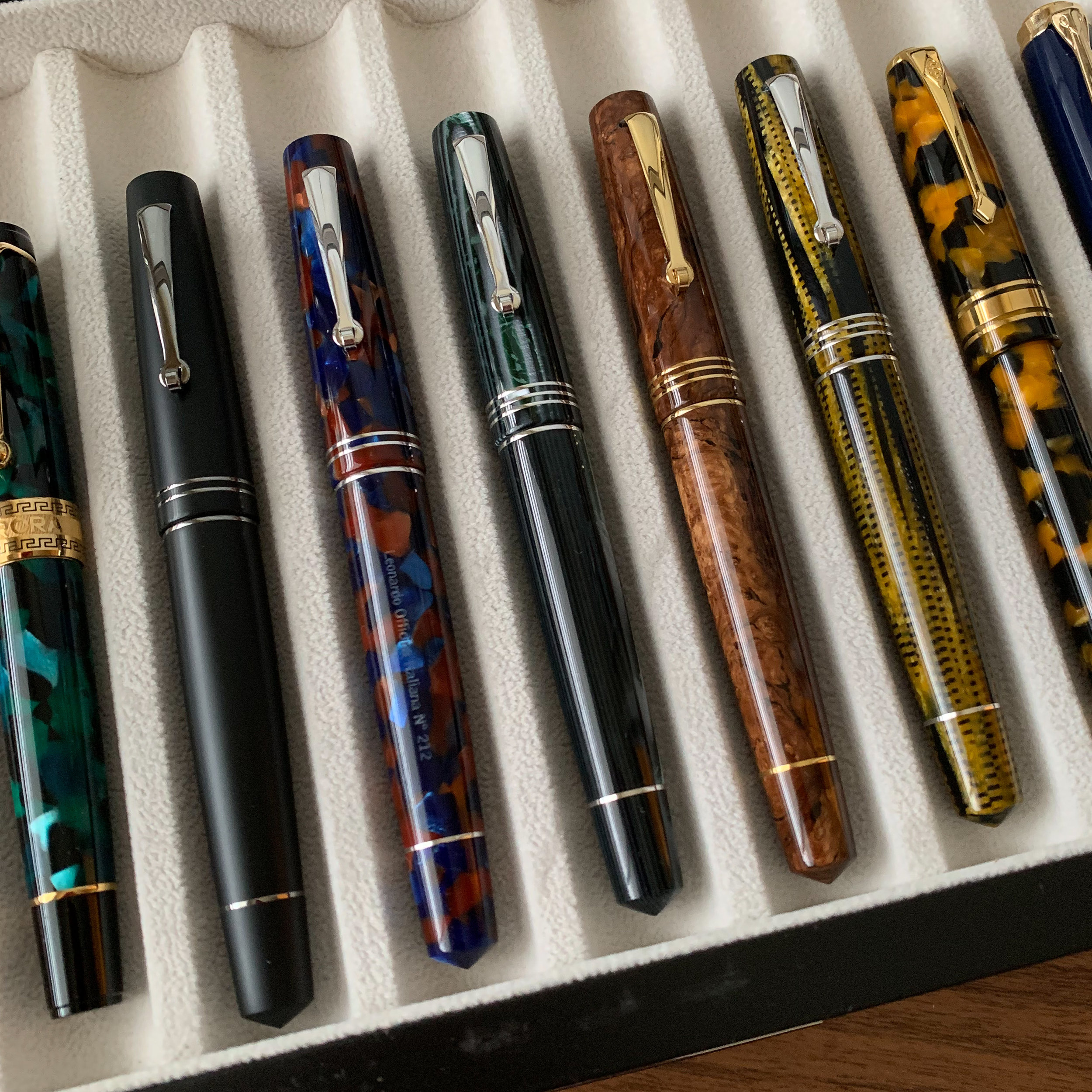
The work Leonardo has done in Italian celluloid is what initially drew me to the brand. The three pens in the center are the piston-filler Momento Zero in, from left, Omas Arco Verde celluloid, Omas Burlwood celluloid, and Omas Burkina celluloid.

Originally, before launching their own pens, Leonardo was a workshop that partnered with Armando Simoni Club, which had purchased certain assets of Omas (most notably, their remaining stock of celluloid rods). It is my understanding that the same penmakers behind Leonardo manufacture most of the ASC pens, which have received very good reviews in their own right, though their size, design, and price point target a vary specific customer.

The only other acrylic material in my collection that captures the depth of the material Leonardo uses has been from Conway Stewart. Shown here is the Conway Stewart Model 100 in “Honey Noire,” next to the Momento Zero in Pietra Marina (“Sea Stone”)…

The only other acrylic material in my collection that captures the depth of the material Leonardo uses has been from Conway Stewart. Shown here is the Conway Stewart Model 100 in “Honey Noire,” next to the Momento Zero in Pietra Marina (“Sea Stone”) acrylic.

Last year, Leonardo began releasing pens under their own name. The first model, the Momento Zero, took some time to "gather momentum," for lack of a better expression, because the pen was initially produced in small quantities, and not heavily promoted. I'm not sure of the official order of release, but the first Momento Zero pens I recall seeing available for sale were the "Abyss Celluloid" releases, which commanded a high price and sold quickly. As production ramped up, Leonardo not only released additional higher-priced celluloid and ebonite pens in a range of different (and beautiful) materials, but expanded the Momento Zero lineup to include acrylic pens at the $160-$200 price point, which is when I really became interested. They even included a matte black pen with ruthenium trim, which is good enough to give the Sailor Pro Gear Imperial Black a run for its money, especially as a price/value proposition.

The next generation of Italian pens: from the Delta Fusion 82 to the Leonardo Momento Zero.

I Take the Plunge (or Jump Off the Cliff)

I didn't start with the standard lineup, though. Though I was never a fan of Omas pens from a usability perspective, I had long admired their materials and design - especially their celluloids. When I saw the Leonardo "Maestro" set, consisting of three Momento Zeroes in long-discontinued Omas Burkina, Arco Verde, and Burlwood celluloids, I knew that I'd have to sell some pens and pick up a set. Unfortunately, by the time I'd sold enough pens to pay for most of the purchase, nearly all retailers had already sold out, except for one set still held by Emil at Pen Venture. You can say that I liked the size and shape of these pens - since then I've acquired two more Momento Zeroes from the standard "production line," and will likely add additional pens in the future.

The Leonardo Momento Zero “Maestro” set in its presentation box. Each of these pens arrived in impeccable condition with nibs tuned to perfection.

What Do I Like So Much about the Momento Zero?

The Leonardo Momento Zero wins big in all the major categories that I look at when selecting and buying a pen.

  • Balance and Writing Comfort. Perhaps most importantly, the pen is perfectly sized and balanced for my hand - neither too long nor too short, and I can easily use it posted or unposted. The only other pens that hit this same sweet spot are the Montblanc 146 and, sadly, the Delta Fusion 82, which no longer exists (though one remains in my collection). The Leonardo feels most like the 146 in my hand, since the barrel is wider than the Fusion 82, though it’s much lighter due to the absence of a brass piston.

  • Classic Design. In terms of design, Leonardo has definitely gone for the classic look. The shape somewhat reminds me of a Sailor Pro Gear, but slightly larger with peaked ends reminiscent of a Nakaya Piccolo or Long Piccolo. All of the materials - acrylic, celluloid, or ebonite - exude a vintage vibe and have excellent depth to the various patterns, and Leonardo uses simple, understated trim to avoid the trap that Delta and Omas sometimes fell into, which is making the pens too flashy or “busy” in an effort to create a unique look.

  • Well-Tuned Nibs. The Momento Zero features standard Bock nibs that have been personalized with the Leonardo logo, and I suspect have been tuned and set at the factory. The higher-priced celluloid and ebonite pens feature 14kt gold nibs on an ebonite feed, with steel nibs and plastic feeds on the production line pens. Overall, I've had excellent luck with the nibs on my Leonardos. Emil tuned the gold nibs on my Maestro set to perfection, and the steel nibs on the pens from the standard lineup performed perfectly well out of the box. Since any Bock nibs have the potential for quality control issues, I would recommend purchasing from a retailer who will check and, if necessary, tune the nib for you, unless you are comfortable doing the work yourself or plan to get the nib ground or tuned at a pen show.

  • Overall Build Quality. If you’ve used a lot of fountain pens, you’ll know what I’m talking about when I say that you can “feel” whether a pen is well-made or not. The Momento Zero feels great. These pens have been hand-turned, and to achieve this level of consistency requires years of experience and a lot of care. Another nice touch is the filling system: My celluloid Maestro pens feature a lightweight integrated piston, and while the acrylic models are cartridge-converter, the converter is semi-integrated in that it not only threads into the section, but has a metal-plated knob at the end that extends out the back of the barrel. If you don’t feel like unscrewing the section to fill the pen, you can remove the blind cap and fill the pen piston-style.

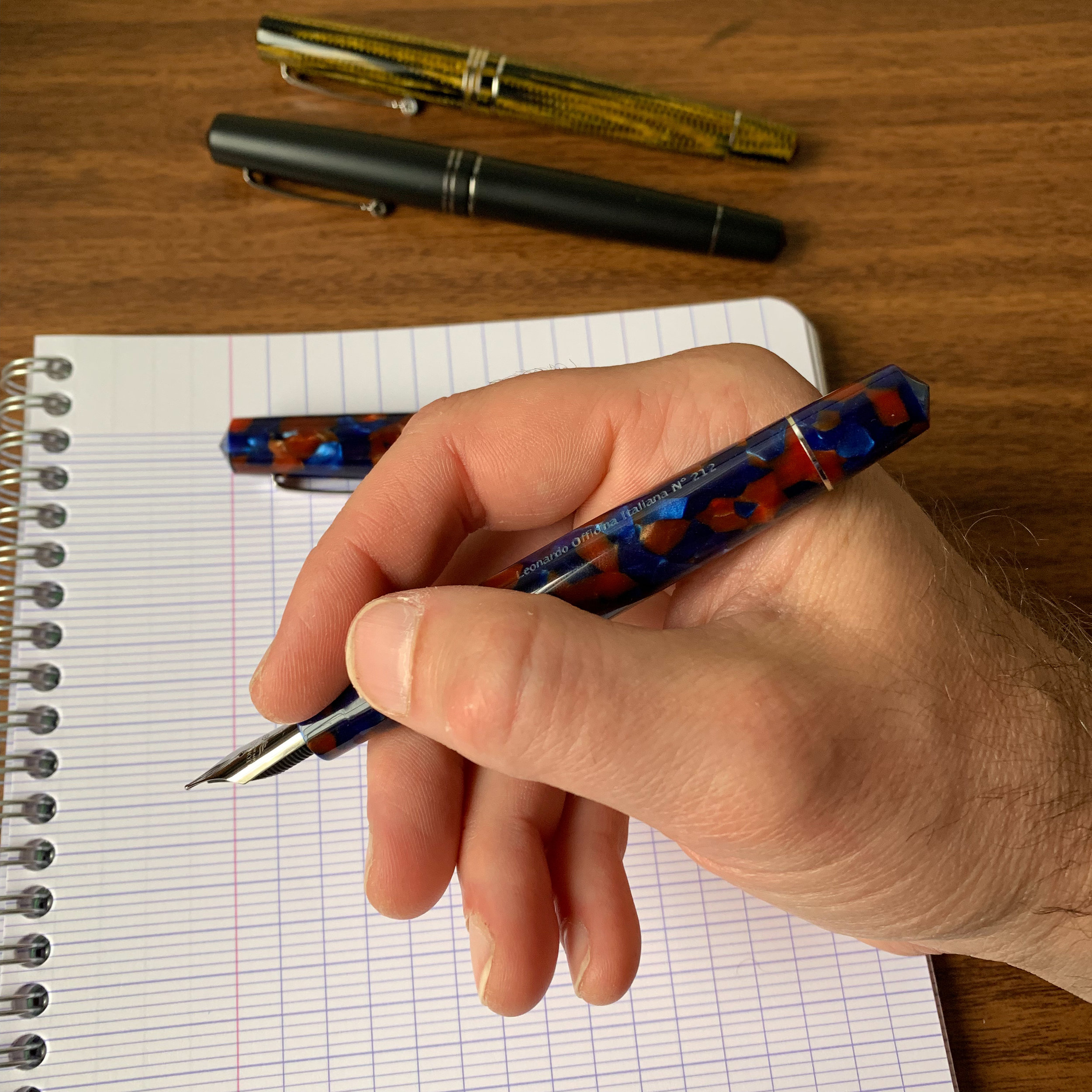
View fullsize Leonardo Momento Zero Posted
View fullsize Leonardo Momento Zero Unposted

Leonardo Momento Zero nibs, ranging from the ruthenium-plated (top), to the stainless steel (bottom left) to the rhodium-plated gold (bottom right).

A writing sample from three of my pens. Compare the line width from the broad and extra fine steel nibs to the medium gold. The combination of a gold nib and an ebonite feed makes the pen a very wet writer, which is nice to have, but may affect the choice of someone looking to use this particular pen as a daily writer.

The end of the converter on the Momento Zero can be used piston-style by removing the blind cap.

Takeaways and Where to Buy

The Leonardo Momento Zero is the first pen in a long time that I’ve reviewed where I don’t have any significant critiques or “negatives” - it’s that good of a pen in terms of design, build quality, and execution. Of course, so much of this hobby is driven by personal taste that it’s entirely possible that you won’t be drawn to this pen the same way I am, but that’s how these things go. I will note, however, that the gold nib pens are wet writers - probably due to the use of an ebonite feed - so you’ll want to consider this when selecting a nib size and adjust a size down from what you would normally choose (i.e., if you’re looking for a medium, buy a fine).

I’m happy to see that Leonardo pens are now widely available, and am eagerly awaiting what else they plan to release in the coming year. In addition to Pen Venture, where I purchased my Maestro Set, I acquired my matte black model from Dan Smith (The Nibsmith), and my Pietra Marina “Sea Stone” pen from Appelboom. Other retailers who now carry Leonardo include Pen Chalet and Goldspot. Prices start at $169 for a resin/acrylic Momento Zero with a steel nib, and range up to $200 for more complex materials such as the Pietra Marina (Sea Stone) and Hawaii acrylics. For a pen with this level of craftsmanship, I find the price point more than fair. The ebonite and celluloid pens are more expensive (approximately $695), but still sit at a price lower than what you would pay for a comparable pen from Aurora or Montegrappa.

A Leonardo Momento Zero “Family Snapshot,” with some other pens for comparison purposes. From left: Montegrappa Monte-Grappa, Montblanc 146, Aurora Optima, Momento Zeroes in Matte Black, Sea Stone Acrylic, Arco Verde celluloid, Burlwood celluloid, and Burkina celluloid, Conway Stewart Model 100, and a Pelikan M800 Stone Garden.

Disclaimer: This post contains links to paid sponsors and contains affiliate links. I purchased all of the Leonardo pens featured in this review with my own funds, for my own personal collection.
In Pens Tags Leonardo, Leonardo Momento Zero, Pens
6 Comments

New Product Alert: Staples TRU RED Notebooks

May 15, 2019

Staples surprised me a couple of weeks ago by reaching out and asking whether they could send me some products to review from their “TRU RED” lineup, which ended up including two spiral-bound notebooks and an assortment of gel pens, permanent markers, and highlighters. Knowing that Staples has, in the past, been capable of sourcing inexpensive, relatively fountain pen-friendly paper, the notebooks interested me the most. On the whole, I wasn’t disappointed, and one notebook was excellent, though I predict there will be inconsistency in paper performance for those who want to exclusively use fountain pens or wet rollerballs in these notebooks.

The inside of each TRU RED notebook features a “catch-all” folder, which I find useful for work.

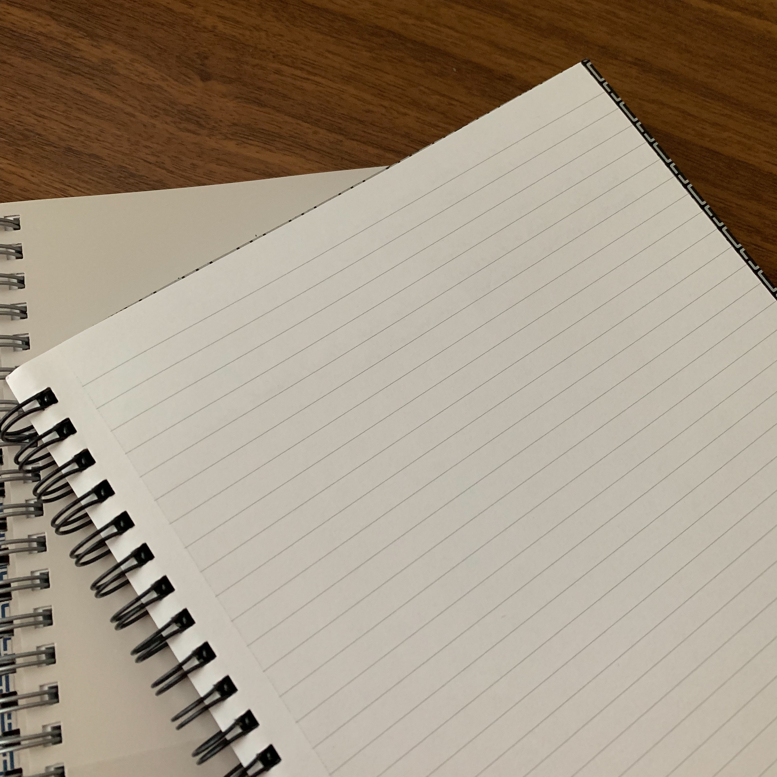
The TRU RED notebooks come in both softcover and hardcover variants, in medium and large sizes. Both notebooks sent to me by Staples were mediums (6.5” x 9.5"), which roughly equate to an A5 size. These spiral-bound notebooks look and feel premium-quality and durable - the hardcover notebooks feature a heavy chipboard cover, while the “softcover” versions sport a flexible plastic cover similar to what you would find on a Miquelrius notebook. The double spiral bindings feel like they will hold up in a bag, and haven’t bent despite some rough treatment.

The covers are thick and durable, and the double spiral binding should hold up well.

The paper is a mixed bag, and the packaging on these notebooks doesn’t provide much specific information other than that they are made in Taiwan. (The only information regarding weight, etc. is the designation as “Premium Heavyweight Paper,” which the Staples website indicates is 27-32 lbs.) Staples offers several different ruling options, including narrow (college) ruled, blank, “meeting”, and “project”. I’d personally love to see dot grid, but I’ll happily use a ruled notebook as long as the ruling is narrow enough. The best part? Perforated pages. For the notebooks I use at my day job, I need to be able to shred/scan/file notes, and the ability to easily remove pages is essential.

The first notebook I tested (the softcover) performed exceptionally well with fountain pens.

Not a hint of bleedthrough - or even show-through - on the reverse, despite the fact that I was using a very wet medium gold nib with an ebonite feed!

Not a hint of bleedthrough - or even show-through - on the reverse, despite the fact that I was using a very wet medium gold nib with an ebonite feed!

So what about paper quality? Well, it’s a bit of a mixed bag. The first notebook I opened (the softcover) had me really excited, because the paper was excellent, showing zero bleedthrough or feathering even with very wet fountain pen nibs. That initial thrill was tempered a bit when I tested out the hardcover notebook, because the paper - while OK - wasn’t nearly as good as the paper in the softcover notebook, despite the softcover notebook costing less money and nothing on the label to indicate that the two notebooks contained different paper. To me, the discrepancy in performance suggests batch variability, meaning that Staples is purchasing the paper for these notebooks from multiple sources, which makes perfect sense given the numbers. If you’re producing tens of thousands of these things, it’s unlikely that a single paper supplier will be able to meet demand.

On the hardcover notebook, the paper bled through, especially with a stub nib fountain pen, though it remained well within my “zone of usability” for everyday work purposes.

Good thing I don’t write with a stub nib at my day job.

Takeaways and Where to Buy

It’s hard for me to offer a single verdict on the “TRU RED” notebooks given the inconsistency in how the paper behaves, but on the whole I will say they are good for the price point. I’ll probably run by Staples this weekend and pick up one or two more of the black softcover notebooks, and if the paper is consistently good in that version, stock up because it’s some of the best inexpensive fountain pen-friendly paper I’ve used recently. Regardless, I’d wouldn’t hesitate to pick up more of these notebooks for work purposes, especially given the durability, professional look, and the attractive $9.99 price point for the medium softcover.

You can purchase these notebooks at Staples, either in their brick and mortar stores or online. Though it looks like the promotion ends today, Staples is currently offering a coupon code for 15% off purchases of $75 or more from their “Business Essentials” line. I have a few more of these products queued up for review, so stay tuned!

Disclaimer: Staples provided me with the notebooks featured in this review free of charge, for review purposes. I was not otherwise compensated for this review.

In Notebook Review Tags Notebook Review, Spiral Notebook, Staples, Tru Red
2 Comments

Rediscovering an Old Favorite: Private Reserve Burgundy Mist

May 11, 2019

I haven’t used Private Reserve ink regularly in years. For those of you who were in this hobby a decade ago, you may recall a time when Noodler’s, Private Reserve, and maybe Levenger were the only options for bright, saturated fountain pen inks that came in dozens of colors. Sure, ink enthusiasts complained about slow dry times, smearing, clogging, feathering and other “high-maintenance” behaviors, but options weren’t plentiful if you wanted to write with an ink other than your basic black, red, or washed-out blue, and these inks were widely available at retail. (Private Reserve ink remains one of the few inks stocked in my local “pen store,” Nashville Trunk & Bag.) Two colors - Private Reserve Burgundy Mist and Sherwood Green, were among the first five bottles of ink I purchased after I discovered fountain pens.

Classic packaging, classic Private Reserve jar/bottle. Though some might claim it lacks aesthetic appeal, Private Reserve makes one of the more practical ink bottles out there.

Unfortunately, over the years, as new ink companies emerged, and as the larger pen companies such as Pilot, Sailor, Pelikan, etc. began to introduce a wider range of options into the ink market, Private Reserve lost ground. Reports of quality control issues didn’t help - I personally lost a bottle of Burgundy Mist to “Slime in the Bottle” (mold) and another red ink turned brown as the dye deteriorated. Then, the owner passed away, and the future of the company was in doubt. You didn’t see much Private Reserve ink in stock at retailers or at pen shows. From an outsider’s perspective, things looked grim.

Not so fast. Recently, things have turned around. A former employee purchased the company. Changes apparently were made to ink formulations. Old favorites such as D.C. Supershow Blue, Burgundy Mist, and Tanzanite began to reappear in stock at retailers. And you know what? The ink I’ve tried thus far is excellent. Back at the beginning of March, as I was getting ready to leave the Baltimore Pen Show, Lisa Vanness asked whether I’d like to take a bottle of Private Reserve to review, as the new owner had been making the rounds at the show - where she had her own table - promoting the company and letting everyone know that Private Reserve is back and ready to do business.

66ml, filled to the brim! (Don’t knock this one over onto the carpet.)

So what about my beloved Burgundy Mist? Is it as good as I remember (minus the whole SITB issue)? In short, yes. Burgundy Mist is the same saturated, classic dark burgundy that shows up well on the page and is perfect for a more conservative office environment. Despite the saturation, the ink behaves incredibly well - it dries nearly immediately in a fine or extra fine nib, with no noticeable feathering and minimal bleedthrough even on the cheapest of generic memo pads from my desk at work. Not what I expected from Private Reserve. Did I mention that the ink remains inexpensive? At $11 for 66ml, you’ll be hard-pressed to find a better deal based on price-per-ml, though I wouldn’t be surprised to see that price come up a bit in the future as the company regains its foothold.

Takeaways and Where to Buy

Based on my experience with Burgundy Mist, I’m going to give Private Reserve another shot, and look forward to picking up more old favorites such as Sherwood Green, Supershow Blue, Tanzanite, Avocado (yes, they fixed the spelling) and Chocolate. At the price-point, it’s a low-risk proposition, and based on my experience with Burgundy Mist I’m confident that at least a few of those will turn out well and wind up back in the rotation.

Though not as widely available as it used to be, Private Reserve is still relatively easy to find at retailers. The deep bottle is more of a jar, with the wide mouth making it easy to fill pens with large nibs.

Disclaimer: This post has been revised to reflect/disclose that as of June 2025, T.G.S. is now a retailer of Private Reserve Ink! You can purchase a selection of the Private Reserve Colors directly from our shop.

In Ink Reviews Tags Private Reserve, Ink Review
2 Comments

Perfect Pairings: TWSBI Eco Transparent Orange and Pen Addict/Robert Oster Fire on Fire Ink

May 8, 2019

I don’t typically try to “match” inks to pens - there are only a handful of pens in my collection that have “one” ink that fits them so perfectly I won’t use anything else. The new TWSBI ECO Transparent Orange might just have become one of them, with the recent release of the much-awaited Pen Addict/Robert Oster collaboration “Fire on Fire.” Read on as I take a look at the ink, as well as TWSBI’s latest special edition from its Eco lineup!

First, the Pen

TWSBI has slowed down their releases of new products over the past couple years. Apart from the TWSBI Go and the very recently released TWSBI Aurora (which only appeared in limited quantities), most of their efforts have gone into releasing variations on their standard lineup, including the 580 AL series, the Diamond Mini AL series, the Vac 700R/Vac Mini, the Precision technical pens/pencil, and TWSBI’s entry-level piston filler, the TWSBI Eco. The Eco has been a success story for TWSBI in the years since it’s release, with limited edition colors flying off the shelves at retailers, and TWSBI even releasing an “ECO-T” with a triangular grip section. It wouldn’t surprise me to learn that the ECO has overtaken the standard 580 as the most popular TWSBI model, as the ECO offers users TWSBI’s excellent high-capacity piston filling mechanism at a much lower price point. Sure, you lose the ability to easily swap nibs using TWSBI’s screw-in nib units for the 580, but if you’re someone who prefers a single nib size for most of your writing (which I venture are most people), interchangeable nib units aren’t a selling point anyway. You can read my prior review of the TWSBI ECO, which I published shortly after the pen’s release and which still holds up three years later. The Eco has also retained a spot on my “Best Fountain Pens for Beginners” list.

I successfully restrained myself from purchasing any of the first Transparent or Color ECOs, or the ECO-T, mainly out of a desire to avoid accumulating more pens. (At this price point, it’s easy to fall into the “catch-’em-all” mindset.) I couldn’t pass up the orange, however, especially since I’ve experienced major seller’s regret after letting go of my Amber Diamond 540 and Orange 580AL. TWSBI makes a great orange pen, and I may end up having to pay “stupid tax” on the secondary market to get those other two back. If you’re looking to unload an Amber 540 or a 580 AL Orange via sale or trade, hit me up….

The TWSBI Eco, while long, is still usable posted due to the light weight. I also think the chunky, faceted Eco cap looks better in a transparent material.

And on to the Ink…

Moving on to the ink that drove this pen purchase: Earlier this year Brad Dowdy at the Pen Addict released his first ink in collaboration with Australian ink maker Robert Oster, who has become known for his “Fire” series of inks that feature a red sheen. “Fire on Fire” is just that - a bright, pure orange ink that offers a hint of red sheen in especially broad or wet nibs. While I haven’t found the sheen particularly pronounced, this is still a great orange ink, and perhaps one of the best I’ve used in a long time.

In order to earn a regular spot in my rotation, an orange ink has to check a few boxes:

  • Visibility. The ink can’t be too yellow for me to use in a fine or extra-fine nib. I like to use orange inks for annotating documents, and if the ink appears too pale it’s illegible.

  • Dryness. Depending on the dye used to make the ink, certain oranges end up drier than others. This not only makes visibility issues worse, but also can make the ink scratchy and unpleasant to write with. In the past, I’ve passed on inks that I’ve found too dry, but going forward this may be less of an issue as Vanness Pens is now selling the “White Lightning” ink additive, a drop of which can significantly improve performance.

  • Minimal Precipitate, or “Nib Crud.” I know nib crud is supposed to be the harmless result of dye precipitating out of highly saturated inks, but it’s one of those things that annoys me and that I can’t be bothered to tolerate. The dye used in red and orange inks are particularly prone to nib crud, and I generally avoid those inks that have a reputation for “crusting up” on the nib.

Tested in three pens: From left, Kanilea Pen Company Hanauma Bay with a fine nib from Nibs on Point; a JoWo 1.1mm Stub in an Additive Pens Double Helix Eyedropper, and the TWSBI Eco Transparent Orange pictured here.

Since receiving this bottle directly from Brad at this year’s Baltimore Pen Show, I’ve used Fire on Fire in three different pens and it has performed flawlessly in all of them. The ink flows well, with zero nib crud noticeable on any of the pens and one of them was an eyedropper that has held the ink for months. But my favorite thing is the color - Brad and Robert Oster nailed the tone on this orange ink, which is the closest to a “pure” orange that I’ve used. (Note: what constitutes a “pure” orange may differ from person to person. To me a “pure” orange leans towards the red end of the spectrum.) The “fire” comes out as hints of red around the edges of your writing in broader or wetter nibs, and the ink remains highly visible even in a finer nib. It’s a perfect “daily user” orange ink for me, and I can’t wait for Brad to start selling it in the massive 100ml Oster bottles! (If he can take a hint….)

A writing sample in three different nib sizes shows that Fire on Fire won’t lose its visibility when writing a finer line.

Takeaways and Where to Buy

Since I’m an orange (and red) pen and ink fanatic, both of these items were “must have” purchases for me. The fact that you can get both the pen and the ink for less than $50 made them no-brainers.

The TWSBI ECO in Transparent Orange is generally available from most TWSBI retailers. While I’ve heard the Transparent ECOs described as “special editions,” TWSBI seems to have made a lot of them, with all of the previously released colors (blue, green, red) still available as of the time of publication of this review. I don’t think there’s any immediate danger of this one disappearing, but TWSBI is known for retiring popular pens without much notice, so keep that in mind. [UPDATE: The ECO in transparent orange is no longer available, though you can now purchase TWSBI fountain pens, including other colors of the TWSBI ECO demonstrators, directly from the T.G.S. Curated Shop.]

Pen Addict/Robert Oster Fire-on-Fire Ink is available exclusively at the Pen Addict Shop, along with lots of other great Pen Addict branded goods.

Disclaimer: I purchased the pen featured in this review with my own funds, for my own use, and the ink was provided to me free of charge by Brad at the Baltimore Pen Show for review purposes.

In Pens Tags Pens, Ink Review, Fire on Fire, Robert Oster, Pen Addict, Perfect Pairing
Comment

More from the Bargain Bin: KACO Retro Fountain Pen

May 4, 2019

So, Joe, why have you been reviewing so many inexpensive fountain pens lately? Why have you been scouring Amazon and eBay for $20 pens when you presumably have cases and drawers full of perfectly nice, much more expensive and higher-quality fountain pens at home, not to mention a zillion other things to review?

Fair questions, all of them. And ones I can easily answer: with a few notable exceptions, I'm getting bored with what the old "mainline" pen companies have been releasing (or not releasing), especially where enthusiasts are being asked to pay ever-increasing prices for products characterized by what I view as a general lack of creativity and innovation. So, as I see new Chinese pen companies moving well beyond the "$1.99 eBay pen" market or Montblanc knockoffs and releasing their own original designs, with legitimately good nibs, I've begun to enjoy exploring the so-called "lower-end" of the market.

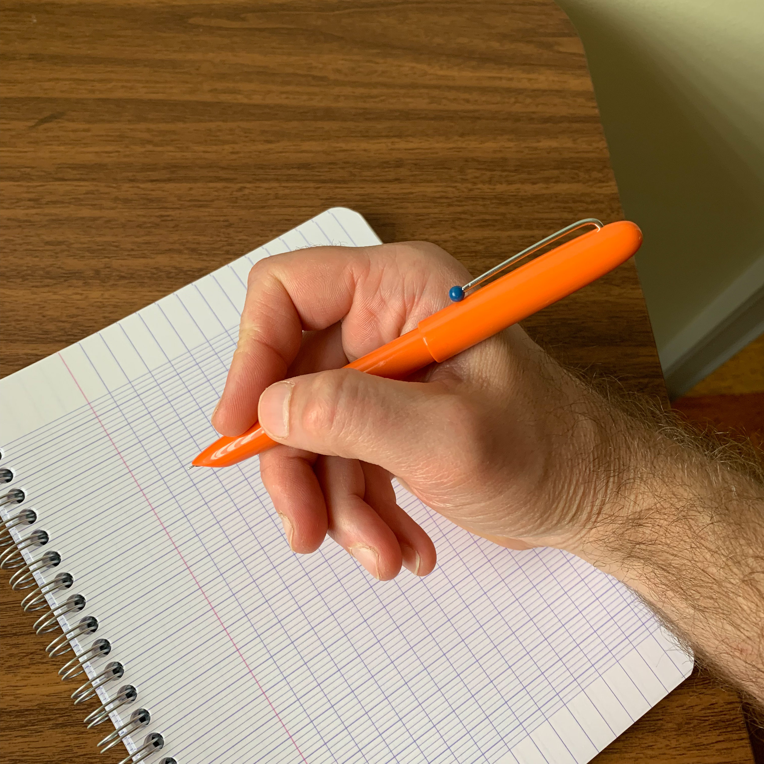
Each color version of the pen ships with a different color plastic ball

Some brands stand head and shoulders above the rest. Two of my favorites are Wing Sung and KACO, which in my opinion make some of the better inexpensive pens on the market, to the point where some U.S. retailers are starting to carry them as part of their regular stock. I recently reviewed the KACO Edge, a Makrolon fountain pen that vaguely resembles something that Lamy might have made had they foregone the misguided Aion and created a product for those of us who don't want to write with a metal nightstick. At the same time I purchased the Edge, I picked up the KACO Retro, an even less expensive hooded-nib pen that I think I actually prefer.

Ink window! A nice touch at the price point.

Why do I like this pen so much? For starters, I like hooded nib fountain pens, for both their design and functionality. With the Retro, KACO actually made an effort to design a pen that's not just another inexpensive Parker 51 clone (there are already plenty of those out there). The name "Retro" fits the pen well, from the hooded nib to the injection molded mid-century modern design to the colors that come straight out of the 1960s. I even like the minimalist wire clip, with a contrasting plastic ball acting as the "keeper" on the end.

The hooded steel nib arrived with both the feed and the tines properly aligned, which can be a problem-area with low-cost hooded-nib pens.

The KACO Retro definitely isn't a fancy pen. It feels lightweight and inexpensive, uses a generic yet sturdy plastic converter, and at this price point is something you could give to an older child or just throw in your bag to use as a work or travel pen. But it also writes quite well, better in fact than not only all of the cheap Parker 51 clones I've tried, but better than many of the Parker Super 21 and 51 Special fountain pens I've used. (For those of you who are not vintage pen aficionados, the Super 21 and the 51 Special were lower-end, alloy-nib versions of the Parker 51 that Parker released at a lower price point.)

Sure, it’s a generic plastic converter, but it seems pretty sturdy compared to what I’ve seen on other cheap pens. I do find it odd that this pen comes packaged with a converter, but the KACO Edge (which is more expensive) does not.

The stainless steel nib writes a slightly wider and wetter line than the nib on the Moonman N3, comparable to the KACO Edge though it’s a different nib.

View fullsize KACO Retro Posted
View fullsize KACO Retro Unposted

Takeaways and Where to Buy

The KACO Retro isn't going to become my daily writer, but it's a good enough pen that a student or budget conscious fountain pen lover could easily use it as one. Fans of vintage-style hooded-nib pens might consider the KACO Retro as a travel pen, for those who don't want to deal with the risk of using their vintage pens on an airplane, or worry about losing a prized pen at conferences or in an office or hotel room. The barrier to entry is very low, and I have no problem recommending the Retro given the price point.

I purchased this pen from Amazon, and it arrived quickly because it was Prime-eligible. Of course, I went with the orange version, but there are turquoise, burgundy, blue, white, black and turquoise pens available as well.

If companies such as KACO, Moonman, and Wing Sung keep this up, and can sustain a decent level of quality at their current price point, Lamy, Pilot, Pelikan, and a few others will have something to worry about with their mid-tier and entry-level offerings, especially since the trend has been towards higher pricing and spottier quality control. If nothing else, it adds variety and a bit of competition to a segment that traditionally has been dominated by a few pens - not just a few companies - and in my opinion more choice for the consumer is always a good thing.

Editor’s Note and Follow-up

I'm going to take a minute here to supplement my review of the KACO Edge and my thoughts on lower-end pens in general. Despite the overall good quality of both Wing Sung and KACO pens, I've experienced cap cracks with both, which I accept as par for the course in this price bracket. At sub-$20, you're going to have to accept a lower level of manufacturing quality control on the front end, and what becomes important is the extent to which the retailers and manufacturers will support their customers on the back end. In the case of the KACO Edge, I was warned by a reader to be on the lookout for cap cracks, and a week or so after finalizing my review, I found one. I reached out to the Amazon Seller (who I assume is affiliated with KACO), who literally responded within 5 minutes offering to mail me a new cap, and requesting that I send her a photo of the crack with details of its location so she could share with the factory. A far cry from the service you would get when you used to receive a bag of five $2 Jinhaos, and you were lucky if two of them actually wrote.

Disclaimer: This post contains links to paid sponsors and affiliates. I purchased the pen featured in this review with my own funds, for my own use.

In Pens Tags KACO, KACO Retro, Chinese Pens, Amazon, Inexpensive Pens, Pen Review
2 Comments
← Newer Posts Older Posts →
Store Hours and Events
Shop T.G.S. Online
Updated 2026 "Best Pens" Guide
No results found
On The Paper Trail: Live In Nashville Event Tickets Now Available!
TGS_25 Roterfaden Restock Notification
Hierarchies of Fountain Pen Friendly Paper

Join Our Patreon!
Subscribe to the TGS E-mail List

Featured Posts

Featured
Pilot-Custom-Heritage-92.jpg
June 6, 2026
Workhorse Pens: Pilot Custom Heritage 92 Fountain Pen
June 6, 2026
June 6, 2026
Kakimori-Inkstand-Before.jpeg
May 30, 2026
Japan Trip Journal: A Visit to Kakimori, Including Custom Notebooks and the InkStand!
May 30, 2026
May 30, 2026
Five-Foundational-Fountain-Pens.jpeg
April 22, 2026
T.G.S. 12th Anniversary: 5 Fountain Pens Everyone Should Experience
April 22, 2026
April 22, 2026
The Gentleman Stationer RSS

View Cart

© Digital Divide Media, LLC, 2014-present.

All content is the exclusive property of Digital Divide Media, LLC, d/b/a The Gentleman Stationer, including “The Gentleman Stationer” website and trademark, and should not be reproduced without express written permission.  All rights reserved.

All content containing paid advertising, affiliate links, or sponsored content will be plainly disclosed by a disclaimer when/if featured.

Contact Information

Website Terms and Conditions

Store Shipping Policy and Return Policy

Privacy Policy and Cookie Policy

Accessibility Statement

Powered by Squarespace