• Blog
  • Shop
  • Podcast
  • Resources
  • YouTube
  • Archive
  • FAQ
  • About
  • Contact
  • Sign In My Account
Menu

The Gentleman Stationer

  • Blog
  • Shop
  • Podcast
  • Resources
  • YouTube
  • Archive
  • FAQ
  • About
  • Contact
  • Sign In My Account

I’m well into the “second half” of my current work notebook, and actively considering what I want to use next. I may have to opt for one of these bound Soumkine notebooks, with the tall slender format and the mustard cover.

Sunday Reading for March 27, 2022 (Plus, Introducing a New Feature!)

March 27, 2022
  1. Reading Journal (via KraftyKats). If you’re finding yourself overwhelmed with notebooks and looking for new and varied ways in which to use your pens and stationery, a reading notebook (or a commonplace book), is an excellent way to work through your backlog.

  2. On Keeping a Commonplace Book (via Notebook Stories). Commonplacing has been receiving a lot of attention recently, huh? Even from the New York Times?

  3. How I End a Journaling Notebook (via mnmlscholar). Do you review and index your completed notebooks? I don’t, but probably should.

  4. Onoto Scholar (via Dapprman). People are raving about the Onoto Scholar, a lower-cost version of the well-reviewed British fountain pens that are slowly making an impact here in the U.S. and into the broader pen community at large.

  5. My Personal Pens: Leonardo Momento Magico (via S.B.R.E. Brown). Despite exceptional reviews, I can’t get my head around the Momento Magico enough to add one to my personal collection. I think I’m too sold on the standard-size Momento Zero.

  6. Icon, Maker, or Luxe? (via UK Fountain Pens). Why do we keep certain pens in our personal collection, yet pass on others even if we agree that the pens themselves are excellent? I’ve not examined my own behavior in this regard, but as always, Anthony has some astute observations.

  7. Take Me Out Tonight: Pelikan M205 Petrol (via A Fleeting Ripple). I never found myself getting into seriously collecting the Pelikan M205 series, but they have a devoted following (especially if you love color-matching pens to inks).

  8. TWSBI Emerald Green (via Fountain Pen Pharmacist). TWSBI’s inks don’t get the attention they deserve, IMHO, because they’re somewhat basic colors yet behave quite well and are extremely inexpensive. You can check them out here.

  9. Today I Got To: ______ (via From the Pen Cup). As always, I enjoy Mary’s periodic posts. I absolutely need to find a way to make sure I’m able to write for just a little bit each day.

  10. Monarca Inks Part 3 (via Well-Appointed Desk). Monarca Inks are now in stock at a range of stationery stores including Amarillo Ink, Vanness, and Dromgoole’s. Jesi has the last installment of a three-part review featuring my personal favorite, Mar Caribe (a bright Turquoise).

In Case You Missed It…

This week was my first full week back from pen show + family vacation + extended work trip + daylight savings time, and it was a bear. In the intervening two years of more or less not leaving the house or traveling to locations where I stayed put for an extended period, I apparently forgot how exhausting travel truly can be. That said, I did manage to get back on a regular posting schedule. Hopefully you all enjoyed my post “Join the Dark Side: Grades of Pencil Graphite from HB to 4B” in which I discussed my preference for the “B Side” of the graphite spectrum, as well as my re-review of the Visconti Homo Sapiens Bronze Age fountain pen, which has drawn a lot of commentary on Visconti’s seemingly inexplicable inability to resolve quality and consistency issues with their nibs. Finally, early on this week I wrote a short post on different types of paper I use for letter writing, and why I’ve chosen to stock them in the Curated Shop.

Midori MD Cotton is a favorite paper for pencils.

This Week in the Curated Shop

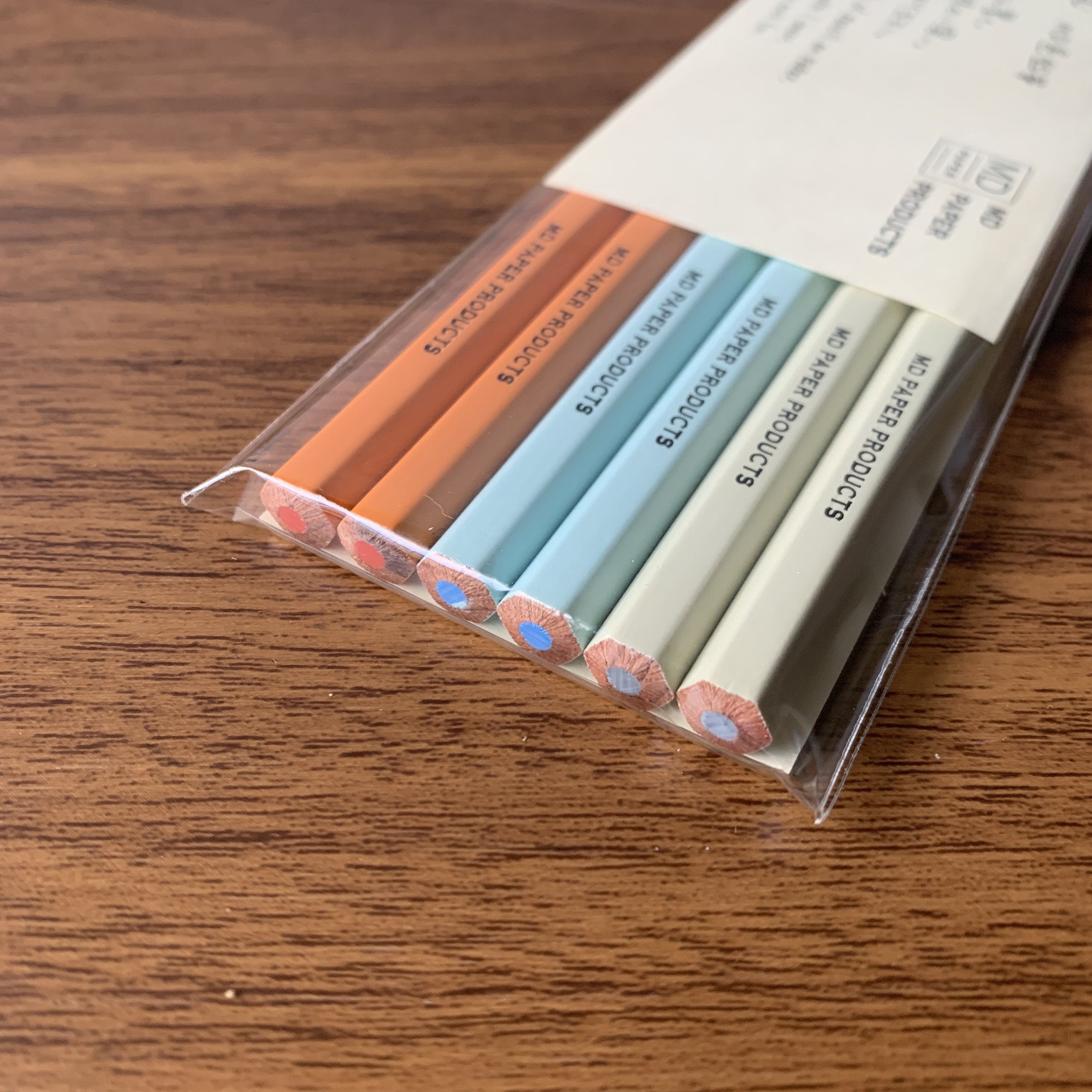
We’re still sorting and posting a huge restock of Midori, including a huge lot of MD and MD Cotton writing pads, as well as Clairefontaine A5 Clothbound notebooks and Triomphe paper. We’ve substantially built out our stock of high-quality graphite pencils and erasers over the past several weeks, and of course have restocked on the ever-popular Caran d’Ache 849 ballpoints, rollerballs, and Fixpencils!

Caran d'Ache
Caran d'Ache
Soumkine Planners
Soumkine Planners
Midori MD
Midori MD
Pencils
Pencils

Introducing T.G.S. “From the Archives”!

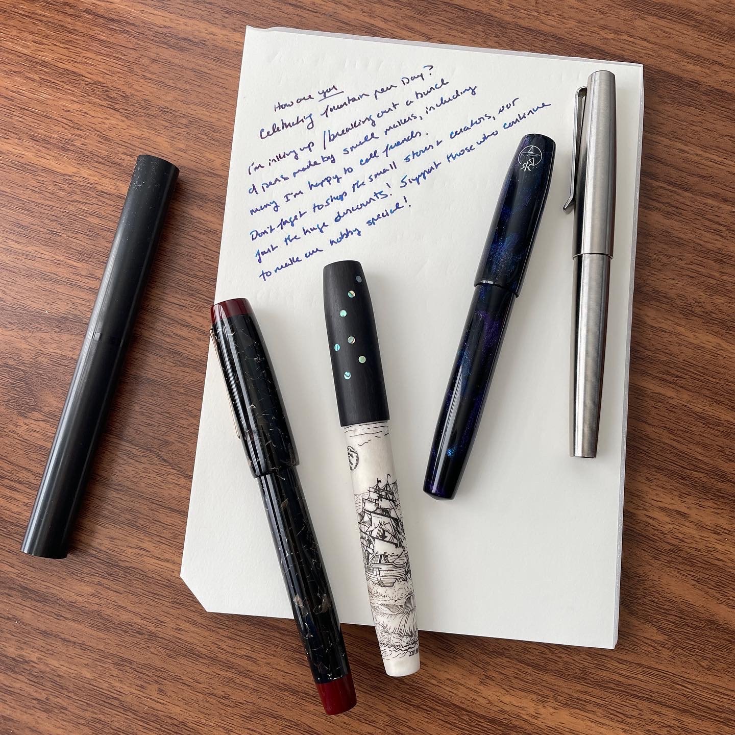
There’s a wealth of back content here at The Gentlemen Stationer (I have been writing this blog/website/whatever it is for eight years now, and much of it belies categorization in something like the Fountain Pen Review archive. I thought it might be fun - for me as much as you all - to dive into the back catalogue and pull out some of my favorite deep cuts. One per week, perhaps with a little bit of updated commentary as applicable. This week’s somewhat randomly selected choice is Travel Tips: Packing a Writing Kit for the Road, published in January 2020 before, well, “things happened.” Reading back through this brought up a lot of feelings, because I remember this extended trip well, and also because when I hit the road this past month I used a similar travel setup due to my recently purchased travel gear being essentially like new.
In LInks Tags Links
1 Comment

The More Things Change, The More They're The Same: The Visconti Homo Sapiens Revisited

March 26, 2022

Back in 2017, I reviewed a Visconti Homo Sapiens “Dark Ages” fountain pen that I purchased at the D.C. Pen Show, and while my impressions of the pen were generally favorable, I ultimately moved on from it due to usability concerns. The 23k Palladium nibs that Visconti used at the time wrote far too wet for my preference, making it extremely difficult for me to use the pen at work, even with an “extra fine” nib that Mike Masuyama had ground down even further. Though it wasn’t a particularly difficult decision to sell this pen, I still found myself admiring the Homo Sapiens, with its comfortable size and shape and unique texture. When I saw that Visconti had moved away from Palladium nibs and back to 18k gold, I snagged a standard “Bronze Age” pen on sale. While the experience hasn’t been perfect, I do intend to keep this pen as part of my personal collection.

For the most part, my previous review of the Visconti Homo Sapiens remains accurate, and I would encourage you to start there for background on the pen design and overall usability and build quality. In short, the pen itself has not changed, other than Visconti has now made it available in many new materials. As noted above, however, I wanted to take the opportunity to update the review to reflect the new nib, as well as updated impressions of the filling mechanism now that I have a Visconti Traveling Inkwell.

The Visconti Homo Sapiens 18k nib. Certain of the new models have a 14k, but the Bronze Age is 18k.

Visconti Should Stick with the 18k Nib

In my personal opinion, the 18k gold nib is a huge upgrade over the previous Palladium “Dreamtouch” nib, at least for those of us who use our fountain pens for everyday writing. While still a wet writer, the 18k nib writes a much more usable, consistent line, and I’ve not experienced nearly the same amount of bleed-through as with the Dreamtouch. That said, my “extra fine” Visconti nib lays down what I would consider a “fine-medium” line, or even what many might consider a medium in a Japanese pen. If you like to go much narrower with your nib sizes, you’ll need to have the nib ground. (More on that below.)

The “extra fine” nib on the Visconti Homo Sapiens writes a broader line than some might expect.

The Visconti Homo Sapiens is a large pen, and doesn’t post. I find the combination of size and material extremely comfortable to use.

The Visconti Traveling Inkwell Is a Recommended Add-on Purchase

If you recall from my previous review, one of the critiques I had about the Homo Sapiens was ink capacity. Despite Visconti’s use of the vacuum “Power Filler,” it was hard to get a full fill. For example, I was barely able to get the filling system to take more than 1ml of ink - little more than a standard converter. While there are many tips and tricks that people use to get more ink into their Homo Sapiens fountain pens, the best method is to use Visconti’s Traveling Inkwell, which creates a seal around the section and allows you to invert the inkwell above the pen while you’re filling, maximizing the volume drawn into the barrel. (Just remember to hold on tight, lest you inadvertently create an “ink rocket”.) Since I last reviewed the Homo Sapiens, I’ve picked up a Traveling Inkwell, and I can confirm that it does maximize the ink capacity. While the pen still doesn’t hold as much ink as the Pilot Custom 823 or even the TWSBI Vac700R, you won’t need to refill as often, a point helped by the fact that the pen no longer has the ink-gushing Dreamtouch nib.

The Visconti Traveling Inkwell in action (shown here with a TWSBI Vac700R)

Alas, Visconti Nib Quality Control Remains Maddeningly Inconsistent

When Visconti switched from the Palladium nibs to the 18k, there was hope that it would improve the consistency in the “out of the box” writing experience. I had no such luck, and still had to have the 18k nib adjusted by Mark Bacas (who discovered that the tines were actually bent into a “wave” shape). While the pen is an exceptional writer now, it still required an after-market nib adjustment, which at this price point simply should not happen. The Homos Sapiens Bronze Age pictured here retails for $895 MSRP, with most retailers selling for around $715 street price. It is entirely unacceptable for a pen at this price point to have serious nib issues, especially things like bent tines, and even though Visconti accepts returns, I always end up avoiding the delay and inconvenience by simply sending the pen off for work myself, especially where there’s no guarantee that the replacement pen will write any better.

Look, I’m not a Visconti “hater”, even if I’m not a Superfan. I have no axe to grind agains the company, and I enjoy their designs, with two expensive pens in my personal collection that I purchased with my own money. Moreover, my experience is consistent with other reviewers. It still frustrates me, however, to see the price of these pens climb ever higher without corresponding improvements in quality control, with the company likely banking on the fact that people will like the unique designs enough to overlook the continued nib inconsistency. Nib issues on Visconti pens have persisted for years, and even it QC is anecdotally “better” with the gold nibs than it was with the Dreamtouch, Visconti has a long way to go. Yesterday I did an unofficial (and admittedly unscientific) Instagram poll, and 36 out of the 60 respondents reported that their Visconti did not write correctly out of the box (approximately 60%). Is that possibly overstated? Sure, since there’s a bias towards those who experienced problems with a product being more willing to report an issue than people who didn’t. But that’s a lot of people who bought expensive pens, and it does reflect my own experience. The three Viscontis that I’ve purchased myself (disregarding those sent to me specifically for review) all required nib adjustments for issues ranging from the minor (inconsistent flow/baby’s bottom) to the major (bent tines). As one nib worker messaged me in response to my post, “Visconti keeps me in business.”

The finish on my Visconti Bronze Age is already developing a patina, which will look even better as time goes on.

Takeaways and Overall Impressions

I guess it’s true that “the more things change, the more they stay the same.” While Visconti has updated the Homo Sapiens to include new colors and materials, and has moved to a gold nib that I find much more usable and pleasant to write with than the old Palladium Dreamtouch, it’s hard for me to recommend that anyone purchase a Homo Sapiens new, unless a nib adjustment is included with the purchase. Viscontis can be exceptionally good pens, and their designs are gorgeous, but if you’re looking to make this kind of investment you will be better served, in my opinion, by purchasing on the secondary market and budgeting for a nib adjustment. The Visconti Homo Sapiens Bronze Age shown here, as noted, retails for around $715 and can be found at most authorized Visconti dealers.

The Visconti Homo Sapiens compared to the Montegrappa Extra 1930 (right), and the Lamy 2000 (left).

I purchased this pen with my own funds, for my own personal use. I was not compensated for this review, and this post does not contain third-party affiliate links. The Gentleman Stationer is supported entirely by purchases from the T.G.S. Curated Shop and the T.G.S. Patreon Program.

In Pens Tags Visconti Homo Sapiens, Visconti, Fountain Pens, Pen Review
8 Comments

Join the Dark Side: Grades of Pencil Graphite from HB to 4B

March 23, 2022

Over the years you tend to settle into those stationery products that really work for you in your day-to-day life, especially with consumable items like pencils. I go through a fair number of pencils regularly, and as I’ve been cleaning up TGS HQ in preparation for some renovation work, I’ve been taking stock of what I’m using most as measured by what’s on my desk and, with regard to pencils, what’s clearly been sharpened dozens of times. On the pencil front, I definitely have a strong preference for darker graphite.

Understanding the Graphite Scale

Here in the United States, we’re accustomed to seeing pencils designated in grades numbered “1-4”, starting with the No. 1 pencil as the softest option available and the “No. 2” as the standard writing or office pencil. (No. 3 and No. 4 pencils feature much harder cores and lighter lines, and are actually fairly difficult to find in the wild.) Once you break into the world of specialized pencils, however, you realize that the subtle variations are endless.

Outside of the United States (and increasingly inside the U.S.), graphite pencils are graded on a more detailed “HB”oriented scale, which measures the ratio of graphite and clay in the core. For example, an “HB” pencil is balanced between clay and graphite, and typically serves as your No. 2 equivalent. From there, pencils are graded as “B” through “10B” for softer, darker pencils that contain more graphite, and H through 10H for harder, lighter pencils that contain more clay. (Of course, there’s also the outlier “F” pencil, which is the equivalent of the rare “2.5” pencil and sits somewhere between HB and H.) For the uninitiated, this grading system can be quite confusing, especially if all you’re looking for is a writing pencil that’s slightly harder or slightly darker than a standard No. 2/HB.

While you can definitely see the progression in darkness as you move up the “B” scale, there are slight variations between brands. For example, the Camel 2B is slightly lighter than the dark Mitsubishi Hi-Uni 2B.

Which Pencils Do I Use for Actual Writing? F through 4B

For the best balance of smoothness and legibility, I prefer pencils that fall on the darker side of the “HB” designation, typically a 2B pencil. (You may recall that I stocked up on a bulk order of 2B pencils back in November.) As long as I use paper with a bit of texture, which tends to hold graphite better, I don’t necessarily have issues with smearing, especially if I’m using a higher quality pencil from Tombow, Uni-Mitsubishi, or Caran D’Ache. That said, I’m willing to live with a touch of smeariness in exchange for a darker line, hence why I will even use 3B/4B pencils that many people find too soft for everyday writing. I also find sharpening pencils to be relaxing and a good “focus point” if I need to take a break at work, so the need to sharpen softer pencils more frequently doesn’t bother me.

On the harder side of the scale, I find “H” and up too light and scratchy for everyday writing. In addition to legibility problems, the feel of harder graphite doesn’t appeal to me. I will occasionally use an “F” grade pencil if I know that I want to be writing somewhere without ready access to a sharpener.

You can tell which pencils see the most use by the length and the “teethmarks” from my Carl Angel 5 sharpener.

Favorite Soft Graphite Pencils

In addition to the Camel 2B, which I wrote about late last year, favorite soft-graphite pencils include the Mitsubishi Hi-Uni 2B, the Staedtler Noris 2B, the Tombow 2558 in B, and the Caran D’Ache Edelweiss in 3B. While I can’t actually peg the grade (since Blackwing doesn’t disclose it), the “Soft” original Blackwing is said to be around a 4B, and I regularly use that pencil for writing. Though it still requires a fair bit of sharpening, it has remarkable point retention and a lack of smeariness for graphite that soft.

Further Reading

For a comprehensive overview of graphite grades and the history behind the “grading system,” as well as years of back content full of pencil knowledge, check out this post from C.W. Pencil Enterprise back in 2018. Their archived site is generally an excellent source of information, even if the store itself is no longer open.

This post does not contain paid third-party affiliate links. Though some of the pencils here are available among the selection of pencils featured in the T.G.S. Curated Shop, others are linked to manufacturers and retailers who have not paid any compensation for being featured here. The Gentleman Stationer is supported entirely by purchases from the T.G.S. Curated Shop and the T.G.S. Patreon Program.

In Pencils Tags Pencils, Graphite Grades, 2B Pencils
2 Comments

Midori MD Cotton Paper is one of my favorite all-purpose options, including for letter writing.

Shop Update: Paper for Letter Writing

March 22, 2022

Even though I failed to get my act together in time to participate in NaNoWriMo last month, I’ve tried to do better with my letter writing, especially now that I have access to a ready stream of paper that’s more appropriate for casual letter writing. I’ve never been one for dedicated “stationery sets,” other than correspondence cards that people have sent me over the years, preferring to rely on standard writing pads that offer more writing space. (Hey, when I do write letters, they tend to be longer.) If you’ve ever received a letter from me, you’ll know that I prefer three types of paper: Clairefontaine Triomphe, Midori MD Cotton, and standard 52gsm Tomoe River paper (which is currently hard to source due to manufacturing changes). What do I like about these specific papers? They’re all “standard” enough to be both readily available and reasonably priced, while still maintaining that classic “vintage stock” feel that’s nicer than a standard legal pad, for both the writer and the recipient.

We’re happy to carry most of these papers in the shop, along with a few other quirky options.

Bright-white Clairefontaine Triomphe paper really shows off the ink!

Clairefontaine Triomphe

Available in both blank and lined formats, I would call Clairefontaine Triomphe my workhorse letter-writing paper of choice, since it’s both readily available, inexpensive, and ink-friendly. I love that it’s sold in bound writing pads, so you can use it for general writing and notetaking as well as correspondence. Available now in both A4 and A5 sizes, starting at only $5 USD.

Midori MD Writing Pads (MD Cotton and MD Standard)

If you favor more absorbent paper than Clairefontaine, or if you sometimes enjoy using pencils to write your letters, Midori MD Writing Pads are an excellent option. The unlined MD Cotton Paper has the best overall feel of any writing paper out there (in my opinion) and my only regret is that they don’t make it with a ruling. At the end of the day, I’ve simply adapted to using unlined paper. As I’ve mentioned before Midori MD pads are excellent for letter writing, and they can pull double-duty as a desk pad since they are bound on two sides and can be turned into a landscape orientation to fit beneath a keyboard. Available in both A4 and A5 sizes, starting at $10 for MD Cotton and $12 for standard Midori MD.

Life Noble Note and Bank Paper

While Japanese Stationery Company “Life” sits outside the stationery mainstream, receiving less attention than peers like Midori, many people find their paper equally as good and it’s developed a cult following. Their “Noble Note” 100-sheet writing pads come in blank, lined, and grid rulings. Personally, I find Life’s standard paper to behave closest to standard Midori MD, though perhaps with a bit more texture? If you favor toothier, more absorbent paper, check out their heavier, vintage-style Bank Paper. Available in A4 size, starting at $26 for a 100-sheet pad of Noble Note, and $28 for a 100-sheet pad of Bank Paper.

WMS & Co. ColorPads

Though color-coated paper is extremely hit or miss with fountain pens, I’ve had a lot of fun lately sending notes on the ColorPads from WMS & Co, mainly using ballpoint pen and pencil. (Colored Pencil looks exceptionally good on the grey paper.) I have one of the “Large Square” ColorPads on my desk at work, which I use for both taking notes and sending professional correspondence (thank-yous, cover notes, etc.). The best part is that all of the WMS & Co desk pads contain a minimum of 185 sheets of paper, so they’ll basically last forever. Available from $25.

WMS & Co makes writing pads in a variety of shapes and sizes. I’ve been using the large square ones (center) for work cover notes and casual correspondence.

Disclaimer: The T.G.S. Curated Shop is an authorized retailer of all brands shown here. The Gentleman Stationer is supported entirely by purchases from the T.G.S. Curated Shop and the T.G.S. Patreon Program.

In Editorial, Paper Products, TGS Curated Shop Tags Letter Writing, Writing Pads, Paper
Comment

Getting caught up on shipping will be a bit of a project for today!

Sunday Reading for March 20, 2022

March 20, 2022
  1. 2022 Baltimore Pen Show Recap and Report Card (via Pen Addict). Kimberly has her own incredibly thorough Baltimore recap. I still can’t get over the number of nib workers available, and the fact that all of them stayed busy!

  2. The Onoto Scholar Was Worth The Wait (via UK Fountain Pens). Onoto moves in to a lower price point, while keeping the major design touches that people love.

  3. Sunday Shorts #1: Journaling (A Fleeting Ripple). If you aren’t reading this blog, give it a glance. I love these sorts of “origin story” posts.

  4. Deciding What I Want in a New Gel or Ballpoint Pen (via mnmlscholar). I’ve also moved on from the Schmidt 8127, due to bleed-through issues on some paper I use. I’ve really grown to appreciate needle-tip ballpoints or hybrid gel-ballpoint pens like the Jetstream.

  5. Ink Review: Monarca Part II (via Well-Appointed Desk). Arena Blanca needs to be inked up as soon as possible. I understand it was a huge seller at the Baltimore Pen Show.

  6. Endless Explorer Refillable Leather Journal (via Rants of the Archer). So Endless is getting in to the Traveler’s-Style notebook game as well, sized to fit their “Storyboard” notebooks.

  7. Asvine v169 (via Dapprman). For those looking to try out a “Skeleton-style” pen without breaking the bank, if you’re willing to make concessions on quality control.

  8. Rhodia Goalbook Ivory and White Paper Comparison and Review (via Fountain Pen Love). The Rhodia “Goalbook” is an interesting take on their classic Webbie, featuring upgraded Rhodia “R” paper, which I’ve never tried. Put this on the experiment list!

In Case You Missed It… This Week on the Blog

My travels didn’t end at the Baltimore Pen Show. I continued on to meet my family in Washington, D.C. for a few days of Spring Break, followed by a three-day work conference in New Orleans. (No, I didn’t get a chance to visit Papier Plume, unfortunately.) I did manage to post my recap of the 2022 Baltimore Pen Show, as well as a short piece on my Travel Carry, in which I discuss my latest bag addition, which I had to pick up in D.C. since my checked luggage was overweight. (Hey, if I’m on the hook for multiple flights’ worth of overweight bag charges, I might as well have a new bag.) Upon my return, I rounded out my Baltimore Show posts with some pictures of my latest Franklin-Christoph additions, including a full shot of my Franklin-Christoph collection and the models I tend to enjoy.

The T.G.S. Curated Shop is Shipping and Back to Normal!

I’m absolutely floored by the level of support you all showed when we were away, despite the delay in receiving your orders. We’re busy shipping all of your orders and I hope to be completely caught up by tomorrow morning with everything in the mail. All orders placed while I was away will include extra stickers, pencils, pins, and possibly more if you were kind enough to place a really big order! In the meantime, we received a large Midori restock that includes favorites such as the Midori MD and Midori MD Cotton Writing Pads in both A4 and A5, along with additional Dot Grid versions of both the A5 Notebook Journal and the A5 Codex!

Midori Pencils
Midori Pencils
Midori Paper
Midori Paper
Caran d'Ache
Caran d'Ache
Fountain Pen Friendly Paper

Consider Joining TGS Patreon for Access to Monthly Meetups and First Dibs on Gently Used Stationery, Exclusive Products and More!

For some additional fun, and to help support the blog consider joining the Patreon program. Patreon supporters receive special pricing and early access to product releases and collaborations such as the T.G.S. x Sunderland pen, in addition to other benefits. You can read more about T.G.S. Patreon here. This year I’ve introduced monthly online meetups, which take place on Friday or Saturday and have been super enjoyable. The Patreon membership also has “first dibs” on my regular gently used stationery sales, before whatever is left becomes available to the general readership.

In LInks Tags Links
Comment
← Newer Posts Older Posts →
Check Out Our New Online Shop!
Store Hours and Events
Updated 2026 "Best Pens" Guide
No results found
On The Paper Trail: Live In Nashville Event Tickets Now Available!
TGS_25 Roterfaden Restock Notification
Hierarchies of Fountain Pen Friendly Paper

Join Our Patreon!
Subscribe to the TGS E-mail List

Featured Posts

Featured
On-The-Paper-Trail-Live-In-Nashville.jpeg
October 21, 2026
Running Our First Stationery Event: A Retrospective on the "On The Paper Trail Live in Nashville" Weekend!
October 21, 2026
Read more →
October 21, 2026
Roterfaden-TGS-25.jpeg
October 13, 2026
New Arrivals: Roterfaden Restock, Kaweco DIY, and On The Paper Trail Live in Nashville Update!
October 13, 2026
Read more →
October 13, 2026
Mongol-Pencil-Incense-Cedar-New-Release.jpeg
October 3, 2026
Hands-on with the New Mongol Pencil, Plus My Current Top 5 Woodcase Pencils for Everyday Writing
October 3, 2026
Read more →
October 3, 2026
The Gentleman Stationer RSS

© Digital Divide Media, LLC, 2014-present.

All content is the exclusive property of Digital Divide Media, LLC, d/b/a The Gentleman Stationer, including “The Gentleman Stationer” website and trademark, and should not be reproduced without express written permission.  All rights reserved.

All content containing paid advertising, affiliate links, or sponsored content will be plainly disclosed by a disclaimer when/if featured.

Contact Information

Website Terms and Conditions

Privacy Policy and Cookie Policy

Accessibility Statement

Legacy Account Login

Powered by Squarespace