• Blog
  • Shop
  • Resources
  • FAQ (Ask TGS)
  • About
  • Archive
  • Contact
  • Sign In My Account
Menu

The Gentleman Stationer

Vintage Living in the Modern World.
  • Blog
  • Shop
  • Resources
  • FAQ (Ask TGS)
  • About
  • Archive
  • Contact
  • Sign In My Account

The More Things Change, The More They're The Same: The Visconti Homo Sapiens Revisited

March 26, 2022

Back in 2017, I reviewed a Visconti Homo Sapiens “Dark Ages” fountain pen that I purchased at the D.C. Pen Show, and while my impressions of the pen were generally favorable, I ultimately moved on from it due to usability concerns. The 23k Palladium nibs that Visconti used at the time wrote far too wet for my preference, making it extremely difficult for me to use the pen at work, even with an “extra fine” nib that Mike Masuyama had ground down even further. Though it wasn’t a particularly difficult decision to sell this pen, I still found myself admiring the Homo Sapiens, with its comfortable size and shape and unique texture. When I saw that Visconti had moved away from Palladium nibs and back to 18k gold, I snagged a standard “Bronze Age” pen on sale. While the experience hasn’t been perfect, I do intend to keep this pen as part of my personal collection.

For the most part, my previous review of the Visconti Homo Sapiens remains accurate, and I would encourage you to start there for background on the pen design and overall usability and build quality. In short, the pen itself has not changed, other than Visconti has now made it available in many new materials. As noted above, however, I wanted to take the opportunity to update the review to reflect the new nib, as well as updated impressions of the filling mechanism now that I have a Visconti Traveling Inkwell.

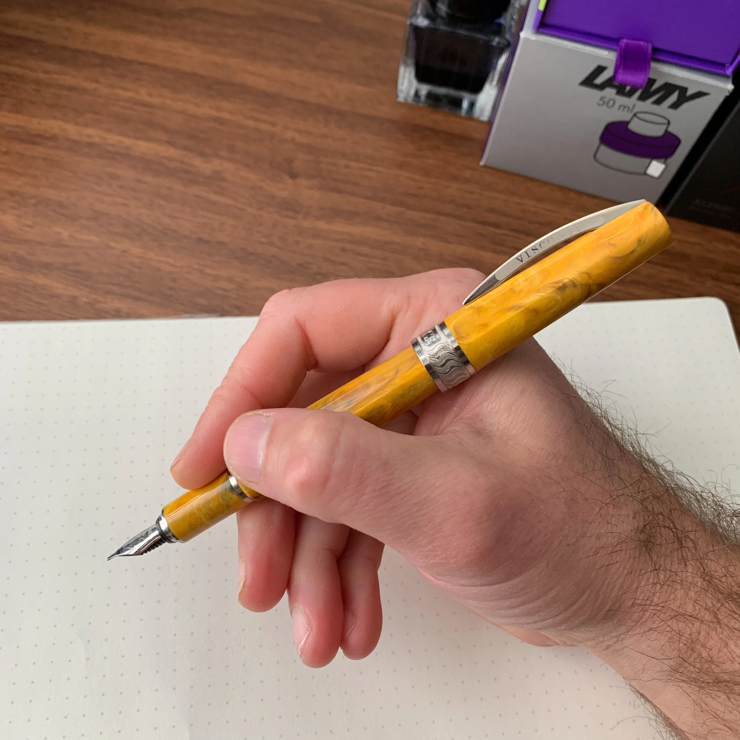
The Visconti Homo Sapiens 18k nib. Certain of the new models have a 14k, but the Bronze Age is 18k.

Visconti Should Stick with the 18k Nib

In my personal opinion, the 18k gold nib is a huge upgrade over the previous Palladium “Dreamtouch” nib, at least for those of us who use our fountain pens for everyday writing. While still a wet writer, the 18k nib writes a much more usable, consistent line, and I’ve not experienced nearly the same amount of bleed-through as with the Dreamtouch. That said, my “extra fine” Visconti nib lays down what I would consider a “fine-medium” line, or even what many might consider a medium in a Japanese pen. If you like to go much narrower with your nib sizes, you’ll need to have the nib ground. (More on that below.)

The “extra fine” nib on the Visconti Homo Sapiens writes a broader line than some might expect.

The Visconti Homo Sapiens is a large pen, and doesn’t post. I find the combination of size and material extremely comfortable to use.

The Visconti Traveling Inkwell Is a Recommended Add-on Purchase

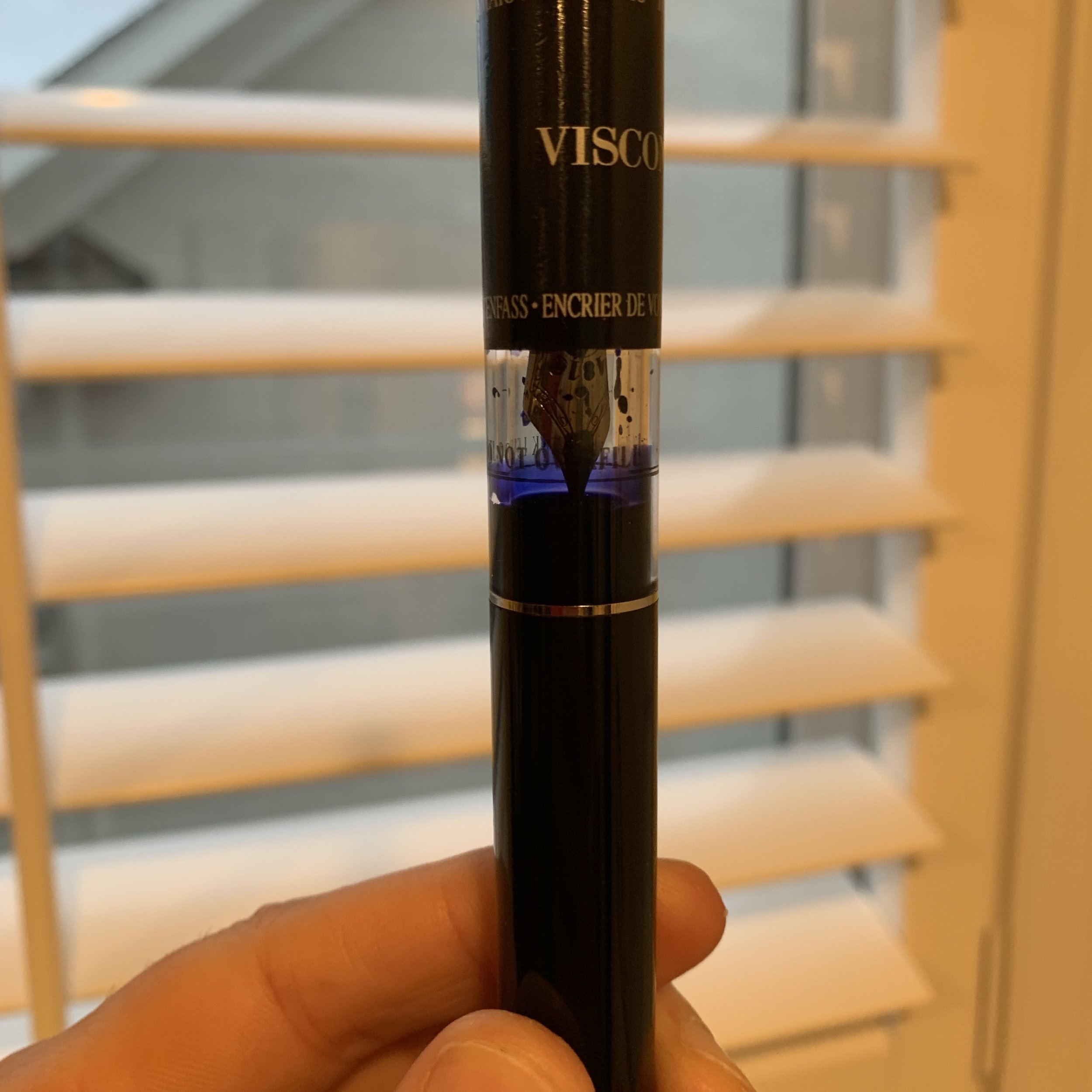
If you recall from my previous review, one of the critiques I had about the Homo Sapiens was ink capacity. Despite Visconti’s use of the vacuum “Power Filler,” it was hard to get a full fill. For example, I was barely able to get the filling system to take more than 1ml of ink - little more than a standard converter. While there are many tips and tricks that people use to get more ink into their Homo Sapiens fountain pens, the best method is to use Visconti’s Traveling Inkwell, which creates a seal around the section and allows you to invert the inkwell above the pen while you’re filling, maximizing the volume drawn into the barrel. (Just remember to hold on tight, lest you inadvertently create an “ink rocket”.) Since I last reviewed the Homo Sapiens, I’ve picked up a Traveling Inkwell, and I can confirm that it does maximize the ink capacity. While the pen still doesn’t hold as much ink as the Pilot Custom 823 or even the TWSBI Vac700R, you won’t need to refill as often, a point helped by the fact that the pen no longer has the ink-gushing Dreamtouch nib.

The Visconti Traveling Inkwell in action (shown here with a TWSBI Vac700R)

Alas, Visconti Nib Quality Control Remains Maddeningly Inconsistent

When Visconti switched from the Palladium nibs to the 18k, there was hope that it would improve the consistency in the “out of the box” writing experience. I had no such luck, and still had to have the 18k nib adjusted by Mark Bacas (who discovered that the tines were actually bent into a “wave” shape). While the pen is an exceptional writer now, it still required an after-market nib adjustment, which at this price point simply should not happen. The Homos Sapiens Bronze Age pictured here retails for $895 MSRP, with most retailers selling for around $715 street price. It is entirely unacceptable for a pen at this price point to have serious nib issues, especially things like bent tines, and even though Visconti accepts returns, I always end up avoiding the delay and inconvenience by simply sending the pen off for work myself, especially where there’s no guarantee that the replacement pen will write any better.

Look, I’m not a Visconti “hater”, even if I’m not a Superfan. I have no axe to grind agains the company, and I enjoy their designs, with two expensive pens in my personal collection that I purchased with my own money. Moreover, my experience is consistent with other reviewers. It still frustrates me, however, to see the price of these pens climb ever higher without corresponding improvements in quality control, with the company likely banking on the fact that people will like the unique designs enough to overlook the continued nib inconsistency. Nib issues on Visconti pens have persisted for years, and even it QC is anecdotally “better” with the gold nibs than it was with the Dreamtouch, Visconti has a long way to go. Yesterday I did an unofficial (and admittedly unscientific) Instagram poll, and 36 out of the 60 respondents reported that their Visconti did not write correctly out of the box (approximately 60%). Is that possibly overstated? Sure, since there’s a bias towards those who experienced problems with a product being more willing to report an issue than people who didn’t. But that’s a lot of people who bought expensive pens, and it does reflect my own experience. The three Viscontis that I’ve purchased myself (disregarding those sent to me specifically for review) all required nib adjustments for issues ranging from the minor (inconsistent flow/baby’s bottom) to the major (bent tines). As one nib worker messaged me in response to my post, “Visconti keeps me in business.”

The finish on my Visconti Bronze Age is already developing a patina, which will look even better as time goes on.

Takeaways and Overall Impressions

I guess it’s true that “the more things change, the more they stay the same.” While Visconti has updated the Homo Sapiens to include new colors and materials, and has moved to a gold nib that I find much more usable and pleasant to write with than the old Palladium Dreamtouch, it’s hard for me to recommend that anyone purchase a Homo Sapiens new, unless a nib adjustment is included with the purchase. Viscontis can be exceptionally good pens, and their designs are gorgeous, but if you’re looking to make this kind of investment you will be better served, in my opinion, by purchasing on the secondary market and budgeting for a nib adjustment. The Visconti Homo Sapiens Bronze Age shown here, as noted, retails for around $715 and can be found at most authorized Visconti dealers.

The Visconti Homo Sapiens compared to the Montegrappa Extra 1930 (right), and the Lamy 2000 (left).

I purchased this pen with my own funds, for my own personal use. I was not compensated for this review, and this post does not contain third-party affiliate links. The Gentleman Stationer is supported entirely by purchases from the T.G.S. Curated Shop and the T.G.S. Patreon Program.

In Pens Tags Visconti Homo Sapiens, Visconti, Fountain Pens, Pen Review
7 Comments

Pen Review: Visconti Mirage Fountain Pen

November 13, 2019

Last year, Visconti introduced several lower-priced products into their lineup, in an attempt to diversify away from the ultra-high end pens for which the brand has become known. Until now, even Visconti pens with steel nibs approached $200, but the new Visconti Breeze and Visconti Mirage are both consistently priced at a much lower, and, dare I say it, almost entry level price point? The Breeze can be found at sub-$100, depending on your retailer, and Visconti has emerged as a player in a segment of the pen market that is becoming increasingly competitive.

I love the resin on this pen. Previously, to get pens in similar patterns you would have to shell out for a Visconti Van Gogh or a Visconti Rembrandt.

The pen featured in this review is the Mirage - priced slightly higher than the Breeze - and it presents quite a bit of value. Here, Visconti has managed to offer a quality writer at a reasonable price, while still incorporating the luxury spirit of the brand and retaining the brand’s hallmarks, such as the iconic Visconti clip. My favorite aspects of this pen include:

  • Material. Appelboom sent me the “Amber” Mirage to review, and it’s made from a beautiful vegetal resin reminiscent of some of the Visconti Van Gogh pens, specifically my “Vincent’s Chair” edition, though this material has a touch more orange/brown to it. The body of the pen features a soft hexagonal design that is comfortable to hold, and the rounded facets, combined with the clip, make this a great pen for work because it’s not going to roll off a desk.

  • Cap Design. I love how Visconti still includes its signature “Arc” clip on these lower-priced pens. Though some people react strongly to the shape, I’m a fan, and I think the clip adds a lot of sophistication to what would otherwise be a relatively ordinary pen design. The cap also features a magnetic twist closure, which feels quite secure with no wiggle when capped. The one feature of the Mirage I could do without is the oversized cap band, which I found a bit much, especially the word “MIRAGE” written across the front.

  • Nib. In terms of an out-of-the-box writing experience, I’ve found that Visconti’s steel nibs write better than their much more expensive palladium offerings. Though the steel nibs sometimes need a bit of smoothing, they aren’t so wet as to be unusable on anything but the most fountain-pen friendly paper, which is the issue I’ve had with more expensive Visconti pens. The steel nib on this Mirage is an excellent writer, but I do wish Visconti had opted for a larger No. 6 nib instead of this No. 5. It always strikes me as a bit awkward to have a smaller nib on a full-size pen.

If Visconti is going to go with this oversized cap band, why not continue the etching all the way around and omit the “Mirage” engraving? I don’t mind subtle branding, and “Visconti” etched on the clip doesn’t set me off, but there’s no need to go further than that.

View fullsize Visconti Mirage Posted
View fullsize Visconti Mirage Unposted
View fullsize Visconti Mirage Nib
View fullsize Visconti Mirage Writing Sample

Takeaways and Where to Buy

I only had a brief time with the Mirage, since it was sent to me on loan from Appelboom and needs to go home to the Netherlands, but I came away impressed. I’m glad to see Visconti expand their lineup to include a wider variety of pens at different price points, and I hope this trend continues, especially if they can maintain consistent quality control. Visconti’s signature “Arc” clip immediately makes the Mirage look like a much more expensive pen, and if you’re a fan of Visconti’s designs, this pen would be a great introduction to the brand. Personally, the biggest thing holding me back from acquiring a Mirage for my own personal collection is the nib, which writes quite well but in my opinion looks disproportionately small on the pen.

You can purchase the Visconti Mirage from our sponsor Appelboom, currently priced at around $130, depending on the exchange rate. The Mirage comes in six different colors: Amber, Azure Blue, Coral, Emerald Green, Horn Grey, and Night Blue. Appelboom also carries the full range of Visconti pens, including the Breeze, the flagship Homo Sapiens, and a wide array of limited and special editions.

Disclaimer: Our sponsor Appelboom loaned me this pen for review purposes, free of charge. This post may contain affiliate links. Many thanks to Appelboom for making this review possible.

In Pens Tags Pen Review, Visconti, Visconti Mirage, Appelboom
Comment

Traveling with Fountain Pens: Do You Need a Traveling Inkwell?

January 24, 2019

Everyone who writes for the pen community gets questions about the ins and outs of traveling with fountain pens. One topic that comes up frequently is the question of filling from a bottle when you’re on the road, especially for an extended period of time. This issue doesn’t arise much for me - my work trips tend to be 2-3 days in most cases, and two fountain pens filled to capacity will easily last me that long. That said, I know there are readers out there who travel for a week or longer at a time, and may need to consider a piece of fountain pen-specific travel gear: a traveling inkwell or ink pot. Also, if you favor piston-fillers with larger nibs, such as the Pelikan M800 or the Montegrappa Extra 1930, or pens like the Visconti power-fillers that are just difficult to fill to capacity, these devices can be quite useful and will make it easier for you to get a full fill of ink.

You’re pretty much limited to two options: the Visconti Traveling Inkwell or the Pineider Pen Filler Inkwell. Visconti created this highly specialized piece of equipment years ago, in 1997, so the idea has been around for quite some time. After Visconti founder Dante Delvecchio left the company to join Pineider, Pineider released their own version, which holds 5ml more ink than the Visconti and costs less than half the price. (The Visconti Traveling Inkwell holds 5ml of ink, and the Pineider Pen Filler holds 10ml.)

Fill ‘er up! It’s hard to see, but both the Visconti Traveling Inkwell and the Pineider Pen Filler feature a rubber gasket on the inside that forms a seal.

Using these inkwells are fairly simple once you grasp the concept, which can seem confusing and a bit counterintuitive (not to mention risky) at first. To start, you remove the cap of the inkwell and fill with your ink of choice to the indicator line, using the supplied eyedropper (or your own syringe or pipette).

When you’re ready to fill, Insert the pen and press gently until you feel the pen come to a stop. The section should form a secure seal against the rubber gasket inside the inkwell, allowing you to invert the inkwell (yes, you heard me correctly) while you turn the piston or converter. You will get a full fill of ink into most pens, which to me is the primary selling point of these contraptions. Note: for vacuum fillers, make sure your seal is TIGHT and hold onto the inkwell securely when you depress the plunger to fill the pen. Otherwise, you may get the “rocket effect” when the inkwell (and all of the ink in it) goes sailing across the room, coating your walls, carpet, etc. It may also be preferable to try outside for the first few times until you get the hang of it.

Check out how much ink I was able to get into a Montblanc 146! The best part? Hardly any ink on the section afterwards. You’ll only have to wipe off the nib and the very end of the pen where the ink meets the feed.

View fullsize Visconti Traveling Inkwell Before Filling
View fullsize Visconti Traveling Inkwell After Filling

In terms of actual traveling, I’m honestly a little nervous about flying with these things, only because you’re technically supposed to put all liquids (including fountain pen inks) into single plastic bag in order to get past security. Both of these inkwells have a “stopper” closure, not a threaded cap, so I have some concern about leakage. For the record, the stopper on the Pineider inkwell feels a lot tighter and more secure than the Visconti. I’ve included pictures of the Pineider in action below, featuring a Sailor Pro Gear. I’ve never been able to get that much ink into a Sailor Converter without syringe filling!

View fullsize Pineider Ink Pot with Sailor Pro Gear
View fullsize Pineider Ink Pot Inverted

Takeaways and Where to Buy

I like both of these products, but perhaps not for their stated purpose of traveling. Rather, for me their true utility lies in the ability to swap favorite inks (mostly Sailors) from the hard-to-fill “flat” bottles into a different format that will let you use piston-fill pens with larger nibs, such as No. 8s. They’re also a great way to make sure your pens are filled to the brim if you’re preparing to leave on a trip or attend a class/meeting where you will have to do a lot of writing.

I acquired both of the inkwells featured in this review from Pen Chalet. The Visconti Traveling Inkwell is currently priced at $70 MSRP, with a street price of $56. While it’s certainly not inexpensive, I recall these being priced well north of $100 when they first came out several years ago. Pineider has priced their version lower at $25 MSRP / $20 street price, and to be honest it’s probably the product I would advise most people to buy. While its overall design lacks some of the elegance of the Visconti and feels a bit insubstantial, it’s the more practical choice for what’s going to be a relatively limited-use purchase for most people. I have, however, read reports that certain Visconti pens don’t fit well into the Pineider inkwell, specifically those with the “hook” closure system, so if you have a large Visconti collection stick with that brand.

Side Note: Though you will eventually run into the same problem as you do with ink bottles once the ink level gets too low, many people forego the traveling inkwell in favor of ink sample vials or the 4oz version of these smaller Nalgene bottles. In addition to being extremely inexpensive, the caps on both are quite secure and have survived many a trip through TSA screening.

Disclaimer: This post contains affiliate links. I purchased both inkwells featured in this review from our sponsor Pen Chalet using store credit generated through Pen Chalet’s affiliate program.

In Accessories Tags Inkwell, Traveling Inkwell, Visconti, Pineider, Pen Travel, Travel
2 Comments

Pen Review: Visconti Van Gogh "Vincent's Chair"

October 21, 2017

Visconti’s “Van Gogh” Impressionist Collection receives scant attention, at least as compared to the Italian company’s other flagship pens such as the Homo Sapiens and Divina. That’s a shame, because of all the Visconti pens I’ve had the opportunity to test out, this might be my favorite. (Sorry, Homo Sapiens Dark Ages.)  

Each pen in the Van Gogh series is cast from an acrylic resin specially mixed to match the palette of colors found in a Vincent Van Gogh painting, in this case, Vincent’s Chair. (Pens based on the works Starry Night, Shoes, Irises, and one of his self-portraits are also available, among others). Each piece is unique, and even those pens based on the same painting will still feature different swirls and patterns in the acrylic.

The Van Gogh packaging includes a reproduction of the original artwork on the inside flap of the leather box, so you can compare the colors in your pen to the painting that inspired it.

This particular Van Gogh features a very nice steel nib - actually, one of the best Visconti nibs out of the box that I’ve used. As I’ve mentioned in prior reviews, Visconti nibs can be supremely frustrating because the company’s quality control is all over the place. These pens sit at a very high price point, and of the three Visconti Pens that I’ve reviewed (Homo Sapiens Dark Ages, Rembrandt Back-to-Black, and this Van Gogh), all three required some sort of nib adjustment out of the box. Not exactly what you would expect when you are shelling out anywhere from $150-700 for a fountain pen.

The stainless steel nib on the Van Gogh is quite attractive, with the crescent-shaped breather hole and scrollwork. 

The stainless steel nib on the Van Gogh is quite attractive, with the crescent-shaped breather hole and scrollwork. 

In the case of this Van Gogh, the “nib work” required to get the pen in writing order was fairly minor: the tines were misaligned but I was able to easily push them back into place with my thumbnail after straightening out the feed. After this ten-second adjustment, the pen wrote exceptionally well: a wet medium line with no hard starts or skipping.

Note: I’m experienced with fountain pens, and consider a tine adjustment to be “minor” and something I can handle myself. I recognize that someone spending $200 on their first expensive fountain pen might not be so brave. For that reason, I generally do not recommend Visconti as a brand for beginners. Regardless, if you are considering purchasing a Visconti, purchase from a reputable retailer (like Goldspot) and specifically ask them to inspect the nib for you prior to shipment to avoid any problems on the front end.

The Van Gogh pens feature the patented Visconti clip, and have the name of the painting that inspired the pen engraved around the cap band. 

So what keeps bringing people back to Visconti, despite the temperamental nibs? The design, which always has a lot of personality to it and inspires strong opinions (positive and negative), particularly surrounding Visconti's larger clips. Those who enjoy Visconti design, however, demonstrate exceptional loyalty to the brand, and Visconti collectors/enthusiasts are well-represented in the pen community. Personally, I like the Visconti “Bridge Clip,” and the polished version here works especially well on the smaller, faceted Van Gogh pen. Yellow pens also tend to be hard to find, and I found this color combination on the “Vincent’s Chair” pen, with its swirls of blues and greens, especially attractive on the faceted barrel. The silver trim also sets off the acrylic nicely.

The Van Gogh also features a secure magnetic closure on the cap, and is compatible with Visconti’s “My Pen” personalization system, if that’s something that interests you.

The Van Gogh might end up as one of my preferred Visconti models. The compact size, light weight, and excellent nib (once adjusted) combine to form an extremely comfortable daily writer. The pen also posts well. While the pen has a metal section, I didn’t end up with a slippage problem, and this is something that bothers me less and less as I learn to not grip my pens so tightly. 

Takeaways and Where to Buy

You can purchase this Visconti Van Gogh Vincent’s Chair fountain pen, as well as the other pens in the Visconti Van Gogh Impressionist Collection, from Goldspot Pens. The Van Gogh sits around the midpoint of Visconti’s pricing scale at $289, which admittedly is on the high side for a steel-nibbed acrylic pen. That said, the effort required to mix and pair each resin with a particular Van Gogh painting likely took work and drove up the cost, so when viewing these pens from a cost/value perspective, it’s probably more appropriate to compare them to a custom pen like an Edison or a Newton, which sits around that same $300 price point.

I've posted this pic before I know, but to give you a sense of the size, here's the Visconti (far right) compared against (from right) a Pilot Vanishing Point, a Ryan Krusac Legend L-14, and a 3952 X800.

Many thanks to Goldspot for loaning me this pen for review. Overall, I’m sad to have to send this one back, but a Vincent’s Chair and/or Starry Night pen might be making its way into my collection in the future.

Disclaimer: Goldspot loaned me this pen free of charge for review purposes. 

In Pens Tags Visconti, Van Gogh, Pen Review
1 Comment

Pen Review: Visconti Rembrandt Back to Black Edition

July 26, 2017

Of all the major pen brands, Visconti might be the one with which I have the least amount of experience. I own one Visconti pen - the Homo Sapiens Dark Ages - but very few of their offerings have spoken to me to the point where I would be willing to pay the premium prices that most Visconti pens command. Sure, there are a few special and limited editions that have made my "someday" short list (i.e., something with the Wall Street celluloid), but what's kept me from diving into Visconti in the same way that I have with other brands is Visconti's reputation for having QC issues with their nibs. Given that Visconti's signature 23kt palladium "Dreamtouch" nibs are somewhat high-maintenance, I wanted to see how the company did with something more basic. Appelboom was kind enough to loan me a steel-nibbed Visconti Rembrandt "Back to Black" for review.  

Design and Build

The Visconti Rembrandt features a classic streamlined profile with very few adornments or flourishes, other than the finial and the engraved cap band. The most notable feature of the Rembrandt is the magnetic closure, which reminds me a bit of the cap on the Steel & Flint pocket pen in that it makes a slight "pop" when you cap/uncap it (though not as audible). The Rembrandt also features Visconti's signature spring-loaded "bridge" clip, modeled after the Ponte Vecchio in Florence, which appears on most other Visconti pens. People either love this clip or hate it - some think it looks ostentatious, but I find it to be one of the more understated elements of Visconti design, which can be ornate and a bit over the top. The clip doubles as an excellent roll-stopper.  

Visconti's signature "Bridge Clip"

Visconti clearly intended the Rembrandt to serve as a "workhorse" pen. It's nicely balanced and a comfortable writer that I was fine using either posted or unposted. Some might find the metal section slippery, though generally ruthenium plating tends to add some "grippiness." Also, note that there are NO THREADS on this pen due to the magnetic closure, allowing for maximum versatility in how you grip the pen (low, high, etc.). I don't generally have a problem with section threads hurting my fingers unless they're exceptionally sharp, but if this is something that regularly poses an issue for your, the Rembrandt may be worth checking out.

Visconti "My Pen" Finial

The Rembrandt features Visconti's "My Pen" system, which you can use to swap out the finial on the cap for a personalized initial, zodiac sign (yes, I'm not kidding), or birthstone.

View fullsize Visconti Rembrandt Back to Black
View fullsize Visconti Rembrandt Posted
View fullsize Visconti Rembrandt Unposted

Nib and Writing Experience

As much as I wanted to love this pen, things fell apart with the nib, which was dry and "squeaky," for lack of a better term. The pen wasn't necessarily scratchy, but I could definitely feel and hear a LOT of feedback from the nib. I suspect this is probably due to the coating applied to the steel nib to give it the "blacked out" look. I've experienced variations of the same thing with other coated or plated steel nibs, but not this severe.

If you're considering this pen (or really any Visconti, for that matter), I'd add $40-60 to the cost to cover your nib work. You may luck out and get one that writes perfectly out of the box, but you're just as likely (if not more likely) to get a dry writer, hard starter, or skippy pen. To illustrate how all over the place Visconti's nib QC can be, check out Matthew's review of a different, unplated Rembrandt nib over at Nib & Ink, where he had a completely different (positive) experience.  

This broad nib definitely needs to be smoothed and have the ink flow increased. The ink is Kaweco Paradise Blue. 

Takeaways and Where to Buy

While I appreciated the look, feel, and balance of the Visconti Rembrandt "Back to Black," the coated steel nib didn't do it for me, though at Appelboom's attractive pricing you may still have room in your budget for a nib tuning. If I were going to purchase this pen, I'd personally consider paying extra to upgrade to the 23kt Palladium "Dreamtouch" nib. While those have their own issues, and typically need some minor adjustments, they are capable of being outstanding writers with a lot of character. 

Appelboom is currently offering the Visconti Rembrandt Back to Black edition for $129 US (excluding VAT). The "Dreamtouch" upgrade to the 23kt palladium nib costs an extra $140. 

Disclaimer: This pen was loaned to me for review purposes by Appelboom. I was not otherwise compensated for this review, and all views expressed here are my own.

In Pens Tags Pen Review, Visconti, Visconti Rembrandt
2 Comments
Older Posts →
Store Location
Visit the T.G.S. Curated SHOP
*New* Updated "Best Pens" Guide (2025)
TGS x Hinze Pens Violet Tendencies Taschenstift Fountain Pen
Hierarchies of Fountain Pen Friendly Paper
Allex Scissors arrayed on a desk showing link to desk accessories

Join Our Patreon!
Subscribe to the TGS E-mail List

Featured Posts

Featured
Pilot-Iroshizuku-Yama-Budo-Writing-Sample.jpeg
May 24, 2025
Joe's Picks: Five Favorite Inks From Pilot's Iroshizuku Lineup
May 24, 2025
May 24, 2025
Yamamoto-Gray-Paper-Sampler-Set.jpeg
May 10, 2025
Discovering Unusual Paper: "Paper Tasting" Sets from Yamamoto Paper
May 10, 2025
May 10, 2025
Four-Micarta-Fountain-Pens.jpeg
Apr 19, 2025
Yes, Micarta for me! I finally got my hands on Some Micarta Pens, Plus My Own Special Edition
Apr 19, 2025
Apr 19, 2025
The Gentleman Stationer RSS

© Digital Divide Media, LLC, 2014-present.

All content is the exclusive property of Digital Divide Media, LLC, d/b/a The Gentleman Stationer, including “The Gentleman Stationer” website and trademark, and should not be reproduced without express written permission.  All rights reserved.

All content containing paid advertising, affiliate links, or sponsored content will be plainly disclosed by a disclaimer when/if featured.

Contact Information

Store Shipping Policy and Return Policy

Privacy Policy

Cookie Policy

Terms and Conditions

Powered by Squarespace