This past weekend I did a post on ink swatching, and walked through how I create the ink swatches that I use both for the shop and to organize my own personal ink collection. Like most people with a lot of ink to organize, a key component of my ink swatching kit is a dip pen. Because I’m a writing enthusiast with an interest in the calligraphy and art sides of things as well, many of the pens that I personally use are on the more expensive side - particularly my glass pens and Drillog metal dip pen.
But what if I told you that an $8 alternative exists, and that in many ways this other pen is just as good and will serve you well for basic ink swatching and even some writing and journaling where you might want to switch up your inks mid-session and don’t want to fiddle with emptying or refilling fountain pens? That solution is the Pilot Iro-Utsushi Dip Pen.
I chose the fine since most of my other dip pens range from medium to double-broad.
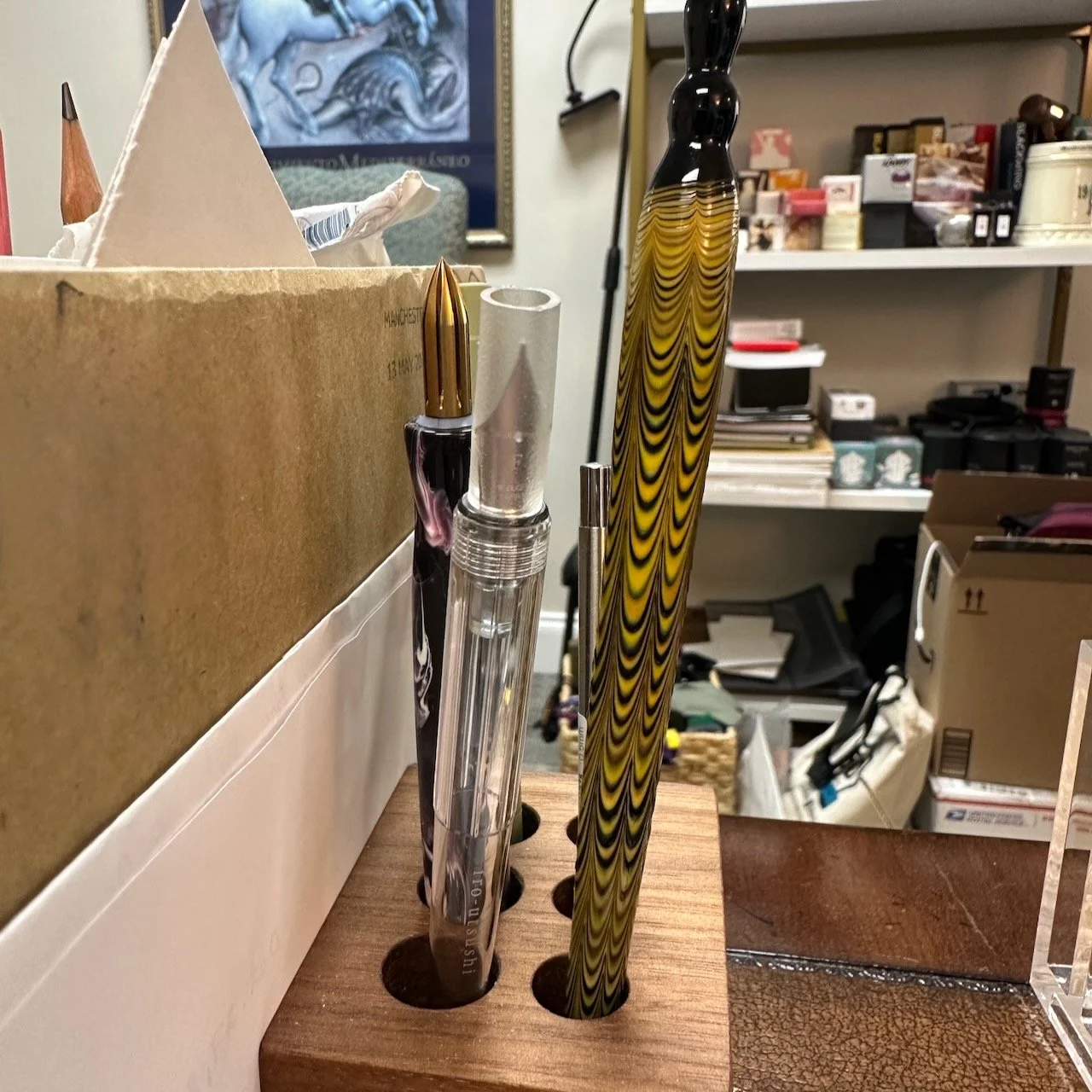
The Pilot Iro-Utsushi is a very basic product: a standard dip pen with a stainless steel fountain pen nib (fine or medium) attached to it. This pen differs from a calligraphy dip pen in that the nib is tipped for writing, and it can’t be swapped out of the holder. While some might find this “limiting,” I think that’s the point and what makes this product special: it’s intended for one thing, which is writing with fountain pen ink.
While I’m not sure I’ll ever make the Iro-Utsushi a “core tool” in my repertoire - I have way too many fun glass pens to reach for - I see no reason not to have one, since it’s an excellent option to have within reach for travel, meetups, and quick writing samples.
As I mentioned above, you can use the Iro-Utsushi for both ink swatching and standard writing. In my last post, I mentioned how I like to keep small sheets of “micro swatches” that are more portable than full-size swatch cards. This dip pen would be perfect for that, especially in the fine nib. And it offers a nice experience for standard writing too. Despite the lack of a feed, the underside of the nib holds a fair bit of ink and I regularly get 3-4 full lines of writing with the fine nib version. While the holder is a bit narrow for my hand and therefore may not be especially comfortable for longer writing sessions of a page or more, that’s not something I’d typically do with a dip pen anyway.
Testing out some Nagasawa Kobe Ink #69 (Kikusui Biotope Green).
Takeaways and Where to Buy
I don’t have any problem saying that the Pilot Iro-Utsushi is one of the best basic dip pen options on the market to use with fountain pen inks. Whether you’re a glass pen enthusiast looking for a less-fragile option to take to meetups or away from the security of your desk, or just someone looking for an inexpensive option to finally finish swatching and categorizing all of your ink samples, it’s hard to do better than the Iro-Utsushi, especially at the price point.
And, yes, I know that some of you have probably heard the internet rumors from the Japanese market that the Iro-Utsushi is being discontinued, but other intel has suggested that Pilot is merely releasing new colors and the pen will continue to be offered, at least in the U.S. market. Pilot is a bit different than many Japanese pen companies in that they continue to offer certain products in the U.S. (i.e., the E95s fountain pen) even after they are discontinued in Japan. Stay tuned, but I’m not panicked on this one yet as I can still get them here.
You can pick up a Pilot Iro-Utsushi dip pen in our own shop, starting at $8, in a range of clear acrylic and wood finishes. Nibs come in fine or medium, but note that not every color available in both nib options.
The Gentleman Stationer is supported by purchases from the T.G.S. Curated Shop (an authorized retailer of Pilot pens) and pledges via the T.G.S. Patreon Program. Our brick-and-mortar store is open Thursdays and Fridays from 1pm-6pm, and on Saturdays from 10am-6pm. Please check our main store page for up-to-date hours and announcements regarding special events.