• Blog
  • Shop
  • Podcast
  • Resources
  • About
  • Archive
  • Contact
  • Cart
  • Sign In My Account
Menu

The Gentleman Stationer

Vintage Living in the Modern World.
  • Blog
  • Shop
  • Podcast
  • Resources
  • About
  • Archive
  • Contact
  • Cart
  • Sign In My Account

Mini Collections, Part II: All the Red Inks

July 21, 2021

My stationery “collection” doesn’t really have a central theme, in that it’s not built around a specific brand. Rather, I tend to accumulate what I like to use, which has given rise to what I refer to as “mini-collections.” The first of these that I wrote about includes several models of the Parker Sonnet, what I consider a vastly under-appreciated pen. The second is on the ink side, which revolves around a rather large stable of red inks, mostly dark reds and burgundies.

Why Red Inks, You Might Ask?

It’s pretty simple. Dark red is just one of my favorite colors. It’s no coincidence that one of the first bottled fountain pen inks I ever purchased was Noodler’s Antietam, that the main color scheme of the T.G.S. website is burgundy and black, that I review red pens whenever I have the option, and that both of the exclusive editions I’ve released through the shop include red somewhere, whether it be the “Aged Red” Penwell or the recent Sunderland mk1. As you can imagine, I have accumulated a LOT of red ink over the years.

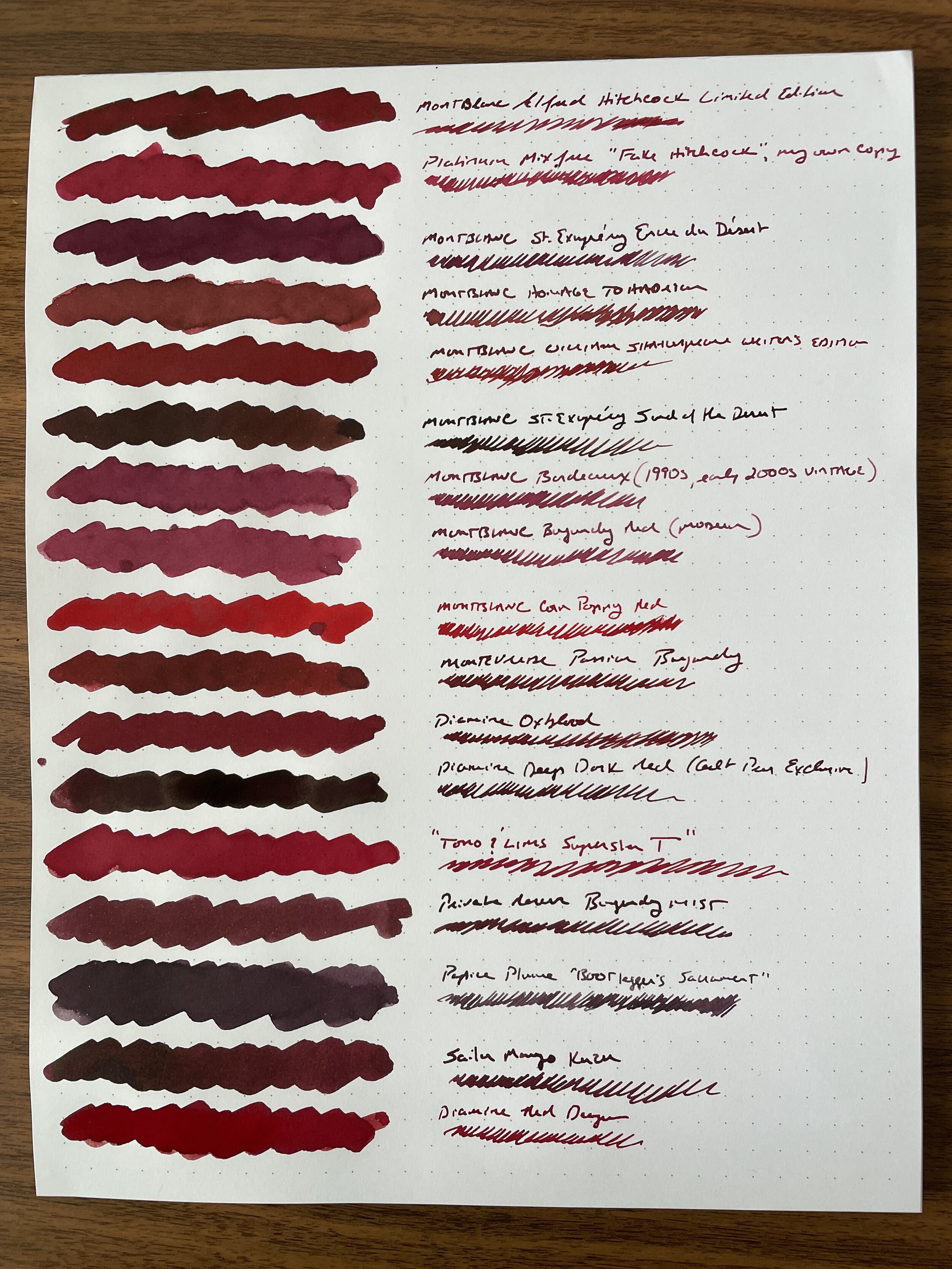
I don’t subscribe to the stigma that writing in red ink is somehow too loud, or should be considered “angry” or offensive. There are various shades of red, and I’ve always enjoyed a darker burgundy or red-black for everyday writing. My favorite, of course, is Montblanc’s legendary Alfred Hitchcock, a limited edition ink that many have tried to duplicate over the years. My personal “grail quest” hasn’t necessarily involved a pen, but rather finding a suitable replacement for this favorite ink, given that I only have half a bottle remaining. What I’ve never done, however, is swab ALL of my current stable of red inks and compare them side-by-side, to get a sense of whether I’ve accomplished my goal (or even whether I still want/need to).

The Process for Standardizing My Ink Samples

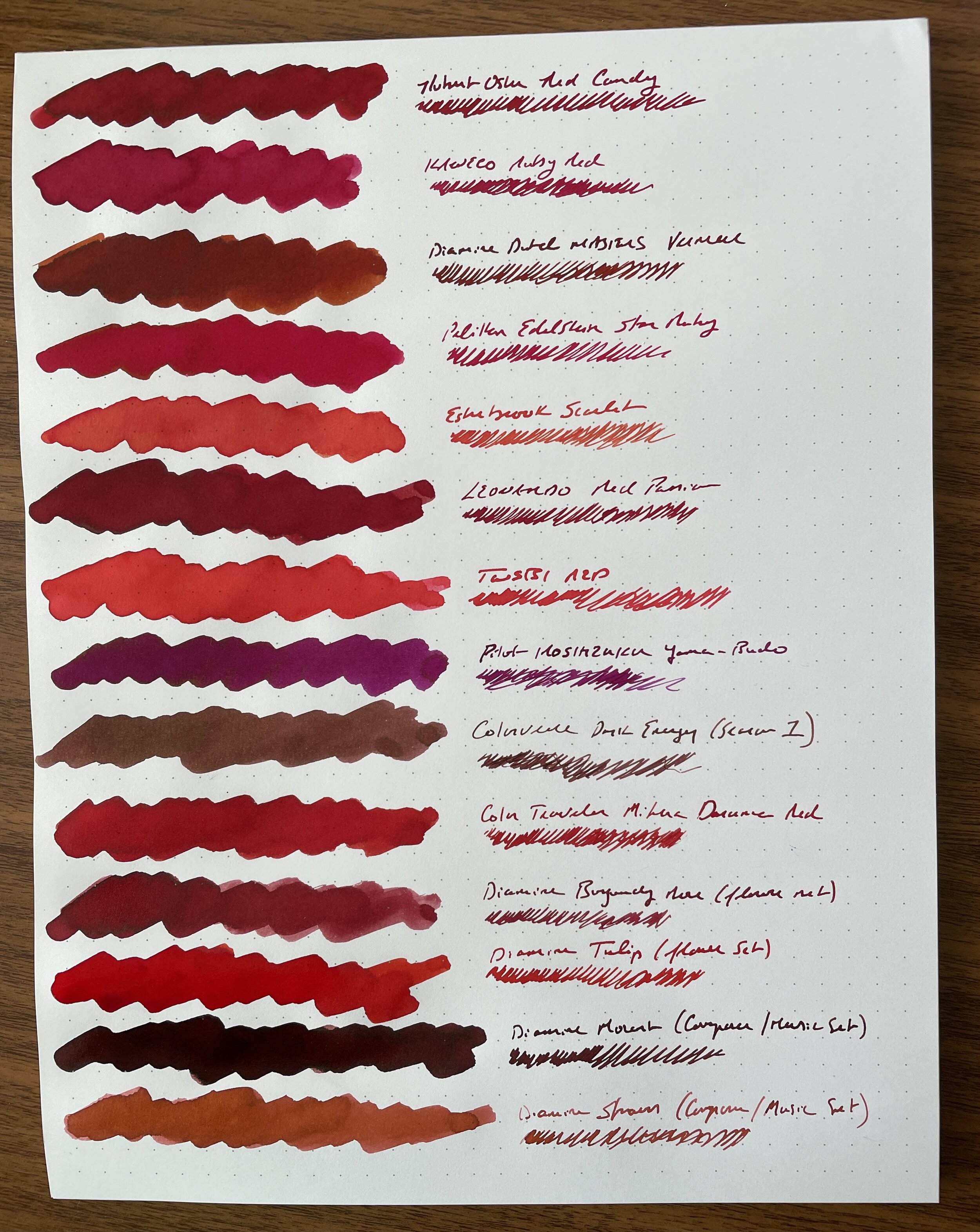
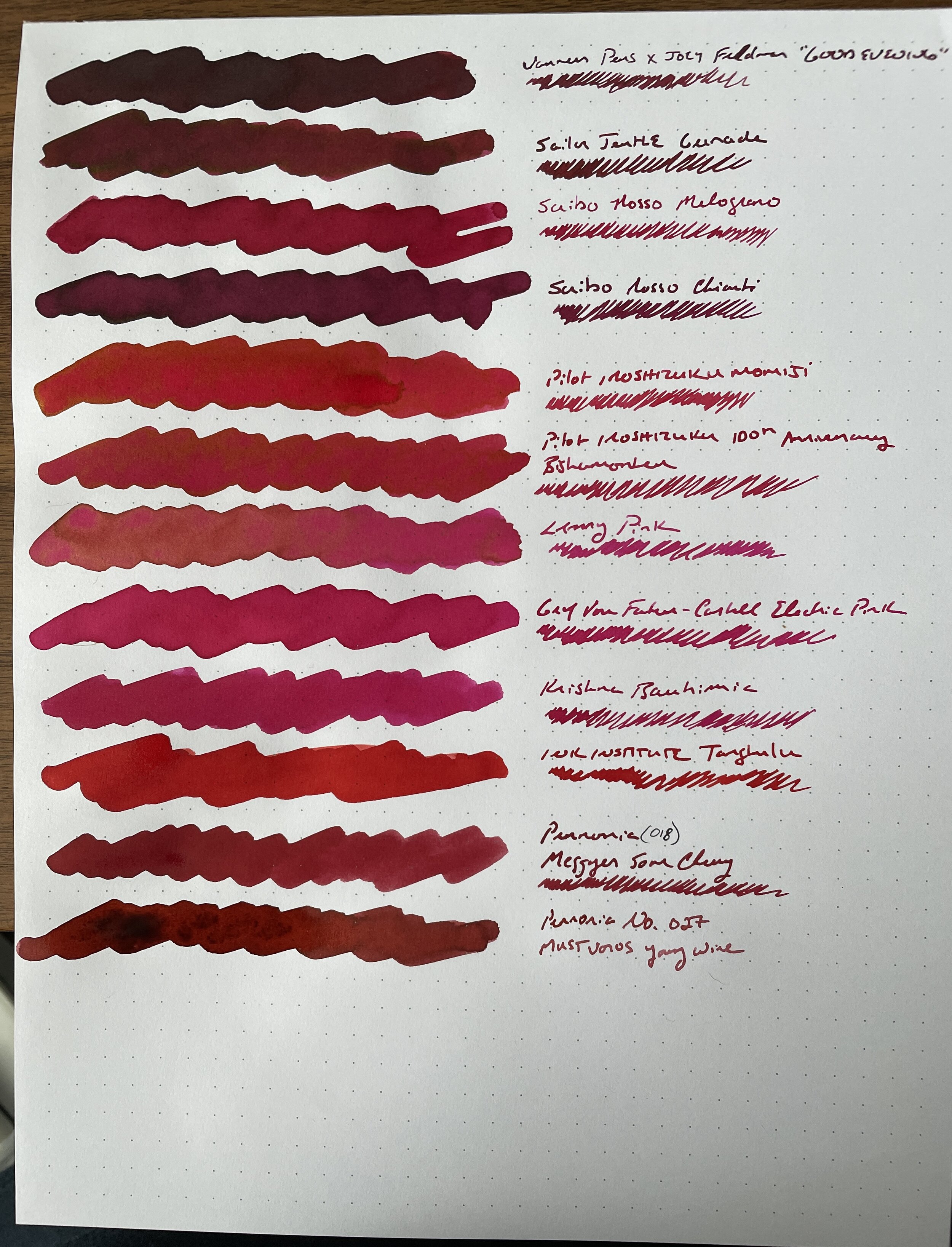
Taking inspiration from Anthony over at UK Fountain Pens, I wanted to use a menu-style format for the comparison with a simple cotton swap + dip pen writing sample combination, on bright white paper from a Write Notepads dot-grid memo pad. I chose this paper because it showcases the ink color quite well, including any shading and sheen, and absolutely will not feather or bleed even with most very wet ink swabs. The whole process took me approximately three hours on a Saturday, and I wound up with three sheets containing 43 different red inks. I laminated these sheets for posterity, and plan on doing similar comparisons with other ink colors in my collection.

View fullsize Red Inks, Sheet 1
View fullsize Red Inks, Sheet 2
View fullsize Red Inks, Sheet 3

Takeaways from My Red Ink Collection, Including Replacements for Hitchcock and Other Cult Inks

I’ve spent a few days thinking about this, and there’s a lot to unpack here, not least that I have more red ink than I can ever use in my lifetime, including a lot of similar shades. Here are my takeaways.

  1. Hitchcock Replacement. So far, no one has been able to come up with what I’d consider a true match. In terms of reasonably priced “everyday writers,” both Diamine Oxblood and Monteverde Passion Burgundy are very close. Vanness and Joey Feldman collaborated on “Good Evening,” an attempt to develop a similar shade of dark red, but I find it to be a touch darker (though still a great ink). The trouble with matching Hitchcock is that the color tends to look much different in wet writers than it does in narrower nibs. I managed to come up with a Platinum mix-free combo that looks very similar in a fine or medium nib writing sample.

  2. Other Matches for Limited Edition or Discontinued Montblanc Inks. Montblanc makes excellent inks, but their best colors tend to be limited or special editions that are made for a year or so and then discontinued. When I was live-posting this project on Instagram in real-time, I received questions about potential matches for Corn Poppy Red, William Shakespeare, and Bordeaux (the predecessor of “Burgundy” in the standard lineup). For Corn Poppy Red, consider Color Traveler Mihara Daruma Red. For William Shakespeare, consider Leonardo Red Passion or Robert Oster Red Candy. And while I don’t think the old Bordeaux is that far off from current Burgundy (maybe slightly darker), Diamine Burgundy Rose (from the “Flowers” set) and Pennonia No. 27 “Mustvoros Young Wine” are close.

  3. My Overall Favorite Red and Burgundy Inks for Everyday Writing. While this category keeps changing, since I’m constantly finding new shades that interest me, I’ve also rediscovered a bunch of inks in my collection that I had forgotten about. The ones that basically leapt off the page were Leonardo Red Passion (Leonardo makes exceptionally good but under-appreciated inks), Montblanc Corn Poppy Red, and Robert Oster Red Candy. You will likely see more of these in my rotation in the future.

  4. I’m Not Going To Use Certain Colors and Need to Purge Some Ink. It’s been over a year since my last ink sale, and I need to let 10 or so of these bottles go. I don’t use pink inks or reds that lean heavily pink, including many of the Pilot inks other than Iroshizuku Yama-Budo. Now that I have these inks swabbed for posterity on a laminated sheet, there’s no need to keep them around solely for comparison purposes. As always, Patreon subscribers will get first crack at whatever I decide to sell off, via the Patreon Sale page, and if anything’s left it will move over to the “Gently Used” stationery page, which is separate from the T.G.S. Curated Shop but can be combined with shop orders for free shipping purposes.

This was a highly satisfying project, and as I mentioned, I plan to repeat with other colors in the hopes of identifying my favorites, (re)discovering some hidden gems, and letting go of a bit more excess. Stay tuned for more fun! If anyone is interested in viewing these sheets in person, I will bring the color sheets with me to the D.C. Pen Show, where I will be behind the Vanness Pens table.

Disclaimer: This post does not contain paid affiliate links. Going forward, T.G.S is supported entirely by purchases from the T.G.S. Curated Shop and the T.G.S. Patreon Program, which offers access to online meetups, exclusive discounts and pre-orders, and more!

In Editorial, Ink Reviews Tags Editorial, Red Inks, Montblanc Ink
8 Comments

I still have a lot of back editions of Write Notepads and Field Notes limited edition notebooks that I’m still working my way through. Yes, I use them.

Stationery Trends: Subscription Services Today, Do You Still Use Them?

June 23, 2021

A few years ago, subscription services were all the rage, and it seems like every stationery company had one. Field Notes started the trend, originally known as the “colors” series. Write Notepads and Baron Fig got in on the game, launching a separate subscription service for each of four different product lines (pens, pencils, and hard and softcover notebooks). Blackwing launched its “Volumes” series, where they would issue a quarterly limited edition pencil that subscribers could receive before anyone else had a chance to buy. Supposedly, the rationale behind these subscriptions was that they would allow small makers to have a guaranteed revenue stream up front from subscriptions, which they could then use to make smaller runs of more experimental products that would otherwise be too speculative or cost-prohibitive. Originally, this was a good idea. It allowed Field Notes to test ideas for pocket notebooks beyond the original Kraft Paper design, and now the special and limited run products make up a majority of the Field Notes line. Similarly, the Volumes program allowed Blackwing to “field test” different pencil finishes and graphite grades that eventually made their way into the standard lineup. (Hello, Blackwing Natural and the Extra-Firm graphite!)

The last four editions of Blackwing Volumes, from left in no particular order: Blackwing 3 (“Ravi Shankar”); Blackwing XIX (“19th Amendment”), Blackwing 6 (“Neon”), and Blackwing 223 (“Woody Guthrie”).

So where do things stand today? Honestly, apart from Blackwing and Field Notes, it seems like the subscription model could be losing momentum. Write Notepads and Baron Fig discontinued their subscription programs after 1-2 years, in favor of releasing special editions on their own schedules. This could partly be due to the businesses stabilizing and becoming established in the industry, and there for no longer needing to rely on subscriptions to fund their manufacturing, but I can’t help but wonder whether the market for this sort of subscription product is saturated by one or two companies. For example, how many pocket notebooks or pencils does one person actually need? I’m sure there are people out there who go through six or more notebooks and a dozen-plus pencils per quarter, but it can’t be the majority of subscribers. Plus, as companies like Field Notes and Blackwing become established (if not omnipresent in mainstream retailers), the key rationale that drove many to subscribe - that you have to support your favorite small brands through a “guaranteed revenue” program - becomes less compelling. I’m sure that both Field Notes and Blackwing continue to have legions of hardcore fans and healthy subscriber bases, but given how large some of these recent runs are, I do wonder whether the majority of the sales from the special editions comes through retail channels or direct sales to non-subscribers. Are even the Field Notes and Blackwing programs becoming less relevant?

Field Notes recently released “Fifty,” their fiftieth limited edition release. (Disclaimer: The Gentleman Stationer does retail select Field Notes Products)

Personally, the only subscription service to which I still belong is Blackwing Volumes, but even that I’m questioning. Not that I don’t like Blackwing, it’s just that I have so many pencils I would prefer not to receive them by default and only purchase those editions that really strike me as special. My recent favorite special editions have actually been the Blackwing store-exclusives, “Eras” releases, and non-Volumes “Blackwing X” collaborations, such as the Third Man Records pencil and the “Hardest Job in the World” edition. While I think the last four Blackwing Volumes pencils have been “good,” I can’t help but wonder why they are moving so much good stuff outside of the subscription program, away from those who are, presumably, their most devoted fans?

I’d be curious to know how many of you still subscribe to stationery subscription services. What do you like and dislike about the option to subscribe? What keeps you coming back?

(This is not “market research”, just genuine curiosity. I have no desire to launch or participate in any sort of subscription service, so I’ll get that out of the way up front. As you all know, I’ve previously written on what sometimes feels like the stationery industry’s fixation on limited and special releases, so this post is intended to continue the discussion along those lines.)

In Editorial Tags Limited Edition, Blackwing Volumes, Blackwing, Field Notes, Editorial
4 Comments

Mid-Year review: Personal Favorites

June 6, 2021

While I thought I wasn’t going to get any time off this summer, the opportunity came up, due to some cancelled meetings at work, to take several days and visit family I haven’t seen in over a year. So, this week I’ll be finishing my mid-year “recaps”, as I originally intended, though you may notice that the schedule is a little different. With that out of the way, the second part of mid-year review takes a look at five of my favorite posts from the first half of 2021, in addition to those featured in Part I, Reader Favorites. Don’t take these as any sort of ranking - they appear in no particular order.

  1. Filling Systems: Pros and Cons of Piston Fillers, Vacuum Fillers, and Cartridge/Converter Fountain Pens. What draws us to certain filling mechanisms? It really depends on why you write with a fountain pen in the first place. For example, if you value ink capacity, you’ll prefer higher-capacity piston and vacuum fillers (or maybe even eyedroppers). On the other hand, if you’re a serial ink changer, you may be fine sticking with a cartridge/converter.

  2. Review Revisited: Is the Pilot G2 Still a Good Pen? One of my major “themes” for the blog, now seven years old, has been revisiting past reviews and opinions to see whether they still “stick”. Here, I took at look at what had previously been my favorite gel refill - the Pilot G2 - and confirmed that it’s still a great option.

  3. Take Five: Favorite Traveler’s Notebook Refills. I haven’t used many notebooks other than My Traveler’s Notebook system this year. I’ve enjoyed having everything in one compact place, and not having to worry about whether the paper will be good or not, since my favorite refills use the excellent Midori MD.

  4. Organizing a Pen Collection: Pulling It All Together. This year, another theme has been one of consolidation and appreciation rather than additional accumulation. I’m in the process of pruning a lot of unused pens, pencils, notebooks and other stationery from my supply, and thinking hard about what it is that I want to keep.

  5. Scribo Feel Fountain Pen and Scribo Ink Reviews. Every year I tend to discover one new brand that sticks with me, and this year it may be Scribo. While I wasn’t much of an OMAS fan, I’ve found myself drawn to Scribo, a “legacy” company founded by former OMAS employees. I’ve especially enjoyed their inks and ink bottles, and have more inks from that line in the queue for review.

A Note on Shop Orders: Due to my travel schedule, orders placed between Friday 6/4 and Saturday 6/12 will ship on 6/13, after my return. Thank you for understanding, and I’ll be sure to thrown in a little something extra for your trouble.

In Editorial Tags Mid-Year Review
1 Comment

Library pockets: a fun tool for commonplacing (or running your own lending library). Details below.

Mid-Year Review: Popular Content from the First Half of 2021

June 2, 2021

Every year around this time (which is typically when I go on vacation, in normal times), I take a week to reflect on both (1) the most popular post from the first several months of the year; and (2) my favorite posts from the first several months. These recaps serve a couple of different purposes: They let new readers and those who’ve fallen behind catch up on posts they may have missed, and give me an overview of where I’ve spent most of my time and whether I want to change direction at all. There’s a nice mix of content here, including updated Top Five lists, personal reflections, and pen and ink reviews, and it’s generally reflective of the site’s new direction. Happy reading!

  1. My Five Best Pencils for Everyday Writing, Five Years Later. With T.G.S. having celebrated it’s seventh anniversary in April, one of my major goals was to revisit popular “Best of” or “Top Five” lists from the early days of the site, many of which had grown woefully out-of-date. First up was this “Best Pencils” post - a solid reader favorite. You can still read the original here, to see what changed and what stayed the same.

  2. A Closer Look: Best Notebooks for a Commonplace Book. All that time spent at home during 2020 really allowed me to restart my reading habit, if not in number of books consumed, then in the depth at which I read. I’ve regularly kept a commonplace book (a collection of quotes, notes, and “to read” recommendations) for the past year and a half and found it to be a fulfilling hobby.

  3. First Impressions: Hands-on with the New Parker 51 Fountain Pen. Of course this one got the page views. (And the comments. Oh yes, the comments. They still keep coming.)

  4. Mini-Collections and Under-Appreciated Pens: The Parker Sonnet. I guess I’ve spent the first part of the year on a bit of a modern Parker kick. I keep coming back to the Sonnet as an all-time favorite, as there’s something about the pen’s classic design that makes it a potential “desert island” writer for me, along with the Lamy 2000. As I discuss in that post, I’ve unconsciously accumulated a small “mini-collection” of Sonnets over the years.

  5. Exploring Iroshizuku, Part I and Part II. I tend to shy away from doing a lot of ink reviews, since I find today’s ink market (1) intimidating due to its sheer size, and (2) a bit of a hype machine designed to encourage people to constantly acquire more ink than any person could ever use in a reasonable lifetime. I do, however, enjoy well-made, beautiful ink that’s suitable for everyday writing, such as Pilot’s Iroshizuku line. In these two posts, which form part of a larger work-in-progress, I look at six different inks, many of which are long-time favorites.

A Late Addition to the Commonplace Book Post….

I don’t recall exactly where I picked this tip up, but sometime during 2020 I started sticking “library pockets” in the back of my books, that I would use to hold index cards for notetaking while I was traveling or reading. I’d later transcribe my notes from the notecards into my commonplace book. The habit has stuck (especially for books I can’t or don’t want to annotate or mark up), but I WAY over-purchased library pockets, and accidentally ordered more than a hundred of them. I don’t want to just throw them out, so I’m giving them away. If you order a notebook from the Curated Shop (hopefully for commonplacing but it’s not necessary), I’ll throw in a couple of these pockets, free of charge. The promotion will last until I’ve exhausted my excess supply. (Just to be clear, you’ll receive two pockets per person, per order, not two pockets per notebook.)

In Editorial Tags Mid-Year Review, Favorites, Editor
2 Comments
F1543CF7-A5E1-4FB7-83C6-99CF91BA9D40_1_201_a.jpeg

What Makes a Great Anniversary Edition: Kanilea Pen Company Honokalani Maile Lei

May 29, 2021

I’ve spent the past week or so writing about my frustration with the constant stream of “special” and “limited” edition pens flooding the market, seemingly without a lot of thought or meaning behind each release. But I can gripe all day, and it doesn’t make any difference unless I (1) offer some sort of alternative myself; or (2) offer my thoughts on what makes a good special edition product. Today I’ll open door number two, using the recent release from Kanilea Pen Company, their Fifth Anniversary Honokalani Maile Lei fountain pen, as an example of how a company can do things the “right” way. After thinking on these issues, I’ve come up with four key points that, to me, make a legitimately “special” limited or special edition pen:

  1. It’s made to commemorate an actual event, or otherwise represents something with special meaning.

  2. The design ties to the “theme” of the special edition in a meaningful way.

  3. If the price point of the special or limited edition product is significantly higher than the company’s standard product line, there is something to justify the markup.

  4. If the product is heavily marketed as “limited” or “special”, the actual availability reflects that, especially if the company relies heavily on “FOMO” (Fear of Missing Out) to promote the release.

So How Does Kanilea’s Fifth Anniversary Pen Get It Right?

For starters, it’s a fifth anniversary pen, and it’s more than appropriate to issue a special release to commemorate something like the fifth anniversary of your company! The Kanilea Pen Company officially launched in August 2016 at the Washington, D.C. Pen Show. While I was in attendance, I didn’t have the opportunity to actually buy a pen because they sold out so fast. Since then, Kanilea has grown its lineup deliberately, typically releasing one or two new pens per year, all in keeping with their original company “theme” - places and locations in Hawaii. The Honokalani Maile Lei is no exception, named after the black sand beach on the island of Maui, with the custom-blended, proprietary acrylic designed to reflect the blue water swirling over the black sand.

Between the custom acrylic and the handcrafted design, no two Kanilea pens are identical. Each pen will have a different pattern of swirls and colors, and for that reason I often enjoy purchasing my Kanilea pens in person at pen shows. Hopefully we’ll get the chance to do that again soon!

Per Kanilea, Honokalani translates to “Harbor of the Chief,” and “Maile” refers to a sacred Hawaiian plant with fragrant, dark green leaves. The workmanship on the silver “Maile Lei” band is gorgeous.

Yes, the “Maile Lei” pen is a bit more expensive than a standard Kanilea, reflecting a markup of approximately $160. But you’re not just paying for a “special” or “limited” moniker - the Maile Lei features an Argentium Silver cap band with a three dimensional design depicting a lei of maile leaves. According to the materials provided by Kanilea with my pen, “[a] maile lei expresses many meanings and is used to celebrate important life events or even given as a sign of friendship. Traditionally, a maile lei is worn draped around the neck, open ended, but closed maile leis are also made.” The Konokalani Maile Lei fountain pen is only available in a single design profile, the Classic, which, in my opinion, perfectly showcases both the acrylic and the custom silver band.

Finally, while the Honokalani Maile Lei is an “Anniversary edition” pen, and presumably won’t be available forever (though I could be wrong about that), you don’t see any desperate “buy-it-now-or-you’ll-miss-it” style marketing that’s become so characteristic of modern pen releases. Each Kanilea launch is accompanied by carefully assembled marketing materials explaining the story behind the pen, how the design choices relate to the theme, and how the pen fits into the overall Kanilea narrative.

Your Kanilea pen arrives packaged in a black walnut keepsake box. I have several of these boxes, and each has found new life as a dresser valet, pencil box, or catch-all for office supplies.

Granted, I do want to point out that Kanilea isn’t exactly an apples-to-apples comparison with other brands, because Kanilea isn’t a typical pen company. Their standard lineup of pens isn’t mass-produced. Each model is carefully tied to the company’s core theme, with each aspect of every pen, from shape to material, carefully selected to reflect its namesake. The pens themselves are designed and handcrafted by the small family team behind Kanilea. But I do think the comparison is still instructive, as one could even argue that what Kanilea does with their “regular line” is what more mainstream companies should be considering for their special and limited releases (at least if their goal is to foster the sort of loyal customer base that has allowed companies like Kanilea to flourish).

Kanilea fountain pens feature an extremely comfortable grip section and reliable No. 6 JoWo nibs, each tuned and smoothed prior to shipment to ensure a good writing experience.

Why I Enjoy Kanilea Pens

Apart from the aesthetics, Kanilea pens are extraordinarily well-designed, ergonomic, and comfortable. The section, in my opinion, is one of the best out there, the pens are perfectly balanced, and Hugh’s skill at nib tuning continues to impress me. While a Kanilea fountain pen makes for an expensive purchase, the entire experience - down to the packaging - delivers a level of value that’s hard to find from any other maker.

Where to Buy the Kanilea Honokalani Maile Lei

If you’re interested in learning more about Kanilea’s Fifth Anniversary Release, visit the Kanilea Pen Company website. As I noted above, the Honokalani Maile Lei retails at a higher price point than a typical Kanilea fountain pen ($555 for a steel nib, and $695 for 18k gold), though there is also a Honokalani model (no Maile Lei band) at the standard $395 pricing. Other Kanilea models currently available for purchase include the Mauna Kea, Aolani, and Nui Nalu, which I’ve previously written about as well as the newer Kona Snow and Kona Cherry designs.

Disclaimer: Kanilea Pen Company was kind enough to provide me with the pen featured in this review on a tryout basis. It’s not going to make it’s way back to them. While I did not receive the pen for free, I did receive a discount on the purchase of a gold nib version. Many thanks to Hugh, Karol, and the rest of the team at Kanilea for making this review possible!

In Pens, Editorial Tags Kanilea Holokalani Maile Lei, Kanilea Pen Co., Pen Review, Limited Edition
2 Comments
← Newer Posts Older Posts →
Store Hours and Location
Visit the T.G.S. Curated SHOP
Updated "Best Pens" Guide
On the Paper Trail Podcast
TGS_25 Roterfaden New Stock Available
Hierarchies of Fountain Pen Friendly Paper

Join Our Patreon!
Subscribe to the TGS E-mail List

Featured Posts

Featured
Pilot-Custom-Series-Pens-overview.jpg
Mar 14, 2026
The Pilot "Custom" Series: An Overview of Some of My Favorite Fountain Pens
Mar 14, 2026
Mar 14, 2026
Pentel-Sign-Pen-Cover.JPG
Feb 28, 2026
Pen Review: The Pentel Sign Pen (Craft Design Technology Version)
Feb 28, 2026
Feb 28, 2026
Cover On the Paper Trail Intro Clip.jpeg
Dec 3, 2025
Introducing "On the Paper Trail," a New Podcast/Video Collaboration with Lisa Vanness of Vanness Pens!
Dec 3, 2025
Dec 3, 2025
The Gentleman Stationer RSS

View Cart

© Digital Divide Media, LLC, 2014-present.

All content is the exclusive property of Digital Divide Media, LLC, d/b/a The Gentleman Stationer, including “The Gentleman Stationer” website and trademark, and should not be reproduced without express written permission.  All rights reserved.

All content containing paid advertising, affiliate links, or sponsored content will be plainly disclosed by a disclaimer when/if featured.

Contact Information

Store Shipping Policy and Return Policy

Privacy Policy

Cookie Policy

Terms and Conditions

Powered by Squarespace