Why on Earth Did Sailor Discontinue Apricot?

Ever since we got the word last year that Sailor was discontinuing it's current Jentle line of inks, and, somewhat oddly, replacing them with new versions of inks previously issued as "limited editions", I've been mourning the discontinuation of Apricot, Sailor's orange ink.  I understand that this is utterly nonsensical.  I'm hoarding two or three bottles of the stuff, and since I've only finished one or two bottles of ink in the five years I've been in this hobby, this probably qualifies as a 10-year supply, if not more.  (Some people may use orange ink on a daily basis.  I don't.)  Despite this, over the past year I've been searching for a suitable alternative to my Apricot, should I ever run out.   

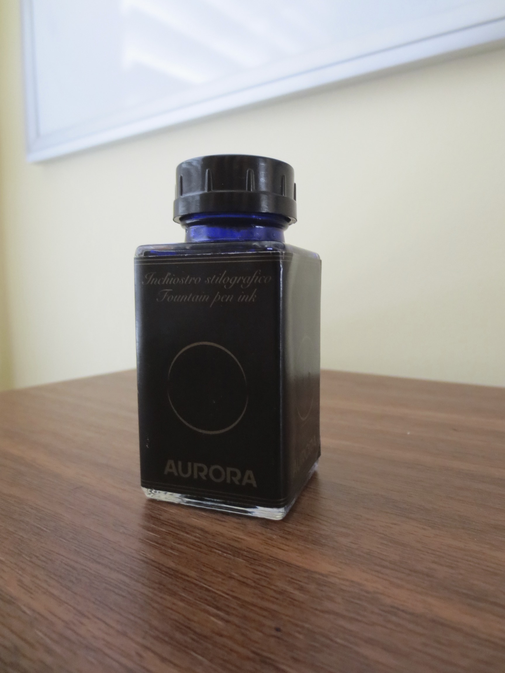
If you look carefully, in the background, you can see my newest ink obsession.  

Enter the first pretender.  Iroshizuku Yu-Yake is a perfectly good ink.  It doesn't feather on my cheap office paper, it flows well, and it has a nice pure orange color that shades decently.  So what's the problem with it?  I'll show you: 

This isn't a 100% accurate color reproduction, but it's close (Orange Inks are hard to photograph/scan.)  In this picture, the Yu-yake shows up a tad light, and the Apricot a shade darker, but the difference in vibrancy is accurate.  

Yu-yake certainly doesn't have the same "pop" as the Apricot, and to be fair, Pilot probably intended Yu-Yake to be a completely different color.  It's also somewhat unfair that I chose to show off the Apricot in a 1911 with a Nagahara-tuned music nib, but Apricot looks just as good in a fine nib.  Iroshizuku does win out on the cheap office paper that I have to use on a daily basis at work, so I will probably keep this bottle around.  Apricot tends to bleed through.

The hunt for a suitable Apricot replacement continues.  But then again, what else do I have to do with my time and money?    

Inks of New York: Noodler's Pinstripe Homage

I broke this out yesterday from my stash of inks that I somehow never got around to trying, and I really like it.  I'm not anti-Noodler's.  I don't necessarily buy the "these inks will dissolve your pen" arguments as long as you are smart about cleaning your pen periodically and use common sense with your fragile vintage stuff.  For example, don't use a super saturated Noodler's Ink in a vintage celluloid pen that could easily stain.  For most modern pens, I'll typically give Noodler's a go.  (As with anything I say on this blog, YMMV, so use your own judgment with regard to what inks you're comfortable with.)  

Pinstripe Homage has some of my favorite Noodler's artwork. 

Anyway, back to this ink.  Pinstripe Homage is one of the "New York Colors" that Noodler's manufactured for the former Art Brown International Pen Shop in Manhattan (may it rest in peace).  Other colors included Subway Series Sepia, Manhattan Blue, and Brooklyn Brawn.  Some of us out there appreciate the overarching baseball theme.  Personally, I love this color, and can't believe that I waited this long to use it.  I'd describe it as a darker blue black with hints of teal (dare I say a "dark Yama-Dori"?)  I also like the fact that this ink dries quickly and doesn't bleed, though it will feather a bit on cheap paper, like most Noodler's inks.  

People have also compared this ink to Iroshizuku Syo-Ro, another "teal-black" ink.  

Unfortunately, as far as I know this ink is not available anymore.  I picked up my bottle from Goldspot, who bought Art Brown's remaining stock when the shop closed.  If anyone wants to do an ink sample trade for some of this, reach out!