I missed out on grabbing a bottle of this year's coveted Lamy limited edition ink, Petrol, but fortunately Appelboom came to the rescue and sent me a bottle for review - AND to give away to my readers! I won't pretend to understand Lamy's strategy (or lack thereof) behind its recent limited releases, but for whatever reason they didn't make near enough Petrol, and this ink is sold out at nearly all major retailers. Other than blog giveaways, Lamy enthusiasts looking for a bottle of Petrol will probably be limited to whatever they can score on the secondary market.
Lamy probably would have sold a ton of this ink had they manufactured it in greater quantities. Petrol is a very dark teal-black ink, making it suitable for professional use. I certainly would have purchased a bottle, maybe two. Here's to hoping that Lamy will someday expand its standard lineup to include some of the unique colors it's tested out in the past: Dark Lilac, Copper Orange, and Petrol. (Though I'll pass on the Charged Green and its neon brethren.) IMHO, it seems like they're missing a great opportunity to revitalize the ink side of their business.
Lamy Petrol would make a great everyday writer.
I plan on eventually picking up one of the matching Petrol Safari's, though I suspect they will remain in stock for some time, since you can still find some "Dark Lilac" pens from last year if you look hard enough.
Don't Forget "Pacific Blue," the Other "Limited Edition"
The other oddity with respect to this year's Lamy releases is that they initially advertised a "Pacific Blue" ink to accompany their "Pacific Blue" AL-Star, only to admit later that it was simply a repackaged version of standard Lamy Turquoise. Lamy Turquoise is an excellent ink in its own right, but why Lamy would go through the trouble of repackaging and marketing it as a Limited Edition and - at least initially - not voluntarily reveal this fact to retailers and customers is beyond me. (Well, not necessarily beyond me, but I prefer to not think that an established and well-regarded company in this industry would intentionally try to dupe its retailers and customers into purchasing something they may already own.) I've been spending some time with Lamy Turquoise, and it's a vibrant, well-behaved ink with decent shading. It's also a fair substitute for this year's limited edition Montblanc UNICEF Blue, and costs a fraction of the price.
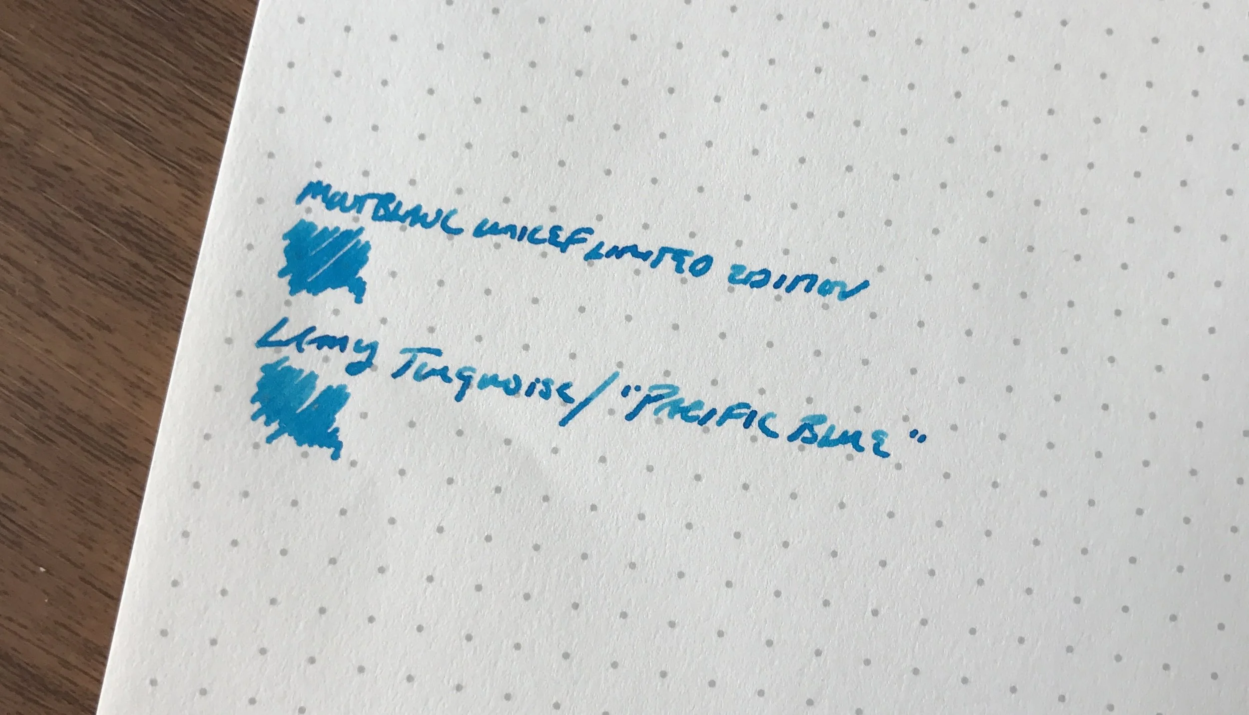
A comparison shot of Lamy Turquoise against the new Montblanc UNICEF Blue. They look very similar, though the Montblanc looks slightly richer and a bit more saturated in person.
Where to Buy, and Giveaway Rules
Appelboom stocks the full range of Lamy Ink and other products, and many thanks to them for donating these bottles for testing and a giveaway. I enjoy Lamy inks, even though their standard color lineup tends to be a bit staid. They're widely regarded as "safe" for use in most pens, including vintage. Their black is a favorite of mine, because it has dusty purple/green undertones to it that make it a bit more interesting than your typical black ink. Unfortunately, as I noted above the limited edition Petrol ink is sold out almost everywhere, and retailers currently do not expect Lamy to make additional ink available for sale. However, there's plenty of Turquoise/"Pacific Blue" in stock, as well as the other colors in the Lamy lineup.
Giveaway Rules and Conditions are as follows:
- In order to enter the giveaway, leave a comment on this blog post indicating which bottle of ink you want. While you don't need to provide your full name, be sure to leave at least some identifying information. (A first or last name plus an initial is generally sufficient.) Lamy ink retails for approximately $12 per bottle, depending on country and retailer.
- The giveaway will end at 11:59pm Central Time on Sunday, June 10, 2017.
- At the close of the giveaway, I will assign each entry a number and pick two winners using a random number generator. I will announce the winners on the blog the following Monday or Tuesday and give each winner exactly one week to contact me to provide a shipping address. Information submitted by entrants and/or winners will be used by me solely to ship your item and will not be sold or otherwise provided to Appelboom or any other sponsor. In the event more than one person indicates a preference for the same ink - which I imagine might be the case with the Petrol - the person who reaches out to me first to claim their prize will have first refusal.
- You must leave a comment to enter. Limit one entry and one prize per person. Your odds of winning are directly proportionate to how many people enter. This giveaway is open to everyone, non-U.S. residents included, though I will have to use the cheapest shipping option available, which may not include tracking.
Disclaimer: I was sent the products featured in this post free of charge by Appelboom for review purposes. I was not otherwise compensated for this review. This post may contain affiliate links.